Chapter 1: Setup & Basics
Set Up Android Studio
Before any work can begin on developing an Android application, the first step is to configure a computer system to act as the development platform. This involves several steps consisting of installing the Android Studio Integrated Development Environment (IDE), including the Android Software Development Kit (SDK), the Kotlin plug-in, and the OpenJDK Java development environment.
This chapter will cover the steps necessary to install the requisite components for Android application development on Windows, macOS, and Linux-based systems.
System Requirements
Android application development may be performed on any of the following system types:
- Windows 8/10/11 64-bit
- macOS 10.14 or later running on Intel or Apple silicon
- Chrome OS device with Intel i5 or higher
- Linux systems with version 2.31 or later of the GNU C Library (glibc)
- Minimum of 8GB of RAM
- Approximately 8GB of available disk space
- 1280 x 800 minimum screen resolution
Downloading the Android Studio Package
All of the work involved in developing applications for Android will be performed using the Android Studio environment. The content and examples in this book were created based on Android Studio Meerkat 2024.3.1 patch 1 using the Android API 35 SDK (Vanilla Ice Cream), which, at the time of writing, is the latest stable releases.
Android Studio is, however, subject to frequent updates so it may change mid-semeser
The latest release of Android Studio may be downloaded from the primary download page, which can be found at the following URL: https://developer.android.com/studio/index.html
Installing Android Studio
Once downloaded, the exact steps to install Android Studio differ depending on the operating system on which the installation is performed.
Installation on Windows
Locate the downloaded Android Studio installation executable file (named android-studio-<version>-windows.exe) in a Windows Explorer window and double-click on it to start the installation process. Click the Yes button in the User Account Control dialog if it appears.
Once the Android Studio setup wizard appears, work through the various screens to configure the installation to meet your requirements in terms of the file system location into which Android Studio should be installed and whether or not it should be made available to other system users. When prompted to select the components to install, ensure that the Android Studio and Android Virtual Device options are all selected.
Although there are no strict rules on where Android Studio should be installed on the system, the remainder of this book will assume that the installation was performed into C:\Program Files\Android\Android Studio and that the Android SDK packages have been installed into the user’s AppData\Local\Android\sdk sub-folder. Once the options have been configured, click the Install button to begin the installation process.
On versions of Windows with a Start menu, the newly installed Android Studio can be launched from the entry added to that menu during the installation. The executable may be pinned to the taskbar for easy access by navigating to the Android Studio\bin directory, right-clicking on the studio64 executable, and selecting the Pin to Taskbar menu option (on Windows 11, this option can be found by selecting Show more options from the menu).
Installation on macOS
Android Studio for macOS is downloaded as a disk image (.dmg) file. Once the android-studio-<version>-mac.dmg file has been downloaded, locate it in a Finder window and double-click on it to open it.
To install the package, drag the Android Studio icon and drop it onto the Applications folder. The Android Studio package will then be installed into the Applications folder of the system, a process that will typically take a few seconds to complete.
To launch Android Studio, locate the executable in the Applications folder using a Finder window and double-click on it.
For future, easier access to the tool, drag the Android Studio icon from the Finder window and drop it onto the dock.
Installation on Linux
Having downloaded the Linux Android Studio package, open a terminal window, change directory to the location where Android Studio is to be installed, and execute the following command:
tar xvfz /<path to package>/android-studio-<version>-linux.tar.gz
Note that the Android Studio bundle will be installed into a subdirectory named android-studio. Therefore, assuming that the above command was executed in /home/demo, the software packages will be unpacked into /home/demo/android-studio.
To launch Android Studio, open a terminal window, change directory to the android-studio/bin sub-directory, and execute the following command:
./studio.sh
The Android Studio Setup Wizard
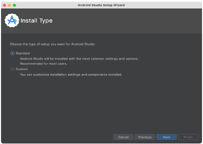
If you have previously installed an earlier version of Android Studio, the first time this new version is launched, a dialog may appear providing the option to import settings from a previous Android Studio version. If you have settings from a previous version and would like to import them into the latest installation, select the appropriate option and location. Alternatively, indicate that you do not need to import any previous settings and click the OK button to proceed.
If you are installing Android Studio for the first time, the initial dialog that appears once the setup process starts may resemble that shown in the illustration. If this dialog appears, click the Next button to display the Install Type screen. On this screen, select the Standard installation option before clicking Next.
Setting up an Android Studio Development Environment
On the Select UI Theme screen, select either the Darcula or Light theme based on your preferences. After making a choice, click Next, and review the options in the Verify Settings screen before proceeding to the License Agreement screen. Select each license category and enable the Accept checkbox. Finally, click the Finish button to initiate the installation.
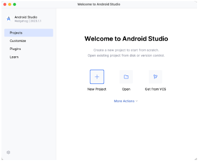
After these initial setup steps have been taken, click the Finish button to display the Welcome to Android Studio screen using your chosen UI theme:
Installing additional Android SDK packages
The steps performed so far have installed the Android Studio IDE and the current set of default Android SDK packages. Before proceeding, it is worth taking some time to verify which packages are installed and to install any missing or updated packages.
This task can be performed by clicking on the More Actions link within the welcome dialog and selecting the SDK Manager option from the drop-down menu. Once invoked, the Android SDK screen of the Settings dialog will appear as shown in:
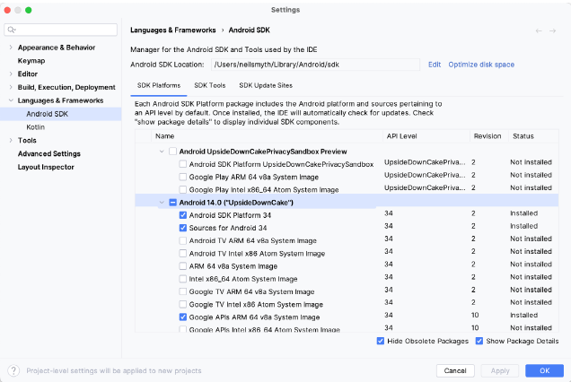
Google pairs each release of Android Studio with a maximum supported Application Programming Interface (API) level of the Android SDK. In the case of Android Studio Hedgehog, this is Android UpsideDownCake (API Level 34). This information can be confirmed using the following link: https://developer.android.com/studio/releases#api-level-support
Immediately after installing Android Studio for the first time, it is likely that only the latest supported version of the Android SDK has been installed. To install older versions of the Android SDK, select the checkboxes corresponding to the versions and click the Apply button. The rest of this book assumes that the Android UpsideDownCake (API Level 34) SDK is installed.
Most of the examples in this book will support older versions of Android as far back as Android 8.0 (Oreo). This ensures that the apps run on a wide range of Android devices. Within the list of SDK versions, enable the checkbox next to Android 8.0 (Oreo) and click the Apply button. Click the OK button to install the SDK in the resulting confirmation dialog. Subsequent dialogs will seek the acceptance of licenses and terms before performing the installation. Click Finish once the installation is complete.
It is also possible that updates will be listed as being available for the latest SDK. To access detailed information about the packages that are ready to be updated, enable the Show Package Details option located in the lower right-hand corner of the screen. This will display information similar to that shown in figure 2-6:
Setting up an Android Studio Development Environment
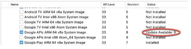
The above figure highlights the availability of an update. To install the updates, enable the checkbox to the left of the item name and click the Apply button.
In addition to the Android SDK packages, several tools are also installed for building Android applications. To view the currently installed packages and check for updates, remain within the SDK settings screen and select the SDK Tools tab as shown in:
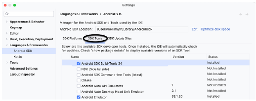
Within the Android SDK Tools screen, make sure that the following packages are listed as Installed in the Status column:
- Android SDK Build-tools
- Android Emulator
- Android SDK Platform-tools
- Google Play Services
- Google USB Driver (Windows only)
- Layout Inspector image server for API 31-34
Once the installation is complete, review the package list and ensure that the selected packages are listed as Installed in the Status column. If any are listed as Not installed, make sure they are selected and click the Apply button again.
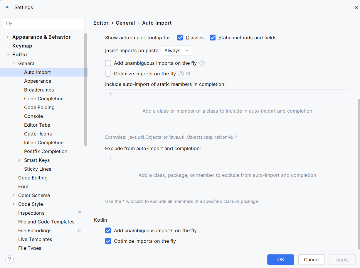
Setting up Auto Imports in Android Studio
Android Studio can be configured to automatically import the correct imports for you. This is a great time saver and it will help you to write code faster and more efficiently.
To set up auto imports, go to the File menu and select Settings. Then, select Editor and then General. Under the Auto Import section, check the boxes under the Kotlin area at the bottom of the page Add unambiguous imports on the fly and Optimize imports on the fly.
Set Up ADB
Setting up the Android Debug Bridge (ADB) command line tool is helpful for Android development as it allows you to communicate with an Android device or emulator instance. This tutorial will guide you through the process of setting up ADB for both macOS and Windows operating systems, including adding it to your system's environment variables for easy access from any command prompt.
You don't have to do this as it is not required for the class, but it may be needed for doing wireless connecting to your physical Android device if you decide to.
Prerequisites
- Android Studio installed: Ensure Android Studio is installed on your computer, as it includes the ADB tool.
- Access to terminal or command prompt: Depending on your OS, you'll need access to Terminal (macOS) or Command Prompt/PowerShell (Windows).
Step 1: Locate the ADB Tool
ADB is part of the Android SDK Platform-Tools, which can be installed via Android Studio.
- Open Android Studio and go to Tools > SDK Manager.
- Navigate to the SDK Tools tab in the SDK Manager.
- Check Android SDK Platform-Tools and click OK to install it if it's not already installed.
After installation, you'll need to locate the ADB tool:
- Default Path on Windows:
C:\Users\<Your-Username>\AppData\Local\Android\Sdk\platform-tools\ - Default Path on macOS:
/Users/$PATH/Library/Android/sdk/platform-tools/
Replace <Your-Username> with your actual username.
Step 2: Add ADB to Environment Variables
To use ADB from any terminal or command prompt, add its directory to your system's PATH environment variable.
For macOS:
- Open Terminal.
- Edit the shell profile file (
.bash_profile,.zshrc,.bashrc, etc.) depending on which shell you use. For most macOS users, it's likely.zshrcon newer systems:vi ~/.zshrc - Add the ADB tool to your PATH:
Save and exit the editor (export PATH=$PATH:/Users/$PATH/Library/Android/sdk/platform-toolsCtrl + X, thenYto confirm changes, andEnterto exit). - Apply the changes:
source ~/.zshrc
For Windows:
- Search for Environment Variables in the Start menu.
- Select Edit the system environment variables > Environment Variables.
- Under System Variables, find and select the
Pathvariable, then click Edit. - Add a new entry for the path to the ADB tool:
C:\Users\<Your-Username>\AppData\Local\Android\Sdk\platform-tools - Click OK to close all dialogs and apply the changes.
Step 3: Verify Installation
To ensure ADB is set up correctly, open a new Terminal or Command Prompt and type:
adb version
This command should display the version of ADB you have installed, indicating that it's correctly set up and accessible from the command line.
Below are some of the commands you can do with ADB
| Command | Description |
|---|---|
adb devices |
Lists all connected Android devices and emulators. |
adb install <apk-file> |
Installs the specified APK file on a connected device. |
adb uninstall <package-name> |
Uninstalls the specified app from a connected device. |
adb shell |
Opens a command-line shell on the connected device. |
adb logcat |
Streams system logs from the connected device, useful for debugging. |
adb push <local> <remote> |
Copies a file from the local system to the device. |
adb pull <remote> <local> |
Copies a file from the device to the local system. |
adb reboot |
Reboots the connected device. |
adb reboot bootloader |
Reboots the device into bootloader mode. |
adb forward <local> <remote> |
Forwards a local port to a remote port on the device. |
adb kill-server |
Stops the ADB server running on the host system. |
adb start-server |
Starts the ADB server on the host system. |
adb sideload <file.zip> |
Flashes a ZIP file (e.g., an OTA update) onto the device. |
Conclusion
You have now successfully set up the Android Debug Bridge (ADB) on both macOS and Windows, and added it to your PATH for easy access. This setup will allow you to perform a wide range of development tasks, including installing apps, scripting, and accessing the Android shell directly from your command line.
Setting Up an Emulator
You will need to set up an emulator to run any of the applications built in this course. Running an emulator is taxing on your computer and your computer may not handle it well. The better method is to run it on a physical device. I realize many of you may not have a Android device and you are not required to get one. However, if you want one they are fairly inexpensive and can be found on Amazon or at any store that carries electronics.
Prerequisites
Ensure that you have Android Studio installed on your computer. You can download it from the official Android Developer website.
Step 1: Launch Android Studio
Open Android Studio on your computer and wait for it to load completely. If you have a project open, you can continue from there, or you can start a new project.
Step 2: Access the Device Manager
The Device Manager is where you manage your virtual devices.
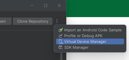
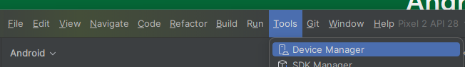
- Navigate to Device Manager: You can access the Device Manager in one of the following ways:
- In the intro screen of Android Studio click the three dots in the upper right corner and click Virtual Device Manager
- In the project view, click on the Device Manager icon in the toolbar on the top right of Android Studio

- In the project view, in the upper left corner there is a 4 line icon click on that to display the menu. Then go to Tools > Device Manager in the menu bar at the top.
- In the intro screen of Android Studio click the three dots in the upper right corner and click Virtual Device Manager
Step 3: Create a New Virtual Device
- Start the Creation Process: In the Device Manager window, click on the + button at the top left of the window. Then click "Create virtual device".
- Choose a Device: You will see a list of device definitions, from phones and tablets to Wear OS and TV devices. For example, select Pixel 6 under the Phone category and click Next.
- Select a System Image: You need to download a system image for the emulator.
- Choose a release name (e.g., Q) under the Recommended tab or other tabs like x86 Images or Other Images.
- Click on the Download link next to the system image (e.g., Q API 29) if it's not already downloaded. This process might take some time depending on your internet speed.
- After Downloading: Once the system image is downloaded, select it and click Next.
Step 4: Configure the Emulator
- Device Name: Give your device a name. For instance, you might name it "Pixel_6_API_29".
- Startup Orientation: Choose the orientation (Portrait or Landscape) in which to start the emulator. I used Portrait
- Advanced Settings (Optional I don't do this): Click on Show Advanced Settings to configure additional options like RAM, VM heap, Internal Storage, SD Card size, etc.
- Finish: Click on Finish to create your virtual device.
Step 5: Launch the Emulator
- Start Your emulator: Back in the Device Manager area, you will see your newly created device listed. Click on the green play button under the Actions column to start the emulator.
- Wait for Emulator to Boot: It may take a few minutes for the emulator to start up, especially the first time.
Step 6: Run Your Application
- Deploy an App: With the emulator running, you can now run your Android app. Go back to the main Android Studio window, select your project, and click on the Run button (a green triangle) in the toolbar.
- Select the Emulator: Choose your newly created device from the list of running devices and click OK. Android Studio will install and launch your app on the emulator.
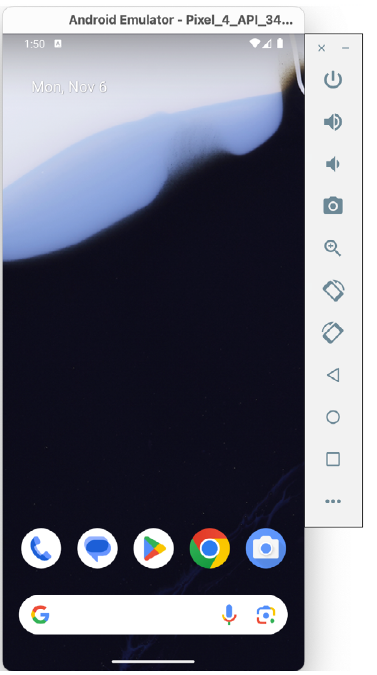
The Emulator Environment
When launched in standalone mode, the emulator displays an initial splash screen during loading. Once loaded, the main emulator window appears, showing the chosen device type (e.g., a Pixel 4 device). The toolbar on the right edge provides quick access to emulator controls and configuration options.
Emulator Toolbar Options
The emulator toolbar offers various options for the appearance and behavior of the emulator environment. Each button in the toolbar has a keyboard accelerator, identified by hovering the mouse pointer over the button for a tooltip or via the help option in the extended controls panel.
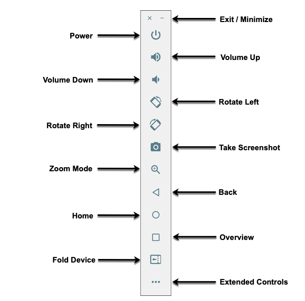
The toolbar options include:
- Exit / Minimize: The uppermost 'x' button exits the emulator session, while the '-' option minimizes the window.
- Power: Simulates the hardware power button on a physical device.
- Volume Up / Down: Controls the audio volume.
- Rotate Left/Right: Rotates the emulated device between portrait and landscape.
- Take Screenshot: Captures the screen content and saves it as specified in the settings.
- Zoom Mode: Toggles zoom mode on and off.
- Back: Performs the standard Android “Back” navigation.
- Home: Displays the home screen.
- Overview: Displays the currently running apps.
- Fold Device: Simulates the folding and unfolding of a foldable device.
- Extended Controls: Opens the extended controls panel for further configuration.
Working in Zoom Mode
The zoom button located in the emulator toolbar switches in and out of zoom mode. When zoom mode is active, the toolbar button is depressed, and the mouse pointer appears as a magnifying glass when hovering over the device screen. Clicking the left mouse button will cause the display to zoom in relative to the selected point on the screen, with repeated clicking increasing the zoom level. Conversely, clicking the right mouse button decreases the zoom level. Toggling the zoom button off reverts the display to the default size.
Clicking and dragging while in zoom mode will define a rectangular area into which the view will zoom when the mouse button is released.
While in zoom mode, the screen's visible area may be panned using the horizontal and vertical scrollbars located within the emulator window.
Resizing the Emulator Window
The emulator window size can be changed by enabling zoom mode and dragging the corners or sides of the window.
Extended Control Options
The extended controls toolbar button opens a panel with various settings:
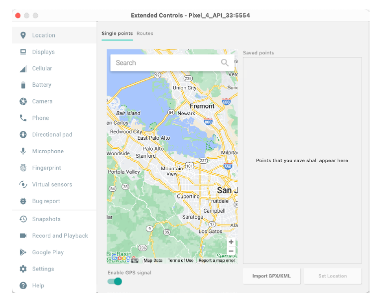
- Location: Sends simulated location information to the emulator.
- Displays: Adds additional displays within the same Android instance.
- Cellular: Changes the simulated cellular connection type.
- Battery: Simulates battery state and charging conditions.
- Camera: Simulates a 3D scene for the camera.
- Phone: Simulates incoming calls and text messages.
- Directional Pad: Simulates D-Pad interaction.
- Microphone: Enables the microphone and simulates virtual connections.
- Fingerprint: Configures fingerprint authentication.
- Virtual Sensors: Simulates accelerometer and magnetometer effects.
- Snapshots: Saves and restores the emulator state.
- Record and Playback: Records the emulator screen and audio.
- Google Play: Displays the current Google Play version and update options.
- Settings: Provides configuration options for the emulator appearance and behavior.
- Help: Contains keyboard shortcuts, links to documentation, bug reporting, and emulator version information.
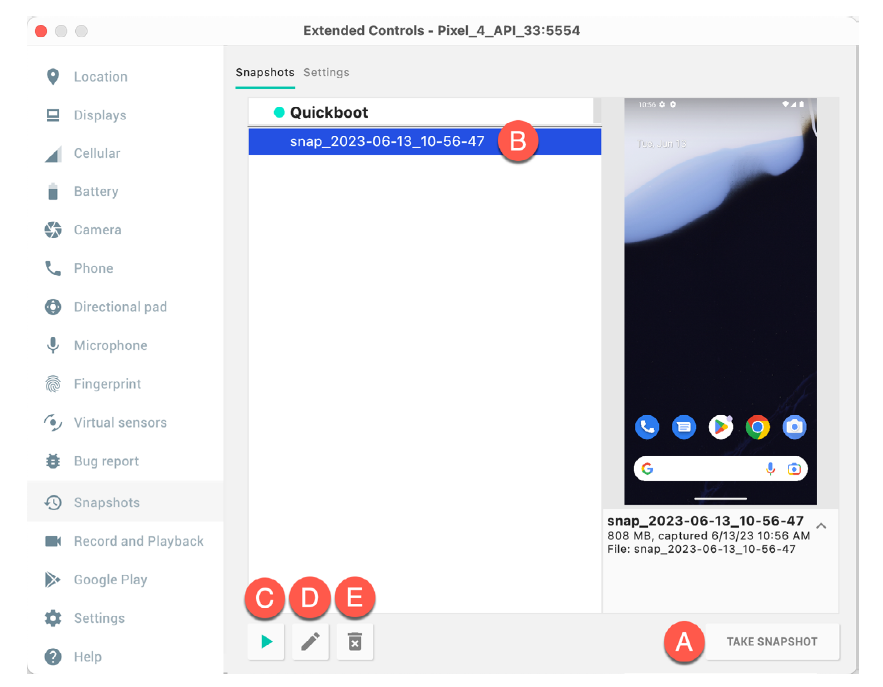
Working with Snapshots
When an emulator starts for the first time, it performs a cold boot, much like a physical Android device when powered on. This cold boot process can take some time to complete as the operating system loads and all the background processes are started. To avoid the necessity of going through this process every time the emulator is started, the system is configured to automatically save a snapshot (referred to as a quick-boot snapshot) of the emulator’s current state each time it exits. The next time the emulator is launched, the quick-boot snapshot is loaded into memory, and execution resumes from where it left off previously, allowing the emulator to restart in a fraction of the time needed for a cold boot to complete.
The Snapshots screen of the extended controls panel can store additional snapshots at any point during the execution of the emulator. This saves the exact state of the entire emulator allowing the emulator to be restored to the exact point in time that the snapshot was taken. From within the screen, snapshots can be taken using the Take Snapshot button (see screenshot). To restore an existing snapshot, select it from the list (B) and click the run button (C) located at the bottom of the screen. Options are also provided to edit (D) the snapshot name and description and to delete (E) the currently selected snapshot:
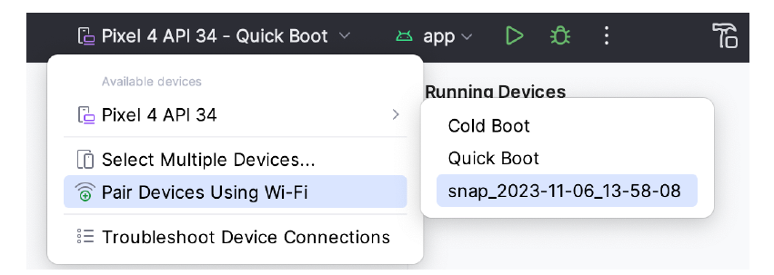
You can also choose whether to start an emulator using either a cold boot, the most recent quick-boot snapshot, or a previous snapshot by making a selection from the run target menu in the main toolbar, as illustrated below.
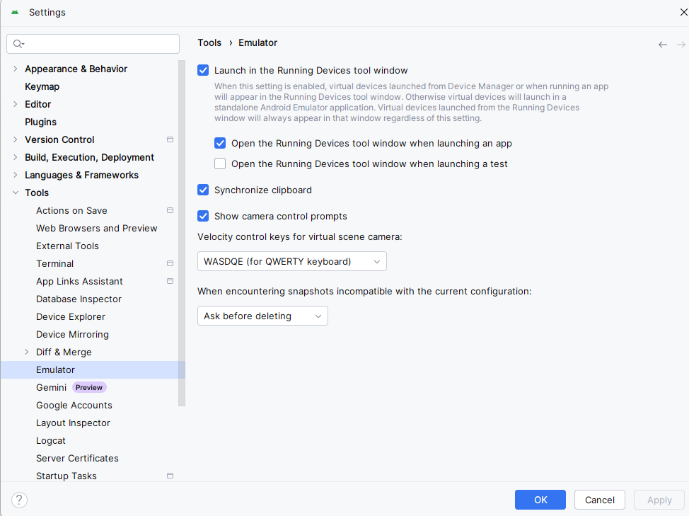
Set the Emulator to run in Tool Window Mode (part of Android Studio)
Just open the settings and click Tools->Emulator and check "Launch in the Running Devices tool window.
The Emulator in Tool Window Mode
When running in tool window mode, the same controls are available as in standalone mode. These buttons perform tasks like power, volume control, rotation, navigation, screenshots, snapshots, and extended controls.
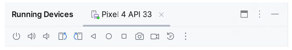
From left to right, these buttons perform the following tasks (details of which match those for standalone mode):
- Power
- Volume Up
- Volume Down
- Rotate Left
- Rotate Right
- Back
- Home
- Overview
- Screenshot
- Snapshots
- Extended Controls
Setting Up a Physical Device
Connecting Android Studio to a physical Android device for app development and testing can be a faster alternative to using an emulator, especially for performance-related aspects and features that rely on device hardware. You can connect your Android device via USB or wirelessly. This tutorial will guide you through the process, including enabling developer mode on your device.
Prerequisites
- Android Studio installed on your computer.
- An Android device.
- A USB cable (for USB connection).
- Both your computer and Android device must be connected to the same Wi-Fi network (for wireless connection).
Step 1: Enable Developer Options and USB Debugging
Before connecting your device to Android Studio, you must enable Developer Options and USB Debugging on your Android device.
- Open Settings on your Android device.
- About Phone: Scroll down and tap on "About Phone".
- Build Number: Find "Build number" and tap it 7 times. You will see a message that says "You are now a developer!".
- Return to the Settings Menu: Go back to the main settings menu and you should see "Developer options" now listed.
- Enable USB Debugging: Under "Developer options", scroll until you find "USB debugging" and enable it.
Step 2: Connect via USB
- Connect Your Device: Use a USB cable to connect your Android device to your computer.
- Check Connection: Once connected, your device might ask you to authorize the connection. Ensure that you allow it by accepting the prompt on your device screen to trust the computer.
- Verify in Android Studio: Open Android Studio, run your project, and select your device from the available devices dropdown list near the run button. If everything is set up correctly, your device should be listed there.
Step 3: Connect Wirelessly (Android 11+)
If you're using Android 11 or later, you can connect your device to Android Studio wirelessly.
- Initial USB Connection: First, connect your device to your computer via USB and make sure USB debugging is enabled.
- Open Terminal in Android Studio: Go to the bottom of Android Studio and open the terminal tab.
- Pair Device Wirelessly:
- Type
adb tcpip 5555and hit enter. This command will restart the ADB daemon in TCP mode on port 5555. - Find your device's IP address from Settings > About phone > Status > IP address.
- Type
adb connect <DEVICE_IP_ADDRESS>:5555replacing<DEVICE_IP_ADDRESS>with your actual IP address, then hit enter. - Disconnect the USB cable. If connected successfully, your device will still be connected over Wi-Fi.
- Type
- Verify Connection: Run your application in Android Studio and select your device from the target devices dropdown list.
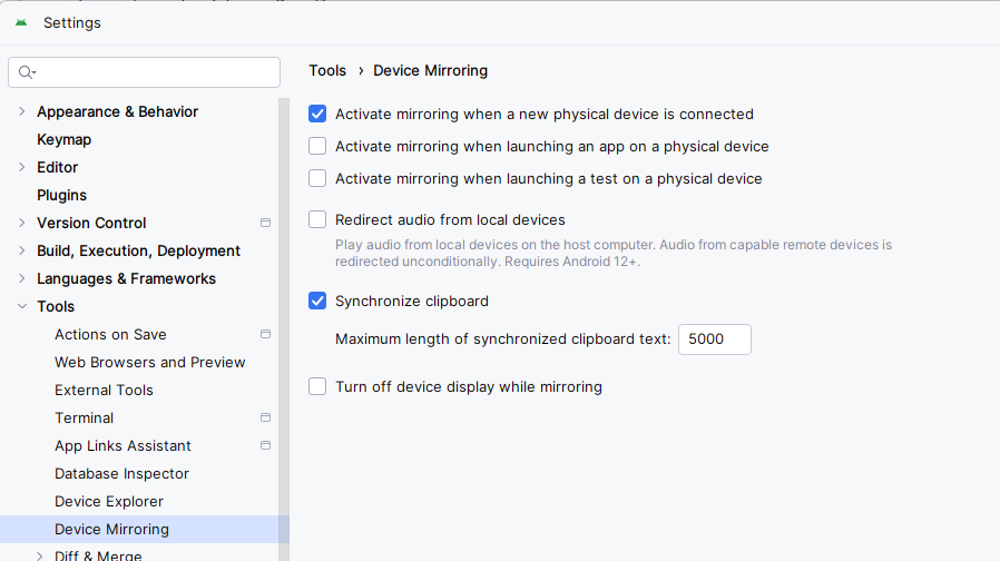
Mirroring the Device to Android Studio
If you want the device to display in Android Studio, as the emluator would you need to enable mirroring. Go to File->Settings->Tools->Device Mirroring, then check "Activate mirroring when a new physical device is connected"
Troubleshooting Tips
- Device Not Recognized: Check if the USB drivers for your device are installed on your computer. You might need to install or update these drivers depending on your device manufacturer.
- Connection Errors: Restart the ADB server with
adb kill-serverfollowed byadb start-serverin the terminal. - No Wireless Connection: Ensure both devices are on the same network and the correct IP address is used.
Conclusion
Connecting your physical Android device to Android Studio either via USB or wirelessly offers a realistic testing environment compared to an emulator. It allows developers to understand how applications will run in real-world conditions, including interactions with different device sensors and battery performance.
By enabling Developer Options and properly setting up connections in Android Studio, you can streamline your development process and ensure your applications perform well on actual devices.
Android Studio Tour
Android Studio is the official Integrated Development Environment (IDE) for Android application development, based on IntelliJ IDEA. On top of IntelliJ's powerful code editor and developer tools, Android Studio offers even more features that enhance your productivity when building Android apps, such as a flexible Gradle-based build system, a fast and feature-rich emulator, and a unified environment where you can develop for all Android devices. Here's a detailed tour of the Android Studio interface to help you navigate and utilize its features effectively.
As you read through this tour open the Android application and follow along.
Getting Started with Android Studio
When you first launch Android Studio, the welcome screen presents several options:
- Start a new Android Studio project: Begin coding a new app from scratch.
- Open an existing Android Studio project: Open a project you've previously worked on.
- Check out project from Version Control: Clone a project from a Git repository.
- Configure: Access settings, check for updates, install plugins, and more.
Main Window
After opening or creating a project, you'll see the main window divided into several areas:
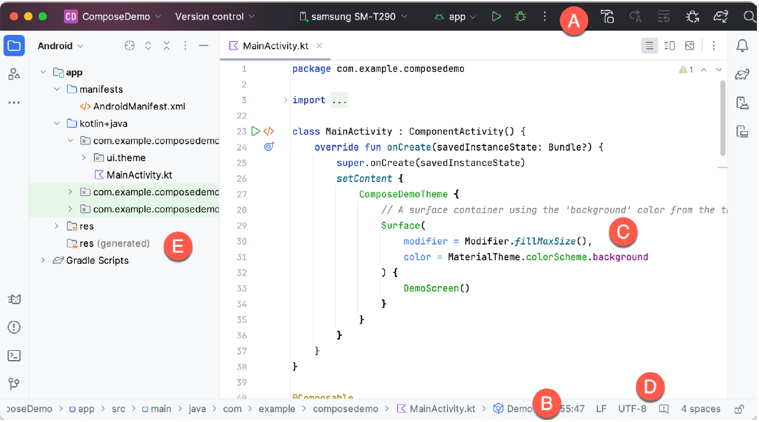
A. Toolbar
At the top, the toolbar provides quick access to run and debug tools, apply changes to the running app, AVD Manager (Android Virtual Device), and more. It includes:
- Run/Debug configurations: Dropdown to select the device or the emulator you want to run your app on.
- Run app: Button to compile and run your application on the selected device.
- Debug app: Start debugging your application.
- Apply Changes and Restart Activity: Quickly reload changes in the active activity without restarting the entire app.
B. Navigation Bar
Right below the toolbar, the navigation bar allows you to quickly navigate the structure of your project and open files for editing.
C. Editor Window
This is the central area where you code. It provides tabs for open files, code linting, syntax highlighting, and intelligent code completion.
D. Status Bar
At the very bottom, the status bar shows the status of your project and IDE, like the current branch you're working on, memory usage, and any background processes.
E. Project Window
On the left side, this window shows a hierarchical view of the components in your project, including:
Tool Windows
Various tools can be accessed from the buttons on the right, bottom, and left sides of the main window:
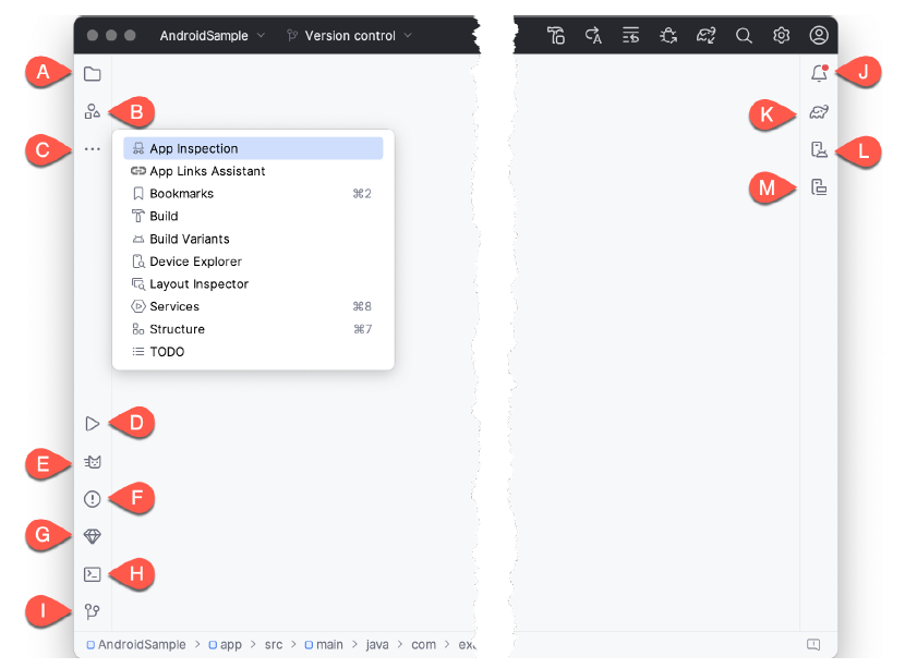
- A. Project View - The project view provides an overview of the file structure that makes up the project allowing for quick navigation between files. Generally, double-clicking on a file in the project view will cause that file to be loaded into the appropriate editing tool.
- B. Resource Manager - A tool for adding and managing resources and assets within the project, such as images, colors, and layout files.
- C. More Tool Windows - Displays a menu containing additional tool windows not currently displayed in a tool window bar. When a tool window is selected from this menu, it will appear as a button in a tool window bar.
- App Inspection - Provides access to the Database and Background Task inspectors. The Database Inspector allows you to inspect, query, and modify your app’s databases while running. The Background Task Inspector allows background worker tasks created using WorkManager to be monitored and managed.
- Bookmarks – The Bookmarks tool window provides quick access to bookmarked files and code lines. For example, right-clicking on a file in the project view allows access to an Add to Bookmarks menu option. Similarly, you can bookmark a line of code in a source file by moving the cursor to that line and pressing the F11 key (F3 on macOS). All bookmarked items can be accessed through this tool window.
- Build - The build tool window displays information about the build process while a project is being compiled and packaged and details of any errors encountered.
- Build Variants – The build variants tool window provides a quick way to configure different build targets for the current application project (for example, different builds for debugging and release versions of the application or multiple builds to target different device categories).
- Device File Explorer – Available via the View -> Tool Windows -> Device File Explorer menu, this tool window provides direct access to the filesystem of the currently connected Android device or emulator, allowing the filesystem to be browsed and files copied to the local filesystem.
- Layout Inspector - Provides a visual 3D rendering of the hierarchy of components that make up a user interface layout.
- Structure – The structure tool provides a high-level view of the structure of the source file currently displayed in the editor. This information includes a list of items such as classes, methods, and variables in the file.
- TODO – As the name suggests, this tool provides a place to review items that have yet to be completed on the project. Android Studio compiles this list by scanning the source files that make up the project to look for comments that match specified TODO patterns. These patterns can be reviewed and changed by opening the Settings dialog and navigating to the TODO entry listed under Editor.
- D. Run – The run tool window becomes available when an application is currently running and provides a view of the results of the run together with options to stop or restart a running process. If an application fails to install and run on a device or emulator, this window typically provides diagnostic information about the problem.
- E. Logcat – The Logcat tool window provides access to the monitoring log output from a running application and options for taking screenshots and videos of the application and stopping and restarting a process.
- F. Problems - A central location to view all of the current errors or warnings within the project. Doubleclicking on an item in the problem list will take you to the problem file and location.
- G. App Quality Insights- Provides access to the cloud-based Firebase app quality and crash analytics platform.
- H. Terminal – Provides access to a terminal window on the system on which Android Studio is running. On Windows systems, this is the Command Prompt interface, while on Linux and macOS systems, this takes the form of a Terminal prompt.
- I. Version Control - This tool window is used when the project files are under source code version control, allowing access to Git repositories and code change history.
- J. Notifications - This tool window is used when the project files are under source code version control, allowing access to Git repositories and code change history.
- K. Gradle – The Gradle tool window provides a view of the Gradle tasks that make up the project build configuration. The window lists the tasks involved in compiling the various elements of the project into an executable application. Right-click on a top-level Gradle task and select the Open Gradle Config menu option to load the Gradle build file for the current project into the editor. Gradle will be covered in greater detail later in this book.
- L. Device Manager - Provides access to the Device Manager tool window where physical Android device connections and emulators may be added, removed, and managed.
- M. Running Devices - Contains the AVD emulator if the option has been enabled to run the emulator in a tool window
Compose Editor
When you open a kotlin file which it written to use composeables, you have the option of opening a preview window to see the application. In the Starter Application that is given at the end of chapter 1. The following block of code has been provided to allow the preview to work
@Preview(showBackground = true, showSystemUi = true)
    @Composable
    fun helloClassPreview(){
        helloClass() // Show the same UI as the main function
    }
The @Preview annotation includes two settings:
showBackground = true– Adds a background color to the preview so the UI elements are easier to see.showSystemUi = true– Displays system elements like the status bar and navigation bar to make the preview look like a real device.
Inside the function, the helloClass() is applied, which wraps the UI in the app's defined visual style (colors, typography, etc.). The helloClass() composable is the actual screen or component being previewed.
When you have the MainActivity.kt file open if you click the split icon  or
or  in the top right corner the preview screen will appear. The screenshot below shows what it looks like using the split screen.
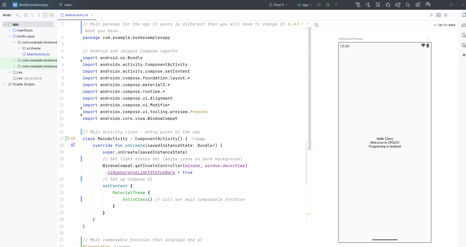
When you first start it you will have to engage the preview and you do that by clicking the link that states something like "Build & Refresh...". In some cases you will have to engage it first which means you will have to click a link inside the preview box that will say something like "Click here to build and refresh". This preview is very useful if you want to be able to view your app screen as you write it. It will update it in real time as you write your code. If it doesn't you can always just click the part in the upper left stating something like "Click here to update".
A really nice feature of the previews you can also put it into interactive mode where you can test your project out to see if it's working there are some limitations however.
- Interactive mode only works with Composable functions. It can't test things like navigation, background services, camera, or location access.
- State resets every time you restart interactive mode. Any changes you make (like clicking buttons or entering text) won't be saved when it's refreshed.
- Some animations and lifecycle-aware components might not work correctly.
- It doesn't have access to full app resources or dependencies like ViewModels, databases, or network data unless you set up mock data or preview-specific content.
- Interactive mode can sometimes be slow or crash, especially with complex UIs or unsupported features.
File and Folder Structure
When you have an app selected in Android Studio, the view typically defaults to the Android view, which organizes files logically rather than by their actual location in the file system. Here's how the files and folders are typically displayed when an app is selected within the Android Studio:
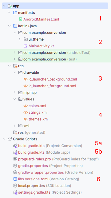
-
Manifest File (
AndroidManifest.xml):- Location in Android Studio:
app > manifests > AndroidManifest.xml - Details: In this view, the Android Manifest appears under the "manifests" directory, which specifically highlights the configuration settings for the app that Android OS uses to run its components. See below for a more detailed explaination of this file
- Location in Android Studio:
-
Kotlin Code Files (e.g.,
MainActivity.kt):- Location in Android Studio:
app > kotlin+java > [your_package_name] > MainActivity.kt - Details: Source files like
MainActivity.ktappear under the "kotlin + java" directory, followed by the package structure that you've defined for your app. This is where all your Kotlin or Java code resides.
- Location in Android Studio:
-
Drawable Folder:
- Location in Android Studio:
app > res > drawable - Details: Drawable resources such as images and XML graphics are located in the "drawable" folder inside the "res" directory. This folder is used to store graphics that your application will use in its UI.
- Location in Android Studio:
-
Strings File (
strings.xml):- Location in Android Studio:
app > res > values > strings.xml - Details: The
strings.xmlfile is located in the "values" folder under "res". This folder also houses other resource types like dimensions (dimens.xml), styles (styles.xml), and color definitions (colors.xml). Thestrings.xmlfile centralizes the text resources for easy localization and referencing.
- Location in Android Studio:
-
Gradle Build Files:
- Project-Level
build.gradle:- Location in Android Studio: Gradle Scripts
- Details: This file contains settings applicable to all modules, such as the Gradle version, repositories, and dependencies applicable at the project level. Please see below for a more detailed explaination of this file
- Module-Level
build.gradle:- Location in Android Studio: Gradle Scripts
- Details: This build file is specific to the app module and includes settings like SDK versions, application ID, dependencies, and more specific to the module. Please see below for a more detailed explaination of this file
- Project-Level
-
libs.versions.toml
- Location in Android Studio within Gradle Scripts
- Details: This file is used to manage and centralize library versions and plugin dependencies for your project. It helps keep versions consistent across modules and simplifies updates by allowing you to define version numbers in one place.
These locations reflect how Android Studio organizes and displays files in a way that emphasizes the logical structure of the app rather than the underlying file system structure. This organization is particularly helpful for navigating large projects efficiently.
Android Manifest File
The Android Manifest file, named AndroidManifest.xml, is a critical file in any Android project. It
serves as a central configuration file that the Android system reads to understand the basic structure and essential
attributes of an application. Here are the key elements and attributes typically included in the Android Manifest
file, and their purposes. NOTE, these are typical not always present:
-
Manifest Tag (
<manifest>): This is the root element of the manifest file. It includes namespace declarations and package declarations that uniquely identify the application. Attributes likepackagedefine the package name that serves as a unique identifier for the application across the system and on the Google Play store. -
Application Tag (
<application>): This tag encapsulates all components of the Android application such as activities, services, broadcast receivers, and content providers. It can also include metadata, libraries, and other attributes that define global properties of the application like theme and logo.- Attributes:
android:name: Specifies the name of a class implementing the application, typically used when creating a custom Application class.android:icon: Defines the icon for all the application's components.android:theme: Specifies an overall theme for all the UI components, which can be defined in the styles resource file.
- Attributes:
-
Activity Tag (
<activity>): Activities are arguably the most important components of an Android app. They represent screens with which users interact. Each activity must be declared in the manifest file.- Attributes:
android:name: The name of the activity class.android:label: A user-readable label for the activity, which can be displayed on the device screen.android:theme: Overrides the application-wide theme for this activity.
- Attributes:
-
Service Tag (
<service>): Services are components that run in the background to perform long-running operations or to perform work for remote processes. Each service used by the application must be declared here. -
Receiver Tag (
<receiver>): These are components that respond to system-wide broadcast announcements. Many broadcasts originate from the system—for example, a broadcast announcing that the screen has turned off, the battery is low, or a picture was captured. -
Provider Tag (
<provider>): Defines a content provider that manages access to a structured set of data. They encapsulate the data and provide mechanisms for defining data security. -
Permission Tag (
<uses-permission>and<permission>): These tags are used to request specific permission from the system to access protected parts of the API and the user's device (like camera, contacts, or GPS). They also can declare permissions that other applications must have to interact with components of this application. -
Intent-Filter Tag (
<intent-filter>): Defines the types of intents that components are willing to receive. By declaring what actions and data an activity, service, or broadcast receiver can handle, these filters determine how other applications can interact with the components of the application. -
Uses-SDK Tag (
<uses-sdk>): Specifies the minimum API Level required by the app and the target version that the app is tested against. -
Meta-Data Tag (
<meta-data>): Provides additional metadata to the Android system and other applications that can interact with the app’s components. This could be configuration values, features, or services the application uses.
The Android Manifest file is essential for not only declaring the structure of the application but also for ensuring the proper interaction with the Android operating system and other applications. It acts as a bridge between your app and the Android system, declaring how the app should behave and what resources or permissions it requires.
The build.gradle file in the Project area (6a)
The project-level build.gradle file serves as the backbone for configuring how Gradle handles the
project's build process. It sets up foundational aspects like where to download dependencies and how different parts
of the project interact. By centralizing this configuration, it ensures that all parts of the project are built
using a unified approach, making the build process more predictable and easier to manage. This file is typically
complemented by module-level build.gradle files, which configure module-specific details. These are discussed further in Chapter 2 section "Android Studio Gradle Explained".
The build.gradle file in the Module area (6b)
The module-level build.gradle file is integral for tailoring the build and configuration settings to the
specifics of an app or library module within an Android project. It determines how the module is built, what
resources are included, and how dependencies are managed, making it foundational to the module's development and
distribution process. These are discussed further in Chapter 2 section "Android Studio Gradle Explained".
Starter Application
Step 1: Create a New Android Project
- Launch Android Studio and choose Start a new Android Studio project.
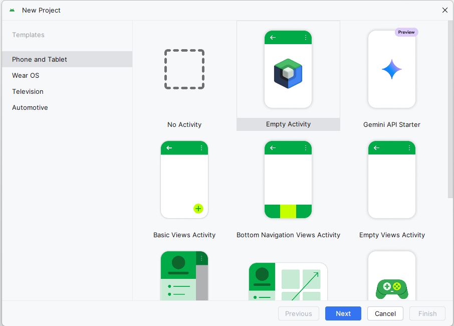
- Select the Empty Activity template and click Next.
- In the next dialog box give your project the name "BookExamplesApp". Your package name should begin with "com." and use a reverse domain name format. Choose a location on your computer to store your project. The path I have in the screenshot is where I stored mine yours will be different, just make sure your remember where you put it.
IMPORTANT it is very important that you do not create multiple locations for your projects. I have had students in the past that will do CPS251 and then cps251 and then be completely confused as to what is where. You just need one location. Please see the folder and file setup section below for more information.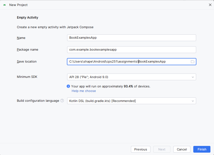
Step 2: Create the Application with Compose
All the applications in this class will be built using Jetpack Compose. Jetpack Compose is Android's modern toolkit for building native user interfaces using a declarative approach. It simplifies UI development by letting you describe how the UI should look and automatically updating it when the underlying data changes. As we progress through this course we will be looking at Compose in detail.
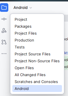
- When the application loads make sure you are in Android view
- Navigate to the
kotlin+javadirectory - Open the
MainActivity.ktfile by double clicking on it. - Replace the existing content with the following code. It is somewhat commented to explain what is going on, but don't worry about the code right now we will be going over that and more in this class.
IMPORTANTIf you followed along your project name will be package com.example.bookexamplesapp, if you named yours differently then you will have to change it to what you have. The package name will be the name of the package underneath the kotlin+java directory that starts withcom..NOTE: You may get an error about the innerPadding parameter. This is because the innerPadding parameter is not used in this example. You can ignore it for now.
// Main package for the app if yours is different then you will have to change it to what you have.
package com.example.bookexamplesapp
// Android and Jetpack Compose imports
import android.os.Bundle
import androidx.activity.ComponentActivity
import androidx.activity.compose.setContent
import androidx.compose.foundation.layout.*
import androidx.compose.material3.*
import androidx.compose.runtime.*
import androidx.activity.enableEdgeToEdge
import androidx.compose.ui.Alignment
import androidx.compose.ui.Modifier
import androidx.compose.ui.tooling.preview.Preview
import androidx.core.view.WindowCompat
// Main activity class - entry point of the app
class MainActivity : ComponentActivity() {
override fun onCreate(savedInstanceState: Bundle?) {
super.onCreate(savedInstanceState)
enableEdgeToEdge()
setContent {
BookExampleAppTheme {
Scaffold(modifier = Modifier.fillMaxSize()) { innerPadding ->
helloClass(modifier = Modifier.padding(innerPadding))
}
}
}
}
}
// Main composable function that displays the UI
@Composable
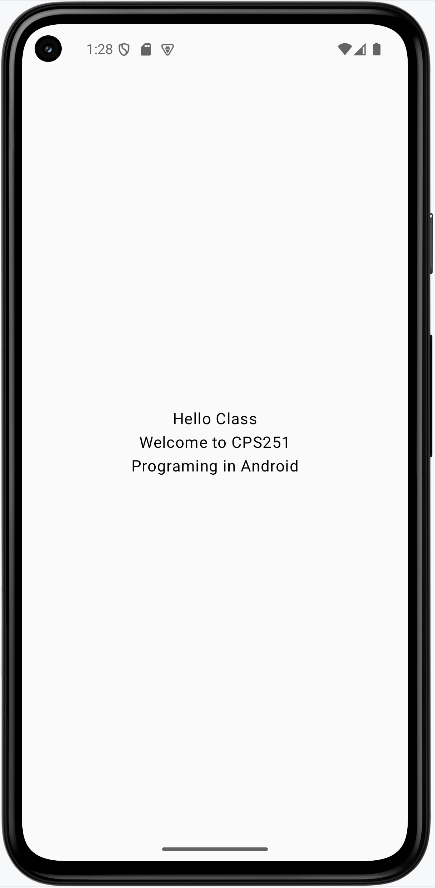
fun helloClass(modifier: Modifier = Modifier) {
// Column arranges children vertically
Column(modifier = modifier.fillMaxSize(), // Fill entire screen
verticalArrangement = Arrangement.Center, // Center content vertically
horizontalAlignment = Alignment.CenterHorizontally) { // Center content horizontally
Text("Hello Class") // Display text
Text(text = "Welcome to CPS251") // Display text
Text(text = "Programing in Android") // Display text
}
}
/**
* Preview for Android Studio's design view.
* This allows you to see the UI in the design tab without running the app.
*/
@Preview(showBackground = true, showSystemUi = true)
@Composable
fun helloClassPreview(){
helloClass() // Show the same UI as the main function
}
Step 3: Preview the App
If you click on the split icon in the upper right hand corner of the screen
You will see a preview of the app in the design tab.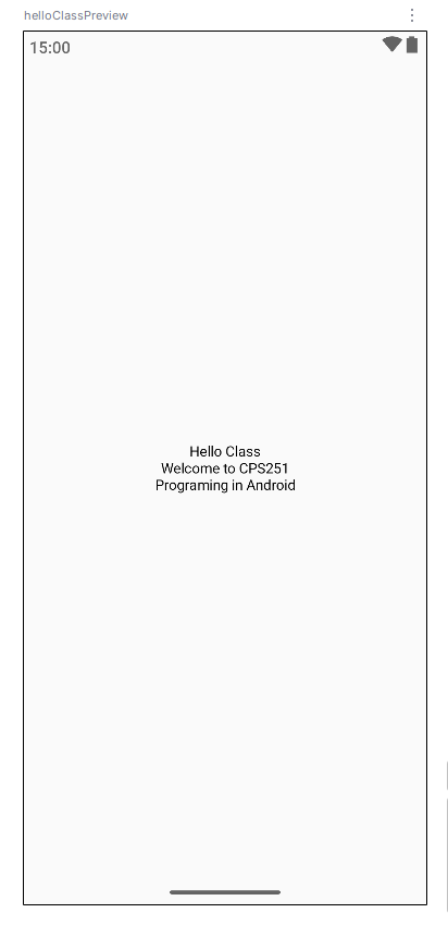
As stated previously the preview is very helpful in seeing how the app will look on the device without having to run it. Running the app in an emulator will take time and uses a lot of computer resources so the preview really helps.
Step 4: Run the App
- Connect an Android device to your computer or set up an emulator.
- Click the Run ('▶') icon in Android Studio to build and run your application.
App should look like this:
NOTE: The screenshots in this book are using the pixel 5 emualator. Howerver, the pixel 6 emulator seems to be better after the latest update in February 2026. If you are using the pixel 6 emulator you may get a different look and feel, but the functionality should be the same.
Reusing this application
Many of the examples and assignments we create will just be changing the Main Activity file. So intead of re-creating a new application each time you can just update/change your main activity file. I would recommend you save all your assignment main activity files as a .kt file. That is how I did most of the examples. In some case we will have to create a new application but for now this is our starting point.
Folder and File Setup
I recommed you create a folder named cps251 and subfolder for every assignment. Inside the assignment folders you will have the main activity file and any other files you need for that assignment. I would also recommend you create a folder named examples and put all your examples in that folder. This will help you keep your files organized and make it easier to find them later. Set Git up in the main cps251 folder and then commit your changes to the repository when needed it will update them all.
Chapter 2: Project Structure
Android Studio Architecture
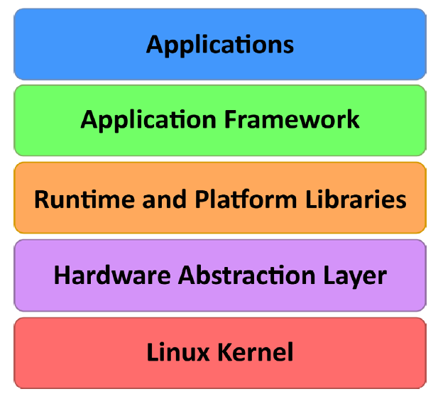
Think of Android like a delicious layer cake - each layer has its own special job, but they all work together to create something amazing! Just like how a cake needs a solid base, filling, and frosting, Android needs different layers to make your apps work smoothly.
In this lesson, we'll explore how Android is built from the ground up. You'll learn about each layer of the Android "cake" and how they work together to create the apps you use every day.
Quick Reference Table
| Layer | Description | What It Does |
|---|---|---|
| Applications | Top layer | Where your apps live and run |
| Application Framework | Services layer | Provides tools and services for apps |
| Libraries | Code libraries | Ready-to-use code for common tasks |
| Android Runtime | Runtime environment | Runs your app code |
| Hardware Abstraction | Hardware interface | Connects software to hardware |
| Linux Kernel | Bottom layer | Manages core system functions |
The Android Software Stack
Android is like a well-organized toolbox, with each layer having a specific job. Let's look at how these layers work together:
The Linux Kernel: The Foundation
What It Does
- Manages memory and system resources
- Handles multiple tasks running at the same time
- Controls hardware like the screen, camera, and speakers
- Manages power to keep your battery lasting longer
The Linux Kernel is like the foundation of a house - it's what everything else is built on. It handles the basic stuff that makes your phone work:
- Managing memory (like keeping track of what apps are using)
- Handling multiple tasks (like running your music app while checking email)
- Controlling hardware (like the screen, camera, and speakers)
- Managing power (like putting your phone to sleep when you're not using it)
Hardware Abstraction Layer: The Translator
What It Does
- Translates between your app and the phone's hardware
- Makes sure apps work on different types of phones
- Handles communication with sensors and cameras
- Ensures consistent behavior across devices
The Hardware Abstraction Layer (HAL) is like a translator between your app and the phone's hardware. It helps your app talk to things like:
- The camera
- The microphone
- The accelerometer (for detecting movement)
- Other sensors and hardware features
Android Runtime: The App Runner
What It Does
- Runs your Android apps efficiently
- Converts app code into a format your phone can understand
- Optimizes app performance and battery usage
- Manages app resources and memory
The Android Runtime (ART) is like a personal trainer for your apps - it helps them run faster and use less battery. Here's how it works:
- When you build your app, it's compiled into a special format called DEX
- When you install the app, ART converts it into a format your phone can understand
- This makes your apps run faster and use less battery
Android Libraries: The Toolbox
What It Does
- Provides ready-to-use code for common tasks
- Handles graphics, animations, and user interface
- Manages user input and touch events
- Connects to system services and features
Android Libraries are like a toolbox full of ready-to-use tools. Here are some of the most useful ones:
- android.app - The basic building blocks for your apps
- android.content - Helps apps share data with each other
- android.graphics - Tools for drawing and animations
- android.view - Building blocks for your app's interface
- android.widget - Ready-made buttons, text fields, and other UI elements
Application Framework: The Rule Book
What It Does
- Manages how apps start, run, and stop
- Handles notifications and alerts
- Manages app resources and settings
- Helps apps work together and share data
The Application Framework is like a rule book that helps apps work together. It includes:
- Activity Manager - Controls how apps start, stop, and switch between each other
- Content Providers - Lets apps share data (like contacts or photos)
- Resource Manager - Manages things like text, colors, and layouts
- Notifications Manager - Handles alerts and notifications
Applications: The User Interface
What It Does
- Provides the interface you see and use
- Handles user interactions and input
- Delivers specific features and functionality
- Creates the user experience
Applications are what you see and use every day - they're the top layer of the Android cake. This includes:
- Built-in apps (like Phone, Messages, and Camera)
- Apps you install from the Play Store
- Apps you create yourself
Tips for Success
- Start by understanding the basic layers and how they work together
- Focus on the Application Framework and Libraries when starting to develop
- Use the Android documentation to learn about available tools and features
- Practice building simple apps to understand how the layers interact
- Keep up with Android updates to learn about new features and improvements
Common Mistakes to Avoid
- Not understanding which layer to use for different tasks
- Trying to access hardware directly without using the proper APIs
- Ignoring the Application Framework's rules and guidelines
- Not considering how your app will work on different devices
- Forgetting to handle app lifecycle events properly
Best Practices
- Follow Android's design guidelines for consistency
- Use the provided libraries instead of creating your own solutions
- Test your app on different devices and Android versions
- Keep your app's code organized and maintainable
- Use the Application Framework's features instead of reinventing them
Android Studio Gradle Files
Think of Gradle as your app's personal chef - it takes all your ingredients (code, resources, and libraries) and follows a recipe (build configuration) to create the final dish (your app). Just like a chef needs to know what ingredients to use and how to combine them, Gradle needs to know how to build your app and what it needs to work properly.
In this lesson, you'll learn how Gradle works behind the scenes to turn your code into a working app. You'll discover how it manages different parts of your project and how to customize the build process when you need special features.
Quick Reference Table
| File | Location | What It Does |
|---|---|---|
| Project build.gradle.kts | Gradle Scripts → build.gradle.kts (Project) | Sets up project-wide settings and plugins |
| Module build.gradle.kts | Gradle Scripts → build.gradle.kts (Module: app) | Manages app-specific settings and libraries |
| Version Catalog | Gradle Scripts → libs.versions.toml | Keeps track of library versions |
| settings.gradle.kts | Gradle Scripts → settings.gradle.kts | Configures project name and repositories |
What is Gradle?
What It Does
- Builds your app automatically
- Manages project configuration
- Handles dependencies
- Creates different versions of your app
When you create a new Android Studio project, it starts with about 80 files. When you click the Run button, Gradle:
- Generates additional files
- Compiles your code
- Downloads needed libraries
- Creates the final app package
- Ends up with about 700 files in your project
Project vs App: Understanding the Structure
Project (The House)
- Contains everything needed to build your app
- Includes multiple modules (like rooms in a house)
- Has one project-level build file (the house's blueprint)
- Manages project-wide settings and plugins
- Can contain multiple apps or libraries
App Module (The Room)
- Is one specific module in your project
- Has its own build file (the room's blueprint)
- Contains the actual app code and resources
- Manages app-specific settings and dependencies
- Is what users will install on their devices
Key Gradle Features
Sensible Defaults: The Smart Assistant
Gradle comes with smart default settings, so you don't have to configure everything yourself. It's like having a chef who knows the basic recipe - you only need to tell them if you want something different.
Dependencies: The Shopping List
Dependencies are like ingredients your app needs to work. For example, if your app needs to show a map, it needs the Google Maps library. Gradle can:
- Find libraries your app needs
- Download them automatically
- Make sure they work together
Build Variants: Different Versions
Build variants let you create different versions of your app. For example:
- A free version and a paid version
- A phone version and a tablet version
- A test version and a release version
Understanding Gradle Files
Settings File
The settings.gradle.kts file is like the project's address book - it tells Gradle where to find libraries and what to call your project:
pluginManagement {
    repositories {
        google()
        mavenCentral()
        gradlePluginPortal()
    }
}
dependencyResolutionManagement {
    repositoriesMode.set(RepositoriesMode.FAIL_ON_PROJECT_REPOS)
    repositories {
        google()
        mavenCentral()
    }
}
rootProject.name = "ThemeDemo"
include(":app")
Project Build File
This is like the master recipe for your entire project. It's usually simple:
plugins {
    alias(libs.plugins.androidApplication) apply false
    alias(libs.plugins.jetbrainsKotlinAndroid) apply false
    alias(libs.plugins.kotlin.compose) apply false
}
Module Build File
This is like the specific recipe for your app. It tells Gradle:
- What tools to use (plugins)
- What your app is called (namespace)
- What Android versions it works with (SDK versions)
- What libraries it needs (dependencies)
Here's a breakdown of the important parts:
plugins {
    alias(libs.plugins.android.application)  // For building Android apps
    alias(libs.plugins.kotlin.android)       // For using Kotlin
    alias(libs.plugins.kotlin.compose)       // For using Jetpack Compose
}

android {
    namespace = "com.example.conversion"     // Your app's unique name
    compileSdk = 35                         // Android version to build with

    defaultConfig {
        applicationId = "com.example.conversion"  // Your app's ID
        minSdk = 28                            // Minimum Android version
        targetSdk = 35                         // Target Android version
        versionCode = 1                        // Version number
        versionName = "1.0"                    // Version name
    }
}

dependencies {
    // Core Android libraries
    implementation(libs.androidx.core.ktx)
    implementation(libs.androidx.lifecycle.runtime.ktx)

    // Compose libraries
    implementation(libs.androidx.activity.compose)
    implementation(platform(libs.androidx.compose.bom))
    implementation(libs.androidx.ui)
    implementation(libs.androidx.material3)

    // Testing libraries
    testImplementation(libs.junit)
    androidTestImplementation(libs.androidx.junit)
}
Version Catalog
The version catalog is like a master ingredient list that keeps track of all the versions. You can find it at Gradle Scripts → libs.versions.toml:
[versions]
agp = "8.3.0"
kotlin = "1.9.0"
coreKtx = "1.12.0"
junit = "4.13.2"
espressoCore = "3.5.1"
appcompat = "1.6.1"
material = "1.11.0"
activity = "1.8.0"
constraintlayout = "2.1.4"

[libraries]
androidx-core-ktx = { group = "androidx.core", name = "core-ktx", version.ref = "coreKtx" }
material = { group = "com.google.android.material", name = "material", version.ref = "material" }
activity = { group = "androidx.activity", name = "activity", version.ref = "activity" }

[plugins]
androidApplication = { id = "com.android.application", version.ref = "agp" }
Tips for Success
- Let Gradle handle the defaults unless you need something specific
- Keep your dependencies up to date
- Use the version catalog to manage library versions
- Test your app after adding new dependencies
- Read the Gradle error messages carefully - they're usually helpful
Common Mistakes to Avoid
- Adding unnecessary dependencies
- Using incompatible library versions
- Not syncing project after changes
- Forgetting to update the version catalog
- Setting SDK versions too high or too low
Best Practices
- Use the version catalog for all dependencies
- Keep your build files organized and commented
- Test different build variants
- Regularly update your dependencies
- Use meaningful version names and codes
Chapter 3: Kotlin Basics
Introduction to Kotlin
Kotlin is a modern programming language that runs on the Java Virtual Machine (JVM) and has emerged as a powerful alternative to Java for Android development. It's designed to be more concise, safer, and more expressive than Java, while maintaining full interoperability with Java code.
Kotlin at a Glance
| Feature | Description | Common Use |
|---|---|---|
| Conciseness | Reduces boilerplate code significantly | Writing cleaner, more maintainable code |
| Null Safety | Type system helps eliminate null pointer exceptions | Building more robust applications |
| Interoperability | Works seamlessly with existing Java code | Gradual migration of Java projects |
| Modern Features | Lambda expressions, extension functions, etc. | More expressive and functional programming |
The Emergence of Kotlin
Kotlin was introduced in 2011 by JetBrains, the company known for creating IntelliJ IDEA, a popular IDE for Java development. The language was designed to be fully interoperable with Java while addressing some of the common pain points of Java, such as verbosity, null safety issues, and boilerplate code.
Kotlin's Adoption for Android Development
Kotlin's significance in the Android development landscape was solidified in 2017 when Google announced official support for Kotlin on Android during their annual developer conference, Google I/O. This endorsement was a response to the growing popularity of Kotlin among Android developers who appreciated its concise syntax and robust features, which streamlined common programming tasks and reduced the likelihood of bugs.
When to Use Kotlin
- When starting a new Android project (Google's preferred language)
- When maintaining large codebases where code clarity is crucial
- When working with teams familiar with modern programming paradigms
- When you want to reduce potential runtime errors through better type safety
Key Advantages of Kotlin
| Feature | What It Does | When to Use It |
|---|---|---|
| Conciseness | Reduces boilerplate code, resulting in fewer lines of code | When you want to write more maintainable, readable code |
| Null Safety | Prevents null pointer exceptions through compile-time checks | When you want to avoid the "billion-dollar mistake" of null references |
| Extension Functions | Allows adding new functions to existing classes without inheriting from them | When extending third-party libraries without modifying source code |
| Smart Casts | Automatically casts types after type checks | When working with polymorphic code to avoid explicit casting |
Kotlin Playground
There is a Kotlin Playground where you can write small kotlin scripts to practice and experiment with the language. This is great for learning, but be aware that it's not suited for Android Studio development.
To use the examples from this chapter in the Kotlin Playground you need to write the code examples inside the function main(). You can then click the run button in the upper right corner to see the output. You can also edit the code and run it again to see the changes.
fun main() {
        // Put the code exxamples here
    }
Practical Examples
// ===========================================
// KOTLIN VS JAVA COMPARISON EXAMPLES
// ===========================================

// Example 1: Data Classes - The Power of Conciseness
// This demonstrates how Kotlin reduces boilerplate code dramatically

// Java equivalent would require:
// - Private fields
// - Constructor
// - Getters and setters
// - equals() and hashCode()
// - toString()
// - copy() method
// - Approximately 50+ lines of code!

// Kotlin data class - just 1 line!
data class Person(val name: String, val age: Int)

// Using the data class
val person1 = Person("Alice", 25)
val person2 = Person("Bob", 30)
val person3 = Person("Alice", 25)

println("=== DATA CLASS EXAMPLE ===")
println("Person 1: $person1")
println("Person 2: $person2")
println("Person 3: $person3")

// Automatic equals and hashCode
println("Person 1 equals Person 3: ${person1 == person3}")  // true
println("Person 1 equals Person 2: ${person1 == person2}")  // false

// Automatic copy method
val person4 = person1.copy(age = 26)
println("Person 4 (copy with age change): $person4")

// Automatic component functions for destructuring
val (name, age) = person1
println("Destructured: name=$name, age=$age")

// Example 2: Null Safety - Preventing Runtime Crashes
// This shows how Kotlin prevents null pointer exceptions at compile time
println("\n=== NULL SAFETY EXAMPLE ===")

// In Java, this would compile but crash at runtime:
// String name = null;
// int length = name.length(); // NullPointerException!

// In Kotlin, this won't even compile:
// val name: String = null  // Compile error!

// Safe nullable types
val nullableName: String? = null
val safeName: String = "John"

// Safe calls - won't crash
val length1 = nullableName?.length
val length2 = safeName.length

println("Nullable name length: $length1")  // null
println("Safe name length: $length2")      // 4

// Elvis operator for default values
val displayName = nullableName ?: "Unknown"
println("Display name: $displayName")      // "Unknown"

// Safe calls with chaining
val email: String? = "user@example.com"
val domain = email?.substringAfter('@')?.substringBefore('.')
println("Email domain: $domain")           // "user"

// Example 3: Extension Functions - Adding Methods to Existing Classes
// This demonstrates how Kotlin can extend classes you don't own
println("\n=== EXTENSION FUNCTIONS EXAMPLE ===")

// Add a new method to String class
fun String.addExclamation(): String {
    return "$this!"
}

// Add a method to check if string is palindrome
fun String.isPalindrome(): Boolean {
    val cleaned = this.lowercase().filter { it.isLetterOrDigit() }
    return cleaned == cleaned.reversed()
}

// Add a method to format phone numbers
fun String.formatPhoneNumber(): String {
    val digits = this.filter { it.isDigit() }
    return when {
        digits.length == 10 -> "(${digits.substring(0, 3)}) ${digits.substring(3, 6)}-${digits.substring(6)}"
        digits.length == 11 && digits.startsWith("1") -> "1 (${digits.substring(1, 4)}) ${digits.substring(4, 7)}-${digits.substring(7)}"
        else -> this
    }
}

// Use the extension functions
val greeting = "Hello"
val palindrome = "A man a plan a canal Panama"
val phoneNumber = "5551234567"

println("Greeting with exclamation: ${greeting.addExclamation()}")
println("Is '$palindrome' a palindrome? ${palindrome.isPalindrome()}")
println("Formatted phone: ${phoneNumber.formatPhoneNumber()}")

// Example 4: Smart Casts - Automatic Type Casting
// This shows how Kotlin eliminates the need for explicit casting
println("\n=== SMART CASTS EXAMPLE ===")

// Function that works with different types
fun processValue(value: Any): String {
    return when (value) {
        is String -> {
            // Kotlin automatically knows 'value' is String here
            "String: '${value.uppercase()}' (length: ${value.length})"
        }
        is Int -> {
            // Kotlin automatically knows 'value' is Int here
            "Integer: $value (doubled: ${value * 2})"
        }
        is List<*> -> {
            // Kotlin automatically knows 'value' is List here
            "List with ${value.size} items: $value"
        }
        is Boolean -> {
            // Kotlin automatically knows 'value' is Boolean here
            "Boolean: $value (opposite: ${!value})"
        }
        else -> "Unknown type: ${value::class.simpleName}"
    }
}

// Test smart casts with different types
val testValues = listOf("Hello", 42, listOf(1, 2, 3), true, 3.14)

for (value in testValues) {
    println("Processing: ${processValue(value)}")
}

// Example 5: Lambda Expressions and Higher-Order Functions
// This demonstrates Kotlin's functional programming capabilities
println("\n=== LAMBDA EXPRESSIONS EXAMPLE ===")

// Lambda expressions
val add = { x: Int, y: Int -> x + y }
val multiply = { x: Int, y: Int -> x * y }
val isEven = { x: Int -> x % 2 == 0 }

// Higher-order function that takes a function as parameter
fun performOperation(x: Int, y: Int, operation: (Int, Int) -> Int): Int {
    return operation(x, y)
}

// Use the higher-order function with different operations
val sum = performOperation(10, 5, add)
val product = performOperation(10, 5, multiply)

println("10 + 5 = $sum")
println("10 * 5 = $product")

// Lambda with collections
val numbers = listOf(1, 2, 3, 4, 5, 6, 7, 8, 9, 10)
val evenNumbers = numbers.filter(isEven)
val doubledNumbers = numbers.map { it * 2 }
val sumOfEvens = evenNumbers.sum()

println("Original numbers: $numbers")
println("Even numbers: $evenNumbers")
println("Doubled numbers: $doubledNumbers")
println("Sum of evens: $sumOfEvens")

// Example 6: String Templates and Interpolation
// This shows Kotlin's powerful string handling
println("\n=== STRING TEMPLATES EXAMPLE ===")

val userName = "Alice"
val userAge = 25
val userScore = 95.5

// Simple string interpolation
val simpleMessage = "Hello, $userName! You are $userAge years old."
println(simpleMessage)

// Complex expressions in strings
val detailedMessage = """
User Profile:
  Name: ${userName.uppercase()}
  Age: $userAge
  Score: ${String.format("%.1f", userScore)}%
  Status: ${if (userScore >= 90) "Excellent" else "Good"}
  Next birthday: ${userAge + 1}
""".trimIndent()

println(detailedMessage)

// Example 7: When Expression - Powerful Switch Statement
// This demonstrates Kotlin's enhanced switch-like functionality
println("\n=== WHEN EXPRESSION EXAMPLE ===")

fun getDayDescription(day: String): String {
    return when (day.lowercase()) {
        "monday" -> "Start of the work week"
        "tuesday" -> "Second day of the work week"
        "wednesday" -> "Hump day - middle of the week"
        "thursday" -> "Almost Friday"
        "friday" -> "TGIF - Thank Goodness It's Friday!"
        "saturday", "sunday" -> "Weekend - time to relax!"
        else -> "Unknown day"
    }
}

fun getGradeDescription(score: Int): String {
    return when {
        score >= 90 -> "A - Excellent"
        score >= 80 -> "B - Good"
        score >= 70 -> "C - Satisfactory"
        score >= 60 -> "D - Needs Improvement"
        else -> "F - Failed"
    }
}

// Test the when expressions
val testDays = listOf("Monday", "Wednesday", "Saturday", "Invalid")
val testScores = listOf(95, 87, 72, 55, 100)

println("Day Descriptions:")
for (day in testDays) {
    println("  $day: ${getDayDescription(day)}")
}

println("\nGrade Descriptions:")
for (score in testScores) {
    println("  Score $score: ${getGradeDescription(score)}")
}

// Example 8: Real-World Kotlin Usage Scenarios
println("\n=== REAL-WORLD KOTLIN SCENARIOS ===")

// Scenario 1: User Management System
data class User(
    val id: String,
    val name: String,
    val email: String,
    val isActive: Boolean = true,
    val createdAt: String = "2024-01-01"
)

// Extension function for user validation
fun User.isValidEmail(): Boolean {
    return email.contains("@") && email.contains(".") && email.indexOf("@") < email.lastIndexOf(".")
}

// Extension function for user display
fun User.getDisplayInfo(): String {
    return """
    User ID: $id
    Name: $name
    Email: $email
    Status: ${if (isActive) "Active" else "Inactive"}
    Created: $createdAt
    """.trimIndent()
}

// Create and use users
val users = listOf(
    User("user1", "Alice Johnson", "alice@example.com"),
    User("user2", "Bob Smith", "bob@example.com", isActive = false),
    User("user3", "Charlie Brown", "invalid-email")
)

println("User Management System:")
for (user in users) {
    println("\n${user.getDisplayInfo()}")
    println("Valid email: ${user.isValidEmail()}")
}

// Scenario 2: Product Catalog with Smart Features
data class Product(
    val id: String,
    val name: String,
    val price: Double,
    val category: String,
    val inStock: Boolean = true
)

// Extension function for product formatting
fun Product.getFormattedPrice(): String {
    return "$${String.format("%.2f", price)}"
}

// Extension function for stock status
fun Product.getStockStatus(): String {
    return if (inStock) "In Stock" else "Out of Stock"
}

// Extension function for discount calculation
fun Product.calculateDiscountedPrice(discountPercent: Double): Double {
    return price * (1 - discountPercent / 100)
}

val products = listOf(
    Product("prod1", "Laptop", 999.99, "Electronics"),
    Product("prod2", "Book", 29.99, "Books"),
    Product("prod3", "Phone", 699.99, "Electronics", inStock = false)
)

println("\nProduct Catalog:")
for (product in products) {
    val discountedPrice = product.calculateDiscountedPrice(10.0)
    println("""
    ${product.name}
      Price: ${product.getFormattedPrice()}
      Category: ${product.category}
      Stock: ${product.getStockStatus()}
      With 10% discount: $${String.format("%.2f", discountedPrice)}
    """.trimIndent())
}
Compilation to Bytecode
Both Kotlin and Java are statically typed languages that compile to the same bytecode format, which runs on the Java Virtual Machine (JVM). This means that when you write Android applications in Kotlin or Java, the source code is compiled into JVM bytecode, which is then executed by the Android Runtime (ART) on Android devices.
The ability to compile to the same bytecode allows Kotlin and Java to be used interchangeably or together within the same project. Android developers can gradually migrate Java codebases to Kotlin, integrating Kotlin files into existing Java applications without needing to rewrite the entire application. This seamless integration is facilitated by the Kotlin plugin for Android Studio, which includes tools for converting Java code to Kotlin automatically.
Tips for Success
- Start with small, isolated Kotlin files in an existing Java project
- Use the "Convert Java File to Kotlin File" feature in Android Studio
- Leverage Kotlin's extension functions to enhance existing Java APIs
- Take advantage of null safety to write more robust code
Common Mistakes to Avoid
- Writing Kotlin code in a Java style (not leveraging Kotlin's features)
- Overusing nullable types when they aren't necessary
- Ignoring compiler warnings about platform types (Java types in Kotlin)
- Converting complex Java files to Kotlin without understanding the generated code
Best Practices
- Write idiomatic Kotlin, not Java-style code in Kotlin syntax
- Use data classes to generate getters, setters, equals, hashCode, and toString methods to reduce boilerplate
- Leverage scope functions (let, apply, with, run, also) for cleaner code
- Prefer immutability (val over var) when possible
- Use expression bodies for simple functions
Impact on Android Development
Kotlin's introduction into the Android ecosystem has led to significant changes in how Android applications are developed. Its adoption has grown rapidly, with many developers and companies switching to Kotlin for its expressiveness, safety features, and the productivity benefits it offers over Java. Google further endorsed Kotlin by announcing it as the preferred language for Android app development at Google I/O 2019.
In conclusion, Kotlin provides an effective alternative to Java for Android development, addressing many of the shortcomings of Java while enhancing code maintainability and developer productivity. Its compatibility with Java and the JVM ensures that developers can leverage the robust ecosystem of Java while benefiting from the improvements that Kotlin offers.
Kotlin Basics
Kotlin gives you powerful tools to store and manage data in your programs. Think of variables as labeled containers that hold different kinds of information - numbers, text, true/false values, and more complex data. Unlike Java, Kotlin was designed with safety and conciseness in mind, helping you avoid common errors like null pointer exceptions while writing less code.
Quick Reference Table
| Concept | Description | Common Use |
|---|---|---|
| val | Immutable variable (read-only) | For values that shouldn't change |
| var | Mutable variable (can be changed) | For values that need to be updated |
| Type? | Nullable type that can hold null values | For optional or potentially missing data |
| ?. operator | Safe call operator | Safely access properties of nullable variables |
| ?: operator | Elvis operator | Provide default values for null cases |
Primitive Data Types:
NOTE: Kotlin doesn't have primitive types in the same way as Java does. However, it provides a set of classes that represent primitive data types under the hood. These classes are optimized for performance and behave like primitives, but they are still objects.
When to Use
- Use Int, Long for whole numbers depending on size needed
- Use Double for decimal numbers (Float for memory-constrained cases)
- Use Boolean for true/false conditions
- Use Char for single characters
| Type | What It Represents | Example |
|---|---|---|
Byte |
8-bit signed integer (-128 to 127) | val smallNumber: Byte = 100 |
Short |
16-bit signed integer (-32,768 to 32,767) | val mediumNumber: Short = 2000 |
Int |
32-bit signed integer (about ±2 billion) | val standardNumber = 1000000 |
Long |
64-bit signed integer (very large range) | val bigNumber = 3000000000L |
Float |
32-bit floating point number | val decimalNumber = 3.14f |
Double |
64-bit floating point number | val preciseDecimal = 3.14159265359 |
Char |
16-bit Unicode character | val letter = 'A' |
Boolean |
true or false value | val isActive = true |
Object Data Types:
When to Use
- Use String for text of any length
- Use Array for fixed-size collections
- Use List, Set, Map for flexible collections
| Type | What It Represents | Example |
|---|---|---|
String |
Text sequence | val name = "Alex" |
Array |
Fixed-size collection | val numbers = arrayOf(1, 2, 3) |
List |
Ordered collection | val items = listOf("apple", "banana") |
Set |
Unique elements collection | val uniqueItems = setOf(1, 2, 3) |
Map |
Key-value pairs | val ages = mapOf("Alice" to 29) |
Variables: Immutable and Mutable
When to Use
- Use
valby default (prefer immutability) - Use
varonly when a value needs to change
| Type | What It Does | When to Use |
|---|---|---|
val |
Defines an immutable (read-only) variable | For values that should not change after initialization |
var |
Defines a mutable variable that can be changed | For values that need to be updated |
Practical Examples
// ===========================================
// VARIABLE DECLARATION EXAMPLES
// ===========================================

// Example 1: Immutable variables (val)
// These variables cannot be changed after they're created
val immutableVal = "I cannot be changed"  // Immutable
val pi = 3.14159                          // Mathematical constant
val maxRetries = 3                         // Configuration value
val companyName = "TechCorp"               // Company name

println("Immutable variable: $immutableVal")
println("Pi: $pi")
println("Max retries: $maxRetries")
println("Company name: $companyName")

// Example 2: Mutable variables (var)
// These variables can be updated as needed
var mutableVar = "I can be changed"       // Mutable
var currentScore = 0                       // Game score that changes
var temperature = 72.5                     // Temperature that fluctuates
var isLoggedIn = false                     // Login status that changes

println("Mutable variable: $mutableVar")
println("Current score: $currentScore")
println("Temperature: $temperature")
println("Is logged in: $isLoggedIn")

// Example 3: Changing mutable variables
println("=== MUTABLE VARIABLE CHANGES ===")
println("Initial value: $mutableVar")
mutableVar = "See, I changed!"            // This works - updating the value
println("After change: $mutableVar")

currentScore = 100                         // Update score
println("Score updated to: $currentScore")

temperature = 85.2                         // Update temperature
println("Temperature changed to: $temperature")

isLoggedIn = true                          // Update login status
println("Login status: $isLoggedIn")

// Example 4: Attempting to change immutable variables (will cause errors)
// The following lines would cause compile errors:
// immutableVal = "Trying to change"      // Error: Val cannot be reassigned
// pi = 3.14                              // Error: Val cannot be reassigned
// maxRetries = 5                          // Error: Val cannot be reassigned

// Example 5: Type annotation examples
// You can explicitly specify the type, or let Kotlin infer it
val explicitInt: Int = 123              // Type annotation
val inferredInt = 123                   // Type inference (Kotlin knows it's Int)
val explicitString: String = "Hello"    // Type annotation
val inferredString = "World"            // Type inference (Kotlin knows it's String)

// Example 6: Real-world variable usage
println("\n=== REAL-WORLD VARIABLE USAGE ===")

// User profile information (immutable - shouldn't change)
val userId = "user_12345"
val dateOfBirth = "1990-05-15"
val email = "user@example.com"

// User session information (mutable - changes during use)
var loginAttempts = 0
var lastLoginTime = "2024-01-01 00:00:00"
var isOnline = false

// Game state variables (mutable - change during gameplay)
var playerHealth = 100
var playerLevel = 1
var experiencePoints = 0
var goldCoins = 50

println("User ID: $userId")
println("Login attempts: $loginAttempts")
println("Player health: $playerHealth")

// Update game state
playerHealth -= 20                       // Player took damage
experiencePoints += 150                  // Player gained experience
goldCoins += 25                         // Player found treasure

println("After updates:")
println("Player health: $playerHealth")
println("Experience points: $experiencePoints")
println("Gold coins: $goldCoins")
Nullability
When to Use
- Use non-nullable types by default
- Use nullable types only when a value might legitimately be absent
- Use safe call operator when working with nullable values
Kotlin's type system helps prevent null pointer exceptions by making "nullability" explicit in the type system. By default, regular types cannot hold null:
| Feature | What It Does | Example |
|---|---|---|
| Non-nullable type | Cannot hold null values | val name: String = "Alex" |
| Nullable type | Can hold null values | val name: String? = null |
| Safe call operator | Safely calls methods on nullable types | val length = name?.length |
| Elvis operator | Provides default value for null cases | val display = name ?: "Unknown" |
| Not-null assertion | Forces treating as non-null (unsafe) | val length = name!!.length |
Practical Examples
// ===========================================
// NULLABILITY EXAMPLES
// ===========================================

// Example 1: Non-nullable vs nullable types
println("=== NULLABILITY COMPARISON ===")

// Non-nullable String - cannot be null
val nonNullableName: String = "John"
// val nonNullableName2: String = null  // This would cause a compile error!

// Nullable String - can be null
val nullableName: String? = null
val nullableName2: String? = "Jane"
val nullableName3: String? = "Bob"

println("Non-nullable name: $nonNullableName")
println("Nullable names: $nullableName, $nullableName2, $nullableName3")

// Example 2: Safe call operator (?.)
// This safely accesses properties without causing crashes
println("\n=== SAFE CALL OPERATOR ===")

val names = listOf(nullableName, nullableName2, nullableName3, "Alice")

for (name in names) {
    // Safe call - won't crash if name is null
    val length = name?.length
    println("Name: '$name', Length: $length")

    // You can also chain safe calls
    val uppercase = name?.uppercase()
    println("  Uppercase: $uppercase")
}

// Example 3: Elvis operator (?:)
// This provides default values when dealing with null
println("\n=== ELVIS OPERATOR ===")

val userInput1: String? = null
val userInput2: String? = "Hello World"
val userInput3: String? = ""

// Provide default values for null cases
val displayName1 = userInput1 ?: "Guest"
val displayName2 = userInput2 ?: "Guest"
val displayName3 = userInput3 ?: "Guest"  // Empty string is not null, so no default

println("User 1: '$userInput1' -> Display: '$displayName1'")
println("User 2: '$userInput2' -> Display: '$displayName2'")
println("User 3: '$userInput3' -> Display: '$displayName3'")

// Example 4: Safe conditional with if check
// This is a way to handle null values safely
println("\n=== SAFE CONDITIONAL CHECKS ===")

val potentialName: String? = "Alice"

if (potentialName != null) {
    // Within this block, Kotlin knows potentialName is not null
    val nameLength = potentialName.length  // Smart cast - no need for safe call
    val uppercaseName = potentialName.uppercase()
    println("Name: $potentialName, Length: $nameLength, Uppercase: $uppercaseName")
} else {
    println("No name provided")
}


// Example 5: Not-null assertion (!!) - Use with caution!
// This forces Kotlin to treat a nullable value as non-null
println("\n=== NOT-NULL ASSERTION (DANGEROUS) ===")

val definitelyNotNull: String? = "Safe to use"
val mightBeNull: String? = null

try {
    // This is safe because we know the value is not null
    val length1 = definitelyNotNull!!.length
    println("Safe assertion: $length1")

    // This will crash with NullPointerException!
    val length2 = mightBeNull!!.length
    println("This will never print: $length2")
} catch (e: NullPointerException) {
    println("Caught NullPointerException: ${e.message}")
}

// Example 6: Real-world nullability scenarios
println("\n=== REAL-WORLD NULLABILITY SCENARIOS ===")

// Simulate user input that might be missing
val userAge: String? = "25"
val userPhone: String? = null
val userAddress: String? = ""

// Process user information safely
val age = userAge?.toIntOrNull() ?: 0
val phone = userPhone ?: "No phone provided"
val address = if (userAddress.isNullOrEmpty()) "No address provided" else userAddress

println("User Profile:")
println("  Age: $age")
println("  Phone: $phone")
println("  Address: $address")

// Example 7: Working with collections that might contain null
println("\n=== NULLABLE COLLECTIONS ===")

val mixedList: List = listOf("Alice", null, "Bob", null, "Charlie")

// Filter out null values
val nonNullNames = mixedList.filterNotNull()
println("All names (including nulls): $mixedList")
println("Non-null names only: $nonNullNames")

// Count null vs non-null values
val nullCount = mixedList.count { it == null }
val nonNullCount = mixedList.count { it != null }
println("Null values: $nullCount, Non-null values: $nonNullCount")
Let Function
When to Use
- When you want to perform operations only if a value is not null
- To avoid repeating a variable name multiple times
- To limit the scope of variables
| Pattern | What It Does | When to Use |
|---|---|---|
value?.let { } |
Executes block only if value is not null | For null-safe operations on optional values |
value?.let { } ?: defaultValue |
Executes block or returns default if null | For transforming values with a fallback |
Practical Examples
// ===========================================
// LET FUNCTION EXAMPLES
// ===========================================

// Example 1: Basic usage with non-null value
// The let function executes the block and returns the result
println("=== BASIC LET USAGE ===")
val name = "Alice"
val result = name.let {
    println("Processing name: $it")
    it.length  // Returns the length of 'name'
}
println("Result: $result")

// Example 2: Null-safe usage with let
// This is the most common use case for let
println("\n=== NULL-SAFE LET USAGE ===")
val nullableName: String? = "Bob"
val nameLength = nullableName?.let {
    println("Name is: $it")
    it.length  // This block only executes if nullableName is not null
} ?: 0
println("Name length: $nameLength")

// Example 3: Let with null value
// When the value is null, the let block is skipped
println("\n=== LET WITH NULL VALUE ===")
val emptyName: String? = null
val length = emptyName?.let {
    it.length  // This block is skipped if emptyName is null
} ?: 0
println("Length of null name: $length")

// Example 4: Let for data transformation
// Let is great for transforming data safely
println("\n=== LET FOR DATA TRANSFORMATION ===")
val userInput: String? = "  hello world  "

val processedInput = userInput?.let {
    it.trim()           // Remove whitespace
        .lowercase()     // Convert to lowercase
        .replace(" ", "_") // Replace spaces with underscores
} ?: "default_value"

println("Original input: '$userInput'")
println("Processed input: '$processedInput'")

// Example 5: Let with multiple operations
// You can perform complex operations within the let block
println("\n=== LET WITH MULTIPLE OPERATIONS ===")
val email: String? = "user@example.com"

val userInfo = email?.let {
    val username = it.substringBefore('@')
    val domain = it.substringAfter('@')
    val isValid = it.contains('@') && it.contains('.')

    //mapOf is a function that creates a map from the given key-value pairs
    mapOf(
        "email" to it,
        "username" to username,
        "domain" to domain,
        "isValid" to isValid
    )
} ?: mapOf("error" to "No email provided")

println("User info: $userInfo")

// Example 6: Let for object initialization
// Let can be used to safely initialize objects
println("\n=== LET FOR OBJECT INITIALIZATION ===")
val configString: String? = "name=John,age=25,city=New York"

val config = configString?.let {
    val pairs = it.split(",")
    val configMap = mutableMapOf()

    for (pair in pairs) {
        val (key, value) = pair.split("=")
        configMap[key.trim()] = value.trim()
    }

    configMap
} ?: emptyMap()

println("Configuration: $config")

// Example 7: Let with chaining
// You can chain let calls for complex operations
println("\n=== LET WITH CHAINING ===")
val numberString: String? = "42"

val result2 = numberString?.let { str ->
    str.toIntOrNull()?.let { num ->
        if (num > 0) {
            num * 2
        } else {
            num * -1
        }
    }
} ?: 0

println("Original string: '$numberString'")
println("Processed result: $result2")

// Example 8: Real-world let usage scenarios
println("\n=== REAL-WORLD LET SCENARIOS ===")

// Scenario 1: Processing user input
val userInput2: String? = "  123.45  "
val processedNumber = userInput2?.let {
    it.trim().toDoubleOrNull()
}?.let { num ->
    if (num > 0) num else 0.0
} ?: 0.0

println("User input: '$userInput2'")
println("Processed number: $processedNumber")

// Scenario 2: Database query result
val queryResult: String? = "user_id=123,name=Alice,email=alice@example.com"
val user = queryResult?.let {
    val parts = it.split(",")
    val userMap = parts.associate { part ->
        val (key, value) = part.split("=")
        key to value
    }
    userMap
} ?: emptyMap()

println("Query result: '$queryResult'")
println("Parsed user: $user")

// Scenario 3: API response processing
val apiResponse: String? = """{"status": "success", "data": {"name": "Bob", "age": 30}}"""
val userName = apiResponse?.let {
    // In a real app, you'd use a JSON parser
    if (it.contains("\"name\"")) {
        val nameStart = it.indexOf("\"name\": \"") + 9
        val nameEnd = it.indexOf("\"", nameStart)
        it.substring(nameStart, nameEnd)
    } else {
        null
    }
} ?: "Unknown User"

println("API response: '$apiResponse'")
println("Extracted name: $userName")
Type Casting
Type casting is the process of converting a value from one type to another. Kotlin provides two operators for type casting: as and as?.
as is the unsafe cast operator, which throws an exception if the cast fails. as? is the safe cast operator, which returns null if the cast fails.
When to Use
- When working with heterogeneous collections
- When dealing with inheritance hierarchies
- When interacting with less type-safe Java code
| Operator | What It Does | When to Use |
|---|---|---|
is |
Checks if an object is of a specific type | Before performing operations specific to a type |
as |
Unsafe cast (throws exception if fails) | When you're certain of the type |
as? |
Safe cast (returns null if fails) | When the cast might fail |
Practical Examples
// ===========================================
// TYPE CASTING EXAMPLES
// ===========================================

// Example 1: Type checking with 'is' operator
// This is the safest way to check types
println("=== TYPE CHECKING WITH 'IS' ===")
val value: Any = "Hello World"

if (value is String) {
    // Smart cast: value is treated as String inside this block
    println("Value is a String: '$value'")
    println("Length: ${value.length}")
    println("Uppercase: ${value.uppercase()}")

    // You can also use string-specific methods
    val words = value.split(" ")
    println("Number of words: ${words.size}")
} else {
    println("Value is not a String")
}

// Example 2: Type checking with different types
// You can check for multiple types
println("\n=== CHECKING MULTIPLE TYPES ===")
val mixedList: List<Any> = listOf("Hello", 42, 3.14, true, 'A')

for (item in mixedList) {
    when (item) {
        is String -> {
            println("String: '$item' (length: ${item.length})")
        }
        is Int -> {
            println("Integer: $item (doubled: ${item * 2})")
        }
        is Double -> {
            println("Double: $item (rounded: ${item.toInt()})")
        }
        is Boolean -> {
            println("Boolean: $item (opposite: ${!item})")
        }
        is Char -> {
            println("Character: '$item' (code: ${item.code})")
        }
        else -> {
            println("Unknown type: ${item::class.simpleName}")
        }
    }
}

// Example 3: Unsafe cast with 'as' operator
// This throws an exception if the cast fails
println("\n=== UNSAFE CAST WITH 'AS' ===")

val obj: Any = "I'm a string"
try {
    val str: String = obj as String  // Works because obj is actually a String
    println("Successfully cast to String: '$str'")

    // This would throw ClassCastException
    val willCrash: Int = obj as Int
    println("This will never print: $willCrash")
} catch (e: ClassCastException) {
    println("Cast failed: ${e.message}")
}

// Example 4: Safe cast with 'as?' operator
// This returns null if the cast fails instead of throwing an exception
println("\n=== SAFE CAST WITH 'AS?' ===")

val anyValue: Any = 123
val safeString: String? = anyValue as? String  // Will be null since anyValue is not a String
val safeInt: Int? = anyValue as? Int           // Will be 123

println("Safe cast to String: $safeString")
println("Safe cast to Int: $safeInt")

// Example 5: Combining safe cast with Elvis operator
// This provides a default value when the cast fails
println("\n=== SAFE CAST WITH ELVIS OPERATOR ===")

val mixedData: List<Any> = listOf("Hello", 42, 3.14, "World", 100)

for (item in mixedData) {
    val stringValue = (item as? String) ?: "Not a string"
    val intValue = (item as? Int) ?: 0
    val doubleValue = (item as? Double) ?: 0.0

    println("Item: $item")
    println("  As String: '$stringValue'")
    println("  As Int: $intValue")
    println("  As Double: $doubleValue")
    println()
}

// Example 6: Type casting in inheritance scenarios
// This is common when working with class hierarchies
println("\n=== TYPE CASTING WITH INHERITANCE ===")

// Simulate a class hierarchy
open class Animal(val name: String)
class Dog(name: String, val breed: String) : Animal(name)
class Cat(name: String, val color: String) : Animal(name)

val animals: List<Animal> = listOf(
    Dog("Buddy", "Golden Retriever"),
    Cat("Whiskers", "Orange"),
    Dog("Max", "Labrador"),
    Cat("Shadow", "Black")
)

for (animal in animals) {
    when (animal) {
        is Dog -> {
            println("Dog: ${animal.name} (Breed: ${animal.breed})")
            // You can access Dog-specific properties
        }
        is Cat -> {
            println("Cat: ${animal.name} (Color: ${animal.color})")
            // You can access Cat-specific properties
        }
        else -> {
            println("Unknown animal: ${animal.name}")
        }
    }
}

// Example 7: Real-world type casting scenarios
println("\n=== REAL-WORLD TYPE CASTING SCENARIOS ===")

// Scenario 1: Processing API responses
val apiResponse: Any = mapOf(
    "status" to "success",
    "data" to mapOf(
        "users" to listOf(
            mapOf("id" to 1, "name" to "Alice"),
            mapOf("id" to 2, "name" to "Bob")
        )
    )
)

// Safely extract user data
val users = (apiResponse as? Map<*, *>)?.let { response ->
    (response["data"] as? Map<*, *>)?.let { data ->
        (data["users"] as? List<*>)?.let { userList ->
            userList.mapNotNull { user ->
                (user as? Map<*, *>)?.let { userMap ->
                    val id = userMap["id"] as? Int
                    val name = userMap["name"] as? String
                    if (id != null && name != null) {
                        "User $id: $name"
                    } else null
                }
            }
        }
    }
} ?: emptyList()

println("API Response: $apiResponse")
println("Extracted users: $users")

// Scenario 2: Database result processing
val dbResult: Any = listOf(
    mapOf("id" to 1, "name" to "Product A", "price" to 29.99),
    mapOf("id" to 2, "name" to "Product B", "price" to 49.99),
    mapOf("id" to 3, "name" to "Product C", "price" to 19.99)
)

val products = (dbResult as? List<*>)?.mapNotNull { row ->
    (row as? Map<*, *>)?.let { product ->
        val id = product["id"] as? Int
        val name = product["name"] as? String
        val price = product["price"] as? Double

        if (id != null && name != null && price != null) {
            "ID: $id, Name: $name, Price: $${String.format("%.2f", price)}"
        } else null
    }
} ?: emptyList()

println("Database Result: $dbResult")
println("Processed products: $products")
String Formatting
When to Use
- When precise control over number formatting is needed
- When working with tabular data presentation
- When creating complex string patterns
| Format | What It Does | Example |
|---|---|---|
%s |
String placeholder | String.format("Hello, %s", name) |
%d |
Integer placeholder | String.format("Count: %d", count) |
%.2f |
Float with 2 decimal places | String.format("Price: $%.2f", price) |
${} |
String template (Kotlin preferred) | "Hello, ${name.capitalize()}" |
Practical Examples
// ===========================================
// STRING FORMATTING EXAMPLES
// ===========================================

// Example 1: Simple string templates (Kotlin's preferred way)
// This is the most readable and flexible approach
println("=== SIMPLE STRING TEMPLATES ===")
val name = "John"
val age = 25
val simple = "Hello, $name! You are $age years old."
println(simple)

// Example 2: Using expressions in templates
// You can put any valid Kotlin expression inside ${}
println("\n=== EXPRESSIONS IN STRING TEMPLATES ===")
val score = 85
val message = "${name.uppercase()} scored $score points, which is ${if (score >= 80) "excellent" else "good"}!"
println(message)

// Example 3: Complex expressions in templates
// You can perform calculations and method calls
println("\n=== COMPLEX EXPRESSIONS IN TEMPLATES ===")
val price = 29.99
val quantity = 3
val total = price * quantity
val discount = if (quantity >= 5) 0.10 else 0.0
val finalTotal = total * (1 - discount)

val receipt = """
Receipt for $name:
  Item price: $${String.format("%.2f", price)}
  Quantity: $quantity
  Subtotal: $${String.format("%.2f", total)}
  Discount: ${(discount * 100).toInt()}%
  Final total: $${String.format("%.2f", finalTotal)}
""".trimIndent()

println(receipt)

// Example 4: String.format for precise formatting
// Use this when you need specific formatting control
println("\n=== STRING.FORMAT EXAMPLES ===")
val productName = "Laptop"
val productPrice = 999.99
val productQuantity = 2

val formatted = String.format("Product: %s, Price: $%.2f, Quantity: %d",
                             productName, productPrice, productQuantity)
println(formatted)

// Example 5: Multiple values in one format string
// This is useful for creating structured output
println("\n=== MULTIPLE VALUES IN FORMAT STRING ===")
val customerName = "Alice Smith"
val orderNumber = "ORD-2024-001"
val orderDate = "2024-01-15"
val orderTotal = 149.99

val orderSummary = String.format("""
Order Summary:
  Customer: %s
  Order #: %s
  Date: %s
  Total: $%.2f
""".trimIndent(), customerName, orderNumber, orderDate, orderTotal)

println(orderSummary)

// Example 6: Number formatting with different precision
// Control decimal places and number formatting
println("\n=== NUMBER FORMATTING ===")
val pi = 3.14159265359
val largeNumber = 1234567.89
val percentage = 0.1234

println("Pi to 2 decimal places: ${String.format("%.2f", pi)}")
println("Pi to 4 decimal places: ${String.format("%.4f", pi)}")
println("Large number with commas: ${String.format("%,.2f", largeNumber)}")
println("Percentage: ${String.format("%.2f%%", percentage * 100)}")

// Example 7: Alignment and spacing
// Control how text is positioned
println("\n=== TEXT ALIGNMENT AND SPACING ===")
val items = listOf("Apple", "Banana", "Cherry", "Date")
val prices = listOf(1.99, 0.99, 3.99, 2.49)

println("Product List:")
for (i in items.indices) {
    val formattedLine = String.format("%-10s $%6.2f", items[i], prices[i])
    println(formattedLine)
}

// Example 8: Real-world formatting scenarios
println("\n=== REAL-WORLD FORMATTING SCENARIOS ===")

// Scenario 1: Financial report
val companyName = "TechCorp Inc."
val revenue = 1250000.50
val expenses = 875000.25
val profit = revenue - expenses
val profitMargin = (profit / revenue) * 100

val financialReport = String.format("""
FINANCIAL REPORT - %s
==========================================
Revenue:     $%,.2f
Expenses:    $%,.2f
Profit:      $%,.2f
Margin:      %.2f%%
""".trimIndent(), companyName, revenue, expenses, profit, profitMargin)

println(financialReport)

// Scenario 2: User profile display
val userName = "john_doe"
val userEmail = "john.doe@example.com"
val userAge = 28
val userScore = 95.5
val isActive = true

val userProfile = """
USER PROFILE
============
Username:    $userName
Email:       $userEmail
Age:         $userAge
Score:       ${String.format("%.1f", userScore)}%
Status:      ${if (isActive) "Active" else "Inactive"}
""".trimIndent()

println(userProfile)

// Scenario 3: Table formatting
val students = listOf(
    Triple("Alice", 95, "A"),
    Triple("Bob", 87, "B"),
    Triple("Charlie", 92, "A"),
    Triple("Diana", 78, "C")
)

println("STUDENT GRADES")
println("==============")
println(String.format("%-10s %-8s %-6s", "Name", "Score", "Grade"))
println("---------- -------- ------")

for ((name, score, grade) in students) {
    val formattedRow = String.format("%-10s %-8d %-6s", name, score, grade)
    println(formattedRow)
}
Tips for Success
- Always prefer
valovervarunless you need mutability - Use string templates instead of concatenation or complex formatting when possible
- Consider whether a value should really be nullable before using
Type? - Take advantage of smart casts after type checking with
is - Use the Elvis operator for clean default value handling
Common Mistakes to Avoid
- Using
!!operator without being certain the value isn't null - Making everything nullable "just in case" (nullability is a design decision)
- Forgetting that properties of nullable types need safe calls
- Using unsafe casts (
as) when the type isn't guaranteed - Not initializing
lateinitvariables before use
Best Practices
- Design your code to minimize the need for nullable types
- Use
letwith safe call for clean null handling - Always handle the null case when using safe casts
- Use type inference when types are obvious
- Chain safe calls (
obj?.prop1?.prop2) instead of nested null checks
Kotlin Operators
Think of operators in programming like the symbols you use in math class. Just as you use +, -, *, and ÷ to perform calculations, programming operators help you manipulate data, compare values, and control the flow of your program. Understanding operators is crucial for writing expressions and making decisions in your code.
In this lesson, we'll explore the different types of operators in Kotlin: arithmetic operators for calculations, comparison operators for making decisions, logical operators for combining conditions, and assignment operators for updating variables. These are the building blocks that make your code dynamic and responsive.
Quick Reference Table
| Operator Type | Description | Common Use |
|---|---|---|
| Arithmetic | Perform mathematical calculations | Calculations, math operations |
| Comparison | Compare values and return true/false | Making decisions, conditions |
| Logical | Combine multiple conditions | Complex decision making |
| Assignment | Update variable values | Storing results, updating data |
Arithmetic Operators
When to Use
- When you need to perform mathematical calculations
- When working with numbers in your program
- When calculating totals, averages, or other numeric results
| Operator | What It Does | Example |
|---|---|---|
+ |
Addition | 5 + 3 = 8 |
- |
Subtraction | 10 - 4 = 6 |
* |
Multiplication | 6 * 7 = 42 |
/ |
Division | 15 / 3 = 5 |
% |
Modulo (remainder) | 17 % 5 = 2 |
Practical Examples
// ===========================================
// BASIC ARITHMETIC OPERATIONS
// ===========================================

// Example 1: Simple calculations
// These demonstrate the basic arithmetic operators
val a = 15
val b = 4

println("=== BASIC ARITHMETIC ===")
println("a = $a, b = $b")
println("Addition: $a + $b = ${a + b}")
println("Subtraction: $a - $b = ${a - b}")
println("Multiplication: $a * $b = ${a * b}")
println("Division: $a / $b = ${a / b}")
println("Modulo: $a % $b = ${a % b}")

// Example 2: Real-world calculations
// This shows practical applications of arithmetic
println("\n=== REAL-WORLD CALCULATIONS ===")

// Shopping cart calculations
val itemPrice = 29.99
val quantity = 3
val taxRate = 0.08  // 8% tax
val discount = 0.10  // 10% discount

val subtotal = itemPrice * quantity
val discountAmount = subtotal * discount
val discountedSubtotal = subtotal - discountAmount
val taxAmount = discountedSubtotal * taxRate
val finalTotal = discountedSubtotal + taxAmount

println("Shopping Cart Calculation:")
println("  Item price: $${String.format("%.2f", itemPrice)}")
println("  Quantity: $quantity")
println("  Subtotal: $${String.format("%.2f", subtotal)}")
println("  Discount (10%): $${String.format("%.2f", discountAmount)}")
println("  After discount: $${String.format("%.2f", discountedSubtotal)}")
println("  Tax (8%): $${String.format("%.2f", taxAmount)}")
println("  Final total: $${String.format("%.2f", finalTotal)}")

// Example 3: Mathematical formulas
// This demonstrates using arithmetic in formulas
println("\n=== MATHEMATICAL FORMULAS ===")

// Circle calculations
val radius = 5.0
val pi = 3.14159

val circumference = 2 * pi * radius
val area = pi * radius * radius

println("Circle with radius $radius:")
println("  Circumference: ${String.format("%.2f", circumference)}")
println("  Area: ${String.format("%.2f", area)}")

// Temperature conversion
val celsius = 25.0
val fahrenheit = (celsius * 9/5) + 32

println("Temperature conversion:")
println("  Celsius: $celsius°C")
println("  Fahrenheit: ${String.format("%.1f", fahrenheit)}°F")

// Example 4: Working with different data types
// This shows how arithmetic works with different types
println("\n=== DATA TYPE ARITHMETIC ===")

val intValue = 10
val doubleValue = 3.5
val longValue = 100L

// Int arithmetic
println("Int arithmetic:")
println("  $intValue + 5 = ${intValue + 5}")
println("  $intValue * 2 = ${intValue * 2}")

// Double arithmetic
println("Double arithmetic:")
println("  $doubleValue + 2.5 = ${doubleValue + 2.5}")
println("  $doubleValue * 3 = ${doubleValue * 3}")

// Mixed type arithmetic
println("Mixed type arithmetic:")
println("  $intValue + $doubleValue = ${intValue + doubleValue}")
println("  $intValue * $longValue = ${intValue * longValue}")

// Example 5: Modulo operations
// This demonstrates the modulo operator for remainders
println("\n=== MODULO OPERATIONS ===")

val numbers = listOf(7, 15, 23, 30, 42)
val divisor = 5

for (number in numbers) {
    val remainder = number % divisor
    val quotient = number / divisor
    println("$number ÷ $divisor = $quotient remainder $remainder")
}

// Check if numbers are even or odd
println("\nEven/Odd check:")
for (number in numbers) {
    val isEven = number % 2 == 0
    println("$number is ${if (isEven) "even" else "odd"}")
}
Comparison Operators
When to Use
- When you need to compare values
- When making decisions in your code
- When checking if conditions are true or false
| Operator | What It Does | Example |
|---|---|---|
== |
Equal to | 5 == 5 returns true |
!= |
Not equal to | 5 != 3 returns true |
> |
Greater than | 10 > 5 returns true |
< |
Less than | 3 < 7 returns true |
>= |
Greater than or equal to | 5 >= 5 returns true |
<= |
Less than or equal to | 4 <= 6 returns true |
Practical Examples
// ===========================================
// COMPARISON OPERATOR EXAMPLES
// ===========================================

// Example 1: Basic comparisons
// These demonstrate the fundamental comparison operators
println("=== BASIC COMPARISONS ===")

val x = 10
val y = 5
val z = 10

println("x = $x, y = $y, z = $z")
println("x == y: ${x == y}")      // Equal to
println("x != y: ${x != y}")      // Not equal to
println("x > y: ${x > y}")        // Greater than
println("x < y: ${x < y}")        // Less than
println("x >= z: ${x >= z}")      // Greater than or equal to
println("x <= z: ${x <= z}")      // Less than or equal to

// Example 2: String comparisons
// This shows how comparison works with text
println("\n=== STRING COMPARISONS ===")

val name1 = "Alice"
val name2 = "Bob"
val name3 = "Alice"

println("name1 = '$name1', name2 = '$name2', name3 = '$name3'")
println("name1 == name2: ${name1 == name2}")
println("name1 == name3: ${name1 == name3}")
println("name1 != name2: ${name1 != name2}")

// String ordering (alphabetical)
println("name1 < name2: ${name1 < name2}")  // 'Alice' comes before 'Bob'
println("name2 > name1: ${name2 > name1}")  // 'Bob' comes after 'Alice'

// Example 3: Real-world comparison scenarios
// This demonstrates practical uses of comparisons
println("\n=== REAL-WORLD COMPARISONS ===")

// Age verification system
val userAge = 17
val minimumAge = 18
val seniorAge = 65

val canVote = userAge >= minimumAge
val isMinor = userAge < minimumAge
val isSenior = userAge >= seniorAge

println("Age verification for user age $userAge:")
println("  Can vote: $canVote")
println("  Is minor: $isMinor")
println("  Is senior: $isSenior")

// Grade calculation
val score = 85
val passingScore = 60
val excellentScore = 90

val isPassing = score >= passingScore
val isExcellent = score >= excellentScore
val needsImprovement = score < passingScore

println("\nGrade analysis for score $score:")
println("  Is passing: $isPassing")
println("  Is excellent: $isExcellent")
println("  Needs improvement: $needsImprovement")

// Example 4: Range checking
// This shows how to check if values fall within ranges
println("\n=== RANGE CHECKING ===")

val temperature = 72
val lowTemp = 65
val highTemp = 78

val isComfortable = temperature >= lowTemp && temperature <= highTemp
val isTooCold = temperature < lowTemp
val isTooHot = temperature > highTemp

println("Temperature analysis for $temperature°F:")
println("  Is comfortable: $isComfortable")
println("  Is too cold: $isTooCold")
println("  Is too hot: $isTooHot")

// Example 5: Multiple comparisons
// This demonstrates combining multiple comparison operations
println("\n=== MULTIPLE COMPARISONS ===")

val testScores = listOf(95, 87, 72, 100, 58, 89)

for (score in testScores) {
    val grade = when {
        score >= 90 -> "A"
        score >= 80 -> "B"
        score >= 70 -> "C"
        score >= 60 -> "D"
        else -> "F"
    }

    val status = when {
        score == 100 -> "Perfect!"
        score >= 90 -> "Excellent"
        score >= 80 -> "Good"
        score >= 70 -> "Satisfactory"
        score >= 60 -> "Needs improvement"
        else -> "Failed"
    }

    println("Score $score: Grade $grade - $status")
}
Logical Operators
When to Use
- When you need to combine multiple conditions
- When creating complex decision logic
- When you need to check if multiple things are true or false
| Operator | What It Does | Example |
|---|---|---|
&& |
Logical AND (both must be true) Short-circuit: Stops evaluating if first condition is false |
true && true returns truefalse && anything returns false (doesn't evaluate "anything") |
|| |
Logical OR (either can be true) Short-circuit: Stops evaluating if first condition is true |
true || false returns truetrue || anything returns true (doesn't evaluate "anything") |
! |
Logical NOT (inverts the value) | !true returns false |
Understanding Short-Circuit Evaluation
Short-circuit evaluation is an important optimization feature of logical operators that can improve performance and prevent errors:
- With
&&(AND): If the first condition isfalse, Kotlin doesn't evaluate the remaining conditions because the result will always befalse. This is useful when checking if something exists before using it (e.g.,list != null && list.size > 0). - With
||(OR): If the first condition istrue, Kotlin doesn't evaluate the remaining conditions because the result will always betrue. This can save time when checking multiple conditions.
Example: In the expression user != null && user.isActive, if user is null, Kotlin won't try to access user.isActive, preventing a null pointer error.
Practical Examples
// ===========================================
// LOGICAL OPERATOR EXAMPLES
// ===========================================

// Example 1: Basic logical operations
// These demonstrate the fundamental logical operators
println("=== BASIC LOGICAL OPERATIONS ===")

val isSunny = true
val isWarm = true
val isRaining = false

println("Weather conditions:")
println("  Is sunny: $isSunny")
println("  Is warm: $isWarm")
println("  Is raining: $isRaining")

// Logical AND - both conditions must be true
val isGoodWeather = isSunny && isWarm
println("  Is good weather (sunny AND warm): $isGoodWeather")

// Logical OR - either condition can be true
val isOutdoorWeather = isSunny || isWarm
println("  Is outdoor weather (sunny OR warm): $isOutdoorWeather")

// Logical NOT - inverts the value
val isNotRaining = !isRaining
println("  Is not raining: $isNotRaining")

// Example 2: Complex logical expressions
// This shows how to combine multiple logical operations
println("\n=== COMPLEX LOGICAL EXPRESSIONS ===")

// User authentication system
val hasValidUsername = true
val hasValidPassword = true
val isAccountActive = false
val isNotLocked = true

// User can login if they have valid credentials AND account is active AND not locked
val canLogin = hasValidUsername && hasValidPassword && isAccountActive && isNotLocked

// User can reset password if they have valid username OR if account is locked
val canResetPassword = hasValidUsername || !isNotLocked

println("Authentication status:")
println("  Has valid username: $hasValidUsername")
println("  Has valid password: $hasValidPassword")
println("  Is account active: $isAccountActive")
println("  Is not locked: $isNotLocked")
println("  Can login: $canLogin")
println("  Can reset password: $canResetPassword")

// Example 3: Real-world logical scenarios
// This demonstrates practical applications of logical operators
println("\n=== REAL-WORLD LOGICAL SCENARIOS ===")

// Shopping cart validation
val hasItems = true
val hasValidPayment = true
val isWithinBudget = false
val hasShippingAddress = true

// Order can be placed if all conditions are met
val canPlaceOrder = hasItems && hasValidPayment && isWithinBudget && hasShippingAddress

// Order can be saved for later if it has items but doesn't meet other criteria
val canSaveForLater = hasItems && (!hasValidPayment || !isWithinBudget || !hasShippingAddress)

println("Shopping cart status:")
println("  Has items: $hasItems")
println("  Has valid payment: $hasValidPayment")
println("  Is within budget: $isWithinBudget")
println("  Has shipping address: $hasShippingAddress")
println("  Can place order: $canPlaceOrder")
println("  Can save for later: $canSaveForLater")

// Example 4: De Morgan's Law demonstration
// This shows how logical expressions can be rewritten
println("\n=== DE MORGAN'S LAW DEMONSTRATION ===")

val a = true
val b = false

// Original expression: !(a && b)
val original = !(a && b)

// Using De Morgan's Law: !a || !b
val demorgan = !a || !b

println("De Morgan's Law demonstration:")
println("  a = $a, b = $b")
println("  Original: !(a && b) = $original")
println("  De Morgan: !a || !b = $demorgan")
println("  Are they equal? ${original == demorgan}")

// Example 5: Short-circuit evaluation
// This demonstrates how logical operators can short-circuit
println("\n=== SHORT-CIRCUIT EVALUATION ===")

fun checkFirst(): Boolean {
    println("  Checking first condition...")
    return false
}

fun checkSecond(): Boolean {
    println("  Checking second condition...")
    return true
}

fun checkThird(): Boolean {
    println("  Checking third condition...")
    return true
}

println("Short-circuit with AND (&&):")
val result1 = checkFirst() && checkSecond() && checkThird()
println("  Final result: $result1")

println("\nShort-circuit with OR (||):")
val result2 = checkFirst() || checkSecond() || checkThird()
println("  Final result: $result2")
Assignment Operators
When to Use
- When you need to update variable values
- When performing calculations and storing results
- When incrementing or decrementing values
| Operator | What It Does | Example |
|---|---|---|
= |
Simple assignment | x = 5 |
+= |
Add and assign | x += 3 is same as x = x + 3 |
-= |
Subtract and assign | x -= 2 is same as x = x - 2 |
*= |
Multiply and assign | x *= 4 is same as x = x * 4 |
/= |
Divide and assign | x /= 2 is same as x = x / 2 |
%= |
Modulo and assign | x %= 3 is same as x = x % 3 |
Practical Examples
// ===========================================
// ASSIGNMENT OPERATOR EXAMPLES
// ===========================================

// Example 1: Basic assignment operators
// These demonstrate the fundamental assignment operations
println("=== BASIC ASSIGNMENT OPERATORS ===")

var number = 10
println("Initial value: $number")

// Simple assignment
number = 15
println("After simple assignment: $number")

// Add and assign
number += 5
println("After += 5: $number")

// Subtract and assign
number -= 3
println("After -= 3: $number")

// Multiply and assign
number *= 2
println("After *= 2: $number")

// Divide and assign
number /= 4
println("After /= 4: $number")

// Modulo and assign
number %= 3
println("After %= 3: $number")

// Example 2: Counter and accumulator patterns
// This shows common programming patterns using assignment operators
println("\n=== COUNTER AND ACCUMULATOR PATTERNS ===")

// Counter pattern
var counter = 0
println("Counter pattern:")
for (i in 1..5) {
    counter += 1
    println("  Iteration $i: counter = $counter")
}

// Accumulator pattern
var total = 0
val numbers = listOf(10, 20, 30, 40, 50)
println("\nAccumulator pattern:")
for (number in numbers) {
    total += number
    println("  Added $number, total = $total")
}

// Running average
var sum = 0.0
var count = 0
val scores = listOf(85, 92, 78, 96, 88)

println("\nRunning average calculation:")
for (score in scores) {
    sum += score
    count += 1
    val average = sum / count
    println("  Score: $score, Running average: ${String.format("%.1f", average)}")
}

// Example 3: Real-world assignment scenarios
// This demonstrates practical uses of assignment operators
println("\n=== REAL-WORLD ASSIGNMENT SCENARIOS ===")

// Bank account balance management
var balance = 1000.0
val transactions = listOf(150.0, -75.0, 200.0, -50.0, 300.0)

println("Bank account transactions:")
println("  Initial balance: $${String.format("%.2f", balance)}")

for (transaction in transactions) {
    if (transaction > 0) {
        balance += transaction
        println("  Deposited $${String.format("%.2f", transaction)}, new balance: $${String.format("%.2f", balance)}")
    } else {
        balance += transaction  // transaction is negative, so this subtracts
        println("  Withdrew $${String.format("%.2f", -transaction)}, new balance: $${String.format("%.2f", balance)}")
    }
}

// Example 4: Increment and decrement operations
// This shows how to increase or decrease values
println("\n=== INCREMENT AND DECREMENT ===")

var count = 0
println("Increment operations:")
count += 1
println("  count += 1: $count")
count += 1
println("  count += 1: $count")

var temperature = 72
println("\nTemperature adjustments:")
temperature += 5
println("  Temperature increased by 5: $temperature")
temperature -= 3
println("  Temperature decreased by 3: $temperature")

// Example 5: Compound assignment with different types
// This demonstrates assignment operators with various data types
println("\n=== COMPOUND ASSIGNMENT WITH DIFFERENT TYPES ===")

// String concatenation
var message = "Hello"
message += " World"
message += "!"
println("String concatenation: $message")

// List operations
var numbers = mutableListOf(1, 2, 3)
numbers += 4
numbers += 5
println("List addition: $numbers")

// Boolean operations
var isActive = true
isActive = isActive && false
println("Boolean assignment: $isActive")
Tips for Success
- Remember that comparison operators return boolean values (true/false)
- Use parentheses to clarify the order of operations in complex expressions
- Be careful with floating-point comparisons - use approximate equality when needed
- Understand short-circuit evaluation for logical operators
- Use assignment operators to make your code more concise
Common Mistakes to Avoid
- Using
=instead of==for comparisons - Forgetting that string comparison uses
==in Kotlin (not.equals()) - Not considering operator precedence in complex expressions
- Using logical operators when you need bitwise operators
- Forgetting that assignment operators modify the original variable
Best Practices
- Use parentheses to make complex expressions more readable
- Choose meaningful variable names to make expressions clear
- Break complex logical expressions into smaller, more readable parts
- Use assignment operators to make your code more concise
- Test your logical expressions with different input values
Kotlin Flow Control
Think of flow control in programming like following a recipe. Just as a recipe might say "if the sauce is too thick, add water" or "repeat steps 2-4 until the dough is smooth," flow control statements help your program make decisions and repeat actions. These are the building blocks that make your code dynamic and responsive to different situations.
In this lesson, we'll explore how to control the flow of your Kotlin programs using loops (for repeating actions) and conditional statements (for making decisions). Understanding these concepts is crucial for writing programs that can handle real-world scenarios and user interactions.
Quick Reference Table
| Control Structure | Description | When to Use |
|---|---|---|
for loop |
Iterates over collections or ranges | When you know how many times to repeat |
while loop |
Repeats while condition is true | When you don't know how many iterations needed |
do-while loop |
Executes at least once, then checks condition | When you need to execute code at least once |
if statement |
Executes code based on a condition | For simple yes/no decisions |
when statement |
Handles multiple conditions | For complex decision trees |
break/continue |
Controls loop execution | When you need to exit or skip iterations |
Loops
When to Use Different Loops
- Use
forloops when you know the number of iterations - Use
whileloops when you don't know how many iterations you'll need - Use
do-whileloops when you need to execute code at least once
| Loop Type | What It Does | When to Use It |
|---|---|---|
for-in |
Iterates over collections or ranges | Processing lists, arrays, or counting |
while |
Repeats while condition is true | Reading input until valid, game loops |
do-while |
Executes once, then repeats if condition true | Menu systems, input validation |
Practical Examples
// ===========================================
// FOR LOOP EXAMPLES
// ===========================================

// Example 1: Iterating over a list of fruits
// This is useful when you have a collection of items to process
val fruits = listOf("apple", "banana", "cherry", "orange", "grape")
println("=== PROCESSING FRUIT LIST ===")
for (fruit in fruits) {
    // Each iteration, 'fruit' contains the next item from the list
    println("I like $fruit")
    // You can perform any operation on each item
    println("  - $fruit has ${fruit.length} letters")
}
// Output:
// I like apple
//   - apple has 5 letters
// I like banana
//   - banana has 6 letters
// ... and so on

// Example 2: Counting with ranges
// The '..' operator creates a range from 1 to 5 (inclusive)
println("\n=== COUNTING WITH RANGES ===")
for (i in 1..5) {
    // 'i' takes the values: 1, 2, 3, 4, 5
    println("Count: $i")

    // You can use the counter variable in calculations
    val square = i * i
    println("  $i squared is $square")
}

// Example 3: Processing with index
// Sometimes you need both the item and its position
println("\n=== PROCESSING WITH INDEX ===")
val colors = listOf("red", "green", "blue", "yellow")
for ((index, color) in colors.withIndex()) {
    // 'index' is the position (0, 1, 2, 3)
    // 'color' is the actual color value
    println("Color #${index + 1}: $color")
}

// Example 4: Counting backwards
// Use 'downTo' to count in reverse order
println("\n=== COUNTDOWN EXAMPLE ===")
for (countdown in 5 downTo 1) {
    println("T-minus $countdown seconds")
}
println("Blast off!")

// ===========================================
// WHILE LOOP EXAMPLES
// ===========================================

// Example 1: Input validation loop
// This loop continues until the user provides valid input
println("\n=== INPUT VALIDATION LOOP ===")
var age = -1  // Start with invalid value
var attempts = 0  // Track how many times user tries

while (age < 0 || age > 120) {
    attempts++
    print("Enter your age (0-120): ")

    // Simulate user input (in real app, this would be readLine())
    val userInput = when (attempts) {
        1 -> "150"      // First attempt: invalid (too high)
        2 -> "-5"       // Second attempt: invalid (negative)
        3 -> "abc"      // Third attempt: invalid (not a number)
        else -> "25"    // Fourth attempt: valid
    }

    // Try to convert input to integer
    age = userInput.toIntOrNull() ?: -1

    if (age < 0 || age > 120) {
        println("Invalid age: $userInput. Please try again.")
    }
}

println("Valid age entered: $age (after $attempts attempts)")

// Example 2: Game loop simulation
// This simulates a simple game that continues until certain conditions
println("\n=== GAME LOOP SIMULATION ===")
var playerHealth = 100
var enemyHealth = 80
var round = 1

while (playerHealth > 0 && enemyHealth > 0) {
    println("=== ROUND $round ===")
    println("Player Health: $playerHealth, Enemy Health: $enemyHealth")

    // Simulate combat
    val playerDamage = (10..20).random()  // Random damage between 10-20
    val enemyDamage = (8..18).random()    // Random damage between 8-18

    enemyHealth -= playerDamage
    playerHealth -= enemyDamage

    println("Player deals $playerDamage damage to enemy")
    println("Enemy deals $enemyDamage damage to player")

    round++

    // Add a small delay to make the output readable
    Thread.sleep(500)
}

// Determine winner
if (playerHealth > 0) {
    println("Player wins! Final health: $playerHealth")
} else {
    println("Enemy wins! Player defeated.")
}

// ===========================================
// DO-WHILE LOOP EXAMPLES
// ===========================================

// Example 1: Menu system
// This loop always shows the menu at least once
println("\n=== MENU SYSTEM EXAMPLE ===")
var choice: Int
var menuShown = 0

do {
    menuShown++
    println("\n--- MENU (shown $menuShown times) ---")
    println("1. Play Game")
    println("2. Settings")
    println("3. View High Scores")
    println("4. Exit")

    // Simulate user input
    choice = when (menuShown) {
        1 -> 5  // First time: invalid choice
        2 -> 2  // Second time: valid choice (Settings)
        else -> 4  // Third time: valid choice (Exit)
    }

    if (choice !in 1..4) {
        println("Invalid choice: $choice. Please select 1-4.")
    } else if (choice == 2) {
        println("Opening Settings...")
        // In a real app, this would open settings
    }

} while (choice !in 1..4)  // Continue until valid choice

println("Menu loop completed. Final choice: $choice")

// Example 2: Password validation
// This ensures the user gets at least one chance to enter a password
println("\n=== PASSWORD VALIDATION ===")
var password = ""
var attempts = 0

do {
    attempts++
    print("Enter password (attempt $attempts): ")

    // Simulate password input
    password = when (attempts) {
        1 -> ""           // First attempt: empty password
        2 -> "123"        // Second attempt: too short
        3 -> "password"   // Third attempt: too weak
        else -> "SecurePass123!"  // Fourth attempt: valid
    }

    // Check password requirements
    val isValid = password.length >= 8 &&
                  password.any { it.isUpperCase() } &&
                  password.any { it.isDigit() }

    if (!isValid) {
        println("Password too weak. Must be at least 8 characters with uppercase and number.")
    }

} while (!isValid && attempts < 5)

if (isValid) {
    println("Password accepted after $attempts attempts!")
} else {
    println("Too many failed attempts. Account locked.")
}
Loop Control Statements
When to Use
- Use
breakwhen you need to exit a loop early - Use
continuewhen you need to skip the current iteration - Use labels when working with nested loops
| Statement | What It Does | When to Use It |
|---|---|---|
break |
Exits the current loop | When you've found what you're looking for |
continue |
Skips to next iteration | When you want to skip certain items |
break@label |
Exits labeled loop | When working with nested loops |
continue@label |
Skips to next iteration of labeled loop | When skipping iterations in outer loops |
Practical Examples
// ===========================================
// BREAK STATEMENT EXAMPLES
// ===========================================

// Example 1: Finding a specific number in a list
// This demonstrates how to exit a loop once you find what you need
println("=== FINDING A NUMBER WITH BREAK ===")
val numbers = listOf(1, 2, 3, 4, 5, 6, 7, 8, 9, 10)
val targetNumber = 7
var found = false
var searchCount = 0

for (num in numbers) {
    searchCount++
    println("Checking number: $num")

    if (num == targetNumber) {
        found = true
        println("Found $targetNumber at position ${searchCount - 1}!")
        break  // Exit the loop immediately - no need to check remaining numbers
    }
}

if (found) {
    println("Search completed in $searchCount steps")
} else {
    println("Number $targetNumber not found")
}

// Example 2: Processing until a condition is met
// This shows how to stop processing when certain criteria are met
println("\n=== PROCESSING UNTIL CONDITION MET ===")
val temperatures = listOf(72, 75, 68, 80, 85, 90, 95, 88, 82, 78)
var comfortableCount = 0

for (temp in temperatures) {
    if (temp > 85) {
        println("Temperature $temp°F is too hot! Stopping processing.")
        break  // Stop when we find an uncomfortable temperature
    }

    if (temp in 68..78) {
        comfortableCount++
        println("Temperature $temp°F is comfortable")
    } else {
        println("Temperature $temp°F is acceptable")
    }
}

println("Found $comfortableCount comfortable temperatures before stopping")

// ===========================================
// CONTINUE STATEMENT EXAMPLES
// ===========================================

// Example 1: Skipping even numbers
// This demonstrates how to skip certain iterations
println("\n=== SKIPPING EVEN NUMBERS ===")
for (i in 1..10) {
    if (i % 2 == 0) {
        continue  // Skip to next iteration when number is even
    }
    // This code only runs for odd numbers
    println("Processing odd number: $i")
    val square = i * i
    println("  $i squared is $square")
}

// Example 2: Processing only valid data
// This shows how to skip invalid or unwanted data
println("\n=== PROCESSING VALID DATA ONLY ===")
val userInputs = listOf("123", "abc", "456", "", "789", "def", "0")
var validNumbers = 0
var total = 0

for (input in userInputs) {
    // Skip empty strings
    if (input.isEmpty()) {
        println("Skipping empty input")
        continue
    }

    // Skip non-numeric inputs
    val number = input.toIntOrNull()
    if (number == null) {
        println("Skipping non-numeric input: '$input'")
        continue
    }

    // Skip zero values
    if (number == 0) {
        println("Skipping zero value")
        continue
    }

    // Process valid numbers
    validNumbers++
    total += number
    println("Processing valid number: $number (running total: $total)")
}

println("Processed $validNumbers valid numbers with total: $total")

// ===========================================
// LABELED LOOPS EXAMPLES
// ===========================================

// Example 1: Breaking out of nested loops
// This shows how to exit multiple loop levels at once
println("\n=== BREAKING OUT OF NESTED LOOPS ===")
outerLoop@ for (i in 1..3) {
    println("Outer loop iteration: $i")

    for (j in 1..3) {
        println("  Inner loop: i=$i, j=$j")

        // Break out of both loops when specific condition is met
        if (i == 2 && j == 2) {
            println("  Breaking out of both loops!")
            break@outerLoop  // Exit the outer loop (and inner loop)
        }

        // Simulate some work
        Thread.sleep(200)
    }

    // This line won't execute when break@outerLoop is used
    println("Completed outer loop iteration $i")
}

println("Both loops completed")

// Example 2: Continuing outer loop from inner loop
// This demonstrates how to skip to the next iteration of an outer loop
println("\n=== CONTINUING OUTER LOOP FROM INNER LOOP ===")
mainLoop@ for (row in 1..4) {
    println("Processing row $row")

    for (col in 1..3) {
        println("  Processing column $col")

        // Skip to next row if we encounter a problem
        if (row == 2 && col == 2) {
            println("  Problem encountered! Moving to next row.")
            continue@mainLoop  // Skip to next iteration of mainLoop
        }

        // Simulate processing
        println("  Successfully processed position ($row, $col)")
    }

    // This line won't execute when continue@mainLoop is used
    println("Completed processing row $row")
}

println("All rows processed")
Conditional Statements
When to Use
- Use
iffor simple yes/no decisions - Use
if-elsewhen you need two alternatives - Use
if-else-iffor multiple conditions - Use
whenfor complex decision trees
| Statement | What It Does | When to Use It |
|---|---|---|
if |
Executes code if condition is true | Simple yes/no decisions |
if-else |
Chooses between two alternatives | When you need two options |
if-else-if |
Handles multiple conditions | When you have many options |
when |
Matches value against patterns | Complex decision trees |
Practical Examples
// ===========================================
// IF STATEMENT EXAMPLES
// ===========================================

// Example 1: Simple age check
// This demonstrates basic if statement usage
println("=== SIMPLE AGE CHECK ===")
val age = 20

if (age >= 18) {
    // This block only executes when age is 18 or greater
    println("You are an adult!")
    println("You can vote!")
    println("You can drive!")
}

// Example 2: Temperature-based clothing advice
// This shows how to use if statements for practical decisions
println("\n=== TEMPERATURE-BASED CLOTHING ADVICE ===")
val temperature = 75

if (temperature > 80) {
    println("It's hot outside!")
    println("Wear light clothing")
    println("Don't forget sunscreen!")
} else {
    // This block executes when temperature is 80 or less
    println("It's comfortable outside")
    println("Regular clothing should be fine")
}

// ===========================================
// IF-ELSE-IF EXAMPLES
// ===========================================

// Example 1: Grade calculation system
// This demonstrates handling multiple conditions in order
println("\n=== GRADE CALCULATION SYSTEM ===")
val score = 85

if (score >= 90) {
    println("Grade: A")
    println("Excellent work!")
} else if (score >= 80) {
    // This executes when score is 80-89
    println("Grade: B")
    println("Good job!")
} else if (score >= 70) {
    // This executes when score is 70-79
    println("Grade: C")
    println("Satisfactory")
} else if (score >= 60) {
    // This executes when score is 60-69
    println("Grade: D")
    println("Needs improvement")
} else {
    // This executes when score is below 60
    println("Grade: F")
    println("Failed")
}

// Example 2: Weather-based activity recommendations
// This shows practical decision-making with multiple conditions
println("\n=== WEATHER-BASED ACTIVITIES ===")
val weather = "rainy"
val temperature2 = 65

if (weather == "sunny" && temperature2 > 70) {
    println("Perfect weather for outdoor activities!")
    println("Go to the beach, have a picnic, or play sports")
} else if (weather == "sunny" && temperature2 <= 70) {
    println("Sunny but cool")
    println("Good for a walk or light outdoor activities")
} else if (weather == "rainy") {
    println("It's raining")
    if (temperature2 > 60) {
        println("Warm rain - good for indoor activities")
    } else {
        println("Cold rain - stay inside and stay warm")
    }
} else if (weather == "snowy") {
    println("It's snowing!")
    println("Great for winter sports or building snowmen")
} else {
    println("Weather is unclear")
    println("Check the forecast for better planning")
}

// ===========================================
// WHEN STATEMENT EXAMPLES
// ===========================================

// Example 1: Day of week decisions
// This demonstrates the when statement for multiple choices
println("\n=== DAY OF WEEK DECISIONS ===")
val day = "Monday"

when (day) {
    "Monday", "Tuesday", "Wednesday", "Thursday", "Friday" -> {
        // Multiple values can share the same action
        println("It's a weekday")
        println("Time to work or study")
        println("Set your alarm for tomorrow")
    }
    "Saturday", "Sunday" -> {
        println("It's the weekend!")
        println("Time to relax and have fun")
        println("Sleep in if you want")
    }
    else -> {
        // This handles any other values
        println("Invalid day: $day")
        println("Please enter a valid day of the week")
    }
}

// Example 2: Type-based processing
// This shows how when can handle different data types
println("\n=== TYPE-BASED PROCESSING ===")
val x: Any = "Hello World"

when (x) {
    // Check if value is in a specific range
    in 1..10 -> {
        println("Single digit number: $x")
        println("This is a small number")
    }
    in 11..99 -> {
        println("Double digit number: $x")
        println("This is a medium number")
    }
    // Check the type of the value
    is String -> {
        println("String value: '$x'")
        println("Length: ${x.length} characters")
        println("Uppercase: ${x.uppercase()}")
    }
    is Boolean -> {
        println("Boolean value: $x")
        if (x) {
            println("This is true")
        } else {
            println("This is false")
        }
    }
    // Handle null case
    null -> {
        println("Value is null")
        println("No processing possible")
    }
    // Default case for any other types
    else -> {
        println("Unknown type: ${x::class.simpleName}")
        println("Value: $x")
    }
}

// Example 3: Complex when with expressions
// This demonstrates advanced when statement features
println("\n=== COMPLEX WHEN WITH EXPRESSIONS ===")
val userInput = "admin"
val userLevel = when {
    // Multiple conditions can be combined
    userInput == "admin" && userLevel > 100 -> "Super Admin"
    userInput == "admin" -> "Administrator"
    userInput == "moderator" -> "Moderator"
    userInput == "user" -> "Regular User"
    userInput.isEmpty() -> "Guest"
    userInput.length < 3 -> "Invalid Username"
    else -> "Unknown User"
}

println("User level determined: $userLevel")

// Example 4: When as an expression
// When can also return values directly
println("\n=== WHEN AS AN EXPRESSION ===")
val score2 = 87
val grade = when (score2) {
    in 90..100 -> "A"
    in 80..89 -> "B"
    in 70..79 -> "C"
    in 60..69 -> "D"
    else -> "F"
}

println("Score: $score2")
println("Grade: $grade")

// You can also use when to assign multiple variables
val (status, message) = when (score2) {
    in 90..100 -> "Pass" to "Excellent work!"
    in 80..89 -> "Pass" to "Good job!"
    in 70..79 -> "Pass" to "Satisfactory"
    in 60..69 -> "Pass" to "Barely passing"
    else -> "Fail" to "Needs improvement"
}

println("Status: $status")
println("Message: $message")
Tips for Success
- Always use curly braces
{}with if statements and loops, even for single lines - Choose the right loop type based on whether you know the number of iterations
- Use
wheninstead of long if-else chains for better readability - Add comments to explain complex conditions or nested structures
- Use meaningful variable names in loop counters and conditions
- Consider using
breakandcontinueto simplify complex loops
Common Mistakes to Avoid
- Creating infinite loops by forgetting to update loop variables
- Using
=instead of==in conditions - Forgetting to handle all possible cases in when statements
- Not using proper indentation in nested structures
- Creating overly complex nested conditions that are hard to read
- Using loops when a built-in function would work better
Best Practices
- Keep loops and conditions simple and focused
- Use early returns or breaks to avoid deep nesting
- Consider extracting complex conditions into well-named functions
- Use range operators (
..,until) for cleaner loop conditions - Add comments to explain the purpose of complex control structures
- Test edge cases in your conditions (boundary values, null cases)
Kotlin Functions
Think of functions in programming like recipes in a cookbook. Just as a recipe is a set of instructions that you can follow to create a dish, a function is a set of instructions that your program can follow to perform a specific task. Functions help you organize your code into reusable pieces, making it easier to write, understand, and maintain.
In this lesson, we'll explore how to create and use functions in Kotlin. We'll learn about different types of functions, how to pass information to them, and how to get results back. Understanding functions is crucial for writing clean, efficient, and reusable code.
Quick Reference Table
| Function Type | Description | When to Use |
|---|---|---|
| Basic Function | Standard function with parameters and return type | For most programming tasks |
| Single Expression | Simplified function that returns one expression | For simple calculations or transformations |
| Local Function | Function defined inside another function | When you need helper functions that are only used in one place |
| Lambda Expression | Anonymous function passed as an argument | For short, one-time operations |
| Higher-Order Function | Function that takes or returns another function | For flexible, reusable code patterns |
Basic Functions
When to Use
- When you need to perform a specific task multiple times
- When you want to organize your code into logical units
- When you need to reuse code in different parts of your program
- When you want to make your code more readable and maintainable
| Component | What It Does | Example |
|---|---|---|
fun keyword |
Declares a function | fun greet() { } |
| Function name | Identifies the function | fun calculateTotal() { } |
| Parameters | Accepts input values | fun add(a: Int, b: Int) { } |
| Return type | Specifies what the function returns | fun multiply(): Int { } |
| Function body | Contains the code to execute | { println("Hello") } |
Practical Examples
// ===========================================
// BASIC FUNCTION EXAMPLES
// ===========================================

// Example 1: Function with no parameters
// This function performs a simple task without needing any input
fun greet() {
    println("Hello, World!")
    println("Welcome to Kotlin programming!")
}

// Example 2: Function with parameters
// This function accepts input and uses it in its logic
fun greetPerson(name: String) {
    // 'name' is a parameter - it holds the value passed when calling the function
    println("Hello, $name!")
    println("Nice to meet you!")

    // You can use the parameter multiple times
    if (name.length > 5) {
        println("That's a long name, $name!")
    }
}

// Example 3: Function with return value
// This function performs a calculation and returns the result
fun calculateTotal(price: Double, quantity: Int): Double {
    // Calculate the total cost
    val subtotal = price * quantity

    // Apply 10% tax
    val tax = subtotal * 0.10

    // Calculate final total
    val total = subtotal + tax

    // Return the calculated total
    return total
}

// Example 4: Function with multiple parameters and complex logic
// This function creates a user profile string with validation
fun createUser(name: String, age: Int, isActive: Boolean): String {
    // Validate the input parameters
    if (name.isEmpty()) {
        return "Error: Name cannot be empty"
    }

    if (age < 0 || age > 150) {
        return "Error: Age must be between 0 and 150"
    }

    // Create a status message based on age and active status
    val status = when {
        age < 18 -> "Minor"
        age < 65 -> "Adult"
        else -> "Senior"
    }

    val activeStatus = if (isActive) "Active" else "Inactive"

    // Build and return the user profile string
    return "User: $name, Age: $age, Status: $status, Account: $activeStatus"
}

// Example 5: Function that returns different types based on conditions
// This function demonstrates conditional returns
fun getMessage(score: Int): String {
    return when {
        score >= 90 -> "Excellent! You're doing great!"
        score >= 80 -> "Good job! Keep up the good work!"
        score >= 70 -> "Not bad, but there's room for improvement."
        score >= 60 -> "You're passing, but consider studying more."
        else -> "You need to work harder to pass this course."
    }
}

// ===========================================
// CALLING FUNCTIONS EXAMPLES
// ===========================================

println("=== CALLING BASIC FUNCTIONS ===")

// Call the greet function (no parameters needed)
greet()
// Output:
// Hello, World!
// Welcome to Kotlin programming!

// Call greetPerson with different names
greetPerson("Alice")
// Output:
// Hello, Alice!
// Nice to meet you!
// That's a long name, Alice!

greetPerson("Bob")
// Output:
// Hello, Bob!
// Nice to meet you!

// Call calculateTotal and store the result
val totalCost = calculateTotal(29.99, 3)
println("Total cost for 3 items at $29.99 each: $${String.format("%.2f", totalCost)}")
// Output: Total cost for 3 items at $29.99 each: $98.97

// Call createUser with different parameters
val user1 = createUser("John Doe", 25, true)
val user2 = createUser("Jane Smith", 17, false)
val user3 = createUser("", 30, true)  // Invalid name

println("User 1: $user1")
println("User 2: $user2")
println("User 3: $user3")

// Call getMessage with different scores
println("Score 95: ${getMessage(95)}")
println("Score 75: ${getMessage(75)}")
println("Score 45: ${getMessage(45)}")
Function Features
When to Use
- Use default parameters when some arguments are optional
- Use varargs when you need to accept any number of arguments
- Use single expression functions for simple calculations
- Use local functions for helper code that's only needed in one place
| Feature | What It Does | When to Use It |
|---|---|---|
| Default Parameters | Provides default values for parameters | When some parameters are optional |
| Varargs | Accepts any number of arguments | When you don't know how many arguments you'll need |
| Single Expression | Simplifies functions that return one expression | For simple calculations |
| Local Functions | Defines functions inside other functions | When you need helper functions that are only used in one place |
Practical Examples
// ===========================================
// DEFAULT PARAMETERS EXAMPLES
// ===========================================

// Example 1: Function with default parameters
// This makes the function more flexible by providing sensible defaults
fun greetUser(name: String = "Guest", greeting: String = "Hello") {
    println("$greeting, $name!")

    // You can use the parameters in conditional logic
    if (name == "Guest") {
        println("Welcome! Please consider creating an account.")
    } else {
        println("Welcome back, $name!")
    }
}

// Example 2: Function with multiple default parameters
// This function calculates shipping cost with optional parameters
fun calculateShipping(
    weight: Double,
    distance: Double = 100.0,  // Default distance of 100 miles
    isExpress: Boolean = false,  // Default to standard shipping
    insurance: Double = 0.0     // Default to no insurance
): Double {
    // Base shipping cost based on weight
    var baseCost = weight * 0.50

    // Add distance cost
    baseCost += distance * 0.10

    // Add express shipping premium
    if (isExpress) {
        baseCost *= 1.5
        println("Express shipping selected - 50% premium applied")
    }

    // Add insurance cost
    if (insurance > 0) {
        baseCost += insurance * 0.05
        println("Insurance added: $${String.format("%.2f", insurance * 0.05)}")
    }

    return baseCost
}

// ===========================================
// VARARGS EXAMPLES
// ===========================================

// Example 1: Function that accepts any number of strings
// The 'vararg' keyword allows flexible argument counts
fun printAll(vararg messages: String) {
    println("Received ${messages.size} messages:")

    // Process each message
    for ((index, message) in messages.withIndex()) {
        println("  ${index + 1}. $message")
    }

    // You can also perform operations on all messages
    val totalLength = messages.sumOf { it.length }
    println("Total characters in all messages: $totalLength")
}

// Example 2: Function that processes any number of numbers
// This function can handle different amounts of numeric data
fun analyzeNumbers(vararg numbers: Int): Map {
    if (numbers.isEmpty()) {
        return mapOf("error" to "No numbers provided")
    }

    val result = mutableMapOf()

    // Calculate various statistics
    result["count"] = numbers.size
    result["sum"] = numbers.sum()
    result["average"] = numbers.average()
    result["min"] = numbers.minOrNull() ?: 0
    result["max"] = numbers.maxOrNull() ?: 0

    // Find even and odd numbers
    val evens = numbers.filter { it % 2 == 0 }
    val odds = numbers.filter { it % 2 != 0 }

    result["evenCount"] = evens.size
    result["oddCount"] = odds.size

    return result
}

// ===========================================
// SINGLE EXPRESSION FUNCTIONS
// ===========================================

// Example 1: Simple mathematical functions
// These functions are so simple they can be written in one line
fun square(x: Int) = x * x
fun cube(x: Int) = x * x * x
fun isEven(x: Int) = x % 2 == 0
fun isPositive(x: Int) = x > 0

// Example 2: String utility functions
// Simple text processing functions
fun capitalizeFirst(str: String) = str.replaceFirstChar { it.uppercase() }
fun reverseString(str: String) = str.reversed()
fun countVowels(str: String) = str.count { it.lowercase() in "aeiou" }

// Example 3: Type conversion functions
// Simple conversion functions
fun toFahrenheit(celsius: Double) = celsius * 9/5 + 32
fun toCelsius(fahrenheit: Double) = (fahrenheit - 32) * 5/9
fun toMiles(kilometers: Double) = kilometers * 0.621371

// ===========================================
// LOCAL FUNCTIONS EXAMPLES
// ===========================================

// Example 1: Function with local helper function
// This function calculates total cost with tax and applies discounts
fun calculateTotalWithTax(price: Double, quantity: Int): Double {
    // Local function to calculate tax
    fun applyTax(amount: Double): Double {
        val taxRate = 0.08  // 8% tax rate
        return amount * taxRate
    }

    // Local function to apply quantity discount
    fun applyQuantityDiscount(amount: Double, qty: Int): Double {
        return when {
            qty >= 10 -> amount * 0.15  // 15% discount for 10+ items
            qty >= 5 -> amount * 0.10   // 10% discount for 5+ items
            else -> 0.0                  // No discount
        }
    }

    // Calculate subtotal
    val subtotal = price * quantity

    // Apply discount
    val discount = applyQuantityDiscount(subtotal, quantity)
    val discountedSubtotal = subtotal - discount

    // Apply tax
    val tax = applyTax(discountedSubtotal)

    // Return final total
    return discountedSubtotal + tax
}

// Example 2: Function with local validation functions
// This function processes user registration with multiple validation steps
fun registerUser(username: String, email: String, age: Int): String {
    // Local function to validate username
    fun isValidUsername(name: String): Boolean {
        return name.length >= 3 &&
               name.all { it.isLetterOrDigit() || it == '_' } &&
               name[0].isLetter()
    }

    // Local function to validate email format
    fun isValidEmail(email: String): Boolean {
        return email.contains("@") &&
               email.contains(".") &&
               email.indexOf("@") < email.lastIndexOf(".")
    }

    // Local function to validate age
    fun isValidAge(age: Int): Boolean {
        return age >= 13 && age <= 120
    }

    // Perform all validations
    if (!isValidUsername(username)) {
        return "Error: Invalid username. Must be 3+ characters, start with letter, only letters/numbers/underscore allowed."
    }

    if (!isValidEmail(email)) {
        return "Error: Invalid email format. Must contain @ and . in correct positions."
    }

    if (!isValidAge(age)) {
        return "Error: Invalid age. Must be between 13 and 120."
    }

    // If all validations pass, return success message
    return "User '$username' registered successfully with email '$email' (age: $age)"
}

// ===========================================
// USING ALL FUNCTION FEATURES TOGETHER
// ===========================================

println("=== DEMONSTRATING ALL FUNCTION FEATURES ===")

// Test default parameters
println("\n--- Default Parameters ---")
greetUser()  // Uses all defaults
greetUser("Alice")  // Uses default greeting
greetUser("Bob", "Hi there")  // Overrides all defaults

// Test varargs
println("\n--- Varargs ---")
printAll("Hello", "World", "Kotlin", "Programming")
printAll("Single message")

val stats = analyzeNumbers(10, 25, 30, 15, 40, 5)
println("Number analysis: $stats")

// Test single expression functions
println("\n--- Single Expression Functions ---")
println("5 squared: ${square(5)}")
println("3 cubed: ${cube(3)}")
println("Is 8 even? ${isEven(8)}")
println("Is -5 positive? ${isPositive(-5)}")
println("'hello' capitalized: ${capitalizeFirst("hello")}")
println("'kotlin' reversed: ${reverseString("kotlin")}")
println("Vowels in 'programming': ${countVowels("programming")}")

// Test local functions
println("\n--- Local Functions ---")
val totalCost = calculateTotalWithTax(25.0, 3)
println("Total cost with tax and discounts: $${String.format("%.2f", totalCost)}")

val registrationResult = registerUser("john_doe", "john@example.com", 25)
println("Registration result: $registrationResult")

val invalidRegistration = registerUser("j", "invalid-email", 5)
println("Invalid registration result: $invalidRegistration")
Advanced Functions
Lambda Expressions - are anonymous functions that can be stored in variables. They are often used for short, one-time operations. They are defined using the lambda keyword.
Higher-Order Functions - are functions that take other functions as parameters or return functions. They are often used to create flexible, reusable code patterns.
Function References - are references to functions that can be passed around and used as arguments. They are often used to pass functions as arguments to other functions.
When to Use
- Use lambda expressions for short, one-time operations
- Use higher-order functions when you need flexible, reusable code patterns
- Use function references when you need to pass functions as arguments
| Type | What It Does | When to Use It |
|---|---|---|
| Lambda Expression | Anonymous function passed as an argument | For short, one-time operations |
| Higher-Order Function | Takes or returns another function | For flexible, reusable code patterns |
| Function Reference | References a function without calling it | When passing functions as arguments |
Practical Examples
// ===========================================
// LAMBDA EXPRESSIONS EXAMPLES
// ===========================================

// Example 1: Basic lambda expressions
// Lambdas are anonymous functions that can be stored in variables
val add = { x: Int, y: Int -> x + y }
val multiply = { x: Int, y: Int -> x * y }
val isEven = { x: Int -> x % 2 == 0 }
val getLength = { str: String -> str.length }

println(add(3, 4))        // 7
println(multiply(5, 6))   // 30
println(isEven(10))       // true
println(isEven(7))        // false
println(getLength("Scott")) // 5

// Example 2: Lambda with different parameter types
// Lambdas can work with any data types
val formatPrice = { price: Double -> "$${String.format("%.2f", price)}" }
val capitalize = { str: String -> str.uppercase() }
val isAdult = { age: Int -> age >= 18 }

println(formatPrice(29.99))  // $29.99
println(capitalize("hello world")) // HELLO WORLD
println(isAdult(25))        // true

// Example 3: Lambda with complex logic
// Lambdas can contain multiple statements
val processUser = { name: String, age: Int ->
    val status = if (age >= 18) "Adult" else "Minor"
    val greeting = if (age >= 18) "Welcome" else "Hello young one"
    "$greeting, $name! You are a $status."
}

println(processUser("Alice", 25)) // Welcome, Alice! You are an Adult.
println(processUser("Bob", 15)) // Hello young one, Bob! You are a Minor.

// ===========================================
// HIGHER-ORDER FUNCTIONS EXAMPLES
// ===========================================

// Example 1: Function that takes another function as parameter
// This function can perform any operation on two numbers
fun performOperation(x: Int, y: Int, operation: (Int, Int) -> Int): Int {
    println("Performing operation on $x and $y")
    val result = operation(x, y)
    println("Result: $result")
    return result
}

println(performOperation(10, 5, add)) // 15
println(performOperation(10, 5, multiply)) // 50

// Example 2: Function that returns a function
// This function creates different greeting functions
fun createGreeter(greeting: String): (String) -> String {
    return { name -> "$greeting, $name!" }
}

println(createGreeter("Good day")("Mr. Smith")) // Good day, Mr. Smith!
println(createGreeter("Hey")("John")) // Hey, John!

// Example 3: Function that processes a list with a custom operation
// This function applies any transformation to list elements
fun processList(
    items: List<String>,
    processor: (String) -> String,
    filter: (String) -> Boolean = { true }  // Default filter accepts everything
): List<String> {
    return items
        .filter(filter)           // Apply the filter function
        .map(processor)           // Apply the processor function
}

// Example 4: Function that combines multiple operations
// This function can chain different operations together
fun  chainOperations(
    initial: T,
    operations: List<(T) -> T>
): T {
    var result = initial
    println("Starting with: $result")

    for ((index, operation) in operations.withIndex()) {
        result = operation(result)
        println("After operation ${index + 1}: $result")
    }

    return result
}

// ===========================================
// FUNCTION REFERENCES EXAMPLES
// ===========================================

// Example 1: Basic function references
// These functions can be referenced and passed around
fun inchesToFeet(inches: Double): Double {
    return inches * 0.0833333
}

fun inchesToYards(inches: Double): Double {
    return inches * 0.0277778
}

fun inchesToMeters(inches: Double): Double {
    return inches * 0.0254
}

// Example 2: Function that uses function references
// This function can convert measurements using any conversion function
fun convertMeasurement(value: Double, converter: (Double) -> Double): Double {
    val result = converter(value)
    println("Converted $value inches to ${String.format("%.4f", result)} units")
    return result
}

// Example 3: Function that creates conversion chains
// This function can apply multiple conversions in sequence
fun createConversionChain(
    startValue: Double,
    conversions: List<(Double) -> Double>
): List<Double> {
    val results = mutableListOf<Double>()
    var currentValue = startValue

    for (conversion in conversions) {
        currentValue = conversion(currentValue)
        results.add(currentValue)
    }

    return results
}

// ===========================================
// USING ALL ADVANCED FUNCTION FEATURES
// ===========================================

println("=== DEMONSTRATING ADVANCED FUNCTION FEATURES ===")

// Test lambda expressions
println("\n--- Lambda Expressions ---")
println("5 + 3 = ${add(5, 3)}")
println("4 * 6 = ${multiply(4, 6)}")
println("Is 7 even? ${isEven(7)}")
println("Length of 'Kotlin': ${getLength("Kotlin")}")
println("Formatted price: ${formatPrice(29.99)}")
println("Capitalized: ${capitalize("hello world")}")
println("User processing: ${processUser("Alice", 25)}")

// Test higher-order functions
println("\n--- Higher-Order Functions ---")
val sum = performOperation(10, 5, add)
val product = performOperation(10, 5, multiply)

// Create custom operations
val power = { x: Int, y: Int ->
    var result = 1
    repeat(y) { result *= x }
    result
}
val powerResult = performOperation(2, 8, power)

// Test function that returns functions
val formalGreeter = createGreeter("Good day")
val casualGreeter = createGreeter("Hey")
println("Formal: ${formalGreeter("Mr. Smith")}")
println("Casual: ${casualGreeter("John")}")

// Test list processing
val names = listOf("alice", "bob", "charlie", "diana", "eve")
val processedNames = processList(
    items = names,
    processor = { it.uppercase() },
    filter = { it.length > 3 }
)
println("Processed names: $processedNames")

// Test operation chaining
val numbers = listOf(
    { x: Int -> x + 10 },
    { x: Int -> x * 2 },
    { x: Int -> x - 5 }
)
val finalResult = chainOperations(5, numbers)
println("Final result after chaining: $finalResult")

// Test function references
println("\n--- Function References ---")
val feet = convertMeasurement(12.0, ::inchesToFeet)
val yards = convertMeasurement(36.0, ::inchesToYards)
val meters = convertMeasurement(39.37, ::inchesToMeters)

// Test conversion chains
val conversionChain = createConversionChain(12.0, listOf(
    ::inchesToFeet,
    ::inchesToYards,
    ::inchesToMeters
))
println("Conversion chain results: $conversionChain")

// Test with custom lambda instead of function reference
val customConversion = { inches: Double -> inches * 0.1 }  // Convert to custom units
val customResult = convertMeasurement(10.0, customConversion)
Tips for Success
- Give your functions clear, descriptive names that indicate what they do
- Keep functions focused on a single task (single responsibility principle)
- Use default parameters to make functions more flexible
- Consider using single expression functions for simple calculations
- Use meaningful parameter names to make your code more readable
- Add comments to explain complex functions or unusual behavior
Common Mistakes to Avoid
- Creating functions that are too long or do too many things
- Using vague or misleading function names
- Forgetting to specify return types for complex functions
- Not handling all possible cases in functions with multiple paths
- Creating functions that have side effects without documenting them
- Using global variables when parameters would be more appropriate
Best Practices
- Follow the single responsibility principle - each function should do one thing well
- Use meaningful parameter names that indicate their purpose
- Consider using default parameters to make functions more flexible
- Use type inference when the types are obvious, but be explicit when they're not
- Add documentation comments to explain what your function does
- Test your functions with different inputs to ensure they work correctly
Kotlin OOP
Think of object-oriented programming (OOP) like building with LEGO blocks. Just as LEGO blocks are reusable pieces that you can combine to create different structures, OOP lets you create reusable pieces of code (called classes) that you can combine to build complex programs. Each LEGO block (or class) has its own properties (like color and size) and can perform actions (like connecting to other blocks).
In this lesson, we'll explore how to use OOP in Kotlin to create organized, reusable code. We'll learn about classes, objects, properties, and methods - the building blocks of object-oriented programming. Understanding these concepts will help you write better, more maintainable code.
Quick Reference Table
| Concept | Description | When to Use |
|---|---|---|
| Class | Blueprint for creating objects | When you need to create multiple similar objects |
| Object | Instance of a class | When you need to work with specific data |
| Property | Data stored in a class | When you need to store information |
| Method | Function defined in a class | When you need to perform actions |
| Constructor | Initializes new objects | When creating new objects with initial values |
Classes and Objects
When to Use
- When you need to represent real-world entities in your code
- When you want to organize related data and functions together
- When you need to create multiple objects with similar properties
- When you want to reuse code across your program
| Component | What It Does | Example |
|---|---|---|
| Class Declaration | Defines a new type of object | class Dog { } |
| Properties | Stores data in the class | var name: String = "Unknown" |
| Methods | Defines actions the class can perform | fun bark() { println("Woof!") } |
| Object Creation | Creates an instance of the class | val myDog = Dog() |
Practical Examples
// ===========================================
// BASIC CLASS WITH PROPERTIES AND METHODS
// ===========================================

// Example 1: Simple Dog class
// This demonstrates the basic structure of a class
class Dog {
    // Properties - data that describes the dog
    var name: String = "Unknown"
    var age: Int = 0
    var breed: String = "Mixed"
    var isHungry: Boolean = true

    // Methods - actions the dog can perform
    fun bark() {
        println("$name says: Woof! Woof!")
    }

    fun eat() {
        if (isHungry) {
            println("$name is eating...")
            isHungry = false
            println("$name is no longer hungry!")
        } else {
            println("$name is not hungry right now.")
        }
    }

    fun sleep() {
        println("$name is sleeping... Zzz...")
        isHungry = true  // Dog gets hungry while sleeping
    }

    fun celebrateBirthday() {
        age++
        println("Happy Birthday, $name! You are now $age years old!")
    }

    fun displayInfo() {
        println("""
        Dog Information:
          Name: $name
          Age: $age
          Breed: $breed
          Hungry: $isHungry
        """.trimIndent())
    }
}

// Example 2: Bank Account class
// This shows a more practical business application
class BankAccount {
    // Properties
    var accountNumber: String = ""
    var accountHolder: String = ""
    var balance: Double = 0.0
    var isActive: Boolean = true

    // Methods
    fun deposit(amount: Double) {
        if (amount > 0 && isActive) {
            balance += amount
            println("Deposited $${String.format("%.2f", amount)} to account $accountNumber")
            println("New balance: $${String.format("%.2f", balance)}")
        } else {
            println("Invalid deposit amount or account inactive")
        }
    }

    fun withdraw(amount: Double): Boolean {
        if (amount > 0 && amount <= balance && isActive) {
            balance -= amount
            println("Withdrew $${String.format("%.2f", amount)} from account $accountNumber")
            println("New balance: $${String.format("%.2f", balance)}")
            return true
        } else {
            println("Insufficient funds, invalid amount, or account inactive")
            return false
        }
    }

    fun checkBalance() {
        println("Account $accountNumber balance: $${String.format("%.2f", balance)}")
    }

    fun deactivate() {
        isActive = false
        println("Account $accountNumber has been deactivated")
    }
}

// ===========================================
// CREATING AND USING OBJECTS
// ===========================================

println("=== CREATING AND USING DOG OBJECTS ===")

// Create a new Dog object (instance of the Dog class)
val myDog = Dog()

// Set the dog's properties
myDog.name = "Buddy"
myDog.age = 3
myDog.breed = "Golden Retriever"

// Use the dog's methods
myDog.displayInfo()
myDog.bark()
myDog.eat()
myDog.sleep()
myDog.celebrateBirthday()
myDog.displayInfo()

println("\n=== CREATING MULTIPLE DOG OBJECTS ===")

// Create another dog object
val anotherDog = Dog()
anotherDog.name = "Max"
anotherDog.age = 5
anotherDog.breed = "Labrador"

// Each dog object has its own state
println("First dog: ${myDog.name}, Age: ${myDog.age}")
println("Second dog: ${anotherDog.name}, Age: ${anotherDog.age}")

// Dogs can have different states
myDog.eat()      // Buddy eats
anotherDog.eat() // Max eats
myDog.eat()      // Buddy is not hungry anymore

println("\n=== CREATING AND USING BANK ACCOUNTS ===")

// Create a bank account
val account1 = BankAccount()
account1.accountNumber = "ACC001"
account1.accountHolder = "John Doe"
account1.balance = 1000.0

// Use the bank account
account1.checkBalance()
account1.deposit(500.0)
account1.withdraw(200.0)
account1.checkBalance()

// Create another account
val account2 = BankAccount()
account2.accountNumber = "ACC002"
account2.accountHolder = "Jane Smith"
account2.balance = 2500.0

// Each account has its own state
println("\nAccount Summary:")
println("Account 1: $${String.format("%.2f", account1.balance)}")
println("Account 2: $${String.format("%.2f", account2.balance)}")
Constructors
When to Use
- When you need to initialize objects with specific values
- When you want to ensure objects are created with valid data
- When you need different ways to create objects
| Type | What It Does | When to Use It |
|---|---|---|
| Primary Constructor | Main way to initialize objects | For basic initialization |
| Secondary Constructor | Alternative way to initialize objects | When you need multiple initialization options |
| Initializer Block | Runs code during initialization | When you need to perform setup tasks |
Practical Examples
// ===========================================
// PRIMARY CONSTRUCTOR EXAMPLES
// ===========================================

// Example 1: Class with primary constructor
// This is the most common way to create classes in Kotlin
class Person(val name: String, var age: Int) {
    // The constructor parameters automatically create properties
    // 'val name' creates an immutable property
    // 'var age' creates a mutable property

    // You can add additional properties
    var email: String = ""
    var isActive: Boolean = true

    // Initializer block - runs when object is created
    init {
        println("Creating person: $name, age $age")

        // You can add validation logic
        if (age < 0) {
            throw IllegalArgumentException("Age cannot be negative")
        }

        if (name.isEmpty()) {
            throw IllegalArgumentException("Name cannot be empty")
        }
    }

    // Methods
    fun introduce() {
        println("Hi, I'm $name and I'm $age years old.")
    }

    fun haveBirthday() {
        age++
        println("Happy Birthday, $name! You are now $age years old!")
    }

    fun updateEmail(newEmail: String) {
        email = newEmail
        println("$name's email updated to: $email")
    }
}

// Example 2: Class with default parameters
// This makes the class more flexible
class Car(
    val brand: String,
    val model: String,
    var year: Int = 2024,
    var color: String = "White",
    var mileage: Double = 0.0
) {
    init {
        println("Creating car: $year $brand $model in $color")
    }

    fun start() {
        println("Starting $brand $model...")
    }

    fun drive(distance: Double) {
        mileage += distance
        println("Drove $distance miles. Total mileage: $mileage")
    }

    fun displayInfo() {
        println("""
        Car Information:
          Brand: $brand
          Model: $model
          Year: $year
          Color: $color
          Mileage: $mileage miles
        """.trimIndent())
    }
}

// ===========================================
// SECONDARY CONSTRUCTOR EXAMPLES
// ===========================================

// Example 3: Class with secondary constructor
// This provides alternative ways to create objects
class BankAccount(val accountNumber: String, var balance: Double) {
    var accountHolder: String = "Unknown"
    var accountType: String = "Checking"
    var isActive: Boolean = true

    // Primary constructor
    init {
        println("Account $accountNumber created with balance $${String.format("%.2f", balance)}")
    }

    // Secondary constructor - calls primary constructor with 'this'
    constructor(number: String, balance: Double, holder: String) : this(number, balance) {
        accountHolder = holder
        println("Account created for $holder")
    }

    // Another secondary constructor
    constructor(number: String, balance: Double, holder: String, type: String) : this(number, balance, holder) {
        accountType = type
        println("Account type set to: $type")
    }

    // Methods
    fun displayAccountInfo() {
        println("""
        Account Information:
          Number: $accountNumber
          Holder: $accountHolder
          Type: $accountType
          Balance: $${String.format("%.2f", balance)}
          Active: $isActive
        """.trimIndent())
    }

    fun deposit(amount: Double) {
        if (amount > 0 && isActive) {
            balance += amount
            println("Deposited $${String.format("%.2f", amount)}")
        }
    }

    fun withdraw(amount: Double): Boolean {
        if (amount > 0 && amount <= balance && isActive) {
            balance -= amount
            println("Withdrew $${String.format("%.2f", amount)}")
            return true
        }
        return false
    }
}

// ===========================================
// USING CONSTRUCTORS
// ===========================================

println("=== USING PRIMARY CONSTRUCTORS ===")

// Create Person objects using primary constructor
val person1 = Person("Alice", 25)
val person2 = Person("Bob", 30)

person1.introduce()
person2.introduce()

person1.haveBirthday()
person1.updateEmail("alice@example.com")

println("\n=== USING CAR CONSTRUCTORS WITH DEFAULTS ===")

// Create cars with different numbers of parameters
val car1 = Car("Toyota", "Camry")  // Uses defaults for year, color, mileage
val car2 = Car("Honda", "Civic", 2023, "Blue")  // Override some defaults
val car3 = Car("Ford", "Mustang", 2022, "Red", 15000.0)  // Override all defaults

car1.displayInfo()
car2.displayInfo()
car3.displayInfo()

car1.start()
car1.drive(50.0)
car1.displayInfo()

println("\n=== USING SECONDARY CONSTRUCTORS ===")

// Create bank accounts using different constructors
val account1 = BankAccount("ACC001", 1000.0)  // Primary constructor
val account2 = BankAccount("ACC002", 2000.0, "John Doe")  // Secondary constructor
val account3 = BankAccount("ACC003", 3000.0, "Jane Smith", "Savings")  // Another secondary constructor

account1.displayAccountInfo()
account2.displayAccountInfo()
account3.displayAccountInfo()

// Test account operations
account1.deposit(500.0)
account2.withdraw(300.0)
account3.deposit(1000.0)

println("\nAfter transactions:")
account1.displayAccountInfo()
account2.displayAccountInfo()
account3.displayAccountInfo()
Properties and Accessors
When to Use
- Use properties to store data in your classes
- Use custom accessors when you need to control how properties are accessed
- Use private properties when you want to restrict access
| Feature | What It Does | When to Use It |
|---|---|---|
| Basic Property | Stores a value | For simple data storage |
| Custom Getter | Computes a value when accessed | When the value needs to be calculated |
| Custom Setter | Validates or transforms values | When you need to control how values are set |
| Private Property | Restricts access to the property | When you want to protect data |
Practical Examples
// ===========================================
// BASIC PROPERTIES AND ACCESSORS
// ===========================================

// Example 1: Class with basic properties
// This shows the standard way to define properties
class Student(
    val studentId: String,  // Immutable property (read-only)
    var name: String,       // Mutable property (read-write)
    var age: Int            // Mutable property (read-write)
) {
    // Additional properties
    var email: String = ""
    var major: String = "Undeclared"
    var gpa: Double = 0.0

    // Method to display student information
    fun displayInfo() {
        println("""
        Student Information:
          ID: $studentId
          Name: $name
          Age: $age
          Email: $email
          Major: $major
          GPA: $gpa
        """.trimIndent())
    }
}

// Example 2: Class with custom getters and setters
// This demonstrates how to control property access
class BankAccount(val accountNumber: Int, private var accountBalance: Double) {
    // Public property with custom getter
    val balance: Double
        get() {
            println("Balance accessed for account $accountNumber")
            return accountBalance
        }

    // Public property with custom getter and setter
    var balanceLessFees: Double
        get() = accountBalance - 25.0  // $25 monthly fee
        set(value) {
            // Validate the new value
            if (value >= 0) {
                accountBalance = value + 25.0  // Add fee back to get actual balance
                println("Balance updated to $${String.format("%.2f", value)} (plus fees)")
            } else {
                println("Error: Balance cannot be negative")
            }
        }

    // Private property for internal use
    private val monthlyFee: Double = 25.0

    // Method to get account type
    val accountType: String
        get() = when {
            accountBalance >= 10000 -> "Premium"
            accountBalance >= 5000 -> "Standard"
            else -> "Basic"
        }

    // Method to display account information
    fun displayAccountInfo() {
        println("""
        Account Information:
          Number: $accountNumber
          Balance: $${String.format("%.2f", balance)}
          Balance after fees: $${String.format("%.2f", balanceLessFees)}
          Account Type: $accountType
          Monthly Fee: $${String.format("%.2f", monthlyFee)}
        """.trimIndent())
    }

    // Method to deposit money
    fun deposit(amount: Double) {
        if (amount > 0) {
            accountBalance += amount
            println("Deposited $${String.format("%.2f", amount)}")
            println("New balance: $${String.format("%.2f", balance)}")
        } else {
            println("Invalid deposit amount")
        }
    }

    // Method to withdraw money
    fun withdraw(amount: Double): Boolean {
        if (amount > 0 && amount <= balance) {
            accountBalance -= amount
            println("Withdrew $${String.format("%.2f", amount)}")
            println("New balance: $${String.format("%.2f", balance)}")
            return true
        } else {
            println("Invalid withdrawal amount or insufficient funds")
            return false
        }
    }
}

// Example 3: Class with computed properties
// This shows properties that calculate values on demand
class Rectangle(val width: Double, val height: Double) {
    // Computed property for area
    val area: Double
        get() = width * height

    // Computed property for perimeter
    val perimeter: Double
        get() = 2 * (width + height)

    // Computed property for diagonal
    val diagonal: Double
        get() = kotlin.math.sqrt(width * width + height * height)

    // Computed property for shape description
    val shapeDescription: String
        get() = when {
            width == height -> "Square"
            width > height -> "Landscape Rectangle"
            else -> "Portrait Rectangle"
        }

    // Method to display rectangle information
    fun displayInfo() {
        println("""
        Rectangle Information:
          Width: $width
          Height: $height
          Area: $area
          Perimeter: $perimeter
          Diagonal: ${String.format("%.2f", diagonal)}
          Shape: $shapeDescription
        """.trimIndent())
    }
}

// Example 4: Class with validation in setters
// This demonstrates how to validate data when setting properties
class Person(var name: String, var age: Int) {
    // Custom setter with validation for name
    var fullName: String = name
        set(value) {
            if (value.isNotBlank() && value.length >= 2) {
                field = value.trim()  // 'field' refers to the backing field
                println("Name updated to: '$field'")
            } else {
                println("Error: Name must be at least 2 characters long")
            }
        }

    // Custom setter with validation for age
    var personAge: Int = age
        set(value) {
            if (value >= 0 && value <= 150) {
                field = value
                println("Age updated to: $field")
            } else {
                println("Error: Age must be between 0 and 150")
            }
        }

    // Computed property for age group
    val ageGroup: String
        get() = when {
            personAge < 13 -> "Child"
            personAge < 20 -> "Teenager"
            personAge < 65 -> "Adult"
            else -> "Senior"
        }

    // Computed property for voting eligibility
    val canVote: Boolean
        get() = personAge >= 18

    // Method to display person information
    fun displayInfo() {
        println("""
        Person Information:
          Name: '$fullName'
          Age: $personAge
          Age Group: $ageGroup
          Can Vote: $canVote
        """.trimIndent())
    }
}

// ===========================================
// USING PROPERTIES AND ACCESSORS
// ===========================================

println("=== USING BASIC PROPERTIES ===")

// Create and use Student objects
val student1 = Student("S001", "Alice Johnson", 20)
student1.email = "alice@university.edu"
student1.major = "Computer Science"
student1.gpa = 3.8

student1.displayInfo()

println("\n=== USING CUSTOM ACCESSORS ===")

// Create and use BankAccount objects
val account1 = BankAccount(1001, 5000.0)
account1.displayAccountInfo()

// Test custom getters and setters
println("\nAccessing balance: ${account1.balance}")
account1.balanceLessFees = 2000.0  // This will update the actual balance
account1.displayAccountInfo()

// Test deposit and withdrawal
account1.deposit(1000.0)
account1.withdraw(500.0)
account1.displayAccountInfo()

println("\n=== USING COMPUTED PROPERTIES ===")

// Create and use Rectangle objects
val rect1 = Rectangle(5.0, 3.0)
val rect2 = Rectangle(4.0, 4.0)

rect1.displayInfo()
println()
rect2.displayInfo()

println("\n=== USING VALIDATION IN SETTERS ===")

// Create and use Person objects
val person1 = Person("John", 25)
person1.displayInfo()

// Test validation in setters
person1.fullName = "John Doe"      // Valid name
person1.fullName = "A"             // Invalid name (too short)
person1.fullName = "   "           // Invalid name (blank)

person1.personAge = 30             // Valid age
person1.personAge = -5             // Invalid age (negative)
person1.personAge = 200            // Invalid age (too high)

person1.displayInfo()
Companion Objects
When to Use
- When you need to create static members in your class
- When you want to create factory methods
- When you need to track class-level information
| Feature | What It Does | When to Use It |
|---|---|---|
| Companion Object | Holds static members | For class-level functionality |
| Factory Method | Creates objects in a controlled way | When you need special object creation |
| Static Property | Shares data across all instances | When you need to track class-level data |
Practical Examples
// ===========================================
// COMPANION OBJECT EXAMPLES
// ===========================================

// Example 1: Basic companion object
// This demonstrates the fundamental concept
class Car {
    var brand: String = "Unknown"
    var model: String = "Unknown"
    var year: Int = 2024

    companion object {
        // Static property - shared across all Car instances
        var totalCars: Int = 0

        // Static method - can be called without creating an instance
        fun getTotalCars(): Int {
            return totalCars
        }

        // Factory method - creates cars in a controlled way
        fun createCar(brand: String, model: String, year: Int): Car {
            val car = Car()
            car.brand = brand
            car.model = model
            car.year = year
            totalCars++  // Increment the counter
            return car
        }

        // Static method to reset counter
        fun resetCounter() {
            totalCars = 0
            println("Car counter reset to 0")
        }
    }

    // Instance method
    fun displayInfo() {
        println("$year $brand $model")
    }
}

// Example 2: Companion object with constants and utilities
// This shows more practical usage patterns
class MathUtils {
    companion object {
        // Mathematical constants
        const val PI = 3.14159265359
        const val E = 2.71828182846
        const val GOLDEN_RATIO = 1.61803398875

        // Utility functions
        fun factorial(n: Int): Long {
            return if (n <= 1) 1 else n * factorial(n - 1)
        }

        fun isPrime(n: Int): Boolean {
            if (n < 2) return false
            for (i in 2..kotlin.math.sqrt(n.toDouble()).toInt()) {
                if (n % i == 0) return false
            }
            return true
        }

        fun fibonacci(n: Int): Long {
            return if (n <= 1) n.toLong() else fibonacci(n - 1) + fibonacci(n - 2)
        }

        fun roundToDecimal(value: Double, decimals: Int): Double {
            val factor = kotlin.math.pow(10.0, decimals.toDouble())
            return kotlin.math.round(value * factor) / factor
        }
    }
}

// Example 3: Companion object for configuration and settings
// This demonstrates managing application-wide settings
class AppConfig {
    companion object {
        // Application settings
        var debugMode: Boolean = false
        var maxUsers: Int = 100
        var sessionTimeout: Int = 3600  // seconds
        var databaseUrl: String = "localhost:5432"

        // Configuration methods
        fun enableDebugMode() {
            debugMode = true
            println("Debug mode enabled")
        }

        fun disableDebugMode() {
            debugMode = false
            println("Debug mode disabled")
        }

        fun updateMaxUsers(newMax: Int) {
            if (newMax > 0) {
                maxUsers = newMax
                println("Maximum users updated to: $maxUsers")
            } else {
                println("Error: Maximum users must be positive")
            }
        }

        fun displayConfig() {
            println("""
            Application Configuration:
              Debug Mode: $debugMode
              Max Users: $maxUsers
              Session Timeout: ${sessionTimeout} seconds
              Database URL: $databaseUrl
            """.trimIndent())
        }
    }
}

// Example 4: Companion object for validation and formatting
// This shows utility functions that don't need instance data
class StringUtils {
    companion object {
        // Validation functions
        fun isValidEmail(email: String): Boolean {
            return email.contains("@") &&
                   email.contains(".") &&
                   email.indexOf("@") < email.lastIndexOf(".")
        }

        fun isValidPhoneNumber(phone: String): Boolean {
            val digits = phone.filter { it.isDigit() }
            return digits.length in 10..11
        }

        fun isValidPassword(password: String): Boolean {
            return password.length >= 8 &&
                   password.any { it.isUpperCase() } &&
                   password.any { it.isDigit() }
        }

        // Formatting functions
        fun formatPhoneNumber(phone: String): String {
            val digits = phone.filter { it.isDigit() }
            return when {
                digits.length == 10 -> "(${digits.substring(0, 3)}) ${digits.substring(3, 6)}-${digits.substring(6)}"
                digits.length == 11 && digits.startsWith("1") -> "1 (${digits.substring(1, 4)}) ${digits.substring(4, 7)}-${digits.substring(7)}"
                else -> phone
            }
        }

        fun formatCurrency(amount: Double): String {
            return "$${String.format("%.2f", amount)}"
        }

        fun capitalizeWords(text: String): String {
            return text.split(" ").joinToString(" ") { word ->
                word.lowercase().replaceFirstChar { it.uppercase() }
            }
        }
    }
}

// ===========================================
// USING COMPANION OBJECTS
// ===========================================

println("=== USING CAR COMPANION OBJECT ===")

// Use companion object methods without creating instances
println("Total cars before creation: ${Car.getTotalCars()}")

// Create cars using the factory method
val car1 = Car.createCar("Toyota", "Camry", 2024)
val car2 = Car.createCar("Honda", "Civic", 2023)
val car3 = Car.createCar("Ford", "Mustang", 2022)

// Display car information
car1.displayInfo()
car2.displayInfo()
car3.displayInfo()

// Check total cars
println("Total cars after creation: ${Car.getTotalCars()}")

// Reset counter
Car.resetCounter()
println("Total cars after reset: ${Car.getTotalCars()}")

println("\n=== USING MATH UTILS COMPANION OBJECT ===")

// Use mathematical constants and utilities
println("PI: ${MathUtils.PI}")
println("E: ${MathUtils.E}")
println("Golden Ratio: ${MathUtils.GOLDEN_RATIO}")

println("Factorial of 5: ${MathUtils.factorial(5)}")
println("Is 17 prime? ${MathUtils.isPrime(17)}")
println("Fibonacci number 10: ${MathUtils.fibonacci(10)}")
println("3.14159 rounded to 2 decimals: ${MathUtils.roundToDecimal(3.14159, 2)}")

println("\n=== USING APP CONFIG COMPANION OBJECT ===")

// Display initial configuration
AppConfig.displayConfig()

// Modify configuration
AppConfig.enableDebugMode()
AppConfig.updateMaxUsers(200)
AppConfig.sessionTimeout = 7200

// Display updated configuration
AppConfig.displayConfig()

println("\n=== USING STRING UTILS COMPANION OBJECT ===")

// Test validation functions
val testEmails = listOf("user@example.com", "invalid-email", "test@", "@domain.com")
val testPhones = listOf("555-123-4567", "1234567890", "1-800-555-0123", "invalid")
val testPasswords = listOf("StrongPass123", "weak", "12345678", "NoNumbers")

println("Email Validation:")
for (email in testEmails) {
    println("  '$email': ${StringUtils.isValidEmail(email)}")
}

println("\nPhone Validation:")
for (phone in testPhones) {
    println("  '$phone': ${StringUtils.isValidPhoneNumber(phone)}")
}

println("\nPassword Validation:")
for (password in testPasswords) {
    println("  '$password': ${StringUtils.isValidPassword(password)}")
}

// Test formatting functions
println("\nFormatting Examples:")
println("Phone: ${StringUtils.formatPhoneNumber("5551234567")}")
println("Currency: ${StringUtils.formatCurrency(1234.56)}")
println("Capitalized: ${StringUtils.capitalizeWords("hello world kotlin programming")}")
Tips for Success
- Keep classes focused on a single responsibility
- Use meaningful names for classes, properties, and methods
- Initialize all properties in constructors when possible
- Use private properties to protect your data
- Add comments to explain complex class structures
- Test your classes with different scenarios
Common Mistakes to Avoid
- Creating classes that are too large or do too many things
- Using public properties when private would be more appropriate
- Forgetting to initialize properties in constructors
- Creating circular dependencies between classes
- Not handling edge cases in custom accessors
- Using companion objects when instance methods would work better
Best Practices
- Follow the single responsibility principle - each class should do one thing well
- Use meaningful property names that indicate their purpose
- Make properties private by default, then expose them if needed
- Use custom accessors to control how properties are accessed
- Add documentation comments to explain what your class does
- Test your classes with different inputs to ensure they work correctly
Kotlin Subclasses, Inheritance and Interfaces
Think of inheritance in programming like a family tree. Just as children inherit traits from their parents, in programming, classes can inherit properties and behaviors from other classes. This allows you to create new classes that build upon existing ones, reusing code and creating a hierarchy of related classes.
In this lesson, we'll explore how to use inheritance and interfaces in Kotlin to create organized, reusable code. We'll learn about subclasses, superclasses, method overriding, and interfaces - the building blocks of object-oriented programming. Understanding these concepts will help you write better, more maintainable code.
Quick Reference Table
| Concept | Description | When to Use |
|---|---|---|
| Inheritance | Creating a new class based on an existing one | When you need to extend functionality |
| Subclass | Class that inherits from another class | When you want to reuse code |
| Superclass | Class that is inherited from | When you want to create a base class |
| Method Overriding | Replacing a method from the superclass | When you need to customize behavior |
| Interface | Contract defining methods a class must implement | When you need to define a common behavior |
Inheritance Basics
When to Use
- When you need to create a new class that is a specialized version of an existing class
- When you want to reuse code from an existing class
- When you need to create a hierarchy of related classes
- When you want to extend functionality without modifying the original class
| Component | What It Does | Example |
|---|---|---|
| Open Class | Makes a class inheritable | open class ParentClass { } |
| Subclass Declaration | Creates a class that inherits from another | class ChildClass : ParentClass() { } |
| Super Keyword | Refers to the parent class | super.methodName() |
| Constructor Call | Initializes the parent class | constructor() : super() |
Practical Examples
// ===========================================
// BASIC INHERITANCE EXAMPLE
// ===========================================

// Step 1: Create a base class (parent class)
// The 'open' keyword makes this class inheritable
open class Animal {
    // Properties that all animals will have
    var name: String = ""
    var age: Int = 0

    // Constructor - called when creating an Animal object
    constructor(name: String, age: Int) {
        this.name = name
        this.age = age
    }

    // Method that can be overridden by subclasses
    open fun makeSound() {
        println("Some animal sound")
    }

    // Method to display animal info
    fun displayInfo() {
        println("Name: $name, Age: $age")
    }
}

// Step 2: Create a subclass (child class)
// The colon ':' means "inherits from"
// Dog inherits all properties and methods from Animal
class Dog : Animal {
    // Additional property specific to dogs
    var breed: String = ""

    // Constructor for Dog - must call parent constructor
    constructor(name: String, age: Int, breed: String) : super(name, age) {
        this.breed = breed
    }

    // Override the makeSound method from Animal
    override fun makeSound() {
        println("Woof! Woof!")
    }

    // New method specific to dogs
    fun wagTail() {
        println("$name is wagging their tail!")
    }
}

// ===========================================
// INHERITANCE WITH CONSTRUCTORS EXAMPLE
// ===========================================

// Base class for vehicles
open class Vehicle(val brand: String) {
    // Properties
    var isRunning: Boolean = false
    var currentSpeed: Int = 0

    // Method that can be overridden
    open fun start() {
        isRunning = true
        println("Starting $brand vehicle")
    }

    // Method to stop the vehicle
    fun stop() {
        isRunning = false
        currentSpeed = 0
        println("Stopping $brand vehicle")
    }

    // Method to accelerate
    open fun accelerate(speed: Int) {
        if (isRunning) {
            currentSpeed += speed
            println("$brand vehicle accelerating to $currentSpeed mph")
        } else {
            println("Cannot accelerate - vehicle is not running!")
        }
    }
}

// Subclass for cars - inherits from Vehicle
class Car(brand: String, val model: String) : Vehicle(brand) {
    // Additional properties specific to cars
    var numberOfDoors: Int = 4
    var fuelType: String = "Gasoline"

    // Override the start method to add car-specific behavior
    override fun start() {
        super.start()  // Call the parent class start method first
        println("Starting $model car with $numberOfDoors doors")
    }

    // Override accelerate method for car-specific behavior
    override fun accelerate(speed: Int) {
        super.accelerate(speed)  // Call parent method
        if (currentSpeed > 80) {
            println("Warning: $model is going fast!")
        }
    }

    // New method specific to cars
    fun honkHorn() {
        println("$model car honking horn: Beep! Beep!")
    }
}

// ===========================================
// USING THE CLASSES EXAMPLE
// ===========================================

// Create and use Animal and Dog objects
println("=== ANIMAL INHERITANCE EXAMPLE ===")
val genericAnimal = Animal("Unknown", 5)
genericAnimal.makeSound()  // Outputs: Some animal sound
genericAnimal.displayInfo() // Outputs: Name: Unknown, Age: 5

val myDog = Dog("Buddy", 3, "Golden Retriever")
myDog.makeSound()    // Outputs: Woof! Woof! (overridden method)
myDog.displayInfo()  // Outputs: Name: Buddy, Age: 3 (inherited method)
myDog.wagTail()      // Outputs: Buddy is wagging their tail! (new method)

println("\n=== VEHICLE INHERITANCE EXAMPLE ===")
val genericVehicle = Vehicle("Generic")
genericVehicle.start()      // Outputs: Starting Generic vehicle
genericVehicle.accelerate(30) // Outputs: Generic vehicle accelerating to 30 mph

val myCar = Car("Toyota", "Camry")
myCar.start()        // Outputs: Starting Toyota vehicle, Starting Camry car with 4 doors
myCar.accelerate(50) // Outputs: Toyota vehicle accelerating to 50 mph
myCar.accelerate(40) // Outputs: Toyota vehicle accelerating to 90 mph, Warning: Camry is going fast!
myCar.honkHorn()     // Outputs: Camry car honking horn: Beep! Beep!
Method Overriding
When to Use
- When you need to customize behavior inherited from a parent class
- When you want to extend functionality of a parent method
- When you need to provide a different implementation for a method
| Component | What It Does | When to Use It |
|---|---|---|
| Open Method | Makes a method overridable | When you want to allow subclasses to customize behavior |
| Override Keyword | Indicates a method is overriding a parent method | When implementing a custom version of a parent method |
| Super Call | Calls the parent class method | When you want to extend rather than replace parent behavior |
Practical Examples
// ===========================================
// METHOD OVERRIDING WITH BANK ACCOUNTS
// ===========================================

// Base class for all bank accounts
open class BankAccount(val accountNumber: Int, var balance: Double) {
    // Properties
    val accountType: String = "Basic Account"
    var isActive: Boolean = true

    // Method that can be overridden
    open fun displayBalance() {
        println("Account $accountNumber ($accountType): Balance is $${String.format("%.2f", balance)}")
    }

    // Method to deposit money
    open fun deposit(amount: Double) {
        if (amount > 0 && isActive) {
            balance += amount
            println("Deposited $${String.format("%.2f", amount)} to account $accountNumber")
            println("New balance: $${String.format("%.2f", balance)}")
        } else {
            println("Invalid deposit amount or account inactive")
        }
    }

    // Method to withdraw money
    open fun withdraw(amount: Double): Boolean {
        if (amount > 0 && amount <= balance && isActive) {
            balance -= amount
            println("Withdrew $${String.format("%.2f", amount)} from account $accountNumber")
            println("New balance: $${String.format("%.2f", balance)}")
            return true
        } else {
            println("Insufficient funds, invalid amount, or account inactive")
            return false
        }
    }
}

// Subclass for savings accounts
class SavingsAccount(accountNumber: Int, balance: Double, val interestRate: Double)
    : BankAccount(accountNumber, balance) {

    // Override the accountType property
    override val accountType: String = "Savings Account"

    // Override displayBalance to show additional info
    override fun displayBalance() {
        super.displayBalance()  // Call parent method first to show basic info
        println("  Interest Rate: ${(interestRate * 100)}%")  // Add savings-specific info
        println("  Interest earned this period: $${String.format("%.2f", calculateInterest())}")
    }

    // Override deposit to add interest calculation
    override fun deposit(amount: Double) {
        super.deposit(amount)  // Use parent method for basic deposit
        // Add interest calculation for savings
        val interest = calculateInterest()
        if (interest > 0) {
            println("  Interest added: $${String.format("%.2f", interest)}")
        }
    }

    // Override withdraw to add savings-specific logic
    override fun withdraw(amount: Double): Boolean {
        // Check if withdrawal would leave minimum balance
        if (balance - amount < 100) {
            println("Warning: This withdrawal would leave less than $100 minimum balance")
        }

        // Use parent method for actual withdrawal
        return super.withdraw(amount)
    }

    // New method specific to savings accounts
    fun calculateInterest(): Double {
        return balance * interestRate
    }

    // Method to add interest to balance
    fun addInterest() {
        val interest = calculateInterest()
        balance += interest
        println("Interest of $${String.format("%.2f", interest)} added to savings account")
    }
}

// Subclass for checking accounts
class CheckingAccount(accountNumber: Int, balance: Double, val monthlyFee: Double)
    : BankAccount(accountNumber, balance) {

    override val accountType: String = "Checking Account"

    // Override displayBalance to show fees
    override fun displayBalance() {
        super.displayBalance()  // Call parent method
        println("  Monthly fee: $${String.format("%.2f", monthlyFee)}")
    }

    // Override withdraw to add checking-specific logic
    override fun withdraw(amount: Double): Boolean {
        // Check if withdrawal would cause overdraft
        if (amount > balance) {
            println("Warning: This withdrawal will cause overdraft!")
        }

        return super.withdraw(amount)
    }

    // New method to apply monthly fee
    fun applyMonthlyFee() {
        balance -= monthlyFee
        println("Monthly fee of $${String.format("%.2f", monthlyFee)} applied to checking account")
    }
}

// ===========================================
// USING THE OVERRIDDEN METHODS
// ===========================================

println("=== BANK ACCOUNT OVERRIDING EXAMPLE ===")

// Create different types of accounts
val basicAccount = BankAccount(1001, 500.0)
val savingsAccount = SavingsAccount(1002, 1000.0, 0.025)  // 2.5% interest
val checkingAccount = CheckingAccount(1003, 750.0, 5.0)   // $5 monthly fee

// Test basic account
println("--- Basic Account ---")
basicAccount.displayBalance()
basicAccount.deposit(200.0)
basicAccount.withdraw(100.0)

// Test savings account with overridden methods
println("\n--- Savings Account ---")
savingsAccount.displayBalance()  // Shows interest rate and earned interest
savingsAccount.deposit(500.0)   // Shows interest calculation
savingsAccount.addInterest()     // Adds interest to balance
savingsAccount.displayBalance()  // Shows updated balance with interest

// Test checking account with overridden methods
println("\n--- Checking Account ---")
checkingAccount.displayBalance() // Shows monthly fee
checkingAccount.withdraw(800.0) // Shows overdraft warning
checkingAccount.applyMonthlyFee() // Applies monthly fee
checkingAccount.displayBalance()  // Shows balance after fee
Interfaces
When to Use
- When you need to define a contract that multiple classes can implement
- When you want to ensure certain methods are available in a class
- When you need to support multiple inheritance of behavior
| Feature | What It Does | When to Use It |
|---|---|---|
| Interface Declaration | Defines a contract of methods | When you need to define common behavior |
| Interface Implementation | Makes a class implement an interface | When you want to ensure certain methods are available |
| Multiple Interfaces | Allows a class to implement multiple interfaces | When you need to combine different behaviors |
Practical Examples
// ===========================================
// INTERFACE BASICS EXAMPLE
// ===========================================

// Interface defines what methods a class MUST have
// Think of it as a "contract" or "promise"
interface Drivable {
    // Any class that implements Drivable MUST have these methods
    fun drive()
    fun stop()
    fun getSpeed(): Int
}

interface Flyable {
    fun fly()
    fun land()
    fun getAltitude(): Int
}

interface Swimmable {
    fun swim()
    fun dive()
    fun getDepth(): Int
}

// ===========================================
// IMPLEMENTING SINGLE INTERFACE
// ===========================================

// Car implements only the Drivable interface
class Car : Drivable {
    private var currentSpeed: Int = 0
    private var isEngineRunning: Boolean = false

    // MUST implement all methods from Drivable interface
    override fun drive() {
        if (isEngineRunning) {
            currentSpeed = 60
            println("Car is driving at $currentSpeed mph")
        } else {
            println("Cannot drive - engine is not running!")
        }
    }

    override fun stop() {
        currentSpeed = 0
        println("Car has stopped")
    }

    override fun getSpeed(): Int {
        return currentSpeed
    }

    // Additional methods specific to cars
    fun startEngine() {
        isEngineRunning = true
        println("Car engine started")
    }

    fun turnOffEngine() {
        isEngineRunning = false
        currentSpeed = 0
        println("Car engine turned off")
    }
}

// ===========================================
// IMPLEMENTING MULTIPLE INTERFACES
// ===========================================

// Duck can implement multiple interfaces
// This gives it the behavior of multiple different types
class Duck : Drivable, Flyable, Swimmable {
    private var currentSpeed: Int = 0
    private var currentAltitude: Int = 0
    private var currentDepth: Int = 0
    private var isFlying: Boolean = false
    private var isSwimming: Boolean = false

    // Implement Drivable interface methods
    override fun drive() {
        // Ducks don't really "drive" but we can make them walk
        currentSpeed = 5
        println("Duck is waddling at $currentSpeed mph")
    }

    override fun stop() {
        currentSpeed = 0
        println("Duck has stopped waddling")
    }

    override fun getSpeed(): Int {
        return currentSpeed
    }

    // Implement Flyable interface methods
    override fun fly() {
        isFlying = true
        currentAltitude = 100
        println("Duck is flying at altitude $currentAltitude feet")
    }

    override fun land() {
        isFlying = false
        currentAltitude = 0
        println("Duck has landed")
    }

    override fun getAltitude(): Int {
        return currentAltitude
    }

    // Implement Swimmable interface methods
    override fun swim() {
        isSwimming = true
        currentDepth = 0
        println("Duck is swimming on the surface")
    }

    override fun dive() {
        if (isSwimming) {
            currentDepth = 10
            println("Duck is diving to depth $currentDepth feet")
        } else {
            println("Duck must be swimming before diving!")
        }
    }

    override fun getDepth(): Int {
        return currentDepth
    }

    // Additional methods specific to ducks
    fun quack() {
        println("Duck says: Quack! Quack!")
    }

    fun flapWings() {
        if (isFlying) {
            println("Duck is flapping wings while flying")
        } else {
            println("Duck is flapping wings on the ground")
        }
    }
}

// ===========================================
// USING INTERFACES FOR POLYMORPHISM
// ===========================================

// Function that works with ANY Drivable object
fun testDriving(vehicle: Drivable) {
    println("Testing driving capabilities...")
    vehicle.drive()
    println("Current speed: ${vehicle.getSpeed()} mph")
    vehicle.stop()
    println("---")
}

// Function that works with ANY Flyable object
fun testFlying(aircraft: Flyable) {
    println("Testing flying capabilities...")
    aircraft.fly()
    println("Current altitude: ${aircraft.getAltitude()} feet")
    aircraft.land()
    println("---")
}

// Function that works with ANY Swimmable object
fun testSwimming(swimmer: Swimmable) {
    println("Testing swimming capabilities...")
    swimmer.swim()
    swimmer.dive()
    println("Current depth: ${swimmer.getDepth()} feet")
    println("---")
}

// ===========================================
// USING THE INTERFACE-BASED CLASSES
// ===========================================

println("=== INTERFACE IMPLEMENTATION EXAMPLE ===")

// Create objects
val car = Car()
val duck = Duck()

// Test car (implements only Drivable)
println("--- Testing Car ---")
car.startEngine()
testDriving(car)  // Car can be used anywhere a Drivable is expected
car.turnOffEngine()

// Test duck (implements multiple interfaces)
println("\n--- Testing Duck ---")
duck.quack()
testDriving(duck)   // Duck can be used as a Drivable
testFlying(duck)    // Duck can be used as a Flyable
testSwimming(duck)  // Duck can be used as a Swimmable

// Show how interfaces enable polymorphism
println("\n=== POLYMORPHISM EXAMPLE ===")
val drivableObjects: List = listOf(car, duck)
val flyableObjects: List = listOf(duck)
val swimmableObjects: List = listOf(duck)

println("All drivable objects:")
for (obj in drivableObjects) {
    testDriving(obj)
}

println("All flyable objects:")
for (obj in flyableObjects) {
    testFlying(obj)
}
Tips for Success
- Use inheritance when there's a clear "is-a" relationship between classes
- Keep inheritance hierarchies shallow to avoid complexity
- Use interfaces to define common behavior across unrelated classes
- Always call super() in constructors of subclasses
- Use the override keyword when overriding methods
- Consider using composition over inheritance when appropriate
Common Mistakes to Avoid
- Forgetting to mark classes as 'open' when you want them to be inherited
- Forgetting to mark methods as 'open' when you want them to be overridden
- Creating deep inheritance hierarchies that are hard to maintain
- Using inheritance when composition would be more appropriate
- Not calling super() in constructors of subclasses
- Not implementing all methods required by an interface
Best Practices
- Follow the "is-a" relationship when using inheritance
- Keep inheritance hierarchies shallow and focused
- Use interfaces to define common behavior
- Always call super() in constructors of subclasses
- Use the override keyword when overriding methods
- Consider using composition over inheritance when appropriate
Chapter 4: Compose Basics
Introduction to Compose
Think of Jetpack Compose as a modern way to build Android apps, like using LEGO blocks instead of traditional building materials. Just as LEGO blocks snap together to create structures, Compose lets you build user interfaces by combining small, reusable pieces called composables.
In this lesson, we'll explore how Jetpack Compose revolutionizes Android development by allowing you to write your entire user interface in Kotlin code. We'll learn about composables, how they work together, and why Compose is becoming the preferred way to build Android apps.
Quick Reference Table
| Concept | Description | When to Use |
|---|---|---|
| Composable | Building block for UI elements | When creating any part of your UI |
| Text | Displays text on screen | When showing text to users |
| Button | Interactive element users can tap | When users need to perform actions |
| Column | Arranges items vertically | When stacking elements |
| Row | Arranges items horizontally | When placing elements side by side |
Compose Basics
When to Use
- When building new Android apps
- When you want to write UI code in Kotlin
- When you need a more modern approach to Android development
- When you want to create responsive UIs that update automatically
| Feature | What It Does | When to Use It |
|---|---|---|
| Declarative UI | Describes what the UI should look like | When you want to focus on the end result |
| Composable Functions | Creates reusable UI components | When you need to reuse UI elements |
| State Management | Handles data changes automatically | When your UI needs to update based on data |
| Layout System | Arranges UI elements on screen | When you need to position elements |
A Few Examples
// Basic text display
fun Greeting() {
    Text("Hello, world!")//notice the text does not have brackets {..}
}

// Interactive button
fun Counter() {
    var count by remember { mutableStateOf(0) }

    Column {
        Text("Count: $count")
        Button(onClick = { count++ }) {
            Text("Increment")
        }
    }
}

// Layout with multiple elements
fun ProfileCard(name: String, role: String) {
    Column (modifier = Modifier.padding(16.dp))  // Notice the column here has (...) this is calling parameters
    //The curly braces here is a trailing lambda passed as the last paremeter of the function.  In Compose, that trailing lambda is the content block (sometimes called a content lambda or slot).
    {
        Text(name, style = MaterialTheme.typography.h5)
        Text(role, style = MaterialTheme.typography.body1)
        Button(onClick = { /* Handle click */ }) {  //notice the button does have brackets {...}
            Text("Contact")
        }
    }
}
What These Examples Are Doing
Here’s what each snippet does in plain terms:
- Greeting: A minimal composable that only shows the text "Hello, world!" on the screen. There are no parameters and no child elements—just one
Textcall. - Counter: A small interactive example. It uses
remember { mutableStateOf(0) }to keep a number in memory. The screen shows "Count: 0" (or whatever the current count is) and a button labeled "Increment." Each time you tap the button,count++runs, the count updates, and Compose redraws the UI so the new number appears. This is a simple example of state driving the UI. - ProfileCard: A composable that takes a
nameandroleas parameters. It puts them in aColumn(so they stack vertically), with the name in a larger heading style and the role in body text, plus a "Contact" button at the bottom. So you can reuse the same card for different people by passing different names and roles.
Why Some Composables Use Brackets and Others Don't
The difference comes down to whether the composable can contain children:
Composables Without a Content Lambda → Just (...)
Text("Hello World")Textdoesn't expect child composables.- It just draws some text, and its parameters (text, modifier, style, etc.) are enough.
- Therefore, you only pass arguments in parentheses.
Composables With a Content Lambda → (...){ ... }
Button(onClick = { /* do something */ }) {
            Text("Click Me")
}Buttonis a container composable.- It needs:
- Parameters (like
onClick) → go in the(...). - Child content (UI inside the button, like
Text) → goes in the trailing{ ... }lambda.
- Parameters (like
- That trailing lambda is called the content slot or content lambda.
Why This Matters
Think of it like HTML:
Text(...)is like<span>Hello</span>→ no nested tags.Button(...){ ... }is like<button><span>Click Me</span></button>→ it wraps other UI elements.
Compose vs. Traditional Android
When to Use
- Use Compose for new projects or modernizing existing apps
- Use traditional XML layouts when maintaining older apps
- Use Compose when you want to write UI code in Kotlin
| Approach | What It Does | When to Use It |
|---|---|---|
| Traditional (XML) | Separates layout and logic | For older Android apps |
| Compose | Combines layout and logic | For modern Android apps |
Practical Examples
// Traditional XML approach
<TextView
    android:id="@+id/textView"
    android:text="Hello, world!"
    android:layout_width="wrap_content"
    android:layout_height="wrap_content" />
// Traditional Kotlin approach
val textView = findViewById<TextView>(R.id.textView)
textView.text = "Hello, world!"
// Compose approach
fun Greeting() {
    Text("Hello, world!")
}
What These Three Approaches Are Doing
All three snippets show "Hello, world!" on the screen, but in different ways:
- Traditional XML: The first block is an XML layout file. It defines a
TextViewwith an id and the text "Hello, world!". The layout and the text are declared in XML, separate from your Kotlin code. - Traditional Kotlin: The second block is Kotlin code that runs after the screen is built. It finds the
TextViewby its id (findViewById) and then sets its text. So you have two steps: define the UI in XML, then change it from Kotlin. - Compose approach: The third block is a Compose function. It describes the UI directly in Kotlin: when
Greeting()is called, it draws aTextthat says "Hello, world!". There is no separate XML file and nofindViewById—just one function that builds the UI.
Tips for Success
- Start with simple composables and build up to more complex ones
- Use the Compose Preview feature to see your UI as you build it
- Break down complex UIs into smaller, reusable composables
- Use Material Design components for a consistent look and feel
- Learn about state management early to create interactive UIs
- Use the Compose documentation and samples as reference
Common Mistakes to Avoid
- Forgetting to use the @Composable annotation on composable functions
- Not handling state properly, leading to UI not updating
- Creating overly complex composables that are hard to maintain
- Not using the Compose Preview feature to check your UI
- Mixing traditional XML layouts with Compose unnecessarily
- Not following Material Design guidelines for consistency
Best Practices
- Keep composables small and focused on a single responsibility
- Use meaningful names for your composable functions
- Extract reusable UI elements into separate composables
- Use the Compose Preview feature to iterate quickly
- Follow Material Design guidelines for a consistent look
- Test your composables with different screen sizes and orientations
Writing Your First Composable
Like stated in the last section, think of composable functions as the building blocks of your app's user interface. Just as you use LEGO pieces to build structures, composables are the pieces you use to build your app's screens. Each composable is a special function that creates a part of your UI, like a button, text, or image. The main advantage of using Jetpack Compose over XML is you can write UI code in Kotlin, which is more powerful and flexible than XML.
In this lesson, we'll learn how to create your first composable function and understand how these functions work together to build complete screens. We'll explore the structure of composables, how to customize them, and how to combine them to create more complex UIs.
Quick Reference of Composable Function Components
| Component | What It Does | Example |
|---|---|---|
| @Composable Annotation | Marks a function as a UI component | @Composable fun Greeting() { } |
| Function Name | Identifies the composable | fun Greeting() { } |
| Parameters | Customizes the composable | fun Greeting(name: String) { } |
| Callback Parameters | Handles user interactions (lambda functions) | fun Button(onClick: () -> Unit) { } |
| Function Body | Contains the UI elements | { Text("Hello") } |
When to Use
- When you need to create any part of your app's UI
- When you want to display text, buttons, or other UI elements
- When you need to create reusable UI components
- When you want to build responsive layouts
Practical Example
This is a small example; we will go much deeper into composable functions as we continue through this book. In this example we have a function named MainScreen that creates a Box that contains a Column. The column calls Greeting three times; Greeting displays a line of text. Greeting can take a value for name or use a default value, and it can take an optional modifier for extra styling.
Note about Callback Parameters: When you need to handle user interactions (like button clicks, text input changes, etc.), you use callback parameters. These are lambda functions (function types) that get called when the interaction occurs. For example, a Button composable uses onClick: () -> Unit as a callback parameter to handle click events. We'll explore interactive composables with callbacks in more detail in later chapters.
@Composable
fun MainScreen() {
    Box(modifier = Modifier.fillMaxSize()) {
        Column(
            modifier = Modifier
                .fillMaxSize()
                .padding(50.dp),
            horizontalAlignment = Alignment.CenterHorizontally
        ) {
            // Demonstrates different ways to use the Greeting composable:
            Greeting()  // Uses default values
            Greeting(name = "Android")  // Custom name
            Greeting(
                name = "Developer",
                modifier = Modifier.padding(24.dp) //dp stands for density pixels
            )
        }
    }
}


@Composable
fun Greeting(
    modifier: Modifier = Modifier,
    name: String = "Compose"

) {
    Text(
        text = "Hello, $name!",
        modifier = modifier.padding(16.dp),
        style = TextStyle(
            fontSize = 24.sp, //sp stands for Scale-independent Pixels
            fontWeight = FontWeight.Bold
        ),
        color = MaterialTheme.colorScheme.primary
    )
}
What This Example Is Doing
Here’s a simple walkthrough of what the code above does, step by step.
- MainScreen is the top-level composable. It creates a
Boxthat fills the screen, then puts aColumninside it. The column fills the space and has 50 density-independent pixels of padding on all sides, and it centers its children horizontally. - Inside that column, three
Greetingcomposables are called:Greeting()— No arguments, so it uses the default name"Compose". The user sees: Hello, Compose!Greeting(name = "Android")— Passes a custom name. The user sees: Hello, Android!Greeting(name = "Developer", modifier = Modifier.padding(24.dp))— Passes both a name and extra padding (24 dp) around that text. The user sees: Hello, Developer! with more space around it.
- Greeting is a reusable composable that shows one line of text. It takes an optional
modifier(defaults to no extra styling) and aname(defaults to"Compose"). It displays"Hello, $name!"with 16 dp padding, bold 24 sp text, and the theme’s primary color. So the same function can show different messages depending on the parameters you pass.
In short: MainScreen sets up the layout (a centered column), and Greeting is the small building block that displays each greeting. Using parameters like name and modifier makes Greeting reusable without copying and pasting code.
How the example renders
The image below shows what the example looks like when you run it: three lines of text stacked vertically—"Hello, Compose!", "Hello, Android!", and "Hello, Developer!"—each produced by a call to Greeting. The snippet above is only part of the code; to see and run the full project, go to my GitHub page and open the chapter4 function_code.kt file.
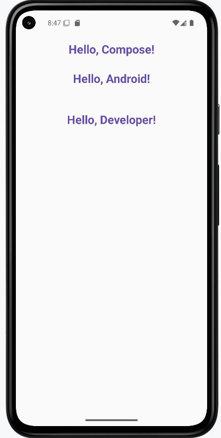
Tips for Success
- Always use the @Composable annotation for UI functions
- Name your composables with descriptive nouns
- Keep composables small and focused on a single responsibility
- Use parameters to make composables reusable
- Use callback parameters (lambda functions) to handle user interactions like clicks and input changes
- Use the Compose Preview feature to see your UI as you build it
- Break down complex UIs into smaller, reusable composables
Common Mistakes to Avoid
- Forgetting to add the @Composable annotation
- Creating overly complex composables that are hard to maintain
- Not using parameters to make composables reusable
- Forgetting to use callback parameters for handling user interactions
- Not handling state properly in interactive composables
- Not using the Compose Preview feature to check your UI
- Not following Material Design guidelines for consistency
Best Practices
- Use meaningful names for your composable functions
- Keep composables small and focused on a single responsibility
- Use parameters to make composables reusable
- Use callback parameters (function types) to handle user interactions in interactive composables
- Use the Compose Preview feature to iterate quickly
- Follow Material Design guidelines for a consistent look
- Test your composables with different screen sizes and orientations
Layout Basics
Think of layouts in Jetpack Compose as the invisible containers that organize your app's user interface. Just as you use different types of containers to organize items in your home—shelves for stacking books, drawers for side-by-side items, and boxes for layered objects—layouts help you arrange UI elements in your app.
In this lesson, we'll explore the three most common layout types in Compose: Column, Row, and Box. You'll learn how to use these layouts to create well-organized, visually appealing screens for your Android apps.
Quick Reference Table
| Layout | Description | When to Use |
|---|---|---|
| Column | Stacks elements vertically | When you need to arrange items from top to bottom |
| Row | Arranges elements horizontally | When you need to place items side by side |
| Box | Overlays elements on top of each other | When you need to layer items or position them precisely |
When to Use
- When you need to organize multiple UI elements on a screen
- When you want to create structured, visually appealing layouts
- When you need to position elements relative to each other
- When you want to create responsive designs that adapt to different screen sizes
You also use something called a Modifier with layouts (and their children) to control appearance and positioning, like adding padding, setting size, alignment, or background color. We'll talk about modifiers in more detail later in the book, but for now, just see how they are used in the code examples.
Column Layout
When to Use
- When you need to stack elements vertically
- When creating forms or lists
- When displaying content that flows from top to bottom
- When you want to create a vertical navigation menu
Practical Example
@Composable
fun ColumnExample() {
    Column(
        modifier = Modifier
            .padding(16.dp)  // Add space around the column
            .border(2.dp, MaterialTheme.colorScheme.secondary)  // Add a border
    ) {
        Text("Part 1")
        Text("Part 2")
        Text("Part 3")
        Text("Part 4")
        Text("Part 5")
    }
}
In this example, everything inside the Column is stacked vertically. The Modifier.padding(16.dp) adds space around the column so its content doesn't touch the edge of the screen. The Modifier.border(2.dp, MaterialTheme.colorScheme.secondary) adds a border around the column to make it easier to see its size and position.
Row Layout
When to Use
- When you need to arrange elements horizontally
- When creating navigation bars or toolbars
- When displaying items side by side
- When you want to create a horizontal list of options
Practical Example
@Composable
fun RowExample() {
    Row(
        modifier = Modifier
            .padding(16.dp)  // Add space around the row
            .border(2.dp, MaterialTheme.colorScheme.tertiary)  // Add a border
    ) {
        Text("Part 1")
        Spacer(modifier = Modifier.width(20.dp))  // Add space between elements
        Text("Part 2")
        Spacer(modifier = Modifier.width(20.dp))
        Text("Part 3")
        Spacer(modifier = Modifier.width(20.dp))
        Text("Part 4")
        Spacer(modifier = Modifier.width(20.dp))
        Text("Part 5")
    }
}
In the RowExample, the text elements are displayed side by side. The Spacer adds horizontal space between them. The Modifier.padding(16.dp) adds space around the row so its content doesn't touch the edge of the screen. The Modifier.border(2.dp, MaterialTheme.colorScheme.tertiary) adds a border around the row to make it easier to see its size and position.
Box Layout
When to Use
- When you need to overlay elements on top of each other
- When you want to position elements precisely within a container
- When you need to layer UI elements
- When you want to create complex layouts with overlapping components
Practical Example
@Composable
fun BoxExample() {
    Box(
        modifier = Modifier
            .size(300.dp)  // Set the size of the box
            .padding(16.dp)  // Add space around the box
            .border(2.dp, MaterialTheme.colorScheme.primary)  // Add a border
    ) {
        Text(
            text = "This is the top part of a box",
            modifier = Modifier.align(Alignment.TopCenter)  // Position at the top center
        )
        Text(
            text = "This is the middle part of a box",
            modifier = Modifier.align(Alignment.Center)  // Position in the center
        )
        Text(
            text = "This is the bottom part of a box",
            modifier = Modifier.align(Alignment.BottomCenter)  // Position at the bottom center
        )
    }
}
In the BoxExample, the three text elements are displayed on top of each other. The Modifier.size(300.dp) sets the size of the box. The Modifier.padding(16.dp) adds space around the box so its content doesn't touch the edge of the screen. The Modifier.border(2.dp, MaterialTheme.colorScheme.primary) adds a border around the box to make it easier to see its size and position.
How these examples render
The image below shows what the three layout examples look like when you run them: a column with "Part 1" through "Part 5" stacked vertically, a row with "Part 1" through "Part 5" side by side with space between them, and a box with three lines of text at the top, center, and bottom. The snippets above are only part of the code; to see and run the full project, go to my GitHub page and open the chapter4 layout_code.kt file.

Tips for Success
- Start with simple layouts and build up to more complex ones
- Use the Compose Preview feature to see your layouts as you build them
- Combine different layout types to create complex UIs
- Use modifiers to fine-tune the appearance and positioning of your layouts
- Test your layouts on different screen sizes and orientations
- Use the Compose documentation and samples as reference
Common Mistakes to Avoid
- Creating overly complex layouts that are hard to maintain
- Not using modifiers to control the appearance and positioning of layouts
- Not considering different screen sizes and orientations
- Not using the Compose Preview feature to check your layouts
- Not following Material Design guidelines for consistency
- Not breaking down complex layouts into smaller, reusable components
Best Practices
- Keep layouts simple and focused on a single responsibility
- Use meaningful names for your layout composables
- Extract reusable layout components into separate composables
- Use the Compose Preview feature to iterate quickly
- Follow Material Design guidelines for a consistent look
- Test your layouts with different screen sizes and orientations
Column Layout
Think of a Column like a stack of building blocks - each block sits on top of the one below it. In Jetpack Compose, a Column is one of the most important tools for creating vertical layouts. Whether you're building a profile screen, a settings menu, or a form, the Column layout helps you stack your UI elements neatly from top to bottom.
In this lesson, we'll explore how to use the Column layout effectively in your Android apps. You'll learn how to create basic columns, center items, add spacing, and style your columns to create beautiful, user-friendly interfaces.
Quick Reference Table
| Property | Description | When to Use |
|---|---|---|
| modifier | Controls appearance and behavior | When you need to style or position the column |
| verticalArrangement | Controls spacing between items | When you need to adjust vertical spacing |
| horizontalAlignment | Controls horizontal alignment of items | When you need to center or align items |
Your First Column
When to Use
- When you need to stack elements vertically
- When creating forms or lists
- When displaying content that flows from top to bottom
- When you want to create a vertical navigation menu
Practical Example
@Composable
fun ColumnExample() {
    Column(
        modifier = Modifier.padding(16.dp)  // Add space around the column
    ) {
        Text("Welcome to Compose!")  // First text element
        Text("Let's build a layout.") // Second text element
    }
}
What's happening here:
- The
Columnis like a container that holds everything together Modifier.padding(16.dp)adds some breathing room around the edges- The two
Textelements stack on top of each other, just like blocks
Centering Your Column Items
When to Use
- When you want to center items horizontally
- When creating a balanced, symmetrical layout
- When you want to create a more polished look
- When you need to align items in the middle of the screen
Practical Example
@Composable
fun CenteredColumn() {
    Column(
        modifier = Modifier.fillMaxWidth(),  // Make the column as wide as the screen
        horizontalAlignment = Alignment.CenterHorizontally  // Center items horizontally
    ) {
        Text("Centered Item 1")  // First centered text
        Text("Centered Item 2")  // Second centered text
    }
}
This code does two important things:
fillMaxWidth()makes the Column stretch across the whole screenhorizontalAlignment = Alignment.CenterHorizontallycenters everything inside
Adding Space Between Items
When to Use
- When you need consistent spacing between items
- When you want to create a more readable layout
- When you need to separate different sections of content
- When you want to create a more visually appealing design
Practical Example
This is one way to add space between items. Using verticalArrangement = Arrangement.spacedBy(12.dp) adds exactly 12 units of space between each item automatically. Think of it like adding invisible spacers between your blocks.
@Composable
fun SpacedColumn() {
    Column(
        modifier = Modifier.padding(16.dp),  // Add space around the column
        verticalArrangement = Arrangement.spacedBy(12.dp)  // Add space between items
    ) {
        Text("Item One")    // First item
        Text("Item Two")    // Second item
        Text("Item Three")  // Third item
    }
}
Another way to add space between items is to use the Spacer composable. You can also add Spacer composables between items when you want different amounts of space in different places. For example:
Column {
    Text("First Item")
    Spacer(modifier = Modifier.height(20.dp))  // Adds 20 units of space
    Text("Second Item")
    Spacer(modifier = Modifier.height(10.dp))  // Adds 10 units of space
    Text("Third Item")
}
What This Second Example Is Doing
This version uses Spacer composables instead of Arrangement.spacedBy. The column shows "First Item," then an invisible Spacer that is 20 dp tall, then "Second Item," then a 10 dp Spacer, then "Third Item." So you get a different amount of space between the first and second items (20 dp) than between the second and third (10 dp). That gives you more control when you want different spacing in different places.
Making Your Column Look Fancy
When to Use
- When you want to create a visually appealing UI
- When you need to highlight important content
- When you want to create a card-like container
- When you need to create a more polished, professional look
Practical Example
@Composable
fun StyledColumn() {
    // First, let's set up our Column with some basic styling
    Column(
        // This modifier chain sets up the Column's appearance
        modifier = Modifier
            .fillMaxWidth()  // Makes the Column as wide as the screen
            .padding(16.dp)  // Adds space around the edges
            .background(     // Adds a background color
                color = MaterialTheme.colorScheme.primaryContainer,
                shape = RoundedCornerShape(16.dp)  // Makes the corners rounded
            )
            .border(        // Adds a border around the Column
                width = 2.dp,
                color = MaterialTheme.colorScheme.primary,
                shape = RoundedCornerShape(16.dp)
            )
            .padding(16.dp),  // Adds more space inside the Column

        // Center everything horizontally
        horizontalAlignment = Alignment.CenterHorizontally,
        // Add space between items
        verticalArrangement = Arrangement.spacedBy(8.dp)
    ) {
        // First item: A large, bold title
        Text(
            text = "Styled Column",
            style = TextStyle(
                fontSize = 24.sp,        // Makes the text bigger
                fontWeight = FontWeight.Bold,  // Makes it bold
                color = MaterialTheme.colorScheme.primary  // Uses the primary color
            ),
            modifier = Modifier.padding(bottom = 8.dp)  // Adds space below
        )

        // Second item: A smaller, regular text
        Text(
            text = "This is a styled text",
            style = TextStyle(
                fontSize = 16.sp,  // Smaller text size
                color = MaterialTheme.colorScheme.onPrimaryContainer  // Different color
            )
        )

        // Third item: A button
        Button(
            onClick = { /* TODO: Add click action */ },
            modifier = Modifier.padding(top = 8.dp)  // Adds space above
        ) {
            Text("Styled Button")
        }

        // Fourth item: A colored box with text
        Box(
            modifier = Modifier
                .size(100.dp)  // Makes the box 100x100 units
                .background(    // Adds a different background color
                    color = MaterialTheme.colorScheme.secondaryContainer,
                    shape = RoundedCornerShape(8.dp)  // Rounded corners
                )
                .padding(8.dp),  // Adds space inside the box
            contentAlignment = Alignment.Center  // Centers the text inside
        ) {
            Text(
                text = "Box",
                color = MaterialTheme.colorScheme.onSecondaryContainer
            )
        }
    }
}
Let's understand what each part does:
The Column Setup
fillMaxWidth()makes the Column stretch across the screenpadding(16.dp)adds space around the edgesbackground()gives it a nice background color with rounded cornersborder()adds a colored border around it
The Items Inside
- Title Text: Big, bold text in the primary color
- Regular Text: Smaller text in a different color
- Button: A clickable button with text
- Box: A colored square with centered text
Spacing and Alignment
horizontalAlignment = Alignment.CenterHorizontallycenters everythingverticalArrangement = Arrangement.spacedBy(8.dp)adds space between items- Individual
padding()modifiers add extra space where needed
How these examples render
The image below shows what the column examples look like when you run them: a simple column, a centered column, a spaced column, and the styled column with title, text, button, and colored box. The snippets above are only part of the code; to see and run the full project, go to my GitHub page and open the chapter4 column_code.kt file.
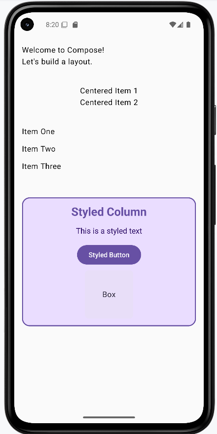
Tips for Success
- Start with simple columns and build up to more complex ones
- Use the Compose Preview feature to see your columns as you build them
- Use modifiers to fine-tune the appearance and positioning of your columns
- Test your columns on different screen sizes and orientations
- Use the Compose documentation and samples as reference
- Break down complex columns into smaller, reusable components
Common Mistakes to Avoid
- Creating overly complex columns that are hard to maintain
- Not using modifiers to control the appearance and positioning of columns
- Not considering different screen sizes and orientations
- Not using the Compose Preview feature to check your columns
- Not following Material Design guidelines for consistency
- Not breaking down complex columns into smaller, reusable components
Best Practices
- Keep columns simple and focused on a single responsibility
- Use meaningful names for your column composables
- Extract reusable column components into separate composables
- Use the Compose Preview feature to iterate quickly
- Follow Material Design guidelines for a consistent look
- Test your columns with different screen sizes and orientations
Row Layout
Imagine you're arranging pictures on a wall - if you put them side by side, that's exactly what a Row does in your app! While a Column stacks things from top to bottom (like a stack of books), a Row puts things next to each other from left to right (like books on a shelf). You'll use Row when you want things to sit next to each other - like putting an icon next to some text, or creating a row of buttons.
In this lesson, we'll explore how to use the Row layout effectively in your Android apps. You'll learn how to create basic rows, add spacing between items, align items vertically, and create beautiful, user-friendly interfaces.
Quick Reference Table
| Property | Description | When to Use |
|---|---|---|
| modifier | Controls appearance and behavior | When you need to style or position the row |
| horizontalArrangement | Controls spacing between items | When you need to adjust horizontal spacing |
| verticalAlignment | Controls vertical alignment of items | When you need to align items vertically |
Let's Start Simple: A Basic Row
When to Use
- When you need to arrange elements horizontally
- When creating navigation bars or toolbars
- When displaying items side by side
- When you want to create a horizontal list of options
Practical Example
@Composable
fun RowExample() {
    Row(
        modifier = Modifier
            .padding(16.dp)  // Outer padding
            .border(width = 1.dp, color = Color.Blue)  // Add a border
            .padding(16.dp)  // Inner padding between elements and border
    ) {
        Text("First")
        Text("Second")
        Text("Third")
        Text("Fourth")
        Text("Fifth")
    }
}
What's happening here?
- We create a row with some space around it (that's what padding does - like margins in a notebook)
- We add a blue border so we can see where our row is (like drawing a box around our words)
- We put five words inside: "First", "Second", "Third", "Fourth", and "Fifth"
Adding Space Between Items
When to Use
- When you need consistent spacing between items
- When you want to create a more readable layout
- When you need to separate different sections of content
- When you want to create a more visually appealing design
Using Spacers (Like Adding Invisible Bookends)
This is one way to add space between items. Using Spacer composables between items when you want different amounts of space in different places. For example:
@Composable
fun RowWithSpacer() {
    Row(modifier = Modifier.padding(16.dp)) {
        Text("First")
        Spacer(modifier = Modifier.width(10.dp))  // Add 10dp of space
        Text("Second")
        Spacer(modifier = Modifier.width(10.dp))  // Add 10dp of space
        Text("Third")
        Spacer(modifier = Modifier.width(10.dp))  // Add 10dp of space
        Text("Fourth")
        Spacer(modifier = Modifier.width(10.dp))  // Add 10dp of space
        Text("Fifth")
    }
}
Here, we're adding invisible spacers between our words. Each spacer is exactly 10dp wide (dp is just a measurement unit - like inches or centimeters, but for screens).
Spreading Things Out Automatically
This is another way to add space between items. Using Arrangement.SpaceBetween to spread items evenly across the row. For example:
@Composable
fun RowWithArrangement() {
    Row(
        modifier = Modifier
            .fillMaxWidth()  // Make the row as wide as the screen
            .padding(16.dp),  // Add space around the row
        horizontalArrangement = Arrangement.SpaceBetween  // Spread items evenly
    ) {
        Text("First")
        Text("Second")
        Text("Third")
        Text("Fourth")
        Text("Fifth")
    }
}
This time, instead of adding specific spaces, we tell the row to spread things out evenly across the whole width. It's like telling five people to spread out equally across a room!
Making Things Line Up Vertically
When to Use
- When you want to align items at the top, middle, or bottom
- When creating a more polished, professional look
- When you need to create a balanced, symmetrical layout
- When you want to create a more visually appealing design
Lining Things Up
In these examples, we make the row 100dp tall.
Top Alignment
@Composable
fun RowTopAlignment() {
    Row(
        modifier = Modifier
            .height(100.dp)  // Set the height of the row
            .fillMaxWidth()  // Make the row as wide as the screen
            .border(width = 1.dp, color = Color.Blue)  // Add a border
            .padding(16.dp),  // Add space around the row
        verticalAlignment = Alignment.Top  // Align items at the top
    ) {
        Text("First")
        Spacer(modifier = Modifier.width(16.dp))  // Add space between items
        Text("Second")
        Spacer(modifier = Modifier.width(16.dp))
        Text("Third")
        Spacer(modifier = Modifier.width(16.dp))
        Text("Fourth")
        Spacer(modifier = Modifier.width(16.dp))
        Text("Fifth")
    }
}
What this does: The row is 100 dp tall with a blue border. verticalAlignment = Alignment.Top pulls all the text and spacers to the top of that row, so "First," "Second," "Third," "Fourth," and "Fifth" sit on the top edge instead of in the middle or bottom.
Center Alignment
@Composable
fun RowCenterAlignment() {
    Row(
        modifier = Modifier
            .height(100.dp)  // Set the height of the row
            .fillMaxWidth()  // Make the row as wide as the screen
            .border(width = 1.dp, color = Color.Blue)  // Add a border
            .padding(16.dp),  // Add space around the row
        verticalAlignment = Alignment.CenterVertically  // Align items in the center
    ) {
        Text("First")
        Spacer(modifier = Modifier.width(16.dp))  // Add space between items
        Text("Second")
        Spacer(modifier = Modifier.width(16.dp))
        Text("Third")
        Spacer(modifier = Modifier.width(16.dp))
        Text("Fourth")
        Spacer(modifier = Modifier.width(16.dp))
        Text("Fifth")
    }
}
What this does: Same row size and border, but verticalAlignment = Alignment.CenterVertically centers all the items vertically inside the row. The five words and the spacers between them sit in the middle of the 100 dp height.
Bottom Alignment
@Composable
fun RowBottomAlignment() {
    Row(
        modifier = Modifier
            .height(100.dp)  // Set the height of the row
            .fillMaxWidth()  // Make the row as wide as the screen
            .border(width = 1.dp, color = Color.Blue)  // Add a border
            .padding(16.dp),  // Add space around the row
        verticalAlignment = Alignment.Bottom  // Align items at the bottom
    ) {
        Text("First")
        Spacer(modifier = Modifier.width(16.dp))  // Add space between items
        Text("Second")
        Spacer(modifier = Modifier.width(16.dp))
        Text("Third")
        Spacer(modifier = Modifier.width(16.dp))
        Text("Fourth")
        Spacer(modifier = Modifier.width(16.dp))
        Text("Fifth")
    }
}
What this does: Same row again, but verticalAlignment = Alignment.Bottom pushes all the items to the bottom of the row. The five words sit on the bottom edge of the 100 dp tall row.
How these examples render
The image below shows what the row examples look like when you run them: a basic row of five words, a row with spacers between items, a row with items spread across the width, and the three alignment variants (top, center, bottom). The snippets above are only part of the code; to see and run the full project, go to my GitHub page and open the chapter4 row_code.kt file.
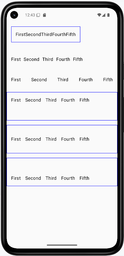
Tips for Success
- Start with simple rows and build up to more complex ones
- Use the Compose Preview feature to see your rows as you build them
- Use modifiers to fine-tune the appearance and positioning of your rows
- Test your rows on different screen sizes and orientations
- Use the Compose documentation and samples as reference
- Break down complex rows into smaller, reusable components
Common Mistakes to Avoid
- Creating overly complex rows that are hard to maintain
- Not using modifiers to control the appearance and positioning of rows
- Not considering different screen sizes and orientations
- Not using the Compose Preview feature to check your rows
- Not following Material Design guidelines for consistency
- Not breaking down complex rows into smaller, reusable components
Best Practices
- Keep rows simple and focused on a single responsibility
- Use meaningful names for your row composables
- Extract reusable row components into separate composables
- Use the Compose Preview feature to iterate quickly
- Follow Material Design guidelines for a consistent look
- Test your rows with different screen sizes and orientations
Box Layout
Think of a Box like a stack of photos on your desk - you can put one thing on top of another! In Android apps, we use Box when we want to layer things, like putting text over a picture or adding a cool badge in the corner of something.
In this lesson, we'll explore how to use the Box layout effectively in your Android apps. You'll learn how to create basic boxes, style them, and layer content to create beautiful, user-friendly interfaces.
Quick Reference Table
| Property | Description | When to Use |
|---|---|---|
| modifier | Controls appearance and behavior | When you need to style or position the box |
| contentAlignment | Controls default alignment of content | When you need to align items within the box |
| content | The items to be displayed in the box | When you need to add content to the box |
Let's Start Simple: A Basic Box
When to Use
- When you need to layer elements on top of each other
- When you want to position elements precisely within a container
- When you need to create complex layouts with overlapping components
- When you want to create a more visually appealing design
Practical Example
@Composable
fun BoxExample() {
    Box(modifier = Modifier
        .size(150.dp)  // Set the size of the box
        .padding(16.dp)  // Add space around the box
        .border(width = 1.dp, color = Color.Blue)  // Add a border
    ) {
        Text(
            text = "Top Text",
            modifier = Modifier.align(Alignment.TopCenter)  // Position at the top center
        )
        Text(
            text = "Bottom Text",
            modifier = Modifier.align(Alignment.BottomCenter)  // Position at the bottom center
        )
    }
}
Let's break down what this does:
- Creates a box that's 150 by 150 units big (like a square sticky note)
- Adds some space around it (16 units of padding)
- Adds a blue border so we can see where the box is
- Puts "Top Text" at the top center (like sticking it to the top of the note)
- Puts "Bottom Text" at the bottom center (like sticking it to the bottom)
Making a Box Look Pretty
When to Use
- When you want to create a visually appealing UI
- When you need to highlight important content
- When you want to create a card-like container
- When you need to create a more polished, professional look
Practical Example
@Composable
fun ColoredBox() {
    Box(
        modifier = Modifier
            .size(200.dp)  // Set the size of the box
            .padding(16.dp)  // Add space around the box
            .background(  // Add a background color
                Color(0xFF673AB7),  // Purple color
                shape = androidx.compose.foundation.shape.RoundedCornerShape(24.dp)  // Rounded corners
            )
            .border(  // Add a border
                width = 1.dp,
                color = Color(0xFF512DA8),  // Darker purple
                shape = androidx.compose.foundation.shape.RoundedCornerShape(24.dp)  // Rounded corners
            )
    ) {
        Text(
            "Box Content",
            color = Color.White,  // White text
            modifier = Modifier.align(Alignment.Center)  // Center the text
        )
    }
}
This is like:
- Taking a box and making it 200 units big
- Adding some breathing room (16 units of padding)
- Painting it in a nice purple color (that's what the Color(0xFF673AB7) does)
- Making the corners round (like a rounded rectangle)
- Adding a darker purple border to make it pop
- Putting white text right in the middle so it's easy to read against the purple
Putting One Thing On Top of Another
When to Use
- When you need to overlay elements on top of each other
- When you want to position elements precisely within a container
- When you need to layer UI elements
- When you want to create complex layouts with overlapping components
Practical Example
@Composable
fun BoxWithOverlay() {
    Box(
        modifier = Modifier
            .size(200.dp)  // Set the size of the box
            .padding(16.dp)  // Add space around the box
            .background(Color.Cyan)  // Add a cyan background
    ) {
        Text(
            text = "Overlay",
            color = Color.White,  // White text
            modifier = Modifier
                .align(Alignment.BottomEnd)  // Position at the bottom right
                .background(Color.DarkGray)  // Dark gray background
                .padding(4.dp)  // Add space around the text
        )
    }
}
Here's what's happening:
- We make a bigger cyan (light blue) box that's 200 units big
- We add some space around it (16 units of padding)
- We add the word "Overlay" on top of it
- We put that word in the bottom-right corner
- We give the word a dark gray background and some space around it (padding) so it's easy to read
How these examples render
The image below shows what the three box examples look like when you run them: a basic box with "Top Text" and "Bottom Text" at the top and bottom, a purple rounded box with centered "Box Content," and a cyan box with an "Overlay" label in the bottom-right corner. The snippets above are only part of the code; to see and run the full project, go to my GitHub page and open the chapter4 box_code.kt file.
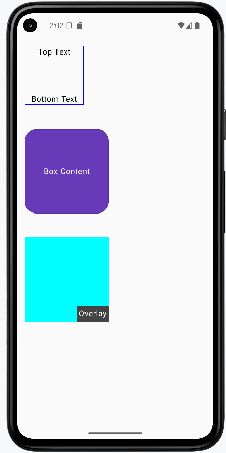
Tips for Success
- Start with simple boxes and build up to more complex ones
- Use the Compose Preview feature to see your boxes as you build them
- Use modifiers to fine-tune the appearance and positioning of your boxes
- Test your boxes on different screen sizes and orientations
- Use the Compose documentation and samples as reference
- Break down complex boxes into smaller, reusable components
Common Mistakes to Avoid
- Creating overly complex boxes that are hard to maintain
- Not using modifiers to control the appearance and positioning of boxes
- Not considering different screen sizes and orientations
- Not using the Compose Preview feature to check your boxes
- Not following Material Design guidelines for consistency
- Not breaking down complex boxes into smaller, reusable components
Best Practices
- Keep boxes simple and focused on a single responsibility
- Use meaningful names for your box composables
- Extract reusable box components into separate composables
- Use the Compose Preview feature to iterate quickly
- Follow Material Design guidelines for a consistent look
- Test your boxes with different screen sizes and orientations
Chapter 5: Compose UI Elements
Adding Space
Introduction
Have you ever looked at a webpage or app and thought, "This looks too crowded!" or "These elements are too far apart!"? That's where spacing comes in! In Jetpack Compose, we have two powerful tools to control the space between elements: Spacer and Arrangement. Think of them like the spacing tools in a word processor - they help you create layouts that are easy to read and use.
Quick Reference
| Tool | Description | Common Use |
|---|---|---|
| Spacer | Creates flexible space between specific elements | Custom spacing, uneven gaps |
| Arrangement | Controls spacing between all elements in a layout | Consistent spacing, equal gaps |
When to Use Each Tool
- Use Spacer when:
- You need different amounts of space between elements
- You want precise control over specific gaps
- You're working with a small number of elements
- Use Arrangement when:
- You want equal spacing between all elements
- You're working with many elements
- You want to maintain consistent spacing automatically
Common Options
| Option | What It Does | When to Use It |
|---|---|---|
| Spacer with height | Creates vertical space in Columns | Adding gaps between stacked elements |
| Spacer with width | Creates horizontal space in Rows | Adding gaps between side-by-side elements |
| Arrangement.spacedBy() | Adds equal space between all elements | Creating consistent spacing in lists or grids |
Using Spacer
Let's look at how to use Spacer to create custom spacing between elements:
@Composable
fun SpacerExample() {
    Column(modifier = Modifier.padding(16.dp)) {
        Text("Item 1")
        Spacer(modifier = Modifier.height(16.dp))  // Adds 16dp of vertical space
        Text("Item 2")
        Spacer(modifier = Modifier.height(32.dp))  // Adds 32dp of vertical space
        Text("Item 3")
    }
}
What This Example Is Doing
SpacerExample shows a column with three lines of text: "Item 1," "Item 2," and "Item 3." Between "Item 1" and "Item 2" there is a Spacer(modifier = Modifier.height(16.dp)), so 16 density-independent pixels of vertical space. Between "Item 2" and "Item 3" there is a Spacer of 32 dp. So you get different gaps in different places—useful when you want one section more spaced out than another.
Using Arrangement
Here's how to use Arrangement to create consistent spacing between all elements:
@Composable
fun ArrangementExample() {
    Column(
        modifier = Modifier
            .padding(16.dp)
            .fillMaxWidth(),
        verticalArrangement = Arrangement.spacedBy(16.dp)  // Adds 16dp between all items
    ) {
        Text("Item A")
        Text("Item B")
        Text("Item C")
    }
}
What This Example Is Doing
ArrangementExample shows a column with three lines: "Item A," "Item B," and "Item C." The column uses verticalArrangement = Arrangement.spacedBy(16.dp), so Compose automatically puts 16 dp of space between every pair of items. You don't add any Spacers—the layout handles it. Good for lists or any place where you want the same gap between all items.
How these examples render
The image below shows what the spacing examples look like when you run them: the column with custom gaps (16 dp and 32 dp) from Spacers, and the column with even 16 dp spacing from Arrangement.spacedBy(16.dp). The snippets above are only part of the code; to see and run the full project, go to my GitHub page and open the chapter5 spacer_code.kt file.
Tips for Success
- Start with
Arrangementfor consistent spacing - Use
Spacerwhen you need custom spacing between specific elements - Consider using both tools together for complex layouts
- Test your spacing on different screen sizes
Common Mistakes to Avoid
- Using too many
Spacers whenArrangementwould be simpler - Forgetting to add padding around your layout
- Using inconsistent spacing values
- Not considering how spacing affects touch targets
Best Practices
- Use standard spacing values (8dp, 16dp, 24dp, 32dp) for consistency
- Consider accessibility when spacing touch targets
- Use
Arrangementfor lists and grids - Test your layout with different content lengths
Understanding Modifiers
Introduction
Think of modifiers in Jetpack Compose like the settings on your phone - they let you customize how things look and behave without changing what they are. Want to make a button bigger? Add some space around text? Change colors? That's what modifiers are for! They're like a toolbox full of ways to style and arrange your UI elements.
Quick Reference
| Modifier Type | What It Does | Common Use |
|---|---|---|
| Size Modifiers | Controls width, height, and dimensions | Making elements bigger/smaller |
| Padding Modifiers | Adds space around elements | Creating margins and spacing |
| Background Modifiers | Changes element background | Adding colors and visual separation |
| Alignment Modifiers | Positions elements within containers | Centering and aligning content |
When to Use Modifiers
- When you need to customize how an element looks
- To add spacing or padding around elements
- When you want to change the size of elements
- To align elements within their containers
- When you need to add backgrounds or borders
Common Options
| Modifier | What It Does | When to Use It |
|---|---|---|
| padding() | Adds space around an element | Creating margins and spacing |
| size() | Sets exact dimensions | Fixed-size elements |
| fillMaxWidth() | Makes element as wide as possible | Full-width layouts |
| background() | Adds background color | Visual separation and styling |
| align() | Positions element in container | Centering and alignment |
Basic Modifier Example
Let's start with a simple example that shows how to add padding and a background color:
@Composable
        fun ModifierExample() {
            Text(
                text = "Hello, Modifier!",
                modifier = Modifier
                    .border(2.dp, Color.Red)//border around text element
                    .padding(36.dp)  // Outer padding
                    .border(2.dp, Color.Green)//border around text
                    .background(Color.LightGray)  // Background color
                    .padding(18.dp), // Inner padding around text
                color = Color.Blue
            )
        }
What This Example Is Doing
The modifier chain is applied from the bottom up (the last modifier in the chain is closest to the text). So from the text outward: (1) 18 dp padding around the text, (2) light gray background, (3) green border around that, (4) 36 dp padding, (5) red border around the whole thing. The order matters—if you put background before padding, the background would only be behind the text, not the padded area. color = Color.Blue is a parameter of the Text composable itself (the text color), not part of the modifier chain.
The Modifier class in Compose is immutable: each modifier function returns a new Modifier. Chaining them with Modifier.padding(...).background(...) and so on builds one chain that gets applied to the UI element in order.
Size and Alignment Example
Here's how to control the size of elements and position them within containers:
@Composable
fun ModifierSizeExample() {
    Box(
        modifier = Modifier
            .size(200.dp)          // Fixed size box
            .background(Color.Cyan) // Cyan background
    ) {
        Text(
            text = "Centered",
            modifier = Modifier.align(Alignment.Center)  // Center the text
        )
    }
}
What This Example Is Doing
ModifierSizeExample draws a 200 dp × 200 dp Box with a cyan background—so a square. Inside the box, a Text says "Centered." The text uses Modifier.align(Alignment.Center), which positions it in the center of the box. So you get a fixed-size container and one child positioned in the middle.
Chaining Modifiers
Modifiers work like a chain - each one builds on the previous one. The order matters!
@Composable
fun ModifierChainExample() {
    Text(
        text = "Order Matters",
        modifier = Modifier
            .background(Color(0xFFFF0000))  // First, add background
            .padding(16.dp)        // Then, add padding inside
    )
}
What This Example Is Doing
Here the chain is background first, then padding. So the red background is applied to the full size of the text; then 16 dp of padding is added inside that, so the red shows as a band around the padded text. If you reversed the order (padding then background), the background would only sit behind the text, and the padding would be outside it—so the visible result would be different. Order matters.
Parent and Child Modifiers
You can style both containers and their children. Here's how:
@Composable
fun ModifierParentChildExample() {
    Column(
        modifier = Modifier
            .fillMaxWidth()        // Make column full width
            .background(Color.Gray) // Gray background for column
            .padding(16.dp)        // Padding around column
    ) {
        Text("Child 1", modifier = Modifier.background(Color.White).padding(8.dp))
        Text("Child 2", modifier = Modifier.background(Color.LightGray).padding(8.dp))
    }
}
What This Example Is Doing
The Column has modifiers: full width, gray background, and 16 dp padding. So the column is a gray strip with space around its edges. Inside it, "Child 1" has a white background and 8 dp padding, and "Child 2" has a light gray background and 8 dp padding. So the parent (column) gets one set of styles and each child gets its own—showing how you can style both the container and the items inside it.
How these examples render
The image below shows what the modifier examples look like when you run them: the layered borders and padding around "Hello, Modifier!," the cyan square with centered text, the red-backed "Order Matters" with padding, and the gray column with two differently styled children. The snippets above are only part of the code; to see and run the full project, go to my GitHub page and open the chapter5 modifiers_code.kt file.
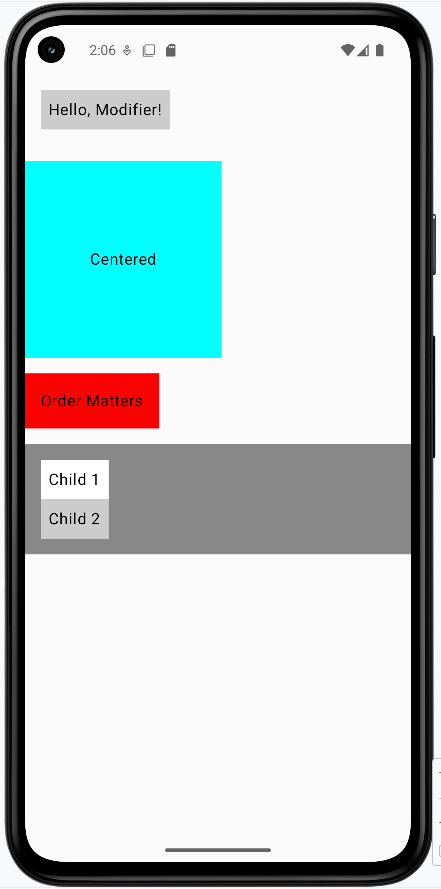
Tips for Success
- Start with basic modifiers like padding and background
- Remember that modifier order matters
- Use comments to explain complex modifier chains
- Test your layouts on different screen sizes
Common Mistakes to Avoid
- Putting modifiers in the wrong order
- Forgetting to add padding around elements
- Using too many nested modifiers
- Not considering how modifiers affect layout
Best Practices
- Keep modifier chains readable and well-commented
- Use standard spacing values (8dp, 16dp, 24dp, 32dp)
- Consider reusing common modifier combinations
- Test your layouts with different content
Custom Modifiers
Introduction
Have you ever found yourself copying and pasting the same styling code over and over? Or wished you could give your favorite combination of modifiers a cool name? That's exactly what custom modifiers are for! Think of them like creating your own special recipe - you combine different ingredients (modifiers) once, give it a name, and then you can use it anywhere you want.
Quick Reference
| Concept | What It Is | When to Use It |
|---|---|---|
| Custom Modifier | A reusable function that combines modifiers | Repeating the same styling |
| Extension Function | A way to add new functions to existing types | Creating modifier functions |
| Parameterized Modifier | A custom modifier that accepts options | Creating flexible styling |
When to Create Custom Modifiers
- When you're repeating the same modifier chain in multiple places
- To make your code more readable and maintainable
- When you want to create consistent styling across your app
- To simplify complex modifier chains
- When you want to create a reusable design system
Common Options
| Feature | What It Does | When to Use It |
|---|---|---|
| Basic Custom Modifier | Combines fixed modifiers | Consistent styling |
| Parameterized Modifier | Accepts custom values | Flexible styling |
| Default Parameters | Provides fallback values | Optional customization |
Creating a Basic Custom Modifier
Let's create a custom modifier for styling tags, like the ones you might use for skills or categories:
fun Modifier.tagStyle(): Modifier {
    return this
        .background(Color.LightGray)  // Add background color
        .padding(horizontal = 8.dp, vertical = 4.dp)  // Add padding
}
What This Example Is Doing
tagStyle() is an extension function on Modifier: you call it as Modifier.tagStyle(). It returns a modifier that (1) gives the element a light gray background and (2) adds 8 dp of padding on the left and right and 4 dp on the top and bottom. So any composable you pass this modifier to will look like a small, padded tag. You define it once and reuse it wherever you want that style.
Using Your Custom Modifier
Here's how to use your custom modifier in a real layout:
@Composable
fun TagExample() {
    Row(horizontalArrangement = Arrangement.spacedBy(8.dp)) {
        Text("Compose", modifier = Modifier.tagStyle())  // Apply the style
        Text("Kotlin", modifier = Modifier.tagStyle())   // Apply the style
        Text("UI", modifier = Modifier.tagStyle())       // Apply the style
    }
}
What This Example Is Doing
TagExample displays three words—"Compose," "Kotlin," and "UI"—in a horizontal row with 8 dp between them. Each word uses Modifier.tagStyle(), so they all get the same light gray background and padding from your custom modifier. If you change tagStyle() (e.g., different color or padding), every tag in the app that uses it updates in one place.
Adding Parameters to Custom Modifiers
Want to make your custom modifier more flexible? Add parameters!
fun Modifier.tagStyleParam(
    color: Color = Color.Red  // Default color if none provided
): Modifier {
    return this
        .background(color)  // Use the provided color
        .padding(horizontal = 8.dp, vertical = 4.dp)
}
Now you can customize the color when you use it:
Text("Android", modifier = Modifier.tagStyleParam(Color.Green))  // Custom color
Text("iOS", modifier = Modifier.tagStyleParam())  // Default color (red)
What This Example Is Doing
tagStyleParam is like tagStyle() but takes an optional color parameter (default Color.Red). The first line uses tagStyleParam(Color.Green), so "Android" gets a green background and the usual padding. The second uses tagStyleParam() with no argument, so "iOS" gets the default red background. One function, flexible styling.
How these examples render
The image below shows what the custom modifier examples look like when you run them: a row of tags styled with tagStyle(), and (if you use the parameterized version) tags with different colors from tagStyleParam(). The snippets above are only part of the code; to see and run the full project, go to my GitHub page and open the chapter5 cust_modifier.kt file.
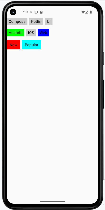
Tips for Success
- Give your custom modifiers clear, descriptive names
- Start with basic modifiers before adding parameters
- Use default values for optional parameters
- Keep your modifier functions focused and simple
Common Mistakes to Avoid
- Creating too many parameters in one modifier
- Making modifiers too specific to one use case
- Forgetting to return the modified chain
- Not using default values for optional parameters
Best Practices
- Create modifiers for commonly used style combinations
- Use meaningful parameter names
- Document your custom modifiers with comments
- Test your modifiers with different content
Click Events
Introduction
Think of click events in Compose like pressing buttons on your phone - they're how your app responds when users tap or click on things. Just like how your phone knows what to do when you tap an app icon, Compose needs to know what to do when users interact with your app's elements. We'll learn how to make your app respond to these interactions in a simple and effective way.
Quick Reference
| Command/Topic | Description | Common Use |
|---|---|---|
| Modifier.clickable | Makes any element respond to clicks | Making text, images, or custom elements interactive |
| Button onClick | Handles button press events | Creating interactive buttons and controls |
| remember | Allows Compose to remember a value across recompositions (screen reloads) | It is commonly used for storing data that needs to survive configuration changes, like screen rotations |
| mutableStateOf | It is a function that creates a changeable state in Compose | It is commonly used for managing values that can change over time, such as user input or interactive UI elements |
When to Use Click Events
- When you need to respond to user taps or clicks
- To create interactive buttons and controls
- When you want to toggle between different states
- To collect user input or selections
Practical Examples
Clickable Text with State
This example shows how to make text interactive - like a simple toggle button. When clicked, it changes its message, similar to how a light switch toggles between on and off states.
Why remember and mutableStateOf?
Compose functions can be called many times when the UI updates; that process is called recompose. Recomposing means Compose re-runs only the composables that depend on changed state—it redraws those parts of the screen, not the whole page. That is how a state change (like clicked flipping to true) becomes visible: when you update the state, Compose recomposes the composables that read that state, so the Text is redrawn with the new message. mutableStateOf(false) creates a state object that holds the current value and notifies Compose when the value changes, which triggers that recomposition. remember keeps that same state object across recompositions—without it, a new state would be created every time the composable ran, and clicked would reset to false and the toggle would not work. Together, remember { mutableStateOf(false) } means: "keep one state value for the lifetime of this composable, and tell Compose to recompose when it changes."
@Composable
fun ClickableTextExample() {
    var clicked by remember { mutableStateOf(false) }

    Text(
        text = if (clicked) "You clicked the text!" else "Click this text",
        modifier = Modifier
            .padding(16.dp)
            .clickable { clicked = !clicked }
    )
}
What This Example Is Doing
ClickableTextExample keeps a single piece of state: clicked, which starts as false. The Text shows "Click this text" when clicked is false and "You clicked the text!" when it's true. The Modifier.clickable { clicked = !clicked } makes the whole text area tappable: each tap flips clicked to its opposite, so the message toggles. remember { mutableStateOf(false) } keeps that state across recompositions so the toggle keeps working instead of resetting.
Button Click Counter
This example demonstrates a common pattern in apps - a counter that increases with each click. Think of it like a "like" button that keeps track of how many times it's been pressed.
@Composable
fun ButtonClickExample() {
    var count by remember { mutableStateOf(0) }

    Column(modifier = Modifier.padding(16.dp)) {
        Button(onClick = { count++ }) {
            Text("Add One")
        }
        Spacer(modifier = Modifier.height(12.dp))
        Text("You clicked $count times")
    }
}
What This Example Is Doing
ButtonClickExample uses count (state that starts at 0). A Column holds a Button labeled "Add One" and a Text that shows "You clicked 0 times" (or the current count). The button's onClick runs count++, so each tap increases the number. Compose recomposes when count changes, so the text below updates automatically to show the new count.
Selectable Tags
This example shows how to create interactive tags that users can select, similar to how you might select categories in a shopping app or filter options in a social media feed.
@OptIn(ExperimentalLayoutApi::class)// Required for FlowRow - marks that we're using an experimental feature
@Composable
fun SelectableTagsExample() {
    var selectedTag by remember { mutableStateOf(null) }

    val tags = listOf("Kotlin", "Compose", "Android", "UI")

    Column(modifier = Modifier.padding(16.dp)) {
        Text("Select a tag:")
        Spacer(modifier = Modifier.height(8.dp))

        FlowRow(horizontalArrangement = Arrangement.spacedBy(8.dp)) {
            for (tag in tags) {
                val selected = tag == selectedTag
                Text(
                    text = tag,
                    modifier = Modifier
                        .background(
                            color = if (selected) Color.Blue else Color.LightGray,
                            shape = RoundedCornerShape(12.dp)
                        )
                        .clickable { selectedTag = tag } //This modifier makes the text clickable.  If clicked selectedTag stores the name of the tag clicked.
                        .padding(horizontal = 12.dp, vertical = 6.dp),
                    color = if (selected) Color.White else Color.Black
                )
            }
        }

        Spacer(modifier = Modifier.height(16.dp))

        Text(
            text = if (selectedTag != null)
                "Selected tag: $selectedTag"
            else
                "No tag selected"
        )
    }
}
What This Example Is Doing
SelectableTagsExample keeps selectedTag in state (initially null). It shows the label "Select a tag:" and a FlowRow of four tags: "Kotlin," "Compose," "Android," and "UI." Each tag is a Text with Modifier.clickable { selectedTag = tag }, so tapping a tag sets selectedTag to that tag's name. The tag's background is blue with white text when it's the selected tag, and light gray with black text otherwise. Below the row, another Text shows "Selected tag: Kotlin" (or whichever tag was clicked) or "No tag selected" if none has been tapped yet.
How these examples render
The image below shows what the click-event examples look like when you run them: the clickable text (before/after clicking), the button with the count and "You clicked … times," and the selectable tags with one tag highlighted and "Selected tag: …" below. The snippets above are only part of the code; to see and run the full project, go to my GitHub page and open the chapter5 click_event_code.kt file.
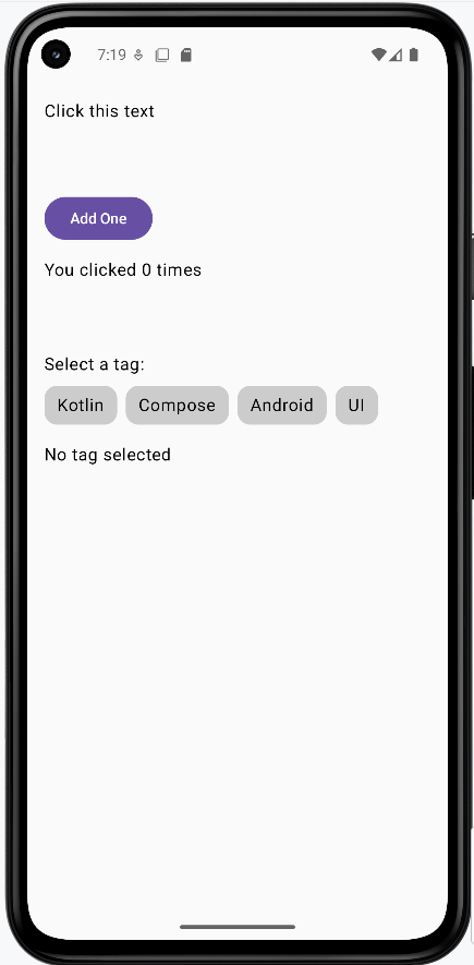
Learning Aids
Tips for Success
- Always use
rememberandmutableStateOfwhen you need to track changes from clicks - Keep click handlers simple and focused on one task
- Use meaningful variable names for your state variables
- Test your click events on both emulator and real devices
Common Mistakes to Avoid
- Forgetting to use
rememberfor state variables - Putting complex logic directly in click handlers
- Not providing visual feedback for clickable elements
- Using click events when a more appropriate input method exists
Best Practices
- Always provide visual feedback for clickable elements
- Keep click handlers concise and readable
- Use appropriate modifiers for different types of interactions
- Consider accessibility when implementing click events
FlowRow and FlowColumn
Introduction
Have you ever tried to display a list of items that's too wide for your screen? Or maybe you've needed to show multiple columns of content that need to wrap when they run out of space? That's exactly what FlowRow and FlowColumn are designed to handle!
Think of them like text wrapping in a word processor: when text hits the edge of the page, it automatically moves to the next line. FlowRow and FlowColumn do the same thing for your UI elements, making them perfect for creating responsive layouts that adapt to different screen sizes.
Quick Reference
| Component | Description | Common Use |
|---|---|---|
| FlowRow | Arranges items horizontally with automatic wrapping | Tag clouds, button groups, filter chips |
| FlowColumn | Arranges items vertically with automatic column wrapping | Image galleries, card layouts, content grids |
When to Use FlowRow and FlowColumn
- When you need items to wrap to new lines/columns automatically
- For responsive layouts that adapt to different screen sizes
- When displaying dynamic content that might grow or shrink
- For creating tag clouds, filter chips, or button groups
- When building image galleries or card layouts
Important Note: Experimental API
Before we dive into the examples, there's one important thing to know: FlowRow and FlowColumn are part of Jetpack Compose's experimental layout system. This means they work great but might have minor changes in future updates. To use them, you need to add this line above any composable function that uses them:
@OptIn(ExperimentalLayoutApi::class)What this does: This annotation tells the compiler that you're okay using an experimental API. You must add it above any composable that uses FlowRow or FlowColumn, or your project may not compile.
FlowRow in Action
Let's look at a basic example of FlowRow that displays several items:
@OptIn(ExperimentalLayoutApi::class)
@Composable
fun FlowRowExample() {
    FlowRow(
        modifier = Modifier.padding(16.dp),
        horizontalArrangement = Arrangement.spacedBy(8.dp),
        verticalArrangement = Arrangement.spacedBy(8.dp)
    ) {
        Text("Item 1", modifier = Modifier.background(Color.LightGray).padding(8.dp))
        Text("Item 2", modifier = Modifier.background(Color.LightGray).padding(8.dp))
        Text("Item 3", modifier = Modifier.background(Color.LightGray).padding(8.dp))
        Text("Item 4", modifier = Modifier.background(Color.LightGray).padding(8.dp))
        Text("Item 5", modifier = Modifier.background(Color.LightGray).padding(8.dp))
        Text("Item 6", modifier = Modifier.background(Color.LightGray).padding(8.dp))
    }
}
What This Example Is Doing
FlowRowExample puts six items ("Item 1" through "Item 6") in a FlowRow with 8 dp of space between items horizontally and between rows. Unlike a regular Row, when the row runs out of horizontal space, the next item wraps to a new line automatically. So on a narrow screen you might see two rows of three items; on a wide screen, more items might fit on the first line. No need to compute line breaks yourself—the layout is responsive.
FlowColumn Example
Here's how FlowColumn works - it's similar to FlowRow but stacks elements vertically and wraps to new columns when needed:
@OptIn(ExperimentalLayoutApi::class)
@Composable
fun FlowColumnExample() {
    FlowColumn(
        modifier = Modifier.padding(16.dp),
        verticalArrangement = Arrangement.spacedBy(8.dp),
        horizontalArrangement = Arrangement.spacedBy(8.dp)
    ) {
        Text("Item 0", modifier = Modifier.background(Color.Cyan).padding(8.dp))
        Text("Item 1", modifier = Modifier.background(Color.Cyan).padding(8.dp))
        Text("Item 2", modifier = Modifier.background(Color.Cyan).padding(8.dp))
        Text("Item 3", modifier = Modifier.background(Color.Cyan).padding(8.dp))
        Text("Item 4", modifier = Modifier.background(Color.Cyan).padding(8.dp))
        Text("Item 5", modifier = Modifier.background(Color.Cyan).padding(8.dp))
        Text("Item 6", modifier = Modifier.background(Color.Cyan).padding(8.dp))
        Text("Item 7", modifier = Modifier.background(Color.Cyan).padding(8.dp))
        Text("Item 8", modifier = Modifier.background(Color.Cyan).padding(8.dp))
        Text("Item 9", modifier = Modifier.background(Color.Cyan).padding(8.dp))
    }
}
What This Example Is Doing
FlowColumnExample puts ten items ("Item 0" through "Item 9") in a FlowColumn with 8 dp of space between items vertically and between columns. Items stack vertically first; when they run out of vertical space, the next item flows into a new column to the side. So you get a responsive grid that wraps by column instead of by row, which is useful for tall content or narrow, scrollable areas.
Interactive Example: Dynamic FlowRow
Let's make things more interesting by creating a dynamic FlowRow and FlowColumn that lets users add items at runtime:
FlowRow Part:
@OptIn(ExperimentalLayoutApi::class)
@Composable
fun DynamicFlowRow() {
    // State to track number of items
    var itemCount by remember { mutableStateOf(1) }

    Column(
        modifier = Modifier.padding(16.dp)
    ) {
        // Button to add more items
        Button(onClick = { itemCount++ }) {
            Text("Add Row Item")
        }

        Spacer(modifier = Modifier.height(16.dp))

        // FlowRow automatically wraps items to new rows when they exceed the width
        FlowRow(
            horizontalArrangement = Arrangement.spacedBy(8.dp),  // Space between items horizontally
            verticalArrangement = Arrangement.spacedBy(8.dp)     // Space between rows
        ) {
            // Create items based on itemCount
            for (i in 1..itemCount) {
                Text(
                    "Item $i",
                    modifier = Modifier
                        .background(Color.LightGray)  // Light gray background for visibility
                        .padding(horizontal = 12.dp, vertical = 8.dp)  // Padding inside each item
                )
            }
        }
    }
}
What This Example Is Doing
DynamicFlowRow keeps itemCount in state (starting at 1). It shows an "Add Row Item" button; each click increases itemCount. Below the button, a FlowRow draws that many items ("Item 1," "Item 2," …). So you start with one item and add more; the flow row wraps them to new lines when the width is full. This shows how flow layouts behave when the number or size of items changes at runtime.
FlowColumn Part
@OptIn(ExperimentalLayoutApi::class)
@Composable
fun DynamicFlowColumn() {
    // State to track number of items
    var itemCount by remember { mutableStateOf(1) }

    Column(
        modifier = Modifier.padding(16.dp)
    ) {
        // Button to add more items
        Button(onClick = { itemCount++ }) {
            Text("Add Column Item")
        }

        Spacer(modifier = Modifier.height(16.dp))

        // Box with fixed height to demonstrate flowing behavior
        Box(
            modifier = Modifier
                .fillMaxWidth()
                .height(300.dp)  // Fixed height container
                .background(Color.LightGray.copy(alpha = 0.2f))  // Light background to show container
                .padding(16.dp)
        ) {
            // FlowColumn automatically wraps items to new columns when they exceed the height
            FlowColumn(
                modifier = Modifier.fillMaxWidth(),
                verticalArrangement = Arrangement.spacedBy(8.dp),    // Space between items vertically
                horizontalArrangement = Arrangement.spacedBy(8.dp)   // Space between columns
            ) {
                // Create items based on itemCount
                for (i in 1..itemCount) {
                    Text(
                        "Column $i",
                        modifier = Modifier
                            .background(Color.Cyan)  // Cyan background for visibility
                            .padding(horizontal = 12.dp, vertical = 8.dp)  // Padding inside each item
                    )
                }
            }
        }
    }
}
What This Example Is Doing
DynamicFlowColumn also keeps itemCount in state and has an "Add Column Item" button. The items are drawn inside a fixed-height (300 dp) box so you can see the flow: as you add items, they fill the first column vertically, then wrap into a second column when the height is used. So you get a dynamic, column-wrapping layout that responds to both the container size and the number of items.
How these examples render
The image below shows what the FlowRow and FlowColumn examples look like when you run them: items wrapping to new lines (FlowRow) or new columns (FlowColumn), and the dynamic examples with the add buttons. The snippets above are only part of the code; to see and run the full project, go to my GitHub page and open the chapter5 flow_code.kt file.
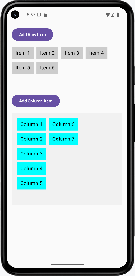
Tips for Success
- Always add the
@OptIn(ExperimentalLayoutApi::class)annotation when using these components - Use
horizontalArrangementandverticalArrangementto control spacing between items - Consider using
Modifier.padding()to add space around your flow layouts - Test your layout with different screen sizes to ensure proper wrapping
Common Mistakes to Avoid
- Forgetting to add the
@OptInannotation - Not considering the minimum width/height of items when they wrap
- Using flow layouts when a simple
RoworColumnwould suffice - Not testing the layout with different content sizes
Best Practices
- Use flow layouts for dynamic content that might change size
- Add appropriate spacing between items using arrangement parameters
- Consider accessibility when items wrap to new lines/columns
- Test your layout with various screen sizes and orientations
Chapter 6: State Management
Understanding State in Compose
Think of state in Compose like a memory box that remembers things for you. Just like how you might remember your score in a game or what level you're on, state helps your app remember information that can change over time. We'll learn how to use state to make your apps interactive and responsive to user actions.
Quick Reference
| Command/Topic | Description | Common Use |
|---|---|---|
| remember | Ensures a value, like a state object, survives across UI updates (recompositions) for a specific Composable. Without it, the value would be re-initialized every time the UI redraws. | Storing data that needs to persist during a Composable's active display |
| mutableStateOf | Creates an observable state holder. When its value changes, Compose automatically triggers a recomposition of any UI elements that are reading this state, making your app interactive. | Making UI elements interactive and triggering automatic UI updates |
| by | A Kotlin property delegate used with remember { mutableStateOf(...) }. It lets you read and write the state value directly (e.g. count, count++) instead of using .value every time (e.g. count.value, count.value = 5). |
Simplifying state variable declarations for cleaner code |
When to Use State
- When you need to remember user input
- To track what's selected or not selected
- When saving scores or progress
- To remember user preferences
- When UI elements need to change based on user actions
Practical Examples
Basic Counter
This example shows how to create a simple counter that increases when clicked. Think of it like a scoreboard that updates automatically.
@Composable
fun Counter() {
    // This creates a state variable that starts at 0
    var count by remember { mutableStateOf(0) }

    Column {
        // Display the current count
        Text("Count: $count")

        // A button that increases the count when clicked
        Button(onClick = { count++ }) {
            Text("Add One")
        }
    }
}
What This Example Is Doing
Counter creates count with remember { mutableStateOf(0) } so the value survives recomposition and triggers UI updates when it changes. The column shows "Count: 0" (or the current count) and an "Add One" button. Clicking the button runs count++; Compose recomposes and the Text shows the new number. So one state variable drives both the display and the update.
Common State Patterns
Here are some common ways to use state in your apps:
Text Input
@Composable
fun TextInputExample() {
    var text by remember { mutableStateOf("") }

    TextField(
        value = text,
        onValueChange = { text = it } /*it refers to the parameter passed to the lambda function. In this case, it represents the new value of the text input field when the user types or changes the text.*/
    )
}
What This Example Is Doing
TextInputExample keeps text in state (initially empty). The TextField’s value is text and onValueChange = { text = it } updates that state when the user types. So it is the new string from the field; assigning it to text updates state and recomposition shows the new value in the field. The UI and state stay in sync.
Checkboxes
@Composable
fun CheckboxExample() {
    var isChecked by remember { mutableStateOf(false) }

    Row {
        Checkbox(
            checked = isChecked,
            onCheckedChange = { isChecked = it } //it refers to either true or false
        )
        Text("Check me!")
    }
}
What This Example Is Doing
CheckboxExample keeps isChecked in state (initially false). The Checkbox’s checked is bound to isChecked and onCheckedChange = { isChecked = it } updates it when the user taps the checkbox. So it is the new boolean (true or false). The row shows the checkbox and "Check me!"; the checkbox stays checked or unchecked because state is remembered across recompositions.
Lists
@Composable
fun ListExample() {
    var items by remember { mutableStateOf(listOf("Item 1", "Item 2")) }

    Column {
        for (item in items) {
            Text(item) //will create two Text composables, one for each item in the list
        }
    }
}
What This Example Is Doing
ListExample keeps items in state—a list of strings ("Item 1", "Item 2"). The column loops over items and creates a Text for each. So you see two lines. If you later did items = items + "Item 3" (or similar) in response to a button or input, the state would change and the column would recompose to show three items. State can hold any type, including lists.
Interactive Counter App
This example demonstrates a more complete counter with both increase and decrease buttons, showing how state can be modified in different ways.
@Composable
fun CounterApp() {
    // Remember the current count
    var count by remember { mutableStateOf(0) }

    Column(
        modifier = Modifier.padding(16.dp),
        horizontalAlignment = Alignment.CenterHorizontally
    ) {
        // Show the current count
        Text(
            text = "Count: $count",
            style = TextStyle(fontSize = 24.sp)
        )

        // Add some space between elements
        Spacer(modifier = Modifier.height(16.dp))

        // Row of buttons to control the count
        Row {
            // Button to decrease count
            Button(onClick = { count-- }) {
                Text("-")
            }

            // Add space between buttons
            Spacer(modifier = Modifier.width(8.dp))

            // Button to increase count
            Button(onClick = { count++ }) {
                Text("+")
            }
        }
    }
}
What This Example Is Doing
CounterApp keeps count in state and shows it with large text. A row has two buttons: "−" runs count-- and "+" runs count++. So the user can increase or decrease the count; the displayed number updates each time because Compose recomposes when count changes. The remembered state is the count value.
How these examples render
The image below shows the counter app (e.g. after tapping the + button a few times—the count is the remembered state). The snippets above are only part of the code; to see and run the full project, go to my GitHub page and open the chapter6 state.kt file.
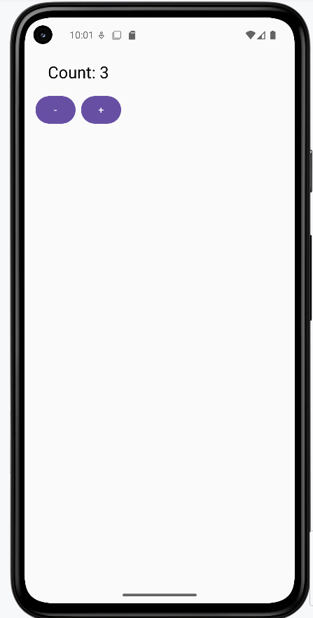
Learning Aids
Tips for Success
- Always use
rememberfor values that need to persist during a Composable's active display and recompositions - Use meaningful names for your state variables
- Keep state changes simple and predictable
- Test your state changes thoroughly
Common Mistakes to Avoid
- Forgetting to use
rememberfor state variables, leading to state resetting on recomposition - Creating state variables outside of composable functions (they won't trigger recompositions or be remembered by Compose)
- Modifying state directly instead of using the proper update methods (e.g., `count.value = 5` instead of `count = 5` with `by`)
- Creating too many state variables when one would suffice
Best Practices
- Keep state as local as possible
- Use state only when necessary
- Make state changes predictable and traceable
- Consider the impact of state changes on performance
To try these examples, go to my GitHub page and look at the chapter6 state.kt file.
Stateless and Stateful Composables
Think of composables like building blocks for your app. Some blocks are simple and don't need to remember anything (stateless), while others need to keep track of information (stateful). We'll learn about both types and when to use them to build better, more organized apps!
Quick Reference
| Type | Description | Common Use |
|---|---|---|
| Stateless | Simple display components that don't remember anything | Displaying static content, reusable UI elements |
| Stateful | Smart components that remember and manage changing data | Interactive elements, forms, dynamic content |
When to Use Each Type
- Use Stateless Composables when:
- You just need to display information
- The component doesn't need to change on its own
- You want to make the component reusable
- You're creating simple UI elements
- Use Stateful Composables when:
- You need to remember information that changes
- The component needs to respond to user actions
- You need to manage complex interactions
- You're handling form inputs or user data
Common Options
| Option | What It Does | When to Use It |
|---|---|---|
| Parameters | Pass data to composables | When creating stateless components |
| remember | Store state in composables | When creating stateful components |
| mutableStateOf | Create changeable state | When state needs to update UI |
Practical Examples
Stateless Composable Example
This example shows a simple greeting card that just displays information. The GreetingCard Composable function creates a greeting card that dynamically shows the input name and a static welcome message. Each time this Composable is recomposed with a new name, it will display the updated name without any memory of the previous name.
@Composable
fun GreetingCard(name: String) {
    Column(
        modifier = Modifier.padding(16.dp),
        horizontalAlignment = Alignment.CenterHorizontally
    ) {
        Text(
            text = "Hello, $name!",
            style = TextStyle(fontSize = 24.sp)
        )
        Text(
            text = "Welcome to my app!",
            style = TextStyle(fontSize = 16.sp)
        )
    }
}
What This Example Is Doing
GreetingCard takes a name parameter and displays "Hello, name!" and "Welcome to my app!" in a centered column. It does not use remember or any state—it only shows what it is given. If the parent passes a different name, the composable recomposes and shows the new name. It has no memory of previous names; it is stateless.
Stateful Composable Example
This example demonstrates a counter that remembers and updates its value. Think of it like a scoreboard that needs to keep track of points!
@Composable
fun Counter() {
    // This is state - it remembers the count
    var count by remember { mutableStateOf(0) }

    Column(
        modifier = Modifier.padding(16.dp),
        horizontalAlignment = Alignment.CenterHorizontally
    ) {
        Text(
            text = "Count: $count",
            style = TextStyle(fontSize = 24.sp)
        )
        Button(onClick = { count++ }) {  //If count did not have by remember it would not know what the past number was
            Text("Add One")
        }
    }
}
What This Example Is Doing
Counter keeps count in state with remember { mutableStateOf(0) }. It shows the count and an "Add One" button; clicking the button runs count++. Without remember, count would be re-initialized on every recomposition and would never increase. Because it is stateful, the composable remembers the count across recompositions and the UI updates when the value changes.
Combining Both Types
This example shows how stateless and stateful composables can work together in a profile card app.
@Composable
fun ProfileInfo(name: String, age: String) {
    Column(
        modifier = Modifier.padding(16.dp),
        horizontalAlignment = Alignment.CenterHorizontally
    ) {
        Text(
            text = "Name: $name",
            style = TextStyle(fontSize = 24.sp)
        )
        Spacer(modifier = Modifier.height(8.dp))
        Text(
            text = "Age: $age",
            style = TextStyle(fontSize = 20.sp)
        )
    }
}

@Composable
fun EditableProfile() {
    var isEditing by remember { mutableStateOf(false) }
    var name by remember { mutableStateOf("John") }
    var age by remember { mutableStateOf("20") }

    Column(
        modifier = Modifier
            .fillMaxWidth()
            .padding(16.dp),
        horizontalAlignment = Alignment.CenterHorizontally
    ) {
        ProfileInfo(name = name, age = age)

        Spacer(modifier = Modifier.height(16.dp))

        Button(onClick = { isEditing = !isEditing }) {
            Text(if (isEditing) "Save" else "Edit")
        }

        if (isEditing) {
            Spacer(modifier = Modifier.height(16.dp))

            OutlinedTextField(
                value = name,
                onValueChange = { name = it },
                label = { Text("Name") },
                modifier = Modifier.fillMaxWidth()
            )

            Spacer(modifier = Modifier.height(8.dp))

            OutlinedTextField(
                value = age,
                onValueChange = { age = it },
                label = { Text("Age") },
                modifier = Modifier.fillMaxWidth()
            )
        }
    }
}
What This Example Is Doing
ProfileInfo is stateless: it takes name and age (as strings) and displays them in a column. It does not hold or change any state. EditableProfile is stateful: it keeps isEditing, name, and age in state. It shows ProfileInfo(name, age) at the top. The button toggles isEditing; when true, the label shows "Save" and the two text fields appear, bound directly to name and age. Typing in the fields updates state immediately, so the displayed profile and the form always show the same values. When the user clicks the button again, edit mode turns off and the fields hide. So the stateless ProfileInfo only displays what the stateful parent passes; the parent owns all state and the edit/view toggle.
Code Breakdown
Stateless Component (ProfileInfo)
The ProfileInfo composable is stateless because:
- It's like a simple display component that just shows what it's given
- It doesn't remember anything on its own
- It doesn't handle any user interactions
- It's completely controlled by its parent (it just displays the name and age it receives)
- Think of it like a picture frame - it just shows what you put in it
Stateful Component (EditableProfile)
The EditableProfile composable is stateful because:
- It manages its own memory (the state variables)
- It makes decisions based on its state (showing/hiding edit fields)
- It handles user interactions (button clicks, text input)
- It coordinates between different parts of the UI
- Think of it like a smart form - it remembers what you type and can change its appearance
The key point is that ProfileInfo is completely controlled by EditableProfile - it can't change anything on its own. However, EditableProfile is in control of its own behavior and can change based on user interactions. This example shows how you can build complex UIs by combining simple, stateless components (that just display things) with smart, stateful components (that handle user interactions and remember things).
How these examples render
The first image shows the stateless GreetingCard or the stateful Counter / EditableProfile in view mode (profile displayed, "Edit" button). The second image shows EditableProfile in edit mode: text fields for name and age and a "Save" button. The snippets above are only part of the code; to see and run the full project, go to my GitHub page and open the chapter6 stateful.kt file.
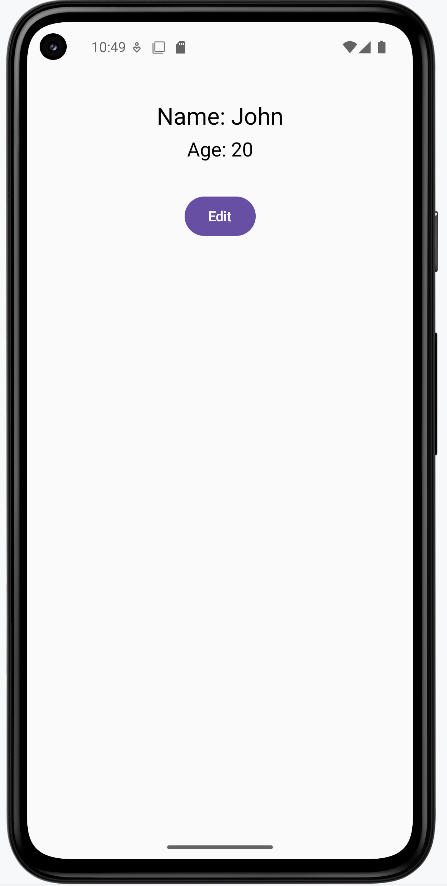
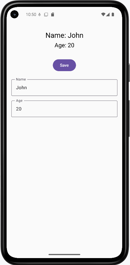
Learning Aids
Tips for Success
- Start with stateless composables when possible
- Keep state management at the top level
- Break complex composables into smaller, focused pieces
- Use meaningful names for your composables
Common Mistakes to Avoid
- Adding state when it's not needed
- Putting state in the wrong place
- Making composables too complex
- Forgetting to handle state updates properly
Best Practices
- Keep it Simple: Try to make most of your composables stateless
- State at the Top: Put stateful logic in the top-level composables
- Single Responsibility: Each composable should do one thing well
- Reusability: Design composables to be reusable when possible
Launched Effect
Have you ever wanted your app to do something automatically when it starts up? Maybe load some data from the internet, or start a timer? That's where LaunchedEffect comes in! It's like telling your app "Hey, when this screen appears, do this thing for me!" We'll learn how to use LaunchedEffect to make your apps more dynamic and responsive.
Quick Reference
| Command/Topic | Description | Common Use |
|---|---|---|
| LaunchedEffect(Unit) | Runs code once when composable appears | Initial setup, one-time tasks |
| LaunchedEffect(key) | Runs code when key value changes | Responding to data changes |
| delay() | Pauses execution for a time | Creating timers, loading delays |
When to Use LaunchedEffect
- When you need to load data when a screen appears
- To start timers or animations automatically
- When subscribing to data updates
- For any task that needs to happen automatically
- When you need to perform side effects in your composable
Common Options
| Option | What It Does | When to Use It |
|---|---|---|
| Unit key (uses the unit keyword) | Runs effect once when composable appears | For one-time setup tasks |
| Variable key (uses the variable name) | Runs effect when variable changes | For reactive tasks |
| delay() | Pauses execution | For timing-based tasks |
Practical Examples
Basic Welcome Screen
This example shows how to run code when a screen first appears. In the example below, the WelcomeScreen Composable function combines the functionality of printing a message to the console (println) for internal logging or debugging purposes and displaying a welcome message to the user (Text) on the screen. The LaunchedEffect is used for side effects, while the Text Composable is used for rendering UI elements.
@Composable
fun WelcomeScreen() {
    // This will run when the screen first appears
    LaunchedEffect(Unit) {
        // This code runs automatically when the screen starts
        println("Welcome to my app!")
    }

    Text("Welcome to my app!")
}
What This Example Is Doing
WelcomeScreen runs two things when the screen appears: (1) LaunchedEffect(Unit) runs once and prints "Welcome to my app!" to the log (for debugging). (2) The Text composable shows "Welcome to my app!" on the screen. The Unit key means the effect runs only when the composable first enters the composition—it does not run again on recomposition. So you get one-time setup (the println) plus the visible UI.
Reactive Counter with Effect
This example shows how to use LaunchedEffect to respond to changes in your app. Think of it like a smart counter that logs every change.
@Composable
fun CounterWithEffect() {
    var count by remember { mutableStateOf(0) }

    // This effect runs whenever count changes
    LaunchedEffect(count) {
        println("Count changed to: $count")
    }

    Column {
        Text("Count: $count")
        Button(onClick = { count++ }) {
            Text("Add One")
        }
    }
}
What This Example Is Doing
CounterWithEffect keeps count in state and shows a column with the count and an "Add One" button. LaunchedEffect(count) uses count as the key: every time count changes (e.g. when you tap the button), the effect runs again and prints "Count changed to: …" to the log. So the effect reacts to state changes instead of running only once.
Common Use Cases
Here are some practical ways to use LaunchedEffect in your apps:
Loading User Data
@Composable
fun UserProfile(userId: String) {
    var userData by remember { mutableStateOf("") }

    LaunchedEffect(userId) {
        // Load user data when the screen starts
        userData = loadUserData(userId)
    }

    Text(userData)
}
What This Example Is Doing
UserProfile takes a userId and keeps userData in state. LaunchedEffect(userId) runs when the composable first appears and whenever userId changes. Inside the effect, it calls loadUserData(userId) (e.g. a network or database call), sets the result into userData, and the Text shows it. So when the user navigates to a different profile, the key changes and the effect loads that user's data.
Creating a Timer
@Composable
fun TimerWithButton() {
    var time by remember { mutableStateOf(0) }
    var isTimerRunning by remember { mutableStateOf(false) }

    /* Launched effect will run whenever isTimerRunning value is changed so when it is true
    the while loop will engage and keeps running incrementing time.  When false LaunchedEffect will
    stop thus stopping the while loop*/
    LaunchedEffect(isTimerRunning) {
        while (isTimerRunning) {
            delay(1000) // Wait 1 second
            time++
        }
    }

    Column(
        horizontalAlignment = Alignment.CenterHorizontally,
        verticalArrangement = Arrangement.Center
    ) {
        Text("Time: $time seconds")
        Button(
            onClick = { isTimerRunning = !isTimerRunning }
        ) {
            Text(if (isTimerRunning) "Stop Timer" else "Start Timer")
        }
    }
}
What This Example Is Doing
TimerWithButton keeps time (seconds) and isTimerRunning in state. The button toggles isTimerRunning and its label switches between "Start Timer" and "Stop Timer." LaunchedEffect(isTimerRunning) runs when that value changes. When isTimerRunning is true, the effect enters a while loop that waits 1 second (delay(1000)), increments time, and repeats. When you tap "Stop Timer," isTimerRunning becomes false, the effect is cancelled, and the loop stops—so the timer only runs while the effect is active.
Subscribing to Updates
@Composable
fun WeatherWidget() {
    var temperature by remember { mutableStateOf(0) }

    LaunchedEffect(Unit) {
        // Subscribe to weather updates
        weatherUpdates.collect { update ->
            temperature = update.temperature
        }
    }

    Text("Temperature: $temperature°C")
}
What This Example Is Doing
WeatherWidget keeps temperature in state. LaunchedEffect(Unit) runs once when the composable appears and subscribes to weatherUpdates (e.g. a flow or channel). Each time an update is received, it sets temperature = update.temperature, which triggers recomposition so the Text shows the new value. So the widget stays updated as new data arrives.
Loading Screen with Effect
This example demonstrates how to use LaunchedEffect to create a loading screen that automatically transitions to show data. Think of it like a loading screen in a game that shows while content is being prepared.
@Composable
fun LoadingScreen() {
    // State to remember if we're loading
    var isLoading by remember { mutableStateOf(true) }
    // State to remember our loaded data
    var message by remember { mutableStateOf("") }

    // This LaunchedEffect runs when the screen starts
    LaunchedEffect(Unit) {
        // Simulate loading some data
        delay(2000) // Wait for 2 seconds
        message = "Data loaded successfully!"
        isLoading = false
    }

    Column(
        modifier = Modifier.fillMaxSize(),
        horizontalAlignment = Alignment.CenterHorizontally,
        verticalArrangement = Arrangement.Center
    ) {
        if (isLoading) {
            CircularProgressIndicator()
            Text("Loading...")
        } else {
            Text(message)
        }
    }
}
What This Example Is Doing
LoadingScreen keeps isLoading (initially true) and message (initially empty) in state. LaunchedEffect(Unit) runs once when the screen appears: it waits 2 seconds with delay(2000), sets message = "Data loaded successfully!", and sets isLoading = false. While loading, the UI shows a CircularProgressIndicator and "Loading..."; after the delay, it shows the message. So you get a simple simulated loading flow that switches to content automatically.
How these examples render
The images below show what the LaunchedEffect examples look like when you run them (e.g. the welcome screen, the counter with effect logging, or the loading screen before and after the delay). The snippets above are only part of the code; to see and run the full project, go to my GitHub page and open the chapter6 launchedEffect.kt file.
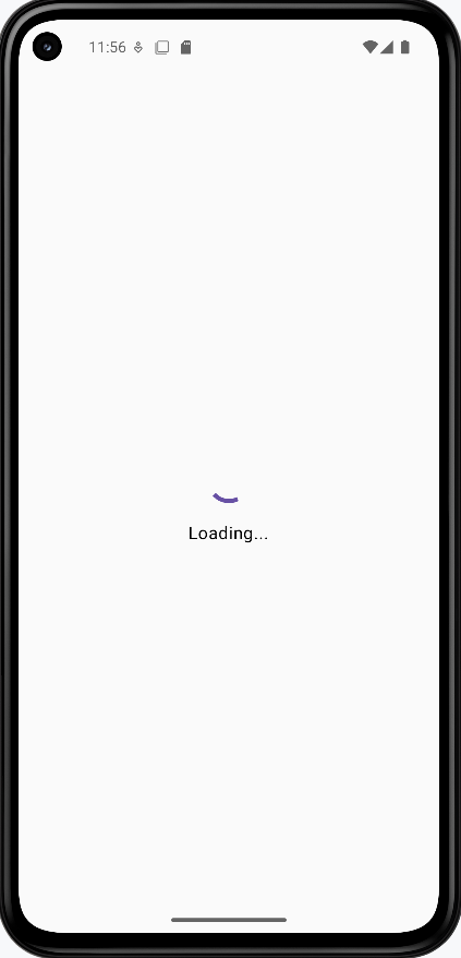
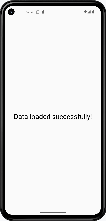
Learning Aids
Tips for Success
- Choose your key wisely - it determines when the effect runs
- Keep effects simple and focused on one task
- Remember to clean up resources when needed
- Use meaningful names for your effects
Common Mistakes to Avoid
- Using the wrong key for your effect
- Creating infinite loops without proper cleanup
- Putting too much logic in a single effect
- Forgetting to handle errors in effects
Best Practices
- Keep effects simple and focused
- Clean up resources when the composable disappears
- Use appropriate keys for your use case
- Handle errors gracefully in your effects
Recomposition
Introduction
Have you ever wondered how your app updates when you click a button or change some text? That's where recomposition comes in! Think of recomposition like updating a picture - when something changes, Compose redraws just the parts that need to change, making your app fast and efficient. We'll learn how Compose smartly updates only what needs to change in your UI.
Quick Reference
| Concept | Description | Common Use |
|---|---|---|
| Recomposition | Smart UI updates that only change what's needed | Updating UI when data changes |
| remember | Keeps state between recompositions | Storing data that needs to persist |
| rememberSaveable | Keeps state after screen rotation | Preserving data during configuration changes |
When Recomposition Occurs
Recomposition happens automatically in these situations:
- When a state variable created with
mutableStateOfchanges value - When a composable's parameters change
- When a parent composable recomposes
You don't need to manually trigger recomposition - Compose handles this automatically when you use state variables. For example:
@Composable
fun Counter() {
    // When this state changes, Compose automatically recomposes
    // any composables that read this value
    var count by remember { mutableStateOf(0) }

    Column {
        // This Text will automatically recompose when count changes
        Text("Count: $count")
        Button(onClick = { count++ }) {
            Text("Add One")
        }
    }
}
In this example, when you click the button and count changes, Compose automatically recomposes the Text that displays the count. You don't need to do anything special to make this happen - it's built into how Compose works!
Common Options
| Option | What It Does | When to Use It |
|---|---|---|
| remember | Preserves state during recomposition | For normal state management |
| rememberSaveable | Preserves state after screen rotation | When state needs to survive configuration changes |
| mutableStateOf | Creates observable state | When you need values that can change |
Practical Examples
Basic Counter Example
This example shows how recomposition works with a simple counter. Think of it like a scoreboard that only updates the number, not the whole display.
@Composable
fun Counter() {
    // This state will trigger recomposition when it changes
    var count by remember { mutableStateOf(0) }

    Column {
        Text("Count: $count")
        Button(onClick = { count++ }) {
            Text("Add One")
        }
    }
}
What This Example Is Doing
Counter keeps count in state with remember { mutableStateOf(0) }. The column shows "Count: $count" and an "Add One" button. When you click the button, count++ runs, the state changes, and Compose recomposes only the composables that read count—so the Text updates to the new number. The button and the rest of the tree can be reused without being re-created. You don't call any "refresh" method; recomposition is automatic when state changes.
Common Recomposition Patterns
Here are some practical ways to use recomposition in your apps:
Updating Text
@Composable
fun TextUpdater() {
    var text by remember { mutableStateOf("Hello") }

    Column {
        Text(text)  // Recomposes when text changes
        TextField(
            value = text,
            onValueChange = { text = it }
        )
    }
}
What This Example Is Doing
TextUpdater keeps text in state (starting as "Hello"). The TextField shows that value and calls onValueChange = { text = it } when the user types, so text updates. Because the first Text reads text, it recomposes and shows the new string. So the displayed text and the text field stay in sync through state and recomposition.
Showing/Hiding Content
@Composable
fun ShowHideExample() {
    var isVisible by remember { mutableStateOf(true) }

    Column {
        if (isVisible) {
            Text("This text appears/disappears")
        }
        Button(onClick = { isVisible = !isVisible }) {
            Text(if (isVisible) "Hide" else "Show")
        }
    }
}
What This Example Is Doing
ShowHideExample keeps isVisible in state (initially true). When true, the column shows the text "This text appears/disappears" and a "Hide" button; when false, that text is not in the composition and the button says "Show." Clicking the button toggles isVisible, so Compose recomposes and either adds or removes the Text. So the UI structure itself changes based on state.
Changing Colors
@Composable
fun ColorChanger() {
    var isRed by remember { mutableStateOf(false) }

    Box(
        modifier = Modifier
            .size(100.dp)
            .background(if (isRed) Color.Red else Color.Blue)
            .clickable { isRed = !isRed }
    )
}
What This Example Is Doing
ColorChanger keeps isRed in state (initially false). A 100 dp box’s background is red when isRed is true and blue when false; the box is clickable and toggles isRed. So each tap triggers recomposition, and the box’s background modifier is re-evaluated and redraws with the new color.
Handling Screen Rotation
This example shows how to handle state during screen rotation. Think of it like preserving your work when you turn your paper sideways.
@Composable
fun RotationExample() {
    // This will reset when screen rotates
    var count by remember { mutableStateOf(0) }

    // This will keep its value even after rotation
    var savedCount by rememberSaveable { mutableStateOf(0) }

    Column {
        Text("Regular count: $count")  // Resets on rotation
        Text("Saved count: $savedCount")  // Keeps value after rotation

        Button(onClick = {
            count++
            savedCount++
        }) {
            Text("Add One")
        }
    }
}
What This Example Is Doing
RotationExample shows two counters: one with remember { mutableStateOf(0) } and one with rememberSaveable { mutableStateOf(0) }. Both start at 0; one button increments both. When you rotate the device, the activity is re-created. The "Regular count" resets to 0 because remember only survives recomposition, not process/activity recreation. The "Saved count" keeps its value because rememberSaveable saves and restores state across configuration changes (like rotation). So you see the difference between in-memory state and state that survives rotation.
Smart Counter with Conditional Updates
This example shows how Compose can be smart about what it updates. Think of it like a smart display that only changes what needs to change.
@Composable
    fun SmartCounter() {
        var count by remember { mutableStateOf(0) }

        // This Text will recompose when count changes
        Text("Count: $count")

        // This Text will never recompose because it's static
        Text("This text never changes!")

        // This Text will only recompose when count is even
        Text("Count is ${if (count % 2 == 0) "even" else "odd"}")

        Button(onClick = { count++ }) {
            Text("Add One")
        }
    }
What This Example Is Doing
SmartCounter has one count state and three text lines. The first Text("Count: $count") reads count, so it recomposes every time count changes. The second Text("This text never changes!") does not read any state, so Compose can skip recomposing it. The third Text reads count (in the "even"/"odd" expression), so it recomposes when count changes. So only the parts that depend on count are recomposed; the static text is left alone.
Profile Card with Smart Updates
This example demonstrates how different parts of the UI can update independently. Think of it like a smart form where only the changed fields update.
@Composable
            fun ProfileCard() {
                // State variables with remember/rememberSaveable to maintain state across recompositions
                var name by rememberSaveable { mutableStateOf("John") }
                var age by remember { mutableStateOf(20) }
                var favoriteColor by remember { mutableStateOf("Blue") }

                // Predefined lists for cycling through different values
                val names = listOf("John", "Jane", "Alex", "Sam")
                val colors = listOf(
                    Pair(Color(0xFF2196F3), "Blue"),      // Material Blue
                    Pair(Color(0xFF4CAF50), "Green"),     // Material Green
                    Pair(Color(0xFFF44336), "Red"),       // Material Red
                    Pair(Color(0xFF9C27B0), "Purple")     // Material Purple
                )

                // Indices for cycling through the predefined lists
                var nameIndex by remember { mutableStateOf(0) }
                var colorIndex by remember { mutableStateOf(0) }

                // Main layout container
                Column(
                    modifier = Modifier
                        .fillMaxSize()
                        .padding(16.dp),
                    horizontalAlignment = Alignment.CenterHorizontally,
                    verticalArrangement = Arrangement.spacedBy(16.dp)
                ) {
                    // Card title
                    Text(
                        text = "Profile Card",
                        style = MaterialTheme.typography.headlineMedium,
                        modifier = Modifier.padding(bottom = 8.dp)
                    )

                    // Profile information card with dynamic background color
                    Card(
                        modifier = Modifier
                            .fillMaxWidth()
                            .weight(1f),
                        colors = CardDefaults.cardColors(
                            containerColor = colors[colorIndex].first
                        )
                    ) {
                        // Profile information container
                        Column(
                            modifier = Modifier
                                .padding(16.dp)
                                .fillMaxWidth(),
                            horizontalAlignment = Alignment.CenterHorizontally,
                            verticalArrangement = Arrangement.spacedBy(16.dp)
                        ) {
                            // Profile information text fields
                            Text(
                                text = "Name: $name",
                                style = MaterialTheme.typography.bodyLarge,
                                color = Color.White
                            )

                            Text(
                                text = "Age: $age",
                                style = MaterialTheme.typography.bodyLarge,
                                color = Color.White
                            )

                            Text(
                                text = "Favorite Color: ${colors[colorIndex].second}",
                                style = MaterialTheme.typography.bodyLarge,
                                color = Color.White
                            )
                        }
                    }
                    ...more code is here...
                }
            }
What This Example Is Doing
ProfileCard shows a card with name, age, and favorite color. The name uses rememberSaveable so it survives screen rotation; the background color (and color index) use remember so they reset when the configuration changes. Buttons let you cycle through predefined names and colors. So when you rotate the device, the name stays (e.g. "Alex") but the card color goes back to the default (e.g. blue), illustrating the difference between the two state holders.
How these examples render
The snippets above are only part of the code; to see and run the full project, go to my GitHub page and open the chapter6 recomposition.kt file.
The first image shows the app after the name button has been clicked so "Alex" appears and the background color was set to green. The second image shows the app after the device is rotated. The name is still "Alex" because it uses rememberSaveable, but the background color is blue again (the initial color) because the color index uses remember, which does not survive configuration changes. So rememberSaveable preserves state across rotation; remember does not.
NOTE: The rotated screen shows a partial view of the card.
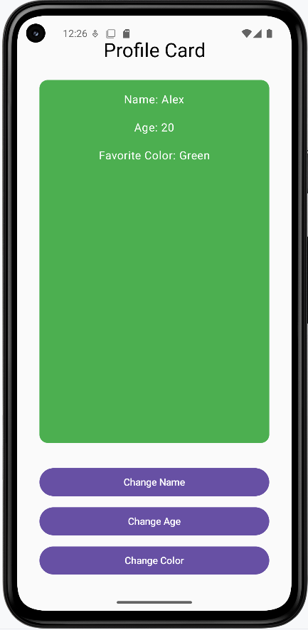
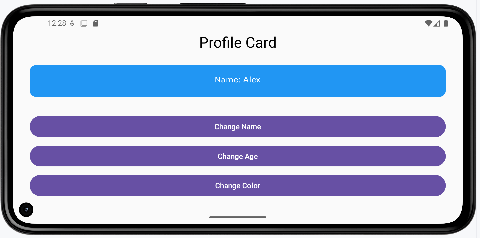
Learning Aids
Tips for Success
- Only update what needs to change
- Keep state close to where it's used
- Use remember for normal state management
- Use rememberSaveable when state needs to survive rotation
Common Mistakes to Avoid
- Putting state in the wrong place
- Forgetting to use remember
- Updating more than necessary
- Not handling screen rotation properly
Best Practices
- Keep recompositions minimal
- Use appropriate state management
- Handle configuration changes properly
- Test your UI with different scenarios
Chapter 7: User Input
Text Fields
Introduction
Text fields are the building blocks of user input in Android apps. Just like a form you fill out on paper, text fields give users a place to type their information. Whether you're creating a login screen, a search bar, or a contact form, text fields are essential for getting information from your users.
Quick Reference
| Component | Description | Best For |
|---|---|---|
| TextField | Basic text input with a simple design | Simple forms, search bars |
| OutlinedTextField | Text input with a visible border | Forms, login screens |
When to Use Text Fields
- When you need to collect user information
- For search functionality in your app
- When creating forms or surveys
- For user authentication (login/signup)
- When you need to get text input from users
Common Options (TextField and OutlinedTextField)
Both TextField and OutlinedTextField use the same options. Here are the main ones:
| Option | What It Does | When to Use It |
|---|---|---|
| value | Stores the current text | Always required to track input |
| onValueChange | Handles text changes | When you need to respond to user typing |
| label | Shows field description | To tell users what to enter |
| placeholder | Shows example text | To provide input guidance |
| isError | Shows error state (e.g. red border) | When the input is invalid; use with supportingText to show the message |
| supportingText | Shows extra text below the field (e.g. hint or error message) | To explain an error or give a short hint; often used with isError |
| minLines | Minimum number of visible lines | To make a field taller (e.g. for a message box); use 2 or more for multi-line |
| maxLines | Maximum number of visible lines | To cap how tall the field can grow; use 1 for single-line, or a number to limit scrolling |
Basic Text Field
Here's how to create a simple text field:
@Composable
fun SimpleTextField() {
    // This state will store what the user types
    var text by remember { mutableStateOf("") }

    TextField(
        value = text,
        onValueChange = { text = it },
        label = { Text("Enter your name") }
    )
}
What This Example Is Doing
SimpleTextField keeps text in state with remember { mutableStateOf("") }. The TextField shows that value and calls onValueChange = { text = it } when the user types, so the state and the field stay in sync. The label "Enter your name" appears above or inside the field. So you get a basic single-line text input with state.
Outlined Text Field
For a more visually distinct input field. The options are the same as for TextField—see Common Options (TextField and OutlinedTextField) above.
@Composable
fun OutlinedTextFieldExample() {
    var text by remember { mutableStateOf("") }

    OutlinedTextField(
        value = text,
        onValueChange = { text = it },
        label = { Text("Your message") }
    )
}
What This Example Is Doing
OutlinedTextFieldExample is the same idea as the simple text field but uses OutlinedTextField instead of TextField. The outlined version has a visible border around the input area, which is common in Material-style forms. State is still text; value and onValueChange bind the field to that state.
Practical Examples
Contact Form Example
Here's a real-world example of a contact form using multiple text fields:
@Composable
fun ContactForm() {
    // State for each field
    var name by remember { mutableStateOf("") }
    var email by remember { mutableStateOf("") }
    var message by remember { mutableStateOf("") }

    Column(
        modifier = Modifier
            .fillMaxWidth()
            .padding(16.dp),
        verticalArrangement = Arrangement.spacedBy(8.dp)
    ) {
        OutlinedTextField(
            value = name,
            onValueChange = { name = it },
            label = { Text("Name") },
            modifier = Modifier.fillMaxWidth()
        )

        OutlinedTextField(
            value = email,
            onValueChange = { email = it },
            label = { Text("Email") },
            placeholder = { Text("Enter your email") },
            modifier = Modifier.fillMaxWidth()
        )

        OutlinedTextField(
            value = message,
            onValueChange = { message = it },
            label = { Text("Message") },
            modifier = Modifier.fillMaxWidth(),
            minLines = 3
        )

        Button(
            onClick = { /* Handle form submission */ },
            modifier = Modifier.fillMaxWidth()
        ) {
            Text("Send Message")
        }
    }
}
What This Example Is Doing
ContactForm keeps three state variables: name, email, and message. A column holds three full-width OutlinedTextFields (Name, Email, Message) and a "Send Message" button. Each field is bound to its state with value and onValueChange. The email field has a placeholder "Enter your email"; the message field has minLines = 3 so it can grow for longer text. The button’s onClick would typically send the form data. So you get a simple multi-field form with separate state per field.
OutlinedTextField Explained
Text Fields with Error States and Validation
Text fields can show error states to provide immediate feedback to users. Here's how to implement error handling:
@Composable
fun TextFieldWithError() {
    var text by remember { mutableStateOf("") }
    var isValid by remember { mutableStateOf(true) }

    Column(
        modifier = Modifier
            .fillMaxWidth()
            .padding(16.dp),
        verticalArrangement = Arrangement.spacedBy(16.dp)
    ) {
        OutlinedTextField(
            value = text,
            onValueChange = {
                text = it
                // Validate that the field is not empty
                isValid = it.isNotEmpty()
            },
            label = { Text("Required Field") },
            // Show error state when field is invalid and user has typed something
            isError = !isValid && text.isNotEmpty(),
            // Display error message below the field
            supportingText = {
                if (!isValid && text.isNotEmpty()) {
                    Text(
                        text = "This field is required",
                        color = Color.Red
                    )
                }
            },
            modifier = Modifier.fillMaxWidth()
        )

        // Show validation status
        Text(
            text = "Field Valid: $isValid",
            color = if (isValid) Color.Green else Color.Red
        )
    }
}
Code Explanation:
State Variables:
var text by remember { mutableStateOf("") }: This line declares a mutable state variable namedtext, initialized as an empty string. This variable holds the current value of the text entered into theOutlinedTextField. Therememberfunction helps retain this state across recompositions, andmutableStateOfmakes it observable by the UI.var isValid by remember { mutableStateOf(true) }: This declares another mutable state variable namedisValid, initialized totrue. This boolean flag tracks the validation status of the text field. It will befalseif the field is empty andtrueotherwise.
OutlinedTextField Parameters:
value = text: Binds the content of the text field to thetextstate variable.onValueChange = { ... }: This lambda is invoked whenever the user types into the text field.text = it: Updates thetextstate variable with the new input (it).isValid = it.isNotEmpty(): Updates theisValidstate. If the new inputitis not empty,isValidbecomestrue; otherwise, it becomesfalse. This is the core validation logic for this example.
label = { Text("Required Field") }: Provides a floating label for the text field.isError = !isValid && text.isNotEmpty(): This is a crucial parameter for displaying the error state.!isValid: Checks if the `isValid` flag is `false` (meaning the field is empty).text.isNotEmpty(): Ensures that the error is only shown if the user has actually typed something and then deleted it, or if they tried to submit an empty field. This prevents the error from showing immediately when the field is initially displayed empty.- The error state (e.g., a red border) is activated only when both conditions are met.
supportingText = { ... }: This composable block is used to display additional text, typically error messages, below the input field.if (!isValid && text.isNotEmpty()) { ... }: The error message "This field is required" is only shown if the same conditions that trigger the `isError` state are met.color = Color.Red: Sets the color of the supporting text to red to visually indicate an error.
modifier = Modifier.fillMaxWidth(): Makes the text field take up the full width available.
Advanced Error Handling Example
var name by remember { mutableStateOf("") }
var email by remember { mutableStateOf("") }
var message by remember { mutableStateOf("") }
var nameHasInteracted by remember { mutableStateOf(false) } // New state for name field interaction
var isNameValid by remember { mutableStateOf(true) } // New state for name field validity


//...more code here...

OutlinedTextField( // Changed to OutlinedTextField
    value = name,
    onValueChange = {
        name = it
        nameHasInteracted = true // Mark as interacted
        isNameValid = it.length >= 3 // Validation logic
    },
    label = { Text("Name") },
    modifier = Modifier.fillMaxWidth(),
    placeholder = { Text("Enter your full name") },
    isError = nameHasInteracted && !isNameValid, // Error state based on interaction and validity
    supportingText = {
        if (nameHasInteracted && !isNameValid) {
            Text(
                text = "Name must be at least 3 characters",
                color = MaterialTheme.colorScheme.error
            )
        }
    }
)

// Email input field with validation
OutlinedTextField(
    value = email,
    onValueChange = { email = it },
    label = { Text("Email") },
    modifier = Modifier.fillMaxWidth(),
    placeholder = { Text("Enter your email address") },
    isError = email.isNotEmpty() && !email.contains("@"),  // Basic email validation
    supportingText = {
        if (email.isNotEmpty() && !email.contains("@")) {
            Text(
                text = "Email must contain an @ symbol",
                color = MaterialTheme.colorScheme.error
            )
        }
    }
)
Code Explanation
State Variables:
var username by remember { mutableStateOf("") }: Holds the current text input for the "Name" field.var email by remember { mutableStateOf("") }: Holds the current text input for the "Email" field.var message by remember { mutableStateOf("") }: Holds the current text input for the "Message" field (though the `OutlinedTextField` for message is not shown in this snippet, the state is declared).var nameHasInteracted by remember { mutableStateOf(false) }: A boolean flag, initialized to `false`, that becomes `true` once the user starts typing in the "Name" field. This is used to prevent validation errors from showing prematurely on an untouched field.var isNameValid by remember { mutableStateOf(true) }: A boolean flag, initialized to `true`, that indicates the validity of the "Name" field based on its validation rules.
"Username"
value = username: Binds the field's content to the `username` state variable.onValueChange = { ... }: This lambda updates the state when the user types:username = it: Updates the `username` variable with the new input.usernameHasInteracted = true: Sets this flag to `true` to indicate user interaction.isNameValid = it.length >= 3: The validation rule for the username field. `isNameValid` is `true` if the input has 3 or more characters, `false` otherwise.
label = { Text("Username") }: Provides a floating label.placeholder = { Text("Enter your full name") }: Displays hint text when the field is empty and not focused.isError = usernameHasInteracted && !isUsernameValid: The error state (e.g., red border) is active if the user has `usernameHasInteracted` AND the `isUsernameValid` flag is `false`.supportingText = { ... }: Displays an error message below the field:if (usernameHasInteracted && !isUsernameValid) { Text(text = "Username must be at least 3 characters", color = MaterialTheme.colorScheme.error) }: Shows the "Username must be at least 3 characters" message in red only when the error conditions (interacted and invalid) are met.
"Email"
value = email: Binds the field's content to the `email` state variable.onValueChange = { email = it }: Updates the `email` variable with the new input.label = { Text("Email") }: Provides a floating label.placeholder = { Text("Enter your email address") }: Displays hint text.isError = email.isNotEmpty() && !email.contains("@"): The error state for the email field is active if the `email` is not empty AND it does not contain the "@" symbol.supportingText = { ... }: Displays an error message below the field:if (email.isNotEmpty() && !email.contains("@")) { Text(text = "Email must contain an @ symbol", color = MaterialTheme.colorScheme.error) }: Shows the "Email must contain an @ symbol" message in red when the error conditions (not empty and missing "@") are met.
How these examples render
The image below shows what the text field examples look like when you run them (e.g. the simple text field, outlined text field, contact form, or validated field with error state). The snippets above are only part of the code; to see and run the full project, go to my GitHub page and open the chapter7 textfield.kt file.
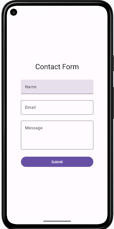
Tips for Success
- Always use state to track text field values
- Make labels clear and descriptive
- Use placeholders to guide user input
- Consider using OutlinedTextField for better visibility
- Test your text fields with different input types
Common Mistakes to Avoid
- Forgetting to handle state changes
- Using unclear or missing labels
- Not providing enough space for input
- Missing error handling for invalid input
- Not considering keyboard types for different inputs
Best Practices
- Use appropriate keyboard types for different inputs (email, number, etc.)
- Validate input as users type
- Provide clear error messages
- Use consistent styling across your app
- Consider accessibility needs
Managing Input State
Introduction
Think of input state management like having a conversation with your app - it needs to listen, understand, and respond to what users type in real-time. In this chapter, we'll explore how to handle text input in Compose, from simple text fields to complex forms with validation. We'll learn how to create responsive, user-friendly interfaces that give immediate feedback to users as they type.
Quick Reference: Input State Patterns
| Pattern | Description | When to Use |
|---|---|---|
| Basic Text Input | Simple text field with state management | Single input fields, search boxes |
| Form Validation | Real-time input validation with feedback | Login forms, registration forms |
| Debounced Input | Delayed processing of input changes | Search fields, auto-save features |
| State Hoisting | Managing state at parent level | Complex forms, shared input state |
Basic Input State Management
Basic input state management is the foundation of handling user input in Compose. Think of it like having a notepad that automatically updates whenever someone writes something new. It's a way to store, track, and update what users type in your app's text fields. The state persists across UI updates, ensuring that user input isn't lost when the screen refreshes or changes.
When to Use Basic Input State
- When you need to capture user text input
- For simple forms with one or two fields
- When real-time validation isn't required
- For search functionality
Common Input State Features
| Feature | What It Does | When to Use It |
|---|---|---|
| mutableStateOf | Creates state that can be updated | Any time you need to store user input |
| OutlinedTextField | Material Design text input field | Most text input scenarios |
| VisualTransformation | Changes how text appears | Password fields, formatted input |
Real-World Example: A Login Screen
Let's look at a complete example that shows these special input state features:
NOTE: In order for the icon on the password field to work, you need to add the following to your libs.versions.toml file:
[libraries]
compose-material-icons-extended = { module = "androidx.compose.material:material-icons-extended" }
You also need to add the following to your build.gradle file:
implementation(libs.compose.material.icons.extended)
@Composable
fun LoginScreen() {
    // State for username and password
    var username by remember { mutableStateOf("") }
    var password by remember { mutableStateOf("") }
    // State to remember if we're showing the password
    var showPassword by remember { mutableStateOf(false) }
    // State for validation
    var isUsernameValid by remember { mutableStateOf(true) }
    var isPasswordValid by remember { mutableStateOf(true) }

    Column(
        modifier = Modifier
            .fillMaxWidth()
            .padding(16.dp),
        verticalArrangement = Arrangement.spacedBy(8.dp)
    ) {
        // Username field with validation
        OutlinedTextField(
            value = username,
            onValueChange = {
                username = it
                isUsernameValid = it.length >= 3
            },
            label = { Text("Username") },
            modifier = Modifier.fillMaxWidth(),
            isError = !isUsernameValid && username.isNotEmpty(),
            supportingText = {
                if (!isUsernameValid && username.isNotEmpty()) {
                    Text("Username must be at least 3 characters")
                }
            }
        )

        // Password field with show/hide and validation
        OutlinedTextField(
            value = password,
            onValueChange = {
                password = it
                isPasswordValid = it.length >= 6
            },
            label = { Text("Password") },
            modifier = Modifier.fillMaxWidth(),
            visualTransformation = if (showPassword) VisualTransformation.None else PasswordVisualTransformation(),
            isError = !isPasswordValid && password.isNotEmpty(),
            supportingText = {
                if (!isPasswordValid && password.isNotEmpty()) {
                    Text("Password must be at least 6 characters")
                }
            },
            trailingIcon = {
                IconButton(onClick = { showPassword = !showPassword }) {
                    Icon(
                        if (showPassword) Icons.Default.VisibilityOff else Icons.Default.Visibility,
                        contentDescription = if (showPassword) "Hide password" else "Show password"
                    )
                }
            }
        )

        // Login button (disabled if inputs are invalid)
        Button(
            onClick = { /* Handle login */ },
            modifier = Modifier.fillMaxWidth(),
            enabled = isUsernameValid && isPasswordValid && username.isNotEmpty() && password.isNotEmpty()
        ) {
            Text("Login")
        }
    }
}
Code Explanation:
State Variables:
var username by remember { mutableStateOf("") }: A mutable state variable holding the text entered into the username field, initialized as an empty string.var password by remember { mutableStateOf("") }: A mutable state variable holding the text entered into the password field, initialized as an empty string.var showPassword by remember { mutableStateOf(false) }: A boolean mutable state variable that controls the visibility of the password text. When true, the password is shown as plain text; when false, it's obscured (e.g., with asterisks).var isUsernameValid by remember { mutableStateOf(true) }: A boolean mutable state variable indicating the validation status of the username. It's true if the username meets the criteria, false otherwise.var isPasswordValid by remember { mutableStateOf(true) }: A boolean mutable state variable indicating the validation status of the password. It's true if the password meets the criteria, false otherwise.
Layout (Column):
The main content of the login screen is arranged vertically using a Column:
- modifier = Modifier.fillMaxWidth().padding(16.dp): The column fills the width of its parent and has 16dp of padding on all sides.
- verticalArrangement = Arrangement.spacedBy(8.dp): Provides 8dp of vertical space between its child composables.
Username OutlinedTextField:
This input field handles the username entry and its validation:
value = username: Binds the field's text to the username state.onValueChange = { username = it; isUsernameValid = it.length >= 3 }: Updates username with new input (it) and sets isUsernameValid to true if the username length is 3 or more characters, false otherwise.label = { Text("Username") }: The floating label for the field.isError = !isUsernameValid && username.isNotEmpty(): The error state is active if the username is invalid AND not empty (prevents error on initial empty field).
isErroris a parameter of the OutlinedTextField composable. When you set isError = true, it signals to the OutlinedTextField that there's an error with the input. The OutlinedTextField then automatically applies the Material Design error styling, which includes changing the border color (and usually the label and supporting text color) to the designated error color (often red).supportingText = { ... }: Displays an error message:- if (!isUsernameValid && username.isNotEmpty()) { Text("Username must be at least 3 characters") }: Shows this message when the username is invalid and not empty.
Password OutlinedTextField:
This input field handles password entry, its validation, and the show/hide functionality:
value = password: Binds the field's text to the password state.onValueChange = { password = it; isPasswordValid = it.length >= 6 }: Updates password with new input (it) and sets isPasswordValid to true if the password length is 6 or more characters, false otherwise.label = { Text("Password") }: The floating label for the field.visualTransformation = if (showPassword) VisualTransformation.None else PasswordVisualTransformation(): This is key for the show/hide functionality. If showPassword is true, the text is displayed normally (VisualTransformation.None); otherwise, it's obscured using PasswordVisualTransformation().isError = !isPasswordValid && password.isNotEmpty(): The error state is active if the password is invalid AND not empty.supportingText = { ... }: Displays an error message:- if (!isPasswordValid && password.isNotEmpty()) { Text("Password must be at least 6 characters") }: Shows this message when the password is invalid and not empty.
trailingIcon = { ... }:trailingIconis a parameter ofOutlinedTextField(andTextField) that lets you put any composable at the end of the field—often an icon button. You choose what to put there; it's just a slot. Here we use it for a show/hide password button.- IconButton(onClick = { showPassword = !showPassword }): A clickable icon that toggles the showPassword state when pressed.
- Icon(...): The actual icon comes from the Material Icons library that ships with Compose. Names like
Icons.Default.VisibilityandIcons.Default.VisibilityOffare the standard “eye” and “eye with slash” icons. You find them in the Material Icons catalog online, in your IDE's autocomplete when you typeIcons., or by searching for “visibility” in the docs—developers use these names to pick the right icon.
Login Button:
The button to initiate the login process:
- onClick = { /* Handle login */ }: Placeholder for the actual login logic.
- modifier = Modifier.fillMaxWidth(): Makes the button fill the width.
- enabled = isUsernameValid && isPasswordValid && username.isNotEmpty() && password.isNotEmpty(): The button is only enabled when ALL of these conditions are met:
- isUsernameValid is true
- isPasswordValid is true
- username is not empty
- password is not empty
- Text("Login"): The text displayed on the button.
How these examples render
The images below show the login screen at different stages. The snippets above are only part of the code; to see and run the full project, go to my GitHub page and open the chapter7 inputstate.kt file.
- First image: Screen when first loaded (empty fields, Login disabled).
- Second image: Username is valid but password is too short; password shows an error message and Login stays disabled.
- Third image: Both username and password are valid, the show-password icon has been clicked so the password is visible, and the Login button is enabled.
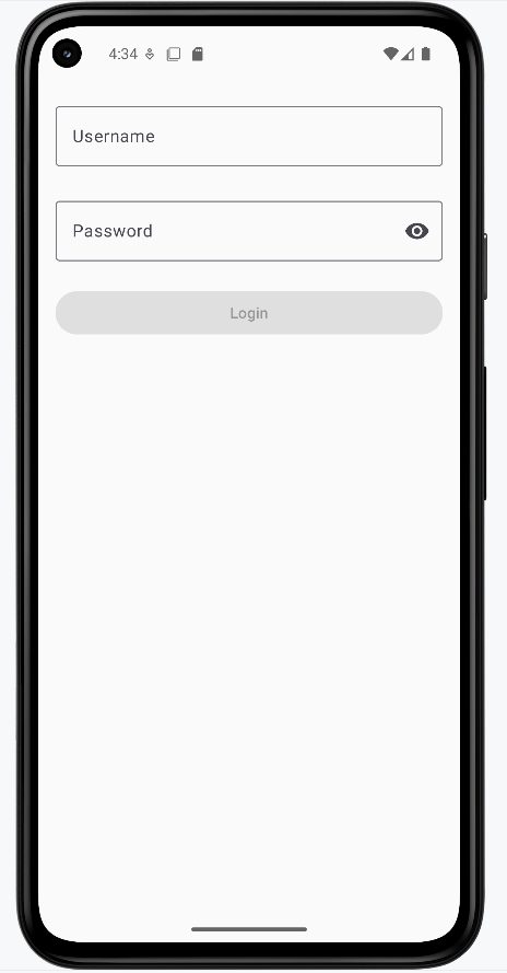
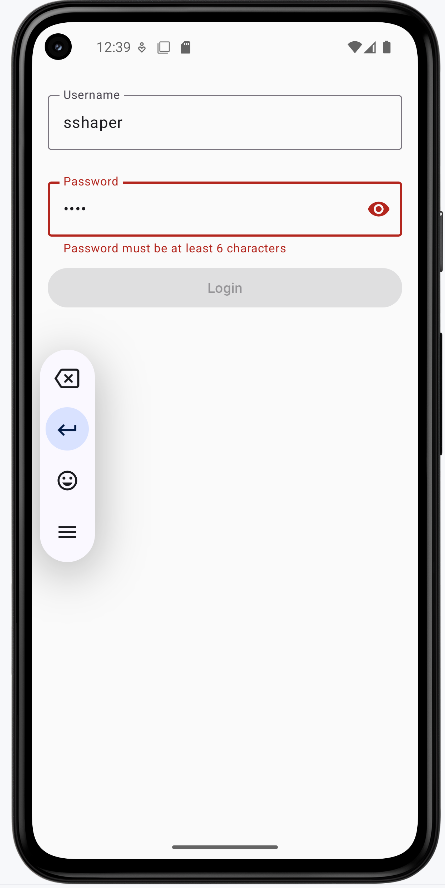
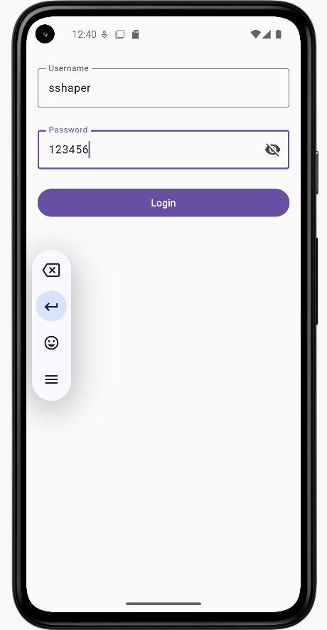
State Hoisting in Input Management
State hoisting is a pattern in Compose where you move state management up to a parent component, making it the single source of truth for that state. Think of it like a family tree: instead of each child component managing its own state, the parent component holds the state and passes it down to its children. This is particularly useful for input management when you need to share state between multiple components or when child components need to communicate with each other.
When to Use State Hoisting
- When multiple components need to share input state
- For complex forms with interdependent fields
- When you need to validate across multiple inputs
- To make input components more reusable
Here's a simple example of state hoisting with an input field:
@Composable
fun ParentScreen() {
    // State is hoisted to the parent
    var text by remember { mutableStateOf("") }

    Column {
        // Pass state and update function to child
        CustomTextField(
            value = text,
            onValueChange = { text = it },
            label = "Enter text"
        )

        // Another component using the same state
        Text("You typed: $text")
    }
}

@Composable
fun CustomTextField(
    value: String,
    onValueChange: (String) -> Unit,
    label: String
) {
    OutlinedTextField(
        value = value,
        onValueChange = onValueChange,
        label = { Text(label) }
    )
}
What This Example Is Doing
ParentScreen holds the only state: text. It passes value = text and onValueChange = { text = it } to CustomTextField, so the child never owns state—it just displays and reports changes. The parent also shows "You typed: $text" below the field, so the same state drives both the field and the label. CustomTextField is stateless and reusable: it only needs a value and a callback.
Let's break down how this hoisting example works:
State Management:
- The text state is defined in the parent composable
- The state update function is passed down to the child
- The child composable is stateless and just displays the value
Benefits of Hoisting:
- Multiple components can share the same input state
- Input components become more reusable
- State management is centralized in one place
- Testing becomes easier as components are more predictable
Here's a more practical example showing hoisting with validation:
@Composable
fun FormScreen() {
    // State Hoisting: All state is managed at the parent level
    // This allows child components to share and react to state changes
    var name by remember { mutableStateOf("") }
    var email by remember { mutableStateOf("") }
    // This state depends on both name and email, showing why hoisting is useful
    var isFormValid by remember { mutableStateOf(false) }

    Column {
        // State Hoisting: Passing state and update functions to child components
        // The child components don't manage their own state, they just display and update it
        NameInput(
            value = name,
            onValueChange = {
                name = it
                // Validation happens at the parent level, affecting multiple components
                isFormValid = name.isNotEmpty() && email.isNotEmpty()
            }
        )

        EmailInput(
            value = email,
            onValueChange = {
                email = it
                // Same validation logic is shared between components
                isFormValid = name.isNotEmpty() && email.isNotEmpty()
            }
        )

        // The button's state depends on the hoisted validation state
        // This wouldn't be possible if each input managed its own state
        Button(
            onClick = { /* Handle submit */ },
            enabled = isFormValid
        ) {
            Text("Submit")
        }
    }
}

@Composable
fun NameInput(
    value: String,
    onValueChange: (String) -> Unit
) {
    OutlinedTextField(
        value = value,
        onValueChange = onValueChange,
        label = { Text("Name") }
    )
}

@Composable
fun EmailInput(
    value: String,
    onValueChange: (String) -> Unit
) {
    OutlinedTextField(
        value = value,
        onValueChange = onValueChange,
        label = { Text("Email") }
    )
}
Code Explanation:
This Kotlin Composable function, FormScreen, along with its child components NameInput and EmailInput, demonstrates a fundamental concept in Jetpack Compose called **State Hoisting**. State hoisting involves moving the state management (e.g., mutableStateOf variables) from a child composable to its parent, making the child composable "stateless."
FormScreen Composable: (Parent Component - State Holder)
This composable is responsible for holding and managing the state for the form:
var name by remember { mutableStateOf("") }: Holds the current text for the name input.var email by remember { mutableStateOf("") }: Holds the current text for the email input.var isFormValid by remember { mutableStateOf(false) }: A boolean flag indicating if the entire form is valid. This state depends on bothnameandemailbeing non-empty.
Inside the Column layout:
- NameInput and EmailInput Calls:
value = name(oremail): The current value of the input field is passed down from the parent's state.onValueChange = { ... }: A lambda function is passed down, which is responsible for updating the parent's state. When the child component calls thisonValueChangewith new input, the parent updates itsnameoremailstate.- **Validation Logic**: The line
isFormValid = name.isNotEmpty() && email.isNotEmpty()is executed in bothonValueChangecallbacks. This demonstrates that the validation logic for the entire form is managed at the parent level, ensuring thatisFormValidaccurately reflects the validity of both input fields.
- Button Composable:
enabled = isFormValid: The "Submit" button's enabled state directly depends on theisFormValidstate hoisted in FormScreen. This means the button will only become clickable when both the name and email fields are non-empty, showcasing the power of shared state.
NameInput Composable: (Child Component - Stateless)
This composable is a reusable input field that doesn't manage its own state:
value: String: It receives its current text value from the parent.onValueChange: (String) -> Unit: It receives a callback function from the parent to notify the parent about changes in its text. It simply calls this function when its ownOutlinedTextField'sonValueChangeis triggered.OutlinedTextField(...): The actual UI element for the text input.
EmailInput Composable: (Child Component - Stateless)
Similar to NameInput, this is another stateless child component for the email input, showcasing the reusability and simplified logic that state hoisting enables.
How these examples render
The images below show the state-hoisting form. The snippets above are only part of the code; to see and run the full project, go to my GitHub page and open the chapter7 hoisting.kt file.
- First image: Form when first loaded (empty fields, Submit disabled).
- Second image: Name and email are filled in, so the Submit button is enabled.
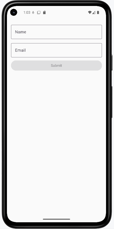
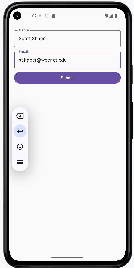
Tips for Success
- Always validate input in real-time for better user experience
- Provide clear, helpful error messages
- Use appropriate input types for different data (email, password, etc.)
- Consider accessibility when designing input fields
- Test your forms with different input scenarios
Common Mistakes to Avoid
- Not providing immediate feedback on invalid input
- Forgetting to handle edge cases in validation
- Not considering keyboard types for different inputs
- Over-complicating simple input scenarios
- Ignoring performance with frequent state updates
Best Practices
- Use state hoisting for complex forms
- Implement debouncing for search and auto-save features
- Keep validation logic separate from UI components
- Use appropriate Material Design components
- Consider form submission handling
Regular Expressions
Introduction
Regular expressions, or "regex" for short, are like a special language for finding and matching patterns in text. Think of them as a super-powered search tool that can help you validate user input in your apps. Let's learn how to use regex to make your input validation even better!
Understanding Regex Basics
When to Use Regex
- Validating email addresses
- Checking phone number formats
- Enforcing password requirements
- Validating dates and times
- Checking ZIP codes and other formatted input
Quick Reference: Common Regex Components
| Component | What It Does | When to Use It |
|---|---|---|
| Position Markers | ^ (start) and $ (end) | When you need to match the entire string |
| Character Classes | \d (digits), \w (word chars) | When matching specific types of characters |
| Quantifiers | *, +, ?, {n} | When you need to match multiple occurrences |
| Character Sets | [a-z], [0-9], [^abc] | When matching specific ranges of characters |
Regex Components Reference
Position Markers
| Symbol | What It Does | Example |
|---|---|---|
^ |
Start of string | ^Hello matches "Hello" at start |
$ |
End of string | world$ matches "world" at end |
\b |
Word boundary | \bcat\b matches "cat" as whole word |
\B |
Non-word boundary | \Bcat\B matches "cat" inside words |
Character Classes
| Symbol | What It Matches | Example |
|---|---|---|
. |
Any single character (except newline) | c.t matches "cat", "cut", "c@t" |
\d |
Any digit (0-9) | \d{3} matches "123", "456" |
\D |
Any non-digit | \D+ matches "abc", "!@#" |
\w |
Word character (letter, number, underscore) | \w+ matches "hello123" |
\W |
Non-word character | \W+ matches "!@#$%" |
\s |
Whitespace (space, tab, newline) | \s+ matches " " or "\t\n" |
\S |
Non-whitespace | \S+ matches "hello" |
Quantifiers
| Symbol | What It Does | Example |
|---|---|---|
* |
Zero or more | a* matches "", "a", "aa" |
+ |
One or more | a+ matches "a", "aa" |
? |
Zero or one | a? matches "", "a" |
{n} |
Exactly n times | a{3} matches "aaa" |
{n,} |
n or more times | a{2,} matches "aa", "aaa" |
{n,m} |
Between n and m times | a{2,4} matches "aa", "aaa", "aaaa" |
Character Sets
| Pattern | What It Matches | Example |
|---|---|---|
[abc] |
Any single character from set | [abc] matches "a", "b", "c" |
[^abc] |
Any character not in set | [^abc] matches "d", "1", "@" |
[a-z] |
Any lowercase letter | [a-z]+ matches "hello" |
[A-Z] |
Any uppercase letter | [A-Z]+ matches "HELLO" |
[0-9] |
Any digit | [0-9]+ matches "123" |
[a-zA-Z] |
Any letter | [a-zA-Z]+ matches "Hello" |
Special Characters
| Symbol | What It Matches | Example |
|---|---|---|
\. |
Literal dot | \. matches "." |
\+ |
Literal plus | \+ matches "+" |
\* |
Literal asterisk | \* matches "*" |
\? |
Literal question mark | \? matches "?" |
\( |
Literal opening parenthesis | \( matches "(" |
\) |
Literal closing parenthesis | \) matches ")" |
Email Pattern
The email pattern ^[A-Za-z0-9+_.-]+@(.+)$ breaks down as follows:
^- Start of the text[A-Za-z0-9+_.-]- Any letter (both cases), number, or special characters +, _, ., or -+- One or more of the previous characters@- The @ symbol(.+)- One or more of any character (the domain part)$- End of the text
Phone Number Pattern
The phone pattern ^\\d{3}-\\d{3}-\\d{4}$ breaks down as follows:
^- Start of the text\\d{3}- Exactly three digits-- A hyphen\\d{3}- Exactly three more digits-- Another hyphen\\d{4}- Exactly four digits$- End of the text
Phone Number Patterns with Different Separators
You can create more flexible phone number patterns that accept different separators:
- Hyphen or Forward Slash:
^\\d{3}[-/]\\d{3}[-/]\\d{4}$- Accepts:
123-456-7890or123/456/7890 - Uses character class
[-/]to match either separator
- Accepts:
- Optional Separators:
^\\d{3}[-/]?\\d{3}[-/]?\\d{4}$- Accepts:
123-456-7890,123/456/7890, or1234567890 - Uses
?to make separators optional
- Accepts:
- Multiple Separator Options:
^\\d{3}[-/\\s]\\d{3}[-/\\s]\\d{4}$- Accepts:
123-456-7890,123/456/7890, or123 456 7890 - Uses
[-/\\s]to match hyphen, forward slash, or space
- Accepts:
Note: The \\s matches any whitespace character (space, tab, newline).
Password Pattern
The password pattern ^(?=.*[0-9])(?=.*[a-z])(?=.*[A-Z]).{8,}$ breaks down as follows:
^- Start of the text(?=.*[0-9])- Must contain at least one number (positive lookahead)(?=.*[a-z])- Must contain at least one lowercase letter (positive lookahead)(?=.*[A-Z])- Must contain at least one uppercase letter (positive lookahead).{8,}- Must be at least 8 characters long$- End of the text
ZIP Code Pattern
The ZIP code pattern ^\d{5}(-\d{4})?$ breaks down as follows:
^- Start of the text\d{5}- Exactly five digits(-\d{4})?- Optional four digits$- End of the text
Time Pattern
The time pattern ^\d{2}:\d{2}$ breaks down as follows:
^- Start of the text\d{2}- Exactly two digits:- The colon\d{2}- Exactly two digits$- End of the text
Practical Examples
Email Validation in Compose
@Composable
fun EmailInput() {
    var email by remember { mutableStateOf("") }
    var isEmailValid by remember { mutableStateOf(true) }

    // Create the regex pattern
    val emailRegex = "^[A-Za-z0-9+_.-]+@(.+)$".toRegex()

    OutlinedTextField(
        value = email,
        onValueChange = {
            email = it
            // Check if the email matches our pattern
            isEmailValid = it.isEmpty() || it.matches(emailRegex)
        },
        label = { Text("Email") },
        isError = !isEmailValid && email.isNotEmpty(),
        supportingText = {
            if (!isEmailValid && email.isNotEmpty()) {
                Text("Please enter a valid email address")
            }
        }
    )
}
What This Example Is Doing
EmailInput keeps email and isEmailValid in state. It builds a regex from the pattern ^[A-Za-z0-9+_.-]+@(.+)$ (local part with letters, numbers, +_.-, then @, then domain). In onValueChange it updates email and sets isEmailValid = it.isEmpty() || it.matches(emailRegex), so an empty field is not shown as invalid. When the text is non-empty and doesn’t match the pattern, isError is true and the supporting text shows "Please enter a valid email address." So the user gets live email-format validation.
Phone Number Validation in Compose
@Composable
fun PhoneInput() {
    var phone by remember { mutableStateOf("") }
    var isPhoneValid by remember { mutableStateOf(true) }

    // Create regex pattern for phone numbers with hyphens or forward slashes
    val phoneRegex = "^\\d{3}[-/]\\d{3}[-/]\\d{4}$".toRegex()

    OutlinedTextField(
        value = phone,
        onValueChange = {
            phone = it
            // Check if the phone matches our pattern
            isPhoneValid = it.isEmpty() || it.matches(phoneRegex)
        },
        label = { Text("Phone Number") },
        isError = !isPhoneValid && phone.isNotEmpty(),
        supportingText = {
            if (!isPhoneValid && phone.isNotEmpty()) {
                Text("Please enter a valid phone number (123-456-7890 or 123/456/7890)")
            }
        },
        placeholder = { Text("123-456-7890") }
    )
}
What This Example Is Doing
PhoneInput keeps phone and isPhoneValid in state. The regex ^\\d{3}[-/]\\d{3}[-/]\\d{4}$ expects three digits, a hyphen or slash, three digits, a hyphen or slash, and four digits (e.g. 123-456-7890 or 123/456/7890). On each change, isPhoneValid is set to true when the field is empty or matches the pattern. Invalid non-empty input shows an error and the message "Please enter a valid phone number (123-456-7890 or 123/456/7890)." The placeholder hints at the expected format.
ZIP Code Validation in Compose
@Composable
fun ZipCodeInput() {
    var zipCode by remember { mutableStateOf("") }
    var isZipValid by remember { mutableStateOf(true) }

    // Create regex pattern for 5-digit ZIP codes
    val zipRegex = "^\\d{5}$".toRegex()

    OutlinedTextField(
        value = zipCode,
        onValueChange = {
            zipCode = it
            // Check if the ZIP code matches our pattern
            isZipValid = it.isEmpty() || it.matches(zipRegex)
        },
        label = { Text("ZIP Code") },
        isError = !isZipValid && zipCode.isNotEmpty(),
        supportingText = {
            if (!isZipValid && zipCode.isNotEmpty()) {
                Text("Please enter a valid 5-digit ZIP code")
            }
        },
        placeholder = { Text("12345") }
    )
}
What This Example Is Doing
ZipCodeInput keeps zipCode and isZipValid in state. The regex ^\\d{5}$ matches exactly five digits. When the user types, isZipValid is true only if the field is empty or matches that pattern. Non-empty invalid input (wrong length or non-digits) shows the error state and "Please enter a valid 5-digit ZIP code." The placeholder "12345" shows the expected format.
Tips for Success
- Start with simple patterns and add complexity gradually
- Test your patterns with various input cases
- Use online regex testers to verify your patterns
- Break complex patterns into smaller, understandable parts
- Document your patterns with clear comments
Common Mistakes to Avoid
- Forgetting to escape special characters
- Not considering edge cases in your patterns
- Making patterns too complex to maintain
- Not testing with invalid input
- Ignoring performance with complex patterns
Best Practices
- Keep patterns as simple as possible
- Use meaningful variable names for your patterns
- Add comments explaining complex patterns
- Consider using predefined patterns for common cases
- Test patterns with both valid and invalid input
Validation
Introduction
When users enter information into your app, you want to make sure they're providing the right kind of data. This is called input validation, and it's like having a helpful assistant that checks if the information is correct before letting users proceed. Let's learn how to add these helpful checks to your Compose apps!
Quick Reference: Common Validation Types
| Validation Type | What It Checks | When to Use It |
|---|---|---|
| Required Fields | If a field is empty | Essential information like name, email |
| Format Validation | Correct pattern (email, phone) | Structured data like emails, dates |
| Length Validation | Minimum/maximum length | Passwords, usernames, messages |
| Matching Validation | If two fields match | Password confirmation, email confirmation |
Basic Validation Concepts
When to Use Validation
- When collecting user information
- For form submissions
- When data needs to follow a specific format
- For security-sensitive information
- When data needs to be consistent
Common Validation Features
| Feature | What It Does | When to Use It |
|---|---|---|
| isError | Shows red border for invalid input | When input doesn't meet requirements |
| supportingText | Displays error messages | To explain what's wrong |
| regex patterns | Validates complex formats | For email, phone, password validation |
Basic Validation Example
Let's start with a simple example that shows how to validate a required field, we have seen this type of example before so this is just a review.
@Composable
fun NameInput() {
    // State to store the name and validation status
    var name by remember { mutableStateOf("") }
    var isNameValid by remember { mutableStateOf(true) }

    Column {
        OutlinedTextField(
            value = name,
            onValueChange = {
                name = it
                // Check if the name is not empty
                isNameValid = it.isNotEmpty()
            },
            label = { Text("Name") },
            // Show red border if name is empty
            isError = !isNameValid && name.isNotEmpty(),
            // Show error message below the field
            supportingText = {
                if (!isNameValid && name.isNotEmpty()) {
                    Text("Please enter your name")
                }
            }
        )
    }
}
What This Example Is Doing
NameInput keeps name and isNameValid in state. On each change it sets isNameValid = it.isNotEmpty(), so the field is valid when it has at least one character. The error state and message are shown only when the field is invalid and non-empty (!isNameValid && name.isNotEmpty()), so an empty field at startup doesn’t show an error. When the user types and then clears the field, the red border and "Please enter your name" appear.
Advanced Validation Patterns
Email Validation
Email addresses have a specific format they need to follow. Let's create a more complex validation that checks for a proper email format using regex:
@Composable
fun EmailInput() {
    var email by remember { mutableStateOf("") }
    var isEmailValid by remember { mutableStateOf(true) }
    var errorMessage by remember { mutableStateOf("") }

    // Create regex pattern for email validation
    val emailRegex = "^[A-Za-z0-9+_.-]+@(.+)$".toRegex()

    Column {
        OutlinedTextField(
            value = email,
            onValueChange = {
                email = it
                // Use regex to check email format
                isEmailValid = it.isEmpty() || it.matches(emailRegex)
                // Set error message only when we'll show it (not empty and invalid format)
                errorMessage = if (it.isNotEmpty() && !it.matches(emailRegex)) "Please enter a valid email address" else ""
            },
            label = { Text("Email") },
            isError = !isEmailValid && email.isNotEmpty(),
            supportingText = {
                if (!isEmailValid && email.isNotEmpty()) {
                    Text(errorMessage)
                }
            }
        )
    }
}
What This Example Is Doing
EmailInput keeps three things in state: email (what the user typed), isEmailValid (whether that text looks like a valid email), and errorMessage (the exact message to show under the field when something is wrong). Keeping errorMessage in state lets us pick the right message as the user types and then show it in supportingText.
Every time the user types, onValueChange runs. It (1) updates email with the new text, (2) sets isEmailValid to true if the field is empty or if the text matches the email regex, and (3) sets errorMessage to "Please enter a valid email address" only when the field is not empty and doesn't match the regex—otherwise "". That way we only store a message when we will actually show it. isError and supportingText are only used when !isEmailValid && email.isNotEmpty(), so the field does not show an error when it is empty—the screen does not load with a red field, and if the user clears the field the error goes away. The user only sees the red state and "Please enter a valid email address" when they have typed something that is invalid (e.g. missing @).
This example uses a regex to decide what counts as a valid email. The pattern ^[A-Za-z0-9+_.-]+@(.+)$ checks for:
- Letters (uppercase or lowercase), numbers, and characters like +, _, ., and - before the @
- An @ symbol
- Something after the @ (the domain part)
Note: This is a very simple email check. In real apps you might use a stricter or more complex pattern to validate email addresses.
Password Validation
Passwords often need to meet specific security requirements. Here's an example that checks for password strength using regex:
@Composable
fun PasswordInput() {
    var password by remember { mutableStateOf("") }
    var isPasswordValid by remember { mutableStateOf(true) }
    var errorMessage by remember { mutableStateOf("") }

    // Create regex pattern for password validation
    val passwordRegex = "^(?=.*[0-9])(?=.*[a-z])(?=.*[A-Z]).{8,}$".toRegex()

    Column {
        OutlinedTextField(
            value = password,
            onValueChange = {
                password = it
                // Use regex to check password requirements
                isPasswordValid = it.isEmpty() || it.matches(passwordRegex)
                // Set error message only when we'll show it (not empty and invalid)
                errorMessage = if (it.isNotEmpty() && !it.matches(passwordRegex)) "Password must be at least 8 characters with uppercase, lowercase, and numbers" else ""
            },
            label = { Text("Password") },
            visualTransformation = PasswordVisualTransformation(),
            isError = !isPasswordValid && password.isNotEmpty(),
            supportingText = {
                if (!isPasswordValid && password.isNotEmpty()) {
                    Text(errorMessage)
                }
            }
        )
    }
}
What This Example Is Doing
PasswordInput keeps password, isPasswordValid, and errorMessage in state. The regex requires at least one digit, one lowercase letter, one uppercase letter, and length 8 or more. visualTransformation = PasswordVisualTransformation() masks the input. We set errorMessage only when the field is not empty and doesn't match the regex—otherwise ""—so we only store a message when we will show it. isError and supportingText are used only when !isPasswordValid && password.isNotEmpty(), so the field does not show an error when it is empty (the screen does not load with a red field, and clearing the field clears the error). The user only sees the red state and "Password must be at least 8 characters with uppercase, lowercase, and numbers" when they have typed something that fails the requirements.
This password validation uses regex to check for:
- Minimum length of 8 characters
- At least one uppercase letter
- At least one lowercase letter
- At least one number
Registration Form Example
Let's put it all together in a registration form that validates multiple fields using regex:
@Composable
fun RegistrationForm() {
    var name by remember { mutableStateOf("") }
    var email by remember { mutableStateOf("") }
    var password by remember { mutableStateOf("") }
    var confirmPassword by remember { mutableStateOf("") }

    var isNameValid by remember { mutableStateOf(true) }
    var isEmailValid by remember { mutableStateOf(true) }
    var isPasswordValid by remember { mutableStateOf(true) }
    var isConfirmPasswordValid by remember { mutableStateOf(true) }

    // Create regex patterns
    val emailRegex = "^[A-Za-z0-9+_.-]+@(.+)$".toRegex()
    val passwordRegex = "^(?=.*[0-9])(?=.*[a-z])(?=.*[A-Z]).{8,}$".toRegex()
    val nameRegex = "^[A-Za-z\\s]{2,}$".toRegex() // At least 2 characters, letters and spaces only

    Column(
        modifier = Modifier
            .fillMaxWidth()
            .padding(16.dp),
        verticalArrangement = Arrangement.spacedBy(8.dp)
    ) {
        // Name field
        OutlinedTextField(
            value = name,
            onValueChange = {
                name = it
                isNameValid = it.isEmpty() || it.matches(nameRegex)
            },
            label = { Text("Name") },
            isError = !isNameValid && name.isNotEmpty(),
            supportingText = {
                if (!isNameValid && name.isNotEmpty()) {
                    Text("Name must be at least 2 characters and contain only letters and spaces")
                }
            }
        )

        // Email field
        OutlinedTextField(
            value = email,
            onValueChange = {
                email = it
                isEmailValid = it.isEmpty() || it.matches(emailRegex)
            },
            label = { Text("Email") },
            isError = !isEmailValid && email.isNotEmpty(),
            supportingText = {
                if (!isEmailValid && email.isNotEmpty()) {
                    Text("Please enter a valid email address")
                }
            }
        )

        // Password field
        OutlinedTextField(
            value = password,
            onValueChange = {
                password = it
                isPasswordValid = it.isEmpty() || it.matches(passwordRegex)
            },
            label = { Text("Password") },
            visualTransformation = PasswordVisualTransformation(),
            isError = !isPasswordValid && password.isNotEmpty(),
            supportingText = {
                if (!isPasswordValid && password.isNotEmpty()) {
                    Text("Password must be at least 8 characters with uppercase, lowercase, and numbers")
                }
            }
        )

        // Confirm password field
        OutlinedTextField(
            value = confirmPassword,
            onValueChange = {
                confirmPassword = it
                isConfirmPasswordValid = it == password
            },
            label = { Text("Confirm Password") },
            visualTransformation = PasswordVisualTransformation(),
            isError = !isConfirmPasswordValid && confirmPassword.isNotEmpty(),
            supportingText = {
                if (!isConfirmPasswordValid && confirmPassword.isNotEmpty()) {
                    Text("Passwords don't match")
                }
            }
        )

        // Submit button
        Button(
            onClick = { /* Handle registration */ },
            modifier = Modifier.fillMaxWidth(),
            enabled = isNameValid && isEmailValid && isPasswordValid &&
                     isConfirmPasswordValid && name.isNotEmpty() &&
                     email.isNotEmpty() && password.isNotEmpty() &&
                     confirmPassword.isNotEmpty()
        ) {
            Text("Register")
        }
    }
}
Understanding the RegistrationForm Composable (Step-by-Step)
This Kotlin code defines a RegistrationForm composable using Jetpack Compose, which implements a user registration form with real-time input validation. Let's break down how it works:
The RegistrationForm() Composable - Central State Management
The RegistrationForm() function is the central point of this UI. It is responsible for:
- Holding all form data (state): It declares variables for
name,email,password, andconfirmPassword. These are marked withremember { mutableStateOf("") }, meaning their values can change, and Compose will automatically recompose (update) the UI when they do. - Holding all validation states: Similarly, it declares boolean variables like
isNameValid,isEmailValid, etc., initialized totrue. These will track the validity of each input. - Defining validation rules (Regex): It sets up regular expressions (
emailRegex,passwordRegex,nameRegex) that define the criteria for valid input for each field.
var name by remember { mutableStateOf("") }
var email by remember { mutableStateOf("") }
var password by remember { mutableStateOf("") }
var confirmPassword by remember { mutableStateOf("") }

var isNameValid by remember { mutableStateOf(true) }
var isEmailValid by remember { mutableStateOf(true) }
var isPasswordValid by remember { mutableStateOf(true) }
var isConfirmPasswordValid by remember { mutableStateOf(true) }

// Create regex patterns
val emailRegex = "^[A-Za-z0-9+_.-]+@(.+)$".toRegex()
val passwordRegex = "^(?=.*[0-9])(?=.*[a-z])(?=.*[A-Z]).{8,}$".toRegex()
val nameRegex = "^[A-Za-z\\s]{2,}$".toRegex() // At least 2 characters, letters and spaces only
Structuring the Layout
A Column composable is used to arrange the input fields and button vertically, with some padding and spacing:
Column(
    modifier = Modifier
        .fillMaxWidth()
        .padding(16.dp),
    verticalArrangement = Arrangement.spacedBy(8.dp)
) {
    // Input fields and button go here
}
Individual Input Fields (OutlinedTextField)
Each input field (Name, Email, Password, Confirm Password) uses an OutlinedTextField composable. Let's look at the "Name field" as an example, as the others follow a similar pattern:
OutlinedTextField(
    value = name, // 1. Displays the current 'name' state
    onValueChange = { // 2. Lambda executed when user types
        name = it // Updates the 'name' state in RegistrationForm
        isNameValid = it.isEmpty() || it.matches(nameRegex) // Updates 'isNameValid' state
    },
    label = { Text("Name") }, // 3. Label for the input field
    isError = !isNameValid && name.isNotEmpty(), // 4. Controls error visual
    supportingText = { // 5. Displays error message if needed
        if (!isNameValid && name.isNotEmpty()) {
            Text("Name must be at least 2 characters and contain only letters and spaces")
        }
    }
)
-
value = name: This ties the text field's displayed content directly to thenamestate variable from `RegistrationForm`. Whatever is in `name` will be shown here. -
onValueChange = { ... }: This is a **callback function** (a lambda) that gets triggered every time the user types a character.name = it: The `it` refers to the new text entered by the user. This line updates the `name` state variable in the `RegistrationForm`. Because `name` is a mutable state, this will trigger a recomposition, updating the `OutlinedTextField` with the new text.isNameValid = it.isEmpty() || it.matches(nameRegex): This line immediately re-evaluates the validity of the name based on the `nameRegex`. `it.isEmpty()` handles the case where the field is empty (no error shown). The `isNameValid` state is updated, which will affect the `isError` parameter.
-
label = { Text("Name") }: This provides a floating label for the input field. -
isError = !isNameValid && name.isNotEmpty(): This is a crucial line for visual feedback.- If `isNameValid` is `false` (meaning the input doesn't match the regex) AND the `name` field is not empty, `isError` becomes `true`.
- When `isError` is `true`, the `OutlinedTextField` automatically changes its visual style (e.g., border color turns red) to indicate an error.
-
supportingText = { ... }: This is another lambda that provides a small helper text below the input.- It only displays the error message ("Name must be at least 2 characters...") when `isNameValid` is `false` AND the `name` field is not empty, matching the `isError` condition.
The "Email field" (`isEmailValid`, `emailRegex`), "Password field" (`isPasswordValid`, `passwordRegex`, `PasswordVisualTransformation` to hide text), and "Confirm password field" (`isConfirmPasswordValid`, checks `it == password`) follow the same pattern, each with its own specific validation logic and error messages.
The Submit Button
Finally, a `Button` is displayed at the bottom:
Button(
    onClick = { /* Handle registration */ },
    modifier = Modifier.fillMaxWidth(),
    enabled = isNameValid && isEmailValid && isPasswordValid &&
             isConfirmPasswordValid && name.isNotEmpty() &&
             email.isNotEmpty() && password.isNotEmpty() &&
             confirmPassword.isNotEmpty()
) {
    Text("Register")
}
-
onClick = { /* Handle registration */ }: This is the lambda that will be executed when the button is pressed. Currently, it's just a placeholder. -
enabled = ...: This condition determines if the button is clickable. The button is only enabled (`true`) if:- ALL validation states (`isNameValid`, `isEmailValid`, `isPasswordValid`, `isConfirmPasswordValid`) are `true`.
- AND ALL input fields (`name`, `email`, `password`, `confirmPassword`) are not empty.
Overall Flow:
When the user interacts with any `OutlinedTextField`:
- The `onValueChange` lambda for that field is executed.
- The corresponding state variable (e.g., `name`) in `RegistrationForm` is updated.
- The corresponding validation state (e.g., `isNameValid`) in `RegistrationForm` is updated based on the regex.
- Because these are mutable states, Compose detects the changes and triggers a recomposition of `RegistrationForm` and its children.
- During recomposition, the `OutlinedTextField`s re-render, potentially showing error visuals and messages based on their updated `isError` and `supportingText` conditions.
- The `Button` also re-renders, and its `enabled` state is re-evaluated based on the current validity and emptiness of all fields.
This entire process provides a responsive, real-time feedback mechanism for form validation.
This registration form shows how to:
- Use regex patterns for validating name, email, and password
- Show different error messages for each field
- Enable/disable the submit button based on all validations
- Handle password confirmation
- Provide clear visual feedback for each field
- Coordinate validation across multiple fields
- Manage complex button state logic
How these examples render
The images below show the registration form at different stages. The snippets above are only part of the code; to see and run the full project, go to my GitHub page and open the chapter7 validation.kt file.
- First image: Form when first loaded (empty fields, Register disabled).
- Second image: Invalid input entered—error messages and red borders show for fields that don’t meet the rules.
- Third image: All fields filled with valid data—errors cleared and Register button enabled.
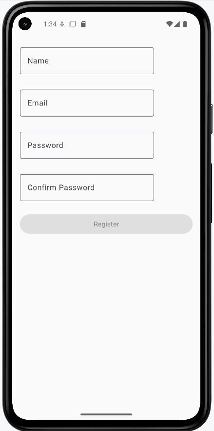
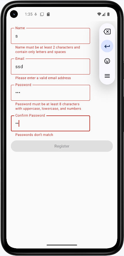
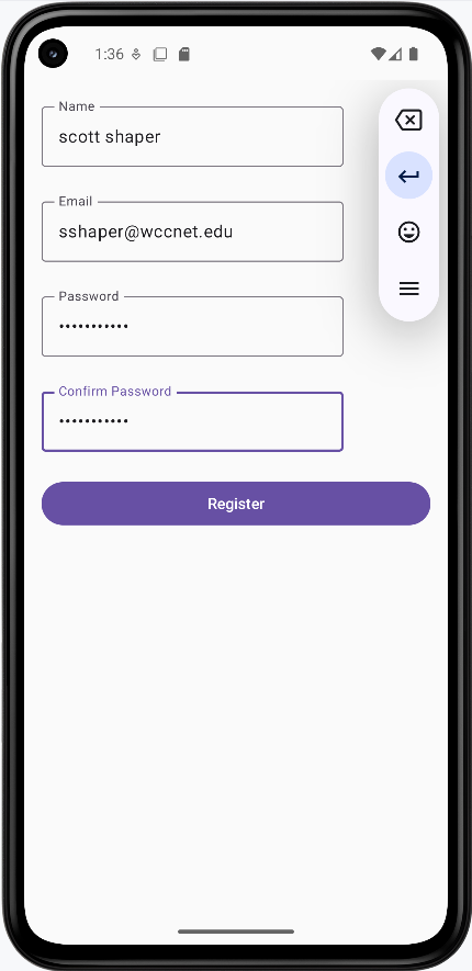
Tips for Success
- Validate input as the user types for immediate feedback
- Use clear, specific error messages
- Show validation errors only after user interaction
- Keep validation rules consistent across your app
- Test validation with various input scenarios
Common Mistakes to Avoid
- Showing errors before user starts typing
- Using vague error messages
- Not validating on both client and server side
- Making validation rules too strict
- Not handling edge cases in validation
Best Practices
- Use regex for complex format validation
- Provide helpful error messages
- Validate in real-time when possible
- Keep validation logic separate from UI
- Consider accessibility in error messages
Keyboard Behavior and Focus
Introduction
When you're using text fields in your app, you want to make sure the keyboard works smoothly and users can easily move between different fields. Think of it like having a smart helper that knows when to show the keyboard, what type of keyboard to show, and how to help users move between fields. Let's learn how to make your app's keyboard behavior user-friendly!
Quick Reference: Keyboard Features
| Feature | What It Does | When to Use It |
|---|---|---|
| KeyboardOptions | Controls keyboard type and actions | When you need specific keyboard types |
| ImeAction | Sets keyboard action button behavior | For navigation between fields |
| FocusRequester | Manages focus between fields | For multi-field forms |
| KeyboardActions | Handles keyboard button presses | For custom keyboard behavior |
Basic Keyboard Concepts
When to Use Keyboard Options
- When collecting different types of input (text, numbers, email)
- For forms with multiple fields
- When you need specific keyboard layouts
- For better user experience in data entry
- When you want to control keyboard behavior
Common Keyboard Types
| Keyboard Type | What It Shows | When to Use It |
|---|---|---|
| Text | Regular keyboard (letters and numbers) | For general text input |
| Email keyboard with @ symbol | For email addresses | |
| Password | Password keyboard (hides characters) | For password fields |
| Number | Number keyboard | For numeric input |
| Phone | Phone number keyboard | For phone numbers |
| Url | URL keyboard with .com button | For web addresses |
Common IME Actions
| Action | What It Does | When to Use It |
|---|---|---|
| Next | Moves focus to next field | For multi-field forms |
| Done | Hides keyboard | For final field in form |
| Go | Triggers "Go" action | For navigation actions |
| Search | Triggers search | For search fields |
| Send | Triggers send action | For message sending |
Basic Keyboard Options Example
Let's start with a simple example that shows how to set up different keyboard options:
@Composable
fun TextInputExample() {
    var text by remember { mutableStateOf("") }

    OutlinedTextField(
        value = text,
        onValueChange = { text = it },
        label = { Text("Enter your name") },
        // Set keyboard options
        keyboardOptions = KeyboardOptions(
            // Set keyboard type to text
            keyboardType = KeyboardType.Text,
            // Set IME action to "Done"
            imeAction = ImeAction.Done
        ),
        // Handle the "Done" action
        keyboardActions = KeyboardActions(
            onDone = {
                // Hide the keyboard when "Done" is pressed
                LocalFocusManager.current.clearFocus()
            }
        )
    )
}
What This Example Is Doing
TextInputExample keeps text in state and shows one OutlinedTextField with label "Enter your name." keyboardOptions sets keyboardType = KeyboardType.Text (letters and numbers) and imeAction = ImeAction.Done so the keyboard shows a "Done" key. keyboardActions = KeyboardActions(onDone = { ... }) runs when the user taps Done; inside it, LocalFocusManager.current.clearFocus() clears focus and hides the keyboard. So the user gets a text keyboard, a Done button, and the keyboard dismisses when Done is pressed.
Phone Keyboard Example
For phone number fields, use KeyboardType.Phone so the device shows a numeric keypad suited for dialing (digits, +, and symbols like * and #). This makes it faster for users to enter numbers and avoids showing the full text keyboard.
@Composable
fun PhoneInputExample() {
    var phone by remember { mutableStateOf("") }

    OutlinedTextField(
        value = phone,
        onValueChange = { phone = it },
        label = { Text("Phone number") },
        keyboardOptions = KeyboardOptions(
            keyboardType = KeyboardType.Phone,
            imeAction = ImeAction.Done
        ),
        keyboardActions = KeyboardActions(
            onDone = { LocalFocusManager.current.clearFocus() }
        ),
        singleLine = true
    )
}
What This Example Is Doing
PhoneInputExample keeps phone in state and shows one OutlinedTextField with label "Phone number." keyboardOptions sets keyboardType = KeyboardType.Phone, so when the user taps the field, the system shows the phone-style keyboard (numeric keypad) instead of the full text keyboard. imeAction = ImeAction.Done and keyboardActions(onDone = { ... }) hide the keyboard when the user presses Done. Use KeyboardType.Phone whenever you are collecting a phone number so users get the right keyboard without switching.
Advanced Focus Management
Moving Between Fields
When you have multiple text fields, you want users to be able to easily move between them. This is where FocusRequester comes in handy. It's like having a helper that knows which field should get the keyboard focus next!
@Composable
fun FocusExample() {
    // Create focus requesters for each field
    val nameFocus = remember { FocusRequester() }
    val emailFocus = remember { FocusRequester() }
    val passwordFocus = remember { FocusRequester() }

    Column {
        // Name field
        OutlinedTextField(
            value = name,
            onValueChange = { name = it },
            label = { Text("Name") },
            // Set focus requester
            focusRequester = nameFocus,
            // Move to email field when "Next" is pressed
            keyboardOptions = KeyboardOptions(
                imeAction = ImeAction.Next
            ),
            keyboardActions = KeyboardActions(
                onNext = {
                    emailFocus.requestFocus()
                }
            )
        )

        // Email field
        OutlinedTextField(
            value = email,
            onValueChange = { email = it },
            label = { Text("Email") },
            focusRequester = emailFocus,
            keyboardOptions = KeyboardOptions(
                keyboardType = KeyboardType.Email,
                imeAction = ImeAction.Next
            ),
            keyboardActions = KeyboardActions(
                onNext = {
                    passwordFocus.requestFocus()
                }
            )
        )

        // Password field
        OutlinedTextField(
            value = password,
            onValueChange = { password = it },
            label = { Text("Password") },
            focusRequester = passwordFocus,
            keyboardOptions = KeyboardOptions(
                keyboardType = KeyboardType.Password,
                imeAction = ImeAction.Done
            ),
            keyboardActions = KeyboardActions(
                onDone = {
                    // Hide keyboard when done
                    LocalFocusManager.current.clearFocus()
                }
            )
        )
    }
}
What This Example Is Doing
FocusExample uses a FocusRequester for each of the three fields (name, email, password). Each field has focusRequester = ... so the parent can move focus. The name field uses ImeAction.Next and keyboardActions(onNext = { emailFocus.requestFocus() }), so pressing Next on the keyboard moves focus to the email field. The email field does the same to move to the password field and uses KeyboardType.Email. The password field uses ImeAction.Done and onDone = { LocalFocusManager.current.clearFocus() } to hide the keyboard. So the user can move name → email → password with the keyboard and then dismiss it. (In the full app, name, email, and password would be state variables declared in the composable.)
This example shows how to:
- Create focus requesters for each field
- Move focus automatically when the user presses "Tab" or the "Next" button if there is one (might be an arrow key)
- Show different keyboard types for different fields. There are six different keyboard types:
- Text: Regular keyboard (letters and numbers)
- Email: Email keyboard with @ symbol
- Password: Password keyboard (hides characters)
- Number: Number keyboard
- Phone: Phone number keyboard
- Url: URL keyboard with .com button
- Hide the keyboard when the user is done
How these examples render
The images below show the keyboard and focus behavior. The snippets above are only part of the code; to see and run the full project, go to my GitHub page and open the chapter7 keyboard.kt file.
- First image: The name field is focused and the text keyboard is showing.
- Second image: Focus has moved to the email field and the keyboard has switched to the email keyboard (e.g. with @).
- Third image: The password field is focused and the keyboard has switched to the password type (e.g. character hiding).
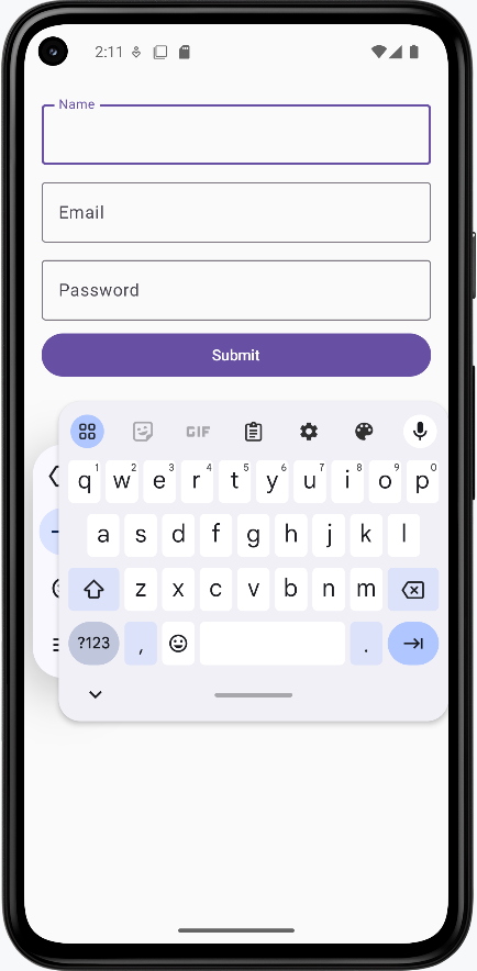
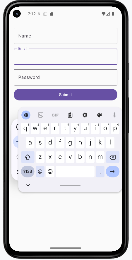
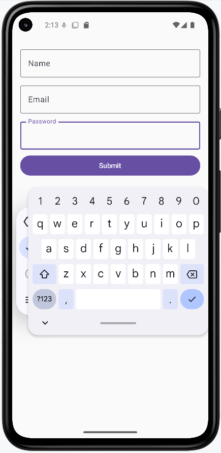
Focus Management Tips
- Use FocusRequester for each field that needs focus
- Set appropriate ImeAction for each field
- Handle focus changes in keyboardActions
- Clear focus when form is complete
- Consider the natural flow of data entry
Tips for Success
- Choose the right keyboard type for each field
- Make focus movement intuitive and natural
- Clear focus when users are done
- Keep keyboard behavior consistent
- Ensure fields are visible when keyboard is shown
Common Mistakes to Avoid
- Using wrong keyboard type for input
- Not handling focus properly
- Leaving keyboard visible when not needed
- Inconsistent keyboard behavior
- Not considering screen space with keyboard
Best Practices
- Use appropriate keyboard types
- Implement smooth focus navigation
- Handle keyboard actions properly
- Consider user experience
- Test on different screen sizes
Chapter 8: Lists & Selection
Lazy Column
Introduction
Imagine you're scrolling through your social media feed. You see posts, pictures, and comments as you scroll down. But have you ever wondered how your phone manages to show all that content without getting slow or running out of memory? That's where LazyColumn comes in!
LazyColumn is like a smart list that only shows you what you can actually see on your screen. Think of it as a window into a long list of items - you only see what's in the window, and as you move the window (by scrolling), it shows you different parts of the list. This is super important because it helps your app run smoothly, even when you have hundreds or thousands of items to display.
Quick Reference: LazyColumn Features
| Feature | What It Does | When to Use It |
|---|---|---|
| Memory Efficiency | Only creates visible items | For long lists of data |
| Item Recycling | Reuses UI components | For smooth scrolling |
| Built-in Scrolling | Handles scroll behavior | For scrollable lists |
| Easy Implementation | Simple API compared to RecyclerView | For modern Android apps |
Basic LazyColumn Concepts
When to Use LazyColumn
- Long lists of items (social media feeds)
- Dynamic content (search results)
- Smooth scrolling needed (chat apps)
- Complex items (cards with images)
When to Use Regular Column
- Short lists (settings menu)
- Static content (forms)
- No scrolling needed
- Simple layouts
How LazyColumn Works
- Data Management:
- Stores all item data in memory
- Only creates UI for visible items
- Recycling Process:
- Moves off-screen items to recycling pool
- Reuses components for new items
- Updates content with new data
Real-World Example: Contact List
Let's look at a practical example - a contact list app. This is something you might actually build!
// Data class for our list items
data class Contact(
    val name: String,
    val email: String
)

@Composable
fun LazyColumnExample(modifier: Modifier = Modifier.padding(top = 50.dp)) {
    val contacts = listOf(
        Contact("John Doe", "john@example.com"),
        Contact("Jane Smith", "jane@example.com"),
        Contact("Bob Johnson", "bob@example.com"),
        Contact("Alice Brown", "alice@example.com"),
        Contact("Charlie Wilson", "charlie@example.com")
        ...more names here
    )

    LazyColumn(
        modifier = modifier
            .fillMaxWidth()
            .padding(16.dp),
        verticalArrangement = Arrangement.spacedBy(8.dp)
    ) {
        items(contacts) { contact ->
            ContactCard(contact)
        }
    }
}

@Composable
fun ContactCard(contact: Contact) {
    Card(
        modifier = Modifier.fillMaxWidth(),
        elevation = CardDefaults.cardElevation(defaultElevation = 4.dp)
    ) {
        Column(
            modifier = Modifier
                .fillMaxWidth()
                .padding(16.dp),
            verticalArrangement = Arrangement.spacedBy(4.dp)
        ) {
            Text(
                text = contact.name,
                style = MaterialTheme.typography.titleMedium
            )
            Text(
                text = contact.email,
                style = MaterialTheme.typography.bodyMedium,
                color = MaterialTheme.colorScheme.onSurfaceVariant
            )
        }
    }
}
What This Example Is Doing
A Contact data class holds name and email. LazyColumnExample builds a list of contacts and passes it to LazyColumn. Instead of putting every contact on screen at once, items(contacts) { contact -> ... } creates only the visible rows (and a few off-screen for smooth scrolling); as you scroll, items are composed when they enter view and recycled when they leave. Each item is a ContactCard—a Card with the contact’s name and email in a column. So you get a scrollable contact list that stays efficient even with many entries.
How this example renders
The screenshot shows the contact list on screen: a vertical list of cards, each with a name (e.g., “John Doe”) and email below it. You can scroll up and down to see more contacts; only the visible cards are actually composed, so the list stays smooth even with many entries. The code above is a snippet; the full project is on my GitHub page—open the chapter8 lazycolumn.kt file to run it.
Tips for Success
- Use LazyColumn for long, scrollable lists
- Keep item layouts simple and efficient
- Use proper spacing between items
- Consider using Card components for list items
- Test with different screen sizes
Common Mistakes to Avoid
- Using LazyColumn for short, static lists
- Creating complex layouts for each item
- Not handling empty states
- Forgetting to add proper spacing
- Not considering performance with large datasets
Best Practices
- Use appropriate item spacing
- Implement proper error handling
- Add loading states for data
- Consider accessibility
- Test scrolling performance
Lazy Row
Introduction
Imagine you're scrolling through Instagram stories or browsing movies on Netflix. You see content that you can swipe through horizontally. But have you ever wondered how your phone manages to show all that content smoothly? That's where LazyRow comes in!
LazyRow is like a smart horizontal list that only shows you what you can actually see on your screen. Think of it as a window into a long row of items - you only see what's in the window, and as you move the window (by swiping), it shows you different parts of the row. This is super important because it helps your app run smoothly, even when you have many items to display horizontally.
Quick Reference: LazyRow Features
| Feature | What It Does | When to Use It |
|---|---|---|
| Memory Efficiency | Only creates visible items | For horizontal lists of data |
| Item Recycling | Reuses UI components | For smooth horizontal scrolling |
| Built-in Scrolling | Handles horizontal scroll behavior | For horizontal scrollable lists |
| Easy Implementation | Simple API for horizontal lists | For modern Android apps |
Basic LazyRow Concepts
When to Use LazyRow
- Horizontal lists of items (photo galleries)
- Image carousels (featured content)
- Smooth horizontal scrolling needed (stories)
- Category-based layouts (movie categories)
When to Use Regular Row
- Short horizontal lists (toolbars)
- Static content (headers)
- No scrolling needed
- Simple layouts
How LazyRow Works
- Data Management:
- Stores all item data in memory
- Only creates UI for visible items
- Recycling Process:
- Moves off-screen items to recycling pool
- Reuses components for new items
- Updates content with new data
Real-World Example: Image Carousel
Let's look at a practical example - an image carousel. This is something you might actually build!
Note: In order for the carousel to work you will need to add the following dependencies and permissions.
This will go in your libs.versions.toml file
[versions]
...
coil = "2.4.0" // Add this line for Coil version

[libraries]
...
coil-compose = { module = "io.coil-kt:coil-compose", version.ref = "coil" } // Add this line for Coil Compose make sure it is in the libraries section.
This will go in your build.gradle file
dependencies {
    ...
    implementation(libs.coil.compose) // Add this line for Coil Compose
}
You will need to add this code to your manifest file to allow internet access. It is found in apps→manifests→AndroidManifest.xml.
<uses-permission android:name="android.permission.INTERNET" />
@Composable
    fun CarouselItem(image: CarouselImage) {
        Card(
            modifier = Modifier
                .width(300.dp)    // Fixed width for consistent card size
                .height(200.dp),  // Fixed height for consistent card size
            shape = RoundedCornerShape(12.dp),  // Rounded corners
            elevation = CardDefaults.cardElevation(defaultElevation = 4.dp)  // Card shadow
        ) {
            Box(modifier = Modifier.fillMaxSize()) {
                // Load and display the image with proper scaling
                AsyncImage(

                    model = image.imageUrl,
                    contentDescription = image.title,
                    modifier = Modifier
                        .fillMaxSize()
                        .clip(RoundedCornerShape(12.dp)),
                    contentScale = ContentScale.Crop  // Crop image to fill the space
                )

                // Semi-transparent overlay for the title
                Surface(
                    modifier = Modifier
                        .fillMaxWidth()
                        .align(Alignment.BottomCenter),
                    color = MaterialTheme.colorScheme.surface.copy(alpha = 0.7f)  // Semi-transparent background
                ) {
                    Text(
                        text = image.title,
                        style = MaterialTheme.typography.titleMedium,
                        modifier = Modifier.padding(16.dp)
                    )
                }
            }
        }
    }
What This Example Is Doing
CarouselItem is a single card in the carousel: a fixed-size card (300×200 dp) with rounded corners. Inside, AsyncImage loads the image from image.imageUrl (using Coil) and fills the card; a semi-transparent Surface at the bottom shows the image.title. The full carousel uses a LazyRow and calls items(...) { image -> CarouselItem(image) } so only visible cards are composed; as you swipe horizontally, new items appear and off-screen ones are recycled. The dependency snippets (Coil in libs.versions.toml and build.gradle, INTERNET permission in the manifest) are required for loading images from the network.
We will be looking at coil and AsyncImage in more detail later in this book but for now you can just know that it is a way to load and display images from the network.
How this example renders
The screenshot shows the horizontal carousel: image cards with a title overlay at the bottom of each card. You swipe left or right to see more images; only the visible cards are composed, so scrolling stays smooth. The dependency snippets (Coil in libs.versions.toml and build.gradle, INTERNET in the manifest) are needed so images can load from the network. The full project is on my GitHub page—open the chapter8 lazyrow.kt file to run it.
Tips for Success
- Use LazyRow for horizontal scrollable lists
- Keep item layouts simple and efficient
- Use proper spacing between items
- Consider using snap scrolling for better UX
- Test with different screen sizes
Common Mistakes to Avoid
- Using LazyRow for short, static lists
- Creating complex layouts for each item
- Not handling empty states
- Forgetting to add proper spacing
- Not considering performance with large datasets
Best Practices
- Use appropriate item spacing
- Implement proper error handling
- Add loading states for data
- Consider accessibility
- Test scrolling performance
Combining LazyColumn and LazyRow
In this section we will combine LazyColumn and LazyRow to create a more complex layout. We will use a LazyColumn to display a list of categories and a LazyRow to display a list of items for each category.
Note: In order for the images to work you will need to add the following dependencies and permissions.
This will go in your libs.versions.toml file
[versions]
...
coil = "2.4.0" // Add this line for Coil version

[libraries]
...
coil-compose = { module = "io.coil-kt:coil-compose", version.ref = "coil" } // Add this line for Coil Compose make sure it is in the libraries section.
This will go in your build.gradle file
dependencies {
    ...
    implementation(libs.coil.compose) // Add this line for Coil Compose
}
You will need to add this code to your manifest file to allow internet access. It is found in apps→manifests→AndroidManifest.xml.
<uses-permission android:name="android.permission.INTERNET" />
@Composable
    fun CategoryList() {
        // Create sample data
        val categories = List(7) { categoryIndex ->
            Category(
                id = categoryIndex,
                name = "Category ${categoryIndex + 1}",
                items = List(10) { itemIndex ->
                    CategoryItem(
                        id = itemIndex,
                        title = "Title ${itemIndex + 1}",
                        // Using placeholder images from picsum.photos
                        imageUrl = "https://picsum.photos/200/300?random=${categoryIndex * 10 + itemIndex}"
                    )
                }
            )
        }

        LazyColumn(
            modifier = Modifier
                .fillMaxSize()
                .padding(top=50.dp),
            verticalArrangement = Arrangement.spacedBy(16.dp),
            contentPadding = PaddingValues(16.dp)
        ) {
            items(categories) { category ->
                // Within the LazyColumn we have a CategorySection composable which contains a LazyRow
                CategorySection(category)
            }
        }
    }

    @Composable
    fun CategorySection(category: Category) {
        Column {
            // Category title
            Text(
                text = category.name,
                style = MaterialTheme.typography.titleLarge,
                modifier = Modifier.padding(bottom = 8.dp)
            )

            // Horizontal scrolling list of items
            LazyRow(
                horizontalArrangement = Arrangement.spacedBy(8.dp)
            ) {
                items(category.items) { item ->
                    CategoryItemCard(item)
                }
            }
        }
    }

    @Composable
fun CategoryItemCard(item: CategoryItem) {
    Card(
        modifier = Modifier
            .width(160.dp)    // Fixed width for consistent card size
            .height(200.dp),  // Fixed height for consistent card size
        elevation = CardDefaults.cardElevation(defaultElevation = 4.dp)  // Card shadow
    ) {
        Column {

            AsyncImage(
                model = item.imageUrl,
                contentDescription = item.title,
                modifier = Modifier
                    .fillMaxWidth()
                    .height(120.dp),
                contentScale = ContentScale.Crop  // Crop image to fill the space
            )


            Text(
                text = item.title,
                style = MaterialTheme.typography.titleMedium,
                maxLines = 2,  // Limit to 2 lines
                overflow = TextOverflow.Ellipsis,  // Show ellipsis for overflow
                modifier = Modifier.padding(8.dp)
            )
        }
    }
}
What This Example Is Doing
CategoryList builds sample data: seven categories, each with ten items that have titles and image URLs (from picsum.photos). A LazyColumn scrolls vertically through categories; for each category, CategorySection shows the category name and a LazyRow of item cards. So you get a vertical list of sections, and each section has a horizontal row of cards. CategoryItemCard displays each item in a fixed-size card: AsyncImage loads the image from the URL (Coil + INTERNET permission required), and the title appears below. The dependency snippets above add the Coil library and INTERNET permission so images can load from the web.
Above Code Explained
The CategoryList composable creates a vertically scrolling list of categories using LazyColumn. Each category contains:
- A title displayed at the top
- A horizontally scrolling list of items using LazyRow
- Proper spacing between categories (16.dp) and items (8.dp)
The CategorySection composable handles the display of each category by:
- Showing the category name using Material Design typography
- Creating a horizontal LazyRow for the category's items
- Managing the layout and spacing of items
The CategoryItemCard composable displays individual items as cards, each containing:
- An image loaded from the provided URL
- A title below the image
- Material Design styling with proper elevation and padding
How this example renders
The screenshot shows the combined layout on screen: a vertically scrolling list of category sections (e.g., “Category 1”, “Category 2”). Each section has a title at the top and a horizontally scrolling row of cards below it. Each card shows an image and a title. You scroll down to see more categories and scroll left/right within a section to see more items. The full project is on my GitHub page—open the chapter8 combined.kt file to run it.
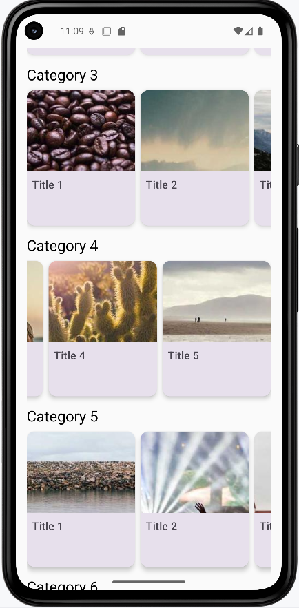
Handling Clicks and Selection
Introduction
Have you ever wondered how apps know when you tap on something? Or how you can select multiple items at once? That's what we're going to learn about today! We'll discover how to make your lists respond to user touches and handle different types of selection.
Quick Reference: Interaction Types
| Interaction Type | What It Does | When to Use It |
|---|---|---|
| Basic Click | Responds to single tap | For simple item selection |
| Single Selection | Selects one item at a time | For exclusive choices |
| Multiple Selection | Selects multiple items | For choosing many items |
| Checkbox Selection | Shows clear selection state | For clear visual feedback |
| Long Press | Activates selection mode | For starting multi-select |
Basic Interaction Concepts
When to Use Different Interactions
- Basic Click: Simple item selection, navigation
- Single Selection: Settings, options, single choice
- Multiple Selection: Lists, galleries, bulk actions
- Checkbox Selection: Clear visual feedback needed
- Long Press: Starting selection mode, context menus
Example List
For the small examples you can use this list code
@Composable
fun ExampleUsage() {
    val sampleNames = listOf(
        "Alice",
        "Bob",
        "Charlie",
        "Diana",
        "Ethan"
    )
    ClickableList(items = sampleNames)//You will have to change this to test other examples
}
Basic Click Example
Basic click handling is the simplest form of interaction. It allows users to tap on an item to perform an action. In this example, we use the clickable modifier to make each list item respond to taps. When tapped, it shows a Toast message with the item's text. This is perfect for simple navigation or item selection where you don't need to maintain any selection state.
@Composable
fun ClickableList(items: List<String>) {
    var clickedItem by remember { mutableStateOf("") }

    Column(modifier = Modifier.padding(top = 50.dp)) {
        LazyColumn(
            modifier = Modifier.weight(1f)   /* fill available space but not more so the text
        will show at that bottom. NOTE: AI could not figure out why the text did not show up */
        ) {
            items(items) { item ->
                ListItem(
                    headlineContent = { Text(item) },
                    modifier = Modifier.clickable {
                        clickedItem = "You clicked: $item"
                    }
                )
            }
        }

        if (clickedItem.isNotEmpty()) {
            Text(
                text = clickedItem,
                modifier = Modifier.padding(16.dp)
            )
        }
    }
}
What This Example Is Doing
ClickableList keeps clickedItem in state (initially empty). The LazyColumn shows each string in a ListItem with Modifier.clickable { clickedItem = "You clicked: $item" }. When you tap an item, state updates and the text at the bottom shows "You clicked: Alice" (or whichever item). So you get a simple list where each tap updates a single message below the list.
Single Selection
Single selection allows users to select one item at a time, similar to radio buttons. We use a state variable to track the currently selected item. When an item is tapped, it becomes selected and changes its background color. This is ideal for settings menus or when you need exclusive selection, like choosing a single option from a list.
@Composable
fun SelectableList(items: List<String>) {
    var selectedItem by remember { mutableStateOf<String?>(null) }

    Column(modifier = Modifier.padding(top = 50.dp)) {
        LazyColumn(modifier = Modifier.weight(1f)) {
            items(items) { item ->
                ListItem(
                    headlineContent = { Text(item) },
                    modifier = Modifier.clickable { selectedItem = item },
                    /*
                    The 'colors' parameter lets you override the default Material3 background (container) and content (text/icon) colors of the ListItem. By using ListItemDefaults.colors, you can provide different containerColor values depending on state (selected/unselected). This is the *official* Material3 way to change a ListItem's background color.*/
                    colors = ListItemDefaults.colors(
                        containerColor = if (selectedItem == item) {
                            Color.Red
                        } else {
                            Color.Green
                        }
                    )
                )
            }
        }
    }
}
What This Example Is Doing
SelectableList keeps selectedItem in state (nullable string). Each ListItem is clickable and sets selectedItem = item. The colors parameter uses ListItemDefaults.colors(containerColor = ...) so the row is red when selectedItem == item and green otherwise. Only one item can be selected at a time; tapping another replaces the selection. So you get a single-selection list with clear visual feedback.
Multiple Selection
Multiple selection allows users to select several items at once, like checkboxes. We use a Set to track selected items, and each tap toggles the selection state. This is perfect for bulk actions, like selecting multiple emails to delete or photos to share. The background color changes to indicate which items are selected.
@Composable
fun MultiSelectList(items: List<String>) {
    /*
       'selectedItems' holds the set of currently selected names from the list.
       We use 'mutableStateOf' so that Compose will automatically recompose
       the UI whenever the set changes. Without 'mutableStateOf', the UI would not
       update when selections are added or removed.
    */
    var selectedItems by remember { mutableStateOf<Set<String>>(setOf()) }

    Column(modifier = Modifier.padding(top = 50.dp)) {
        LazyColumn(modifier = Modifier.weight(1f)) {
            items(items) { item ->
                ListItem(
                    headlineContent = { Text(item) },
                    modifier = Modifier.clickable {
                        /*
                           When an item is clicked, toggle its selection:
                           - If it's already in 'selectedItems', remove it
                           - If it's not in 'selectedItems', add it
                        */
                        selectedItems = if (selectedItems.contains(item)) {
                            selectedItems - item
                        } else {
                            selectedItems + item
                        }
                    },
                    /*
                       Change the background color based on whether the item is selected.
                       - Red means selected
                       - Green means unselected
                    */
                    colors = ListItemDefaults.colors(
                        containerColor = if (selectedItems.contains(item)) {
                            Color.Red   /* selected */
                        } else {
                            Color.Green /* unselected */
                        }
                    )
                )
            }
        }
    }
}
What This Example Is Doing
MultiSelectList keeps selectedItems as a Set<String> in state. When you tap an item, the clickable toggles it: if the item is in the set it’s removed, otherwise it’s added. ListItemDefaults.colors(containerColor = ...) shows red for selected and green for unselected. So you can select multiple items; each tap adds or removes that item from the selection.
Checkbox Selection
Checkbox selection provides a clear visual indicator of selection state using actual checkboxes. This makes it very obvious which items are selected. We combine the checkbox with the item text in a Row, and both the checkbox and the text area are clickable. This is great for forms, settings, or any situation where you want to make the selection state very clear to users.
@Composable
fun CheckboxList(items: List<String>) {
    /*
       'selectedItems' holds the set of currently checked items.
       Using 'mutableStateOf' ensures the UI will automatically
       recompose whenever the set changes.
    */
    var selectedItems by remember { mutableStateOf<Set<String>>(setOf()) }

    Column(modifier = Modifier.padding(top = 50.dp)) {
        LazyColumn(modifier = Modifier.weight(1f)) {
            items(items) { item ->
                Row(
                    modifier = Modifier
                        .fillMaxWidth()
                        .clickable {
                            /*
                               Toggle selection when the row is clicked:
                               - If the item is already selected, remove it
                               - If not, add it to the set
                            */
                            selectedItems = if (selectedItems.contains(item)) {
                                selectedItems - item
                            } else {
                                selectedItems + item
                            }
                        }
                        .padding(16.dp),
                    verticalAlignment = Alignment.CenterVertically
                ) {
                    Checkbox(
                        checked = selectedItems.contains(item),
                        onCheckedChange = {
                            /*
                               Toggle selection when the checkbox itself is clicked.
                               This keeps row clicks and checkbox clicks in sync.
                            */
                            selectedItems = if (selectedItems.contains(item)) {
                                selectedItems - item
                            } else {
                                selectedItems + item
                            }
                        }
                    )
                    Spacer(modifier = Modifier.width(8.dp))
                    Text(item)
                }
            }
        }
    }
}
What This Example Is Doing
CheckboxList also keeps selectedItems as a set. Each row has a Checkbox (checked when the item is in the set) and the item text; the whole row and the checkbox both toggle the item in/out of selectedItems on click. So the checkbox state and the set stay in sync, and the user gets a clear multi-select list with checkboxes.
Long Press Selection
Long press selection is a common pattern in mobile apps: when you hold your finger on an item for a moment, the app switches into a special mode (like selection mode) instead of treating it as a normal tap. That way, a quick tap can do one thing (e.g., open the item) and a long press can do another (e.g., start selecting multiple items). It's similar to how many photo gallery apps work—a long press enters selection mode, and then you can tap more items to add or remove them from the selection.
In Compose we handle both taps and long presses on the same element with Modifier.combinedClickable. You pass it an onClick lambda for normal taps and an onLongClick lambda for long presses. The framework decides whether the user did a short tap or a long press (based on how long the finger was down) and calls the right lambda. So we don't have to measure time ourselves; we just provide the two behaviors.
@OptIn(ExperimentalComposeUiApi::class, ExperimentalFoundationApi::class)
    @Composable
    fun LongPressList(items: List<String>) {

        /*
           isSelectionMode:
           Tracks whether we are currently in multi-select mode.
           Starts as false.
         */
        var isSelectionMode by remember { mutableStateOf(false) }

        /*
           selectedItems:
           Stores the set of currently selected items.
           We use a Set to prevent duplicates.
         */
        var selectedItems by remember { mutableStateOf(setOf<String>()) }

        Column(modifier = Modifier.padding(top = 50.dp)) {

            // Optional: Show selection count when in selection mode
            if (isSelectionMode) {
                Text(
                    text = "Selected: ${selectedItems.size}",
                    modifier = Modifier.padding(16.dp),
                    color = Color.Black
                )
            }

            LazyColumn {

                items(items) { item ->

                    val isSelected = selectedItems.contains(item)

                    ListItem(
                        headlineContent = { Text(item) },

                        /*
                           combinedClickable is the correct Compose API
                           for handling click + long click gestures.
                         */
                        modifier = Modifier
                            .fillMaxWidth()
                            .combinedClickable(

                                /*
                                   Normal Click Behavior
                                   ---------------------
                                   - If in selection mode → toggle selection
                                   - If NOT in selection mode → normal action
                                 */
                                onClick = {
                                    if (isSelectionMode) {

                                        selectedItems =
                                            if (isSelected) {
                                                selectedItems - item   // remove from selection
                                            } else {
                                                selectedItems + item   // add to selection
                                            }

                                        // Exit selection mode if nothing selected
                                        if (selectedItems.isEmpty()) {
                                            isSelectionMode = false
                                        }

                                    } else {
                                        // Normal click behavior (replace with real action)
                                        println("Clicked: $item")
                                    }
                                },

                                /*
                                   Long Click Behavior
                                   -------------------
                                   - Enter selection mode
                                   - Select the long-pressed item
                                 */
                                onLongClick = {
                                    if(isSelectionMode){
                                        isSelectionMode = false
                                        // Clear ALL selected items
                                        selectedItems = emptySet()
                                    }
                                    else {
                                        isSelectionMode = true
                                        selectedItems = selectedItems + item
                                    }
                                }
                            ),

                        /*
                           Change background color based on selection state
                           Red   → selected
                           Green → not selected
                         */
                        colors = ListItemDefaults.colors(
                            containerColor =
                                if (isSelected) Color.Red
                                else Color.Green
                        )
                    )
                }
            }
        }
    }
What This Example Is Doing
The list keeps two pieces of state: isSelectionMode (whether we're in multi-select mode) and selectedItems (the set of items currently selected). When isSelectionMode is true, a header above the list shows "Selected: N" so the user sees how many items are selected.
Each row uses Modifier.combinedClickable with two lambdas. On a normal tap (onClick): if we're in selection mode, that tap toggles the item in or out of selectedItems (add if not selected, remove if selected), and if the set becomes empty we turn off selection mode; if we're not in selection mode, the tap does the normal action (here, just printing the item). On a long press (onLongClick): if we're already in selection mode, we exit it and clear all selections; if we're not in selection mode, we turn it on and add the long-pressed item to selectedItems. So one long press enters selection mode and selects that item; further taps add or remove items; another long press (or clearing the selection) exits selection mode.
Visual feedback: each row's background is red when that item is in selectedItems and green when it isn't, so the user can see the current selection at a glance.
Putting It All Together
Now that we've learned about the different types of interactions, let's put them all together in a single example. This example shows how to create a list of tasks with different types of interactions:
@Composable
    fun TaskListApp() {
        // Sample data for our task list
        val tasks = listOf(
            Task("1", "Study for Math Exam", "Review chapters 1-5"),
            Task("2", "Complete Programming Assignment", "Finish the Android app"),
            Task("3", "Read History Chapter", "Read pages 50-75"),
            Task("4", "Write Essay", "Draft the introduction"),
            Task("5", "Group Project Meeting", "Prepare presentation slides")
        )
        TaskList(tasks = tasks)
    }

    @Composable
    fun TaskList(tasks: List<Task>) {
        var selectionMode by remember { mutableStateOf(SelectionMode.SINGLE) }
        var selectedTask by remember { mutableStateOf<String?>(null) }
        var selectedTasks by remember { mutableStateOf(setOf<String>()) }
        val context = LocalContext.current

        Column(
            modifier = Modifier
                .fillMaxSize()
                .padding(16.dp)
                .padding(top = 50.dp)
        ) {
            // Mode selector buttons
            Row(
                modifier = Modifier
                    .fillMaxWidth()
                    .padding(bottom = 16.dp),
                horizontalArrangement = Arrangement.SpaceEvenly
            ) {
                Button(
                    onClick = {
                        selectionMode = SelectionMode.SINGLE
                        selectedTasks = emptySet()
                        selectedTask = null

                    },
                    colors = ButtonDefaults.buttonColors(
                        containerColor = if (selectionMode == SelectionMode.SINGLE) Color(0xFF4CAF50) else Color(0xFFF44336), // Green if selected, red if not
                        contentColor = Color.White
                    )
                ) {
                    Text("Single Selection")
                }
                Button(
                    onClick = {
                        selectionMode = SelectionMode.MULTIPLE
                        selectedTask = null
                        selectedTasks = emptySet()
                    },
                    colors = ButtonDefaults.buttonColors(
                        containerColor = if (selectionMode == SelectionMode.MULTIPLE) Color(0xFF4CAF50) else Color(0xFFF44336), // Green if selected, red if not
                        contentColor = Color.White
                    )
                ) {
                    Text("Multiple Selection")
                }
            }

            // Selection mode header
            if (selectionMode == SelectionMode.MULTIPLE && selectedTasks.isNotEmpty()) {
                Row(
                    modifier = Modifier
                        .fillMaxWidth()
                        .padding(bottom = 8.dp),
                    horizontalArrangement = Arrangement.SpaceBetween,
                    verticalAlignment = Alignment.CenterVertically
                ) {
                    Text(
                        "${selectedTasks.size} tasks selected",
                        style = MaterialTheme.typography.titleMedium
                    )
                    Row {
                        IconButton(onClick = {
                            Toast.makeText(context, "Completing ${selectedTasks.size} tasks", Toast.LENGTH_SHORT).show()
                        }) {
                            Icon(Icons.Default.Check, "Complete")
                        }
                        IconButton(onClick = {
                            Toast.makeText(context, "Deleting ${selectedTasks.size} tasks", Toast.LENGTH_SHORT).show()
                        }) {
                            Icon(Icons.Default.Delete, "Delete")
                        }
                    }
                }
            }

            // Task list
            LazyColumn {
                items(tasks) { task ->
                    TaskItem(
                        task = task,
                        isSelected = if (selectionMode == SelectionMode.SINGLE) selectedTask == task.id else selectedTasks.contains(task.id),
                        selectionMode = selectionMode,
                        onTaskClick = {
                            if (selectionMode == SelectionMode.SINGLE) {
                                selectedTask = task.id
                                selectedTasks = emptySet()
                                Toast.makeText(context, "Selected: ${task.title}", Toast.LENGTH_SHORT).show()
                            } else {
                                selectedTask = null
                                selectedTasks = if (selectedTasks.contains(task.id)) {
                                    selectedTasks - task.id
                                } else {
                                    selectedTasks + task.id
                                }
                            }
                        },
                        onTaskLongPress = {
                            if (selectionMode == SelectionMode.SINGLE) {
                                selectionMode = SelectionMode.MULTIPLE
                                selectedTasks = setOf(task.id)
                                selectedTask = null
                            }
                        }
                    )
                }
            }
    }
}
What This Example Is Doing
TaskListApp provides sample tasks and calls TaskList. TaskList keeps selectionMode (SINGLE or MULTIPLE), selectedTask (one id), and selectedTasks (set of ids). Two buttons at the top switch between Single and Multiple selection (and clear selection). In single mode, tapping a task sets selectedTask and shows a toast; in multiple mode, tapping toggles the task in selectedTasks. When multiple items are selected, a header shows the count and Complete/Delete icon buttons (toasts in this example). Long-pressing a task (via TaskItem and e.g. combinedClickable) can switch to multiple mode and select that task. So you get a task list with switchable single/multi selection and action bar for multi-select.
How these examples render
The two screenshots below show what the task list looks like on screen. First image (Single Selection): The list is in single-selection mode; one task is highlighted (e.g., “Complete Programming Assignment”). Tapping a task selects it; tapping another switches the selection. The “Single Selection” button is highlighted to show the current mode. Second image (Multiple Selection): The list is in multiple-selection mode with several tasks selected. A header at the top shows “X tasks selected” and the Complete (checkmark) and Delete icons; tapping those would run actions on the selected tasks (here they show toasts). To try it yourself, get the full project from my GitHub page and open the chapter8 selectClick.kt file.
Tips for Success
- Make items clickable to respond to taps
- Use state to keep track of what's selected
- Support multiple selection when needed
- Add clear visual indicators for selection
- Provide actions for selected items
- Consider using long press for selection mode
Common Mistakes to Avoid
- Not handling selection state properly
- Missing visual feedback for selection
- Forgetting to clear selection state
- Not considering accessibility
- Ignoring long press interactions
Best Practices
- Use appropriate selection patterns
- Provide clear visual feedback
- Handle selection state properly
- Consider accessibility
- Test all interaction patterns
Another Click Handling Example
In this section we will create a news feed that allows the user to click on a news item to read more about it.
Note: In order for the news feed images to work you will need to add the following dependencies and permissions.
This will go in your libs.versions.toml file
[versions]
...
coil = "2.4.0" // Add this line for Coil version

[libraries]
...
coil-compose = { module = "io.coil-kt:coil-compose", version.ref = "coil" } // Add this line for Coil Compose make sure it is in the libraries section.
This will go in your build.gradle file
dependencies {
    ...
    implementation(libs.coil.compose) // Add this line for Coil Compose
}
You will need to add this code to your manifest file to allow internet access. It is found in apps→manifests→AndroidManifest.xml.
<uses-permission android:name="android.permission.INTERNET" />
Sticky Header and Surface
In the news feed code below we use two ideas you haven’t seen yet: a sticky header and a Surface.
Sticky header: A sticky header is a title or bar that stays at the top of the list while the user scrolls. The rest of the list (the news cards) scrolls underneath it. So instead of the title scrolling away, it stays visible so the user always knows which section they’re in. In Compose we get this with stickyHeader { ... } inside a LazyColumn.
Surface: Surface is a Material Design composable that acts as a container with a background color and optional elevation (a slight shadow or lift). It’s useful for grouping content—like our “Latest News” title—and making it stand out from the content behind or below it. In the example we use Surface inside the sticky header so the header has a clear background and a bit of elevation, which makes it look like it’s sitting above the scrolling list.
fun NewsFeedExample() {
    // Sample data for the news feed
    val newsItems = listOf(
        NewsItem(
            title = "News Article One",
            description = "Lorem ipsum dolor sit amet, consectetur adipiscing elit. Nullam id massa id ante pretium molestie. Donec a libero pellentesque, hendrerit ante faucibus, feugiat mi. Maecenas fringilla urna quis elit egestas, in tincidunt velit feugiat. ",
            imageUrl = "https://picsum.photos/800/400"
        ),
        NewsItem(
            title = "News Article Two",
            description = "Lorem ipsum dolor sit amet, consectetur adipiscing elit. Nullam id massa id ante pretium molestie. Donec a libero pellentesque, hendrerit ante faucibus, feugiat mi. Maecenas fringilla urna quis elit egestas, in tincidunt velit feugiat. ",
            imageUrl = "https://picsum.photos/800/401"
        ),
        NewsItem(
            title = "News Article Three",
            description = "Lorem ipsum dolor sit amet, consectetur adipiscing elit. Nullam id massa id ante pretium molestie. Donec a libero pellentesque, hendrerit ante faucibus, feugiat mi. Maecenas fringilla urna quis elit egestas, in tincidunt velit feugiat. ",
            imageUrl = "https://picsum.photos/800/406"
        ),
        NewsItem(
            title = "News Article Four",
            description = "Lorem ipsum dolor sit amet, consectetur adipiscing elit. Nullam id massa id ante pretium molestie. Donec a libero pellentesque, hendrerit ante faucibus, feugiat mi. Maecenas fringilla urna quis elit egestas, in tincidunt velit feugiat. ",
            imageUrl = "https://picsum.photos/800/403"
        )
    )

    // State to track which news item is being shown in the dialog
    var selectedNewsItem by remember { mutableStateOf(null) }

    // Box is used as a container for the news feed
    Box(
        modifier = Modifier.fillMaxSize()
    ) {
        // LazyColumn displays the list of news items with system bar padding
        LazyColumn(
            modifier = Modifier
                .fillMaxSize()
                .systemBarsPadding()
        ) {
            // Sticky header for the section title this will stay at the top of the list while scrolling
            stickyHeader {
                Surface(
                    color = MaterialTheme.colorScheme.surface,
                    tonalElevation = 4.dp
                ) {
                    Text(
                        "Latest News",
                        modifier = Modifier
                            .fillMaxWidth()
                            .padding(16.dp),
                        style = MaterialTheme.typography.titleLarge
                    )
                }
            }
            // Display each news item in the list
            items(newsItems) { news ->
                NewsCard(
                    news = news,
                    onClick = { selectedNewsItem = news }
                )
            }
        }

        // Show dialog when a news item is selected
        selectedNewsItem?.let { news ->
            NewsDialog(
                news = news,
                onDismiss = { selectedNewsItem = null }
            )
        }
    }
}

/**
 * NewsCard displays a single news item in a card layout.
 * It shows the news image, title, and description.
 * Uses Coil's AsyncImage for image loading and RoundedCornerShape for image corners.
 */
@Composable
fun NewsCard(
    news: NewsItem,
    onClick: () -> Unit
) {
    Card(
        modifier = Modifier
            .fillMaxWidth()
            .padding(8.dp)
            .clickable(onClick = onClick),
        elevation = CardDefaults.cardElevation(defaultElevation = 4.dp)
    ) {
        Column(
            modifier = Modifier.padding(16.dp)
        ) {
            // News image
            AsyncImage(
                model = news.imageUrl,
                contentDescription = news.title,
                modifier = Modifier
                    .fillMaxWidth()
                    .height(200.dp)
                    .clip(RoundedCornerShape(8.dp))
            )
            Spacer(modifier = Modifier.height(8.dp))
            // News title
            Text(
                text = news.title,
                style = MaterialTheme.typography.titleMedium
            )
        }
    }
}

/**
 * NewsDialog displays a popup dialog with the full news item details.
 * Includes a close button and shows the image, title, and description.
 */
@Composable
fun NewsDialog(
    news: NewsItem,
    onDismiss: () -> Unit
) {
    Dialog(onDismissRequest = onDismiss) {
        Card(
            modifier = Modifier
                .fillMaxWidth()
                .padding(16.dp),
            shape = RoundedCornerShape(16.dp)
        ) {
            Column(
                modifier = Modifier.padding(16.dp)
            ) {
                // Close button
                Row(
                    modifier = Modifier.fillMaxWidth(),
                    horizontalArrangement = Arrangement.End
                ) {
                    IconButton(onClick = onDismiss) {
                        Icon(
                            imageVector = Icons.Default.Close,
                            contentDescription = "Close"
                        )
                    }
                }

                // News image
                AsyncImage(
                    model = news.imageUrl,
                    contentDescription = news.title,
                    modifier = Modifier
                        .fillMaxWidth()
                        .height(200.dp)
                        .clip(RoundedCornerShape(8.dp))
                )

                Spacer(modifier = Modifier.height(16.dp))

                // News title
                Text(
                    text = news.title,
                    style = MaterialTheme.typography.titleLarge
                )

                Spacer(modifier = Modifier.height(8.dp))

                // News description
                Text(
                    text = news.description,
                    style = MaterialTheme.typography.bodyLarge
                )
            }
        }
    }
}
What This Example Is Doing
NewsFeedExample holds a list of NewsItems (title, description, image URL) and selectedNewsItem in state. A LazyColumn shows a sticky “Latest News” header at the top and then each item as a NewsCard. Tapping a card sets selectedNewsItem = news. When selectedNewsItem is not null, NewsDialog is shown: a dialog with the full image, title, description, and a close button that clears selectedNewsItem. So you get a scrollable news list; tap a card to open the article in a dialog, then close it to return to the list. Coil and the INTERNET permission (from the snippets above) are required for loading images.
Composable Functions Explained
NewsFeedExample
The main composable that sets up the entire news feed interface. It:
- Creates sample news data with titles, descriptions, and images
- Manages the selected news item state
- Uses LazyColumn for efficient scrolling of news items
- Includes a sticky header that stays at the top while scrolling
- Shows a dialog when a news item is selected
NewsCard
A reusable card component that displays a single news item. It:
- Shows a news image with rounded corners
- Displays the news title below the image
- Handles click events to show the full article
- Uses Material Design elevation for a modern look
NewsDialog
A popup dialog that shows the complete news article. It:
- Displays a larger version of the news image
- Shows the full title and description
- Includes a close button to dismiss the dialog
- Uses proper spacing and typography for readability
How this example renders
The two screenshots show the news feed in action. First image: The main list with a “Latest News” header at the top and a vertical list of news cards (image + title). You scroll to see more articles; tapping a card opens the full article. Second image: The dialog that appears when you tap a card—it shows the same image, the full title, the full description, and a close (X) button. Tapping close dismisses the dialog and returns you to the list. The full project is on my GitHub page—open the chapter8 newsfeed.kt file to run it.

Chapter 9: Navigation
Introduction to Navigation
What is Navigation?
Think of navigation in Android apps like moving between different rooms in a house. Just as you need doors and hallways to move from one room to another, your app needs a way to move between different screens. In Android Compose, we use the Navigation component to create these "doors" between screens, making it easy for users to move around your app.
Whether you're building a social media app where users need to move between their feed and profile, or a shopping app where users browse products and view their cart, navigation is essential for creating a smooth user experience.
Why Do We Need Navigation?
- Move between different screens in your app
- Create a back button experience
- Pass data between screens
- Handle user flow and app structure
- Manage screen history
Quick Reference: Navigation Components
| Component | What It Does | When to Use It |
|---|---|---|
| NavHost | Container for navigation destinations | Setting up the navigation structure |
| NavController | Manages navigation between screens | Handling navigation actions |
| composable() | Defines a navigation destination | Adding new screens to navigate to |
| navController.navigate() | Performs navigation | Moving between screens |
Setting Up Navigation Dependencies
Before you can use navigation in your app, you need to add the required dependencies. These dependencies provide the navigation components and functionality we'll be using.
Add to libs.versions.toml
[versions]
    # ... other versions ...
    navigation-compose = "2.7.7"

    [libraries]
    # ... other libraries ...
    androidx-navigation-compose = { group = "androidx.navigation", name = "navigation-compose", version.ref = "navigation-compose" }
Add to app/build.gradle.kts
dependencies {
        // ... other dependencies ...
        implementation(libs.androidx.navigation.compose)
    }
After adding these dependencies, sync your project with Gradle files. You'll then be able to use all the navigation components we'll discuss in these lessons.
Basic Navigation Example
@Composable
fun AppNav(){
    val navController = rememberNavController()
    NavHost(navController = navController, startDestination = "home"){
        composable("home") {
            HomeScreen(onNavigateToProfile = {
                navController.navigate("profile") {
                    launchSingleTop = true

                }

            })
        }
        composable("profile"){
            ProfileScreen(onBack = {
                navController.popBackStack()
            })

        }
    }
}

@Composable
fun HomeScreen(onNavigateToProfile: () -> Unit) {
    Column(
        modifier = Modifier
            .fillMaxSize()
            .systemBarsPadding(),
        horizontalAlignment = Alignment.Start
    ) {
        Button(onClick = onNavigateToProfile) {
            Text("Go to Profile")
        }
        Spacer(modifier = Modifier.height(16.dp))
        Text(
            "This is the home page",
            modifier = Modifier.padding(16.dp)
        )
    }
}

@Composable
fun ProfileScreen(onBack: () -> Unit) {
    Column(
        modifier = Modifier
            .fillMaxSize()
            .systemBarsPadding(),
        horizontalAlignment = Alignment.Start
        ){
        Button(onClick = onBack) {
            Text("Go back")
        }
        Spacer(modifier = Modifier.height(16.dp))
        Text(
            "This is the profile page",
            modifier = Modifier.padding(16.dp)
        )

    }
}
What's Happening in the Example?
In this example we have two screens: Home and Profile. Below we walk through each part of the code and what it does.
1. The navigation manager: rememberNavController()
val navController = rememberNavController() creates the object that runs navigation. The navController knows every screen in the app, how to go to them, and the order in which you visited them (like a back-stack). You don't need to memorize that—just think of it as the "manager" that handles moving between screens.
2. The map of screens: NavHost
The NavHost is where you list all the screens and say where the app should start:
NavHost(navController = navController, startDestination = "home") { ... }— Inside the braces you define every screen the user can reach.startDestination = "home"— When the app launches, the first screen shown is the one named"home".
3. Defining each screen: composable()
Each screen is declared with composable("routeName") { ... }. The string (e.g. "home" or "profile") is the route—the name you use when navigating.
composable("home") { ... }— When the app goes to the route"home", it shows whatever you put inside the block (here,HomeScreen).composable("profile") { ... }— When the app goes to"profile", it showsProfileScreen.
4. Going forward: navController.navigate()
When the user taps "Go to Profile" on the Home screen, we call navController.navigate("profile") { launchSingleTop = true }. That means: "Go to the screen whose route is \"profile\"."
launchSingleTop = true is a small but useful option: if we're already on the Profile screen, we don't add another Profile screen on top. We stay on the one that's already there. That avoids stacking duplicate screens and keeps behavior predictable.
5. Going back: navController.popBackStack()
When the user taps "Go back" on the Profile screen, we call navController.popBackStack(). That tells the nav controller: "Remove the current screen from the history and show the previous one." So the user ends up back on Home, like pressing the device back button.
Putting it together
In order: (1) The app starts on Home. (2) Tapping "Go to Profile" navigates to Profile. (3) Tapping "Go back" pops Profile off the stack and returns to Home. The navController and NavHost work together so that each route name leads to the right composable and back navigation works as expected.
How this example renders
Above is just a snippet of the code to view the full code, you need to go to my GitHub page and look at the chapter9 intro.kt file.
The first image shows the home screen. The second image shows the profile screen.
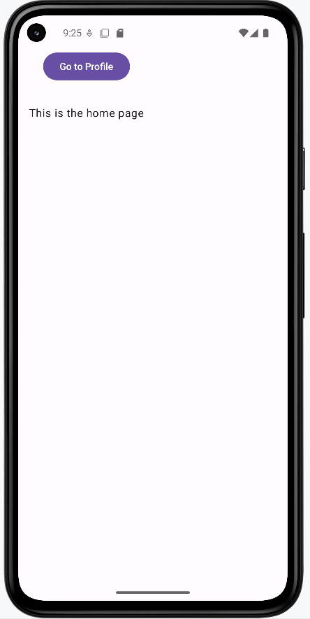
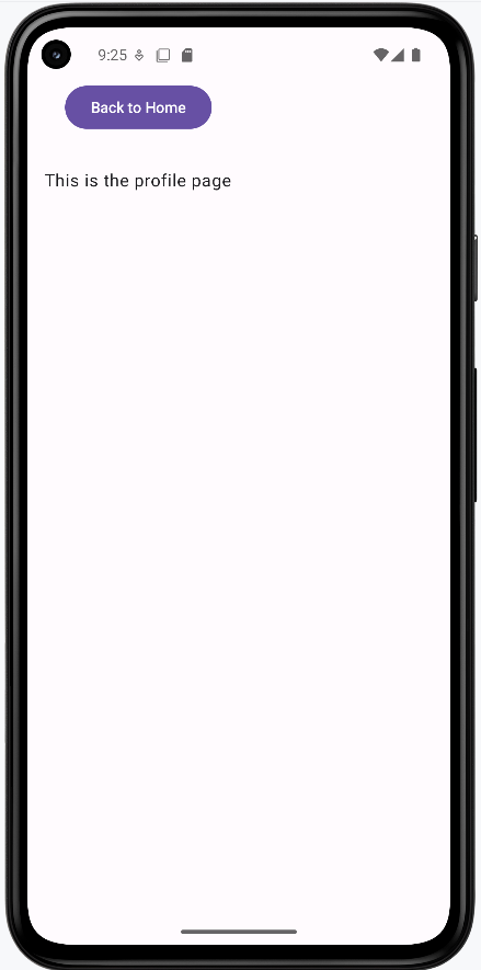
Tips for Getting Started
- Plan your navigation structure before implementing
- Use meaningful names for your routes
- Start with simple navigation before adding complexity
- Test navigation on different screen sizes
Common Mistakes to Avoid
- Creating circular navigation paths
- Forgetting to handle the back button
- Using hardcoded route names
- Not planning navigation structure
Passing Arguments
Building on the Previous Lesson
In Introduction to Navigation, we used fixed routes: "home" and "profile". Every time you went to Profile, that screen looked the same. In many apps you need to send data to the next screen—for example, which user's profile to show, or which product was tapped. This lesson adds navigation arguments: data you pass when you navigate so the destination screen can use it.
What’s different:
- Before: Route was a fixed string like
"profile". No data was sent. - Now: The route includes a placeholder (e.g.
"profile/{userName}"). When you navigate, you supply the value (e.g. the user’s name), and the Profile screen receives it and can display “Hello, Alex” instead of a generic message.
What Are Navigation Arguments?
Navigation arguments are values you attach to a navigation action. When the user goes from one screen to another, those values are available on the new screen. Typical uses: passing a user ID to a profile screen, a product ID to a detail screen, or a search query to a results screen. The data is passed once when you navigate; it doesn’t automatically update if something changes elsewhere (for that you’ll use state, which we cover later).
Types of Arguments
Arguments have types, just like variables. You declare the type so the navigation system knows how to parse and pass the value.
| Type | What It's For | Example Use |
|---|---|---|
| String | Text data | User names, messages |
| Int | Whole numbers | IDs, counts |
| Float | Decimal numbers | Prices, measurements |
| Boolean | True/False values | Settings, flags |
Expanding the first example to pass an argument
@Composable
fun AppNav(){
    val navController = rememberNavController()
    NavHost(navController = navController, startDestination = "home"){
        composable("home") {
            HomeScreen(onNavigateToProfile = {
                navController.navigate("profile/$it") {
                    launchSingleTop = true
                }
            })
        }
        composable(
            route = "profile/{userName}",
            arguments = listOf(
                navArgument("userName") { type = NavType.StringType }
            )
        ) { backStackEntry ->
            val username = backStackEntry.arguments?.getString("userName")
            ProfileScreen(
                userName = username,
                onBack = { navController.popBackStack() }
            )
        }
    }
}

@Composable
fun HomeScreen(onNavigateToProfile: (String) -> Unit) {
    var name by remember { mutableStateOf("") }
    Column(
        modifier = Modifier
            .fillMaxSize()
            .systemBarsPadding(),
        horizontalAlignment = Alignment.Start
    ) {
        OutlinedTextField(
            value = name,
            onValueChange = { name = it },
            label = { Text("Your Name") }
        )
        Button(onClick = { onNavigateToProfile(name) }, enabled = name.isNotBlank()) {
            Text("Go to Profile")
        }
        Spacer(modifier = Modifier.height(16.dp))
        Text(
            "This is the home page",
            modifier = Modifier.padding(16.dp)
        )
    }
}

@Composable
fun ProfileScreen(userName: String?, onBack: () -> Unit) {
    Column(
        modifier = Modifier
            .fillMaxSize()
            .systemBarsPadding(),
        horizontalAlignment = Alignment.Start
    ){
        Spacer(modifier = Modifier.height(16.dp))
        Button(onClick = onBack) {
            Text("Back to Home")
        }
        Spacer(modifier = Modifier.height(16.dp))
        Text(
            "Hello, $userName, This is the profile page",
            modifier = Modifier.padding(16.dp)
        )
    }
}
Here’s how it works compared to the intro lesson. You still use NavHost, composable(), and navController.navigate(). The new pieces are: a route with a placeholder, declaring the argument type, passing the value when navigating, and reading it in the destination.
1. Route with a placeholder
Instead of composable("profile"), you use something like composable("profile/{userName}"). The part in curly braces is the argument name. When you navigate to "profile/Alex", the system will match this route and treat "Alex" as the value for userName.
2. Declare the argument type
Inside composable(...) you add an arguments list and tell the navigation system the type of each placeholder, e.g. navArgument("userName") { type = NavType.StringType }. That way it knows how to parse and pass the value safely.
3. Pass the value when navigating
From the Home screen, instead of navigate("profile"), you call something like navigate("profile/$name") where name is the actual string (e.g. from a text field). So the full route might be "profile/Alex". The destination that matches "profile/{userName}" will receive "Alex" as userName.
4. Read the argument in the destination
The composable block receives a parameter (often named backStackEntry). That object represents the current screen in the navigation stack—it’s not about “going back,” it’s the current destination’s information. From it you get the arguments: backStackEntry.arguments?.getString("userName"). You then pass that value into your screen composable (e.g. ProfileScreen(userName = username, ...)). Always handle the case where the value might be null (e.g. use String? and null checks or a default).
Full runnable code: chapter9 passingArgs.kt on the GitHub examples repo.
How This Example Renders
Below: home screen where the user enters a name, then the profile screen showing that name. Full code is in chapter9 passingArgs.kt on GitHub.
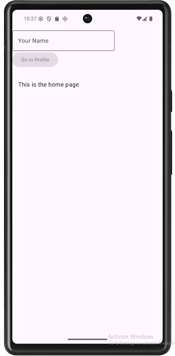
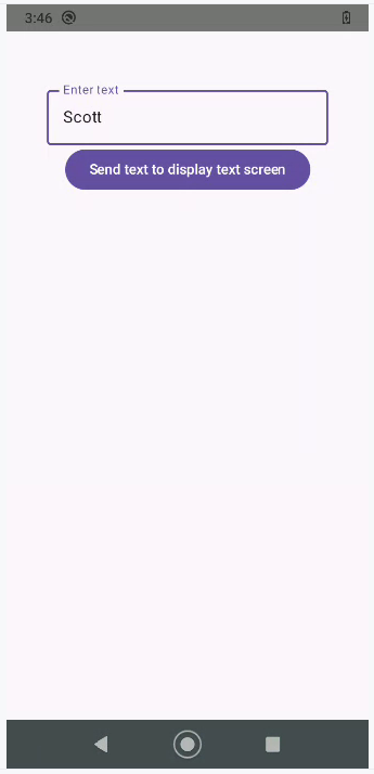

Multiple Arguments
You can pass more than one value. The route lists multiple placeholders, e.g. "product/{id}/{name}". You define each in the arguments list with its own type (NavType.IntType, NavType.StringType, etc.). When navigating, you build the route with all values in order, e.g. navigate("product/$id/$name"). In the destination you read each from backStackEntry.arguments (e.g. getInt("id"), getString("name")).
Example: Multiple arguments
@Composable
fun NavigationWithMultipleArgs() {
    val navController = rememberNavController()

    NavHost(
        navController = navController,
        startDestination = "home"
    ) {
        composable("home") {
            HomeScreen(
                onNavigateToProduct = { id, name ->
                    navController.navigate("product/$id/$name")
                }
            )
        }
        composable(
            "product/{id}/{name}",
            arguments = listOf(
                navArgument("id") { type = NavType.IntType },
                navArgument("name") { type = NavType.StringType }
            )
        ) { backStackEntry ->
            val id = backStackEntry.arguments?.getInt("id")
            val name = backStackEntry.arguments?.getString("name")
            ProductScreen(
                id = id,
                name = name,
                onNavigateBack = {
                    navController.popBackStack()
                }
            )
        }
    }
}

@Composable
fun HomeScreen(onNavigateToProduct: (Int, String) -> Unit) {
    Column(
        modifier = Modifier
            .fillMaxSize()
            .padding(16.dp)
            .padding(top = 50.dp),
        horizontalAlignment = Alignment.CenterHorizontally,
        verticalArrangement = Arrangement.spacedBy(8.dp)
    ) {
        Text(
            text = "Available Products",
            modifier = Modifier.padding(bottom = 16.dp)
        )

        val products = listOf(
            Product(1, "Smartphone"),
            Product(2, "Laptop"),
            Product(3, "Headphones"),
            Product(4, "Tablet")
        )

        products.forEach { product ->
            Button(
                onClick = { onNavigateToProduct(product.id, product.name) },
                modifier = Modifier.fillMaxWidth()
            ) {
                Text("View ${product.name}")
            }
        }
    }
}

@Composable
fun ProductScreen(
    id: Int?,
    name: String?,
    onNavigateBack: () -> Unit
) {
    Column(
        modifier = Modifier
            .fillMaxSize()
            .padding(16.dp)
            .padding(top = 50.dp),
        horizontalAlignment = Alignment.CenterHorizontally,
        verticalArrangement = Arrangement.spacedBy(16.dp)
    ) {
        Text(
            text = "Product Details",
            modifier = Modifier.padding(bottom = 8.dp)
        )

        if (id != null && name != null) {
            Text("Product ID: $id")
            Text("Product Name: $name")
        } else {
            Text("Error: Product information not available")
        }

        Button(
            onClick = onNavigateBack,
            modifier = Modifier.padding(top = 16.dp)
        ) {
            Text("Back to Products")
        }
    }
}

data class Product(
    val id: Int,
    val name: String
)
What this example is doing
The app has two screens: a Home screen that shows a list of products, and a Product screen that shows details for the one the user tapped. We need to pass two pieces of data—both the product’s ID (a number) and its name (text)—so the detail screen knows what to show.
On the Home screen, we build a simple list of products (Smartphone, Laptop, Headphones, Tablet), each with an id and a name. Each item is a button. When the user taps “View Smartphone,” we call onNavigateToProduct(1, "Smartphone"), which triggers navigate("product/1/Smartphone"). So the route string includes both values in order: id first, then name.
The route "product/{id}/{name}" has two placeholders, and we declare both in the arguments list—id as IntType and name as StringType. In the composable, we read them with getInt("id") and getString("name"), then pass them into ProductScreen. The detail screen checks that both are not null; if they are, it shows an error message. Otherwise it displays the product ID and name and provides a “Back to Products” button that calls popBackStack().
Full example: chapter9 multiple.kt on GitHub.
How the Multiple-Argument Example Renders
See chapter9 multiple.kt on GitHub for the full code.
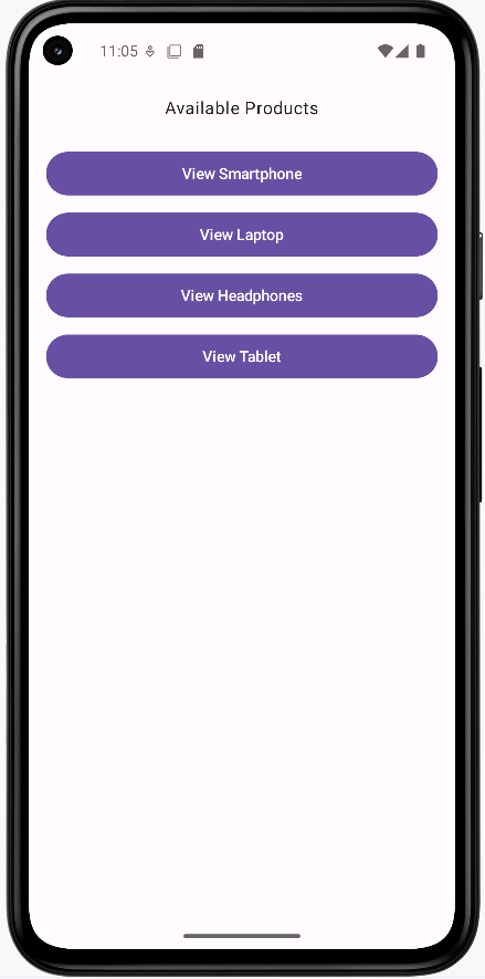
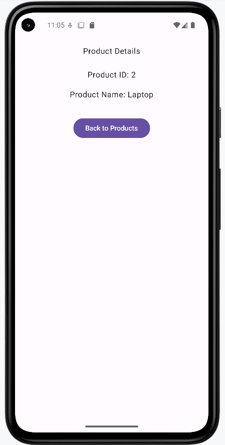
Optional Arguments
Sometimes a value isn’t always required. You make an argument optional by giving it a defaultValue in its navArgument block. In the route pattern, the part after the ? is the query; arguments in the query can be optional when you provide a default. For example, profile/{userId}?showDetails={showDetails} has a required path argument userId and an optional query argument showDetails. In the example below, a home screen has two buttons: one navigates to the profile with only the user ID (so showDetails is omitted and defaults to false), and the other navigates with the user ID plus showDetails=true. The same profile screen then shows either a basic view or a detailed view depending on that optional argument.
Example: Optional argument
@Composable
fun AppNavWithOptionalArgs() {
    val navController = rememberNavController()
    NavHost(
        navController = navController,
        startDestination = "home"
    ) {
        composable("home") {
            HomeScreen(
                onNavigateToProfileBasic = { userId ->
                    navController.navigate("profile/$userId") {
                        launchSingleTop = true
                    }
                },
                onNavigateToProfileWithDetails = { userId ->
                    navController.navigate("profile/$userId?showDetails=true") {
                        launchSingleTop = true
                    }
                }
            )
        }
        composable(
            route = "profile/{userId}?showDetails={showDetails}",
            arguments = listOf(
                navArgument("userId") { type = NavType.StringType },
                navArgument("showDetails") {
                    type = NavType.BoolType
                    defaultValue = false
                }
            )
        ) { backStackEntry ->
            val userId = backStackEntry.arguments?.getString("userId")
            val showDetails = backStackEntry.arguments?.getBoolean("showDetails") ?: false
            ProfileScreen(
                userId = userId,
                showDetails = showDetails,
                onNavigateBack = {
                    navController.popBackStack()
                }
            )
        }
    }
}

@Composable
fun HomeScreen(
    onNavigateToProfileBasic: (String) -> Unit,
    onNavigateToProfileWithDetails: (String) -> Unit
) {
    Column(
        modifier = Modifier
            .fillMaxSize()
            .systemBarsPadding()
            .padding(16.dp),
        horizontalAlignment = Alignment.Start,
        verticalArrangement = Arrangement.spacedBy(12.dp)
    ) {
        Text(
            text = "Optional argument example",
            modifier = Modifier.padding(bottom = 8.dp),
            style = MaterialTheme.typography.titleMedium
        )
        Text(
            text = "Choose how to view the profile:",
            modifier = Modifier.padding(bottom = 8.dp)
        )
        Button(onClick = { onNavigateToProfileBasic("alex") }) {
            Text("View profile (basic)")
        }
        Button(onClick = { onNavigateToProfileWithDetails("alex") }) {
            Text("View profile (with details)")
        }
        Spacer(modifier = Modifier.height(16.dp))
        Text(
            text = "This is the home page.",
            modifier = Modifier.padding(8.dp),
            style = MaterialTheme.typography.bodySmall
        )
    }
}

@Composable
fun ProfileScreen(
    userId: String?,
    showDetails: Boolean,
    onNavigateBack: () -> Unit
) {
    Column(
        modifier = Modifier
            .fillMaxSize()
            .systemBarsPadding()
            .padding(16.dp),
        horizontalAlignment = Alignment.Start,
        verticalArrangement = Arrangement.spacedBy(12.dp)
    ) {
        Text(
            text = "Profile for user: $userId",
            style = MaterialTheme.typography.titleMedium
        )
        if (showDetails) {
            Text(
                text = "Extra details (showDetails = true):",
                style = MaterialTheme.typography.labelMedium
            )
            Text(text = "Email: ${userId}@example.com")
            Text(text = "Member since: Jan 2024")
            Text(text = "Preferences: Notifications enabled")
        } else {
            Text(
                text = "Basic view only. Use \"View profile (with details)\" from home to see more.",
                style = MaterialTheme.typography.bodySmall
            )
        }
        Spacer(modifier = Modifier.height(16.dp))
        Button(onClick = onNavigateBack) {
            Text("Back to Home")
        }
    }
}
What this example is doing
Overview. The app has a home screen and a profile screen. The profile screen is reached by a single route, profile/{userId}?showDetails={showDetails}. We can navigate to it in two different ways: with just the user ID (basic view) or with the user ID plus showDetails=true (detailed view). The profile screen then shows different content depending on whether showDetails was passed and what value it had.
The route pattern. The string "profile/{userId}?showDetails={showDetails}" has two parts. Everything before the ? is the path: profile/{userId}. So we must always pass a userId (e.g. "profile/alex"). The part after the ? is the optional query: showDetails={showDetails}. So we can call the route as "profile/alex" (no query) or "profile/alex?showDetails=true" (with the optional argument). When we don’t pass showDetails, we need a default—that’s why we set defaultValue = false in navArgument("showDetails"). The navigation system will then use false whenever the URL doesn’t include showDetails.
Home screen: two ways to navigate. HomeScreen has two buttons. “View profile (basic)” calls onNavigateToProfileBasic("alex"), which does navController.navigate("profile/alex"). So the route has no query, and showDetails will be false. “View profile (with details)” calls onNavigateToProfileWithDetails("alex"), which does navController.navigate("profile/alex?showDetails=true"). So the same profile route is used, but this time with the optional argument set to true. In both cases we’re going to the same composable (the profile destination); only the argument values differ.
Declaring and reading the arguments. In the composable(...) for the profile route we declare both arguments: userId as StringType (required), and showDetails as BoolType with defaultValue = false (optional). Inside the composable block we receive backStackEntry and read userId with getString("userId") and showDetails with getBoolean("showDetails") ?: false. The ?: false is a safety fallback so we always have a non-null Boolean to pass to ProfileScreen. We then call ProfileScreen(userId = userId, showDetails = showDetails, onNavigateBack = { ... }).
Profile screen: one screen, two layouts. ProfileScreen takes userId, showDetails, and onNavigateBack. It always shows “Profile for user: $userId”. Then it branches on showDetails: if showDetails is true, it shows the extra details (email, member since, preferences); if showDetails is false, it shows the short message “Basic view only…”. So one composable, one route, but two possible “modes” depending on the optional argument. The “Back to Home” button calls onNavigateBack, which runs popBackStack() to return to the home screen.
Full runnable example: chapter9 optional_argument.kt on GitHub.
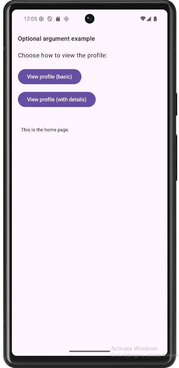
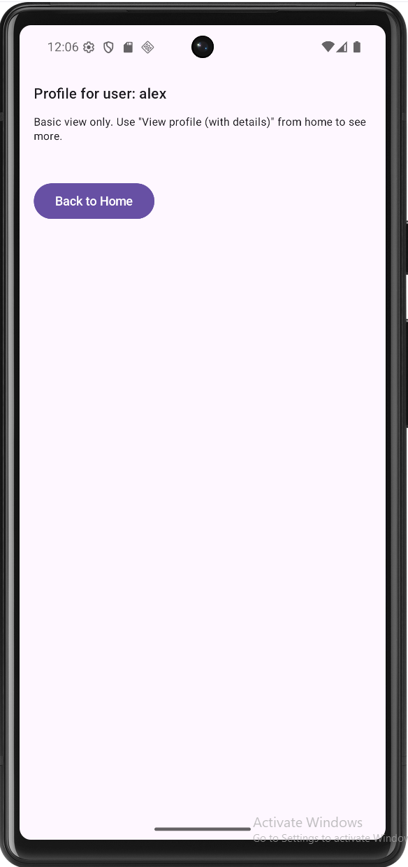
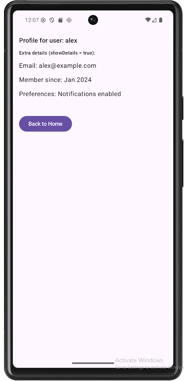
Tips for Success
- Use clear, consistent argument names in the route and in
navArgument. - Always treat arguments as nullable when reading them and handle null safely.
- Keep routes and argument names in sync with your
navigate(...)calls.
Common Mistakes to Avoid
- Forgetting to declare the argument type in
arguments. - Passing arguments in the wrong order when you have multiple.
- Assuming the argument is never null instead of using safe calls or defaults.
Managing the Back Stack
What is the Back Stack?
Think of the back stack like a stack of cards. Each time you navigate to a new screen, it's like adding a new card to the top of the stack. When you press the back button, it's like removing the top card to reveal the previous one. The back stack helps maintain the history of screens the user has visited, allowing them to navigate backward through their journey in your app.
Basic Back Stack Operations
| Operation | What It Does | When to Use It |
|---|---|---|
| popBackStack() | Goes back one screen | Basic back navigation |
| popUpTo() | Clears screens up to a point | Clearing navigation history |
| navigateUp() | Goes up in hierarchy | Parent-child navigation |
| clearBackStack() | Clears entire history | Starting fresh navigation |
Basic Back Navigation
@Composable
fun BasicBackNavigation() {
    val navController = rememberNavController()

    NavHost(
        navController = navController,
        startDestination = "home"
    ) {
        composable("home") {
            HomeScreen(
                onNavigateToProfile = {
                    navController.navigate("profile")
                }
            )
        }
        composable("profile") {
            ProfileScreen(
                onNavigateBack = {
                    navController.popBackStack()
                }
            )
        }
    }
}

@Composable
fun ProfileScreen(onNavigateBack: () -> Unit) {
    Column(
        modifier = Modifier.fillMaxSize(),
        horizontalAlignment = Alignment.CenterHorizontally,
        verticalArrangement = Arrangement.Center
    ) {
        Text("Profile Screen")
        Button(onClick = onNavigateBack) {
            Text("Go Back")
        }
    }
}
Understanding Basic Back Navigation
Let's break down how this basic back navigation works:
- Navigation Setup:
rememberNavController()creates a controller to manage navigation stateNavHostdefines our navigation graph with "home" as the starting point- Two destinations are defined: "home" and "profile"
- Navigation Flow:
- When user clicks to go to profile:
navController.navigate("profile")adds profile screen to stack - When user clicks back:
navController.popBackStack()removes profile screen - The back stack now looks like: [home] → [home, profile] → [home]
- When user clicks to go to profile:
- Back Button Behavior:
- System back button automatically triggers
popBackStack() - Custom back button in ProfileScreen also calls
popBackStack() - Both methods achieve the same result: returning to the previous screen
- System back button automatically triggers
Key Points:
- popBackStack() removes the current screen
- System back button works automatically
- Back navigation preserves screen state
- Handle back navigation in each screen
Clearing the Back Stack
@Composable
fun ClearingBackStack() {
    val navController = rememberNavController()

    NavHost(
        navController = navController,
        startDestination = "home"
    ) {
        composable("home") {
            HomeScreen(
                onNavigateToLogin = {
                    // Clear all screens up to and including home
                    navController.navigate("login") {
                        popUpTo("home") { inclusive = true }
                    }
                }
            )
        }
        composable("login") {
            LoginScreen(
                onLoginSuccess = {
                    // Clear entire back stack and set new start
                    navController.navigate("main") {
                        popUpTo(0) { inclusive = true }
                    }
                }
            )
        }
    }
}
Understanding Stack Clearing
This example shows two important ways to clear the back stack:
1. Clearing to a Specific Screen
navController.navigate("login") {
    popUpTo("home") { inclusive = true }
}- What it does:
- Navigates to "login" screen
- Removes all screens up to and including "home"
- The
inclusive = truemeans "home" is also removed
- When to use:
- When you want to clear history up to a certain point
- Common in logout flows or when resetting to a specific screen
- Example: User logs out, you clear to login screen
2. Clearing the Entire Stack
navController.navigate("main") {
    popUpTo(0) { inclusive = true }
}- What it does:
popUpTo(0)refers to the first screen in the stack- Clears ALL screens in the back stack
- Makes "main" the new root screen
- When to use:
- After successful login to start fresh
- When you want to prevent going back to previous screens
- Example: After login, you don't want users to go back to login screen
Key Points:
- popUpTo() clears screens up to a destination
- inclusive = true includes the target screen
- popUpTo(0) clears entire stack
- Use when starting fresh navigation
Handling System Back
@Composable
fun SystemBackHandling() {
    val navController = rememberNavController()

    // Handle system back button
    BackHandler {
        if (navController.previousBackStackEntry != null) {
            navController.popBackStack()
        } else {
            // Handle app exit or show confirmation
        }
    }

    NavHost(
        navController = navController,
        startDestination = "home"
    ) {
        // ... navigation setup
    }
}
Understanding System Back Handling
This example shows how to take control of the system back button:
- BackHandler Component:
- Intercepts the system back button press
- Gives you control over what happens when back is pressed
- Can be used to show confirmations or prevent navigation
- Navigation Check:
previousBackStackEntry != nullchecks if there's a screen to go back to- If true: performs normal back navigation
- If false: you can handle app exit or show a confirmation dialog
- Common Use Cases:
- Preventing accidental back navigation
- Showing "Are you sure you want to exit?" dialogs
- Custom back behavior for specific screens
Tips for Success
- Plan your back stack behavior
- Handle system back button
- Clear stack when appropriate
- Test navigation flows
Common Mistakes to Avoid
- Forgetting to handle back navigation
- Creating infinite back stacks
- Not clearing stack when needed
- Ignoring system back button
Navigation UI Components
Introduction to Navigation UI
Navigation UI components are the visual elements that help users move around your app. Think of them like signs and doors in a building - they show users where they can go and how to get there. In this lesson, we'll learn about two common navigation UI components:
| Component | Where It Goes | What It's For | When to Use |
|---|---|---|---|
| Top App Bar | Top of the screen | Show app title and important actions | App-wide actions, context, or navigation. Note the or navigation part. |
| Bottom Navigation Bar | Bottom of the screen | Switch between main app sections | 3-5 top-level destinations |
What is Scaffold?
Scaffold is a layout in Jetpack Compose that gives your screen a standard structure: a place for a top bar, an optional bottom bar, and a large area in the middle for your main content. You don’t have to figure out where each part goes—Scaffold does that. You pass in the top bar (and bottom bar if you have one), and you put your main content in a block (a lambda). Scaffold also passes paddingValues into that block so you can add padding to your content and keep it from drawing underneath the bars.
In the example below, MainScreen uses Scaffold to show a top navigation bar and the main content. The main content is everything you put inside the content block. Here, that’s the NavHost. The NavHost is what actually shows your screens—HomeScreen, ProfileScreen, and SettingsScreen—depending on the current route. So in this code, the “main content” is the NavHost and the screen that’s currently visible inside it. Scaffold’s job is to put the top bar above that content and to give you paddingValues so the content doesn’t sit under the bar.
Here’s the same idea in terms of the code:
topBar = { TopNavigationBar(navController) }— This is the top bar. Scaffold draws it at the top of the screen.- The block
{ paddingValues -> ... }is the content block. Whatever you put here is the main content. Here we put theNavHost. - Inside the content block we use
Modifier.padding(paddingValues)on the NavHost. That applies the padding Scaffold provides so the NavHost (and the Home, Profile, or Settings screen inside it) is drawn below the top bar instead of underneath it.
@Composable
fun MainScreen() {
    val navController = rememberNavController()

    Scaffold(
        topBar = { TopNavigationBar(navController) }
    ) { paddingValues ->
        NavHost(
            navController = navController,
            startDestination = NavigationRoutes.HOME,
            modifier = Modifier.padding(paddingValues)
        ) {
            composable(NavigationRoutes.HOME) { HomeScreen() }
            composable(NavigationRoutes.PROFILE) { ProfileScreen() }
            composable(NavigationRoutes.SETTINGS) { SettingsScreen() }
        }
    }
}
So: the main content is the NavHost and the screens it displays (HomeScreen, ProfileScreen, SettingsScreen). Scaffold places the top bar above that content and gives you paddingValues so the content stays visible below the bar.
Top App Bar
The Top App Bar (also called Action Bar) is like a header that stays at the top of your screen. It's great for showing the current screen title and navigation actions.
// NavigationRoutes.kt
    object NavigationRoutes {
        const val HOME = "home"
        const val PROFILE = "profile"
        const val SETTINGS = "settings"
    }

    // TopNavigation.kt
@OptIn(ExperimentalMaterial3Api::class)
@Composable
fun TopNavigationBar(navController: NavController) {
    val currentRoute = navController.currentBackStackEntryAsState().value?.destination?.route

    TopAppBar(
        title = { Text("Top Navigation Bar") },
        colors = TopAppBarDefaults.topAppBarColors(
            containerColor = MaterialTheme.colorScheme.primaryContainer,
            titleContentColor = MaterialTheme.colorScheme.onPrimaryContainer
        ),
        actions = {
            IconButton(onClick = {
                navController.navigate(NavigationRoutes.HOME) { launchSingleTop = true }
            }) {
                Icon(
                    imageVector = Icons.Filled.Home,
                    contentDescription = "Home",
                    tint = if (currentRoute == NavigationRoutes.HOME) MaterialTheme.colorScheme.primary else MaterialTheme.colorScheme.onPrimaryContainer
                )
            }
            IconButton(onClick = {
                navController.navigate(NavigationRoutes.PROFILE) { launchSingleTop = true }
            }) {
                Icon(
                    imageVector = Icons.Filled.Person,
                    contentDescription = "Profile",
                    tint = if (currentRoute == NavigationRoutes.PROFILE) MaterialTheme.colorScheme.primary else MaterialTheme.colorScheme.onPrimaryContainer
                )
            }
            IconButton(onClick = {
                navController.navigate(NavigationRoutes.SETTINGS) { launchSingleTop = true }
            }) {
                Icon(
                    imageVector = Icons.Filled.Settings,
                    contentDescription = "Settings",
                    tint = if (currentRoute == NavigationRoutes.SETTINGS) MaterialTheme.colorScheme.primary else MaterialTheme.colorScheme.onPrimaryContainer
                )
            }
        }
    )
}

    // MainScreen.kt
    @Composable
    fun MainScreen() {
        val navController = rememberNavController()

        Scaffold(
            topBar = { TopNavigationBar(navController) }
        ) { paddingValues ->
            NavHost(
                navController = navController,
                startDestination = NavigationRoutes.HOME,
                modifier = Modifier.padding(paddingValues)
            ) {
                composable(NavigationRoutes.HOME) { HomeScreen() }
                composable(NavigationRoutes.PROFILE) { ProfileScreen() }
                composable(NavigationRoutes.SETTINGS) { SettingsScreen() }
            }
        }
    }
How the Top App Bar works:
- The top app bar is like a header at the top of your screen that shows your app's name and navigation buttons
- It's different from the bottom navigation bar because it's meant for app-level actions and showing where you are in the app
- In the code, we use
topBarin theScaffoldto put it at the top of the screen - It can show a back button when you're not on the home screen
- While it can have navigation buttons, its main job is to show your app's title and important actions
How this example renders
Above is just a snippet of the code to view the full code, you need to go to my GitHub page and look at the chapter9 topNavBar.kt file.
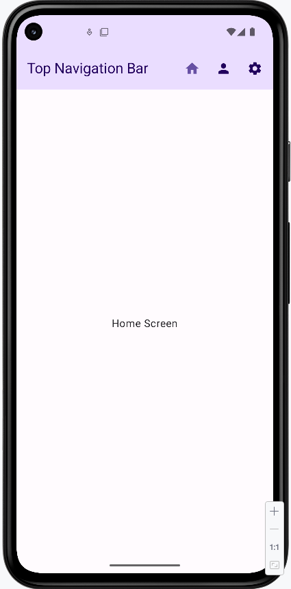
Bottom Navigation Bar
The bottom navigation bar is perfect for switching between the main sections of your app. It's like having a row of buttons at the bottom of the screen that take you to different places.
/ NavigationRoutes.kt
    object NavigationRoutes {
        const val HOME = "home"
        const val PROFILE = "profile"
        const val SETTINGS = "settings"
    }

    // BottomNavigation.kt
    @Composable
    fun BottomNavigationBar(navController: NavController) {
        val currentRoute = navController.currentBackStackEntryAsState().value?.destination?.route

        NavigationBar {
            NavigationBarItem(
                icon = { Icon(Icons.Filled.Home, contentDescription = "Home") },
                label = { Text("Home") },
                selected = currentRoute == NavigationRoutes.HOME,
                onClick = {
                    navController.navigate(NavigationRoutes.HOME) {
                        launchSingleTop = true
                    }
                }
            )
            NavigationBarItem(
                icon = { Icon(Icons.Filled.Person, contentDescription = "Profile") },
                label = { Text("Profile") },
                selected = currentRoute == NavigationRoutes.PROFILE,
                onClick = {
                    navController.navigate(NavigationRoutes.PROFILE) {
                        launchSingleTop = true
                    }
                }
            )
            NavigationBarItem(
                icon = { Icon(Icons.Filled.Settings, contentDescription = "Settings") },
                label = { Text("Settings") },
                selected = currentRoute == NavigationRoutes.SETTINGS,
                onClick = {
                    navController.navigate(NavigationRoutes.SETTINGS) {
                        launchSingleTop = true
                    }
                }
            )
        }
    }

    // MainScreen.kt
    @Composable
    fun MainScreen() {
        val navController = rememberNavController()

        Scaffold(
            bottomBar = { BottomNavigationBar(navController) }
        ) { paddingValues ->
            NavHost(
                navController = navController,
                startDestination = NavigationRoutes.HOME,
                modifier = Modifier.padding(paddingValues)
            ) {
                composable(NavigationRoutes.HOME) { HomeScreen() }
                composable(NavigationRoutes.PROFILE) { ProfileScreen() }
                composable(NavigationRoutes.SETTINGS) { SettingsScreen() }
            }
        }
    }
How Bottom Navigation Works:
- Think of the bottom navigation bar like a row of buttons at the bottom of your screen that let you jump to different parts of your app
- Each button (called a
NavigationBarItem) has an icon and a label to show what it does - The current section you're on will be highlighted automatically
- It's perfect for apps with 3-5 main sections (like Home, Profile, Settings)
- In the code, we use
bottomBarin theScaffoldto put it at the bottom of the screen
How this example renders
Above is just a snippet of the code to view the full code, you need to go to my GitHub page and look at the chapter9 bottomNavBar.kt file.
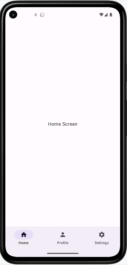
Bottom Navigation vs Top App Bar: What's the Difference?
- Where they go:
- Bottom Navigation Bar goes at the bottom of your screen
- Top App Bar goes at the top of your screen
- What they're for:
- Bottom Navigation Bar is for switching between the main parts of your app (like Home, Profile, Settings)
- Top App Bar is for showing your app's name and important actions at the top
- When to use each:
- Use Bottom Navigation when you want users to easily switch between main sections of your app
- Use Top App Bar when you want to show the app name and important actions at the top of the screen
Where Do the Icons Come From?
In our examples, we use icons from the Material Icons library. These are built into Android and easy to use. Here's how we get them:
// Import the icons we want to use
import androidx.compose.material.icons.Icons
import androidx.compose.material.icons.filled.Home
import androidx.compose.material.icons.filled.Person
import androidx.compose.material.icons.filled.Settings

// Then use them in our code
Icon(Icons.Filled.Home, contentDescription = "Home")
Icon(Icons.Filled.Person, contentDescription = "Profile")
Icon(Icons.Filled.Settings, contentDescription = "Settings")
Some things to know about Material Icons:
- They're free to use and come with Android
- There are many icons to choose from (like Home, Settings, Person, etc.)
- You can find all available icons in Android Studio by typing
Icons.Filled.and looking at the suggestions - Always include a
contentDescriptionfor accessibility
Tips for Success
- Choose the right navigation component for your app's needs
- Keep navigation consistent throughout your app
- Use clear icons and labels
- Test navigation on different screen sizes
Common Mistakes to Avoid
- Using too many navigation components at once
- Unclear icons or labels
- Inconsistent navigation patterns
- Not handling back navigation properly
Organizing Navigation with Multiple Files
What We Will Cover
This lesson covers how to organize an Android app across multiple files and how to manage different kinds of data between screens. You will see a recommended package structure, how to separate navigation from UI and business logic, and how screen-specific state and shared state work together.
Why Separate Files?
Keeping all code in a single file makes an app hard to navigate, debug, and extend. Splitting code into multiple files by responsibility improves clarity and maintainability. Benefits include:
- Easier to locate code — Navigation lives in one place, each screen in its own file, ViewModels grouped by purpose.
- Easier to fix bugs — When something breaks, you know which module or screen to inspect.
- Better for teamwork — Different developers can work on different screens or layers without constant merge conflicts.
- Single responsibility — Each file has a clear purpose (e.g., one file for routes, one per screen).
- Easier testing — You can test ViewModels and navigation logic separately from the UI.
Recommended File Structure
Below is a typical structure for a Compose app that uses navigation and ViewModels. Routes and navigation logic live in one place; each screen has its own package and optional ViewModel.
app/
├── src/
│   ├── main/
│   │   ├── java/
│   │   │   └── com.example.myapp/
│   │   │       ├── MainActivity.kt              // App entry point
│   │   │       ├── navigation/                  // Navigation graph and routes
│   │   │       │   ├── AppNavigation.kt         // NavHost and composable destinations
│   │   │       │   └── NavigationRoutes.kt      // Route constants
│   │   │       ├── viewmodels/                  // State and business logic
│   │   │       │   ├── shared/
│   │   │       │   │   └── SharedViewModel.kt   // State shared across screens
│   │   │       │   └── screens/
│   │   │       │       ├── HomeViewModel.kt     // Home screen state
│   │   │       │       ├── ProfileViewModel.kt  // Profile screen state
│   │   │       │       └── SettingsViewModel.kt // Settings screen state
│   │   │       └── screens/                     // UI composables per screen
│   │   │           ├── home/
│   │   │           │   └── HomeScreen.kt
│   │   │           ├── profile/
│   │   │           │   └── ProfileScreen.kt
│   │   │           └── settings/
│   │   │               └── SettingsScreen.kt
Understanding the Structure
- navigation/ — Centralizes routing and the NavHost.
AppNavigation.kt— Defines the NavHost and composable destinations; contains the navigation graph.NavigationRoutes.kt— Holds route name constants (e.g."home","profile/{userId}") so they are defined once and reused.
- viewmodels/ — Holds state and logic that survives configuration changes.
shared/— ViewModels used by more than one screen (e.g. current user).screens/— ViewModels used by a single screen (e.g. profile data for one user).
- screens/ — One package per screen; each contains the composable(s) for that screen and can use a screen-specific or shared ViewModel.
Required Gradle Dependencies
As discussed earlier in the navigation chapter, add the following dependencies to your project.
NOTE: The lifecycle-viewmodel-compose dependency is also required for ViewModels to work.
Update Version Catalog (gradle/libs.versions.toml)
[versions]
    # ... existing versions ...
    navigation-compose = "2.7.7"
    lifecycle-viewmodel-compose = "2.7.0"

    [libraries]
    # ... existing libraries ...
    androidx-navigation-compose = { group = "androidx.navigation", name = "navigation-compose", version.ref = "navigation-compose" }
    androidx-lifecycle-viewmodel-compose = { group = "androidx.lifecycle", name = "lifecycle-viewmodel-compose", version.ref = "lifecycle-viewmodel-compose" }
Update App Dependencies (app/build.gradle.kts)
dependencies {
    // ... existing dependencies ...

    // ViewModels and Navigation
    implementation(libs.androidx.lifecycle.viewmodel.compose)
    implementation(libs.androidx.navigation.compose)
}
Understanding the Dependencies
- lifecycle-viewmodel-compose:
- Provides
viewModel()so composables can obtain a ViewModel scoped to the current navigation destination or activity. - Integrates ViewModels with Compose so UI recomposes when state changes.
- Preserves ViewModel state across configuration changes (e.g. rotation).
- Provides
- navigation-compose:
- Provides
NavHost,composable(),rememberNavController(), and related APIs. - Supports type-safe navigation and passing arguments between screens.
- Provides
Understanding Different Types of Data Management
In a multi-screen app you need to decide where state lives and how it is passed. Three common approaches are: screen-specific ViewModels (state for one screen), shared ViewModels (state used by several screens), and navigation arguments (data passed when navigating to a screen).
Screen-Specific ViewModels
Use a ViewModel scoped to one screen when the state is only needed on that screen (e.g. form fields, loading flag, or data loaded for that screen only):
// viewmodels/screens/HomeViewModel.kt
class HomeViewModel : ViewModel() {
    var screenTitle by mutableStateOf("Home")
        private set

    fun updateTitle(newTitle: String) {
        screenTitle = newTitle
    }
}

// screens/home/HomeScreen.kt
@Composable
fun HomeScreen(
    homeViewModel: HomeViewModel = viewModel(),
    onProfileClick: (String) -> Unit,
    onSettingsClick: () -> Unit
) {
    Column(
        modifier = Modifier.fillMaxSize(),
        verticalArrangement = Arrangement.Center,
        horizontalAlignment = Alignment.CenterHorizontally
    ) {
        Text(text = homeViewModel.screenTitle)
        Button(onClick = { onProfileClick("Scott Shaper") }) {
            Text("Go to Profile")
        }
        Button(onClick = onSettingsClick) {
            Text("Go to Settings")
        }
    }
}
Shared ViewModels
Use a shared ViewModel when multiple screens need to read or update the same state (e.g. current user, app-wide settings):
// viewmodels/shared/SharedViewModel.kt
class SharedViewModel : ViewModel() {
    var currentUser by mutableStateOf(null)
        private set

    fun updateUser(user: User) {
        currentUser = user
    }

    fun clearUser() {
        currentUser = null
    }
}
Navigation Parameters
Use navigation arguments when you need to pass a specific value to the destination screen (e.g. user id, item id). The value is read from the route or back stack entry when the screen is shown:
// When navigating from Home to Profile
onProfileClick("Scott Shaper")  // Passing a specific name

// The Profile screen receives this name
@Composable
fun ProfileScreen(
    userId: String = "Unknown",  // Receiving the passed name
    // ... other parameters
) {
    // Use the userId to load the right profile
    LaunchedEffect(userId) {
        profileViewModel.loadProfile(userId)
    }
}
When to Use Each Approach
| Type | When to Use | Example |
|---|---|---|
| Screen-Specific ViewModels | State used only on one screen | Form state, screen-specific loading/data |
| Shared ViewModels | State needed on multiple screens | Current user, app settings, cart |
| Navigation Parameters | Pass a value when navigating to a screen | User id, product id, search query |
Complete Example Implementation
The following example ties together the file structure, navigation, and the three data approaches: a Home screen, a Profile screen (with a navigation argument), and a Settings screen, using both screen-specific and shared ViewModels.
1. Define Routes (NavigationRoutes.kt)
Put all your route names in one place so the rest of the app can reuse them and you avoid typos.
// navigation/NavigationRoutes.kt
object NavigationRoutes {
    const val HOME = "home"
    const val PROFILE = "profile/{userId}"     // userId is a path argument
    const val SETTINGS = "settings"
}
What each part does:
- Simple routes — No extra data is sent when you navigate:
When you go to Home or Settings, you just use the route name (e.g.const val HOME = "home" const val SETTINGS = "settings""home"). - Route with a placeholder — The profile screen needs to know which user:
const val PROFILE = "profile/{userId}"{userId}is a slot. When you navigate, you replace it with a real value. For example,"profile/Scott Shaper"or"profile/John". The Profile screen will receive that value so it can load the right user's data.
2. Create ViewModels
We use one shared ViewModel (for data that multiple screens need) and one ViewModel per screen where we need screen-only state.
SharedViewModel — Stores the currently logged-in user. Any screen can read or update it.
// viewmodels/shared/SharedViewModel.kt
class SharedViewModel : ViewModel() {
    var currentUser by mutableStateOf(null)
        private set

    fun updateUser(user: User) {
        currentUser = user
    }

    fun clearUser() {
        currentUser = null
    }
} currentUser— The user who is logged in (ornullif no one is).mutableStateOfmeans when this changes, the UI automatically updates.updateUser(user)— Call this to “log in” a user (e.g. from the Settings screen).clearUser()— Call this to “log out.”
HomeViewModel — State that only the Home screen cares about.
// viewmodels/screens/HomeViewModel.kt
class HomeViewModel : ViewModel() {
    var screenTitle by mutableStateOf("Home")
        private set
    var isLoading by mutableStateOf(false)
        private set

    fun updateTitle(newTitle: String) {
        screenTitle = newTitle
    }

    fun loadHomeData() {
        isLoading = true
        // Simulate loading data
        isLoading = false
    }
}screenTitle— The text shown at the top of the Home screen.isLoading—truewhile data is loading; the UI can show a spinner.
ProfileViewModel — State for the Profile screen. It loads profile data for a specific user.
// viewmodels/screens/ProfileViewModel.kt
class ProfileViewModel : ViewModel() {
    var profileData by mutableStateOf(null)
        private set
    var isLoading by mutableStateOf(false)
        private set

    fun loadProfile(userId: String) {
        isLoading = true
        // Simulate loading profile data for the specific user
        profileData = ProfileData(
            userId = userId,
            description = "Profile for $userId - This is a sample profile description."
        )
        isLoading = false
    }
}
loadProfile(userId: String)— You pass the user id (e.g. from the route). The ViewModel then loads (here, simulates) that user’s profile and stores it inprofileData.
3. Create Screen Composables
Each screen is a composable that receives the ViewModels and navigation callbacks it needs:
// screens/home/HomeScreen.kt
@Composable
fun HomeScreen(
    homeViewModel: HomeViewModel = viewModel(),
    sharedViewModel: SharedViewModel = viewModel(),
    onProfileClick: (String) -> Unit,
    onSettingsClick: () -> Unit
) {
    Column(
        modifier = Modifier.fillMaxSize(),
        verticalArrangement = Arrangement.Center,
        horizontalAlignment = Alignment.CenterHorizontally
    ) {
        Text(text = homeViewModel.screenTitle)

        if (homeViewModel.isLoading) {
            CircularProgressIndicator()
        }

        // Show shared user information if available
        sharedViewModel.currentUser?.let { user ->
            Text("Welcome ${user.name}!")
            Text("Email: ${user.email}")
        }

        Button(onClick = { onProfileClick("Scott Shaper") }) {
            Text("Go to Profile")
        }
        Button(onClick = onSettingsClick) {
            Text("Go to Settings")
        }
    }
}

// screens/profile/ProfileScreen.kt
@Composable
fun ProfileScreen(
    userId: String = "Unknown",  // This receives the name passed from Home
    profileViewModel: ProfileViewModel = viewModel(),
    sharedViewModel: SharedViewModel = viewModel(),
    onHomeClick: () -> Unit,
    onSettingsClick: () -> Unit
) {
    // Load profile data for the specific user when the screen appears
    LaunchedEffect(userId) {
        profileViewModel.loadProfile(userId)
    }

    Column(
        modifier = Modifier.fillMaxSize(),
        verticalArrangement = Arrangement.Center,
        horizontalAlignment = Alignment.CenterHorizontally
    ) {
        Text("Profile Screen")

        if (profileViewModel.isLoading) {
            CircularProgressIndicator()
        } else {
            profileViewModel.profileData?.let { profile ->
                Text("User: ${profile.userId}")
                Text(profile.description)
            }
        }

        // Show shared user information
        sharedViewModel.currentUser?.let { user ->
            Text("Shared User: ${user.name}")
        }

        Button(onClick = onHomeClick) {
            Text("Go to Home")
        }
        Button(onClick = onSettingsClick) {
            Text("Go to Settings")
        }
    }
}

// screens/settings/SettingsScreen.kt
@Composable
fun SettingsScreen(
    sharedViewModel: SharedViewModel,
    onHomeClick: () -> Unit,
    onProfileClick: (String) -> Unit
) {
    Column(
        modifier = Modifier.fillMaxSize(),
        verticalArrangement = Arrangement.Center,
        horizontalAlignment = Alignment.CenterHorizontally
    ) {
        Text("Settings Screen")

        // Show current user information
        sharedViewModel.currentUser?.let { user ->
            Text("Current User: ${user.name}")
            Text("Email: ${user.email}")
        }

        // Button to login a sample user
        Button(
            onClick = {
                val sampleUser = User(
                    id = "1",
                    name = "John Doe",
                    email = "john.doe@example.com"
                )
                sharedViewModel.updateUser(sampleUser)
            }
        ) {
            Text("Login Sample User")
        }

        // Button to go to profile using shared user name
        Button(
            onClick = {
                onProfileClick(sharedViewModel.currentUser?.name ?: "Unknown")
            }
        ) {
            Text("Go to Profile")
        }

        Button(onClick = onHomeClick) {
            Text("Go to Home")
        }
    }
}
What each screen does (with key code):
- HomeScreen — Gets both ViewModels with
viewModel(). It shows the home title and, if someone is logged in, a welcome message. When the user taps a button, it calls the navigation callbacks:
So "Go to Profile" passes the stringButton(onClick = { onProfileClick("Scott Shaper") }) { ... } Button(onClick = onSettingsClick) { ... }"Scott Shaper"; the navigation layer will build the route"profile/Scott Shaper". "Go to Settings" just callsonSettingsClick()with no argument. - ProfileScreen — Receives
userIdfrom the route (e.g."Scott Shaper"). When the screen appears, it loads that user's profile:
So the correct profile is shown. It also shows the shared user name if set and has buttons to go Home or Settings.LaunchedEffect(userId) { profileViewModel.loadProfile(userId) } - SettingsScreen — Uses only the shared ViewModel. It can "log in" a sample user and navigate to that user's profile:
sharedViewModel.updateUser(sampleUser)  // other screens now see this user
onProfileClick(sharedViewModel.currentUser?.name ?: "Unknown")  // go to Profile for current user
4. Set Up Navigation (AppNavigation.kt)
AppNavigation defines the NavHost and wires each route to its screen, passing the shared ViewModel and extracting navigation arguments where needed:
@Composable
fun AppNavigation() {
    val navController = rememberNavController()
    val sharedViewModel: SharedViewModel = viewModel()

    NavHost(navController = navController, startDestination = NavigationRoutes.HOME) {
        // Home screen
        composable(NavigationRoutes.HOME) {
            HomeScreen(
                sharedViewModel = sharedViewModel,
                onProfileClick = { userName ->
                    // Navigate to profile with a specific user name
                    navController.navigate("profile/$userName")
                },
                onSettingsClick = {
                    navController.navigate(NavigationRoutes.SETTINGS)
                }
            )
        }

        // Profile screen with navigation parameter
        composable(
            route = NavigationRoutes.PROFILE,  // "profile/{userId}"
            arguments = listOf(
                navArgument("userId") {
                    type = NavType.StringType  // The userId is a string
                }
            )
        ) { backStackEntry ->
            // Extract the userId from the navigation arguments
            val userId = backStackEntry.arguments?.getString("userId") ?: "Unknown"

            ProfileScreen(
                userId = userId,  // Pass the extracted userId to ProfileScreen
                sharedViewModel = sharedViewModel,
                onHomeClick = { navController.navigate(NavigationRoutes.HOME) },
                onSettingsClick = { navController.navigate(NavigationRoutes.SETTINGS) }
            )
        }

        // Settings screen
        composable(NavigationRoutes.SETTINGS) {
            SettingsScreen(
                sharedViewModel = sharedViewModel,
                onHomeClick = { navController.navigate(NavigationRoutes.HOME) },
                onProfileClick = { userName ->
                    navController.navigate("profile/$userName")
                }
            )
        }
    }
}
What each part does (with snippets):
- Setup — One NavController and one SharedViewModel for the whole app:
So the app starts on the Home screen, and every screen that needs the current user gets the sameval navController = rememberNavController() val sharedViewModel: SharedViewModel = viewModel() NavHost(..., startDestination = NavigationRoutes.HOME) { ... }sharedViewModel. - Home route — When the user is on Home, we show HomeScreen and tell it how to navigate:
So "Go to Profile" becomes a route likeonProfileClick = { userName -> navController.navigate("profile/$userName") }, onSettingsClick = { navController.navigate(NavigationRoutes.SETTINGS) }"profile/Scott Shaper", and "Go to Settings" goes to"settings". - Profile route (with an argument) — The route has a placeholder
{userId}. We declare it and then read the value to pass to ProfileScreen:
So when you navigate tocomposable( route = NavigationRoutes.PROFILE, // "profile/{userId}" arguments = listOf(navArgument("userId") { type = NavType.StringType }) ) { backStackEntry -> val userId = backStackEntry.arguments?.getString("userId") ?: "Unknown" ProfileScreen(userId = userId, ...) }"profile/Scott Shaper",userIdis"Scott Shaper"and ProfileScreen can load that user's data. - Settings route — Same idea as Home: we show SettingsScreen and pass callbacks that call
navController.navigate(...)to go Home or to Profile (with a user name).
5. Main Activity (MainActivity.kt)
The activity is where the app starts. It draws the Compose UI and puts the navigation graph at the root.
class MainActivity : ComponentActivity() {
    override fun onCreate(savedInstanceState: Bundle?) {
        super.onCreate(savedInstanceState)
        setContent {
            MaterialTheme {
                Surface(
                    modifier = Modifier.fillMaxSize(),
                    color = MaterialTheme.colorScheme.background
                ) {
                    AppNavigation()  // Start the navigation system
                }
            }
        }
    }
}
What this code does:
setContent { ... }— This is where we build the Compose UI. Everything the user sees is inside this block.AppNavigation()— This draws the NavHost and all the screens. So when the app opens, the first screen you see is the start destination (Home). Tapping buttons on each screen triggers the callbacks we defined in AppNavigation, which callnavController.navigate(...)to switch screens.
Understanding How Data Flows
Summary of how data moves in this example:
- Home → Profile:
- HomeScreen calls
onProfileClick("Scott Shaper"). - Navigation builds the route
"profile/Scott Shaper". - ProfileScreen receives
userId = "Scott Shaper"from the back stack entry and loads profile data for that user.
- HomeScreen calls
- Home → Settings:
- HomeScreen calls
onSettingsClick(); no arguments are passed. - SettingsScreen uses SharedViewModel to display the current user if one is set.
- HomeScreen calls
- Settings → Profile:
- SettingsScreen can call
onProfileClick(sharedViewModel.currentUser?.name). If the current user is "John Doe", the route becomes"profile/John Doe". - ProfileScreen receives that
userIdand loads the corresponding profile.
- SettingsScreen can call
How the Example Renders
You can try the full example by downloading the NavState project and opening it in Android Studio.
Home screen when the app first loads:
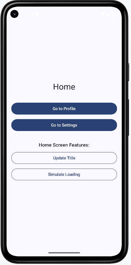
Profile screen when navigating from Home with the user name "Scott Shaper" passed as an argument:
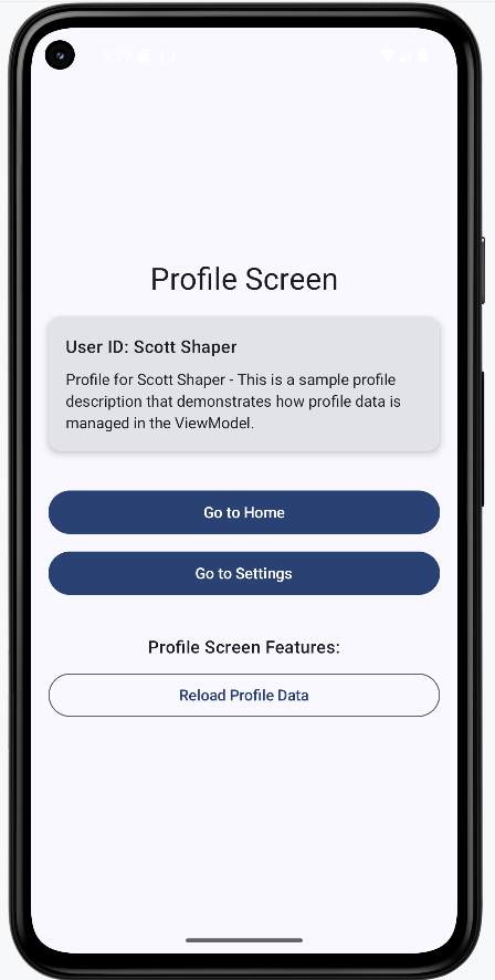
Settings screen when navigating from Home. The user name is not passed to Settings; only the Profile route receives the "Scott Shaper" argument. Settings does not need the user name unless it uses the shared ViewModel.
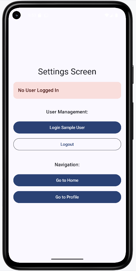
Profile screen when navigating from Settings before any user is logged in. The profile shows "Unknown" because nothing has been set in the shared ViewModel yet.
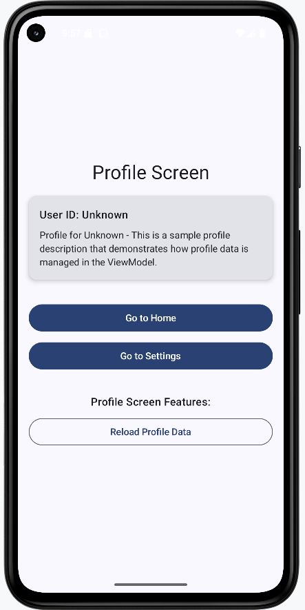
Settings screen after the login button is clicked:
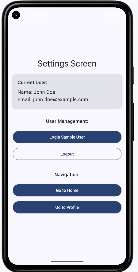
Profile screen when navigating from Settings after login. The profile shows "John Doe" because Settings updated the shared ViewModel with the logged-in user, and the navigation callback passed that user name to the profile route.
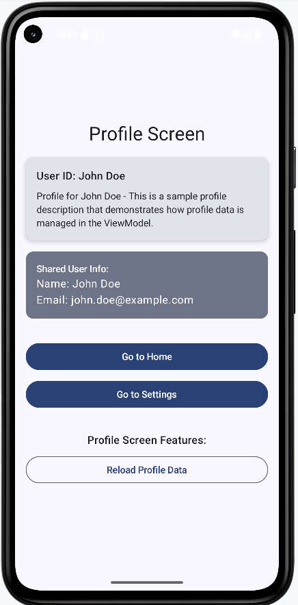
Home screen after login. Home displays "John Doe" from the shared ViewModel. The same would appear whether you navigated to Home from Profile or from Settings.
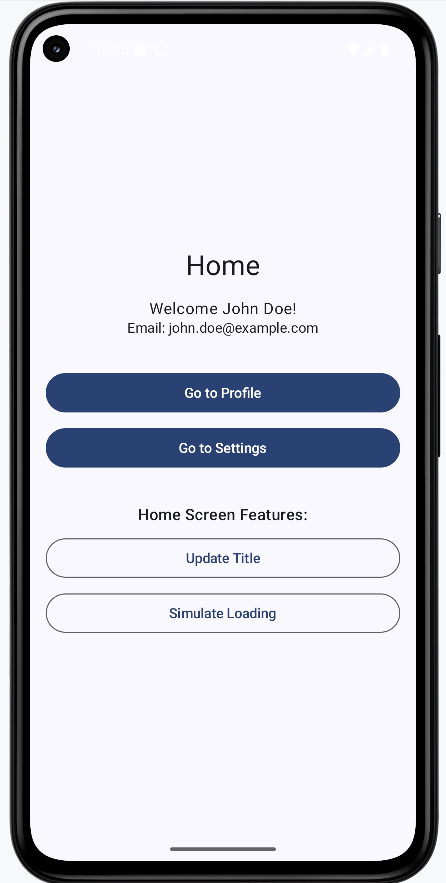
Profile screen after the reload button is clicked. The profile shows "ReloadedUser" and "John Doe": the profile screen updated its local profile data but did not change the shared ViewModel.
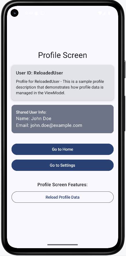
Home screen again after the profile reload. Home still shows the same information as before because it reads from the shared ViewModel, which was not modified by the profile screen.
Benefits of This Structure
- Organization:
- Each screen has its own file and (when needed) its own ViewModel.
- Navigation logic is separate from UI and business logic.
- Routes are defined in one place (NavigationRoutes.kt).
- Shared state vs. screen-specific state is clearly separated.
- Maintainability:
- Easier to find and change a specific screen or its logic.
- Changes to one screen are less likely to affect others.
- Clear separation of concerns: UI, navigation, and state.
- State updates are easier to trace and reason about.
- Scalability:
- New screens can be added with their own ViewModels and packages.
- Screen-specific features stay localized.
- Multiple developers can work on different screens or layers.
- Shared state can be introduced when multiple screens need it.
- State Management:
- Clear distinction between shared and screen-specific state.
- ViewModel state survives configuration changes (e.g. rotation).
- State flow is predictable when using ViewModels and navigation arguments consistently.
Best Practices
- File organization:
- Keep route names in a single place (e.g. NavigationRoutes.kt).
- Use consistent naming for files and packages.
- Group each screen and its ViewModel in a dedicated package.
- Keep navigation logic in the navigation layer, not inside screen composables.
- State management:
- Use ViewModels for screen-specific state.
- Use a shared ViewModel for state that multiple screens need.
- Keep state as close as possible to where it is used.
- Use
mutableStateOf(or equivalent) for state that should trigger UI updates.
- Navigation:
- Use type-safe navigation arguments where possible.
- Pass the shared ViewModel only to screens that need it.
- Keep navigation callbacks simple and focused on building the route and calling
navigate. - Use constants for route names to avoid typos and simplify refactoring.
- UI:
- Show loading states during async work.
- Handle errors and empty states in the UI.
- Keep composables focused on display and user input; put logic in ViewModels.
- Use the right state holder for the kind of state you have (screen vs. shared).
Common Mistakes to Avoid
- State management:
- Putting all state in one ViewModel when it should be split (e.g. screen-specific vs. shared).
- Not using a ViewModel for screen-specific state that should survive configuration changes.
- Forgetting to handle loading and error states in the UI.
- Not using reactive state (e.g.
mutableStateOf) for values that should drive UI updates.
- Navigation:
- Scattering route strings across the codebase instead of using a central constants object.
- Not passing the shared ViewModel to screens that need it (or passing it to screens that do not).
- Using string literals for routes instead of constants, which leads to typos and harder refactoring.
- Not reading or validating navigation arguments in the destination screen.
- File organization:
- Putting all composables in one file, which becomes hard to maintain.
- Mixing navigation logic (e.g. NavHost, route definitions) with screen UI code.
- No clear package structure, making it unclear where to add new screens or ViewModels.
- Putting ViewModel logic inside composables instead of separate ViewModel classes.
Tips for Success
- Planning:
- Decide on a file and package structure early in the project.
- Plan where state will live (screen-specific vs. shared) before implementing.
- Document your navigation graph (which screens exist and how they connect).
- Implementation:
- Use constants for route names from the start.
- Keep screen composables focused on UI; put business logic in ViewModels.
- Use ViewModels for state that should survive configuration changes.
- Follow consistent naming for screens, ViewModels, and packages.
- Testing:
- Test ViewModels independently of the UI when possible.
- Verify that state updates correctly and that navigation arguments are received.
- Test navigation flows (e.g. Home → Profile → back, Settings → Profile with shared user).
- Confirm that state survives configuration changes (e.g. rotation) where expected.
Chapter 10: ViewModels & State
What is a ViewModel?
Introduction
A ViewModel is like a manager for your app's data. It keeps track of information your screen needs, even if the user rotates their phone or leaves and comes back. In Jetpack Compose (and Android in general), ViewModels help you keep your UI and your app's logic separate, making your code easier to understand and maintain.
When to Use a ViewModel
- When you need to keep data around as the user navigates or rotates the device
- When you want to separate your UI code from your business logic
- When you have data that is shared between multiple composables or screens
Main Concepts
- Lifecycle-aware: ViewModels survive configuration changes (like screen rotation) so your data isn't lost.
- UI separation: The ViewModel holds the data and logic, while your composables just display it.
- State holder: The ViewModel is the "single source of truth" for your screen's state.
Dependencies
You will have to add some dependencies to your gradle file for view models to work.
Gradle (build.gradle.kts Module :app)
dependencies {
    // ... your existing dependencies ...
    implementation(libs.androidx.lifecycle.viewmodel.compose)
    // ... rest of your dependencies ...
}
libs.versions.toml
[versions]
# ... your existing versions ...
lifecycle = "2.7.0"  # Add this line

[libraries]
androidx-lifecycle-viewmodel-compose = { group = "androidx.lifecycle", name = "lifecycle-viewmodel-compose", version.ref = "lifecycle" }
Creating a New Class File
You will need to create a new class file for your ViewModel.
Right click on your package name, it will start with com.
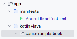
Then click New and then Kotlin File/Class
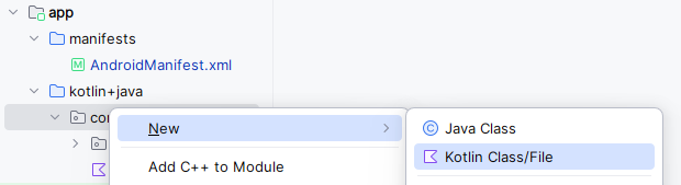
In the dialog box select Class and enter the file name "MainViewModel". NOTE: The file name can be anything you want.
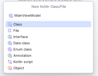
That will create a class file and place it in the same package as your MainActivity.kt file.
Creating the ViewModel
You have to have a file that is your view model. For this example I will create a file called MainViewModel.kt. It contains the following code:
import androidx.compose.runtime.mutableStateOf
    import androidx.lifecycle.ViewModel

    class MainViewModel : ViewModel() {
        private var _count = mutableStateOf(0)
        var count: Int
            get() = _count.value
            private set(value) {
                _count.value = value
            }

        fun increment() {
            count = count + 1
        }
    }
This Kotlin code defines a MainViewModel class, which extends ViewModel.
The ViewModel class is part of the Android Architecture Components and is designed to store and manage UI-related data in a lifecycle-conscious way.
This means the data within the ViewModel persists across configuration changes (like screen rotations) and the ViewModel itself lives as long as the scope of the UI (e.g., an Activity or Fragment).
Key components:
private var _count = mutableStateOf(0): This declares a private mutable state variable named_countand initializes it to 0.mutableStateOfis a function from the Jetpack Compose UI toolkit that creates an observable state holder. When the value of_countchanges, any UI elements observing it will automatically recompose (update). By making it private, external classes cannot directly modify this internal state.var count: Int: This declares a public read-only property namedcountof typeInt. It has a custom getter and a private setter:get() = _count.value: The getter simply returns the current value of the private_count.private set(value) { _count.value = value }: The setter is private, meaning that while thecountcan be read publicly, it can only be modified internally within theMainViewModelclass. This enforces a pattern where the UI can observe the state, but cannot directly change it; changes must happen through defined functions in the ViewModel.
fun increment(): This is a public function that provides a way to modify thecount. When called, it increments thecountby 1. This function serves as the controlled entry point for the UI to request a state change.
In summary, this ViewModel manages a simple counter.
The UI can observe the count property to display its current value, and it can call the increment() function to request an update to the counter, without directly manipulating the state.
MainActivity.kt
You also must have a mainactivity.kt file. The MainActivity.kt file is the UI that uses the view model for its data. The partial code is shown below:
import androidx.lifecycle.viewmodel.compose.viewModel  //this imports the viewModel file
...

//this is the composable function that uses the view model
@Composable
fun CounterScreen() {
    // Get or create a ViewModel instance
    // viewModel() is a composable function that handles ViewModel lifecycle
    val viewModel: MainViewModel = viewModel()

    // Column arranges its children vertically
    Column(
        modifier = Modifier
            .padding(top = 50.dp)  // Add top padding for better spacing from status bar
            .padding(16.dp)        // Add padding around all sides
    ) {
        // Button that triggers the increment function in ViewModel
        Button(onClick = { viewModel.increment() }) {
            Text("Increment")
        }

        // Text composable that displays the current count
        // It automatically updates when the count changes in ViewModel
        Text("Count: ${viewModel.count}")
    }
}
The key line in the code above is Button(onClick = { viewModel.increment() }) { This is the button that triggers the increment function in the ViewModel. The Text("Count: ${viewModel.count}") is displaying the count from the ViewModel.
How this example renders
Above is just a snippet of the code to view the full code, you need to go to my GitHub page and look at the chapter10 mainviewmodel1.kt file and chapter10 mainactivity1.kt file.
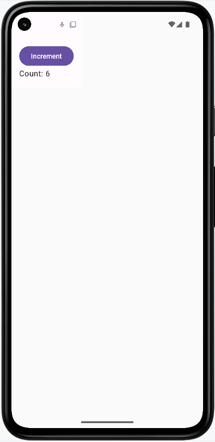
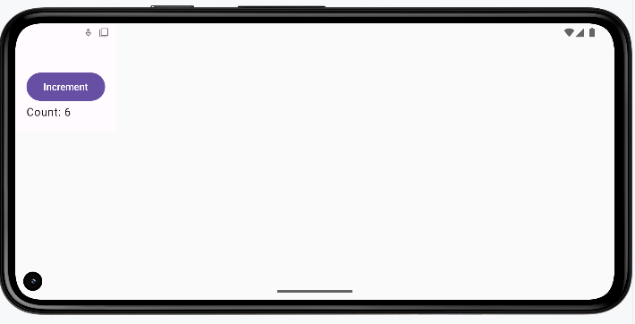
Passing Data to the ViewModel
So far we've seen the ViewModel hold state (like a count) and the UI read it and call functions like increment(). But often the user types something in a text field or makes a choice, and you need to send that data into the ViewModel. The UI "passes" the data by calling a function on the ViewModel with the new value. The ViewModel stores it and can use it later (for example, to show a message or to send to a server). The following example shows a screen where the user enters a name; that name is passed to the ViewModel, and when they tap a button, the ViewModel uses that name to set an output message.
In the earlier counter example, the ViewModel used mutableStateOf directly, which is fine for very small, UI-only screens. In this more realistic example, the ViewModel uses StateFlow (and MutableStateFlow) instead. Flow is Kotlin's standard way to represent a stream of values over time that can be used not just by Compose, but also by other layers like repositories and use cases. The UI collects the latest value with collectAsState(), so when the ViewModel updates the flow, the UI recomposes and shows the new value. The pattern is the same: the ViewModel owns the data; the UI reads it and sends events (like "name changed" or "display name clicked") by calling functions on the ViewModel.
MainViewModel.kt
class MainViewModel : ViewModel() {

    private val _Name = MutableStateFlow("")
    val Name: StateFlow<String> = _Name

    private val _output = MutableStateFlow("")
    val output: StateFlow<String> = _output

    fun onNameChange(name: String) {
        _Name.value = name
    }

    fun displayName() {
        _output.value = "The name is ${_Name.value}"
    }
}
Why use private variables? The ViewModel uses a common pattern: private mutable variables (_Name, _output) and public read-only properties (Name, output). The underscore names (_Name, _output) are MutableStateFlows—only the ViewModel can write to them (e.g. _Name.value = name). The public Name and output are typed as StateFlow, which only lets the UI read the latest value; the UI cannot assign to them. That way, the UI cannot change the state directly. All updates go through the ViewModel's functions (onNameChange, displayName), so the ViewModel stays in control of when and how state changes, which keeps the logic in one place and avoids bugs.
The ViewModel holds two pieces of state: the current name (_Name) and the message to show (_output). Both are exposed as read-only StateFlows (Name and output) so the UI can observe them. When the user types, the UI calls onNameChange(name)—that's "passing data to the ViewModel." When the user taps the button, the UI calls displayName(), and the ViewModel sets _output using the name it stored. So the data flow is: user input → UI calls onNameChange → ViewModel stores it; user taps button → UI calls displayName → ViewModel reads the stored name and updates output.
PassingData composable in MainActivity.kt
@Composable
fun PassingData(modifier: Modifier = Modifier) {

    val viewModel: MainViewModel = viewModel()

    val Name by viewModel.Name.collectAsState()
    val Output by viewModel.output.collectAsState()

    Column(modifier = modifier.padding(16.dp)) {

        Text(
            text = "Enter Name",
            modifier = modifier
        )

        OutlinedTextField(
            value = Name,
            onValueChange = { viewModel.onNameChange(it) },
            label = { Text("Enter Name") },
        )

        Button(onClick = { viewModel.displayName() }) {
            Text("Display Name")
        }

        Text(text = Output)
    }
}
PassingData gets the ViewModel with viewModel(). It then collects the ViewModel's Name and output flows into Compose state with collectAsState(), so whenever the ViewModel updates those flows, the UI recomposes. The text field's value is Name (from the ViewModel), and onValueChange passes the new text into the ViewModel by calling viewModel.onNameChange(it). That's how the typed name is sent to the ViewModel. The button calls viewModel.displayName(), which updates output in the ViewModel; the Text(text = Output) at the bottom shows that message. So the screen stays simple: it only displays state and forwards user actions to the ViewModel, and the ViewModel holds the data and decides what the output message is.
How this example renders
Above is just a snippet of the code to view the full code, you need to go to my GitHub page and look at the chapter10 PassingData folder you will find the full code for the Main Acvitity and Main View Model files.
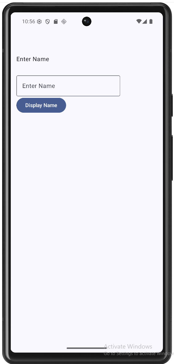
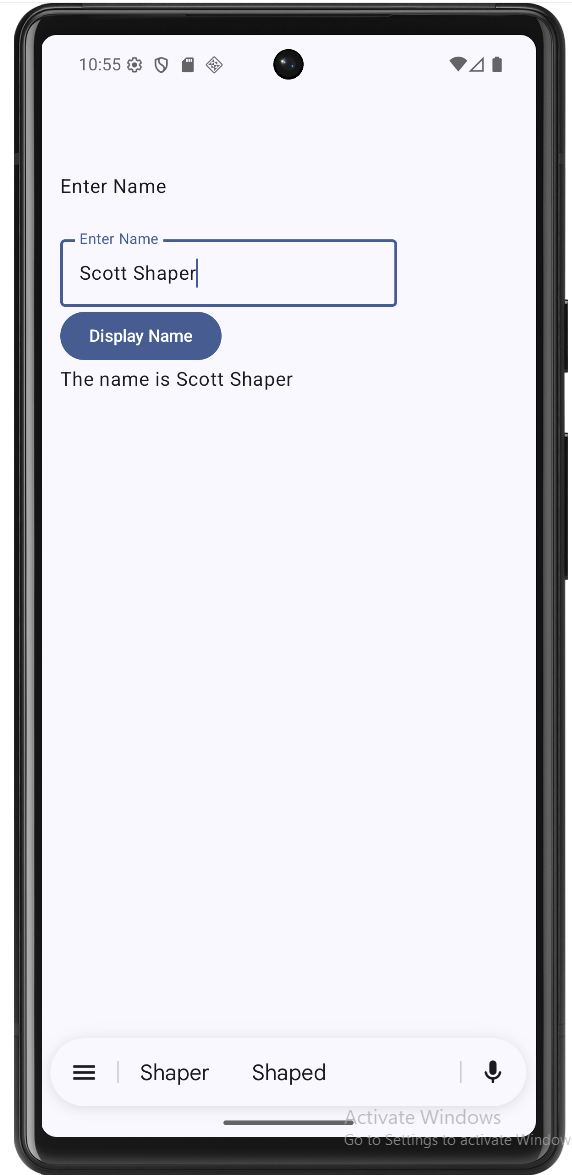
Tips for Success
- Use ViewModels for any data you want to keep when the screen changes.
- Keep your UI code (composables) simple—let the ViewModel handle the logic.
- Don't put Android Context or UI elements in your ViewModel.
Common Mistakes to Avoid
- Storing UI elements or Context in the ViewModel (it should only hold data and logic).
- Trying to use a ViewModel for data that should only exist temporarily (like a text field's current value).
- Forgetting to use
by mutableStateOffor state you want Compose to react to.
Best Practices
- Use one ViewModel per screen or feature.
- Expose only the data and functions your UI needs (keep things
privatewhen possible). - Document what your ViewModel does and what state it holds.
Hoisting State Up
Introduction
"Hoisting state up" means moving data and logic to a common parent so that multiple composables can share and update the same information. In Jetpack Compose, this is a key pattern for building apps that are easy to understand and maintain. It helps keep your UI predictable and your code organized.
When to Hoist State Up
- When two or more composables need to read or change the same data
- When you want to keep your UI components reusable and independent
- When you want to separate your UI from your app's logic
Main Concepts
- Single Source of Truth: Keep the data in one place (usually a parent composable or ViewModel) and pass it down to children.
- Unidirectional Data Flow: Data flows down from parent to child, and events flow up from child to parent.
- Stateless Composables: UI components that don't manage their own state are easier to reuse and test.
Why Hoist State? A Before and After Example
Let's look at a counter example first without hoisting, and then see how hoisting makes the code more maintainable and follows best practices:
Without Hoisting (More Complex to Maintain)
// Each composable manages its own state
@Composable
fun CounterScreen() {
    Column(
        modifier = Modifier
            .padding(top = 50.dp)
            .padding(16.dp)
    ) {
        // Display has its own state
        var displayCount by remember { mutableStateOf(0) }
        Text("Count: $displayCount")

        // Button has its own state
        var buttonCount by remember { mutableStateOf(0) }
        Button(onClick = {
            buttonCount++
            displayCount = buttonCount  // We can sync them, but this gets messy
        }) {
            Text("Increment")
        }

        // If we add another button, we need to update both states
        Button(onClick = {
            buttonCount--
            displayCount = buttonCount  // Duplicate code
        }) {
            Text("Increment Again")
        }

        // If we add another display, we need to update it too
        Text("Another Count: $displayCount")
    }
}
- While we can keep the states in sync, it requires manual synchronization
- Each new component that needs the count requires additional state updates
- If we forget to update any state, the UI becomes inconsistent
- As the app grows, this approach becomes harder to maintain and more prone to bugs
- Components are tightly coupled because they need to know about each other's state
With Hoisting (Better Practice)
// Parent composable holds the state
@Composable
fun CounterParent() {
    var count by remember { mutableStateOf(0) }
    Column(
        modifier = Modifier
            .padding(top = 50.dp)
            .padding(16.dp)
    ) {
        CounterDisplay(count = count)
        CounterIncButton(onIncrement = { count++ })
        CounterDecButton(onDeIncrement = { count-- })
    }
}

/**
 * CounterDisplay is a stateless composable that shows the current count.
 * It receives the count as a parameter and simply displays it.
 * Being stateless makes it reusable and easier to test.
 */
@Composable
fun CounterDisplay(count: Int) {
    Text("Count: $count")
}

/**
 * CounterIncButton is a stateless composable that provides the increment functionality.
 * It receives a callback function (onIncrement) as a parameter.
 * When clicked, it triggers the callback to update the parent's state.
 */
@Composable
fun CounterIncButton(onIncrement: () -> Unit) {
    Button(onClick = onIncrement) {
        Text("Increment")
    }

}

/**
 * CounterDecButton is a stateless composable that provides the increment functionality.
 * It receives a callback function (onDeIncrement) as a parameter.
 * When clicked, it triggers the callback to update the parent's state.
 */
@Composable
fun CounterDecButton(onDeIncrement: () -> Unit){
    Button(onClick = onDeIncrement){
        Text("DeIncrement")
    }
}
- State is managed in one place (single source of truth)
- Adding new components is simple - just pass the state and callback
- Components are decoupled - they don't need to know about each other
- The code is more maintainable and less prone to bugs
- Components are reusable because they're stateless
With Hoisting Using a ViewModel
The same hoisting pattern works when the state lives in a ViewModel instead of in the parent composable. The idea is the same: one place owns the state (the ViewModel), and the UI just displays it and sends events (like button clicks) to update it. The big advantage is that the ViewModel survives configuration changes (like rotating the device), so the count is not lost when the screen is recreated.
// CounterViewModel.kt (or in the same file for a small example)
import androidx.lifecycle.ViewModel
import androidx.compose.runtime.mutableStateOf
import androidx.compose.runtime.getValue
import androidx.compose.runtime.setValue

class CounterViewModel : ViewModel() {
    private var _count = mutableStateOf(0)
    val count: Int
        get() = _count.value

    fun increment() {
        _count.value = _count.value + 1
    }

    fun decrement() {
        _count.value = _count.value - 1
    }
}
The parent composable no longer holds remember { mutableStateOf(0) }. Instead, it gets a ViewModel with viewModel() and passes the ViewModel's count and functions down to the same stateless children. The child composables (CounterDisplay, CounterIncButton, CounterDecButton) stay exactly the same—they still receive a value and callbacks; they don't care whether the state came from a parent composable or a ViewModel.
// Parent composable uses the ViewModel as the state owner
import androidx.lifecycle.viewmodel.compose.viewModel

@Composable
fun CounterParentWithViewModel() {
    val viewModel: CounterViewModel = viewModel()
    Column(
        modifier = Modifier
            .padding(top = 50.dp)
            .padding(16.dp)
    ) {
        CounterDisplay(count = viewModel.count)
        CounterIncButton(onIncrement = { viewModel.increment() })
        CounterDecButton(onDeIncrement = { viewModel.decrement() })
    }
}

// CounterDisplay, CounterIncButton, and CounterDecButton are unchanged—
// they still take count and callbacks; only the source of that data changed.- The ViewModel is the single source of truth; the UI only reads and sends events.
- The same stateless composables (
CounterDisplay,CounterIncButton,CounterDecButton) are reused—no changes needed. - The count survives screen rotation because the ViewModel is lifecycle-aware.
- This is still hoisting: state lives in one place (the ViewModel) and flows down; events flow up through function calls.
Note: While it's possible to keep states in sync without hoisting, hoisting is considered a best practice because it makes your code more maintainable, less prone to bugs, and easier to extend. It's especially important as your app grows in complexity.
Note: In the first hoisting example (parent composable only), we did not use a ViewModel, so the state will not persist on rotation of the device. The ViewModel version above does the same hoisting pattern and keeps the state across rotation.
How this example renders (both examples above output the same result)
Above is just a snippet of the code to view the full code, you need to go to my GitHub page and look at the chapter10 hoisting.kt file.
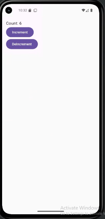
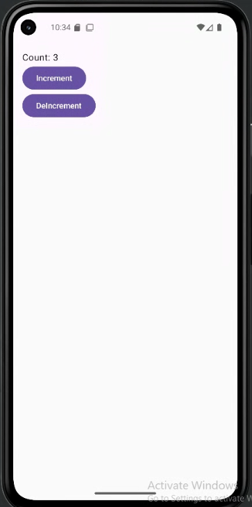
Tips for Success
- Keep state as high as necessary, but as low as possible.
- Make your UI components stateless whenever you can.
- Pass data and event handlers (like
onClick) down to children.
Common Mistakes to Avoid
- Letting multiple composables manage the same piece of state (can cause bugs and confusion).
- Making UI components manage their own state when they don't need to.
- Not passing event handlers down, which makes it hard for children to update state.
Best Practices
- Always keep a single source of truth for each piece of data.
- Use stateless composables for UI whenever possible.
- Document which composable owns the state and which are stateless.
UI Separation: Logic vs View
Introduction
When building modern apps, one of the most important principles is separating your app's logic from its view (UI). Think of it like a restaurant: the kitchen (logic) prepares the food, while the dining area (view) serves it to customers. They work together but have different responsibilities. In app development, this separation means keeping the code that decides what your app does (logic) separate from the code that decides how it looks (view). This separation makes your code easier to read, test, and modify later. In Jetpack Compose, we use ViewModels to help maintain this clear separation.
Why Separate Logic from View?
Imagine trying to cook a meal in the middle of your dining room. It would be messy, confusing, and hard to manage. The same applies to mixing UI code with business logic. By keeping them separate, we gain several important benefits:
First, it makes your code much easier to understand. When you look at a file, you immediately know whether it's responsible for how things look or how things work. This clarity is especially valuable when working in teams, as different developers can focus on different aspects of the app without stepping on each other's toes.
Second, this separation makes testing much more straightforward. You can test your business logic without needing to run the entire app or deal with UI elements. This means faster tests and more reliable code. It also makes it easier to modify either the UI or the logic without breaking the other part.
Understanding the Components
Let's break down the main components of this separation:
The View (UI) is like the front of the house in a restaurant. It's what users see and interact with. In your app, this includes all the composables, layouts, buttons, and other visual elements. The view's job is to display information and handle user input, like button clicks or text entry. It should be focused on how things look and feel to the user.
The Logic is like the kitchen in a restaurant. It's where the real work happens, but users don't see it directly. This includes all the calculations, data updates, and business rules that make your app function. The logic decides what should happen when a user performs an action, but it doesn't care about how that action is presented to the user.
The ViewModel acts as the bridge between these two components. Think of it as the server in a restaurant, taking orders from the dining area to the kitchen and bringing the prepared food back to the customers. In your app, the ViewModel holds your logic and data, and provides it to the UI in a way that's easy to use.
File Organization
Just as we separate logic from view, we should also separate our files. Let's look at how to organize files for a simple counter app in two different scenarios:
Scenario 1: Counter with ViewModel (for shared/persistent state)
app/
├── screens/
│   └── CounterScreen.kt    // Contains the @Composable function
└── viewmodels/
    └── CounterViewModel.kt // Contains the ViewModel class
This organization:
- Separates UI concerns from business logic and state that needs to persist across configuration changes.
- Leverages the Android ViewModel to manage lifecycle-aware data.
- Facilitates sharing state between multiple composables or screens.
- Adheres to the single responsibility principle.
Scenario 2: Counter with Local State (separated files)
app/
└── screens/
    ├── CounterScreen.kt    // Contains the @Composable function
    └── CounterLogic.kt     // Contains the local state logic
This organization:
- Keeps UI concerns separate from state management logic, even for local state.
- Allows for independent testing of the logic.
- Promotes reusability of the logic in other composables if needed.
- Adheres to the single responsibility principle.
Practical Example
Let's see how to implement a counter in both ways. Notice the required imports for each approach. Note I am just showing the required imports for each approach, obviously you will need to import other things as well:
1. Counter with ViewModel (for shared/persistent state)
// CounterViewModel.kt

class CounterViewModel : ViewModel() {
    var count by mutableStateOf(0)
        private set
    fun increment() { count++ }
}

// CounterScreen.kt
//These imports are required for the ViewModel approach
import androidx.compose.runtime.Composable
import androidx.lifecycle.viewmodel.compose.viewModel

@Composable
fun CounterScreen(
    viewModel: CounterViewModel = viewModel()
) {
    Column {
        Text("Count: ${viewModel.count}")
        Button(onClick = { viewModel.increment() }) {
            Text("Increment")
        }
    }
}
This approach is best when:
- You need the count to survive screen rotations
- The count needs to be shared between multiple composables
- You want to keep the business logic separate from the UI
2. Counter with Local State (separated files)
// CounterLogic.kt

class CounterLogic {
    var count by mutableStateOf(0)
        private set
    fun increment() { count++ }
}

// CounterScreen.kt
//These imports are required for the local state approach
//NOTE: Because CounterLogic.kt is (in this example) in the same package (folder) as CounterScreen.kt, we do not need to import it.
import androidx.compose.runtime.Composable
import androidx.compose.runtime.remember

@Composable
fun CounterScreen() {
    // Create local state logic
    val counterLogic = remember { CounterLogic() }

    Column {
        Text("Count: ${counterLogic.count}")
        Button(onClick = { counterLogic.increment() }) {
            Text("Increment")
        }
    }
}
This approach is best when:
- The count is only needed in this one composable
- The count doesn't need to persist across configuration changes
- You want to keep the logic separate from the UI, even for local state
Note about imports: The imports shown above are essential for each approach to work. The ViewModel approach needs the lifecycle and viewmodel imports, while the local state approach needs the compose runtime imports. Make sure to include these in your actual code.
How the Connections Work
You might be wondering how the composables know about and connect to their logic classes. Let's explain how each approach works:
ViewModel Connection
In the ViewModel approach, the connection between CounterScreen and CounterViewModel is managed by the Android framework:
- The
viewModel()function (fromandroidx.lifecycle.viewmodel.compose.viewModel) automatically creates or retrieves a ViewModel instance - When
CounterScreencallsviewModel(), it either:- Gets an existing ViewModel if one was already created for this screen
- Creates a new ViewModel if this is the first time the screen is shown
- This is why we use
viewModel: CounterViewModel = viewModel()as a default parameter - The Android framework handles all the lifecycle management, ensuring the ViewModel survives configuration changes
Local State Connection
In the local state approach, the connection between CounterScreen and CounterLogic is simpler but still managed by Compose:
- The
rememberfunction creates and remembers aCounterLogicinstance - When
CounterScreencallsremember { CounterLogic() }, it:- Creates a new
CounterLogicinstance the first time the composable runs - Returns the same instance on subsequent recompositions
- Creates a new
- This ensures the state persists as long as the composable is in the composition, but critically, **this state is lost when the composable is removed from the composition (e.g., due to a screen rotation or navigation away)**.
- Furthermore, each instance of a composable using
remember { CounterLogic() }will create its own independentCounterLogicinstance, meaning **this state cannot be directly shared between multiple composables without manual passing**.
The key difference is that ViewModels are managed by the Android framework and are designed to survive configuration changes and be easily shared across multiple composables within the same scope. In contrast, local state managed by Compose's remember function only lives as long as the composable is in the composition and is not inherently shareable. This is why we use ViewModels for important, shared, or persistent data, and local state for temporary, UI-specific data that doesn't need to survive configuration changes or be shared.
You can see complete example of both approaches on my github page at the GitHub site. They are in chapter10 named CounterScreenViewModel and CounterScreenLocalState.
NOTE: Both examples output the same execpt only the main view model example persists the state across rotation and the local state example does not.
Managing State: Where Does It Belong?
One of the most important decisions in app development is deciding where to store your state (data that can change). In Jetpack Compose, you have two main options: storing state in a ViewModel or directly in a composable. This decision is crucial for building apps that are easy to understand and maintain.
When to Keep State in a ViewModel
- When you want the data to survive configuration changes (like screen rotation)
- When the state needs to be shared between multiple composables or screens
- When the data is part of your app's logic or business rules
- When the data needs to persist across navigation events
When to Keep State in a Composable
- When the data is only needed for a single composable
- When the state is temporary (like a text field's current value)
- When you don't need to share the data or keep it after the composable is gone
- When the state is purely UI-related (like animation states)
Separating Logic from View in Non-ViewModel Composables
Even when using local state in a composable, you can still choose to separate the logic from the view. Here's when to keep them together versus when to separate them:
When to Keep Logic in the Same File as the View:
- When the logic is very simple (like a single counter increment)
- When the logic is tightly coupled to the UI (like animation state)
- When the composable is small and self-contained
- When the logic is only used by this one composable
When to Separate Logic into Its Own File:
- When the logic becomes complex or has multiple operations
- When you want to make the logic reusable across different composables
- When the logic needs to be tested independently
- When the composable is large and the logic would make it harder to read
- When you want to maintain consistent separation of concerns throughout your app
Remember: Even though the state is local to a composable, separating the logic into its own file can still make your code more maintainable and testable. The key is to consider the complexity and reusability of your logic when making this decision.
Tips for Success
- Keep your composables focused on their primary responsibility: displaying data and handling user input
- Make composables simple and straightforward, mainly concerned with how things look and how users interact with them
- Put all complex business logic and data updates in your ViewModel
- Use ViewModel for important or shared data
- Use composable state for local, temporary, or UI-only data
- Don't be afraid to move state as your app grows—start simple!
Common Pitfalls to Avoid
- Mixing logic and UI code in the same function - this creates code that's hard to read, test, and modify
- Putting calculation logic directly in composable functions instead of the ViewModel
- Letting the UI directly change data instead of going through the ViewModel
- Keeping all state in the ViewModel (can make your code harder to manage)
- Putting important data in a composable when it should be in a ViewModel
- Forgetting that composable state is lost when the composable is removed
Best Practices
- Always keep your logic and view code in separate files
- Use ViewModels to manage your app's data and logic
- Keep composables focused solely on UI concerns
- Think about how long you need the data and who needs to use it
- Keep state as close as possible to where it's used, but as high as necessary
- Document where your state lives and why
Sharing State Between Screens
Introduction
In real apps, you often need to share data between different screens. Jetpack Compose makes this possible by using shared ViewModels or other state holders. This lesson shows you how to share state between screens in a way that's simple and reliable.
When to Share State
- When two or more screens need to access or update the same data
- When you want to keep user progress or selections as they move through your app
- When you want to avoid passing lots of arguments between screens
Main Concepts
- Shared ViewModel: Use a ViewModel that is scoped to a navigation graph or activity so multiple screens can access it.
- Navigation arguments: Pass data directly when navigating, for simple cases.
- Single source of truth: Keep your shared data in one place to avoid bugs and confusion.
Practical Example
Let's look at a practical example that demonstrates sharing state between screens using a ViewModel. We'll create a counter app with two screens that share the same count:
The Shared ViewModel
// MainViewModel.kt
import androidx.lifecycle.ViewModel
import androidx.compose.runtime.getValue
import androidx.compose.runtime.mutableStateOf
import androidx.compose.runtime.setValue

class MainViewModel : ViewModel() {
    // The state is shared between screens
    var count by mutableStateOf(0)
        private set

    fun increment() { count++ }
}
Setting Up Navigation (on Main Activity)
// MainActivity.kt
import androidx.compose.runtime.Composable
import androidx.navigation.compose.NavHost
import androidx.navigation.compose.composable
import androidx.navigation.compose.rememberNavController

@Composable
fun MainScreen() {
    val navController = rememberNavController()

    NavHost(navController = navController, startDestination = "screen1") {
        composable("screen1") {
            CounterScreen1(navController)
        }
        composable("screen2") {
            CounterScreen2(navController)
        }
    }
}
The Two Screens (on Main Activity)
//MainActivity.kt
import androidx.compose.foundation.layout.Column
import androidx.compose.material3.Button
import androidx.compose.material3.Text
import androidx.compose.runtime.Composable
import androidx.lifecycle.viewmodel.compose.viewModel
import androidx.navigation.NavController

@Composable
fun CounterScreen1(
  navController: NavController,
  viewModel: MainViewModel = viewModel()
) {
  Column {
      Text("Screen 1")
      Text("Count: ${viewModel.count}")
      Button(onClick = { viewModel.increment() }) {
          Text("Increment")
      }
      Button(onClick = { navController.navigate("screen2") }) {
          Text("Go to Screen 2")
      }
  }
}

@Composable
fun CounterScreen2(
  navController: NavController,
  viewModel: MainViewModel = viewModel()
) {
  Column {
      Text("Screen 2")
      Text("Count: ${viewModel.count}")
      Button(onClick = { viewModel.increment() }) {
          Text("Increment")
      }
      Button(onClick = { navController.navigate("screen1") }) {
          Text("Go to Screen 1")
      }
  }
}
This example demonstrates several important concepts about sharing state:
- The state (count) is managed by a single ViewModel, making it the single source of truth
- Both screens share the same ViewModel instance, so they see the same count
- The count persists when navigating between screens
- Each screen can update the count, and all screens reflect the change
- The state survives configuration changes (like screen rotation)
How this example renders
Above is just a snippet of the code to view the full code, you need to go to my GitHub page and look at the chapter10 sharingScreens folder you will find the full code for the Main Acvitity and Main View Model files.
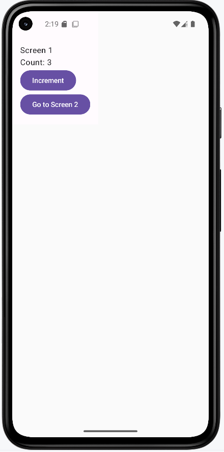

Tips for Success
- Use a shared ViewModel for data that needs to be accessed by multiple screens.
- Keep your shared state simple and focused.
- Document what data is shared and why.
Common Mistakes to Avoid
- Creating separate ViewModels for each screen when you need to share data.
- Passing too much data as navigation arguments (can get messy).
- Letting multiple places update the same data without coordination.
Best Practices
- Use a single source of truth for shared data.
- Scope your ViewModel to the navigation graph or activity, not just a single composable.
- Keep your shared ViewModel focused on just the data that needs to be shared.
Using Coroutines in ViewModel for Background Work
Introduction
Many apps need to do work in the background, like loading data from the internet or saving to a database. In Jetpack Compose, you can use coroutines in your ViewModel to do this work without freezing the UI. This lesson shows you how to use coroutines in a ViewModel to keep your app fast and responsive.
When to Use Coroutines in ViewModel
- When you need to load data from a network or database
- When you want to do work in the background without blocking the UI
- When you need to update the UI after background work is done
Main Concepts
- Coroutine: A lightweight way to do work in the background in Kotlin.
- viewModelScope: A special scope that automatically cancels coroutines when the ViewModel is destroyed.
- State updates: Use
mutableStateOfto update the UI when background work is done.
Coroutine Scopes
Different coroutine scopes serve different purposes in Android development. Here's a breakdown of the most commonly used scopes:
| Scope | Purpose | When to Use | Lifecycle |
|---|---|---|---|
viewModelScope |
Coroutines tied to the ViewModel's lifecycle | For background work in ViewModels | Automatically cancelled when ViewModel is cleared |
lifecycleScope |
Coroutines tied to the Activity/Fragment lifecycle | For UI-related work in Activities/Fragments | Cancelled when Activity/Fragment is destroyed |
GlobalScope |
Application-wide coroutine scope | Avoid using this in Android apps | Lives for the entire application lifetime |
coroutineScope |
Creates a new scope for a block of code | For structured concurrency within a function | Cancelled when any child coroutine fails |
supervisorScope |
Creates a new scope that doesn't cancel children on failure | When you want to handle failures independently | Continues even if some child coroutines fail |
Scope Best Practices
- Use
viewModelScopefor background work in ViewModels - Use
lifecycleScopefor UI-related work in Activities/Fragments - Avoid
GlobalScopeas it can lead to memory leaks - Use
coroutineScopefor structured concurrency - Use
supervisorScopewhen you need to handle failures independently
Coroutine Dispatchers
Dispatchers determine which thread a coroutine runs on. Android provides several built-in dispatchers for different purposes:
| Dispatcher | Purpose | When to Use |
|---|---|---|
Dispatchers.Main |
Main thread for UI operations | Updating UI, working with Compose state |
Dispatchers.IO |
Optimized for I/O operations | Network calls, database operations, file I/O |
Dispatchers.Default |
Optimized for CPU-intensive work | Complex calculations, sorting, parsing |
Dispatchers.Unconfined |
Not confined to any specific thread | Avoid using in Android apps |
Using Dispatchers
// Example of using different dispatchers
viewModelScope.launch(Dispatchers.IO) {
    // Do I/O work here
    val result = networkCall()

    // Switch to Main thread for UI updates
    withContext(Dispatchers.Main) {
        updateUI(result)
    }
}
Error Handling in Coroutines
Proper error handling is crucial for robust coroutine usage. Here are the main ways to handle errors:
Try-Catch Block
viewModelScope.launch {
    try {
        // Risky operation
        val result = networkCall()
        updateUI(result)
    } catch (e: Exception) {
        // Handle specific errors
        when (e) {
            is IOException -> handleNetworkError()
            is TimeoutException -> handleTimeout()
            else -> handleUnknownError(e)
        }
    }
}
CoroutineExceptionHandler
val exceptionHandler = CoroutineExceptionHandler { _, exception ->
    // Handle uncaught exceptions
    Log.e("CoroutineError", "Error: ${exception.message}")
    // Update UI to show error
    _errorState.value = exception.message
}

viewModelScope.launch(exceptionHandler) {
    // Coroutine code here
    // Uncaught exceptions will be handled by the handler
}
Error Handling Best Practices
- Always use try-catch for expected errors
- Use CoroutineExceptionHandler for uncaught exceptions
- Handle different types of exceptions appropriately
- Update UI to show error states to users
- Log errors for debugging purposes
- Consider retry mechanisms for transient errors
Practical Example
In the example below we are using a ViewModel to manage the state of the data loading and the counter. What this example demonstrates is that the UI remains responsive during coroutine operations.
Main View Model
// MainViewModel.kt
class MainViewModel : ViewModel() {
    // State for the loaded data
    var data by mutableStateOf(null)
        private set

    // State to track loading status
    var isLoading by mutableStateOf(false)
        private set

    // State for the counter
    var counter by mutableStateOf(0)
        private set

    // Function to increment counter
    fun incrementCounter() {
        counter++
    }
    /*
    In the loadData function we are using the viewModelScope.launch to start a coroutine for background work. If no dispatcher is specified, the coroutine will run on Dispatchers.Main by default because it is a viewModelScope.
    */
    fun loadData() {
        viewModelScope.launch {
            try {
                isLoading = true
                // Simulate background work
                delay(2000)
                data = "Data loaded successfully!"
            } catch (e: Exception) {
                data = "Error loading data: ${e.message}"
            } finally {
                isLoading = false
            }
        }
    }
}
Main Activity
// MainActivity.kt
@Composable
fun DataScreen(viewModel: MainViewModel) {
    Column(
        modifier = Modifier.padding(16.dp)
    ) {
        // Data Loading Section
        Text("Data Loading Demo", style = MaterialTheme.typography.titleLarge)
        Spacer(modifier = Modifier.height(8.dp))

        if (viewModel.isLoading) {
            CircularProgressIndicator()
        } else {
            Text(viewModel.data ?: "No data loaded yet")
        }

        Button(
            onClick = { viewModel.loadData() },
            modifier = Modifier.padding(vertical = 8.dp)
        ) {
            Text("Load Data")
        }

        // Divider between sections
        Divider(modifier = Modifier.padding(vertical = 16.dp))

        // Counter Section
        Text("Counter Demo", style = MaterialTheme.typography.titleLarge)
        Spacer(modifier = Modifier.height(8.dp))

        Text("Counter: ${viewModel.counter}")

        Button(
            onClick = { viewModel.incrementCounter() },
            modifier = Modifier.padding(vertical = 8.dp)
        ) {
            Text("Increment Counter")
        }
    }
}
When you tap the button (load data) that starts the slow work, the ViewModel calls viewModelScope.launch { ... }. That starts a coroutine—a piece of code that can run without freezing the screen. While that work runs (here, a fake delay), isLoading is set to true so the UI can show a loading spinner so the user knows something is happening.
The counter on the same screen is the important part: you can keep tapping Increment Counter while the “slow” work is still going. That proves the main thread isn’t stuck—the app stays responsive. When the coroutine finishes, the ViewModel updates its state (for example, turns off loading and sets the new data), and Compose redraws the screen so you see the result automatically.
How this example renders
Above is just a snippet of the code to view the full code, you need to go to my GitHub page and look at the chapter10 coroutine folder you will find the full code for the Main Acvitity and Main View Model files.
In the screenshot below I have incremented the counter 3 times and the data has loaded successfully. This demonstrates that the UI remains responsive during coroutine operations.
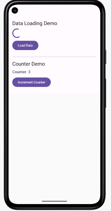
Understanding Our Example vs. Real-World Usage
Our example uses a simple delay(2000) to simulate background work. In a real application, you would typically be doing actual I/O operations like:
- Making network calls to fetch data from an API
- Reading from or writing to a database
- Processing large files
- Performing complex calculations
Why We Used Coroutines in This Example
While our example could have been implemented without coroutines (using Threads or Handlers), we used coroutines to:
- Demonstrate the recommended approach for handling asynchronous operations in Android
- Show how to use
viewModelScopeproperly - Provide a foundation for when you need to do real I/O operations
- Follow modern Android development best practices
Real-World Example
Here's how our example would look with a real network call:
class MainViewModel : ViewModel() {
    var data by mutableStateOf(null)
        private set
    var isLoading by mutableStateOf(false)
        private set

    fun loadData() {
        viewModelScope.launch(Dispatchers.IO) {  // Use IO dispatcher for network call
            try {
                isLoading = true
                // Real network call instead of delay
                val response = apiService.fetchData()
                withContext(Dispatchers.Main) {  // Switch to Main thread for UI updates
                    data = response.data
                }
            } catch (e: Exception) {
                withContext(Dispatchers.Main) {
                    data = "Error loading data: ${e.message}"
                }
            } finally {
                withContext(Dispatchers.Main) {
                    isLoading = false
                }
            }
        }
    }
}
Fetching data over the internet is slow compared to what the phone does in a split second. If you tried to do that work on the main thread (the same thread that draws the screen and handles taps), the app would freeze until the server answered—sometimes for several seconds. Android doesn’t allow blocking the main thread for network calls anyway; you’re expected to do that work somewhere else. That’s why viewModelScope.launch(Dispatchers.IO) starts the job on a background thread pool meant for input/output: the network request runs there while the UI thread stays free so the user can still scroll and tap.
When the response comes back, you need to put the result into data (and update isLoading) so Compose can show new text on screen. Those state properties should be updated on the main thread, so the code uses withContext(Dispatchers.Main) { ... } to jump back to the main thread before assigning data = response.data or turning off the spinner. Think of it as: do the slow work in the background, then hop back to the main thread to update what the user sees.
A network call might also fail—no Wi‑Fi, server error, timeout. The try / catch block catches those problems so the app doesn’t crash; instead you can show a message like “Error loading data.” The finally block runs whether the call succeeded or failed, so isLoading is always set back to false and the loading spinner doesn’t spin forever. Coroutines make this whole story readable: one function can “wait” for the network, switch threads, and handle errors without nesting lots of callbacks.
Tips for Success
- Always use
viewModelScopefor coroutines in a ViewModel. - Update UI state with
mutableStateOfso Compose can react to changes. - Handle errors in your coroutines (try/catch) to avoid crashes.
- Use separate state variables for different UI elements to keep the code organized.
Common Mistakes to Avoid
- Blocking the UI thread (never use
Thread.sleepor long loops in the UI). - Forgetting to update state after background work is done.
- Not handling errors in coroutines (can cause crashes).
- Creating multiple ViewModel instances instead of sharing one.
Best Practices
- Keep your background work in the ViewModel, not in composables.
- Use
viewModelScopefor all coroutines in ViewModel. - Show loading indicators and handle errors gracefully.
- Use separate state variables for different UI elements.
- Demonstrate UI responsiveness during coroutine operations.
Chapter 11: Data Persistence
DataStore for Simple Storage
What is DataStore?
DataStore is Android's modern way to save simple app settings and preferences. It permanently stores values like a user name, dark mode preference, font size, and notification toggle. When the app closes and opens again, those values are still there.
In this lesson, you are using Preferences DataStore, which stores key-value pairs in your app's private storage. That means your app can read and write the settings safely, and other apps cannot access them.
Those preferences are persisted on the device or emulator as a real file (not as a text file in your project folder). The name you pass to preferencesDataStore(name = "simple_preferences") determines the file DataStore uses. You can often show students that file in Android Studio; see Where the file lives and how to see it below.
Quick Reference Table
| Type | Description | Common Use |
|---|---|---|
Preferences DataStore |
Key-value storage for simple data | User settings, toggles, simple preferences |
Proto DataStore |
Type-safe storage using Protocol Buffers | Structured objects and more complex app state |
Required Dependencies
To use Preferences DataStore, make sure these entries exist:
gradle/libs.versions.toml
datastore = "1.0.0"
androidx-datastore-preferences = { group = "androidx.datastore", name = "datastore-preferences", version.ref = "datastore" }
app/build.gradle.kts
dependencies {
    implementation(libs.androidx.datastore.preferences)
}
Big Picture: How This App Works
This app has four important files, and each one has a specific job:
PreferencesManager.kt: reads/writes raw values in DataStoreDataStoreViewModel.kt: exposes those values asStateFlowfor UIDataStoreScreen.kt: displays settings and sends user actions to ViewModelMainActivity.kt: applies app theme and hosts the screen
When a user changes a setting, the data path is:
- User taps a control in
DataStoreScreen.kt(the Composable UI). - The screen calls a function on
DataStoreViewModel.kt(for exampleupdateDarkMode(...)). That function is not suspend, so it cannot block the UI thread. - The ViewModel starts a coroutine with
viewModelScope.launch { ... }and inside that coroutine callsPreferencesManager.kt. PreferencesManagerrunsdataStore.edit { ... }, which writes the new value to disk and makes DataStore emit a fresh preferences snapshot.- The
Flowthat reads dark mode inPreferencesManageremits the new boolean. The ViewModel had already turned that Flow intoStateFlowwithstateIn, sodarkModeupdates for all observers. - Compose screens that use
collectAsState()on thatStateFlowrecompose: text and switches show the new value, andMainActivity.ktcan rebuildMaterialThemeso colors actually change.
Example walkthrough
Suppose the user turns dark mode on.
Step 1 — DataStoreScreen.kt: the user acts, and the screen forwards the request
The settings screen has two jobs at once. First, it shows the latest values from the ViewModel so the switch and labels match what is saved. Second, when the user changes something, it tells the ViewModel to save the new value. For dark mode, the screen collects darkMode from the ViewModel and wires the switch so a tap calls updateDarkMode with the new on/off value (it).
val darkMode by viewModel.darkMode.collectAsState()

Switch(
    checked = darkMode,
    onCheckedChange = { viewModel.updateDarkMode(it) }
)
collectAsState() is how Compose listens to the ViewModel. When the value changes later (after DataStore updates), this line causes the screen to redraw so the switch and text stay correct. The Switch line does not save anything by itself; it only calls the ViewModel. Saving happens in the next steps.
Step 2 — DataStoreViewModel.kt: run the save off the UI thread
The function updateDarkMode(enabled) is written so the Composable can call it from a click handler without waiting. It uses viewModelScope.launch { ... } to start a coroutine: a piece of work that can run while the UI stays responsive. Inside the coroutine it calls preferencesManager.updateDarkMode(enabled), which actually talks to DataStore.
fun updateDarkMode(enabled: Boolean) {
    viewModelScope.launch {
        preferencesManager.updateDarkMode(enabled)
    }
}
viewModelScope is tied to the ViewModel's lifetime. If the user leaves the screen and the ViewModel is cleared, work started here is cancelled so you do not leave stray background tasks running. launch means "start this work; return right away from updateDarkMode" so the main thread is not blocked.
Step 3 — PreferencesManager.kt: keys, file, read path, and write path
This class is the only place that knows how DataStore is set up. It defines keys (like DARK_MODE) and gets a single DataStore instance via preferencesDataStore(name = "simple_preferences"), so all reads and writes go to one private file for this app on the device (see Where the file lives and how to see it for how to open that folder in Android Studio).
Reading uses dataStore.data, which is a Flow: whenever preferences change, a new snapshot is emitted. The code maps that snapshot to a boolean and supplies a default if the key was never set (?: false), so the first launch behaves predictably.
val darkMode: Flow<Boolean> = context.dataStore.data.map { preferences ->
    preferences[PreferencesKeys.DARK_MODE] ?: false
}
Writing uses dataStore.edit { ... }. That block is a small transaction: you get a mutable preferences object, set the key, and when the block ends DataStore commits the change safely. If several keys were updated in the same block, they would commit together. edit is a suspend function, so it can do I/O without blocking the UI thread when called from the coroutine the ViewModel started.
suspend fun updateDarkMode(enabled: Boolean) {
    context.dataStore.edit { preferences ->
        preferences[PreferencesKeys.DARK_MODE] = enabled
    }
}
After edit finishes, DataStore updates storage and dataStore.data emits again. That is how the “read” Flow learns the new value automatically; you do not call read and write as two separate manual steps in the UI.
Step 4 — DataStoreViewModel.kt again: from Flow to StateFlow
The PreferencesManager exposes darkMode as a Flow<Boolean>. Flows are great for storage, but the UI layer wants a value that always has a “current” setting and updates in one place. The ViewModel converts the Flow into StateFlow using stateIn(...): it collects the Flow in viewModelScope, uses SharingStarted.Lazily so collection starts when something needs it, and passes an initial value (here false) until DataStore delivers the first real read.
val darkMode: StateFlow<Boolean> = preferencesManager.darkMode.stateIn(
    viewModelScope,
    SharingStarted.Lazily,
    false
)
When step 3’s edit completes and the Flow emits, this StateFlow updates. Both DataStoreScreen and MainActivity observe the same StateFlow, so they stay in sync without duplicating DataStore code.
Step 5 — DataStoreScreen.kt and MainActivity.kt: the UI catches up
When the StateFlow updates, any Composable that used collectAsState() on viewModel.darkMode recomposes. In DataStoreScreen, the switch position and the “Dark Mode: Enabled/Disabled” text refresh.
MainActivity does the same collection for theme: it reads darkMode, picks darkColorScheme() or lightColorScheme(), and wraps the app in MaterialTheme(colorScheme = ...). That is what actually changes backgrounds and colors app-wide. The project also uses SideEffect with WindowCompat so status bar icons stay visible against light or dark backgrounds (import androidx.core.view.WindowCompat in the real file).
val viewModel: DataStoreViewModel = viewModel()
val darkMode by viewModel.darkMode.collectAsState()
val colorScheme = if (darkMode) darkColorScheme() else lightColorScheme()

SideEffect {
    WindowCompat.getInsetsController(window, window.decorView)
        .isAppearanceLightStatusBars = !darkMode
}

MaterialTheme(colorScheme = colorScheme) {
    DataStoreScreen(viewModel = viewModel)
}
Putting it together: step 1 sends the new boolean to the ViewModel; steps 2–3 persist it; step 4 pushes the new value through StateFlow; step 5 redraws the settings screen and the whole theme. One toggle both saves to disk and updates what you see.
Where the file lives and how to see it in Android Studio
When PreferencesManager calls dataStore.edit { ... }, DataStore updates a binary preferences file under your app’s private internal storage on the device or emulator. The file is not part of your source tree next to PreferencesManager.kt; it is created at runtime when the app first saves data.
For this demo, the delegate uses preferencesDataStore(name = "simple_preferences"). On disk, Preferences DataStore typically stores that as a file named like simple_preferences.preferences_pb inside a datastore folder under the app’s files directory.
To show students the file in Android Studio (use an emulator or a debuggable device for the simplest path):
- Install and run the app so it has written at least one preference.
- Open View → Tool Windows → Device File Explorer (or Device Explorer in some Android Studio versions).
- Select your emulator or device, then navigate to:
/data/data/<your.package.name>/files/datastore/(replace<your.package.name>with the app’s application ID, for examplecom.example.datastoredemo). - Look for
simple_preferences.preferences_pb(or a similarly named.preferences_pbfile). You can confirm the file exists and that its timestamp or size changes after you change settings in the app.
The file is not plain text (it is a protobuf-backed format), so you will not show students readable key-value lines inside it. The point of the demo is to prove that persistence is a real file on the device, not that you edit that file by hand. Browsing /data/data/... is easiest on the emulator; access on physical devices may be restricted.
What to Test in This App
- Change user name, font size, dark mode, and notifications
- Close the app fully
- Open the app again
- Verify all values are restored from DataStore
- Verify dark mode still controls the app color scheme after restart
- Optional: in Device File Explorer, open
.../files/datastore/simple_preferences.preferences_pband confirm the file exists after the app has saved settings
How this example renders
The snippets above summarize the main ideas. To view the full project, see the chapter11/DataStoreDemo app in the course examples repository.
Here is a screenshot of the app running:
Top and bottom of the application
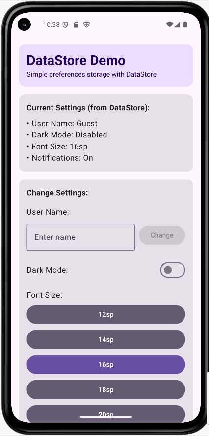
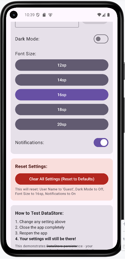
The app is running on a Pixel 7 Pro with Android 14.
Application after the user has changed the settings (top part only)
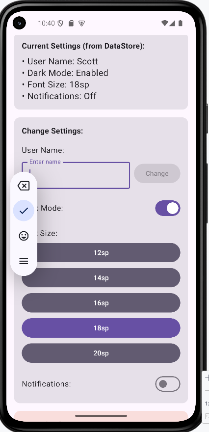
Tips for Success
- Give every preference a clear key name
- Always provide defaults when reading values from DataStore
- Keep read/write logic in
PreferencesManager, not in Composables - Use ViewModel as the middle layer between storage and UI
- Use
collectAsState()so Compose updates automatically - Use Device File Explorer on an emulator to show that DataStore really creates a
.preferences_pbfile under the app’s private storage
Common Mistakes to Avoid
- Doing DataStore writes directly in UI code
- Forgetting defaults, which can create null/empty behavior surprises
- Treating dark mode as saved data but never applying it to
MaterialTheme - Creating multiple DataStore instances for the same file unnecessarily
- Trying to store complex relational data (use Room instead)
Best Practices
- Use DataStore for simple persistent settings
- Use Room for larger or relational data
- Keep each layer focused: Data layer, ViewModel layer, UI layer
- Name update functions clearly (
updateFontSize,updateDarkMode, etc.) - Test persistence by restarting the app after changing values
Introduction to Room Database
DataStore is good for small things but with more complex and larger storage needs, you need a more powerful database. Room is a modern, object-oriented way to work with databases in your Android apps.
Room is built on top of SQLite (Android's built-in database), but it makes everything much simpler and less error-prone. Instead of writing complicated database code, you work with easy-to-understand building blocks.
Main Parts of Room Database
| Part | What It Does | Real-World Analogy |
|---|---|---|
| Entity | Defines what kind of data you want to store (like a Note or User) | Entities are also known as tables in a database |
| DAO | Lists all the ways you can work with your data (add, find, delete, update) | Here is where you list your SQL queries. |
| Database | Brings all your entities and DAOs together in one place | This is what contains all the data |
| Repository | Acts as a middleman between your app and the database | Connects the ViewModel to the database. |
| ViewModel | Manages the data for your app's screens and keeps them up to date | Updates the UI when the data changes. |
How Room Database Works
Room helps your app store and organize information in a way that's safe, fast, and easy to use. Each part has a special job, and together they make sure your data is always where you need it, when you need it.
- Entities are like blueprints for your data. They define what information you want to keep.
- DAOs are the instructions for how to work with your data—like adding, finding, or deleting notes.
- The Database is the main hub that brings everything together.
- The Repository helps keep your code clean and organized by handling all the data operations.
- The ViewModel makes sure your app's screens always show the latest data, even if the device rotates or the app is paused.
Building Example Database
The rest of the lessons will build an example database that will allow use to create, edit, and delete notes. Below the project file
RoomDatabaseDemo/
    ├── app/
    │   ├── src/
    │   │   └── main/
    │   │       ├── AndroidManifest.xml
    │   │       └── java/
    │   │           └── com/example/roomdatabasedemo/
    │   │               ├── NoteDatabase.kt
    │   │               ├── MainActivity.kt
    │   │               ├── Note.kt
    │   │               ├── NoteDao.kt
    │   │               ├── NoteRepository.kt
    │   │               ├── NoteViewModel.kt
    │   │               ├── NoteScreen.kt
    │   │               └── ui/
    │   │                   └── theme/
    │   │                       ├── Color.kt
    │   │                       ├── Theme.kt
    │   │                       └── Type.kt
    │   ├── build.gradle.kts
    │   └── ...
    ├── gradle/
    │   └── libs.versions.toml
    ├── build.gradle.kts
    ├── settings.gradle.kts
    └── ...
The files we will mostly focus, when done upgrading the gradle and .toml files, will be the following:
- NoteDatabase.kt
- Note.kt
- NoteDao.kt
- NoteRepository.kt
- NoteViewModel.kt
- NoteScreen.kt
Dependencies
To use Room and Jetpack Compose, you need to add the right dependencies. Here is the code that was added.
gradle/libs.versions.toml (added)
[versions]
room = "2.7.0-alpha12"
ksp = "2.2.10-2.0.2"

[libraries]
androidx-room-runtime = { group = "androidx.room", name = "room-runtime", version.ref = "room" }
androidx-room-ktx = { group = "androidx.room", name = "room-ktx", version.ref = "room" }
androidx-room-compiler = { group = "androidx.room", name = "room-compiler", version.ref = "room" }

[plugins]
ksp = { id = "com.google.devtools.ksp", version.ref = "ksp" }
app/build.gradle.kts (added)
plugins {
alias(libs.plugins.ksp)
}
dependencies {
implementation(libs.androidx.room.runtime)
implementation(libs.androidx.room.ktx)
ksp(libs.androidx.room.compiler)
}
For the rest of the lesson we will walk through buidling each part of this application going backwards starting with buiding the Entity and DAO. I have found that this method works best for understand how all the pieces fit together.
Creating Entities and DAOs
Entities and DAOs are the foundation of your Room Database. Think of an Entity as the blueprint for what you want to store, and a DAO as the set of instructions for how to work with that data. Together, they make sure your app knows exactly what information to keep and how to find it later.
Entities: Defining Your Data
An Entity is a data class that tells Room what kind of information you want to save. Each Entity becomes a table in your database, and each property becomes a column in that table.
- Use an Entity when you want to store structured data (like notes, users, or products).
- Each Entity should focus on one type of data.
Example: Note Entity (from RoomDatabaseDemo)
// Defines the 'Note' data class, which represents a table in the Room database.
// The tableName is explicitly set to "notes".
@Entity(tableName = "notes")
data class Note(
// Primary key for the 'notes' table, automatically generated by the database.
@PrimaryKey(autoGenerate = true) val id: Int = 0,
// The title of the note.
val title: String,
// The main content/body of the note.
val content: String,
// The date when the note was created or last updated.
val date: String
)
The Note data class is an essential part of our Room database, as it defines the structure of the data we want to store. Think of it as the blueprint for a single entry (a row) in our 'notes' table. Here's a breakdown of what each part signifies:
@Entity(tableName = "notes"): This is an annotation provided by Room that marks theNoteclass as an entity. This means Room will recognize it as a table in your database. ThetableName = "notes"parameter explicitly tells Room to name this table "notes". If you don't provide atableName, Room will use the class name by default.data class Note(...): This defines a Kotlin data class namedNote. Data classes are convenient in Kotlin for holding data, as they automatically provide useful functions likeequals(),hashCode(),toString(), andcopy().@PrimaryKey(autoGenerate = true) val id: Int = 0:@PrimaryKey: This annotation designates theidfield as the primary key for the 'notes' table. A primary key uniquely identifies each row in a database table.(autoGenerate = true): This important parameter tells Room to automatically generate a unique ID for each newNoteinserted into the database. You don't need to provide anidwhen creating a newNote; Room handles it.val id: Int = 0: This declares an immutable property namedidof typeInt. We provide a default value of0, which is typically ignored whenautoGenerateis true for new insertions.
val title: String: This declares an immutable property namedtitleof typeString. This will be a column in our 'notes' table, storing the title of each note.val content: String: Similarly, this declares an immutable property namedcontentof typeString. This will hold the main body or content of our note.val date: String: This declares an immutable property nameddateof typeString. This column will store the date associated with the note. We're storing it as aStringfor simplicity in this example.
In summary, the Note entity provides a clear, structured way to represent and store note data within your Room database. Each instance of a Note object corresponds to a row in the 'notes' table, with its properties mapping directly to the table's columns.
DAOs: Working With Your Data
A DAO (Data Access Object) is an interface that lists all the ways you can interact with your data—like adding, finding, or deleting notes.
- Use a DAO to keep your data operations organized and easy to manage.
- Each DAO should focus on one Entity or a related group of Entities.
Example: NoteDao (from RoomDatabaseDemo)
// Note Data Access Object (DAO).
// This interface defines the methods for interacting with the 'notes' table in the database.
@Dao
interface NoteDao {
// Query to retrieve all notes from the 'notes' table, ordered by date in descending order.
// Returns a Flow, which emits updates whenever the data in the table changes.
@Query("SELECT * FROM notes ORDER BY date DESC")
fun getAllNotes(): Flow<List<Note>>
// Inserts a new note or replaces an existing one if there's a conflict (e.g., same primary key).
// 'suspend' keyword indicates that this is a coroutine function and can be paused and resumed.
@Insert(onConflict = OnConflictStrategy.REPLACE)
suspend fun insert(note: Note)
// Deletes an existing note from the database.
// 'suspend' keyword indicates that this is a coroutine function.
@Delete
suspend fun delete(note: Note)
}
This DAO lets you get all notes, add a new note, or delete a note.
Understanding the `NoteDao` Interface
The NoteDao (Data Access Object) is an interface that defines how your application interacts with the data stored in the `notes` table of your Room database. It acts as a bridge between your application's logic and the database operations, abstracting away the raw SQL queries.
1. DAO Annotation and Interface Definition
@Dao
interface NoteDao {
// ...
}
@Dao: This annotation is crucial. It tells Room that this interface is a Data Access Object. Room will then automatically generate the code required to implement these methods, allowing you to perform database operations without writing raw SQL for basic inserts, updates, and deletes.interface NoteDao { ... }: The DAO is defined as an `interface`. This means you only declare the methods (what operations you want to perform), and Room provides the actual implementation behind the scenes.
2. Querying All Notes
@Query("SELECT * FROM notes ORDER BY date DESC")
fun getAllNotes(): Flow<List<Note>>
@Query("SELECT * FROM notes ORDER BY date DESC"): This annotation is used for more complex database interactions where Room's default annotations (like `@Insert` or `@Delete`) aren't sufficient. You provide a SQL query directly as a string."SELECT * FROM notes ORDER BY date DESC": This is a standard SQL query. It means: "Select all columns (`*`) from the table named `notes`, and order the results by the `date` column in descending order (most recent first)."
fun getAllNotes(): Flow<List<Note>>: This declares a function that will execute the SQL query. The return type is significant:Flow<List<Note>>: This indicates that the function returns a Kotlin `Flow` which emits a `List` of `Note` objects. A `Flow` is a reactive stream of data. This means that whenever the data in the `notes` table changes (e.g., a new note is added or deleted), this `Flow` will automatically emit the updated list of notes to any part of your app that is observing it. This is incredibly powerful for building responsive UIs.
3. Inserting a Note
@Insert(onConflict = OnConflictStrategy.REPLACE)
suspend fun insert(note: Note)
@Insert(onConflict = OnConflictStrategy.REPLACE): This annotation tells Room that this method is for inserting data into the database.onConflict = OnConflictStrategy.REPLACE: This specifies what Room should do if you try to insert a `Note` that has the same primary key (e.g., the same `id`) as an existing note. `REPLACE` means the old note will be replaced by the new one. Other strategies include `ABORT` (stop the operation), `IGNORE` (keep the old one), etc.
suspend fun insert(note: Note):suspend: This keyword is part of Kotlin's coroutines. It indicates that this function is a "suspending function," meaning it can be paused and resumed later. Database operations can take time, so making them `suspend` allows the main thread (UI thread) of your application to remain free and responsive, preventing your app from freezing.fun insert(note: Note): This is the function that takes a `Note` object as a parameter and inserts it into the database.
4. Deleting a Note
@Delete
suspend fun delete(note: Note)
@Delete: This annotation tells Room that this method is for deleting a specific entity from the database.suspend fun delete(note: Note): Similar to the `insert` function, this is a `suspend` function, ensuring the deletion operation runs asynchronously. It takes a `Note` object as a parameter and deletes the corresponding entry from the database.
Tips for Success
- Start with simple Entities and DAOs before adding more features.
- Use clear names for your data and operations.
- Keep each Entity and DAO focused on a single job.
Common Mistakes to Avoid
- Forgetting to mark your data class with
@Entity. - Trying to put too much in one Entity or DAO.
- Not using
suspendfunctions for database operations.
Best Practices
- Keep Entities simple and focused on data storage.
- Use DAOs to organize your data operations.
- Test your Entity and DAO code before connecting to the UI.
Building the Database
The Database Class: The Hub of Your Data
The Database class ties all your Entities and DAOs together. It tells Room what tables exist and how to access them. You only need one Database class for your app.
- Create a Database class when you have at least one Entity and one DAO.
- Use it to manage the database version and provide access to your DAOs.
Example: NoteDatabase (from RoomDatabaseDemo)
@Database(entities = [Note::class], version = 1, exportSchema = false)
abstract class NoteDatabase : RoomDatabase() {
// Abstract method to provide the Data Access Object (DAO) for notes.
// Room will generate the implementation for this method.
abstract fun noteDao(): NoteDao
// Companion object allows us to define static-like members and methods for the database.
companion object {
// The @Volatile annotation ensures that changes to the INSTANCE variable are immediately
// visible to all threads. This is crucial for thread-safe singleton implementation.
@Volatile
private var INSTANCE: NoteDatabase? = null
// Provides a singleton instance of the NoteDatabase.
// If INSTANCE is null, it creates the database in a synchronized block to prevent multiple instances.
fun getDatabase(context: Context): NoteDatabase {
return INSTANCE ?: synchronized(this) {
// Create database here if INSTANCE is null.
val instance = Room.databaseBuilder(
context.applicationContext, // Application context to prevent memory leaks.
NoteDatabase::class.java,
"notes_db" // The name of the database file.
).build()
INSTANCE = instance
instance
}
}
}
}Understanding the `NoteDatabase` Class
This section explains the core components of your Room Database implementation. The `NoteDatabase` class serves as the central hub for your database operations, bringing together your data entities and data access objects (DAOs).
1. Database Annotation and Class Definition
@Database(entities = [Note::class], version = 1, exportSchema = false)
abstract class NoteDatabase : RoomDatabase() {
// ...
}Here's what each part means:
@Database(...): This annotation tells Room that this abstract class is your database. It requires a few parameters:entities = [Note::class]: This is a list of all the data classes (Entities) that belong to this database. In our case, we only have one:Note. If you had more tables, you'd list them here.version = 1: This is the version number of your database. Every time you make a structural change to your database (like adding a new table, adding a column, or changing a column type), you must increment this version number. Room uses this to manage database migrations.exportSchema = false: This setting prevents Room from exporting the database schema into a JSON file. While exporting the schema can be useful for version control and reviewing database history, for simpler projects or initial development, setting it tofalseis common.
abstract class NoteDatabase : RoomDatabase(): Your database class must be an `abstract class` and it must `extend RoomDatabase`. Room will automatically generate the necessary code for this abstract class during compilation.
2. Data Access Object (DAO) Declaration
abstract fun noteDao(): NoteDao
abstract fun noteDao(): NoteDao: Inside your `NoteDatabase` class, you must declare an abstract function for each DAO you have. This function simply returns an instance of your DAO interface (NoteDaoin this example). Room will generate the implementation for this function, allowing you to access your DAO methods to perform database operations.
3. Singleton Pattern for Database Instance
companion object {
@Volatile
private var INSTANCE: NoteDatabase? = null
fun getDatabase(context: Context): NoteDatabase {
return INSTANCE ?: synchronized(this) {
val instance = Room.databaseBuilder(
context.applicationContext,
NoteDatabase::class.java,
"notes_db"
).build()
INSTANCE = instance
instance
}
}
}This `companion object` block implements the Singleton pattern, which is a design pattern that ensures only one instance of a class exists throughout your application. For a database, this is crucial to prevent multiple connections and potential data inconsistencies.
companion object { ... }: In Kotlin, a companion object is used to define static-like members and methods for a class.@Volatile private var INSTANCE: NoteDatabase? = null:@Volatile: This annotation is vital for thread safety. It ensures that any changes made to the `INSTANCE` variable are immediately visible to all threads. Without `volatile`, one thread might see an outdated value of `INSTANCE`, leading to multiple database instances being created.private var INSTANCE: NoteDatabase? = null: This declares a private, nullable variable `INSTANCE` to hold our single database instance. It's initialized to `null`.
fun getDatabase(context: Context): NoteDatabase { ... }: This is the public method that your application will call to get the database instance.return INSTANCE ?: synchronized(this) { ... }: This is a "double-checked locking" mechanism for thread-safe singleton creation:INSTANCE ?:: It first checks if `INSTANCE` is already initialized. If it is, that existing instance is returned directly.synchronized(this) { ... }: If `INSTANCE` is `null`, it enters a synchronized block. This ensures that only one thread can execute the code inside this block at a time, preventing race conditions where multiple threads might try to create the database simultaneously.val instance = Room.databaseBuilder(...): Inside the synchronized block, the database is actually built:context.applicationContext: It uses the application context to create the database. This is important because using an Activity context could lead to memory leaks if the Activity is destroyed while the database connection is still active.NoteDatabase::class.java: Specifies the database class (our `NoteDatabase`)."notes_db": This is the name of your database file that will be created on the device's storage.
.build(): Finalizes the database creation.INSTANCE = instance: The newly created database instance is assigned to `INSTANCE`.instance: The created instance is returned.
Tips for Success
- Use the Database class to keep your data organized and easy to access.
- Only one Database class is needed for your app.
- Keep your Database class simple—just list your Entities and DAOs.
Common Mistakes to Avoid
- Forgetting to include all your Entities in the
@Databaseannotation. - Creating multiple Database classes for the same app.
- Not updating the version number when you change your database structure.
Best Practices
- Use a Singleton pattern to make sure there's only one database instance.
- Keep your Database class focused on connecting Entities and DAOs.
- Plan your database structure before you start coding.
Building the Repository
The Repository pattern is a design pattern used to abstract the way data is accessed. In Android development, especially with Room, a Repository acts as a clean API for your UI or ViewModel to interact with different data sources (like a database, network, or device storage). It centralizes data operations, making your code modular, testable, and easier to maintain.
Think of the Repository as a librarian. Instead of your ViewModel (the student) directly going to the database (the shelves) to find or store books, the ViewModel asks the librarian (Repository) for what it needs. The librarian knows where the books are, how to get them, and how to put them back, without the student needing to know the details of the library's internal organization.
Why Use a Repository?
- Abstraction: Your ViewModel doesn't need to know if data comes from a local database, a remote server, or both. It just asks the Repository for data.
- Centralized Logic: All data-related logic (e.g., fetching, caching, error handling) can be managed in one place.
- Testability: It's easier to test your ViewModel when it interacts with a Repository interface, as you can easily swap out the actual data source with a mock for testing.
- Maintainability: Changes to your data source (e.g., switching from Room to another database) only require modifying the Repository, not every ViewModel that uses it.
Example: NoteRepository (from RoomDatabaseDemo)
// NoteRepository acts as an abstraction layer over the data source (NoteDao).
// It provides a clean API for the ViewModel to interact with data.
class NoteRepository(private val noteDao: NoteDao) {
// Exposes a Flow of all notes, allowing for observing changes in the database.
val allNotes: Flow<List<Note>> = noteDao.getAllNotes()
// Suspended function to insert a new note into the database.
// Marked as suspend because Room operations are asynchronous.
suspend fun insert(note: Note) = noteDao.insert(note)
// Suspended function to delete an existing note from the database.
// Marked as suspend because Room operations are asynchronous.
suspend fun delete(note: Note) = noteDao.delete(note)
}
Understanding the `NoteRepository` Class
The NoteRepository class is designed to encapsulate the logic for accessing data from a single source, in our case, the NoteDao. It provides a clean API for the ViewModel, abstracting the details of database operations.
1. Class Definition and Dependency Injection
class NoteRepository(private val noteDao: NoteDao) {
// ...
}
class NoteRepository(private val noteDao: NoteDao): This defines ourNoteRepositoryclass. Notice that its constructor takes aNoteDaoas a parameter. This is an example of dependency injection, where the repository receives the `NoteDao` it needs rather than creating it itself. This makes the `NoteRepository` more flexible and easier to test.
2. Exposing All Notes as a Flow
val allNotes: Flow<List<Note>> = noteDao.getAllNotes()
val allNotes: Flow<List<Note>>: This property exposes all the notes from the database.Flow<List<Note>>: Just like in the DAO, this is a KotlinFlowthat emits a list ofNoteobjects. The repository simply passes through the `Flow` from the `noteDao`. This means any part of the application observing `allNotes` will automatically receive updates whenever the underlying database changes. This makes your UI highly responsive to data modifications.
3. Inserting a Note
suspend fun insert(note: Note) = noteDao.insert(note)
suspend fun insert(note: Note): This function is responsible for inserting a newNoteinto the database.suspend: As with the DAO, `suspend` indicates that this is a suspending function, meaning it can be run asynchronously without blocking the main thread. The repository delegates this operation directly to the `noteDao`.
4. Deleting a Note
suspend fun delete(note: Note) = noteDao.delete(note)
suspend fun delete(note: Note): This function handles the deletion of an existingNotefrom the database.suspend: Again, this is a suspending function, ensuring asynchronous execution. The repository delegates this operation to the `noteDao`.
Tips for Success
- Keep your Repositories focused on data access and abstraction, not business logic.
- Inject DAOs and other data sources into your Repository constructor for better testability.
- Always use `suspend` functions for long-running operations like database calls to keep your UI responsive.
Common Mistakes to Avoid
- Putting UI-specific logic or business rules directly into the Repository.
- Creating multiple instances of the same Repository unnecessarily.
- Forgetting to handle different data sources (e.g., network vs. local database) within the Repository, if applicable.
Best Practices
- Implement a single source of truth for your data within the Repository.
- Expose data streams (like Kotlin `Flow`) from the Repository for observing changes.
- Write unit tests for your Repository to ensure data operations work correctly.
Building the ViewModel
Now that we have our Database and Repository, we can build the ViewModel. The ViewModel is the bridge between your UI and your data. It manages the data for your app's screens and keeps everything in sync, even if the device rotates or the app is paused.
Why Use ViewModels with Room?
ViewModels make it easy to manage your app's data and UI. They keep your data safe during screen changes and help your UI always show the latest information from your database.
- Keep your data and UI in sync
- Separate your data logic from your UI code
- Make your app easier to maintain and update
Building the ViewModel
The ViewModel manages the data for your app's screens. It talks to the Repository to get and update data, and makes sure your UI always shows the latest information.
Example: NoteViewModel (from RoomDatabaseDemo)
// NoteViewModel acts as a communication bridge between the UI (NoteScreen) and the data repository.
// It exposes data to the UI and handles UI-related data operations, abstracting the data source.
class NoteViewModel(private val repository: NoteRepository) : ViewModel() {
// Expose a StateFlow of notes from the repository. This allows the UI to observe changes.
// stateIn converts a Flow into a StateFlow, ensuring it's always active while subscribed.
val notes: StateFlow<List<Note>> = repository.allNotes.stateIn(
viewModelScope,
SharingStarted.WhileSubscribed(5000), // Start collecting when there's an active subscriber and stop 5s after the last subscriber disappears.
emptyList()
)
// Function to add a new note. It launches a coroutine in the viewModelScope
// to perform the insert operation asynchronously via the repository.
fun addNote(title: String, content: String, date: String) {
viewModelScope.launch {
repository.insert(Note(title = title, content = content, date = date))
}
}
// Function to delete an existing note. It launches a coroutine in the viewModelScope
// to perform the delete operation asynchronously via the repository.
fun deleteNote(note: Note) {
viewModelScope.launch {
repository.delete(note)
}
}
// Companion object to provide a factory for the NoteViewModel.
// This is necessary because NoteViewModel has a constructor that takes NoteRepository.
companion object {
fun provideFactory(application: Application): ViewModelProvider.Factory {
// Create a NoteRepository, which in turn depends on NoteDao from NoteDatabase.
return NoteViewModelFactory(NoteRepository(NoteDatabase.getDatabase(application).noteDao
()))
}
}
}
// NoteViewModelFactory is a custom ViewModelProvider.Factory that allows us to instantiate
// NoteViewModel with a NoteRepository dependency.
class NoteViewModelFactory(private val repository: NoteRepository) : ViewModelProvider.Factory {
// The create method is responsible for creating new ViewModel instances.
override fun <T : ViewModel> create(modelClass: Class<T>): T {
// Check if the requested ViewModel class is NoteViewModel.
if (modelClass.isAssignableFrom(NoteViewModel::class.java)) {
// If it is, create and return a new NoteViewModel instance.
@Suppress("UNCHECKED_CAST") // Suppress the unchecked cast warning as we've checked the type.
return NoteViewModel(repository) as T
}
// If an unknown ViewModel class is requested, throw an exception.
throw IllegalArgumentException("Unknown ViewModel class")
}
}
Understanding the `NoteViewModel` Class
The NoteViewModel is a central component in your Android app's architecture, especially when working with Room and Compose. Its primary role is to hold and manage UI-related data in a lifecycle-conscious way, surviving configuration changes like screen rotations. It acts as a communication bridge between your UI (NoteScreen) and your data layer (NoteRepository).
1. ViewModel Class Definition and Dependency
// NoteViewModel acts as a communication bridge between the UI (NoteScreen) and the data repository.
// It exposes data to the UI and handles UI-related data operations, abstracting the data source.
class NoteViewModel(private val repository: NoteRepository) : ViewModel() {
// ...
}
class NoteViewModel(private val repository: NoteRepository) : ViewModel():- This defines our
NoteViewModelclass. It takes aNoteRepositoryas a constructor parameter. This is a crucial concept called Dependency Injection. Instead of the ViewModel creating its own Repository, it receives an already existing one. This makes the ViewModel easier to test and more flexible, as you can swap out different Repository implementations if needed. - It extends
ViewModel()from the Android Architecture Components. This base class provides the lifecycle awareness that allows the ViewModel to retain its data across configuration changes.
- This defines our
2. Exposing Notes as a StateFlow
val notes: StateFlow<List<Note>> = repository.allNotes.stateIn(
viewModelScope,
SharingStarted.WhileSubscribed(5000), // Start collecting when there's an active subscriber and stop 5s after the last subscriber disappears.
emptyList()
)
val notes: StateFlow<List<Note>>: This property is how the UI observes the list of notes. It's aStateFlow, which is a hot observable that always has a value and efficiently emits updates.repository.allNotes: The ViewModel gets theFlowof all notes directly from theNoteRepository..stateIn(...): This is a powerful Kotlin Flow operator that converts a cold `Flow` into a hot `StateFlow`. It needs a few parameters:viewModelScope: This is a CoroutineScope tied to the ViewModel's lifecycle. Any coroutines launched within this scope will be automatically cancelled when the ViewModel is cleared, preventing memory leaks.SharingStarted.WhileSubscribed(5000): This strategy dictates when the `StateFlow` should start and stop collecting from the upstream `Flow` (repository.allNotes). `WhileSubscribed(5000)` means it will start collecting when there's at least one active subscriber and will keep collecting for 5 seconds after the last subscriber disappears before stopping. This optimizes resource usage.emptyList(): This is the initial value that the `StateFlow` will hold before any data is collected from the repository.
3. Adding and Deleting Notes
fun addNote(title: String, content: String, date: String) {
viewModelScope.launch {
repository.insert(Note(title = title, content = content, date = date))
}
}
fun deleteNote(note: Note) {
viewModelScope.launch {
repository.delete(note)
}
}
fun addNote(...)andfun deleteNote(...): These functions are public methods that the UI (e.g., your `NoteScreen`) calls to perform data modifications.viewModelScope.launch { ... }: Inside these functions, we launch a coroutine using `viewModelScope.launch`. This is crucial because database operations are often long-running and should not be executed on the main UI thread. Launching them in a coroutine on a background thread ensures your app remains responsive. The ViewModel then simply delegates these operations to the `NoteRepository`.
4. ViewModel Factory for Custom Dependencies
companion object {
fun provideFactory(application: Application): ViewModelProvider.Factory {
return NoteViewModelFactory(NoteRepository(NoteDatabase.getDatabase(application).noteDao
()))
}
}
}
class NoteViewModelFactory(private val repository: NoteRepository) : ViewModelProvider.Factory {
override fun <T : ViewModel> create(modelClass: Class<T>): T {
if (modelClass.isAssignableFrom(NoteViewModel::class.java)) {
@Suppress("UNCHECKED_CAST")
return NoteViewModel(repository) as T
}
throw IllegalArgumentException("Unknown ViewModel class")
}
}
- Why a Factory? Normally, `ViewModel`s are created by the system. However, if your `ViewModel` needs custom dependencies (like our `NoteRepository`), you need to provide a custom `ViewModelProvider.Factory`. This factory tells the system how to create an instance of your `ViewModel` with its specific dependencies.
companion object { ... }: The `provideFactory` method is defined in a `companion object` so it can be called directly on the `NoteViewModel` class without needing an instance.fun provideFactory(application: Application): ViewModelProvider.Factory: This function returns an instance of our `NoteViewModelFactory`. It takes an `Application` context, which is then used to get the `NoteDatabase` instance and subsequently the `NoteDao` to construct the `NoteRepository`.class NoteViewModelFactory(private val repository: NoteRepository) : ViewModelProvider.Factory { ... }: This is our custom factory class.- It takes a `NoteRepository` in its constructor, which it will then use to create the `NoteViewModel`.
override fun <T : ViewModel> create(modelClass: Class<T>): T: This is the core method of the factory. It's called by the system when it needs to create a ViewModel.- It checks if the requested `modelClass` is `NoteViewModel`.
- If it is, it creates a new `NoteViewModel` instance, passing the `repository` it holds.
- The `@Suppress("UNCHECKED_CAST")` is used because the Kotlin compiler can't fully guarantee the type safety here, but we've already checked `modelClass`, so it's safe.
- If an unexpected ViewModel class is requested, it throws an `IllegalArgumentException`.
Tips for Success
- Use ViewModels to keep your UI and data in sync.
- Let the Repository handle all data operations.
- Keep your ViewModel focused on managing UI state and business logic.
Common Mistakes to Avoid
- Mixing UI code and data operations in the same place.
- Not using coroutines for database operations.
- Forgetting to update your UI when data changes.
Best Practices
- Keep your ViewModel and Repository code clean and organized.
- Use StateFlow or LiveData for reactive state management.
- Test your ViewModel logic separately from your UI.
The NoteScreen View
The NoteScreen composable is the main user interface (UI) for our note-taking application. This is the screen that users will interact with to view, add, edit, and delete notes. It's built using Jetpack Compose, Android's modern toolkit for building native UI.
This screen is designed to be reactive, meaning it automatically updates when the underlying data changes. It uses a NoteViewModel to manage and observe the state of our notes, ensuring that the UI always displays the most up-to-date information.
Below is the full code for the NoteScreen composable, followed by a detailed explanation of each part.
// Opt-in to use experimental Material 3 API features, like the new Scaffold.
@OptIn(ExperimentalMaterial3Api::class)
@Composable
fun NoteScreen(viewModel: NoteViewModel) {
// Collect the list of notes from the ViewModel as a State, so UI recomposes on changes.
val notes by viewModel.notes.collectAsState()
// State for the title input field.
var title by remember { mutableStateOf("") }
// State for the content input field.
var content by remember { mutableStateOf("") }
// State to hold the note currently being edited, if any.
var editingNote by remember { mutableStateOf(null) }
// State to control the visibility of the delete confirmation dialog.
var showDeleteDialog by remember { mutableStateOf(null) }
// Formatter for displaying dates in a consistent format.
val dateFormat = remember { SimpleDateFormat("yyyy-MM-dd HH:mm", Locale.getDefault()) }
// State for managing SnackBar messages.
val snackbarHostState = remember { SnackbarHostState() }
// Coroutine scope for launching suspending functions, like showing snackbars.
val scope = rememberCoroutineScope()
// Scaffold provides a basic screen layout with a SnackBarHost.
Scaffold(
snackbarHost = { SnackbarHost(snackbarHostState) }
) { padding ->
// Main column for arranging input fields, buttons, and the note list.
Column(modifier = Modifier
.padding(16.dp)
.padding(top = 50.dp)) {
// Title for the note input section.
Text("Add a Note", style = MaterialTheme.typography.titleLarge)
Spacer(modifier = Modifier.height(8.dp))
// Outlined text field for note title input.
OutlinedTextField(
value = title,
onValueChange = { title = it },
label = { Text("Title") },
modifier = Modifier.fillMaxWidth()
)
Spacer(modifier = Modifier.height(4.dp))
// Outlined text field for note content input.
OutlinedTextField(
value = content,
onValueChange = { content = it },
label = { Text("Content") },
modifier = Modifier.fillMaxWidth()
)
Spacer(modifier = Modifier.height(8.dp))
// Row for action buttons (Add/Update Note, Cancel Edit).
Row {
// Button to add a new note or update an existing one.
Button(onClick = {
if (title.isNotBlank() && content.isNotBlank()) {
if (editingNote == null) {
// If not editing, add a new note.
viewModel.addNote(title, content, dateFormat.format(Date()))
scope.launch { snackbarHostState.showSnackbar("Note added!") }
} else {
// If editing, delete the old note and add a new one with updated content.
viewModel.deleteNote(editingNote!!)
viewModel.addNote(title, content, dateFormat.format(Date()))
editingNote = null
scope.launch { snackbarHostState.showSnackbar("Note updated!") }
}
// Clear input fields after action.
title = ""
content = ""
}
}) {
// Button text changes based on whether a note is being edited.
Text(if (editingNote == null) "Add Note" else "Update Note")
}
// Show "Cancel Edit" button only when a note is being edited.
if (editingNote != null) {
Spacer(modifier = Modifier.width(8.dp))
OutlinedButton(onClick = {
// Clear editing state and input fields on cancel.
editingNote = null
title = ""
content = ""
}) {
Text("Cancel Edit")
}
}
}
Spacer(modifier = Modifier.height(16.dp))
// Title for the list of notes.
Text("Your Notes", style = MaterialTheme.typography.titleMedium)
Spacer(modifier = Modifier.height(8.dp))
// LazyColumn to efficiently display a scrollable list of notes.
LazyColumn(modifier = Modifier.fillMaxHeight()) {
// idx = index: 0 for first note, 1 for second, ...
items(notes.size) { idx ->
val note = notes[idx]
// Surface for individual note display, with a slight elevation.
Surface(
modifier = Modifier
.fillMaxWidth()
.padding(vertical = 4.dp),
tonalElevation = 2.dp
) {
// Row to arrange note details and action buttons horizontally.
Row(
modifier = Modifier
.fillMaxWidth()
.padding(8.dp),
horizontalArrangement = Arrangement.SpaceBetween
) {
// Column for displaying note title, content, and date.
Column(modifier = Modifier.weight(1f)) {
Text(note.title, style = MaterialTheme.typography.titleSmall)
Text(note.content, style = MaterialTheme.typography.bodyMedium)
Text(note.date, style = MaterialTheme.typography.bodySmall)
}
// Column for Edit and Delete buttons.
Column {
// Button to initiate editing of a note.
Button(onClick = {
editingNote = note
title = note.title
content = note.content
}) {
Text("Edit")
}
Spacer(modifier = Modifier.height(4.dp))
// Button to show delete confirmation dialog.
Button(onClick = { showDeleteDialog = note }, colors = ButtonDefaults.buttonColors(containerColor = MaterialTheme.colorScheme.error)) {
Text("Delete")
}
}
}
}
}
}
}
// Delete confirmation AlertDialog.
if (showDeleteDialog != null) {
AlertDialog(
onDismissRequest = { showDeleteDialog = null },
title = { Text("Delete Note") },
text = { Text("Are you sure you want to delete this note?") },
confirmButton = {
TextButton(onClick = {
// Delete the note, show snackbar, and reset states.
viewModel.deleteNote(showDeleteDialog!!)
scope.launch { snackbarHostState.showSnackbar("Note deleted!") }
showDeleteDialog = null
// If the deleted note was being edited, clear editing state.
if (editingNote == showDeleteDialog) {
editingNote = null
title = ""
content = ""
}
}) {
Text("Delete")
}
},
dismissButton = {
TextButton(onClick = { showDeleteDialog = null }) {
Text("Cancel")
}
}
)
}
}
}
Understanding the `NoteScreen` Composable
The NoteScreen is a sophisticated UI component built with Jetpack Compose. It handles user input for creating and editing notes, displays a list of existing notes, and manages interactions like deleting notes and showing feedback. Let's break down its key parts.
1. Screen Setup and ViewModel Integration
@OptIn(ExperimentalMaterial3Api::class)
@Composable
fun NoteScreen(viewModel: NoteViewModel) {
val notes by viewModel.notes.collectAsState()
var title by remember { mutableStateOf("") }
var content by remember { mutableStateOf("") }
var editingNote by remember { mutableStateOf<Note?>(null) }
var showDeleteDialog by remember { mutableStateOf<Note?>(null) }
val dateFormat = remember { SimpleDateFormat("yyyy-MM-dd HH:mm", Locale.getDefault()) }
val snackbarHostState = remember { SnackbarHostState() }
val scope = rememberCoroutineScope()
Scaffold(
snackbarHost = { SnackbarHost(snackbarHostState) }
) { padding ->
// ... UI content ...
}
}
@OptIn(ExperimentalMaterial3Api::class): This annotation is necessary to use certain experimental features from Material Design 3, like the `Scaffold` composable. It acknowledges that these APIs might change in future versions.@Composable fun NoteScreen(viewModel: NoteViewModel): This defines our main UI composable. It takes a `viewModel` of type `NoteViewModel` as a parameter. This is another example of Dependency Injection, where the `NoteScreen` receives its ViewModel, promoting better testability and separation of concerns.val notes by viewModel.notes.collectAsState(): This line collects the `StateFlow` of notes from our `viewModel` and converts it into a Compose `State`. Any time the list of notes changes in the ViewModel, the UI will automatically recompose (update itself) to display the latest list.var title by remember { mutableStateOf("") }, etc.: These lines declare various `MutableState` variables. In Compose, `remember { mutableStateOf(...) }` is used to create observable state that triggers UI recomposition when its value changes. These specific states manage:titleandcontent: The text entered by the user in the input fields for a note.editingNote: Holds the `Note` object if a note is currently being edited.showDeleteDialog: Controls the visibility of the delete confirmation dialog.
val dateFormat = remember { SimpleDateFormat(...) }: Initializes a `SimpleDateFormat` for consistent date formatting. `remember` ensures this object is reused across recompositions.val snackbarHostState = remember { SnackbarHostState() }andval scope = rememberCoroutineScope(): These are used for displaying temporary messages (snackbars) at the bottom of the screen. `snackbarHostState` manages the state of the snackbar, and `rememberCoroutineScope()` provides a coroutine scope tied to the composable's lifecycle, allowing us to launch suspend functions (like `showSnackbar`) from within the composable.Scaffold(...) { padding -> ... }: The `Scaffold` composable provides a basic visual structure for Material Design screens. It includes slots for elements like a top app bar, bottom navigation, floating action button, and, importantly for us, a `SnackbarHost` to display snackbar messages. The `padding` parameter provides the insets that ensure content doesn't overlap with system bars or other `Scaffold` elements.
2. Note Input and Action Buttons
Column(modifier = Modifier
.padding(16.dp)
.padding(top = 50.dp)) {
Text("Add a Note", style = MaterialTheme.typography.titleLarge)
Spacer(modifier = Modifier.height(8.dp))
OutlinedTextField(
value = title,
onValueChange = { title = it },
label = { Text("Title") },
modifier = Modifier.fillMaxWidth()
)
Spacer(modifier = Modifier.height(4.dp))
OutlinedTextField(
value = content,
onValueChange = { content = it },
label = { Text("Content") },
modifier = Modifier.fillMaxWidth()
)
Spacer(modifier = Modifier.height(8.dp))
Row {
Button(onClick = { // ... add/update logic ... }) {
Text(if (editingNote == null) "Add Note" else "Update Note")
}
if (editingNote != null) {
Spacer(modifier = Modifier.width(8.dp))
OutlinedButton(onClick = { // ... cancel logic ... }) {
Text("Cancel Edit")
}
}
}
}
ColumnandModifier.padding(...): These arrange the input fields and buttons vertically, with appropriate spacing.Text("Add a Note", ...): A simple text label for the input section.OutlinedTextField(...): These are Material Design text fields for user input. The `value` is bound to our `title` and `content` state variables, and `onValueChange` updates these states whenever the user types.Row { ... }: Arranges the action buttons horizontally.Button(onClick = { ... }) { Text(...) }: This is the primary action button. Its text changes dynamically between "Add Note" and "Update Note" based on whether `editingNote` is null.- The `onClick` lambda contains the core logic for adding or updating a note. It checks if the `title` and `content` are not blank.
- If
editingNoteisnull, it callsviewModel.addNote(). Otherwise, it callsviewModel.deleteNote()on the note being edited, thenviewModel.addNote()with the new title, content, and date. The button label says "Update Note" because, from the user's perspective, they edited an existing note. scope.launch { snackbarHostState.showSnackbar(...) }: After a successful operation, a snackbar message is shown to provide user feedback.- Finally, the input fields are cleared.
OutlinedButton(...) { Text("Cancel Edit") }: This button appears only when a note is being edited. Clicking it clears the `editingNote` state and the input fields.
Database note: "update" here is delete + new row, not necessarily a SQL UPDATE. In production code you often keep the same primary key by calling Room's @Update on a Note that still has the original id, or by using an insert strategy that replaces by id. This demo only uses insert and delete in the DAO, so "editing" is implemented as delete the old row, then insert a new row with the revised fields. Because id is auto-generated, the new row gets a new id. The user still sees one updated note in the list; only the internal row identity changes. That is a design choice for simplicity, not the only way to implement edits.
3. Displaying the List of Notes
Text("Your Notes", style = MaterialTheme.typography.titleMedium)
Spacer(modifier = Modifier.height(8.dp))
LazyColumn(modifier = Modifier.fillMaxHeight()) {
// idx = index: 0 for first note, 1 for second, ...
items(notes.size) { idx ->
val note = notes[idx]
Surface(
modifier = Modifier
.fillMaxWidth()
.padding(vertical = 4.dp),
tonalElevation = 2.dp
) {
Row(
modifier = Modifier
.fillMaxWidth()
.padding(8.dp),
horizontalArrangement = Arrangement.SpaceBetween
) {
Column(modifier = Modifier.weight(1f)) {
Text(note.title, style = MaterialTheme.typography.titleSmall)
Text(note.content, style = MaterialTheme.typography.bodyMedium)
Text(note.date, style = MaterialTheme.typography.bodySmall)
}
Column {
Button(onClick = { // ... edit logic ... }) {
Text("Edit")
}
Spacer(modifier = Modifier.height(4.dp))
Button(onClick = { // ... delete dialog logic ... }, colors = ButtonDefaults.buttonColors(containerColor = MaterialTheme.colorScheme.error)) {
Text("Delete")
}
}
}
}
}
}
Text("Your Notes", ...): A header for the list of notes.LazyColumn(...) { items(notes.size) { idx -> ... } }: This is a highly efficient composable for displaying a scrollable list of items. Unlike a regular `Column`, `LazyColumn` only renders the items that are currently visible on the screen, which is crucial for performance with potentially large lists.items(notes.size) { idx -> ... }:itemsbuilds one row for each position in the list, from index0up tonotes.size - 1. The parameteridxis shorthand for index: it is0for the first note,1for the second, and so on. The lineval note = notes[idx]fetches theNoteat that position (like using an index into an array or list). You could name the parameterindexoriinstead;idxis only a variable name, not a special Compose keyword.Surface(...): Each note is displayed within a `Surface`, providing a Material Design background and elevation.Row(...): Arranges the note's details (title, content, date) and action buttons horizontally.Column(modifier = Modifier.weight(1f)) { ... }: Displays the `title`, `content`, and `date` of the note. `Modifier.weight(1f)` makes this column take up available horizontal space.Button(onClick = { ... }) { Text("Edit") }: The "Edit" button. When clicked, it sets the `editingNote` state to the current note and populates the input fields with its `title` and `content`.Button(onClick = { showDeleteDialog = note }, ...) { Text("Delete") }: The "Delete" button. When clicked, it sets `showDeleteDialog` to the current note, which triggers the display of the delete confirmation dialog. The `colors` parameter applies a distinct error color to the button.
4. Delete Confirmation Dialog
if (showDeleteDialog != null) {
AlertDialog(
onDismissRequest = { showDeleteDialog = null },
title = { Text("Delete Note") },
text = { Text("Are you sure you want to delete this note?") },
confirmButton = {
TextButton(onClick = { // ... delete logic ... }) {
Text("Delete")
}
},
dismissButton = {
TextButton(onClick = { showDeleteDialog = null }) {
Text("Cancel")
}
}
)
}
if (showDeleteDialog != null) { ... }: This condition ensures that the `AlertDialog` is only displayed when `showDeleteDialog` holds a `Note` (i.e., when a user has clicked the delete button).AlertDialog(...): This is a Material Design composable for displaying a modal dialog that requires user attention. It provides slots for:onDismissRequest = { showDeleteDialog = null }: Defines what happens when the user clicks outside the dialog or presses the back button (the dialog is dismissed).title = { Text("Delete Note") }andtext = { Text("Are you sure you want to delete this note?") }: The title and message displayed in the dialog.confirmButton = { ... }: The action to perform when the user confirms the deletion.TextButton(onClick = { ... }) { Text("Delete") }: When this button is clicked, it calls `viewModel.deleteNote()`, shows a snackbar message, dismisses the dialog, and if the deleted note was being edited, it also clears the editing state.
dismissButton = { ... }: The action to perform when the user cancels the deletion.TextButton(onClick = { showDeleteDialog = null }) { Text("Cancel") }: This simply dismisses the dialog without performing any deletion.
Tips for Success
- Keep your composables focused: Each composable should ideally do one thing well.
- Manage state carefully: Use `remember` and `mutableStateOf` for UI state, and collect `StateFlow` from ViewModels for data.
- Use `LazyColumn` for lists: It's optimized for performance with large datasets.
- Handle user interactions asynchronously: Use coroutines (`scope.launch`) for database operations or other long-running tasks.
Common Mistakes to Avoid
- Modifying state directly within a composable without `remember` or `mutableStateOf` (or observing a `StateFlow`).
- Performing long-running operations directly on the main UI thread, leading to ANRs (Application Not Responding) errors.
- Forgetting to handle edge cases like empty lists or network errors.
- Over-recomposing: Unnecessary UI updates can impact performance. Be mindful of state changes.
Best Practices
- Follow Material Design guidelines for a consistent and intuitive user experience.
- Use descriptive variable and function names for clarity.
- Provide clear user feedback for actions (e.g., snackbars for successful operations).
- Test your composables using Compose's testing utilities to ensure they behave as expected.
Building the MainActivity
The MainActivity is the entry point of the application. It is the first screen that the user sees when they open the app. It is responsible for setting up the Compose UI and managing the ViewModel. For this application the MainActivity just calls the NoteScreen composable and passes the ViewModel to it.
// MainActivity is the entry point of the Android application.
class MainActivity : ComponentActivity() {
// onCreate is called when the activity is first created.
override fun onCreate(savedInstanceState: Bundle?) {
super.onCreate(savedInstanceState)
// Configure the window to use light status bar icons for a modern look.
WindowCompat.getInsetsController(window, window.decorView).isAppearanceLightStatusBars = true
// Initialize the ViewModel using by viewModels.
// The provideFactory method ensures the ViewModel has access to the application context.
val viewModel: NoteViewModel by viewModels {
NoteViewModel.provideFactory(application)
}
// Set up the Compose UI content for this activity.
setContent {
// Apply the custom theme for the application.
MaterialTheme {
// Surface is a fundamental composable that applies background color and fills the screen.
Surface(
modifier = Modifier.fillMaxSize(),
color = MaterialTheme.colorScheme.background
) {
// Display the NoteScreen, passing the initialized ViewModel to it.
NoteScreen(viewModel)
}
}
}
}
}
Completed Application
This is the complete application code for the RoomDatabaseDemo application. You can view the code on my GitHub page and look at the chapter11/RoomDatabaseDemo project.
How this example renders
Above is just a snippet of the code to view the full code, you need to go to my GitHub page and look at the chapter11/RoomDatabaseDemo project.
The app is running and showing two notes.
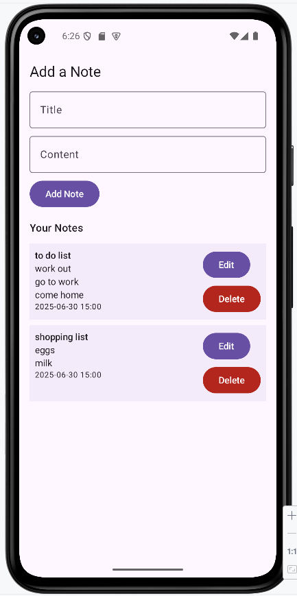
The app editing a note.
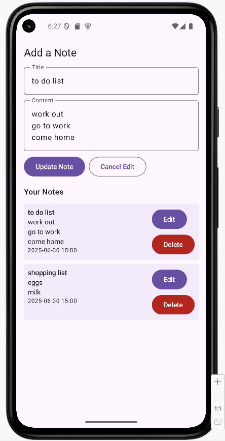
The app deletion confirmation screen.
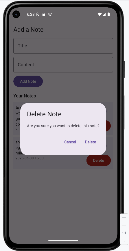
The app after a note was deleted.
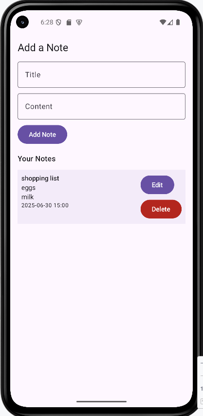
Tips for Success
- Keep your project organized by separating data, UI, and logic.
- Always add the correct dependencies for Room and Compose.
- Test your app after each major change.
- Use ViewModels to keep your UI and data in sync.
- Read error messages carefully—they often tell you exactly what's wrong!
Common Mistakes to Avoid
- Forgetting to add the
kaptplugin for Room. - Not including all your entities in the
@Databaseannotation. - Mixing UI code and data logic in the same file.
- Not updating the database version when you change the schema.
Best Practices
- Use clear, meaningful names for files and classes.
- Keep each file focused on a single job.
- Follow the MVVM (Model-View-ViewModel) pattern for clean code.
- Document your code and project structure for future reference.
Chapter 12: Networking
REST API
Imagine you have a restaurant, and your customers (which are apps) want to order food (data). Instead of shouting their orders directly to the kitchen (database), they speak to a waiter (API). The waiter then communicates with the kitchen, gets the food, and brings it back to the customer.
A REST API (Representational State Transfer Application Programming Interface) is like a standardized, well-organized waiter for web services. It's a set of rules and conventions that allows different software applications to communicate with each other over the internet.
In simpler terms, it's how your mobile app talks to a server to get information (like weather data, news, or social media posts) or send information (like posting a comment or updating a profile).
Core REST Principles (Constraints)
RESTful APIs are designed around a few key principles that make them efficient, scalable, and easy to use:
-
Client-Server Architecture
Clients (e.g., your mobile app) and servers (where the data lives) are separated. This means they can evolve independently, improving flexibility and scalability. The client doesn't care about the server's internal workings, only about the data it receives.
-
Statelessness
Each request from a client to a server must contain all the information needed to understand the request. The server doesn't store any client context between requests. This makes APIs more reliable and easier to scale, as any server can handle any request.
-
Cacheability
Responses from the server should explicitly state whether they can be cached by the client. This helps improve performance and network efficiency by allowing clients to reuse previously fetched data. While this is a good practice we will not be doing that in the example we build later in this chapter.
-
Uniform Interface
This is the most crucial principle, simplifying and decoupling the architecture. It involves four sub-principles:
- Resource Identification in Requests: Each piece of data (resource) is identified by a unique URL (Uniform Resource Locator). For example, `/users/123` identifies a specific user.
- Resource Manipulation Through Representations: When a client receives a representation of a resource (e.g., a JSON file for a user), it has enough information to modify or delete the resource.
- Self-Descriptive Messages: Each message from the client or server includes enough information to describe how to process the message. For example, a response might indicate its media type (e.g., `application/json`).
- Hypermedia as the Engine of Application State (HATEOAS): Clients interact with the application solely through hypermedia provided dynamically by the server. This means the client starts with a fixed URL and then uses links within the responses to discover available actions and resources, much like browsing a website.
-
Layered System
A client cannot ordinarily tell whether it is connected directly to the end server, or to an intermediary along the way. This allows for features like load balancing, shared caches, and security gateways to be added without affecting the client-server interaction.
HTTP Methods (Verbs) and Resources
In a RESTful API, you interact with resources (which can be any data or service, like a user, a product, or weather information) using standard HTTP methods (also known as verbs).
Each method has a specific purpose for performing actions on a resource:
| HTTP Method | Description | Typical Usage | Idempotent? |
|---|---|---|---|
GET |
Retrieves data from a specified resource. | Fetching a list of users, getting weather data. | Yes |
POST |
Submits data to a specified resource, often creating a new resource. | Creating a new user, submitting a form. | No |
PUT |
Updates an existing resource, or creates it if it doesn't exist, by completely replacing it. | Updating all fields of a user's profile. | Yes |
PATCH |
Applies partial modifications to a resource. | Updating only a few fields of a user's profile (e.g., changing email only). | No |
DELETE |
Deletes a specified resource. | Removing a user account, deleting a post. | Yes |
Idempotent means that making the same request multiple times will have the same effect as making it once. For example, deleting a resource multiple times will still result in the resource being deleted, and getting a resource multiple times will return the same data.
Learning Aids
Tips for Success
- Always use appropriate HTTP methods (GET, POST, PUT, DELETE) for their intended actions on resources.
- Design your API resources to be logical and intuitive (e.g., `/users`, `/products/{id}`).
- Ensure your API responses are self-descriptive and include relevant status codes and error messages.
- Consider versioning your API (e.g., `/v1/users`) to allow for future changes without breaking existing clients.
Common Mistakes to Avoid
- Using `GET` requests to modify data; `GET` should always be idempotent and safe.
- Ignoring HTTP status codes; they provide crucial information about the outcome of an API request.
- Creating overly complex URLs or using query parameters for actions that should be part of the resource path.
- Building a stateful API where the server remembers client context between requests, which violates REST principles.
Best Practices
- Use clear and consistent naming conventions for your resources and API endpoints.
- Return meaningful HTTP status codes (e.g., 200 OK, 201 Created, 404 Not Found, 500 Internal Server Error).
- Provide comprehensive documentation for your API, including examples of requests and responses.
- Implement proper authentication and authorization mechanisms to secure your API.
What is JSON
JSON stands for JavaScript Object Notation. It's a simple, text-based way for computers to send data to each other. Think of JSON as a digital version of a form or a table—it's a way to organize information so both sides know what each piece means.
APIs (like the weather service we will be building) almost always send data in JSON format. Your app will receive this data and turn it into objects you can use in your code.
Quick Reference
| JSON Feature | Description | Example |
|---|---|---|
| Object | A group of key-value pairs (like a dictionary) | { "temperature": 22.5, "description": "Cloudy" } |
| Array | A list of values | [ 1, 2, 3 ] or [ { "city": "Ann Arbor" }, { "city": "Detroit" } ] |
| Value | Can be a number, string, boolean, or null | "Cloudy", 22.5, true, null |
How JSON Looks
Here's a sample JSON response you might get from a weather API, I got this from entering the URL into the browser https://api.openweathermap.org/data/2.5/weather?zip=48843,US&appid=80d537a4b4cd7a3b10a3c65a70316965. This is the URL what will be created and sent by our app.
You can see it is just some key value pairs that are wrapped in objects and arrays. Our program will parse this and turn it into a Kotlin object that we can use in our code. As we progress we will see how this data is used.
{
"coord": {
"lon": -83.9248,
"lat": 42.6159
},
"weather": [
{
"id": 803,
"main": "Clouds",
"description": "broken clouds",
"icon": "04d"
}
],
"base": "stations",
"main": {
"temp": 7,
"feels_like": 4.85,
"temp_min": 6.14,
"temp_max": 7.8,
"pressure": 1009,
"humidity": 89,
"sea_level": 1009,
"grnd_level": 977
},
"visibility": 10000,
"wind": {
"speed": 3.09,
"deg": 10
},
"clouds": {
"all": 75
},
"dt": 1761834149,
"sys": {
"type": 1,
"id": 5267,
"country": "US",
"sunrise": 1761826031,
"sunset": 1761863480
},
"timezone": -14400,
"id": 0,
"name": "Howell",
"cod": 200
}Learning Aids
Tips for Success
- Use an online tool like JSONLint to check if your JSON is valid.
- Remember: JSON keys are always in double quotes.
- JSON is case-sensitive—
Temperatureandtemperatureare different. - When you get stuck, print out the JSON response to see what it looks like.
Common Mistakes to Avoid
- Forgetting to match the JSON keys exactly in your Kotlin data class.
- Using single quotes instead of double quotes for keys or strings.
- Trying to parse invalid or incomplete JSON.
Best Practices
- Keep your data classes simple and match them to the JSON structure.
- Use meaningful names for your data class properties.
- Test with real API responses to make sure your data classes work.
Introduction to Retrofit
What is Retrofit?
Think of Retrofit as your app's personal messenger to the internet. Just like how you might ask a friend to get information for you, Retrofit helps your Android app talk to web servers and get data back. It's like having a translator that converts your app's requests into the language that web servers understand.
Retrofit is a popular library that makes it super easy to connect your Android app to the internet. Instead of writing complicated code to handle network connections, Retrofit does the heavy lifting for you. It's like having a smart assistant that knows exactly how to talk to different websites and bring back the information you need.
Quick Reference
| Concept | Description | When to Use |
|---|---|---|
| API Interface | Defines the contract for network requests | Setting up communication with a web service |
| Retrofit Instance | The main object that handles network operations | Creating the connection to your web server |
| HTTP Methods | GET, POST, PUT, DELETE operations | Different types of data operations |
| Data Classes | Kotlin classes that represent your data | Structuring the data you send and receive |
Setting Up Retrofit in Your Project
When to Use Retrofit
- Your app needs to fetch data from the internet (like weather, news, or user profiles)
- You want to send data to a server (like user registration or form submissions)
- You need to update information on a server (like editing user settings)
- You want to delete data from a server (like removing a post or account)
Common Setup Steps
| Step | What It Does | Why It's Important |
|---|---|---|
| Add Dependencies | Include Retrofit libraries in your project | Gives your app the tools to make network requests |
| Create API Interface | Define the methods for your network calls (by zip code, using OpenWeatherMap) | Maps your app's needs to real web server endpoints |
| Build Retrofit Instance | Create the main Retrofit object with the real base URL | Establishes the connection to your web server |
| Add Internet & Network Permissions | Tell Android your app needs internet and network state access | Required for any network communication and offline checks |
Creating a Retrofit Instance
import retrofit2.Retrofit
import retrofit2.converter.gson.GsonConverterFactory
object RetrofitClient {
private const val BASE_URL = "https://api.openweathermap.org/"
val weatherApiService: WeatherApiService by lazy {
Retrofit.Builder()
.baseUrl(BASE_URL)
.addConverterFactory(GsonConverterFactory.create())
.build()
.create(WeatherApiService::class.java)
}
}
Explanation of RetrofitClient
The RetrofitClient object is a singleton that provides a pre-configured instance of Retrofit, which is then used to create our API service. This ensures that only one Retrofit instance is created, optimizing resource usage.
object RetrofitClient: Declares a singleton object in Kotlin, meaning there will only be one instance of this class throughout the application.private const val BASE_URL = "https://api.openweathermap.org/": Defines the base URL for the OpenWeatherMap API. All relative API endpoint paths will be appended to this base URL.val weatherApiService: WeatherApiService by lazy { ... }: This uses Kotlin's `lazy` delegate to ensure that theweatherApiServiceinstance is created only when it's accessed for the first time. This is an efficient way to initialize properties that might be expensive to create.- Inside the `lazy` block:
Retrofit.Builder(): Starts building a Retrofit object..baseUrl(BASE_URL): Sets the base URL for all requests made through this Retrofit instance..addConverterFactory(GsonConverterFactory.create()): Specifies that Gson should be used to convert JSON responses from the API into Kotlin data classes (and vice-versa for outgoing requests)..build(): Creates the Retrofit instance..create(WeatherApiService::class.java): Creates an implementation of theWeatherApiServiceinterface using the configured Retrofit instance. This is where Retrofit dynamically generates the code to make the API calls defined in our interface.
Creating a Simple API Interface
import retrofit2.http.GET
import retrofit2.http.Query
interface WeatherApiService {
@GET("data/2.5/weather")
suspend fun getCurrentWeather(
@Query("zip") zip: String,
@Query("appid") appId: String,
@Query("units") units: String = "metric"
): WeatherResponse
}
Explanation of WeatherApiService
The WeatherApiService interface defines the contract for our weather API calls. Retrofit uses annotations to convert these interface methods into actual HTTP requests.
interface WeatherApiService: Defines a Kotlin interface. Retrofit will create an implementation of this interface at runtime.@GET("data/2.5/weather"): This annotation specifies that thegetCurrentWeathermethod will perform an HTTP GET request to the relative URL "data/2.5/weather". Retrofit will append this to theBASE_URLdefined inRetrofitClient. The actual URL would be something like https://api.openweathermap.org/data/2.5/weather?zip=48843,us&appid=80d537a4b4cd7a3b10a3c65a70316965&units=metricsuspend fun getCurrentWeather(...): This declares a suspend function, indicating that this is a coroutine-friendly function that can be paused and resumed. This is crucial for performing network operations asynchronously without blocking the main thread.@Query("zip") zip: String: The@Queryannotation indicates that thezipparameter will be added as a query parameter to the URL (e.g., `?zip=12345,us`).@Query("appid") appId: String: Similarly, theappIdparameter will be added as a query parameter (e.g., `&appid=YOUR_API_KEY`).@Query("units") units: String = "metric": This query parameter specifies the units for the temperature (e.g., `&units=metric` for Celsius). It has a default value of "metric".: WeatherResponse: This specifies the return type of the function. Retrofit will automatically parse the JSON response from the API into an instance of theWeatherResponsedata class, which you would define elsewhere to match the structure of the API's JSON output.
WeatherResponse Data Class
The WeatherResponse data class is used to represent the response from the weather API. It is used to parse the JSON response from the API into a Kotlin object.
JSON Response
Here is a example JSON response from the weather API.
{
"coord": {
"lon": -83.9248,
"lat": 42.6159
},
"weather": [
{
"id": 804,
"main": "Clouds",
"description": "overcast clouds",
"icon": "04d"
}
],
"base": "stations",
"main": {
"temp": 11.56,
"feels_like": 10.31,
"temp_min": 10.21,
"temp_max": 12.2,
"pressure": 1006,
"humidity": 59,
"sea_level": 1006,
"grnd_level": 973
},
"visibility": 10000,
"wind": {
"speed": 4.02,
"deg": 30,
"gust": 7.6
},
"clouds": {
"all": 100
},
"dt": 1761856253,
"sys": {
"type": 1,
"id": 5267,
"country": "US",
"sunrise": 1761826031,
"sunset": 1761863480
},
"timezone": -14400,
"id": 0,
"name": "Howell",
"cod": 200
}Here is the data class that matches the JSON response.
data class WeatherResponse(
val coord: Coord,
val weather: List,
val base: String,
val main: Main,
val visibility: Int,
val wind: Wind,
val clouds: Clouds,
val dt: Long,
val sys: Sys,
val timezone: Int,
val id: Int,
val name: String,
val cod: Int
)
data class Coord(
val lon: Double,
val lat: Double
)
data class Weather(
val id: Int,
val main: String,
val description: String,
val icon: String
)
data class Main(
val temp: Double,
val feels_like: Double,
val temp_min: Double,
val temp_max: Double,
val pressure: Int,
val humidity: Int,
val sea_level: Int?,
val grnd_level: Int?
)
data class Wind(
val speed: Double,
val deg: Int,
val gust: Double?
)
data class Clouds(
val all: Int
)
data class Sys(
val type: Int?,
val id: Int?,
val country: String,
val sunrise: Long,
val sunset: Long
)
Learning Aids
Tips for Success
- Always define your API interface clearly with correct HTTP annotations and query parameters.
- Use a JSON converter (like Gson) to automatically parse API responses into Kotlin data classes.
- Ensure your data classes precisely match the structure of the JSON response from the API.
- Utilize `lazy` initialization for your Retrofit service to create it only when needed.
Common Mistakes to Avoid
- Forgetting to add internet permissions to your `AndroidManifest.xml` file.
- Mismatching data class property names with JSON keys, especially when `snake_case` is used in JSON and `camelCase` in Kotlin.
- Not handling network exceptions and errors gracefully in your API calls.
- Hardcoding the base URL and API keys in production applications; use more secure methods for configuration.
Best Practices
- Organize your Retrofit setup (client, service, data classes) into dedicated packages for better modularity.
- Use Kotlin `suspend` functions in your API interface for easy integration with coroutines for asynchronous operations.
- Implement a logging interceptor (like OkHttp's `HttpLoggingInterceptor`) for debugging network requests and responses.
- Design your API interfaces to be as granular as possible, with each method representing a specific API endpoint.
Building a Weather App
We will be building a simple weather app that allows the user to enter a zip code and get the current weather for that location. The app will use the OpenWeatherMap API to get the weather data. The user will enter a zip code and click the button to get the weather for that location. The app will display the weather data in a text field.
Adding Dependencies
We will be using the Retrofit library to make the network request to the OpenWeatherMap API. We will also be using the OkHttp library to make the network request.
Adding Dependencies to libs.versions.toml File
// Add these versions to the [versions] section
[versions]
...
retrofit = "2.9.0"
okhttp = "4.9.0"
lifecycle = "2.7.0"
// Add these libraries to the [libraries] section
[libraries]
...
retrofit = { group = "com.squareup.retrofit2", name = "retrofit", version.ref = "retrofit" }
retrofit-converter-gson = { group = "com.squareup.retrofit2", name = "converter-gson", version.ref = "retrofit" }
okhttp-logging-interceptor = { group = "com.squareup.okhttp3", name = "logging-interceptor", version.ref = "okhttp" }
androidx-lifecycle-viewmodel-compose = { group = "androidx.lifecycle", name = "lifecycle-viewmodel-compose", version.ref = "lifecycle" }
...
This adds the Retrofit, OkHttp dependencies to your version catalog.
Adding Dependencies to build.gradle.kts
dependencies {
...
implementation(libs.retrofit)
implementation(libs.retrofit.converter.gson)
implementation(libs.okhttp.logging.interceptor)
implementation(libs.androidx.lifecycle.viewmodel.compose)
...
}
Updateing the Manifest File
We need to add the following permissions to the manifest file:
<uses-permission android:name="android.permission.INTERNET" />
These permissions are required for your app to access the internet
Sample Project Folder Structure
As we build the app, we will be adding files to the project. The following is a sample of the folder structure you will see in the project.
WeaterApp/
├── app/
│ └── src/
│ └── main/
│ ├── AndroidManifest.xml
│ ├── java/
│ │ └── com/example/weaterapp/
│ │ ├── MainActivity.kt
│ │ ├── WeatherAppScreen.kt
│ │ ├── WeatherViewModel.kt
│ │ ├── WeatherRepository.kt
│ │ ├── api/
│ │ │ ├── WeatherApiService.kt
│ │ │ └── RetrofitClient.kt
│ │ │ └── WeatherResponse.kt
│ │ └── ui.theme/
│ └── res/
│ └── ...
└── ...
This structure helps keep your code organized as you add more features in each lesson.
How the App Renders
Here's what our weather app will look like when it's complete:
To see the full code, you need to go to my GitHub page and look at the chapter12 WeatherAppNoCache.
The app will look like this:
When it first loads.
Error getting weather data.
Successfully getting weather data.
WeatherApp Screen
The MainActivity will call the WeatherAppScreen which will be our UI.
WeatherAppScreen.kt
@Composable
fun WeatherAppScreen() {
val weatherApiService = RetrofitClient.weatherApiService
val weatherRepository = remember { WeatherRepository(weatherApiService) }
val weatherViewModel: WeatherViewModel = viewModel(
factory = WeatherViewModel.provideFactory(weatherRepository)
)
// Collect states from the ViewModel
val zipcode by weatherViewModel.zipcode.collectAsState()
val weatherResponse by weatherViewModel.weatherResponse.collectAsState()
val errorMessage by weatherViewModel.errorMessage.collectAsState()
Column(
modifier = Modifier
.fillMaxSize()
.padding(16.dp),
verticalArrangement = Arrangement.Center,
horizontalAlignment = Alignment.CenterHorizontally
) {
OutlinedTextField(
value = zipcode,
onValueChange = { weatherViewModel.onZipcodeChange(it) },
label = { Text("Enter Zip Code") },
singleLine = true,
modifier = Modifier.padding(bottom = 8.dp)
)
Button(onClick = { weatherViewModel.fetchWeather() }) {
Text("Get Weather")
}
when {
weatherResponse != null -> {
Column(modifier = Modifier.fillMaxWidth().padding(top = 16.dp), horizontalAlignment = Alignment.Start) {
Text("City: ${weatherResponse?.name}")
Text("Temperature: ${weatherResponse?.main?.temp}°C")
Text("Description: ${weatherResponse?.weather?.firstOrNull()?.description}")
Spacer(modifier = Modifier.height(16.dp))
Text("Other Info:")
Text("Temp Min: ${weatherResponse?.main?.temp_min}")
Text("Temp Max: ${weatherResponse?.main?.temp_max}")
Text("Pressure: ${weatherResponse?.main?.pressure}")
Text("Humidity: ${weatherResponse?.main?.humidity}")
Text("Wind Speed: ${weatherResponse?.wind?.speed}")
Text("Wind Direction: ${weatherResponse?.wind?.deg}")
Text("Clouds: ${weatherResponse?.clouds?.all}")
Text("Sunrise: ${weatherResponse?.sys?.sunrise}")
Text("Sunset: ${weatherResponse?.sys?.sunset}")
}
}
errorMessage != null -> {
Column(modifier = Modifier.fillMaxWidth().padding(top = 16.dp), horizontalAlignment = Alignment.Start) {
Text("No weather found for that zip code")
}
}
else -> {
Column(modifier = Modifier.fillMaxWidth().padding(top = 16.dp), horizontalAlignment = Alignment.Start) {
Text("Enter a zip code and press 'Get Weather'")
}
}
}
}
}Code Explanation
The WeatherAppScreen composable function is the main UI component for our weather application. It observes UI state from a WeatherViewModel and handles user interactions, while all data fetching logic is delegated to the ViewModel and Repository layers.
State Management
The WeatherAppScreen composable function utilizes a WeatherViewModel to manage and expose all UI state, including the zipcode input, weather data, and error states. This promotes better separation of concerns and testability.
val weatherApiService = RetrofitClient.weatherApiService
val weatherRepository = remember { WeatherRepository(weatherApiService) }
val weatherViewModel: WeatherViewModel = viewModel(
factory = WeatherViewModel.provideFactory(weatherRepository)
)
// Collect states from the ViewModel
val zipcode by weatherViewModel.zipcode.collectAsState()
val weatherResponse by weatherViewModel.weatherResponse.collectAsState()
val errorMessage by weatherViewModel.errorMessage.collectAsState()
weatherApiService: The Retrofit API service interface for making network requests.weatherRepository: A repository instance created usingrememberto persist it across recompositions. The repository handles data fetching logic.weatherViewModel: An instance of the ViewModel created using theviewModelcomposable with a custom factory. The factory injects theweatherRepositorydependency into the ViewModel. The factory's primary role is to provide the WeatherRepository as a dependency to the WeatherViewModel. This means when the WeatherViewModel is created, the factory ensures it receives the necessary WeatherRepository instance to perform its data fetching operations.zipcode: AStateFlow<String>observed from the ViewModel usingcollectAsState(), storing the user-entered zip code. The zipcode state is fully managed by the ViewModel.weatherResponse: AStateFlow<WeatherResponse?>observed from the ViewModel, holding the fetched weather data. It will be null if no weather data is available or an error occurred.errorMessage: AStateFlow<String?>observed from the ViewModel, holding any error messages to be displayed to the user. It will be null if there is no current error.
Dependencies and Architecture
The application follows a clean architecture pattern with clear separation of concerns:
- Repository Pattern: The
WeatherRepositoryis created in the composable usingrememberto persist it across recompositions. It takes theweatherApiServiceas a dependency and handles all data fetching logic, including API key management and error handling. - ViewModel Factory: The
WeatherViewModel.provideFactory()method creates a factory that injects theweatherRepositoryinto the ViewModel. This allows for proper dependency injection and makes the ViewModel testable. - StateFlow: All state is managed using Kotlin's
StateFlow, which provides a reactive, lifecycle-aware way to observe state changes. The UI collects these states usingcollectAsState(), which automatically recomposes the UI when state changes. - Coroutine Scope: The ViewModel uses
viewModelScopefor launching coroutines, ensuring that any background work is automatically cancelled when the ViewModel is cleared, preventing memory leaks.
UI Layout and Components
The UI is structured using Jetpack Compose's Column composable.
// ... existing code ...
Column(
modifier = Modifier.align(Alignment.Center),
verticalArrangement = Arrangement.Center,
horizontalAlignment = Alignment.CenterHorizontally
) {
// UI elements go here
}
}
// ... existing code ...
Column: Arranges its children vertically in the center of the screenboth vertically and horizontally.
Input Field
OutlinedTextField(
value = zipcode,
onValueChange = { weatherViewModel.onZipcodeChange(it) },
label = { Text("Enter Zip Code") },
singleLine = true,
modifier = Modifier.padding(bottom = 8.dp)
)
An OutlinedTextField allows the user to input a zip code. The value is bound to the zipcode state collected from the ViewModel, and onValueChange calls the ViewModel's onZipcodeChange() method to update the state in the ViewModel. This ensures all state management is centralized in the ViewModel.
Get Weather Button
Button(onClick = { weatherViewModel.fetchWeather() }) {
Text("Get Weather")
}
The "Get Weather" button triggers the data fetching process when clicked. The fetchWeather() method in the ViewModel doesn't require a parameter because it reads the current zipcode value from the ViewModel's internal state. This further demonstrates the separation of concerns—the UI simply triggers an action, and the ViewModel handles the rest.
Weather Data Fetching Logic
The core logic for fetching weather data follows this flow:
- The UI calls
weatherViewModel.fetchWeather()when the button is clicked. - The ViewModel's
fetchWeather()method reads the currentzipcodefrom its internal state and launches a coroutine usingviewModelScope. - The ViewModel calls
repository.getCurrentWeather(zipcode), which handles the actual network request. - The repository uses the
WeatherApiServiceto make the API call and returns aResult<WeatherResponse>. - The ViewModel updates its
_weatherResponseor_errorMessageStateFlow based on the result. - The UI automatically recomposes when the StateFlow values change, thanks to
collectAsState().
This architecture ensures that the UI composable is not directly involved in data fetching, network operations, or error handling. Instead, it simply triggers the ViewModel to perform these operations and observes the results via reactive StateFlows.
Displaying Errors, Loading, and Weather
The UI conditionally displays information based on the state observed from the WeatherViewModel. A when statement is used to handle different scenarios:
// ... existing code ...
when {
weatherResponse != null -> {
Column(modifier = Modifier.fillMaxWidth().padding(top = 16.dp), horizontalAlignment = Alignment.Start) {
Text("City: ${weatherResponse?.name}")
Text("Temperature: ${weatherResponse?.main?.temp}°C")
Text("Description: ${weatherResponse?.weather?.firstOrNull()?.description}")
Spacer(modifier = Modifier.height(16.dp))
Text("Other Info:")
Text("Temp Min: ${weatherResponse?.main?.temp_min}")
Text("Temp Max: ${weatherResponse?.main?.temp_max}")
Text("Pressure: ${weatherResponse?.main?.pressure}")
Text("Humidity: ${weatherResponse?.main?.humidity}")
Text("Wind Speed: ${weatherResponse?.wind?.speed}")
Text("Wind Direction: ${weatherResponse?.wind?.deg}")
Text("Clouds: ${weatherResponse?.clouds?.all}")
Text("Sunrise: ${weatherResponse?.sys?.sunrise}")
Text("Sunset: ${weatherResponse?.sys?.sunset}")
}
}
errorMessage != null -> {
Column(modifier = Modifier.fillMaxWidth().padding(top = 16.dp), horizontalAlignment = Alignment.Start) {
Text("No weather found for that zip code")
}
}
else -> {
Column(modifier = Modifier.fillMaxWidth().padding(top = 16.dp), horizontalAlignment = Alignment.Start) {
Text("Enter a zip code and press 'Get Weather'")
}
}
}
// ... existing code ...
-
Weather Data Display: If
weatherResponseis not null, aColumndisplays various weather details such as city, temperature, description, wind speed, etc. directly from the `weatherResponse` object. -
Error Message: If
errorMessageis not null, aTextcomposable displays the error message, indicating that no weather was found. - Initial State/Guidance: If neither `weatherResponse` nor `errorMessage` is present, a message prompts the user to enter a zip code and press the 'Get Weather' button.
Learning Aids
Tips for Success
- Keep your composables focused on UI and observe state from the ViewModel using
collectAsState(). - Use
StateFlowin your ViewModel for reactive state management. All UI-related state should be managed by the ViewModel, not stored locally in composables. - Use
rememberfor dependencies like repositories that should persist across recompositions but don't need to be part of the ViewModel's state. - Structure your UI using appropriate Jetpack Compose layout composables like
Column,Row, andBoxfor better organization and responsiveness. - Use a ViewModel factory pattern when your ViewModel requires dependencies, as shown in this example.
Common Mistakes to Avoid
- Performing complex business logic or directly initiating network requests within composables; this should be handled by the ViewModel and Repository.
- Storing UI state (like input field values) locally in composables using
mutableStateOfinstead of managing it in the ViewModel. The ViewModel should own all UI-related state. - Forgetting to use
collectAsState()when observing StateFlow values from the ViewModel in composables. - Not using a ViewModel factory when the ViewModel requires dependencies, leading to difficulties in testing and dependency injection.
- Creating deeply nested composable hierarchies, which can negatively impact readability, maintainability, and rendering performance.
- Not using
viewModelScopein the ViewModel for coroutines, which can lead to memory leaks if coroutines aren't properly cancelled.
Best Practices
- Follow the Repository pattern to abstract data sources. The Repository should handle API calls, caching, and data transformation, while the ViewModel coordinates between the Repository and UI.
- Use
StateFlowin ViewModels for all UI-related state. This provides a reactive, lifecycle-aware way to manage state that integrates seamlessly with Jetpack Compose'scollectAsState(). - Delegate all data fetching, error handling, and business logic to the ViewModel and Repository, keeping your composables lean and focused solely on UI.
- Use a ViewModel factory pattern when your ViewModel requires dependencies. This makes dependency injection clean and enables easier testing.
- Always use
viewModelScopefor launching coroutines in ViewModels to ensure proper lifecycle management and automatic cancellation. - Keep UI state management centralized in the ViewModel rather than scattering it across composables. This makes state predictable and easier to test.
- Break down large composables into smaller, focused, and reusable composables for better modularity and easier maintenance.
Building The WeatherViewModel
The WeatherViewModel is responsible for managing UI-related state and coordinating with the WeatherRepository to fetch weather data from the network. It exposes state using StateFlow for reactive UI updates and handles all business logic related to weather data.
class WeatherViewModel(private val repository: WeatherRepository) : ViewModel() {
private val _zipcode = MutableStateFlow("")
val zipcode: StateFlow = _zipcode.asStateFlow()
private val _weatherResponse = MutableStateFlow(null)
val weatherResponse: StateFlow = _weatherResponse.asStateFlow()
private val _errorMessage = MutableStateFlow(null)
val errorMessage: StateFlow = _errorMessage.asStateFlow()
fun onZipcodeChange(newZipcode: String) {
_zipcode.value = newZipcode
}
fun fetchWeather() {
viewModelScope.launch {
_errorMessage.value = null // Clear any previous error
repository.getCurrentWeather(_zipcode.value)
.onSuccess { response ->
_weatherResponse.value = response
}
.onFailure { e ->
_errorMessage.value = e.message
_weatherResponse.value = null
}
}
}
// Factory for ViewModel injection
companion object {
fun provideFactory(repository: WeatherRepository): ViewModelProvider.Factory {
return object : ViewModelProvider.Factory {
@Suppress("UNCHECKED_CAST")
override fun <T : ViewModel> create(modelClass: Class<T>): T {
if (modelClass.isAssignableFrom(WeatherViewModel::class.java)) {
return WeatherViewModel(repository) as T
}
throw IllegalArgumentException("Unknown ViewModel class")
}
}
}
}
} Code Explanation
The WeatherViewModel is a central component for managing and providing weather data to the UI. It extends ViewModel from Android Architecture Components, which means its lifecycle is independent of UI components (like Activities or Composables) and it survives configuration changes.
Dependency Injection
class WeatherViewModel(private val repository: WeatherRepository): The ViewModel takes aWeatherRepositoryas a constructor parameter, following dependency injection principles. This makes the ViewModel testable and decoupled from the data source implementation. The repository handles all network operations and API key management.
State Variables
All UI state is managed using Kotlin's StateFlow, which provides a reactive, lifecycle-aware way to manage state that integrates seamlessly with Jetpack Compose's collectAsState():
private val _zipcode = MutableStateFlow(""): A private, mutableStateFlowthat holds the user-entered zip code. This state is managed by the ViewModel rather than the UI composable, ensuring centralized state management.val zipcode: StateFlow<String> = _zipcode.asStateFlow(): The public, immutableStateFlowthat exposes the zipcode to the UI. The UI observes this usingcollectAsState().private val _weatherResponse = MutableStateFlow<WeatherResponse?>(null): A private, mutableStateFlowthat holds the weather data. It's nullable, meaning it can hold weather data or be null if no data is available or an error occurs. The underscore prefix (`_`) indicates it's a mutable internal state.val weatherResponse: StateFlow<WeatherResponse?> = _weatherResponse.asStateFlow(): The public, immutableStateFlowthat exposes the weather data to the UI. Any changes to_weatherResponsewill automatically trigger UI recomposition when observed withcollectAsState().private val _errorMessage = MutableStateFlow<String?>(null): A private, mutableStateFlowthat holds any error messages. It's a nullableString, set to null when there's no error.val errorMessage: StateFlow<String?> = _errorMessage.asStateFlow(): The public, immutableStateFlowthat exposes error messages to the UI.
State Update Functions
fun onZipcodeChange(newZipcode: String): A function called by the UI when the user types in the zipcode input field. It updates the_zipcodestate, ensuring all state changes go through the ViewModel.
fetchWeather Function
The fetchWeather function is responsible for initiating the weather data retrieval process. It reads the current zipcode from the ViewModel's internal state and delegates the actual network request to the repository.
fun fetchWeather(): The public function called by the UI to request weather data. Notice it doesn't take azipcodeparameter because it reads the current value from_zipcode.value, demonstrating that all state is centralized in the ViewModel.viewModelScope.launch { ... }: This launches a coroutine within the ViewModel's scope.viewModelScopeis a CoroutineScope tied to the ViewModel's lifecycle, meaning that any coroutines launched within it will be automatically cancelled when the ViewModel is cleared, preventing memory leaks._errorMessage.value = null: Before making a new API call, any previous error message is cleared to provide a clean state for the new request.repository.getCurrentWeather(_zipcode.value): This calls the repository'sgetCurrentWeathermethod, passing the current zipcode value. The repository handles all the details of the network request, including API key management and error handling. The repository returns aResult<WeatherResponse>, which is a Kotlin sealed class that represents either success or failure without throwing exceptions..onSuccess { response -> ... }: If the repository call is successful, this lambda receives theWeatherResponseand assigns it to_weatherResponse.value, which automatically updates the exposedweatherResponseStateFlow and triggers UI recomposition..onFailure { e -> ... }: If the repository call fails, this lambda receives the exception. The error message is extracted and assigned to_errorMessage.value, and_weatherResponse.valueis set to null to clear any previous weather data.
ViewModel Factory
The companion object contains a factory method for creating instances of WeatherViewModel with the required dependencies. This is necessary because Android's ViewModel system requires a special way to create ViewModels when they have constructor parameters.
Why a Factory is Needed: Since WeatherViewModel requires a WeatherRepository in its constructor (dependency injection), we can't use the default ViewModel creation mechanism. Android's ViewModelProvider needs a factory that knows how to create our ViewModel with its dependencies.
companion object { ... }: In Kotlin, acompanion objectis like a static class in Java. It allows you to call methods directly on the class (e.g.,WeatherViewModel.provideFactory(repository)) without needing an instance of the class. This is the perfect place for a factory method.fun provideFactory(repository: WeatherRepository): ViewModelProvider.Factory: This is a static method that creates and returns a factory object. It takes theWeatherRepositorydependency as a parameter and "captures" it inside the factory object so it can be used later when creating the ViewModel.return object : ViewModelProvider.Factory { ... }: This creates an anonymous object that implements theViewModelProvider.Factoryinterface. An anonymous object is an object created on-the-fly without a name. This object must implement thecreatemethod defined by the interface.@Suppress("UNCHECKED_CAST"): This annotation suppresses a compiler warning about type casting. The warning appears because we're casting from a specific type (WeatherViewModel) to a generic type (T), but our type checking ensures it's safe.override fun <T : ViewModel> create(modelClass: Class<T>): T: This is the method required byViewModelProvider.Factory. When Android needs to create a ViewModel, it calls this method with the class type it wants to create. The generic typeTmust be a subclass ofViewModel.if (modelClass.isAssignableFrom(WeatherViewModel::class.java)): This checks if the requested ViewModel class isWeatherViewModelor a subclass of it.isAssignableFromreturnstrueif themodelClassis the same as or a subclass ofWeatherViewModel. This ensures we only create ViewModels we know how to handle.return WeatherViewModel(repository) as T: If the check passes, we create a newWeatherViewModelinstance, passing therepositorythat was captured when the factory was created. We then cast it to typeT(the generic type requested by Android) and return it. This is where dependency injection happens—the repository is injected into the ViewModel constructor.throw IllegalArgumentException("Unknown ViewModel class"): If someone tries to use this factory to create a different type of ViewModel (notWeatherViewModel), we throw an exception because this factory doesn't know how to create other ViewModel types.
How It's Used: In the UI composable (like WeatherAppScreen), you call viewModel(factory = WeatherViewModel.provideFactory(weatherRepository)). This tells Jetpack Compose to use our custom factory when creating the ViewModel, ensuring the repository dependency is properly injected.
Benefits: This factory pattern enables proper dependency injection, making the ViewModel testable (you can inject a mock repository during testing), maintainable (dependencies are explicit), and following clean architecture principles.
Learning Aids
Tips for Success
- Keep your ViewModel focused on UI-related data and logic, avoiding direct Android view dependencies.
- Use
StateFlowfor managing all UI state in the ViewModel. This provides reactive, lifecycle-aware state management that integrates well with Jetpack Compose. - Use
viewModelScopefor launching coroutines to ensure they are automatically cancelled when the ViewModel is no longer needed. - Clearly separate mutable internal states (e.g.,
_weatherResponse) from their publicly exposed immutableStateFlowcounterparts (e.g.,weatherResponse). - Delegate data fetching to a Repository layer. The ViewModel should coordinate between the Repository and UI, not directly make network calls.
- Use the ViewModel factory pattern when your ViewModel requires dependencies, enabling clean dependency injection.
Common Mistakes to Avoid
- Passing `Context` directly into the ViewModel, which can lead to memory leaks. Instead, inject application context or use AndroidViewModel if necessary.
- Performing long-running operations directly in the ViewModel without using coroutines, which can block the UI thread.
- Exposing mutable state directly to the UI (e.g., exposing
MutableStateFlowinstead ofStateFlow), which can lead to unexpected UI updates and difficult-to-track bugs. - Making direct API calls from the ViewModel instead of using a Repository layer. This makes the code harder to test and violates separation of concerns.
- Storing UI state (like input field values) in composables instead of the ViewModel, leading to scattered state management.
- Not using a ViewModel factory when the ViewModel requires dependencies, making it difficult to inject mock dependencies for testing.
- Using
mutableStateOfinstead ofStateFlowin ViewModels when you want the state to be observable by multiple collectors or need better integration with reactive programming patterns.
Best Practices
- Inject dependencies (like
WeatherRepository) into the ViewModel constructor for testability and maintainability. This follows dependency injection principles and makes your code more modular. - Use
StateFlowfor all UI-related state in ViewModels. This provides a reactive, lifecycle-aware way to manage state that works seamlessly with Jetpack Compose'scollectAsState(). - Keep all UI state centralized in the ViewModel, including input field values like zipcode, rather than managing it in composables.
- Delegate data fetching operations to a Repository layer. The ViewModel should coordinate between the Repository and UI, handling success/failure states using Kotlin's
Resulttype. - Use the ViewModel factory pattern when your ViewModel requires dependencies. This enables proper dependency injection and makes testing easier.
- Always use
viewModelScopefor launching coroutines in ViewModels to ensure proper lifecycle management and automatic cancellation. - Use a consistent naming convention for mutable and immutable state variables (e.g.,
_weatherResponsefor private mutable state andweatherResponsefor the exposed immutable StateFlow). - Handle errors gracefully using
Resulttypes from repository calls, avoiding try-catch blocks when possible by using functional error handling withonSuccessandonFailure.
Building The WeatherRepository
The WeatherRepository is responsible for fetching weather data from the network and caching it locally. It is also responsible for returning the cached data if the user is offline, that is not modeled in this example. In a real world application, you would likely have a more complex caching strategy, with different rules for when to fetch from the network and when to use the cached data.
class WeatherRepository(private val weatherApiService: WeatherApiService) {
// You would typically get the API key from a more secure location
// or through dependency injection in a real app.
private val API_KEY = "80d537a4b4cd7a3b10a3c65a70316965"
suspend fun getCurrentWeather(zipcode: String): Result<WeatherResponse> {
return try {
val response = weatherApiService.getCurrentWeather(
zip = "$zipcode,us",
appId = API_KEY
)
Result.success(response)
} catch (e: Exception) {
Result.failure(e)
}
}
}Code Explanation
The WeatherRepository is a crucial component in the clean architecture pattern. It acts as an abstraction layer between the data source (in this case, the network API) and the ViewModel. The Repository pattern ensures that the ViewModel doesn't need to know the details of how data is fetched—whether it comes from a network API, a local database, or a cache.
Dependency Injection
class WeatherRepository(private val weatherApiService: WeatherApiService): The Repository takes aWeatherApiService(a Retrofit interface) as a constructor parameter. This follows dependency injection principles, making the Repository testable and allowing you to swap out the actual implementation with a mock service during testing. TheWeatherApiServiceis provided by the Retrofit instance created inRetrofitClient.
API Key Management
private val API_KEY = "80d537a4b4cd7a3b10a3c65a70316965": The API key is stored as a private constant within the Repository. While this works for educational purposes, in a production application, you would typically:- Store the API key in a secure location (like
local.propertiesfor local builds or environment variables for CI/CD) - Use Android's
BuildConfigto inject API keys during the build process - Implement API key rotation and management strategies
- Never commit API keys to version control systems
- The API key is encapsulated within the Repository, meaning the ViewModel doesn't need to know or manage the API key—it's purely a data source concern.
getCurrentWeather Function
The getCurrentWeather function is the main entry point for fetching weather data. It encapsulates all the network request logic and error handling:
suspend fun getCurrentWeather(zipcode: String): Result<WeatherResponse>: This is a suspend function (meaning it can be called from a coroutine) that takes a zipcode as a parameter and returns aResult<WeatherResponse>. TheResulttype is a Kotlin sealed class that represents either success (with the data) or failure (with an exception), allowing for functional error handling without throwing exceptions.return try { ... } catch (e: Exception) { ... }: The function uses a try-catch block to handle any exceptions that might occur during the network request. This ensures that exceptions are converted intoResult.failure()rather than propagating up and potentially crashing the app.val response = weatherApiService.getCurrentWeather(zip = "$zipcode,us", appId = API_KEY): This line makes the actual network request using the injectedWeatherApiService. The zipcode is appended with",us"to specify the country code (United States), and the API key is provided for authentication. Since this is a suspend function call, it will suspend the coroutine until the network request completes.Result.success(response): If the network request succeeds without throwing an exception, the response is wrapped in aResult.success()and returned. This allows the ViewModel to handle success cases using.onSuccess { ... }.Result.failure(e): If an exception occurs (network error, timeout, etc.), it's caught and wrapped in aResult.failure(). This allows the ViewModel to handle errors using.onFailure { ... }without needing try-catch blocks.
Benefits of the Repository Pattern
- Abstraction: The Repository abstracts the data source implementation. If you later need to add caching or switch to a different API, only the Repository needs to change—the ViewModel remains unchanged.
- Testability: You can easily create a mock or fake repository for testing the ViewModel without making actual network calls.
- Single Responsibility: The Repository has one clear responsibility: fetching weather data. This makes the code easier to understand and maintain.
- Error Handling: The Repository centralizes error handling logic, ensuring consistent error handling throughout the application.
- Future Extensibility: The Repository is designed to be easily extended. For example, you could add caching logic that checks a local database before making a network request, all without changing the ViewModel code.
Learning Aids
Tips for Success
- Keep your Repository focused on data operations—fetching, caching, and transforming data. Avoid UI-related logic or business logic.
- Always use suspend functions for network operations in Repositories. This ensures proper integration with coroutines.
- Return
Resulttypes from Repository methods rather than throwing exceptions. This provides a functional approach to error handling that integrates well with coroutines. - Inject dependencies (like API services) through the constructor. This makes the Repository testable and follows dependency injection principles.
- Keep API keys and other sensitive data encapsulated within the Repository. Never expose them to the ViewModel or UI layers.
- Consider making the Repository an interface if you need multiple implementations (e.g., a real repository and a mock repository for testing).
Common Mistakes to Avoid
- Hardcoding API keys directly in the code. In production, use secure storage methods like
local.propertiesor environment variables. - Throwing exceptions from Repository methods instead of returning
Resulttypes. This can make error handling more complex and error-prone. - Mixing business logic or UI logic into the Repository. The Repository should only handle data operations.
- Making the Repository depend on Android-specific components (like
Context) unless absolutely necessary. Keep it platform-agnostic for better testability. - Not handling exceptions properly. Always catch exceptions in Repository methods and convert them to
Result.failure(). - Not making Repository functions suspend functions when they perform network operations. This can block threads and cause performance issues.
- Exposing mutable state or complex data structures from the Repository. Keep the Repository interface simple and focused on data fetching.
Best Practices
- Use the Repository pattern to abstract data sources. This provides a clean separation between the data layer and the business logic layer.
- Always return
Resulttypes from Repository methods that can fail. This enables functional error handling and makes error states explicit. - Use suspend functions for all asynchronous operations in Repositories. This ensures proper integration with coroutines and
viewModelScope. - Keep the Repository interface simple and focused. A Repository method should do one thing: fetch data, cache data, or transform data.
- Encapsulate sensitive information (like API keys) within the Repository. Never expose them to other layers of the application.
- Make the Repository easily testable by injecting dependencies through the constructor. This allows you to provide mock dependencies during testing.
- Consider implementing multiple data sources within a single Repository (e.g., network and local database) to create a single source of truth for your data.
- Handle all exceptions within the Repository and convert them to appropriate
Result.failure()responses. This prevents exceptions from propagating to the ViewModel layer. - In production applications, implement caching strategies within the Repository to improve performance and enable offline functionality.
Building the RetrofitClient
The RetrofitClient file creates and configures Retrofit for the whole app. Think of it as the "network setup station" where we tell the app which website to call and how to turn JSON into Kotlin objects.
object RetrofitClient {
private const val BASE_URL = "https://api.openweathermap.org/"
val weatherApiService: WeatherApiService by lazy {
Retrofit.Builder()
.baseUrl(BASE_URL)
.addConverterFactory(GsonConverterFactory.create())
.build()
.create(WeatherApiService::class.java)
}
}Code Explanation
Why Use an Object?
object RetrofitClientcreates a singleton, which means there is only one instance of this class in the app.- This is useful because we want one shared Retrofit configuration instead of creating a new network client in many places.
- Having one instance also keeps behavior consistent and easier to debug.
Base URL
private const val BASE_URL = "https://api.openweathermap.org/"stores the root API address.privatemeans this value is only used inside this file.const valmeans it is a compile-time constant and cannot change while the app runs.- Retrofit combines this base URL with endpoint paths defined in
WeatherApiService.
Lazy Initialization
val weatherApiService: WeatherApiService by lazy { ... }means the service is created only when first needed.- This can improve startup performance because we avoid creating network objects before they are needed.
- After the first creation, the same service instance is reused.
Retrofit Builder Chain
Retrofit.Builder()starts the configuration..baseUrl(BASE_URL)sets the root URL for all requests..addConverterFactory(GsonConverterFactory.create())tells Retrofit to use Gson so JSON can be converted into Kotlin data classes automatically..build()creates the configured Retrofit instance..create(WeatherApiService::class.java)generates a real implementation of your API interface.
How This Fits the Architecture
WeatherAppScreenasksRetrofitClientforweatherApiService.- That service gets passed to
WeatherRepository. - The repository calls the API through this service, and the ViewModel updates UI state.
- This keeps networking setup separate from UI code.
Learning Aids
Tips for Success
- Keep your Retrofit setup in one file so it is easy to maintain.
- Use a singleton (
object) for network clients in small to medium apps. - Always include the trailing slash in the base URL when using Retrofit.
- Use a converter factory (like Gson) when the API returns JSON.
- Use
by lazywhen an object can be created on first use.
Common Mistakes to Avoid
- Forgetting the trailing slash in
BASE_URLwhich can break endpoint building. - Creating a new Retrofit instance in multiple files instead of sharing one setup.
- Not adding a converter factory, then wondering why JSON parsing fails.
- Putting endpoint paths in this file instead of the API service interface.
- Mixing UI logic into network setup files.
Best Practices
- Keep this file focused on configuration only.
- Expose typed services (like
WeatherApiService) instead of exposing raw Retrofit everywhere. - Use clear naming so new developers can quickly find networking setup.
- In production apps, add logging interceptors and timeout configuration as needed.
- Test your API service methods with known inputs before wiring into complex UI flows.
Building the WeatherApiService
The WeatherApiService file describes the weather endpoint we call with Retrofit. This interface is a contract: it tells Retrofit what URL path to use, what query parameters to send, and what Kotlin type should be returned.
interface WeatherApiService {
@GET("data/2.5/weather")
suspend fun getCurrentWeather(
@Query("zip") zip: String,
@Query("appid") appId: String,
@Query("units") units: String = "metric"
): WeatherResponse
}Code Explanation
Interface as an API Contract
interface WeatherApiServicedefines what operations are available for weather data.- You do not manually implement this interface; Retrofit creates the implementation at runtime.
- This keeps your code simple and readable.
Endpoint Annotation
@GET("data/2.5/weather")says this function uses an HTTP GET request.- This path is appended to the base URL from
RetrofitClient. - Together they form the full endpoint URL.
Suspend Function
suspend fun getCurrentWeather(...)means this function runs in a coroutine.- Network requests can take time, so we run them asynchronously to avoid freezing the UI.
- The repository calls this function from coroutine-based code.
Query Parameters
@Query("zip") zip: Stringsends the zip code (for example,48197,us).@Query("appid") appId: Stringsends the API key needed by OpenWeatherMap.@Query("units") units: String = "metric"sends units and defaults to metric, so temperatures return in Celsius.- Because
unitshas a default value, callers can omit it if they want metric units.
Return Type
- The function returns
WeatherResponse, which is your data model for the JSON response. - Retrofit + Gson convert raw JSON into that Kotlin object automatically.
- This gives type-safe data access instead of manual JSON parsing.
How It Connects to the App
RetrofitClientcreates this service.WeatherRepositorycallsgetCurrentWeather().WeatherViewModelhandles success and failure results for the UI.WeatherAppScreenonly reads state and triggers actions.
Learning Aids
Tips for Success
- Think of each function in this interface as one API endpoint.
- Use clear parameter names that match what the API expects.
- Keep endpoint functions
suspendwhen they perform network I/O. - Use default parameter values when the API has a common default behavior.
- Keep this file focused on endpoint definitions only.
Common Mistakes to Avoid
- Misspelling query names like
appidorzip. - Forgetting
suspendand then calling network code on the wrong thread. - Using the wrong endpoint path in
@GET. - Returning the wrong data class type that does not match the JSON structure.
- Mixing business logic into this interface.
Best Practices
- Keep API interfaces clean and declarative.
- Use one service interface per feature area when possible.
- Return strongly typed models (like
WeatherResponse) for safety and readability. - Use repository classes to wrap service calls and handle errors.
- Document required query parameters in comments or lesson text for teammates.
Building the WeatherResponse Models
The WeatherResponse file contains Kotlin data classes that represent the JSON returned by OpenWeatherMap. These classes let Retrofit and Gson map JSON fields into Kotlin objects automatically.
data class WeatherResponse(
val coord: Coord,
val weather: List,
val base: String,
val main: Main,
val visibility: Int,
val wind: Wind,
val clouds: Clouds,
val dt: Long,
val sys: Sys,
val timezone: Int,
val id: Int,
val name: String,
val cod: Int
)
data class Coord(
val lon: Double,
val lat: Double
)
data class Weather(
val id: Int,
val main: String,
val description: String,
val icon: String
)
data class Main(
val temp: Double,
val feels_like: Double,
val temp_min: Double,
val temp_max: Double,
val pressure: Int,
val humidity: Int,
val sea_level: Int?,
val grnd_level: Int?
)
data class Wind(
val speed: Double,
val deg: Int,
val gust: Double?
)
data class Clouds(
val all: Int
)
data class Sys(
val type: Int?,
val id: Int?,
val country: String,
val sunrise: Long,
val sunset: Long
) Code Explanation
Why Data Classes?
- A
data classis great for storing structured data from APIs. - Kotlin automatically gives useful features like
toString(),equals(), andcopy(). - These classes are easy to read and perfect for JSON mapping.
Top-Level Response Object
WeatherResponseis the full response from the endpoint.- It combines nested objects like
main,wind, andsys. - It also includes simple values such as city name (
name) and status code (cod).
Nested Models
Coordholds location coordinates (lonandlat).Weatherholds weather condition details, and appears as a list because the API returns an array.Mainholds temperature and pressure values.Wind,Clouds, andSyseach represent a specific part of the JSON.
Nullable Fields
- Some fields are optional in the API response, so they use nullable types like
Int?orDouble?. - Examples include
sea_level,grnd_level, andgust. - Nullable types help prevent crashes when a field is missing.
Matching JSON Keys
- Field names in these classes match the JSON keys exactly, including names like
feels_like. - When names match, Gson can map data without extra annotations.
- If names did not match, you would use annotations like
@SerializedName.
How the UI Uses This Model
- The repository returns a
WeatherResponseobject from the API call. - The ViewModel stores it in state.
- The UI reads fields like
weatherResponse.main.tempandweatherResponse.weather.firstOrNull()?.description. - Strong typing makes these accesses safer than manual JSON parsing.
Learning Aids
Tips for Success
- Start by modeling only the fields your app needs, then add more later if needed.
- Use nullable types for fields that may not always be returned.
- Keep model classes small and focused on data only.
- Group related nested JSON objects into separate data classes.
- Check sample JSON from the API docs while building these models.
Common Mistakes to Avoid
- Using non-null types for optional fields, which can cause parsing failures.
- Misspelling field names so they no longer match JSON keys.
- Treating array fields (like
weather) as single objects. - Putting business logic into data model classes.
- Ignoring units and value meaning (for example, metric vs imperial temperature values).
Best Practices
- Keep response models in a dedicated package, such as
apiormodel. - Use clear type choices (
Double,Int,Long) based on API docs. - Prefer immutable properties with
valfor API responses. - Handle nulls in the ViewModel or UI with safe calls and defaults.
- Update your models whenever API response formats change.
Chapter 13: Material Design & Theming
Material Design
Introduction
Material Design is a design language created by Google to help apps look modern, clean, and easy to use. In Jetpack Compose, Material Design is built right in, so you can quickly make your app look professional without a lot of extra work. Think of it as a set of design rules and ready-made building blocks for your app's look and feel. The default colors, typography, and shapes you get in Compose come from MaterialTheme and the Material components library (which follows Google's Material Design tokens). For the full design system—spacing, motion, components, and accessibility—see Material Design (material.io). For how those ideas map to Compose APIs, defaults, and theming, see the Android Developers guide Material Design in Compose.
When to Use Material Design in Compose
- You want your app to look consistent with other Android apps
- You want to use ready-made components like Buttons, Cards, and AppBars
- You want to easily support light and dark themes
- You want to follow Google's design guidelines
Common Material Components
| Component | What It Does | When to Use It |
|---|---|---|
| Button | A clickable button with Material styling | For actions like submit, next, or save |
| Card | A container with elevation and rounded corners | To group related content |
| TopAppBar | A bar at the top of the screen | For titles, navigation, and actions |
| Scaffold | Basic layout structure for screens | To organize app bars, FABs, and content |
Practical Example
@Composable
fun MaterialExample() {
MaterialTheme {
Scaffold(
topBar = {
TopAppBar(title = { Text("My App") })
}
) { padding ->
Column(modifier = Modifier.padding(padding)) {
Card(elevation = CardDefaults.cardElevation(8.dp)) {
Text("Hello, Material Design!", modifier = Modifier.padding(16.dp))
}
Spacer(modifier = Modifier.height(16.dp))
Button(onClick = { /* Do something */ }) {
Text("Click Me")
}
}
}
}
}
Explaining the Example
MaterialThemewraps the whole UI, giving it Material colors and stylesScaffoldsets up a basic screen layout with a top barTopAppBarshows the app's title at the topCarddisplays a message with a shadow and rounded cornersButtonis a clickable Material-styled button
How the example renders:
Above is just a snippet of the code to view the full code, you need to go to my GitHub page and look at the chapter13 material_design.kt file. When you run the code it will look like the example below.
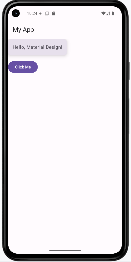
Elevation, Shadows, and Surface Layers
Elevation in Material Design is like stacking pieces of paper: the higher the stack, the bigger the shadow it casts. This helps users see which parts of your app are on top, clickable, or most important. In Compose, you can set elevation on components like Surface, Card, and FloatingActionButton to create this effect.
A FloatingActionButton (FAB) is a circular, elevated button (usually placed in the lower right corner) that triggers a primary action—for example, a "+" button to add a new item or a "send" button in a compose screen. Its elevation (and shadow) helps it "float" above the rest of your UI, drawing the user's attention.
- Higher elevation = bigger shadow = appears "closer" to the user
- Use elevation to show which parts of your UI are interactive or layered above others
- Most Material components (like AppBar, FAB, Card) use elevation by default
@Composable
fun ElevationExample() {
Box(modifier = Modifier.fillMaxSize()) {
Column(modifier = Modifier.padding(16.dp)) {
Surface(
tonalElevation = 2.dp,
shadowElevation = 2.dp,
modifier = Modifier.padding(bottom = 8.dp)
) {
Text("Low elevation (Surface)", modifier = Modifier.padding(16.dp))
}
Spacer(modifier = Modifier.height(25.dp))
Card(elevation = CardDefaults.cardElevation(8.dp), modifier = Modifier.padding(bottom = 8.dp)) {
Text("Higher elevation (Card)", modifier = Modifier.padding(16.dp))
}
Spacer(modifier = Modifier.height(25.dp))
Surface(
tonalElevation = 12.dp,
shadowElevation = 12.dp
) {
Text("Very high elevation (Surface)", modifier = Modifier.padding(16.dp))
}
}
Spacer(modifier = Modifier.height(25.dp))
FloatingActionButton(
onClick = { /* do something */ },
modifier = Modifier.align(Alignment.CenterHorizontally).padding(16.dp),
elevation = FloatingActionButtonDefaults.elevation(6.dp)
) {
Text("+")
}
}
}
How this example renders
Above is just a snippet of the code to view the full code, you need to go to my GitHub page and look at the chapter13 elevation.kt file. When you run the code it will look like the example below.
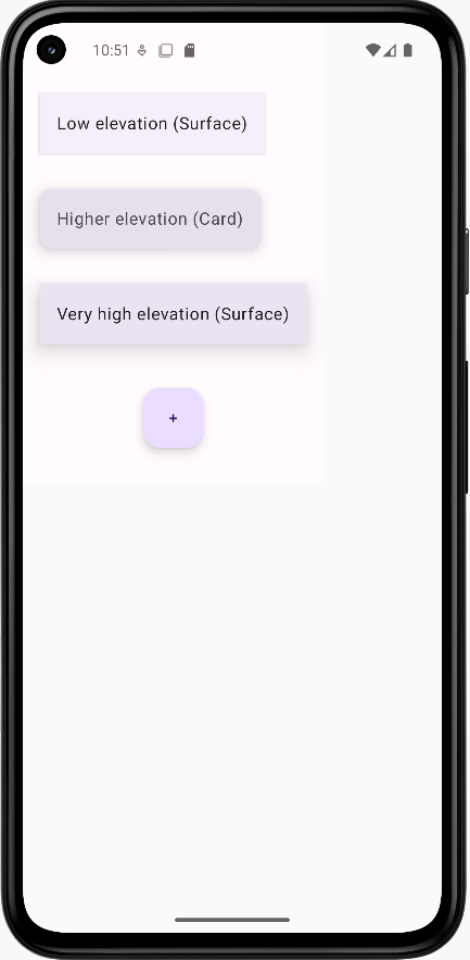
Tips for Success
- Wrap your screens in
MaterialThemefor consistent styling - Use Material components whenever possible—they handle a lot of details for you
- Check out Google's Material Design guidelines for inspiration
Common Mistakes to Avoid
- Not using
MaterialTheme—your app may look inconsistent - Mixing Material and non-Material components without care
- Ignoring accessibility (like color contrast and touch targets)
Best Practices
- Keep your UI simple and clean
- Use Material components for a professional look
- Test your app in both light and dark mode
Using MaterialTheme
Introduction
MaterialTheme is like the style manager for your app in Jetpack Compose. It controls the colors, shapes, and text styles your app uses, so everything looks consistent and professional. By wrapping your UI in MaterialTheme, you make sure your app follows Material Design rules automatically.
When to Use MaterialTheme
- Whenever you want your app to look modern and consistent
- When you want to easily switch between light and dark mode
- When you want to customize your app's colors, typography, or shapes
- When you use Material components (like Button, Card, etc.)
What You Can Customize with MaterialTheme
| Property | What It Does | When to Use It |
|---|---|---|
| colorScheme | Controls all the colors in your app | To match your brand or support dark mode |
| typography | Controls all the text styles | To set custom fonts or text sizes |
| shapes | Controls the roundness of corners | To make buttons or cards more/less rounded |
Want to see all the possible theme properties?
Check out the Theme Reference for a complete list of ColorScheme, Typography, and Shapes properties, what they do, and example values.
Where Are Themes Defined and How Do You Customize Them?
In a real Jetpack Compose project, your app's theme is usually set up in a file called Theme.kt (often found in a ui/theme folder). This file is where you define your color scheme, typography, and shapes for the whole app. When you use MaterialTheme in your code, it uses the settings from this file.
For example, here's what a typical Theme.kt file might look like:
// Theme.kt
val LightColors = lightColorScheme(
primary = Color(0xFF6200EE),
secondary = Color(0xFF03DAC6),
background = Color.White,
// ... other colors
)
@Composable
fun MyAppTheme(content: @Composable () -> Unit) {
MaterialTheme(
colorScheme = LightColors,
typography = Typography,
shapes = Shapes,
content = content
)
}
In Theme.kt, you edit the hex color values so your app matches a brand, your school colors, or anything you like. After you set up the theme, buttons, cards, and other Material widgets pick up those colors and styles on their own—you do not have to restyle every screen by hand. If you never customize the theme, Compose still works: it falls back to the standard Material look. Later, you can also add separate light and dark themes, or even a different theme for one part of the app, when you are ready for that.
Can I Use My Own Variable Name for a Color Scheme?
Yes! You can use any variable name you want for your color scheme—what matters is that you use lightColorScheme() or darkColorScheme() to create it. For example, you could call your color scheme myColorScheme, MyColors, adminColors, or anything you like.
Where does this code go? For your app’s default theme, put the color scheme and your theme composable (for example MyAppTheme) in Theme.kt, usually under something like ui/theme. In MainActivity, you only call that composable: setContent { MyAppTheme { … } }. You do not paste the full lightColorScheme(…) block or the MyAppTheme @Composable into MainActivity—that file should stay thin. Later, you will also see examples where another composable wraps part of the UI in MaterialTheme with its own colors; that is a nested theme (a local override or a teaching example), not a replacement for defining your main theme in Theme.kt.
// Theme.kt — define the scheme and theme composable here (not in MainActivity)
// You can name this variable anything you want!
val myColorScheme = lightColorScheme(
primary = Color(0xFF123456),
secondary = Color(0xFF654321),
background = Color.White,
// ... other colors
)
@Composable
fun MyAppTheme(content: @Composable () -> Unit) {
MaterialTheme(
colorScheme = myColorScheme, // Use your custom variable here
typography = Typography,
shapes = Shapes,
content = content
)
}
- The important part is that
myColorSchemeis created usinglightColorScheme()(ordarkColorScheme()for dark mode). - You can use any variable name that makes sense for your app or section.
- In
MainActivity, callsetContent { MyAppTheme { … } }(or your theme’s name)—you do not need to repeat the color scheme there.
Do You Have to Pick Light or Dark?
For each ColorScheme you build, you call one of the two factories: lightColorScheme() or darkColorScheme(). That choice does not lock your whole app to one mode forever—it tells Material which baseline defaults to use for any color roles you leave unset (and those baselines are tuned for light vs dark surfaces and contrast).
If you support both light and dark mode, you usually define two schemes (one with lightColorScheme(), one with darkColorScheme()), then pass the right one into MaterialTheme based on the system or user setting—for example with isSystemInDarkTheme() in your root theme composable. If you only care about one look, a single scheme built with the matching factory is enough.
Where Does MaterialTheme.colorScheme.background Come From?
MaterialTheme.colorScheme.background (and all the other color properties like primary, secondary, etc.) come from the ColorScheme you provide to MaterialTheme. You set these values when you create your color scheme using lightColorScheme() or darkColorScheme()—either in your Theme.kt file or in a local override inside a composable.
For example, if you write:
val myColorScheme = lightColorScheme(
primary = Color(0xFF123456),
secondary = Color(0xFF654321),
background = Color.White, // This sets colorScheme.background
// ... other colors
)
Then anywhere in your app where you use MaterialTheme.colorScheme.background, it will use the value you set above (in this case, Color.White).
Important: The name you give your variable (myColorScheme, customColors, etc.) is only for where you build the scheme and pass it into MaterialTheme(colorScheme = …). There is no MaterialTheme.myColorScheme on the API—you always read the active scheme with MaterialTheme.colorScheme, which returns whatever ColorScheme that MaterialTheme block was given.
If you don't set background (or any other color) in your color scheme, Compose will use a default Material3 color for that property. You can always check or change these values in your theme setup.
Practical Example
The code below puts lightColorScheme and MaterialTheme inside CustomThemeExample on purpose: it keeps everything in one composable so the chapter can show how theme colors flow to children. That is not where your whole app’s theme should live in a real project—you still use Theme.kt for the default theme and MainActivity only wraps with MyAppTheme { … }. Here, the inner MaterialTheme is a nested theme: it only affects the UI inside its { … } block. If this screen were also under your app’s MyAppTheme, this nested block would override those colors locally—useful for one screen, a dialog, or a demo.
@Composable
fun CustomThemeExample() {
val customColors = lightColorScheme(
primary = Color(0xFF6200EE),
secondary = Color(0xFF03DAC6)
)
MaterialTheme(
colorScheme = customColors
) {
Column(
modifier = Modifier
.fillMaxSize()
.background(MaterialTheme.colorScheme.background),
horizontalAlignment = Alignment.CenterHorizontally,
verticalArrangement = Arrangement.Center
) {
Text(
text = "Welcome!",
color = MaterialTheme.colorScheme.primary,
style = MaterialTheme.typography.headlineMedium
)
Button(onClick = { /* Do something */ }) {
Text("Primary Action")
}
Spacer(modifier = Modifier.height(16.dp))
Button(onClick = { /* Do something else */ }, colors = ButtonDefaults.buttonColors(containerColor = MaterialTheme.colorScheme.secondary)) {
Text("Secondary Action (using secondary color)")
}
}
}
}
Explaining the Example
lightColorSchemecreates a custom color paletteMaterialThemeapplies these colors to all child componentsMaterialTheme.colorScheme.primaryandbackgroundare used for text and backgroundsMaterialTheme.typography.headlineMediumsets the text style- All Material components inside automatically use the custom theme
containerColoris used to set the color of the button
Note on Color Hex Codes: In our example, the primary color is set to 0xFF6200EE (a deep purple) and the secondary color to 0xFF03DAC6 (a teal). The "0xFF" prefix is an alpha (opacity) value (here, fully opaque), and the last six characters (e.g. "6200EE") represent the actual color. You can change these six characters (for example, to "FF0000" for red) to update the color. (For more details, see the Compose Color documentation.)
How this example renders
Above is just a snippet of the code to view the full code, you need to go to my GitHub page and look at the chapter13 material_theme.kt file. When you run the code it will look like the example below.
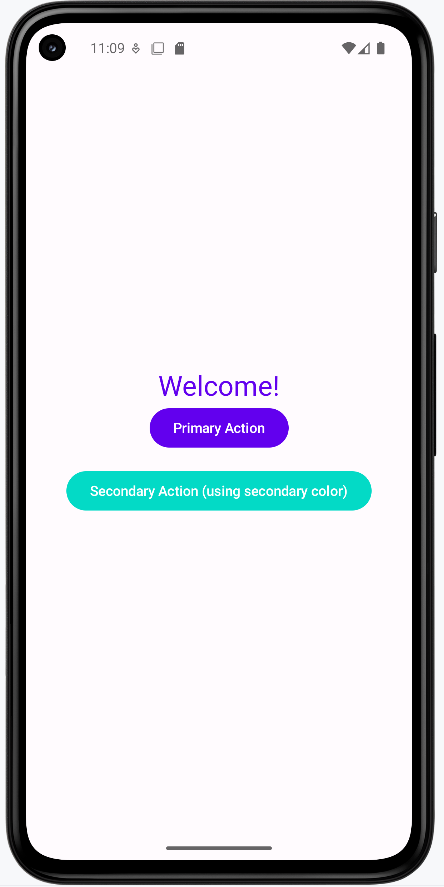
Tips for Success
- Always wrap your app's UI in
MaterialTheme - Use
MaterialTheme.colorSchemeandMaterialTheme.typographyfor consistent styling - Try customizing the theme to match your school or favorite colors
Common Mistakes to Avoid
- Forgetting to use
MaterialTheme—your app may look plain or inconsistent - Hardcoding colors or fonts instead of using the theme
- Not testing your theme in both light and dark mode
Best Practices
- Keep your theme settings in one place for easy updates
- Use theme values instead of hardcoded styles
- Test your app's look on different devices and modes
Typography, Color, and Shape
Introduction
Typography, color, and shape are the building blocks of your app's style in Jetpack Compose. Typography controls how your text looks, color sets the mood and makes things readable, and shape determines how rounded or square your UI elements are. By using these together, you can make your app look unique, professional, and easy to use—all while following Material Design rules.
When to Customize Typography, Color, and Shape
- You want your app to match your school, brand, or personal style
- You want to make your app easier to read and use
- You want to make certain parts of your app stand out
- You want to follow accessibility guidelines (like good contrast and readable fonts)
- You want to make your app feel modern and polished
Quick Reference Table
| Property | Description | How to Use It |
|---|---|---|
| Typography | Controls font, size, and weight of text | Use MaterialTheme.typography for headings, body, etc. |
| Color | Controls all the colors in your app | Use MaterialTheme.colorScheme for backgrounds, text, and buttons |
| Shape | Controls how rounded corners are | Use MaterialTheme.shapes for buttons, cards, and more |
Want to see all the possible typography, color, and shape properties?
Check out the Theme Reference for a complete list of ColorScheme, Typography, and Shapes properties, what they do, and example values.
How Android Studio splits the theme across files
In a typical Jetpack Compose project, Android Studio does not put every detail in a single file. Under something like ui/theme/ you usually get separate Kotlin files that work together:
- Theme.kt — The “main” theme: your root composable (often named like
MyAppThemeorMyApplicationTheme) that callsMaterialThemeand passes incolorScheme,typography, andshapes. This file also often chooses light vs darkColorSchemebased on system settings. - Color.kt — Named brand colors (for example purple, teal, or your school colors) as
Color(…)values. YourlightColorScheme()anddarkColorScheme()inTheme.ktusually reference these so hex codes are not scattered everywhere. - Type.kt — Your
Typographyobject: which text styles use which font sizes, weights, and line heights.Theme.ktpasses this intoMaterialTheme(typography = Typography)(or whatever your variable is named). - Shapes (usually not its own file) — Corner roundness comes from a
Shapes(…)value passed intoMaterialTheme. In the default Android Studio template there is typically no separateShape.kt; theShapesobject lives inTheme.ktnext to your theme composable, or you use Material’s built-in defaults. You can move shapes into a dedicated file (for exampleShape.kt) if you want to organize a large project—same idea as splitting colors and type, just not what the wizard creates by default.
Template file names vary slightly by Android Studio version. Overall: Theme.kt wires everything together; Color.kt and Type.kt hold colors and typography; shapes usually stay in Theme.kt unless you choose to split them out.
Typography
Typography in Compose is managed by MaterialTheme.typography. This is a collection of text styles (like headlineLarge, bodyLarge, labelSmall, etc.) that you can use for different parts of your app. Each style controls the font size, weight, and sometimes the font family. In Android Studio’s default layout, custom text styles are often defined in Type.kt and passed into MaterialTheme from Theme.kt; you can also use the defaults. If you don't set a style, Compose uses a sensible default.
- Where do these values come from? Often from
Type.kt(wired throughTheme.kt), or Material3 defaults. - How do I use them? Pass them to the
styleparameter of aTextcomposable, e.g.style = MaterialTheme.typography.headlineLarge. - What if I want to change them? Edit the
TypographyinType.kt(or wherever your project defines it).
Color
Colors in Compose are managed by MaterialTheme.colorScheme. This is a collection of color values (like primary, secondary, background, onPrimary, etc.) that you can use for backgrounds, text, buttons, and more. You build the scheme with lightColorScheme() or darkColorScheme()—often in Theme.kt, using color constants from Color.kt—or you use the defaults. If you don't set a color, Compose uses a default Material3 color.
- Where do these values come from? Usually from
lightColorScheme/darkColorSchemeinTheme.kt, which often pulls named colors fromColor.kt, or use Material3 defaults. - How do I use them? Use them in your UI, e.g.
color = MaterialTheme.colorScheme.primaryfor text orcontainerColor = MaterialTheme.colorScheme.secondaryContainerfor a card background. - What if I want to change them? Adjust the named colors in
Color.ktand/or thelightColorScheme/darkColorSchemewiring inTheme.kt, or override colors locally in a composable. - What happens if I don't set a value? Compose uses a default color for that property.
Shape
Shapes in Compose are managed by MaterialTheme.shapes. This controls how rounded the corners are for different UI elements. There are several shape presets (like small, medium, large, extraLarge, etc.). Many projects define a Shapes object in Theme.kt (next to the theme composable) or use the defaults. If you don't set a shape, Compose uses a default value.
- Where do these values come from? Often from a
Shapes(…)value inTheme.kt, or Material3 defaults. - How do I use them? Pass them to the
shapeparameter of a component, e.g.shape = MaterialTheme.shapes.mediumfor a button. - What if I want to change them? Edit
ShapesinTheme.ktor override them locally.
Practical Example
Root theme: In setContent, this app uses BookExampleAppTheme—your project’s theme composable from Theme.kt (the name will match your app). That composable is what should call MaterialTheme(…) and pass your Color.kt, Type.kt, and shapes. You do not wrap setContent in a bare MaterialTheme { } here; BookExampleAppTheme is your Material setup for the whole tree. StyleExample does not add another MaterialTheme; it uses MaterialTheme.colorScheme, MaterialTheme.typography, and MaterialTheme.shapes because it sits inside BookExampleAppTheme, which supplies that context to every child composable.
class MainActivity : ComponentActivity() {
override fun onCreate(savedInstanceState: Bundle?) {
super.onCreate(savedInstanceState)
// Configure the window to use light status bar icons for better visibility
WindowCompat.getInsetsController(window, window.decorView).isAppearanceLightStatusBars = true
// Set up the Compose UI with Material Design theme
setContent {
/* Theme.kt must match your app’s package; this example uses com.example.bookexamplesapp. */
BookExampleAppTheme {
// Surface provides a background color and elevation for the content
Surface {
StyleExample()
}
}
}
}
}
@Composable
fun StyleExample() {
Card(
shape = MaterialTheme.shapes.extraLarge,
colors = CardDefaults.cardColors(containerColor = MaterialTheme.colorScheme.secondaryContainer),
modifier = Modifier
.padding(16.dp)
.padding(top=50.dp)
) {
Column(modifier = Modifier
.padding(24.dp)) {
Text(
text = "Big Title",
style = MaterialTheme.typography.headlineLarge,
color = MaterialTheme.colorScheme.primary
)
Text(
text = "This is body text.",
style = MaterialTheme.typography.bodyLarge,
color = MaterialTheme.colorScheme.onSecondaryContainer
)
Button(
onClick = { /* Do something */ },
shape = MaterialTheme.shapes.medium
) {
Text("Styled Button")
}
}
}
}
Explaining the Example
BookExampleAppTheme(inTheme.kt) is the outer wrapper. It applies your app’s Material theme—typically by callingMaterialTheme(colorScheme = …, typography = …, shapes = …)inside—so everything belowsetContentsees the same colors, type, and shapes. The sample name matches the book’s package; your project will use a name likeMyApplicationTheme.Surfacegives a Material surface behindStyleExample; it still uses the theme provided byBookExampleAppTheme.StyleExamplereadsMaterialTheme.*even though it does not wrap itself inMaterialTheme. In Compose, those values come from the nearest provider above—here,BookExampleAppTheme. So “Material theme” is not skipped; your app theme composable is how Material theme is applied.MaterialTheme.shapes.extraLargerounds the card corners; values come from yourShapesinTheme.ktor Material defaults.MaterialTheme.colorScheme.secondaryContainersets the card background;primaryandonSecondaryContainerset text colors—defined in yourColor.kt/ schemes inTheme.ktor defaults.MaterialTheme.typography.headlineLargeandbodyLargecome from yourType.kt(viaTheme.kt) or defaults.- The button uses
MaterialTheme.shapes.mediumfor corner radius from the same theme.
How this example renders
Above is just a snippet of the code to view the full code, you need to go to my GitHub page and look at the chapter13 typography.kt file. When you run the code it will look like the example below.
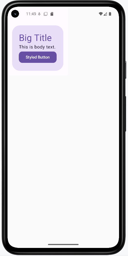
Tips for Success
- Use theme values for all your styles—don't hardcode them. This makes your app easier to update and keeps it consistent.
- Pick colors and fonts that are easy to read and have good contrast.
- Test your app with different font sizes and color settings to make sure it's accessible.
- If you want to see all the available options, check the Theme Reference.
Common Mistakes to Avoid
- Hardcoding colors, fonts, or shapes instead of using the theme
- Using too many different styles, which can make your app look messy
- Not checking accessibility (like color contrast and text size)
- Forgetting that you can override theme values in your theme file or locally if needed
Best Practices
- Keep your style settings in one place for easy updates (like your
Theme.ktfile) - Use the theme for all your UI elements for a consistent look
- Follow Material Design guidelines for a professional appearance
- Check the Theme Reference for details on all properties you can use
Light and Dark Mode
Introduction
Light and dark mode let your app automatically change its colors to match the user's device settings. This makes your app easier to use in different lighting and helps save battery on some screens. Jetpack Compose makes it easy to support both modes with Material Design.
When to Use Light and Dark Mode
- You want your app to look good in any lighting
- You want to follow Android best practices
- You want to make your app more accessible and comfortable for users
- You want to save battery on OLED screens
How Light and Dark Mode Work in Compose
- Compose can automatically detect the system's theme (light or dark)
- You can provide different color schemes for each mode
- Material components will use the right colors automatically
Practical Example
@Composable
fun LightDarkModeExample() {
val isDarkTheme = isSystemInDarkTheme()
val colors = if (isDarkTheme) darkColorScheme() else lightColorScheme()
MaterialTheme(colorScheme = colors) {
Surface(
modifier = Modifier.fillMaxSize(),
color = MaterialTheme.colorScheme.background
) {
Column(
horizontalAlignment = Alignment.CenterHorizontally,
verticalArrangement = Arrangement.Center
) {
Text(
text = if (isDarkTheme) "Dark Mode" else "Light Mode",
color = MaterialTheme.colorScheme.onBackground
)
Button(onClick = { /* Do something */ }) {
Text("Try Me!")
}
}
}
}
}
Explaining the Example
isSystemInDarkTheme()checks if the device is in dark mode- Chooses a color scheme based on the system setting
MaterialThemeapplies the chosen colors to all components- The text changes to show which mode is active
- All Material components use the correct colors automatically
How this example renders
Above is just a snippet of the code to view the full code, you need to go to my GitHub page and look at the chapter13 light_dark.kt file. When you run the code it will look like the example below.
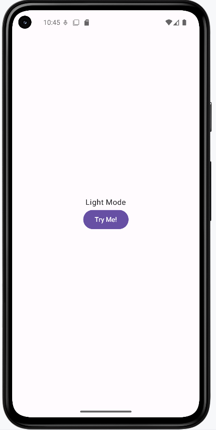
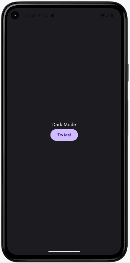
Tips for Success
- Always test your app in both light and dark mode
- Use
MaterialTheme.colorSchemefor all colors in your UI - Let Compose handle the theme switching for you
Common Mistakes to Avoid
- Hardcoding colors that don't adapt to the theme
- Not checking your app's look in both modes
- Using images or icons that are hard to see in dark mode
Best Practices
- Use theme colors everywhere for consistency
- Test your app on real devices in different lighting
- Provide custom color schemes if your brand needs it
Customizing Material Components
Introduction
Sometimes you want a button, card, or other Material component to look a little different—maybe a warning button, a special card, or a unique color for a certain action. In Jetpack Compose, you can customize individual Material components without changing your whole app's theme.
When to Customize Material Components
- You want to highlight a specific action (like a danger or success button)
- You want to make one card or button stand out from the rest
- You want to experiment with different looks for certain UI elements
- You want to match a brand color for a special feature
Common Customizations
| Component | What You Can Change | How |
|---|---|---|
| Button | Colors, shape, elevation | Use colors, shape, elevation parameters |
| Card | Colors, shape, border | Use colors, shape, border parameters |
| TextField | Colors, shape | Use colors, shape parameters |
Where to find the actual parameters and values
The table above only names a few ideas. The real list of parameters lives on each composable in the Material3 library. Here is how students usually look them up:
- Android Studio — Type
Button(,Card(, orOutlinedTextField(and use parameter hints (the IDE shows each parameter name as you fill them in). Press Ctrl+P (Windows/Linux) or Cmd+P (Mac) inside the parentheses to see the full parameter list. Ctrl+Q (or F1) on a composable name opens quick documentation with a link to the full reference. - Official Compose Material3 reference — The Material3 package overview lists every component. Open the page for the widget you care about—for example Button, Card, or OutlinedTextField—and scroll to the function signature to see parameters like
colors,shape, andelevation(names vary by component). - Theme tokens — When you customize using
MaterialTheme.colorScheme.…,MaterialTheme.typography.…, orMaterialTheme.shapes.…, the names and roles of those slots are listed in this course’s Theme Reference (that page is about the theme, not every parameter on every component). ButtonDefaults,CardDefaults, etc. — Helpers likeButtonDefaults.buttonColors(…)live in the same Material3 library. In Android Studio, Ctrl+Click (or Cmd+Click) the name to jump to the source or to documentation and see what each argument does.
Practical Example
@Composable
fun CustomButtonExample() {
Button(
onClick = { /* Do something */ },
colors = ButtonDefaults.buttonColors(containerColor = Color.Red),
shape = RoundedCornerShape(50),
elevation = ButtonDefaults.buttonElevation(12.dp)
) {
Text("Danger!", color = Color.White)
}
}
- This button uses a red background, pill shape, and higher elevation for emphasis
- You can customize any Material component in a similar way
How this example renders
Above is just a snippet of the code to view the full code, you need to go to my GitHub page and look at the chapter13 custom.kt file. When you run the code it will look like the example below.
Tips for Success
- Use custom styles sparingly—too many can make your app look messy
- Keep important actions (like delete) visually distinct
- Test custom components in both light and dark mode
Common Mistakes to Avoid
- Overusing custom styles so nothing stands out
- Using colors that clash with your theme
- Forgetting about accessibility (contrast, touch size)
Best Practices
- Base most of your UI on the theme, and only customize when needed
- Document why you use custom styles
- Keep customizations consistent across your app
Theming for Different App Sections (Multiple Themes)
Introduction
Sometimes you want different parts of your app to look unique—maybe an admin section, a special event screen, or a user profile area. In Jetpack Compose, you can apply different themes to different screens or sections, giving each part its own style while keeping the rest of your app consistent.
When to Use Multiple Themes
- You have different user roles (like admin vs. regular user)
- You want to highlight special features or events
- You want to test new looks without changing your whole app
- You want to support brand partnerships or seasonal themes
How to Apply Multiple Themes in Compose
- Wrap each section or screen in its own
MaterialTheme - Provide different color schemes, typography, or shapes as needed
- Keep your main theme as the default for most of the app
Practical Example
@Composable
fun AdminSection(modifier: Modifier = Modifier) {
// Admin color scheme with red as primary color
val adminColors = lightColorScheme(
primary = Color(0xFFB00020), // Deep red
secondary = Color(0xFF3700B3), // Deep purple
background = Color(0xFFFFEBEE) // Light red background
)
MaterialTheme(colorScheme = adminColors) {
Surface(
modifier = modifier.fillMaxSize(),
color = MaterialTheme.colorScheme.background
) {
Column(modifier = Modifier.padding(16.dp)) {
Text(
text = "Admin Area",
style = MaterialTheme.typography.headlineMedium,
color = MaterialTheme.colorScheme.primary
)
Button(
onClick = { /* TODO: Implement admin action */ },
modifier = Modifier.padding(top = 8.dp)
) {
Text("Admin Action")
}
}
}
}
}
@Composable
fun UserSection(modifier: Modifier = Modifier) {
// User color scheme with blue as primary color
val userColors = lightColorScheme(
primary = Color(0xFF1976D2), // Blue
secondary = Color(0xFF03DAC6), // Teal
background = Color(0xFFE3F2FD) // Light blue background
)
MaterialTheme(colorScheme = userColors) {
Surface(
modifier = modifier.fillMaxSize(),
color = MaterialTheme.colorScheme.background
) {
Column(modifier = Modifier.padding(16.dp)) {
Text(
text = "User Area",
style = MaterialTheme.typography.headlineMedium,
color = MaterialTheme.colorScheme.primary
)
Button(
onClick = { /* TODO: Implement user action */ },
modifier = Modifier.padding(top = 8.dp)
) {
Text("User Action")
}
}
}
}
}
- The admin section has different colors than the user section.
- Both these sections are shown side by side but they could be different pages in the application.
- You can nest or swap themes as needed for different screens
How this example renders
Above is just a snippet of the code to view the full code, you need to go to my GitHub page and look at the chapter13 multi_theme.kt file. When you run the code it will look like the example below.
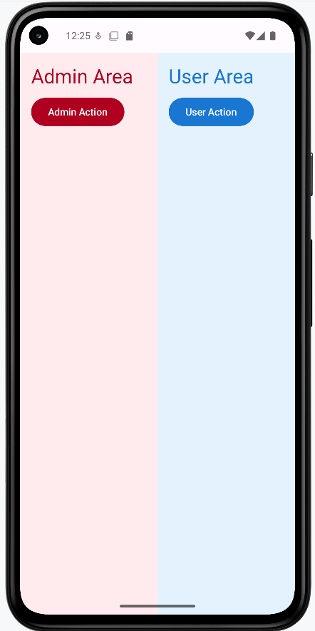
Tips for Success
- Keep most of your app on a single theme for consistency
- Use multiple themes only when you have a clear reason
- Document where and why you use different themes
Common Mistakes to Avoid
- Using too many themes, making your app look inconsistent
- Forgetting to test all sections in both light and dark mode
- Not updating navigation or icons to match the new theme
Best Practices
- Keep your theme logic organized and easy to update
- Use clear naming for different theme sections
- Test your app's look and feel with real users
Animations and Transitions in Material Design
Introduction
Animations and transitions are like the body language of your app—they help users understand what's happening, guide their attention, and make your app feel alive. In Material Design, motion isn't just for decoration; it helps users follow changes and makes your app more enjoyable to use. Jetpack Compose gives you easy tools to add smooth, meaningful animations to your UI, even if you've never done it before.
When to Use Animations and Transitions
- To show changes in state (for example, expanding a card or switching tabs)
- To guide the user's attention to important actions or new content
- To make your app feel more polished and professional
- To provide feedback (like a button press, loading spinner, or error message)
Common Animation Tools in Compose
| Tool | What It Does | When to Use It |
|---|---|---|
animate*AsState | Animates a value (like color, size, or position) smoothly from one state to another | For simple state changes, like making a button grow when pressed |
AnimatedVisibility | Animates showing or hiding content (fades, slides, etc.) | For expanding/collapsing UI, like showing extra details |
updateTransition | Coordinates multiple animations at once | For more complex transitions, like animating several properties together |
rememberInfiniteTransition | Creates looping or repeating animations | For effects like pulsing, spinning, or loading indicators |
Crossfade | Animates switching between two composables with a fade effect | For smoothly changing screens or content |
Animatable | Gives you manual control to animate to specific values, interrupt, or chain animations | For custom or interactive animations |
AnimationSpec | Customizes the timing, speed, and feel of your animations (spring, tween, keyframes, etc.) | When you want to fine-tune how your animation moves |
Transition | Animates multiple values together with more control | For advanced, coordinated animations |
Practical Example: Animated Card with Multiple Effects
@Composable
fun AnimatedCardExample() {
// State variables for animations
var expanded by remember { mutableStateOf(false) }
var showDetails by remember { mutableStateOf(false) }
// Animated values
val cardColor by animateColorAsState(
targetValue = if (expanded) Color(0xFFBBDEFB) else Color.White,
label = "cardColor"
)
val cardElevation by animateDpAsState(
targetValue = if (expanded) 26.dp else 4.dp,
label = "cardElevation"
)
val cardWidth by animateDpAsState(
targetValue = if (expanded) 300.dp else 200.dp,
label = "cardWidth"
)
// Card with animated properties
Card(
colors = CardDefaults.cardColors(
containerColor = cardColor
),
elevation = CardDefaults.cardElevation(
defaultElevation = cardElevation
),
modifier = Modifier
.width(cardWidth)
.padding(16.dp)
.padding(top=50.dp)
.clickable {
expanded = !expanded
showDetails = expanded
}
) {
Column(modifier = Modifier.padding(16.dp)) {
Text(
text = "Tap to ${if (expanded) "collapse" else "expand"}",
style = MaterialTheme.typography.titleLarge
)
// Animated visibility for additional content
AnimatedVisibility(visible = expanded) {
Column {
Spacer(modifier = Modifier.height(8.dp))
// Crossfade animation between states
Crossfade(targetState = showDetails) { detailsVisible ->
if (detailsVisible) {
Text("Here are more details! This text fades in.")
} else {
Text("Tap to see more details.")
}
}
}
}
}
}
}
@Composable
fun AnimatedBoxExample() {
// State variable to track if box is expanded
var isExpanded by remember { mutableStateOf(false) }
// Animated size using animationSpec with tween()
// tween() allows us to specify duration in milliseconds
val boxSize by animateDpAsState(
targetValue = if (isExpanded) 150.dp else 80.dp,
animationSpec = tween(
durationMillis = 500, // Animation duration: 500ms
// easing = FastOutSlowInEasing (default) - starts fast, ends slow
),
label = "boxSize"
)
// Animated color for visual feedback
val boxColor by animateColorAsState(
targetValue = if (isExpanded) Color(0xFF4CAF50) else Color(0xFF2196F3),
animationSpec = tween(durationMillis = 500),
label = "boxColor"
)
Column(
modifier = Modifier.padding(16.dp),
horizontalAlignment = Alignment.CenterHorizontally
) {
Text(
text = "Tap the box to animate!",
style = MaterialTheme.typography.titleMedium,
modifier = Modifier.padding(bottom = 16.dp)
)
// Animated box
Box(
modifier = Modifier
.size(boxSize)
.background(
color = boxColor,
shape = RoundedCornerShape(12.dp)
)
.clickable {
isExpanded = !isExpanded
}
)
Spacer(modifier = Modifier.height(8.dp))
Text(
text = if (isExpanded) "Tap to shrink" else "Tap to expand",
style = MaterialTheme.typography.bodySmall
)
}
}
The block above defines two separate composables you could show on a screen: AnimatedCardExample (a tappable card) and AnimatedBoxExample (a tappable colored square). They are independent demos that use some of the same ideas—state that toggles when you tap, and “as state” animators that smooth the change—so you can compare a richer, multi-part animation (the card) with a smaller, timing-focused one (the box).
AnimatedCardExample
Imagine a card sitting on the screen. When you tap it, it does not jump instantly to a new look. Instead, several things change together, smoothly:
- Color — The card’s background eases from white to a light blue (
animateColorAsState). When you tap again to collapse, it eases back. - Shadow (elevation) — The shadow grows or shrinks (
animateDpAsStateon elevation) so the card feels like it lifts when “expanded” and sits flatter when collapsed. - Width — The card gets wider when expanded and narrower when collapsed (another
animateDpAsState), so the size change is animated, not an instant jump. - Title text — The line that says “Tap to expand” / “Tap to collapse” updates immediately with normal Kotlin string logic; it is not a fade, but it tells the user what will happen on the next tap.
- Extra content area — When the card is collapsed, the bottom section is not just empty: it is not drawn for that state.
AnimatedVisibility(visible = expanded)animates that section in and out (for example with a fade or slide, depending on defaults), so “more stuff” appears in a controlled way instead of popping in. - Two different messages inside that area — Inside the visible region,
Crossfadeswitches between two differentTextcomposables. WhenshowDetailsis true, you see the longer “Here are more details!” line; when it is false, you see the shorter hint. The transition between those two texts is a crossfade (one fades out while the other fades in). In this sample,showDetailsis set to matchexpandedwhen you tap, so after you expand you see the “more details” version; the main point is to show howCrossfadeanimates between two pieces of UI.
How the state fits together: expanded is a simple Boolean remembered in the composable. Tapping the card flips expanded and copies that value into showDetails. The “target” values passed into animateColorAsState and the two animateDpAsState calls all depend on expanded, so whenever expanded changes, Compose animates from the old values to the new ones. Together, this shows one pattern: one user action (a tap) can drive several animated properties plus visibility and a crossfade in the same card.
AnimatedBoxExample — a simpler “one tap, two things animate” demo
This composable is a smaller lesson. You see a label (“Tap the box to animate!”), a square Box, and a short hint under it (“Tap to expand” / “Tap to shrink”).
- Tap the box —
isExpandedtoggles betweenfalseandtrue. - Size animation — The box’s width and height are both tied to
boxSize(Modifier.size(boxSize)). That size comes fromanimateDpAsState, with an explicittween(durationMillis = 500), so the grow/shrink always takes half a second and uses the default easing curve unless you change it. - Color animation — At the same time,
boxColoranimates between blue and green (animateColorAsStatewith the same 500 mstween), so the user gets clear visual feedback that the state changed. - Why show this next to the card? The card uses default timing on its animators; the box shows how to attach a shared
animationSpecso you can control duration (and later easing) in one place. Same idea—state drives target values, animators interpolate—but with fewer moving parts.
Takeaway for both: You store “what mode are we in?” in simple state (expanded, isExpanded). You express “what should the UI look like in each mode?” as target colors, sizes, and visibility. Compose’s animation APIs fill in the frames between old and new targets so the interface feels smooth and easy to follow—especially important for users who are still learning what your screen does.
How this example renders
Above is just a snippet of the code to view the full code, you need to go to my GitHub page and look at the chapter13 animation.kt file. When you run the code it will look like the example below.
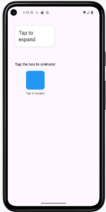
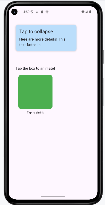
Tips for Success
- Use animations to clarify what's happening, not just to decorate
- Keep animations quick and smooth—most should finish in under 300ms
- Test on real devices to make sure animations look good and don't slow things down
- If you're not sure, start simple! Even a small animation can make a big difference
Common Mistakes to Avoid
- Overusing animations so your app feels slow or distracting
- Using animations that don't match Material Design guidelines (like odd timing or movement)
- Making animations too long or too flashy—users want to get things done!
- Forgetting to test on different devices (animations can look different on slow phones)
Best Practices
- Use motion to guide and inform, not just to decorate
- Follow Material Design's motion guidelines (see Google's docs for details)
- Keep your animations consistent across the app—use the same timing and style everywhere
- Comment your code to explain why you're animating something, especially if it's not obvious
Theme Reference: ColorScheme, Typography, and Shapes
Introduction
Jetpack Compose themes are made up of three main parts: ColorScheme (for colors), Typography (for text styles), and Shapes (for corner roundness). This reference lists all the properties you can set for each, what they do, what type of value they take, and an example or default value. If you don't set a value, Compose uses a sensible default.
How Compose Handles Defaults
If you don't specify a property (like background or headlineLarge), Compose will use a default value from the Material3 design system. You can override any of these by setting your own value in your theme.
ColorScheme Properties
| Name | What It's For | Value Type | Example/Default |
|---|---|---|---|
| primary | Main brand color | Color | Color(0xFF6200EE) |
| onPrimary | Text/icon color on primary | Color | Color.White |
| primaryContainer | Container for primary elements | Color | Color(0xFFBB86FC) |
| onPrimaryContainer | Text/icon on primary container | Color | Color.Black |
| secondary | Secondary color | Color | Color(0xFF03DAC6) |
| onSecondary | Text/icon color on secondary | Color | Color.Black |
| secondaryContainer | Container for secondary elements | Color | Color(0xFF018786) |
| onSecondaryContainer | Text/icon on secondary container | Color | Color.White |
| tertiary | Tertiary color (optional accent) | Color | Color(0xFFB00020) |
| onTertiary | Text/icon color on tertiary | Color | Color.White |
| tertiaryContainer | Container for tertiary elements | Color | Color(0xFFFFDAD4) |
| onTertiaryContainer | Text/icon on tertiary container | Color | Color.Black |
| background | App background | Color | Color.White |
| onBackground | Text/icon color on background | Color | Color.Black |
| surface | Surface color (cards, sheets, etc.) | Color | Color.White |
| onSurface | Text/icon color on surface | Color | Color.Black |
| surfaceVariant | Alternate surface color | Color | Color(0xFFE7E0EC) |
| onSurfaceVariant | Text/icon on surface variant | Color | Color.Black |
| error | Error color | Color | Color(0xFFB00020) |
| onError | Text/icon color on error | Color | Color.White |
| errorContainer | Container for error elements | Color | Color(0xFFFCD8DF) |
| onErrorContainer | Text/icon on error container | Color | Color.Black |
| outline | Outline/border color | Color | Color(0xFF79747E) |
| inverseOnSurface | Text/icon on inverse surface | Color | Color.White |
| inverseSurface | Inverse surface color | Color | Color(0xFF313033) |
| inversePrimary | Inverse primary color | Color | Color(0xFFD0BCFF) |
| surfaceTint | Tint for surfaces | Color | Color(0xFF6200EE) |
| outlineVariant | Alternate outline color | Color | Color(0xFFC4C7C5) |
| scrim | Overlay color for modals | Color | Color(0xFF000000) |
Typography Properties
| Name | What It's For | Value Type | Example/Default |
|---|---|---|---|
| displayLarge | Very large headings | TextStyle | fontSize=57.sp |
| displayMedium | Large headings | TextStyle | fontSize=45.sp |
| displaySmall | Medium headings | TextStyle | fontSize=36.sp |
| headlineLarge | Section headings | TextStyle | fontSize=32.sp |
| headlineMedium | Subsection headings | TextStyle | fontSize=28.sp |
| headlineSmall | Small headings | TextStyle | fontSize=24.sp |
| titleLarge | Large titles | TextStyle | fontSize=22.sp |
| titleMedium | Medium titles | TextStyle | fontSize=16.sp |
| titleSmall | Small titles | TextStyle | fontSize=14.sp |
| bodyLarge | Main body text | TextStyle | fontSize=16.sp |
| bodyMedium | Secondary body text | TextStyle | fontSize=14.sp |
| bodySmall | Small body text | TextStyle | fontSize=12.sp |
| labelLarge | Large labels/buttons | TextStyle | fontSize=14.sp |
| labelMedium | Medium labels | TextStyle | fontSize=12.sp |
| labelSmall | Small labels | TextStyle | fontSize=11.sp |
Shapes Properties
| Name | What It's For | Value Type | Example/Default |
|---|---|---|---|
| extraSmall | Smallest components (chips, etc.) | CornerBasedShape | RoundedCornerShape(4.dp) |
| small | Small components | CornerBasedShape | RoundedCornerShape(8.dp) |
| medium | Default for buttons, cards | CornerBasedShape | RoundedCornerShape(12.dp) |
| large | Dialogs, sheets | CornerBasedShape | RoundedCornerShape(16.dp) |
| extraLarge | Very rounded corners | CornerBasedShape | RoundedCornerShape(28.dp) |
Tips for Using Theme Properties
- Use these properties with
MaterialTheme.colorScheme,MaterialTheme.typography, andMaterialTheme.shapesin your UI. - Only override the values you want to change—Compose will use defaults for the rest.
- Check the official Compose Material3 docs for the latest property lists and defaults.
Chapter 14: Advanced UI Patterns
Bottom Sheets and Dialogs
What are Bottom Sheets and Dialogs?
Think of bottom sheets and dialogs like pop-up menus in a restaurant. When you want to see the dessert menu, the waiter brings it to your table (that's like a dialog). When you want to see the daily specials, they might slide a card across the table (that's like a bottom sheet). These UI elements help you show additional information without taking over the entire screen.
Bottom sheets slide up from the bottom of the screen, while dialogs appear in the center and dim the background. Both are great ways to show extra options, confirm actions, or display additional content without losing context of what's behind them.
Quick Reference
| Component | Description | When to Use |
|---|---|---|
| Bottom Sheet | Slides up from bottom of screen | Showing options, filters, or additional content |
| Dialog | Appears in center with dimmed background | Confirming actions, showing alerts, or important messages |
TextButton |
Material 3 text-style button: label only, no solid fill; looks lighter than a filled or tonal button | Secondary actions in dialogs (Cancel, OK), rows in a list-style dialog, and options inside a bottom sheet where you want a simple tap target without a heavy button |
List-style AlertDialog |
Same as dialog; body is often a column of buttons or rows | Choosing one of several labeled options (e.g. size, category) |
DatePickerDialog + DatePicker |
Modal dialog with a calendar UI and OK/Cancel | Picking a single date; read selectedDateMillis from state |
When to Use Bottom Sheets and Dialogs
Use Bottom Sheets When:
- You want to show multiple options or filters
- You need to display additional content without losing context
- You want to provide a quick way to access related features
- You're showing a list of items that users can select from
- You want to save space on the main screen
Use Dialogs When:
- You need to confirm an important action (like deleting something)
- You want to show an error message or alert
- You need to get user input for a specific task
- You want to display critical information that requires attention
- You're asking for permission or showing terms of service
Practical examples
Each pattern below is minimal on purpose: a little state, a trigger, and the Material 3 composable that does the work.
Showing selections in a text field
@OptIn(ExperimentalMaterial3Api::class)
@Composable
fun MyScreen() {
// State variables to control the visibility of overlays
var showDeleteDialog by remember { mutableStateOf(false) }
var showOptionsSheet by remember { mutableStateOf(false) }
var showListOptionsDialog by remember { mutableStateOf(false) }
var showDatePickerDialog by remember { mutableStateOf(false) }
// Persist each overlay’s result in its own string; the read-only text field below displays them.
var bottomSheetSelection by remember { mutableStateOf("") }
var listOptionSelection by remember { mutableStateOf("") }
var dateSelection by remember { mutableStateOf("") }
// Single block of text for the OutlinedTextField: labeled lines, or a placeholder until any selection exists.
val selectionSummary = buildString {
val hasAny =
bottomSheetSelection.isNotEmpty() || listOptionSelection.isNotEmpty() || dateSelection.isNotEmpty()
if (bottomSheetSelection.isNotEmpty()) appendLine("Bottom sheet: $bottomSheetSelection")
if (listOptionSelection.isNotEmpty()) appendLine("List option: $listOptionSelection")
if (dateSelection.isNotEmpty()) appendLine("Date: $dateSelection")
if (!hasAny) append("Selections will appear here.")
}.trimEnd()The sample start with calling MyScreen which holds three strings in remember { mutableStateOf("") }—one for the last bottom-sheet action, one for the list dialog choice, and one for the formatted date from the date picker.
When the user picks an option or a date, the corresponding callback updates only that string (for example bottomSheetSelection = option or dateSelection = sdf.format(...)). A fourth block of logic builds a single multi-line selectionSummary with buildString: it prints labeled lines for each non-empty string, or the placeholder line “Selections will appear here.” if nothing has been chosen yet.
That summary is bound to an OutlinedTextField with readOnly = true and an empty onValueChange = { }. The field is display-only; the user cannot type into it. Because the field’s value is selectionSummary, any change to the underlying state recomposes the UI and the text box updates immediately—no Context or Android toast API required.
DeleteConfirmationDialog is only a yes/no confirmation in this sample, so it does not write into the summary text; the list dialog, bottom sheet, and date picker are the ones that populate the box.
Modal bottom sheet
@OptIn(ExperimentalMaterial3Api::class)
@Composable
fun BottomSheetDemo() {
var showSheet by remember { mutableStateOf(false) }
Button(onClick = { showSheet = true }) { Text("Open sheet") }
if (showSheet) {
ModalBottomSheet(
onDismissRequest = { showSheet = false },
sheetState = rememberModalBottomSheetState()
) {
Column(Modifier.fillMaxWidth().padding(16.dp)) {
Text("Sheet content", style = MaterialTheme.typography.titleMedium)
TextButton(onClick = { showSheet = false }) { Text("Close") }
}
}
}
}A modal bottom sheet is anchored to the bottom edge of the screen and slides up over the current UI. It is a good fit when you want several related actions or extra content without a full new screen. Material 3’s ModalBottomSheet is still marked experimental, so the composable (or its caller) must use @OptIn(ExperimentalMaterial3Api::class).
Visibility is driven by a single piece of remembered state, here showSheet. The sheet is only composed when showSheet is true, which is the usual Compose pattern: if the flag is false, the sheet is not in the tree at all. Opening the sheet sets the flag to true; closing it must set the flag back to false so the overlay disappears and state stays consistent.
rememberModalBottomSheetState() gives you a SheetState that the implementation uses for expansion, animation, and drag gestures. You pass it into ModalBottomSheet so the sheet can be dismissed with a swipe down as well as by tapping the scrim (the dimmed area outside the sheet).
onDismissRequest runs when the system wants to dismiss the sheet: for example the user tapped outside or used a back gesture. Your lambda should clear showSheet. You can also clear the same flag from an explicit control inside the sheet (here a “Close” TextButton), so both gestures and buttons end up in the same state.
Confirmation alert dialog
@Composable
fun DeleteConfirmationDialog(
onConfirm: () -> Unit,
onDismiss: () -> Unit
) {
AlertDialog(
onDismissRequest = onDismiss,
title = { Text("Delete Item") },
text = { Text("Are you sure you want to delete this item?") },
confirmButton = {
TextButton(onClick = onConfirm) { Text("Delete") }
},
dismissButton = {
TextButton(onClick = onDismiss) { Text("Cancel") }
}
)
}An alert dialog appears in the center of the screen with a dimmed background. It interrupts the flow briefly, which is why it is appropriate for confirmations—especially destructive actions such as delete—where you want a clear yes or no before anything irreversible happens.
This composable does not own “whether the dialog is visible.” The parent decides that, typically with something like if (showDeleteDialog) { DeleteConfirmationDialog(…) }. The dialog composable only describes what appears when it is shown. That separation keeps navigation and state in one place and keeps the dialog reusable.
Material 3’s AlertDialog uses composable slots. title and text are usually short strings; confirmButton and dismissButton are the primary and secondary actions. Naming is conventional: “confirm” is often the risky action (Delete) and “dismiss” the safe escape (Cancel), but the API does not enforce danger styling—you would add colors or typography yourself if needed.
onDismissRequest is called when the user tries to leave the dialog without pressing one of your buttons—tapping outside the dialog (if allowed) or pressing the system back button. It should run the same cleanup as Cancel: typically call the same lambda as the dismiss button or set your visibility flag to false. Keeping onConfirm and onDismiss as separate parameters lets you perform the delete only on confirm, while cancel and outside-dismiss only close the dialog.
List of options in a dialog
@Composable
fun ListOptionsDialog(
onDismiss: () -> Unit,
onOptionSelected: (String) -> Unit = {}
) {
val options = listOf("Small", "Medium", "Large", "Extra large")
AlertDialog(
onDismissRequest = onDismiss,
title = { Text("Choose a size") },
text = {
Column(Modifier.fillMaxWidth()) {
options.forEach { option ->
TextButton(
onClick = {
onOptionSelected(option)
onDismiss()
},
modifier = Modifier.fillMaxWidth()
) {
Text(option)
}
}
}
},
confirmButton = {
TextButton(onClick = onDismiss) { Text("Cancel") }
}
)
}Sometimes you need more than two buttons: several mutually exclusive choices (size, category, sort order). The same AlertDialog API can host a vertical list by putting a Column inside the text slot. Each row is a full-width TextButton so taps are easy to hit and the layout reads like a list.
When the user picks a row, call onOptionSelected(option) so the parent can store the string in state—for example to show it in a read-only OutlinedTextField on the main screen—then call onDismiss() to close the dialog. Order matters: update the parent’s state first, then hide the UI.
The confirmButton slot here holds a neutral Cancel action. Material’s dialog API always wants a confirm button composable; using it for “close without choosing” is a common pattern when the main choices live in the body. Tapping Cancel should only dismiss, not fire onOptionSelected.
The extra parameter onOptionSelected defaults to an empty lambda so callers who only dismiss can omit it. Pass a lambda when you need to copy the chosen label into screen state (such as the summary text field in optionsDialog.kt).
Date picker dialog
@OptIn(ExperimentalMaterial3Api::class)
@Composable
fun DatePickerDemo() {
var showPicker by remember { mutableStateOf(false) }
var dateLabel by remember { mutableStateOf("") }
Button(onClick = { showPicker = true }) { Text("Pick date") }
OutlinedTextField(
value = dateLabel.ifEmpty { "Pick a date above" },
onValueChange = {},
readOnly = true,
label = { Text("Selected date") }
)
if (showPicker) {
val datePickerState = rememberDatePickerState()
DatePickerDialog(
onDismissRequest = { showPicker = false },
confirmButton = {
TextButton(
onClick = {
dateLabel = datePickerState.selectedDateMillis?.let { millis ->
val sdf = SimpleDateFormat("MMM d, yyyy", Locale.getDefault()).apply {
timeZone = TimeZone.getTimeZone("UTC")
}
sdf.format(Date(millis))
} ?: "No date selected"
showPicker = false
}
) { Text("OK") }
},
dismissButton = {
TextButton(onClick = { showPicker = false }) { Text("Cancel") }
}
) {
DatePicker(state = datePickerState)
}
}
}Material 3 provides a dedicated date picker dialog: a shell (DatePickerDialog) with slots for OK and Cancel, plus a trailing lambda that builds the dialog body. The body contains a single DatePicker composable tied to rememberDatePickerState(). That state object holds the calendar UI state and exposes selectedDateMillis after the user selects a day.
The date-picker APIs are experimental, so you need the same @OptIn(ExperimentalMaterial3Api::class) as for the bottom sheet. Until the API is stabilized, expect minor API changes between library versions.
selectedDateMillis can be null if the user has not committed a selection, so the OK handler should use a safe call or check before formatting. The formatted string is assigned to remembered state (dateLabel) and bound to a read-only OutlinedTextField so the user sees the result on the main screen instead of a transient Toast. The sample formats with SimpleDateFormat and sets the formatter’s time zone to UTC because the picker’s millis value is defined in UTC for the chosen calendar date; using UTC for display avoids off-by-one-day bugs in many locales.
rememberDatePickerState() is called inside if (showPicker) so the state is created when the dialog is shown and discarded when it leaves composition. Alternatively, you can hoist state to a fixed call site if you need to preserve selection across open/close cycles.
onDismissRequest should clear showPicker when the user dismisses without OK (for example back or outside tap, depending on behavior). Cancel and OK both should eventually set showPicker to false so the dialog is removed from the tree.
Imports for these examples
Beyond the usual Compose layout and Material 3 imports, the date example uses DatePicker, DatePickerDialog, and rememberDatePickerState; OutlinedTextField for read-only display; and java.text.SimpleDateFormat, java.util.Date, java.util.Locale, and java.util.TimeZone. The sample app optionsDialog.kt combines these patterns and uses one multiline read-only OutlinedTextField to summarize bottom-sheet, list, and date selections.
Key takeaways
- Control each overlay with remembered state; set it to false whenever the user dismisses the surface.
- Use bottom sheets for non-blocking lists of actions; use centered dialogs when you need a hard stop and a clear choice.
- Opt in to experimental Material 3 APIs where the compiler requires it.
- Surface choices on the main screen with
Textor a read-onlyOutlinedTextFieldbound to state updated from callbacks—no need forToastfor simple feedback.
How this example renders
The screenshots below come from the sample app that implements these patterns together. For the complete source, see the chapter14 optionsDialog.kt file on my GitHub page.
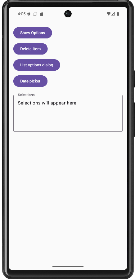
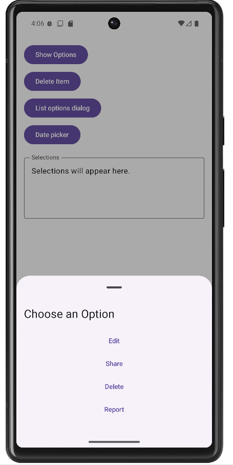
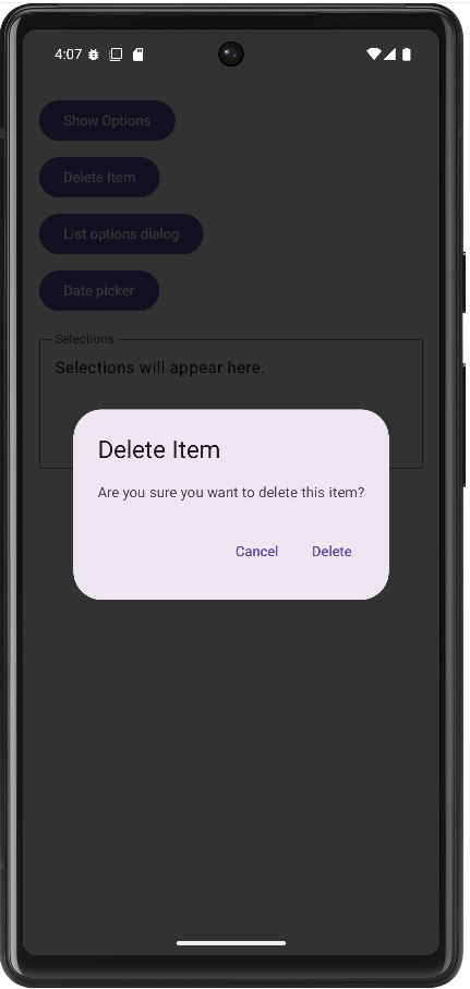
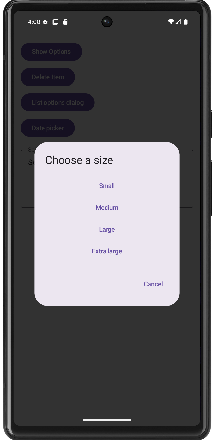
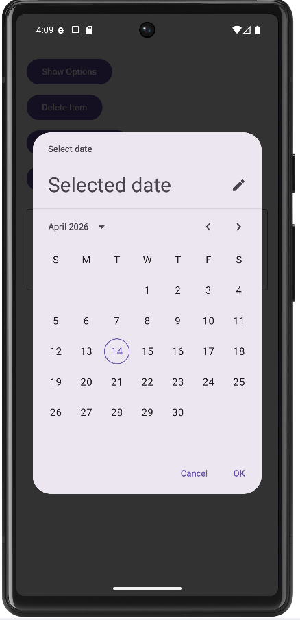
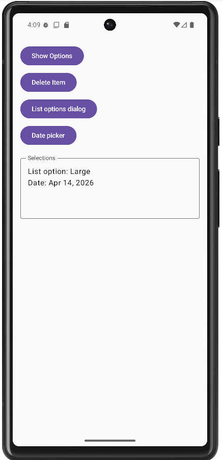
Tips for Success
- Use bottom sheets for multiple options and dialogs for single confirmations
- Always provide a way to dismiss bottom sheets and dialogs
- Keep dialog content focused and avoid overwhelming users
- Use appropriate titles and messages that clearly explain the purpose
- Test your bottom sheets and dialogs on different screen sizes
- Consider accessibility - make sure screen readers can navigate your dialogs
- Use consistent styling across all your dialogs and bottom sheets
Common Mistakes to Avoid
- Using dialogs for simple information that could be shown inline
- Creating bottom sheets that are too tall and hard to dismiss
- Not providing clear action buttons in dialogs
- Forgetting to handle the dismiss action properly
- Using too many nested dialogs or bottom sheets
- Not considering the user's context when showing dialogs
- Making dialogs or bottom sheets too complex with too many options
Best Practices
- Use bottom sheets for actions that don't require immediate attention
- Use dialogs for critical decisions or important information
- Keep dialog content concise and focused on a single task
- Provide clear, descriptive button labels
- Use consistent visual design across all your overlays
- Consider the user's workflow when deciding between bottom sheets and dialogs
- Test your overlays with different content lengths and screen sizes
- Use appropriate animations and transitions for a polished feel
Drawers and Tabs
Drawers and Tabs?
Think of navigation drawers and tabs like the organization system in a library. Navigation drawers are like the main catalog that slides out from the side, showing you all the different sections (like fiction, non-fiction, science, etc.). Tabs are like the dividers in a filing cabinet - they help you quickly switch between related categories without losing your place.
Navigation drawers slide in from the left side of the screen and contain your app's main navigation menu. Tabs appear at the top of the screen and let users switch between different views or sections of your app. Both help users navigate your app efficiently and find what they're looking for.
Quick Reference
| Component | Description | When to Use |
|---|---|---|
| Navigation Drawer | Slides in from left side with main menu | Main app navigation, settings, user profile |
| Top Tabs | Horizontal tabs at top of screen | Switching between related content sections |
| Tab Row | Scrollable row of tabs | Many categories that don't fit on screen |
When to Use Navigation Drawers and Tabs
Use Navigation Drawers When:
- You have many main sections in your app (5+ items)
- You want to save screen space for content
- You need to access settings, profile, or help sections
- You want to provide quick access to all app features
- You're building a complex app with multiple main areas
Use Tabs When:
- You have 2-5 related content sections
- Users need to switch between different views frequently
- You want to show related content side by side
- You're organizing content by categories or types
- You want to keep navigation visible and accessible
Common Components and Options
| Component | What It Does | When to Use It |
|---|---|---|
| DrawerState | Manages the open/closed state of the drawer | When you need to control drawer programmatically |
| TabRow | Creates a horizontal row of tabs | For top-level navigation between sections |
| Tab | Individual tab in a tab row | For each section or category in your app |
| TabPosition | Defines the position and styling of tabs | When you need custom tab appearance |
Practical Examples
Basic Navigation Drawer
@Composable
fun MyAppWithDrawer() {
val drawerState = rememberDrawerState(initialValue = DrawerValue.Closed)
val scope = rememberCoroutineScope()
ModalNavigationDrawer(
drawerState = drawerState,
drawerContent = {
ModalDrawerSheet {
Spacer(modifier = Modifier.height(12.dp))
Text(
"My App",
modifier = Modifier.padding(16.dp),
style = MaterialTheme.typography.titleMedium
)
Spacer(modifier = Modifier.height(12.dp))
NavigationDrawerItem(
icon = { Icon(Icons.Default.Home, contentDescription = null) },
label = { Text("Home") },
selected = false,
onClick = { /* Navigate to home */ }
)
NavigationDrawerItem(
icon = { Icon(Icons.Default.Person, contentDescription = null) },
label = { Text("Profile") },
selected = false,
onClick = { /* Navigate to profile */ }
)
NavigationDrawerItem(
icon = { Icon(Icons.Default.Settings, contentDescription = null) },
label = { Text("Settings") },
selected = false,
onClick = { /* Navigate to settings */ }
)
}
}
) {
// Your main app content here
Column {
TopAppBar(
title = { Text("My App") },
navigationIcon = {
IconButton(onClick = { scope.launch { drawerState.open() } }) {
Icon(Icons.Default.Menu, contentDescription = "Menu")
}
}
)
// Rest of your content
}
}
}This example builds a basic app screen with a navigation drawer. When the user taps the menu icon in the top bar, the drawer slides in from the left and shows Home, Profile, and Settings.
How this code works (step by step)
- Create drawer state:
rememberDrawerState(DrawerValue.Closed)stores whether the drawer is open or closed. - Create a coroutine scope:
rememberCoroutineScope()is needed because opening the drawer uses a suspend function. - Wrap screen in ModalNavigationDrawer: this gives the screen drawer behavior.
- Define drawerContent:
ModalDrawerSheetcontains the title andNavigationDrawerItementries. - Add menu button: the
TopAppBarnavigation icon callsdrawerState.open()insidescope.launch { ... }.
Think of drawer state like a light switch: it is either ON (open) or OFF (closed). UI state variables like this are the foundation of Compose programming.
Top Tabs with Content
@Composable
fun TabbedContent() {
var selectedTabIndex by remember { mutableStateOf(0) }
val tabs = listOf("Recent", "Popular", "Favorites")
Column {
TabRow(selectedTabIndex = selectedTabIndex) {
tabs.forEachIndexed { index, title ->
Tab(
selected = selectedTabIndex == index,
onClick = { selectedTabIndex = index },
text = { Text(title) }
)
}
}
when (selectedTabIndex) {
0 -> RecentContent()
1 -> PopularContent()
2 -> FavoritesContent()
}
}
}
@Composable
fun RecentContent() {
LazyColumn {
items(10) { index ->
ListItem(
headlineContent = { Text("Recent Item ${index + 1}") },
supportingContent = { Text("This is a recent item") }
)
}
}
}This example creates a top tab menu with three choices: Recent, Popular, and Favorites. Tapping a tab updates a state variable, and the screen shows the matching content section.
How this code works (step by step)
- Track selected tab:
selectedTabIndexstarts at0, so the first tab is selected at launch. - Store tab labels: a list holds the names so tabs can be built in a loop.
- Build tabs in TabRow:
forEachIndexedcreates oneTabper label. - Handle clicks:
onClick = { selectedTabIndex = index }changes state when the user taps a tab. - Render content with when: the
when (selectedTabIndex)block decides which composable to display.
In Compose, changing state triggers recomposition (UI redraw). You do not manually refresh the screen.
Scrollable Tab Row
@Composable
fun ScrollableTabs() {
var selectedTabIndex by remember { mutableStateOf(0) }
val categories = listOf(
"All", "Technology", "Science", "Sports", "Entertainment",
"Politics", "Business", "Health", "Education", "Travel"
)
Column {
ScrollableTabRow(
selectedTabIndex = selectedTabIndex,
edgePadding = 16.dp
) {
categories.forEachIndexed { index, category ->
Tab(
selected = selectedTabIndex == index,
onClick = { selectedTabIndex = index },
text = { Text(category) }
)
}
}
// Content based on selected tab
when (selectedTabIndex) {
0 -> AllContent()
1 -> TechnologyContent()
// ... other content
}
}
}This example uses ScrollableTabRow because there are many categories. If all tabs cannot fit on one line, the user can scroll sideways to see more.
How this code works (step by step)
- Keep tab state:
selectedTabIndexstill controls which category is active. - Create a longer category list: labels like Technology, Science, Sports, and more are stored in one list.
- Use ScrollableTabRow: this is the key difference from
TabRow; it supports horizontal scrolling. - Set edge padding:
edgePadding = 16.dpadds visual breathing room at both ends. - Switch content by selected index: a
whenblock shows the right content composable.
Use TabRow for a few tabs and ScrollableTabRow when the number of tabs grows.
Combining Drawer and Tabs
The sample drawerTab.kt uses a second piece of state—mainSection—so drawer destinations are not stubs: Home and Settings show full-screen pages (HomeContent, SettingsContent), while News, Sports & Weather returns to the tab strip. The tab row is only composed when mainSection is tabs; choosing Home or Settings hides the tabs and shows that screen instead.
private enum class MainSection { Tabs, Home, Settings }
@OptIn(ExperimentalMaterial3Api::class)
@Composable
fun AppWithDrawerAndTabs() {
val drawerState = rememberDrawerState(initialValue = DrawerValue.Closed)
val scope = rememberCoroutineScope()
var selectedTab by remember { mutableStateOf(0) }
var mainSection by remember { mutableStateOf(MainSection.Tabs) }
val tabs = listOf("News", "Sports", "Weather")
fun closeDrawer() {
scope.launch { drawerState.close() }
}
ModalNavigationDrawer(
drawerState = drawerState,
drawerContent = {
ModalDrawerSheet {
Text("News App", modifier = Modifier.padding(16.dp))
NavigationDrawerItem(
icon = { Icon(Icons.Filled.List, contentDescription = null) },
label = { Text("News, Sports & Weather") },
selected = mainSection == MainSection.Tabs,
onClick = {
mainSection = MainSection.Tabs
closeDrawer()
}
)
NavigationDrawerItem(
icon = { Icon(Icons.Filled.Home, contentDescription = "Home") },
label = { Text("Home") },
selected = mainSection == MainSection.Home,
onClick = {
mainSection = MainSection.Home
closeDrawer()
}
)
NavigationDrawerItem(
icon = { Icon(Icons.Filled.Settings, contentDescription = "Settings") },
label = { Text("Settings") },
selected = mainSection == MainSection.Settings,
onClick = {
mainSection = MainSection.Settings
closeDrawer()
}
)
}
}
) {
Scaffold(
topBar = {
TopAppBar(
title = {
Text(
when (mainSection) {
MainSection.Home -> "Home"
MainSection.Settings -> "Settings"
MainSection.Tabs -> "News App"
}
)
},
navigationIcon = {
IconButton(onClick = { scope.launch { drawerState.open() } }) {
Icon(Icons.Filled.Menu, contentDescription = "Menu")
}
}
)
}
) { padding ->
Column(modifier = Modifier.padding(padding)) {
if (mainSection == MainSection.Tabs) {
TabRow(selectedTabIndex = selectedTab) {
tabs.forEachIndexed { index, title ->
Tab(
selected = selectedTab == index,
onClick = { selectedTab = index },
text = { Text(title) }
)
}
}
when (selectedTab) {
0 -> NewsContent()
1 -> SportsContent()
2 -> WeatherContent()
}
} else if (mainSection == MainSection.Home) {
HomeContent()
} else {
SettingsContent()
}
}
}
}
}HomeContent and SettingsContent are separate composables (same idea as NewsContent—a column with a headline and body text). The drawer’s selected parameter is tied to mainSection so the active destination is highlighted.
How this code works (step by step)
- Three layers of state:
drawerState(open/closed),selectedTab(which of News/Sports/Weather), andmainSection(tabs vs Home vs Settings). - Drawer items do real navigation: each
onClicksetsmainSection, thencloseDrawer()so the sheet dismisses after a choice. - Return to tabs: the first item (“News, Sports & Weather”) sets
mainSection = MainSection.Tabsso the user can get back to the tab row from Home or Settings. - App bar title follows mode:
when (mainSection)shows “News App”, “Home”, or “Settings”. - Conditional body: if
mainSection == Tabs, showTabRowpluswhen (selectedTab) { … }; otherwise showHomeContent()orSettingsContent().
Rule of thumb: Drawer = which top-level area (tabs vs Home vs Settings); tabs = which feed while you stay in the tabbed area.
How this example renders
Above is just a snippet of the code to view the full code, you need to go to my GitHub page and look at the chapter14 drawerTab.kt file.
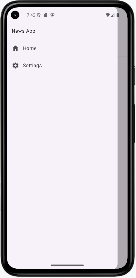
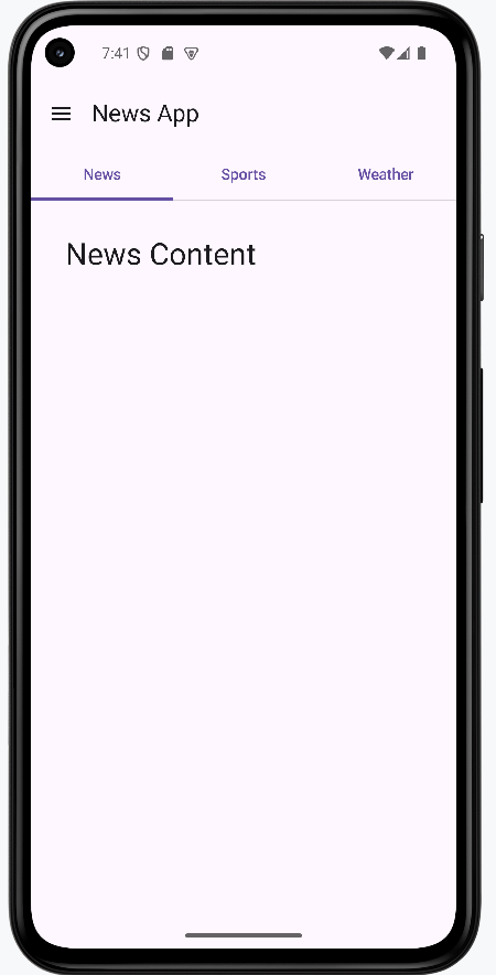
Learning Aids
Tips for Success
- Use navigation drawers for apps with many main sections (5+)
- Use tabs for 2-5 related content sections
- Keep tab labels short and descriptive
- Use appropriate icons for navigation items
- Consider the user's mental model when organizing navigation
- Test navigation on different screen sizes
- Provide visual feedback for selected states
- Use consistent navigation patterns throughout your app
Common Mistakes to Avoid
- Using too many tabs (more than 5 can be overwhelming)
- Putting unrelated items in the same navigation drawer
- Not providing clear visual feedback for selected items
- Using navigation drawers for simple apps with few sections
- Making tab labels too long or unclear
- Not considering how navigation works on different screen sizes
- Forgetting to handle navigation state properly
- Using inconsistent navigation patterns
Best Practices
- Choose navigation based on the number and relationship of your content sections
- Use descriptive labels and appropriate icons for navigation items
- Provide clear visual feedback for the current selection
- Keep navigation consistent across your entire app
- Consider the user's workflow when organizing navigation
- Test navigation on different devices and screen orientations
- Use Material Design guidelines for navigation patterns
- Provide alternative navigation methods for accessibility
Complex List Patterns
Beyond the Basics: Why These Patterns?
Now that you know how to make simple vertical and horizontal lists, let's look at some more advanced ways to organize and display data in your apps. These patterns help you group, organize, and show lots of information in a way that's easy for users to scan and understand.
- Sectioned Lists: Group items by category, like "Account" and "App" in settings.
- Sticky Headers: Keep group headers visible as you scroll, like in a contacts app.
- Grids: Show items in a grid, like a photo gallery or product catalog.
Sectioned List with Headers
Sectioned lists help you organize related items together, making it easier for users to find what they need. Think of a grocery store with aisles for "Produce," "Dairy," and "Snacks." Each aisle is a section header, and the items are grouped underneath.
Example: Settings Screen with Sections
@Composable
fun SectionedSettingsList() {
val settings = listOf(
SettingsSection(
"Account",
listOf(
SettingItem("Profile"),
SettingItem("Privacy"),
SettingItem("Notifications")
)
),
SettingsSection(
"App",
listOf(
SettingItem("Theme"),
SettingItem("Language"),
SettingItem("About")
)
)
)
LazyColumn {
settings.forEach { section ->
item {
Text(
text = section.title,
style = MaterialTheme.typography.titleMedium,
modifier = Modifier.padding(16.dp),
color = MaterialTheme.colorScheme.primary
)
}
items(section.items) { item ->
ListItem(
headlineContent = { Text(item.title) },
modifier = Modifier.clickable { /* Handle click */ }
)
}
item {
Divider(modifier = Modifier.padding(horizontal = 16.dp))
}
}
}
}
// Data classes for the example
data class SettingsSection(val title: String, val items: List)
data class SettingItem(val title: String)
This example builds a settings screen that is grouped into sections. Instead of one long unorganized list, related options are placed under clear headers such as Account and App.
How the code works (step by step)
- Create structured data first: the
settingslist containsSettingsSectionobjects, and each section has a title and a list of items. - Render with LazyColumn:
LazyColumnonly composes visible rows, which keeps long lists efficient. - Add a section header row: inside
item { ... }, the section title is shown with larger text and theme color to separate groups visually. - Render items inside each section:
items(section.items)loops through each setting and creates aListItem. - Make rows interactive:
Modifier.clickablemarks each setting row as tappable for navigation or actions. - Insert visual separators: a
Dividerafter each section helps users quickly scan where one group ends and the next begins.
Why this pattern matters: Grouped lists reduce cognitive load. Users can find settings faster because related actions are clustered in predictable places.
How this example renders
Above is just a snippet of the code to view the full code, you need to go to my GitHub page and look at the chapter14 cl_screen_sections.kt file.
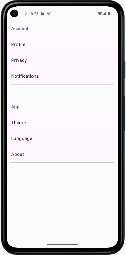
Sticky Headers in a Contact List
Sticky headers keep group labels visible as you scroll through long lists. Imagine a contacts app where the letter "A" stays at the top as you scroll through all the "A" names, then "B" takes its place when you reach the "B" section.
Example: Contacts with Sticky Letter Headers
@Composable
fun ContactListWithStickyHeaders() {
val contacts = listOf(
Contact("Alice"),
Contact("Aaron"),
Contact("Bob"),
Contact("Charlie"),
Contact("David"),
Contact("Eve")
).groupBy { it.name.first().uppercase() }//This creates a map of the contacts by their first letter
LazyColumn {
contacts.forEach { (letter, contactList) ->//This iterates through the map where letter is the key and contactList is the value
stickyHeader {
Surface(
color = MaterialTheme.colorScheme.surface,
modifier = Modifier.fillMaxWidth()
) {
Text(
text = letter,
style = MaterialTheme.typography.titleMedium,
modifier = Modifier.padding(16.dp),
color = MaterialTheme.colorScheme.primary
)
}
}
items(contactList) { contact ->
ListItem(
headlineContent = { Text(contact.name) },
modifier = Modifier.clickable { /* Handle contact selection */ }
)
}
}
}
}
// Data class for the example
data class Contact(val name: String)
This example shows how to keep section labels visible while scrolling. As the user moves through names, the current letter stays pinned at the top until the next letter section reaches it.
How the code works (step by step)
- Build sample contacts: a list of
Contactobjects is created with names. - Group by first letter:
groupBy { it.name.first().uppercase() }turns the list into a map where keys are letters (A, B, C...) and values are lists of contacts in that group. - Iterate over each group:
contacts.forEach { (letter, contactList) -> ... }gives access to one letter and its matching contacts at a time. - Create sticky group headers:
stickyHeader { ... }defines content that stays pinned at the top during scrolling. - Style the header for readability:
Surface,fillMaxWidth(), and themed text make the letter header clear and full-width. - Render contacts under each header:
items(contactList)creates oneListItemper contact name.
Why this pattern matters: Sticky headers preserve context in long lists. Users always know which group they are currently browsing.
How this example renders
Above is just a snippet of the code to view the full code, you need to go to my GitHub page and look at the chapter14 cl_stickyHeaders.kt file.
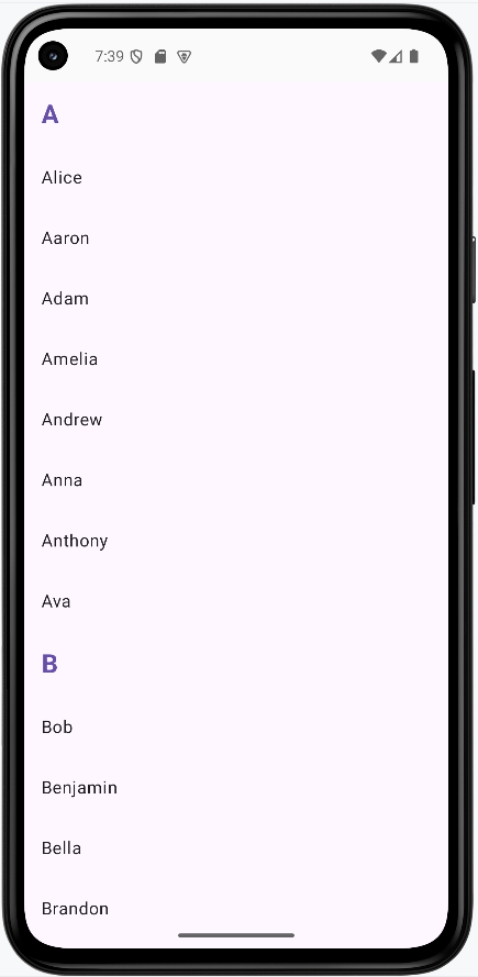
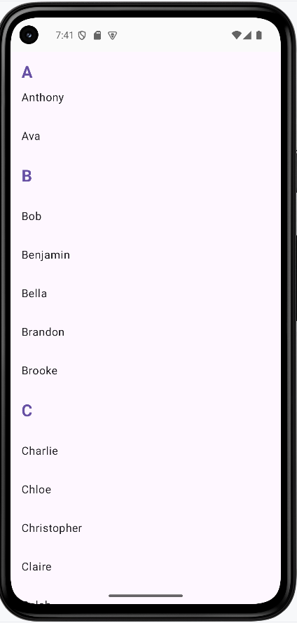
Grid List for a Photo Gallery
Grids are perfect for showing lots of items at once, like photos or products. Think of a photo gallery app where each image is a square in a grid, making it easy to browse many at a time.
Example: Simple Photo Gallery Grid
@Composable
fun PhotoGallery() {
val photos = List(12) { "Photo ${it + 1}" }
LazyVerticalGrid(
columns = GridCells.Fixed(3),
contentPadding = PaddingValues(8.dp),
horizontalArrangement = Arrangement.spacedBy(8.dp),
verticalArrangement = Arrangement.spacedBy(8.dp)
) {
items(photos) { photo ->
Card(
modifier = Modifier
.aspectRatio(1f)
.clickable { /* Handle photo selection */ }
) {
Box(
modifier = Modifier
.fillMaxSize(),
contentAlignment = Alignment.Center
) {
Text(
text = photo,
style = MaterialTheme.typography.bodyMedium
)
}
}
}
}
}
This example creates a gallery-style screen with a fixed 3-column grid. Each item is shown as a square card, making the layout compact and visually consistent.
How the code works (step by step)
- Create data:
List(12) { "Photo ${it + 1}" }generates 12 labels to simulate photo entries. - Use LazyVerticalGrid: this is the grid version of lazy lists; it only composes visible items for better performance.
- Set grid columns:
GridCells.Fixed(3)forces exactly three columns across the screen. - Control spacing:
contentPaddingadds outer margin, whilehorizontalArrangementandverticalArrangementset gaps between cards. - Render each grid cell:
items(photos)loops through photo labels and builds oneCardper item. - Keep each card square:
aspectRatio(1f)ensures width and height stay equal. - Center content inside card: a
BoxwithcontentAlignment = Alignment.Centerplaces label text in the middle. - Support interaction:
Modifier.clickableon each card allows opening a detail view or full image later.
Why this pattern matters: Grids maximize screen usage for visual collections such as images, products, and media thumbnails.
How this example renders
Above is just a snippet of the code to view the full code, you need to go to my GitHub page and look at the chapter14 cl_grid.kt file.
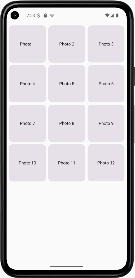
Tips for Success
- Use sectioned lists to group related items and make your UI easier to scan.
- Sticky headers are great for long, grouped lists like contacts or music libraries.
- Grids are perfect for showing lots of items at once, like photos or products.
- Test your lists with different amounts of data to make sure they look good and scroll smoothly.
- Keep your code simple and add features one at a time as you get comfortable.
Custom Composable Components
What are Custom Composable Components?
Think of custom composable components like building your own LEGO pieces. Instead of always using the standard blocks that come with the set, you can create your own special pieces that do exactly what you need. Custom components let you build reusable UI elements that match your app's design and functionality perfectly.
Custom composable components are like creating your own building blocks for your app. They help you avoid repeating the same code, make your app more organized, and create consistent user experiences across your entire application.
Quick Reference
| Component Type | Description | When to Use |
|---|---|---|
| Simple Components | Basic UI elements with custom styling | Custom buttons, cards, or text styles |
| Complex Components | Multi-part components with state | Custom forms, dialogs, or data displays |
| Reusable Components | Components used throughout your app | Common UI patterns, theme elements |
| Composable Functions | Functions that return composable content | Any custom UI element you want to reuse |
When to Create Custom Components
Create Custom Components When:
- You find yourself repeating the same UI code multiple times
- You want to ensure consistent styling across your app
- You need to encapsulate complex UI logic
- You want to make your code more readable and maintainable
- You're building a design system for your app
- You need to create reusable UI patterns
Benefits of Custom Components
- Reduces code duplication and makes maintenance easier
- Ensures consistent design across your app
- Makes your code more readable and organized
- Allows for easy updates and changes
- Improves testing and debugging
- Makes your app more modular and scalable
Common Component Patterns
| Pattern | What It Does | When to Use It |
|---|---|---|
| @Composable Function | Creates a reusable UI component | For any custom UI element |
| Parameters | Makes components configurable | When you need different variations |
| Modifier Parameter | Allows external styling customization | When you want flexible styling |
| State Management | Handles component's internal state | For interactive components |
Practical Examples
Simple Custom Button
@Composable
fun CustomButton(
text: String,
onClick: () -> Unit,
modifier: Modifier = Modifier,
enabled: Boolean = true
) {
Button(
onClick = onClick,
modifier = modifier,
enabled = enabled,
colors = ButtonDefaults.buttonColors(
containerColor = MaterialTheme.colorScheme.primary,
contentColor = MaterialTheme.colorScheme.onPrimary
),
shape = RoundedCornerShape(8.dp)
) {
Text(
text = text,
style = MaterialTheme.typography.labelLarge
)
}
}
// Using the custom button
CustomButton(
text = "Click Me",
onClick = { /* Handle click */ },
modifier = Modifier.padding(16.dp)
)This creates a custom button with consistent styling. You can use it throughout your app to ensure all buttons look the same. The parameters make it flexible for different use cases.
Custom Card Component
@Composable
fun InfoCard(
title: String,
description: String,
icon: ImageVector,
onClick: (() -> Unit)? = null,
modifier: Modifier = Modifier
) {
Card(
modifier = modifier
.fillMaxWidth()
.then(
if (onClick != null) {
Modifier.clickable { onClick() }
} else {
Modifier
}
),
elevation = CardDefaults.cardElevation(defaultElevation = 4.dp)
) {
Row(
modifier = Modifier.padding(16.dp),
verticalAlignment = Alignment.CenterVertically
) {
Icon(
imageVector = icon,
contentDescription = null,
tint = MaterialTheme.colorScheme.primary,
modifier = Modifier.size(24.dp)
)
Spacer(modifier = Modifier.width(16.dp))
Column {
Text(
text = title,
style = MaterialTheme.typography.titleMedium
)
Text(
text = description,
style = MaterialTheme.typography.bodyMedium,
color = MaterialTheme.colorScheme.onSurfaceVariant
)
}
}
}
}
// Using the custom card
InfoCard(
title = "Weather",
description = "Partly cloudy, 72°F",
icon = Icons.Default.Cloud,
onClick = { /* Navigate to weather */ }
)This creates a reusable card component with an icon, title, and description. The optional onClick parameter makes it flexible for both clickable and non-clickable cards.
Custom Loading Component
@Composable
fun LoadingSpinner(
message: String = "Loading...",
modifier: Modifier = Modifier
) {
Column(
modifier = modifier,
horizontalAlignment = Alignment.CenterHorizontally,
verticalArrangement = Arrangement.Center
) {
CircularProgressIndicator(
modifier = Modifier.size(48.dp),
color = MaterialTheme.colorScheme.primary
)
Spacer(modifier = Modifier.height(16.dp))
Text(
text = message,
style = MaterialTheme.typography.bodyLarge,
color = MaterialTheme.colorScheme.onSurfaceVariant
)
}
}
// Using the loading component
LoadingSpinner(
message = "Fetching data...",
modifier = Modifier.fillMaxSize()
)This creates a reusable loading component that you can use anywhere in your app. It provides consistent loading feedback with customizable messages.
Custom Form Input Component
@Composable
fun CustomTextField(
value: String,
onValueChange: (String) -> Unit,
label: String,
modifier: Modifier = Modifier,
isError: Boolean = false,
errorMessage: String? = null,
keyboardOptions: KeyboardOptions = KeyboardOptions.Default,
singleLine: Boolean = true
) {
Column(modifier = modifier) {
OutlinedTextField(
value = value,
onValueChange = onValueChange,
label = { Text(label) },
isError = isError,
keyboardOptions = keyboardOptions,
singleLine = singleLine,
modifier = Modifier.fillMaxWidth()
)
if (isError && errorMessage != null) {
Text(
text = errorMessage,
color = MaterialTheme.colorScheme.error,
style = MaterialTheme.typography.bodySmall,
modifier = Modifier.padding(start = 16.dp, top = 4.dp)
)
}
}
}
// Using the custom text field
var email by remember { mutableStateOf("") }
var emailError by remember { mutableStateOf(false) }
CustomTextField(
value = email,
onValueChange = { email = it },
label = "Email",
isError = emailError,
errorMessage = if (emailError) "Please enter a valid email" else null,
keyboardOptions = KeyboardOptions(
keyboardType = KeyboardType.Email
)
)This creates a custom text field component with built-in error handling. It includes validation feedback and can be easily reused throughout your app.
Complex Custom Component with State
@Composable
fun ExpandableCard(
title: String,
content: String,
modifier: Modifier = Modifier
) {
var expanded by remember { mutableStateOf(false) }
Card(
modifier = modifier.fillMaxWidth(),
elevation = CardDefaults.cardElevation(defaultElevation = 2.dp)
) {
Column(modifier = Modifier.padding(16.dp)) {
Row(
modifier = Modifier.fillMaxWidth(),
horizontalArrangement = Arrangement.SpaceBetween,
verticalAlignment = Alignment.CenterVertically
) {
Text(
text = title,
style = MaterialTheme.typography.titleMedium
)
IconButton(onClick = { expanded = !expanded }) {
Icon(
imageVector = if (expanded) Icons.Default.ExpandLess else Icons.Default.ExpandMore,
contentDescription = if (expanded) "Collapse" else "Expand"
)
}
}
AnimatedVisibility(
visible = expanded,
enter = expandVertically() + fadeIn(),
exit = shrinkVertically() + fadeOut()
) {
Text(
text = content,
style = MaterialTheme.typography.bodyMedium,
modifier = Modifier.padding(top = 8.dp)
)
}
}
}
}
// Using the expandable card
ExpandableCard(
title = "How to use this app",
content = "This app helps you organize your tasks and stay productive. Tap the + button to add new tasks, and swipe to delete completed ones."
)This creates a complex component with internal state management. It handles its own expansion/collapse behavior and includes smooth animations.
Creating a Component Library
// Create a file called MyComponents.kt
object MyComponents {
@Composable
fun PrimaryButton(
text: String,
onClick: () -> Unit,
modifier: Modifier = Modifier
) {
Button(
onClick = onClick,
modifier = modifier,
colors = ButtonDefaults.buttonColors(
containerColor = MaterialTheme.colorScheme.primary
)
) {
Text(text)
}
}
@Composable
fun SecondaryButton(
text: String,
onClick: () -> Unit,
modifier: Modifier = Modifier
) {
OutlinedButton(
onClick = onClick,
modifier = modifier
) {
Text(text)
}
}
@Composable
fun InfoBox(
title: String,
message: String,
modifier: Modifier = Modifier
) {
Card(
modifier = modifier,
colors = CardDefaults.cardColors(
containerColor = MaterialTheme.colorScheme.surfaceVariant
)
) {
Column(modifier = Modifier.padding(16.dp)) {
Text(
text = title,
style = MaterialTheme.typography.titleSmall
)
Text(
text = message,
style = MaterialTheme.typography.bodyMedium
)
}
}
}
}
// Using components from the library
MyComponents.PrimaryButton(
text = "Save",
onClick = { /* Save action */ }
)
MyComponents.InfoBox(
title = "Note",
message = "Your changes have been saved successfully."
)This shows how to create a component library that organizes all your custom components in one place. This makes it easy to maintain consistency and reuse components across your app.
How the Examples Render
I created one example that combines all the custom components into one screen. You can view the full code on my GitHub page and look at the chapter14 customComponents.kt file.
To run this exmaple you will need to add the follwing to your libs.version.toml file in the [Libraries] section:
compose-material-icons-extended = { module = "androidx.compose.material:material-icons-extended" }
You will then need to add the follwing to your build.gradle file:
implementation(platform(libs.androidx.compose.bom))
implementation(libs.compose.material.icons.extended)
Once added make sure to sync your project with gradle files.
This is the rended application
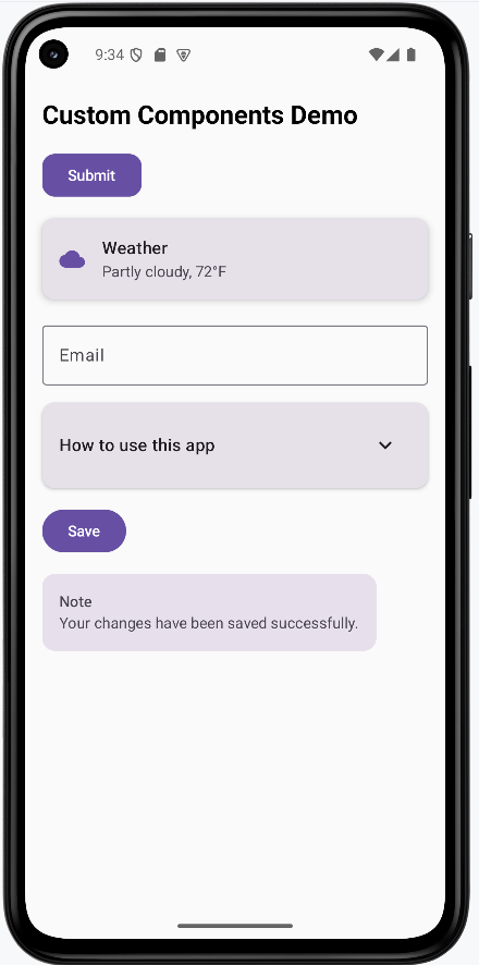
Tips for Success
- Start with simple components and gradually add complexity
- Use descriptive names for your custom components
- Make components flexible with parameters and modifiers
- Keep components focused on a single responsibility
- Use consistent naming conventions across your components
- Document your components with clear parameter descriptions
- Test your components with different data and states
- Consider accessibility when designing custom components
Common Mistakes to Avoid
- Creating components that are too specific and not reusable
- Not providing enough parameters for customization
- Making components too complex with too many responsibilities
- Not considering different screen sizes and orientations
- Forgetting to handle edge cases and error states
- Not using consistent styling across components
- Creating components that are too tightly coupled to specific data
- Not providing proper content descriptions for accessibility
Best Practices
- Design components to be reusable and flexible
- Use meaningful parameter names and provide default values
- Keep components focused and single-purpose
- Use consistent styling and follow Material Design guidelines
- Handle different states (loading, error, empty) gracefully
- Test components with various data and screen sizes
- Document your components and their usage
- Consider performance implications when creating complex components
Gestures and Animations
What are Gestures and Animations?
Think of gestures and animations like the way you interact with a physical book. When you flip a page, you use a swipe gesture, and the page animates as it turns. When you tap on a button, it might animate to show it was pressed. Gestures are the ways users interact with your app using touch, and animations are the visual responses that make those interactions feel natural and engaging.
Gestures include tapping, swiping, dragging, pinching, and more. Animations include transitions, scaling, fading, and moving elements. Together, they create a smooth, intuitive user experience that feels responsive and polished.
Quick Reference
| Type | Description | When to Use |
|---|---|---|
| Tap Gestures | Single finger tap on screen | Buttons, list items, navigation |
| Swipe Gestures | Finger drag across screen | Navigation, deletion, scrolling |
| Drag Gestures | Long press and move | Reordering, dragging items |
| Scale Gestures | Two finger pinch or spread | Zooming images, maps |
When to Use Gestures and Animations
Use Gestures When:
- You want to provide intuitive ways to interact with your app
- You need to handle touch input beyond simple taps
- You want to create natural, app-like interactions
- You're building interactive elements like sliders or draggable items
- You want to provide alternative ways to perform actions
Use Animations When:
- You want to provide visual feedback for user actions
- You need to guide users' attention to important elements
- You want to make transitions between screens smoother
- You're showing loading states or progress
- You want to make your app feel more polished and responsive
Common Gesture and Animation Components
| Component | What It Does | When to Use It |
|---|---|---|
| clickable | Makes an element respond to taps | For buttons, cards, or any tappable element |
| pointerInput | Handles complex touch gestures | For custom gesture recognition |
| animate*AsState | Animates state changes smoothly | For smooth transitions between states |
| AnimatedVisibility | Animates elements appearing/disappearing | For showing/hiding content with animation |
Practical Examples
Tap Animation Example
@Composable
fun TapAnimationExample() {
var isPressed by remember { mutableStateOf(false) }
val scale by animateFloatAsState(
targetValue = if (isPressed) 0.95f else 1f,
animationSpec = tween(durationMillis = 100), label = "tapScale"
)
val buttonColor by animateColorAsState(
targetValue = if (isPressed)
Color(0xFFFF0000) // Red color when pressed
else
MaterialTheme.colorScheme.primary, // Normal theme color
animationSpec = tween(durationMillis = 100), label = "tapColor"
)
Card(
modifier = Modifier
.scale(scale)
.pointerInput(Unit) {
detectTapGestures(
onPress = {
isPressed = true
try {
awaitRelease()
} finally {
isPressed = false
}
}
)
},
colors = CardDefaults.cardColors(
containerColor = buttonColor
),
shape = MaterialTheme.shapes.medium
) {
Box(
modifier = Modifier
.padding(horizontal = 24.dp, vertical = 12.dp),
contentAlignment = Alignment.Center
) {
Text(
text = "Tap Me!",
color = MaterialTheme.colorScheme.onPrimary,
style = MaterialTheme.typography.labelLarge
)
}
}
}Code Breakdown
Press state and animated values
var isPressed by remember { mutableStateOf(false) }
val scale by animateFloatAsState(targetValue = if (isPressed) 0.95f else 1f, ...)
val buttonColor by animateColorAsState(targetValue = if (isPressed) Color(0xFFFF0000) else MaterialTheme.colorScheme.primary, ...)var isPressed by remember { mutableStateOf(false) } creates a Boolean state variable that survives recomposition and starts as not pressed. The two animation lines read that same state: when isPressed is true, scale targets 0.95f (slight shrink) and buttonColor targets red; when false, they return to normal size and theme primary color. Because both animated values are derived from one state source, the size and color transitions stay synchronized and Compose updates both automatically whenever press state changes.
Gesture handler that controls the state
.pointerInput(Unit) {
detectTapGestures(
onPress = {
isPressed = true
try { awaitRelease() } finally { isPressed = false }
}
)
}pointerInput(Unit) attaches a gesture detector to this composable, and using Unit means the detector does not restart unless this modifier is recreated. Inside it, detectTapGestures(onPress = ...) runs when the pointer goes down, immediately setting isPressed = true so the animations begin. awaitRelease() suspends until the finger lifts (or the gesture is canceled), and the finally block always runs, forcing isPressed = false so the UI reliably animates back to normal.
Apply animated values to UI
Card(
modifier = Modifier.scale(scale),
colors = CardDefaults.cardColors(containerColor = buttonColor)
)Modifier.scale(scale) applies the current animated float to the entire card transform, so all content inside the card shrinks/expands together. CardDefaults.cardColors(containerColor = buttonColor) binds the card background to the animated color state, so color transitions happen through the same animation system instead of abrupt changes. These two bindings turn gesture state into two synchronized visual channels (shape and color), which is why the feedback feels responsive and polished.
Swipe to Delete Example
@OptIn(ExperimentalMaterial3Api::class)
@Composable
fun SwipeToDeleteExample() {
var items by remember { mutableStateOf((1..3).map { "Item $it" }.toMutableList()) }
val scope = rememberCoroutineScope()
Column {
items.forEach { item ->
key(item) {
SwipeableListItem(
item = item,
onDelete = {
scope.launch {
delay(250) // Let dismiss animation/background settle briefly before removal.
val updatedItems = items.toMutableList()
updatedItems.remove(item)
items = updatedItems
}
}
)
Spacer(modifier = Modifier.height(8.dp))
}
}
}
}
@OptIn(ExperimentalMaterial3Api::class)
@Composable
fun SwipeableListItem(item: String, onDelete: () -> Unit) {
val dismissState = rememberSwipeToDismissBoxState(
confirmValueChange = { value ->
if (value == SwipeToDismissBoxValue.EndToStart) {
onDelete()
true
} else {
false
}
}
)
SwipeToDismissBox(
state = dismissState,
backgroundContent = {
Box(
modifier = Modifier
.fillMaxSize()
.background(Color.Red)
.padding(horizontal = 20.dp),
contentAlignment = Alignment.CenterEnd
) {
Icon(
imageVector = Icons.Default.Delete,
contentDescription = "Delete",
tint = Color.White
)
}
}
) {
Card(
modifier = Modifier.fillMaxWidth()
) {
ListItem(
headlineContent = { Text(item) }
)
}
}
}Code Breakdown
Parent list state
var items by remember { mutableStateOf((1..3).map { "Item $it" }.toMutableList()) }
val scope = rememberCoroutineScope()
items.forEach { item ->
key(item) {
SwipeableListItem(
item = item,
onDelete = {
scope.launch {
delay(250)
val updatedItems = items.toMutableList()
updatedItems.remove(item)
items = updatedItems
}
}
)
Spacer(modifier = Modifier.height(8.dp))
}
}The first line creates mutable UI state that holds a list of three strings, and the (1..3).map { "Item $it" } expression generates those labels programmatically. rememberCoroutineScope() provides a scope that can launch coroutines from the onDelete callback (the source file imports kotlinx.coroutines.delay and kotlinx.coroutines.launch). key(item) ties each row’s composition identity to its string so swipe/dismiss state does not slide to the wrong row when another item is removed. The forEach loop renders one SwipeableListItem per value. onDelete uses scope.launch { delay(250) … } so the dismiss animation can finish before the list mutates; then it copies the list, removes the item, and assigns items = updatedItems so Compose observes a new list reference and the row leaves the UI cleanly.
Dismiss-state gate for allowed swipe direction
val dismissState = rememberSwipeToDismissBoxState(
confirmValueChange = { value ->
if (value == SwipeToDismissBoxValue.EndToStart) {
onDelete()
true
} else {
false
}
}
)rememberSwipeToDismissBoxState stores swipe progress and target dismissal value for this row. The confirmValueChange callback runs before the state commits to a new value, so it is the correct place to enforce business rules. Here, only SwipeToDismissBoxValue.EndToStart is accepted: if matched, onDelete() is called and true confirms the dismiss; otherwise false cancels state change and snaps the row back. SwipeToDismissBox (shown below) is the container composable that enables this interaction: it wraps a row, tracks horizontal drag gestures, and transitions the content into a dismissed state when the gesture reaches the configured threshold. These swipe APIs come from Jetpack Compose Material 3 (for example, androidx.compose.material3.SwipeToDismissBox, androidx.compose.material3.SwipeToDismissBoxValue, and androidx.compose.material3.rememberSwipeToDismissBoxState).
Background and foreground layers
SwipeToDismissBox(
state = dismissState,
backgroundContent = { /* red background + delete icon */ }
) {
Card { ListItem(headlineContent = { Text(item) }) }
}SwipeToDismissBox renders two layers: backgroundContent (red container with delete icon) and the main content lambda (card/list row). During swipe, the foreground row translates while the background is gradually revealed, which visually explains the pending delete action before commit. Keeping the icon in the background layer, rather than inside the row, ensures it stays anchored while the row moves away.
Draggable Card Example
@Composable
fun DraggableCardExample() {
var offset by remember { mutableStateOf(Offset.Zero) }
val animatedOffset by animateOffsetAsState(
targetValue = offset,
animationSpec = spring(
dampingRatio = Spring.DampingRatioMediumBouncy,
stiffness = Spring.StiffnessLow
), label = "dragOffset"
)
Card(
modifier = Modifier
.offset { IntOffset(animatedOffset.x.roundToInt(), animatedOffset.y.roundToInt()) }
.pointerInput(Unit) {
detectDragGestures { change, dragAmount ->
change.consume()
offset += Offset(dragAmount.x, dragAmount.y)
}
}
.size(200.dp)
) {
Box(
modifier = Modifier.fillMaxSize(),
contentAlignment = Alignment.Center
) {
Text("Drag me around!")
}
}
}Code Breakdown
Position state and animated output
var offset by remember { mutableStateOf(Offset.Zero) }
val animatedOffset by animateOffsetAsState(
targetValue = offset,
animationSpec = spring(...)
)offset is the mutable state that stores the current drag translation in x/y coordinates relative to the card's starting location. animateOffsetAsState(targetValue = offset, ...) creates a second value that continuously interpolates toward that target with spring physics. Using this animated value for rendering prevents abrupt jumps and gives physically smoother motion whenever drag updates arrive quickly.
Drag detection and state updates
.pointerInput(Unit) {
detectDragGestures { change, dragAmount ->
change.consume()
offset += Offset(dragAmount.x, dragAmount.y)
}
}detectDragGestures emits many small movement deltas rather than one final position, so the handler accumulates each delta into offset using offset += Offset(...). change.consume() marks the pointer event as handled, which prevents parent/neighbor gesture detectors from also treating that same movement as their own gesture. This keeps drag behavior deterministic and avoids conflicting interactions in nested layouts.
Render position on screen
.offset {
IntOffset(animatedOffset.x.roundToInt(), animatedOffset.y.roundToInt())
}The offset modifier lambda must return IntOffset, so floating-point animation coordinates are converted with roundToInt(). This conversion happens every frame, mapping the smooth animation output to valid pixel positions that the layout system can place on screen. By using animatedOffset here instead of raw state, the card's visible position remains smooth even as state updates happen rapidly.
Animated Visibility Example
@Composable
fun AnimatedVisibilityExample() {
var visible by remember { mutableStateOf(false) }
Column(horizontalAlignment = Alignment.CenterHorizontally) {
Button(onClick = { visible = !visible }) {
Text(if (visible) "Hide" else "Show")
}
AnimatedVisibility(
visible = visible,
enter = slideInVertically(
initialOffsetY = { -it },
animationSpec = tween(durationMillis = 300)
) + fadeIn(animationSpec = tween(durationMillis = 300)),
exit = slideOutVertically(
targetOffsetY = { -it },
animationSpec = tween(durationMillis = 300)
) + fadeOut(animationSpec = tween(durationMillis = 300))
) {
Card(
modifier = Modifier
.fillMaxWidth()
.padding(16.dp)
) {
Text(
text = "This content animates in and out!",
modifier = Modifier.padding(16.dp)
)
}
}
}
}Code Breakdown
Visibility toggle state
var visible by remember { mutableStateOf(false) }
Button(onClick = { visible = !visible }) {
Text(if (visible) "Hide" else "Show")
}visible is a remembered Boolean state and acts as the single source of truth for this interaction. The button click toggles that state with visible = !visible, and the button text is derived from the same value using an inline if. This means the control label ("Show"/"Hide") and the actual visibility behavior stay logically synchronized without extra bookkeeping.
AnimatedVisibility enter/exit definitions
AnimatedVisibility(
visible = visible,
enter = slideInVertically(initialOffsetY = { -it }, ...) + fadeIn(...),
exit = slideOutVertically(targetOffsetY = { -it }, ...) + fadeOut(...)
) { ... }AnimatedVisibility listens to visible; when true it runs enter, and when false it runs exit. In the enter transition, slideInVertically(initialOffsetY = { -it }) starts content above its final position, where it is the content height, while fadeIn animates alpha from transparent to opaque. The + operator composes these transitions so position and opacity animate concurrently with the same timing model.
Animated content body
AnimatedVisibility(...) {
Card { Text("This content animates in and out!") }
}The snippet shows the animation boundary explicitly: only the card/text block inside AnimatedVisibility participates in enter/exit transitions. Elements outside that block (like the toggle button and parent column) keep their normal layout lifecycle and are not animated by this API. This separation is important because it lets you animate a target region without causing unrelated UI to shift unexpectedly.
Long Press Scale Example
@Composable
fun LongPressScaleExample() {
var isLongPressed by remember { mutableStateOf(false) }
val scale by animateFloatAsState(
targetValue = if (isLongPressed) .75f else 1f, // 0.75f = 75% size
animationSpec = tween(durationMillis = 200), label = "longPressScale"
)
val color by animateColorAsState(
targetValue = if (isLongPressed) {
Color(0xFF00FF00) // Green color for long press
} else {
MaterialTheme.colorScheme.primary // Default theme color
},
animationSpec = tween(durationMillis = 200),
label = "longPressColor"
)
Card(
modifier = Modifier
.scale(scale) // Apply animated scale
.pointerInput(Unit) {
detectTapGestures(
onLongPress = { isLongPressed = true }, // Triggered when user holds down
onPress = {
isLongPressed = false // Reset on regular press
try {
awaitRelease() // Wait for finger to lift
} finally {
isLongPressed = false // Always reset when done
}
}
)
}
.size(150.dp),
colors = CardDefaults.cardColors(
containerColor = color)
) {
Box(
modifier = Modifier.fillMaxSize(),
contentAlignment = Alignment.Center
) {
Text("Long press me!")
}
}
}Code Breakdown
Long-press state and animated outputs
var isLongPressed by remember { mutableStateOf(false) }
val scale by animateFloatAsState(targetValue = if (isLongPressed) .75f else 1f, ...)
val color by animateColorAsState(targetValue = if (isLongPressed) Color(0xFF00FF00) else MaterialTheme.colorScheme.primary, ...)isLongPressed captures whether the long-press condition is active, and both animation targets read that value so behavior is centralized. When true, animateFloatAsState drives scale toward 0.75f and animateColorAsState drives background toward green; when false, both return to default values. This "single state, multiple derived outputs" pattern is key in Compose because it keeps visual effects consistent and prevents state mismatch bugs.
Gesture callbacks
detectTapGestures(
onLongPress = { isLongPressed = true },
onPress = {
isLongPressed = false
try { awaitRelease() } finally { isLongPressed = false }
}
)onLongPress is the semantic event that activates long-press mode, so it sets isLongPressed = true once the hold threshold is reached. onPress begins on initial touch down and handles the full press lifecycle, including release/cancel, which is why it resets the state before and after awaitRelease(). The try/finally structure ensures cleanup always happens even if the gesture is interrupted, preventing stale long-press visuals.
Apply visual feedback to card
Card(
modifier = Modifier.scale(scale),
colors = CardDefaults.cardColors(containerColor = color)
)The card binds animation outputs in two places: Modifier.scale(scale) applies geometric feedback to the whole component, and containerColor = color applies color feedback to the background. Because both are tied to animated state values, the transition into and out of long-press mode is gradual rather than abrupt. This makes recognition of the gesture clearer while still feeling smooth.
Interactive Slider Example
@Composable
fun InteractiveSliderExample() {
var sliderValue by remember { mutableStateOf(0.5f) } // Start at 50%
var isDragging by remember { mutableStateOf(false) }
// Store the actual width of the slider track in pixels
// We need this to calculate thumb position accurately
var trackWidth by remember { mutableStateOf(0f) }
val animatedValue by animateFloatAsState(
targetValue = sliderValue,
animationSpec = if (isDragging) {
tween(durationMillis = 0) // No animation while dragging (instant response)
} else {
spring(dampingRatio = Spring.DampingRatioMediumBouncy) // Bouncy animation when released
}, label = "sliderValue"
)
Column(
modifier = Modifier.padding(16.dp),
horizontalAlignment = Alignment.CenterHorizontally
) {
Text("Value: ${(animatedValue * 100).toInt()}%")
Spacer(modifier = Modifier.height(16.dp))
// This is the parent Box that contains both the track and the thumb
Box(
modifier = Modifier.fillMaxWidth(),
contentAlignment = Alignment.CenterStart // Align thumb to the start
) {
// Slider Track
Box(
modifier = Modifier
.fillMaxWidth()
.height(8.dp)
.background(
color = MaterialTheme.colorScheme.surfaceVariant,
shape = MaterialTheme.shapes.small
)
.onSizeChanged { newSize ->
// Capture the actual width when the track is measured
// This happens after the layout is calculated
trackWidth = newSize.width.toFloat()
}
.pointerInput(trackWidth) { // Re-trigger if width changes
if (trackWidth == 0f) return@pointerInput // Safety check: avoid division by zero
detectDragGestures(
onDragStart = { isDragging = true }, // User started dragging
onDragEnd = { isDragging = false }, // User released
onDrag = { change, dragAmount ->
change.consume()
// Calculate how much the drag represents as a percentage
// dragAmount.x is pixels moved, trackWidth is total width
val dragPercentage = dragAmount.x / trackWidth
// Update slider value, keeping it between 0 and 1
sliderValue = (sliderValue + dragPercentage).coerceIn(0f, 1f)
}
)
}
)
// Slider Thumb (the draggable circle)
Box(
modifier = Modifier
.offset {
// Calculate thumb position: animatedValue (0-1) * trackWidth = position in pixels
val thumbCenterOffset = animatedValue * trackWidth
// Center the thumb: subtract half its width so it's centered on the position
val thumbHalfWidth = (24.dp.toPx() / 2)
IntOffset((thumbCenterOffset - thumbHalfWidth).roundToInt(), 0)
}
.size(24.dp)
.background(
color = MaterialTheme.colorScheme.primary,
shape = CircleShape
)
)
}
}
}Code Breakdown with Snippets:
Core slider state
var sliderValue by remember { mutableStateOf(0.5f) }
var isDragging by remember { mutableStateOf(false) }
var trackWidth by remember { mutableStateOf(0f) }sliderValue stores the domain value in normalized form (0 to 1), which makes it easy to convert between percentage text and pixel position. isDragging tracks interaction mode so animation behavior can switch between "direct-follow" and "settle" modes. trackWidth is measured at runtime because track size depends on device/layout, and drag deltas must be divided by this width to produce accurate value changes.
Conditional animation policy
val animatedValue by animateFloatAsState(
targetValue = sliderValue,
animationSpec = if (isDragging) tween(durationMillis = 0) else spring(...)
)This animation line uses one target (sliderValue) with two possible specs. While dragging, tween(durationMillis = 0) effectively disables interpolation so thumb/value stay locked to finger movement with no lag. After release, the spring spec adds eased settling, which removes abrupt stop behavior and gives a more natural finish.
Track measurement and drag conversion
.onSizeChanged { newSize -> trackWidth = newSize.width.toFloat() }
.pointerInput(trackWidth) {
detectDragGestures(
onDrag = { change, dragAmount ->
change.consume()
val dragPercentage = dragAmount.x / trackWidth
sliderValue = (sliderValue + dragPercentage).coerceIn(0f, 1f)
}
)
}onSizeChanged captures the actual pixel width once layout is measured, and pointerInput(trackWidth) rebuilds the gesture detector if width changes. During drag, dragAmount.x (pixels moved this frame) is divided by trackWidth to compute fractional value change, then added to the current value. coerceIn(0f, 1f) enforces valid range so the thumb cannot move beyond the visual track.
Thumb position calculation
.offset {
val thumbCenterOffset = animatedValue * trackWidth
val thumbHalfWidth = (24.dp.toPx() / 2)
IntOffset((thumbCenterOffset - thumbHalfWidth).roundToInt(), 0)
}animatedValue * trackWidth converts normalized value back into a pixel coordinate along the track. Because offset positions the top-left corner of the thumb, the code subtracts half the thumb diameter (24.dp.toPx() / 2) so the thumb center, not its edge, marks the current value. Final conversion to IntOffset gives the layout engine integer pixel coordinates for placement.
Multi-Gesture Card Example
@Composable
fun MultiGestureCardExample() {
var scale by remember { mutableStateOf(1f) }
var rotation by remember { mutableStateOf(0f) }
var offset by remember { mutableStateOf(Offset.Zero) }
val animatedScale by animateFloatAsState(
targetValue = scale,
animationSpec = spring(dampingRatio = Spring.DampingRatioMediumBouncy), label = "multiScale"
)
val animatedRotation by animateFloatAsState(
targetValue = rotation,
animationSpec = spring(dampingRatio = Spring.DampingRatioMediumBouncy), label = "multiRotation"
)
val animatedOffset by animateOffsetAsState(
targetValue = offset,
animationSpec = spring(dampingRatio = Spring.DampingRatioMediumBouncy), label = "multiOffset"
)
Card(
modifier = Modifier
.offset { IntOffset(animatedOffset.x.roundToInt(), animatedOffset.y.roundToInt()) }
.scale(animatedScale)
.rotate(animatedRotation)
.pointerInput(Unit) {
detectTransformGestures { _, pan, zoom, rotationChange ->
scale *= zoom
rotation += rotationChange
offset += pan
}
}
.size(200.dp)
) {
Box(
modifier = Modifier.fillMaxSize(),
contentAlignment = Alignment.Center
) {
Text("Pinch, rotate, and drag me!")
}
}
}Code Breakdown with Snippets:
Independent transform states
var scale by remember { mutableStateOf(1f) }
var rotation by remember { mutableStateOf(0f) }
var offset by remember { mutableStateOf(Offset.Zero) }The snippet separates transform concerns into three independent state variables: scale for zoom factor, rotation for angle, and offset for translation. Keeping these separate avoids coupling math across unrelated transformations and makes gesture updates easier to reason about. Each gesture delta updates only the property it belongs to.
Animated transform outputs
val animatedScale by animateFloatAsState(targetValue = scale, animationSpec = spring(...))
val animatedRotation by animateFloatAsState(targetValue = rotation, animationSpec = spring(...))
val animatedOffset by animateOffsetAsState(targetValue = offset, animationSpec = spring(...))Each animate*AsState call wraps one transform channel and interpolates toward the latest target value. This is important in transform gestures because pan/zoom/rotation can update at high frequency and sometimes uneven intervals. Spring animation smooths these updates so the card feels stable rather than jittery.
Multi-touch gesture update logic
detectTransformGestures { _, pan, zoom, rotationChange ->
scale *= zoom
rotation += rotationChange
offset += pan
}detectTransformGestures emits four values per frame; this snippet uses three of them: pan, zoom, and rotationChange. Zoom is applied multiplicatively (scale *= zoom) because zoom is a ratio around 1.0, while rotation and translation are accumulated additively because they are incremental deltas. This preserves mathematically correct behavior for continuous multi-touch transformations.
Apply transforms to card
Modifier
.offset { IntOffset(animatedOffset.x.roundToInt(), animatedOffset.y.roundToInt()) }
.scale(animatedScale)
.rotate(animatedRotation)The modifier chain binds the animated transform values back to rendering: offset sets position, scale sets size ratio, and rotate sets angle. Because the values are animated versions of the raw state, the visual card trails rapid gesture updates smoothly instead of snapping. Applying all transforms on the same element allows pinch, rotate, and pan to compose into a single continuous interaction.
Rearrange Example
@Composable
fun RearrangeExample() {
var items by remember { mutableStateOf((1..5).map { "Box $it" }) }
var draggedIndex by remember { mutableStateOf<Int?>(null) }
var dragOffset by remember { mutableStateOf(Offset.Zero) }
val boxHeight = 80.dp
val density = LocalDensity.current
Column(
modifier = Modifier.fillMaxWidth(),
horizontalAlignment = Alignment.CenterHorizontally
) {
items.forEachIndexed { index, item ->
val isDragging = draggedIndex == index
val animatedOffset by animateOffsetAsState(
targetValue = if (isDragging) dragOffset else Offset.Zero,
animationSpec = if (isDragging) {
tween(durationMillis = 0)
} else {
spring(dampingRatio = Spring.DampingRatioMediumBouncy)
}, label = "rearrangeOffset"
)
val scale by animateFloatAsState(
targetValue = if (isDragging) 1.05f else 1f,
animationSpec = tween(durationMillis = 200), label = "rearrangeScale"
)
val alpha by animateFloatAsState(
targetValue = if (isDragging) 0.8f else 1f,
animationSpec = tween(durationMillis = 200), label = "rearrangeAlpha"
)
Box(
modifier = Modifier
.fillMaxWidth()
.height(boxHeight)
.padding(vertical = 4.dp)
.offset { IntOffset(animatedOffset.x.roundToInt(), animatedOffset.y.roundToInt()) }
.scale(scale)
.alpha(alpha)
.shadow(
elevation = if (isDragging) 8.dp else 2.dp,
shape = MaterialTheme.shapes.medium
)
.background(
color = MaterialTheme.colorScheme.primaryContainer,
shape = MaterialTheme.shapes.medium
)
.pointerInput(index) {
detectDragGestures(
onDragStart = {
draggedIndex = index
dragOffset = Offset.Zero
},
onDragEnd = {
val boxHeightPx = with(density) { boxHeight.toPx() }
val newIndex = when {
dragOffset.y < -boxHeightPx / 2 && index > 0 -> index - 1
dragOffset.y > boxHeightPx / 2 && index < items.size - 1 -> index + 1
else -> index
}
if (newIndex != index) {
val newItems = items.toMutableList()
val itemToMove = newItems.removeAt(index)
newItems.add(newIndex, itemToMove)
items = newItems
}
draggedIndex = null
dragOffset = Offset.Zero
},
onDrag = { change, dragAmount ->
change.consume()
dragOffset += Offset(dragAmount.x, dragAmount.y)
}
)
},
contentAlignment = Alignment.Center
) {
Text(
text = item,
style = MaterialTheme.typography.titleMedium,
color = MaterialTheme.colorScheme.onPrimaryContainer
)
}
}
}
}Code Breakdown with Snippets:
Reorder state
var items by remember { mutableStateOf((1..5).map { "Box $it" }) }
var draggedIndex by remember { mutableStateOf<Int?>(null) }
var dragOffset by remember { mutableStateOf(Offset.Zero) }items is the current ordered dataset shown on screen, and reordering works by creating/reassigning this list. draggedIndex identifies which row is currently being moved (or null when none), and dragOffset stores cumulative drag distance for that active row. These three values together define both list structure and in-progress interaction state.
Per-item drag styling and position
val isDragging = draggedIndex == index
val animatedOffset by animateOffsetAsState(targetValue = if (isDragging) dragOffset else Offset.Zero, ...)
val scale by animateFloatAsState(targetValue = if (isDragging) 1.05f else 1f, ...)
val alpha by animateFloatAsState(targetValue = if (isDragging) 0.8f else 1f, ...)isDragging = draggedIndex == index computes row-local drag state inside the loop, so each row can render differently based on whether it is active. The animated offset drives movement for the active row, while animated scale/alpha add visual emphasis so users can track which row is being moved. Inactive rows evaluate the same expressions but resolve to default targets, so they remain stable.
Drag lifecycle and threshold decision
onDragEnd = {
val boxHeightPx = with(density) { boxHeight.toPx() }
val newIndex = when {
dragOffset.y < -boxHeightPx / 2 && index > 0 -> index - 1
dragOffset.y > boxHeightPx / 2 && index < items.size - 1 -> index + 1
else -> index
}
}At drag end, boxHeight is converted from dp to pixels because drag distances are reported in pixels. The when block checks whether vertical movement crossed half-row threshold upward or downward, which prevents accidental reorder from tiny finger jitter. Boundary checks (index > 0 and index < items.size - 1) stop moves beyond first/last positions.
Immutable reorder update
val newItems = items.toMutableList()
val itemToMove = newItems.removeAt(index)
newItems.add(newIndex, itemToMove)
items = newItemsThe code copies the current list to a mutable working list, removes the dragged item from its old index, and inserts it at the new index. Reassigning items = newItems publishes a new list instance to state, which Compose observes as a change and recomposes the rows in new order. This immutable-style state update pattern is more reliable than mutating a shared list in place.
Tile Swap Example
@Composable
fun TileSwapExample() {
var tiles by remember { mutableStateOf(listOf(1, 2, 3, 0)) } // 0 represents empty space
var draggedIndex by remember { mutableStateOf<Int?>(null) }
var dragOffset by remember { mutableStateOf(Offset.Zero) }
val gridSize = 2 // 2x2 grid
Column(
modifier = Modifier.fillMaxWidth(),
horizontalAlignment = Alignment.CenterHorizontally,
verticalArrangement = Arrangement.spacedBy(8.dp)
) {
Text(
text = "Drag tiles to swap with empty space",
style = MaterialTheme.typography.bodyMedium,
modifier = Modifier.padding(bottom = 16.dp)
)
// 2x2 Grid layout
Column(
verticalArrangement = Arrangement.spacedBy(8.dp)
) {
repeat(gridSize) { row ->
Row(
horizontalArrangement = Arrangement.spacedBy(8.dp)
) {
repeat(gridSize) { col ->
val index = row * gridSize + col
val tileValue = tiles[index]
val isDragging = draggedIndex == index
val animatedOffset by animateOffsetAsState(
targetValue = if (isDragging) dragOffset else Offset.Zero,
animationSpec = if (isDragging) {
tween(durationMillis = 0)
} else {
spring(dampingRatio = Spring.DampingRatioMediumBouncy)
}, label = "tileOffset"
)
val scale by animateFloatAsState(
targetValue = if (isDragging) 1.1f else 1f,
animationSpec = tween(durationMillis = 200), label = "tileScale"
)
val alpha by animateFloatAsState(
targetValue = if (isDragging) 0.8f else 1f,
animationSpec = tween(durationMillis = 200), label = "tileAlpha"
)
if (tileValue == 0) {
// Empty space
Box(
modifier = Modifier
.size(100.dp)
.background(
color = MaterialTheme.colorScheme.surfaceVariant,
shape = RoundedCornerShape(12.dp)
)
)
} else {
// Tile with number
Card(
modifier = Modifier
.size(100.dp)
.offset { IntOffset(animatedOffset.x.roundToInt(), animatedOffset.y.roundToInt()) }
.scale(scale)
.alpha(alpha)
.shadow(
elevation = if (isDragging) 8.dp else 4.dp,
shape = RoundedCornerShape(12.dp)
)
.pointerInput(index) {
detectDragGestures(
onDragStart = {
draggedIndex = index
dragOffset = Offset.Zero
},
onDragEnd = {
val emptyIndex = tiles.indexOf(0)
if (isAdjacent(index, emptyIndex, gridSize)) {
val newTiles = tiles.toMutableList()
newTiles[emptyIndex] = tiles[index]
newTiles[index] = 0
tiles = newTiles
}
draggedIndex = null
dragOffset = Offset.Zero
},
onDrag = { change, dragAmount ->
change.consume()
dragOffset += Offset(dragAmount.x, dragAmount.y)
}
)
},
colors = CardDefaults.cardColors(
containerColor = MaterialTheme.colorScheme.primaryContainer
),
shape = RoundedCornerShape(12.dp)
) {
Box(
modifier = Modifier.fillMaxSize(),
contentAlignment = Alignment.Center
) {
Text(
text = tileValue.toString(),
style = MaterialTheme.typography.headlineMedium,
color = MaterialTheme.colorScheme.onPrimaryContainer,
fontWeight = FontWeight.Bold
)
}
}
}
}
}
}
}
}
}
private fun isAdjacent(index1: Int, index2: Int, gridSize: Int): Boolean {
val row1 = index1 / gridSize
val col1 = index1 % gridSize
val row2 = index2 / gridSize
val col2 = index2 % gridSize
return (row1 == row2 && kotlin.math.abs(col1 - col2) == 1) ||
(col1 == col2 && kotlin.math.abs(row1 - row2) == 1)
}Code Breakdown with Snippets:
Puzzle state and grid mapping
var tiles by remember { mutableStateOf(listOf(1, 2, 3, 0)) } // 0 = empty
val gridSize = 2
val index = row * gridSize + coltiles stores the puzzle in row-major order as a flat list, with 0 reserved to represent the empty space. gridSize defines how that one-dimensional data should be interpreted as a square grid. The mapping formula row * gridSize + col converts visual row/column coordinates into the correct list index for reading/updating tile values.
Render empty space vs numbered tile
if (tileValue == 0) {
Box(modifier = Modifier.size(100.dp) /* empty slot */)
} else {
Card(modifier = Modifier.size(100.dp) /* draggable tile */) { ... }
}The conditional split is a rules-enforcement step: if value is 0, render only a visual placeholder box; if value is non-zero, render an interactive card tile. By not attaching drag handlers to the empty slot, the code ensures only numbered tiles can be dragged. This mirrors the behavior of real sliding puzzles, where movement always starts from a numbered tile.
Drag end swap logic
val emptyIndex = tiles.indexOf(0)
if (isAdjacent(index, emptyIndex, gridSize)) {
val newTiles = tiles.toMutableList()
newTiles[emptyIndex] = tiles[index]
newTiles[index] = 0
tiles = newTiles
}On drag end, tiles.indexOf(0) finds the empty cell at that moment, then isAdjacent(...) validates whether the dragged tile is a legal neighbor. Only when legal does the code create a mutable copy and perform the two assignments needed for a swap: move dragged value into empty index and write 0 into the old tile position. Assigning the updated list back to tiles commits the move and refreshes the board UI.
Adjacency function
return (row1 == row2 && abs(col1 - col2) == 1) ||
(col1 == col2 && abs(row1 - row2) == 1)This return expression encodes Manhattan adjacency: same row and one column apart, or same column and one row apart. Diagonal positions fail both conditions, so they are correctly treated as non-adjacent. Encoding adjacency this way keeps move validation concise while still matching puzzle movement rules exactly.
How the Examples Render
I created one example that combines all the custom components into one screen. You can view the full code on my GitHub page and look at the chapter14 gestures.kt file.
This is the rended application. It uses a scrollable tabbed navigation to show the different examples.
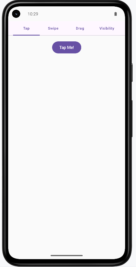
Tips for Success
- Use gestures to provide intuitive ways to interact with your app
- Provide visual feedback for all user interactions
- Keep animations smooth and not too distracting
- Use appropriate animation durations (100-300ms for quick feedback)
- Test gestures on different screen sizes and devices
- Provide alternative ways to perform actions (accessibility)
- Use spring animations for natural, bouncy feel
- Consider the user's context when choosing gesture types
Common Mistakes to Avoid
- Making gestures too complex or hard to discover
- Using animations that are too slow or distracting
- Not providing visual feedback for gesture interactions
- Forgetting to handle edge cases in gesture detection
- Using gestures that conflict with system gestures
- Not considering accessibility for users who can't use gestures
- Making animations that interfere with usability
- Not testing gestures on different devices and screen sizes
Best Practices
- Use standard gestures that users expect (tap, swipe, pinch)
- Provide clear visual feedback for all interactions
- Keep animations smooth and performant
- Use appropriate animation curves and durations
- Test gestures thoroughly on different devices
- Provide alternative interaction methods for accessibility
- Follow platform guidelines for gesture behavior
- Consider the user's mental model when designing interactions
Chapter 15: Videos and Images
Image Loading
Imagine you're building a photo gallery app. You need to show hundreds of pictures, but if you try to load them all at once, your app will be slow and might crash. Just like a smart photo album that only shows the photos you're looking at, image loading libraries help your app display images efficiently. They handle downloading images from the internet, storing them temporarily, and showing them only when needed. This makes your app faster and uses less memory, which is especially important on mobile devices.
In this lesson, we'll learn how to use Coil (Coroutine Image Loader) to load and display images in your Android app. Coil is a popular library that makes it easy to load images from the internet, local storage, or resources, with automatic caching and memory management.
When to Use Image Loading
- When displaying images from the internet (like profile pictures or product photos)
- When showing images from your app's resources or assets
- When creating image galleries or lists with many images
- When you need to show images with loading indicators
- When you want to automatically cache images for better performance
- When displaying images in different sizes (thumbnails, full-size)
- When handling image loading errors gracefully
- When optimizing memory usage for image-heavy apps
Key Image Loading Concepts
| Concept | What It Does | When to Use It |
|---|---|---|
AsyncImage |
Loads and displays images asynchronously | When you need to display images from URLs or resources |
rememberAsyncImagePainter |
Creates an image painter that loads images in the background | When you need more control over image loading states |
ImageRequest |
Defines how and where to load an image | When you need to customize image loading (size, transformations) |
ContentScale |
Defines how the image should be scaled to fit its container | When you need to control how images fill their space |
placeholder |
Shows an image while loading | When you want to show something while the image downloads |
error |
Shows an image when loading fails | When you want to handle image loading errors gracefully |
crossfade |
Creates a smooth fade transition when image loads | When you want smooth visual transitions for better UX |
Project Setup: Image Gallery App
Let's start by setting up our ImageGallery project. This will be a simple app that demonstrates how to load and display images using Coil.
Step 1: Adding Dependencies
First, we need to add the Coil dependency for image loading. We'll update the gradle/libs.versions.toml file:
[versions]
...
coil = "2.6.0" # Add this line
[libraries]
...
coil-compose = { group = "io.coil-kt", name = "coil-compose", version.ref = "coil" } # Add this lineThen update the app/build.gradle.kts file to include the Coil dependency:
dependencies {
...
implementation(libs.coil.compose) // Add this line
}Step 2: Adding Internet Permission
Since our app loads images from the internet, we need to add the internet permission to AndroidManifest.xml:
<?xml version="1.0" encoding="utf-8"?>
<manifest xmlns:android="http://schemas.android.com/apk/res/android"
xmlns:tools="http://schemas.android.com/tools">
<!-- Permission for internet access to load images -->
<uses-permission android:name="android.permission.INTERNET" />
<application
<!--manifest code here-->
</application>
</manifest>Step 3: Understanding the App Structure
Our ImageGallery app will have a simple structure with:
- Image List - A scrollable list of images from the internet
- Loading States - Shows placeholders while images load
- Error Handling - Shows error images when loading fails
- Image Details - Clicking an image shows it in full size
Step 4: Creating the Data Model
First, let's create our data model. Create a new file called ImageItem.kt:
package com.example.imagegallery
// Data class representing an image in our gallery
data class ImageItem(
val id: String,
val title: String,
val imageUrl: String,
val thumbnailUrl: String
)What this does:
id- Unique identifier for each imagetitle- The title or description of the imageimageUrl- URL for the full-size imagethumbnailUrl- URL for a smaller thumbnail version
Step 5: Creating Sample Data
Now let's create sample data for our app. Create SampleImageData.kt:
package com.example.imagegallery
// Sample image data using Picsum Photos (a free image service)
object SampleImageData {
fun getSampleImages(): List {
return listOf(
ImageItem(
id = "1",
title = "Sample Image 1",
imageUrl = "https://picsum.photos/id/1/800/600",
thumbnailUrl = "https://picsum.photos/id/1/200/200"
),
ImageItem(
id = "2",
title = "Sample Image 2",
imageUrl = "https://picsum.photos/id/2/800/600",
thumbnailUrl = "https://picsum.photos/id/2/200/200"
),
ImageItem(
id = "3",
title = "Sample Image 3",
imageUrl = "https://picsum.photos/id/3/800/600",
thumbnailUrl = "https://picsum.photos/id/3/200/200"
),
ImageItem(
id = "4",
title = "Sample Image 4",
imageUrl = "https://picsum.photos/id/4/800/600",
thumbnailUrl = "https://picsum.photos/id/4/200/200"
),
ImageItem(
id = "5",
title = "Sample Image 5",
imageUrl = "https://picsum.photos/id/5/800/600",
thumbnailUrl = "https://picsum.photos/id/5/200/200"
),
ImageItem(
id = "6",
title = "Sample Image 6",
imageUrl = "https://picsum.photos/id/6/800/600",
thumbnailUrl = "https://picsum.photos/id/6/200/200"
)
)
}
} What this does:
object SampleImageData- Creates a singleton object that provides sample datafun getSampleImages()- Returns a list of ImageItem objectsimageUrl- URL for the full-size image (800x600 pixels)thumbnailUrl- URL for the smaller thumbnail (200x200 pixels)- Important: We use
/id/format instead of?random=to ensure the thumbnail and full-size image show the same picture. Using?random=would generate different images each time, causing the thumbnail and full-size image to not match.
Step 6: Creating a Simple Image Card
Now let's create a composable that displays an image card. Create ImageCard.kt:
package com.example.imagegallery
import androidx.compose.foundation.clickable
import androidx.compose.foundation.layout.*
import androidx.compose.foundation.shape.RoundedCornerShape
import androidx.compose.material3.*
import androidx.compose.runtime.Composable
import androidx.compose.ui.Alignment
import androidx.compose.ui.Modifier
import androidx.compose.ui.layout.ContentScale
import androidx.compose.ui.unit.dp
import coil.compose.AsyncImage
@Composable
fun ImageCard(
imageItem: ImageItem,
onClick: () -> Unit,
modifier: Modifier = Modifier
) {
Card(
modifier = modifier
.fillMaxWidth()
.padding(8.dp)
.clickable(onClick = onClick),
shape = RoundedCornerShape(8.dp)
) {
Column {
// Image
AsyncImage(
model = imageItem.thumbnailUrl,
contentDescription = imageItem.title,
modifier = Modifier
.fillMaxWidth()
.height(200.dp),
contentScale = ContentScale.Crop
)
// Image title
Text(
text = imageItem.title,
style = MaterialTheme.typography.titleMedium,
modifier = Modifier.padding(16.dp)
)
}
}
}What this code does:
Card- Creates a card container with rounded corners that holds the image and titleclickable(onClick = onClick)- Makes the entire card clickable, so users can tap anywhere on itAsyncImage- The simplest way to load and display images from URLs. Coil automatically handles:- Downloading the image in the background
- Showing a loading state while downloading
- Caching the image for faster future loads
- Handling errors gracefully
model = imageItem.thumbnailUrl- Tells AsyncImage which URL to load (the thumbnail version for the list)contentDescription- Provides text for screen readers (accessibility)ContentScale.Crop- Crops the image to fill the 200dp height, maintaining aspect ratioText- Displays the image title below the image
Why we use AsyncImage directly:
AsyncImage is the simplest and most reliable way to load images. It automatically handles all the complexity of loading, caching, and error handling for you. While you can use rememberAsyncImagePainter for more control over loading states, AsyncImage is perfect for most use cases and is what we use in this example.
Step 7: Creating the Image Gallery Screen
Now let's create the main screen that displays our image gallery. Create ImageGalleryScreen.kt:
package com.example.imagegallery
import androidx.compose.foundation.layout.*
import androidx.compose.foundation.lazy.LazyColumn
import androidx.compose.foundation.lazy.items
import androidx.compose.material3.*
import androidx.compose.runtime.*
import androidx.compose.ui.Modifier
import androidx.compose.ui.unit.dp
@Composable
fun ImageGalleryScreen(
images: List,
onImageClick: (ImageItem) -> Unit
) {
LazyColumn(
modifier = Modifier
.fillMaxSize()
.padding(top = 50.dp),
verticalArrangement = Arrangement.spacedBy(8.dp),
contentPadding = PaddingValues(horizontal = 16.dp, vertical = 8.dp)
) {
items(images) { image ->
ImageCard(
imageItem = image,
onClick = { onImageClick(image) }
)
}
}
} What this code does:
ImageGalleryScreen- A composable function that displays a scrollable list of image cardsimages: List<ImageItem>- Takes a list of ImageItem objects to display in the galleryonImageClick: (ImageItem) -> Unit- A callback function that gets called when an image card is clicked. It receives the clicked ImageItem as a parameterLazyColumn- Creates a vertically scrollable list that is "lazy" (efficient). It only creates and displays the image cards that are currently visible on screen. As you scroll, it creates new cards and removes ones that are off-screen, making it very memory efficient for long listsfillMaxSize()- Makes the LazyColumn take up the full available screen spacepadding(top = 50.dp)- Adds 50dp of padding at the top to account for the system status barverticalArrangement = Arrangement.spacedBy(8.dp)- Adds 8dp of vertical space between each image card in the listcontentPadding = PaddingValues(horizontal = 16.dp, vertical = 8.dp)- Adds padding around the entire list (16dp on left and right, 8dp on top and bottom)items(images) { image -> ... }- This is a LazyColumn function that creates one item for each element in the images list. For each image, it executes the code inside the curly bracesImageCard- Creates an ImageCard composable for each image in the listonClick = { onImageClick(image) }- When an ImageCard is clicked, it calls the onImageClick callback function and passes the current image as a parameter. This allows the parent composable (like ImageGalleryApp) to know which image was clicked
Why we use LazyColumn:
LazyColumn is essential for displaying lists efficiently. Unlike a regular Column, which would try to create all items at once (even if they're off-screen), LazyColumn only creates the items that are visible. This means:
- Better Performance - Only visible items are created, saving memory and processing power
- Smooth Scrolling - As you scroll, items are created and removed dynamically
- Scalability - Can handle hundreds or thousands of items without performance issues
- Automatic Optimization - Coil works perfectly with LazyColumn, only loading images that are visible
Step 8: Creating a Full-Size Image Viewer
Let's create a screen that shows the full-size image when clicked. Create FullSizeImageScreen.kt:
package com.example.imagegallery
import androidx.compose.foundation.layout.*
import androidx.compose.material.icons.Icons
import androidx.compose.material.icons.automirrored.filled.ArrowBack
import androidx.compose.material3.*
import androidx.compose.material3.ExperimentalMaterial3Api
import androidx.compose.runtime.Composable
import androidx.compose.ui.Alignment
import androidx.compose.ui.Modifier
import androidx.compose.ui.layout.ContentScale
import androidx.compose.ui.unit.dp
import coil.compose.AsyncImage
@OptIn(ExperimentalMaterial3Api::class)
@Composable
fun FullSizeImageScreen(
imageItem: ImageItem,
onBackClick: () -> Unit,
modifier: Modifier = Modifier
) {
Scaffold(
topBar = {
TopAppBar(
title = { Text(imageItem.title) },
navigationIcon = {
IconButton(onClick = onBackClick) {
Icon(
imageVector = Icons.AutoMirrored.Filled.ArrowBack,
contentDescription = "Back"
)
}
}
)
}
) { paddingValues ->
Box(
modifier = modifier
.fillMaxSize()
.padding(paddingValues),
contentAlignment = Alignment.Center
) {
AsyncImage(
model = imageItem.imageUrl,
contentDescription = imageItem.title,
modifier = Modifier.fillMaxSize(),
contentScale = ContentScale.Fit
)
}
}
}What this code does:
@OptIn(ExperimentalMaterial3Api::class)- Required annotation becauseTopAppBaris an experimental Material3 APIScaffold- Provides the basic structure with a top app barTopAppBar- Displays the image title and a back button at the topIcons.AutoMirrored.Filled.ArrowBack- Uses the AutoMirrored version of the back arrow icon, which automatically flips for right-to-left languages (this is the recommended version, as the oldIcons.Default.ArrowBackis deprecated)Box- Container that centers the image on the screenAsyncImage- Loads and displays the full-size imagemodel = imageItem.imageUrl- Uses the full-size image URL (800x600) instead of the thumbnailContentScale.Fit- Scales the image to fit within the screen while maintaining aspect ratio, so the entire image is visible
Key difference from ImageCard:
- ImageCard uses
imageItem.thumbnailUrl(smaller 200x200 image) for the list - FullSizeImageScreen uses
imageItem.imageUrl(larger 800x600 image) for the detail view - This ensures we load smaller images in the list (faster) and larger images only when needed (when clicked)
Step 9: Updating MainActivity
Finally, let's update MainActivity.kt to use our image gallery:
package com.example.imagegallery
import android.os.Bundle
import androidx.activity.ComponentActivity
import androidx.activity.compose.setContent
import androidx.activity.enableEdgeToEdge
import androidx.compose.foundation.layout.fillMaxSize
import androidx.compose.foundation.layout.padding
import androidx.compose.material3.Scaffold
import androidx.compose.runtime.*
import androidx.compose.ui.Modifier
import com.example.imagegallery.ui.theme.ImageGalleryTheme
class MainActivity : ComponentActivity() {
override fun onCreate(savedInstanceState: Bundle?) {
super.onCreate(savedInstanceState)
enableEdgeToEdge()
setContent {
ImageGalleryTheme {
Scaffold(modifier = Modifier.fillMaxSize()) { innerPadding ->
ImageGalleryApp(modifier = Modifier.padding(innerPadding))
}
}
}
}
}
@Composable
fun ImageGalleryApp(modifier: Modifier = Modifier) {
var selectedImage by remember { mutableStateOf(null) }
val images = remember { SampleImageData.getSampleImages() }
if (selectedImage == null) {
ImageGalleryScreen(
images = images,
onImageClick = { image -> selectedImage = image }
)
} else {
FullSizeImageScreen(
imageItem = selectedImage!!,
onBackClick = { selectedImage = null }
)
}
} Understanding Each Part of the Implementation
How the App Flow Works:
- App Starts -
ImageGalleryAppcreates a list of images and showsImageGalleryScreen - Displaying the List -
ImageGalleryScreenuses aLazyColumnto efficiently display all images as cards - Image Cards - Each
ImageCardshows a thumbnail (200x200) usingAsyncImagewithContentScale.Crop - User Clicks - When a user taps an image card, the
onClickcallback updatesselectedImagestate - Showing Full Image - When
selectedImageis not null, the app showsFullSizeImageScreenwith the full-size image (800x600) - Going Back - When the user clicks the back button,
selectedImageis set to null, returning to the list
Image Loading with Coil:
AsyncImage- The simplest way to load and display images. It automatically:- Downloads images in the background without blocking the UI
- Shows a loading indicator while downloading
- Caches images for faster future loads
- Handles errors gracefully
model- The URL or resource to load (can be a String URL, Drawable resource, or other image source)contentDescription- Text description for accessibility (screen readers)
Content Scale Options:
ContentScale.Crop- Crops the image to fill the container while maintaining aspect ratio. Used in ImageCard for thumbnailsContentScale.Fit- Scales the image to fit within the container while maintaining aspect ratio. Used in FullSizeImageScreen so the entire image is visibleContentScale.FillBounds- Stretches the image to fill the container, which may distort the image
State Management:
var selectedImage by remember { mutableStateOf- Tracks which image is currently selected- When
selectedImageisnull, the gallery list is shown - When
selectedImagehas a value, the full-size image screen is shown - This simple state management allows us to switch between two screens
How this example renders
Above is just a snippet of the code to view the full code, you need to go to my GitHub page and look at the chapter15 ImageGallery app.
Tips for Success
- Always use
AsyncImagefor loading images from the internet - it's simple and handles everything automatically - Provide
contentDescriptionfor images to make your app accessible to screen readers - Use thumbnails in lists and load full-size images only when needed - this improves performance
- Use consistent image IDs in URLs (like
/id/1/) to ensure thumbnails and full images match - Choose the right
ContentScale- useCropfor thumbnails andFitfor full-size images - Add internet permission to your manifest when loading images from URLs
- Use
@OptIn(ExperimentalMaterial3Api::class)when using experimental Material3 components likeTopAppBar - Use
Icons.AutoMirrored.Filled.ArrowBackinstead of the deprecatedIcons.Default.ArrowBack - Test that clicking a thumbnail shows the matching full-size image
- Keep your image loading code simple -
AsyncImagehandles most cases perfectly
Common Mistakes to Avoid
- Forgetting to add internet permission for loading images from URLs
- Using
?random=in image URLs, which causes thumbnails and full images to not match - Loading full-size images in lists instead of thumbnails - this wastes bandwidth and memory
- Not providing
contentDescriptionfor accessibility - Forgetting to add the Coil dependency
- Using the wrong
ContentScale- usingFillBoundscan distort images - Forgetting
@OptIn(ExperimentalMaterial3Api::class)when usingTopAppBar - Using deprecated icons like
Icons.Default.ArrowBackinstead ofIcons.AutoMirrored.Filled.ArrowBack - Not testing that the thumbnail matches the full-size image when clicked
- Overcomplicating image loading -
AsyncImageis usually all you need
Best Practices
- Use Coil's
AsyncImagefor all image loading - it's simple, efficient, and handles everything automatically - Use thumbnails in lists (smaller images) and load full-size images only when needed
- Use consistent image IDs in URLs (like
/id/1/) to ensure thumbnails and full images match - Provide meaningful
contentDescriptionfor all images for accessibility - Use
ContentScale.Cropfor thumbnails andContentScale.Fitfor full-size images - Keep image loading code simple -
AsyncImagehandles loading, caching, and errors automatically - Use
LazyColumnfor lists to efficiently display many images - Manage navigation with simple state (like
selectedImage) to switch between screens - Always use
@OptInannotations for experimental APIs - Use AutoMirrored icons for better internationalization support
Video Playback
Imagine you're building a video streaming app like YouTube or Netflix. You need to play videos smoothly, let users pause and resume, and handle different video formats. Just like a TV remote that lets you control playback, video playback in Android apps requires special components that can handle video files, manage playback controls, and work with different video sources. Video playback is more complex than images because videos are larger files that need to stream over time, and users expect controls like play, pause, and seek.
In this lesson, we'll learn how to play videos in your Android app using Media3 (AndroidX Media3), which is Google's modern media player library built on ExoPlayer. Media3 is the recommended library for video playback in Android apps. We'll create a simple video player with basic controls, display video thumbnails using Coil, and learn how to handle different video sources.
When to Use Video Playback
- When displaying video content from the internet or local storage
- When creating video streaming applications
- When building video tutorials or educational content
- When showing video previews or trailers
- When implementing video recording and playback features
- When creating media gallery apps with video support
- When building social media apps with video posts
- When implementing video advertisements
Key Video Playback Concepts
| Concept | What It Does | When to Use It |
|---|---|---|
Media3 / ExoPlayer |
Google's modern media player library (AndroidX Media3) for playing videos and audio. Built on ExoPlayer but with updated APIs and better integration with modern Android features. | When you need to play video or audio files. Media3 is the current recommended library (ExoPlayer 2.x is deprecated). |
PlayerView |
A view component from Media3 that displays video with built-in playback controls (play, pause, seek, etc.) | When you need a simple video player with controls. This is embedded in Compose using AndroidView. |
MediaItem |
Represents a media source (video URL or file). Contains metadata about the media to be played. | When you need to specify what video to play. Created from URIs, files, or other media sources. |
Coil |
An image loading library for Android that efficiently loads and displays images from URLs or other sources | When you need to display video thumbnails or images from the internet in your Compose UI |
Player |
The main interface for controlling playback | When you need to control play, pause, seek, etc. |
prepare() |
Prepares the player to play a media item | When you want to load a video before playing |
play() / pause() |
Controls video playback | When you need to start or stop playback |
seekTo() |
Jumps to a specific position in the video | When you need to skip to a different part |
Project Setup: Video Player App
Let's start by setting up our VideoPlayer project. This will be a simple app that demonstrates how to play videos using ExoPlayer.
Step 1: Adding Dependencies
First, we need to add the Media3 (AndroidX Media3) and Coil dependencies. Media3 is the modern replacement for ExoPlayer 2.x, which is now deprecated. Coil is used for loading and displaying video thumbnails. We'll update the gradle/libs.versions.toml file:
[versions]
...
media3 = "1.2.1" # Media3 version - this is the modern replacement for ExoPlayer 2.x
coil = "2.5.0" # Coil version for image loading
[libraries]
...
# Media3 dependencies (replaces deprecated ExoPlayer 2.x)
media3-exoplayer = { group = "androidx.media3", name = "media3-exoplayer", version.ref = "media3" }
media3-ui = { group = "androidx.media3", name = "media3-ui", version.ref = "media3" }
# Coil for loading video thumbnails
coil-compose = { group = "io.coil-kt", name = "coil-compose", version.ref = "coil" }Explanation: Media3 is AndroidX's modern media library that replaces the deprecated ExoPlayer 2.x. It provides the same functionality with updated APIs and better integration. Coil is a lightweight image loading library that works seamlessly with Jetpack Compose.
Then update the app/build.gradle.kts file to include these dependencies:
dependencies {
...
// Media3 for video playback (replaces deprecated ExoPlayer 2.x)
implementation(libs.media3.exoplayer)
implementation(libs.media3.ui)
// Coil for loading video thumbnails
implementation(libs.coil.compose)
}Why these dependencies:
media3-exoplayer- Provides the ExoPlayer engine for playing videos and audiomedia3-ui- Provides the PlayerView component with built-in controlscoil-compose- Provides AsyncImage composable for loading images from URLs, which we use for video thumbnails
Step 2: Adding Internet Permission
Since our app will play videos from the internet, we need to add the internet permission to AndroidManifest.xml:
<?xml version="1.0" encoding="utf-8"?>
<manifest xmlns:android="http://schemas.android.com/apk/res/android"
xmlns:tools="http://schemas.android.com/tools">
<!-- Permission for internet access to stream videos -->
<uses-permission android:name="android.permission.INTERNET" />
<application
<!--manifest code here-->
</application>
</manifest>Step 3: Understanding the App Structure
Our VideoPlayer app will have a simple structure with:
- Video List - A list of available videos to play
- Video Player - A screen that plays the selected video
- Playback Controls - Play, pause, and seek controls
- Video Information - Title and description of the video
Step 4: Creating the Data Model
First, let's create our data model. Create a new file called VideoItem.kt:
package com.example.videoplayer
// Data class representing a video in our player
data class VideoItem(
val id: String,
val title: String,
val description: String,
val videoUrl: String,
val thumbnailUrl: String
)What this does:
id- Unique identifier for each video. Used to distinguish between different videos in the list.title- The title of the video displayed to users in the video list and player screen.description- Description of the video content, shown below the title to give users more information.videoUrl- URL for the video file. This can be a remote URL (like from the internet) or a local file path. Media3 supports various video formats and sources.thumbnailUrl- URL for a thumbnail image. This is displayed in the video list to give users a preview of the video content before they play it.
Why a data class: Using a data class provides several benefits: automatic generation of equals(), hashCode(), toString(), and copy() methods. This makes it easy to compare videos, create copies, and debug. The val keyword makes all properties immutable, which is a best practice in Kotlin for data models.
Step 5: Creating Sample Data
Now let's create sample data for our app. Create SampleVideoData.kt:
package com.example.videoplayer
// Sample video data using public test videos
object SampleVideoData {
fun getSampleVideos(): List {
return listOf(
VideoItem(
id = "1",
title = "Sample Video 1",
description = "A sample video for testing video playback",
videoUrl = "https://commondatastorage.googleapis.com/gtv-videos-bucket/sample/BigBuckBunny.mp4",
thumbnailUrl = "https://picsum.photos/400/300?random=1"
),
VideoItem(
id = "2",
title = "Sample Video 2",
description = "Another sample video for testing",
videoUrl = "https://commondatastorage.googleapis.com/gtv-videos-bucket/sample/ElephantsDream.mp4",
thumbnailUrl = "https://picsum.photos/400/300?random=2"
),
VideoItem(
id = "3",
title = "Sample Video 3",
description = "A third sample video",
videoUrl = "https://commondatastorage.googleapis.com/gtv-videos-bucket/sample/ForBiggerBlazes.mp4",
thumbnailUrl = "https://picsum.photos/400/300?random=3"
)
)
}
} What this does:
object SampleVideoData- Creates a singleton object (only one instance exists). This is perfect for sample data that doesn't need to be instantiated multiple times.fun getSampleVideos(): List<VideoItem>- Returns a list of VideoItem objects. The return type is explicitly specified asList<VideoItem>to ensure type safety.listOf()- Creates an immutable list containing our sample videos. These are public test videos from Google's test video bucket, perfect for testing without needing your own video files.- Video URLs: We're using Google's public test video bucket, which provides sample videos in various formats. These URLs are publicly accessible and don't require authentication.
- Thumbnail URLs: We're using Picsum Photos, a service that provides placeholder images. The
?random=Xparameter ensures each video gets a different random image.
Why use an object: Using an object instead of a class means we don't need to create an instance - we can call SampleVideoData.getSampleVideos() directly. This is ideal for utility functions and sample data that don't need state.
Step 6: Creating a Video Player Composable
Now let's create a composable that plays videos. This is the core component that handles video playback. Create VideoPlayerComposable.kt:
package com.example.videoplayer
import android.view.ViewGroup
import android.widget.FrameLayout
import androidx.compose.foundation.layout.*
import androidx.compose.material3.*
import androidx.compose.runtime.*
import androidx.compose.ui.Modifier
import androidx.compose.ui.platform.LocalContext
import androidx.compose.ui.viewinterop.AndroidView
import androidx.media3.exoplayer.ExoPlayer
import androidx.media3.common.MediaItem
import androidx.media3.ui.PlayerView
@Composable
fun VideoPlayerComposable(
videoUrl: String,
modifier: Modifier = Modifier
) {
val context = LocalContext.current
// Create and remember the ExoPlayer instance
val exoPlayer = remember {
ExoPlayer.Builder(context).build().apply {
val mediaItem = MediaItem.fromUri(videoUrl)
setMediaItem(mediaItem)
prepare()
}
}
// Clean up when the composable is removed
DisposableEffect(Unit) {
onDispose {
exoPlayer.release()
}
}
// Use AndroidView to embed the PlayerView
AndroidView(
factory = { ctx ->
PlayerView(ctx).apply {
player = exoPlayer
layoutParams = FrameLayout.LayoutParams(
ViewGroup.LayoutParams.MATCH_PARENT,
ViewGroup.LayoutParams.MATCH_PARENT
)
useController = true // Show built-in controls
}
},
modifier = modifier
)
}Detailed Explanation:
Imports:
androidx.media3.exoplayer.ExoPlayer- The Media3 ExoPlayer class (note: this is from Media3, not the deprecated ExoPlayer 2.x package). This is the core player that handles video decoding and playback.androidx.media3.common.MediaItem- Represents a media source (video URL, file, etc.). This is Media3's way of specifying what to play.androidx.media3.ui.PlayerView- The UI component that displays the video and provides built-in controls. This is a traditional Android View, not a Compose composable.androidx.compose.ui.viewinterop.AndroidView- Allows us to embed traditional Android Views (like PlayerView) into our Compose UI.
Function Parameters:
videoUrl: String- The URL of the video to play. This can be a remote URL (http/https) or a local file path.modifier: Modifier = Modifier- Allows the caller to customize the size, padding, and other properties of the video player.
Creating the Player:
val context = LocalContext.current- Gets the Android Context, which is required to create an ExoPlayer instance.LocalContextis a Compose utility that provides access to the current Android context.val exoPlayer = remember { ... }- Creates and remembers the ExoPlayer instance. Therememberfunction ensures the player is only created once and reused across recompositions, which is crucial for performance.ExoPlayer.Builder(context).build()- Creates a new ExoPlayer instance using the builder pattern. The builder allows for configuration of the player (buffering, codecs, etc.), but we're using the default configuration here..apply { ... }- Applies configuration to the player immediately after creation. This is a Kotlin scope function that allows us to configure the object concisely.MediaItem.fromUri(videoUrl)- Creates a MediaItem from the video URL. Media3 supports various URI schemes (http, https, file, content, etc.).setMediaItem(mediaItem)- Tells the player what media to play. You can set multiple items to create a playlist, but here we're just playing one video.prepare()- Prepares the player to play the media. This starts loading the video metadata and buffering. The video won't start playing automatically - the user needs to press play (or you can setplayWhenReady = true).
Lifecycle Management:
DisposableEffect(Unit)- A Compose effect that runs cleanup code when the composable is removed from the composition. TheUnitparameter means this effect runs once when the composable is first composed.onDispose { exoPlayer.release() }- Releases the player's resources when the composable is removed. This is critical - failing to release the player causes memory leaks and can crash your app. Therelease()method frees all resources (decoders, buffers, network connections, etc.).
Embedding the PlayerView:
AndroidView- This composable allows us to embed traditional Android Views into Compose. Since PlayerView is a traditional View (not a Compose composable), we need this bridge.factory = { ctx -> ... }- The factory lambda creates the PlayerView. It receives a Context parameter that we use to create the view.PlayerView(ctx)- Creates the PlayerView instance. This view handles displaying the video and showing the controls.player = exoPlayer- Connects the PlayerView to our ExoPlayer instance. The view will now display the video from this player.layoutParams = FrameLayout.LayoutParams(...)- Sets the layout parameters to fill the available space.MATCH_PARENTmeans the view will take up all available width and height.useController = true- Enables the built-in playback controls (play, pause, seek bar, etc.). Setting this tofalsewould hide the controls, requiring you to build custom controls.
Why this approach: Media3's PlayerView is a mature, well-tested component that provides excellent video playback with minimal code. While you could build a custom video player from scratch, using PlayerView saves significant development time and ensures compatibility with various video formats and Android versions.
Step 7: Creating the Video Player Screen
Now let's create a screen that displays the video player with a top app bar and video information. Create VideoPlayerScreen.kt:
package com.example.videoplayer
import androidx.compose.foundation.layout.*
import androidx.compose.material.icons.Icons
import androidx.compose.material.icons.automirrored.filled.ArrowBack
import androidx.compose.material3.*
import androidx.compose.runtime.Composable
import androidx.compose.ui.Modifier
import androidx.compose.ui.unit.dp
@OptIn(ExperimentalMaterial3Api::class)
@Composable
fun VideoPlayerScreen(
videoItem: VideoItem,
onBackClick: () -> Unit,
modifier: Modifier = Modifier
) {
Scaffold(
topBar = {
TopAppBar(
title = { Text(videoItem.title) },
navigationIcon = {
IconButton(onClick = onBackClick) {
Icon(
imageVector = Icons.AutoMirrored.Filled.ArrowBack,
contentDescription = "Back"
)
}
}
)
}
) { paddingValues ->
Column(
modifier = modifier
.fillMaxSize()
.padding(paddingValues)
) {
// Video player
VideoPlayerComposable(
videoUrl = videoItem.videoUrl,
modifier = Modifier
.fillMaxWidth()
.aspectRatio(16f / 9f) // Standard video aspect ratio
)
// Video information
Column(
modifier = Modifier
.fillMaxWidth()
.padding(16.dp)
) {
Text(
text = videoItem.title,
style = MaterialTheme.typography.titleLarge
)
Spacer(modifier = Modifier.height(8.dp))
Text(
text = videoItem.description,
style = MaterialTheme.typography.bodyMedium
)
}
}
}
}Detailed Explanation:
Imports:
androidx.compose.material.icons.automirrored.filled.ArrowBack- Uses the AutoMirrored version of the ArrowBack icon. This is the recommended version because it automatically mirrors in right-to-left (RTL) languages. The oldIcons.Default.ArrowBackis deprecated.androidx.compose.material3.*- Imports Material Design 3 components, includingTopAppBar,Scaffold, andText.
Annotation:
@OptIn(ExperimentalMaterial3Api::class)- This annotation is required becauseTopAppBaris currently an experimental Material3 API. This tells the compiler that we're intentionally using an experimental API. Without this, you'll get a compilation error.
Function Parameters:
videoItem: VideoItem- The video data to display, containing the URL, title, description, etc.onBackClick: () -> Unit- A callback function that's called when the user taps the back button. This allows the parent composable to handle navigation.modifier: Modifier = Modifier- Allows customization of the screen's layout properties.
Scaffold Structure:
Scaffold- A Material Design component that provides a basic screen structure with slots for a top app bar, bottom bar, floating action button, etc. It handles system window insets (like the status bar) automatically.topBar = { TopAppBar(...) }- Defines the top app bar (toolbar) that appears at the top of the screen. This shows the video title and a back button.TopAppBar- Material3's top app bar component. It provides a consistent look and feel with Material Design guidelines.title = { Text(videoItem.title) }- Displays the video title in the center of the app bar. TheTextcomposable is wrapped in a lambda so it can access the current theme.navigationIcon- The icon shown on the left side of the app bar, typically used for navigation (like going back).IconButton- A clickable button that contains an icon. It provides proper touch targets and ripple effects.Icons.AutoMirrored.Filled.ArrowBack- The back arrow icon. The AutoMirrored version automatically flips in RTL languages, which is important for internationalization.contentDescription = "Back"- Provides an accessibility description for screen readers. This is required for accessibility compliance.
Content Layout:
{ paddingValues -> ... }- The Scaffold's content lambda receivespaddingValuesthat account for the top app bar and system insets. We apply this padding to ensure content isn't hidden behind the app bar.Column- Arranges children vertically. The video player is on top, and the video information is below.modifier.fillMaxSize().padding(paddingValues)- Makes the column fill the entire screen and applies the padding from Scaffold to avoid overlap with the app bar.VideoPlayerComposable- Our custom composable that handles video playback. We pass the video URL from the videoItem..fillMaxWidth().aspectRatio(16f / 9f)- Makes the video player fill the width and maintain a 16:9 aspect ratio (standard widescreen format). This ensures the video doesn't look stretched or squished.Column(for video info) - A second column that displays the video title and description below the player.TextwithtitleLargestyle - Displays the video title in a large, prominent font.Spacer- Adds vertical spacing between the title and description for better readability.TextwithbodyMediumstyle - Displays the description in a smaller, secondary font.
Why this structure: The Scaffold provides a standard Android app layout pattern that users are familiar with. The top app bar gives clear navigation, and the aspect ratio constraint ensures videos display correctly regardless of screen size.
Step 8: Creating a Video List Screen
Let's create a screen that shows a scrollable list of available videos with thumbnails. This screen uses Coil to load images from URLs. Create VideoListScreen.kt:
package com.example.videoplayer
import androidx.compose.foundation.clickable
import androidx.compose.foundation.layout.*
import androidx.compose.foundation.lazy.LazyColumn
import androidx.compose.foundation.lazy.items
import androidx.compose.foundation.shape.RoundedCornerShape
import androidx.compose.material3.*
import androidx.compose.runtime.Composable
import androidx.compose.ui.Alignment
import androidx.compose.ui.Modifier
import androidx.compose.ui.layout.ContentScale
import androidx.compose.ui.unit.dp
import coil.compose.AsyncImage
@Composable
fun VideoListScreen(
videos: List,
onVideoClick: (VideoItem) -> Unit,
modifier: Modifier = Modifier
) {
LazyColumn(
modifier = modifier
.fillMaxSize()
.padding(top = 50.dp),
verticalArrangement = Arrangement.spacedBy(8.dp),
contentPadding = PaddingValues(horizontal = 16.dp, vertical = 8.dp)
) {
items(videos) { video ->
VideoListItem(
videoItem = video,
onClick = { onVideoClick(video) }
)
}
}
}
@Composable
fun VideoListItem(
videoItem: VideoItem,
onClick: () -> Unit,
modifier: Modifier = Modifier
) {
Card(
modifier = modifier
.fillMaxWidth()
.clickable(onClick = onClick),
shape = RoundedCornerShape(8.dp)
) {
Column {
// Thumbnail
AsyncImage(
model = videoItem.thumbnailUrl,
contentDescription = videoItem.title,
modifier = Modifier
.fillMaxWidth()
.height(200.dp),
contentScale = ContentScale.Crop
)
// Video info
Column(
modifier = Modifier.padding(16.dp)
) {
Text(
text = videoItem.title,
style = MaterialTheme.typography.titleMedium
)
Spacer(modifier = Modifier.height(4.dp))
Text(
text = videoItem.description,
style = MaterialTheme.typography.bodySmall,
color = MaterialTheme.colorScheme.onSurface.copy(alpha = 0.7f)
)
}
}
}
} Detailed Explanation:
Imports:
coil.compose.AsyncImage- Coil's Compose image loading composable. This efficiently loads images from URLs with automatic caching, memory management, and placeholder support.androidx.compose.foundation.lazy.LazyColumn- A vertically scrollable list that only composes visible items. This is much more efficient than a regular Column for long lists because it reuses views and only creates items that are visible.androidx.compose.foundation.lazy.items- Extension function that makes it easy to create list items from a collection.androidx.compose.foundation.clickable- Makes a composable respond to click/tap events with proper touch feedback.
VideoListScreen Function:
videos: List<VideoItem>- The list of videos to display. Note the explicit type parameterList<VideoItem>- this is required in Kotlin for type safety.onVideoClick: (VideoItem) -> Unit- Callback function called when a user taps a video. It receives the clicked VideoItem so the parent can navigate to the player screen.LazyColumn- Creates a scrollable vertical list. Unlike a regular Column, LazyColumn only creates composables for items that are currently visible, making it efficient for long lists..fillMaxSize()- Makes the list fill the entire available space..padding(top = 50.dp)- Adds top padding. This might be adjusted based on your app's design (e.g., if you have a status bar or other UI elements).verticalArrangement = Arrangement.spacedBy(8.dp)- Adds 8dp of space between each video item for visual separation.contentPadding- Adds padding around the entire list content (horizontal and vertical). This ensures items don't touch the screen edges.items(videos) { video -> ... }- Creates a list item for each video in the list. The lambda receives each VideoItem and creates a VideoListItem composable for it.
VideoListItem Function:
Card- Material Design card component that provides elevation and rounded corners. Cards are perfect for displaying content in lists..fillMaxWidth()- Makes the card fill the available width..clickable(onClick = onClick)- Makes the entire card clickable. When tapped, it calls the onClick callback.shape = RoundedCornerShape(8.dp)- Gives the card rounded corners (8dp radius) for a modern, polished look.Column- Arranges the thumbnail and video info vertically within the card.AsyncImage- Coil's image loading composable. This is the key component for displaying thumbnails:model = videoItem.thumbnailUrl- The URL of the image to load. Coil supports URLs, URIs, files, resources, and more.contentDescription- Accessibility description for screen readers. Important for users with visual impairments..fillMaxWidth().height(200.dp)- Makes the image fill the width and sets a fixed height of 200dp. This ensures consistent card sizes.contentScale = ContentScale.Crop- Scales the image to fill the space while maintaining aspect ratio, cropping if necessary. This ensures thumbnails look good even if source images have different aspect ratios.
Column(for video info) - Contains the title and description text.TextwithtitleMedium- Displays the video title in a medium-sized, prominent font.Spacer- Adds 4dp of space between title and description.TextwithbodySmall- Displays the description in a smaller, secondary font.color = MaterialTheme.colorScheme.onSurface.copy(alpha = 0.7f)- Makes the description text 70% opaque, giving it a subtle, secondary appearance that doesn't compete with the title.
Why Coil for Images: Coil is a modern, efficient image loading library specifically designed for Kotlin and Compose. It provides:
- Automatic memory and disk caching
- Efficient memory usage
- Automatic image decoding and resizing
- Placeholder and error image support
- Seamless integration with Jetpack Compose
Why LazyColumn: For lists with more than a few items, LazyColumn is essential for performance. It only creates composables for visible items, reuses them as you scroll, and handles large lists efficiently without causing memory issues or lag.
Step 9: Updating MainActivity
Finally, let's update MainActivity.kt to tie everything together. This is the entry point of our app and manages the navigation between the video list and player screens:
package com.example.videoplayer
import android.os.Bundle
import androidx.activity.ComponentActivity
import androidx.activity.compose.setContent
import androidx.activity.enableEdgeToEdge
import androidx.compose.foundation.layout.fillMaxSize
import androidx.compose.foundation.layout.padding
import androidx.compose.material3.Scaffold
import androidx.compose.runtime.*
import androidx.compose.ui.Modifier
import com.example.videoplayer.ui.theme.VideoPlayerTheme
class MainActivity : ComponentActivity() {
override fun onCreate(savedInstanceState: Bundle?) {
super.onCreate(savedInstanceState)
enableEdgeToEdge()
setContent {
VideoPlayerTheme {
Scaffold(modifier = Modifier.fillMaxSize()) { innerPadding ->
VideoPlayerApp(modifier = Modifier.padding(innerPadding))
}
}
}
}
}
@Composable
fun VideoPlayerApp(modifier: Modifier = Modifier) {
var selectedVideo by remember { mutableStateOf(null) }
val videos = remember { SampleVideoData.getSampleVideos() }
if (selectedVideo == null) {
VideoListScreen(
videos = videos,
onVideoClick = { video -> selectedVideo = video }
)
} else {
VideoPlayerScreen(
videoItem = selectedVideo!!,
onBackClick = { selectedVideo = null }
)
}
} Detailed Explanation:
MainActivity Class:
class MainActivity : ComponentActivity- The main activity of our app.ComponentActivityis the base class for activities that use Jetpack Compose.override fun onCreate(savedInstanceState: Bundle?)- Called when the activity is created. This is where we set up our UI.enableEdgeToEdge()- Enables edge-to-edge display, allowing content to extend behind system bars (status bar, navigation bar). This gives a modern, immersive look.setContent { ... }- Sets the Compose content for this activity. Everything inside this lambda becomes the UI of our app.VideoPlayerTheme- Applies our app's theme (colors, typography, etc.). This ensures consistent styling throughout the app.Scaffold- Provides the basic screen structure. TheinnerPaddingaccounts for system bars when edge-to-edge is enabled.VideoPlayerApp- Our root composable that manages the app's state and navigation.
VideoPlayerApp Composable:
var selectedVideo by remember { mutableStateOf- This is the key piece of state management:var- A mutable variable that can change over time.by remember- Therememberfunction ensures this state persists across recompositions (when the UI updates). Without it, the state would reset every time the composable recomposes.mutableStateOf- Creates a state holder that can hold either aVideoItemornull. The type parameter<VideoItem?>is required - without it, Kotlin would infer the type asNothing?, which can't hold any values.nullinitially means no video is selected, so we show the list.- When a video is selected, this becomes a
VideoItem, and we show the player screen.
val videos = remember { SampleVideoData.getSampleVideos() }- Loads the list of videos. Therememberensures we only callgetSampleVideos()once, not on every recomposition. This is a performance optimization.if (selectedVideo == null) { ... } else { ... }- Simple conditional navigation:- If
selectedVideoisnull, show theVideoListScreen. - Otherwise, show the
VideoPlayerScreenwith the selected video.
- If
VideoListScreen- Displays the list of videos. When a video is clicked:onVideoClick = { video -> selectedVideo = video }- SetsselectedVideoto the clicked video. This triggers a recomposition, and theifcondition will now be false, so the player screen is shown.
VideoPlayerScreen- Displays the video player. When the back button is clicked:videoItem = selectedVideo!!- Uses the non-null assertion operator (!!) because we knowselectedVideois not null in the else branch. This is safe here because of theifcondition.onBackClick = { selectedVideo = null }- SetsselectedVideoback tonull. This triggers a recomposition, and we're back to showing the list.
State Management Pattern: This is a simple but effective state management pattern for navigation:
- We use a single state variable (
selectedVideo) to determine which screen to show. - When the state changes, Compose automatically recomposes and shows the appropriate screen.
- This is a unidirectional data flow: state flows down (to child composables), and events flow up (callbacks change the state).
- For more complex apps, you might use Navigation Compose or a state management library, but for simple two-screen navigation, this pattern works perfectly.
Understanding Each Part of the Implementation
Media3/ExoPlayer Setup (Modern API):
ExoPlayer.Builder- Creates a new player instance using the builder pattern. The builder allows you to configure various aspects of the player (codecs, buffering, etc.), but we're using default settings here.MediaItem.fromUri()- Creates a MediaItem from a video URL. Media3's MediaItem is more flexible than ExoPlayer 2.x - it supports various URI schemes and can include metadata.setMediaItem()- Sets the video to play. You can set multiple items to create a playlist, or replace the current item with a new one.prepare()- Prepares the player to play the media. This starts loading metadata and buffering the video. The video won't auto-play unless you also setplayWhenReady = true.- Note: We're using Media3 (AndroidX Media3), not the deprecated ExoPlayer 2.x. The imports are from
androidx.media3packages, notcom.google.android.exoplayer2.
PlayerView (Media3 UI Component):
PlayerView- A traditional Android View (not a Compose composable) that displays the video and provides built-in controls. This is from Media3's UI library.useController = true- Enables the built-in playback controls (play, pause, seek bar, fullscreen, etc.). Setting this tofalsewould hide controls, requiring you to build custom controls.AndroidView- A Compose composable that allows embedding traditional Android Views into Compose. This is necessary because PlayerView is a View, not a composable.layoutParams- Sets the view's layout parameters to fill the available space (MATCH_PARENTfor both width and height).
Lifecycle Management (Critical for Memory):
DisposableEffect- A Compose side effect that runs cleanup code when the composable is removed from the composition. This is essential for resource management.exoPlayer.release()- Releases all player resources (decoders, buffers, network connections, etc.). This is absolutely critical - failing to release the player causes memory leaks, can crash your app, and wastes system resources.- Why it matters: Video players use significant system resources. Without proper cleanup, you'll quickly run out of memory, especially if users navigate between multiple videos.
Coil Image Loading:
AsyncImage- Coil's Compose composable for loading images asynchronously from URLs.model- The image source (URL, URI, file, resource, etc.). Coil automatically handles the loading, caching, and decoding.contentScale- How to scale the image.ContentScale.Cropfills the space while maintaining aspect ratio, cropping excess if needed.- Benefits: Automatic caching (memory and disk), efficient memory usage, placeholder support, and seamless Compose integration.
State Management:
remember- Persists state across recompositions. Essential for maintaining state in Compose.mutableStateOf- Creates observable state. When the value changes, Compose automatically recomposes dependent UI.- Type safety: Always specify the type parameter (e.g.,
mutableStateOf<VideoItem?>(null)) to avoid type inference issues.
Tips for Success
- Use Media3, not ExoPlayer 2.x - Media3 (AndroidX Media3) is the current recommended library. ExoPlayer 2.x is deprecated. Always use
androidx.media3packages, notcom.google.android.exoplayer2. - Always release the player - Use
DisposableEffectto callexoPlayer.release()when done. This is critical for preventing memory leaks and crashes. - Use remember for state - Always use
rememberfor state that should persist across recompositions. Without it, state resets on every recomposition. - Specify type parameters explicitly - When using
mutableStateOforList, always specify the type parameter (e.g.,mutableStateOf<VideoItem?>(null)) to avoid type inference issues. - Use LazyColumn for lists - For any list with more than a few items, use LazyColumn instead of Column. It only composes visible items, making it much more efficient.
- Add @OptIn for experimental APIs - If you use experimental Material3 APIs like TopAppBar, add
@OptIn(ExperimentalMaterial3Api::class)to avoid compilation errors. - Use AutoMirrored icons - Use
Icons.AutoMirrored.Filled.ArrowBackinstead of the deprecatedIcons.Default.ArrowBackfor better RTL language support. - Test with different video formats - Test your app with various video formats (MP4, WebM, etc.) and sizes to ensure compatibility.
- Handle network errors gracefully - When streaming videos, handle network failures, timeouts, and other errors. Show user-friendly error messages.
- Show loading indicators - Consider showing loading indicators while videos prepare. This improves perceived performance and user experience.
- Use appropriate aspect ratios - Set aspect ratios (like 16:9) to prevent video distortion. Don't let videos stretch to fill arbitrary spaces.
- Add internet permission - Don't forget to add
<uses-permission android:name="android.permission.INTERNET" />to AndroidManifest.xml when streaming videos. - Use Coil for images - Coil is the recommended image loading library for Compose. It handles caching, memory management, and provides excellent performance.
- Test on different devices - Test on various devices (phones, tablets) and screen sizes to ensure your UI works well everywhere.
- Consider thumbnails - Using thumbnails in video lists improves performance and user experience. Load full videos only when the user selects them.
Common Mistakes to Avoid
- Using deprecated ExoPlayer 2.x - Don't use
com.google.android.exoplayer2packages. Always useandroidx.media3(Media3) instead. - Forgetting to release the player - Not calling
exoPlayer.release()in DisposableEffect causes memory leaks and can crash your app after playing a few videos. - Missing type parameters - Forgetting to specify types like
List<VideoItem>ormutableStateOf<VideoItem?>causes compilation errors or type inference issues. - Not using remember - Forgetting
rememberfor state means it resets on every recomposition, making state management impossible. - Not adding @OptIn annotation - Using experimental Material3 APIs like TopAppBar without
@OptIn(ExperimentalMaterial3Api::class)causes compilation errors. - Using deprecated icons - Using
Icons.Default.ArrowBackinstead ofIcons.AutoMirrored.Filled.ArrowBackcauses deprecation warnings and poor RTL support. - Not adding internet permission - Forgetting
<uses-permission android:name="android.permission.INTERNET" />means videos from URLs won't load. - Forgetting Coil dependency - If you use AsyncImage from Coil, you must add the Coil dependency. The import alone isn't enough.
- Not handling errors - Not handling network failures, invalid URLs, or unsupported formats leads to crashes and poor user experience.
- Playing multiple videos simultaneously - Creating multiple ExoPlayer instances without proper management wastes resources and can cause performance issues.
- Using Column instead of LazyColumn - Using regular Column for long lists causes performance issues. Always use LazyColumn for scrollable lists.
- Ignoring player lifecycle - Not properly managing when players are created and destroyed leads to resource leaks and crashes.
- No error messages - Not providing user-friendly error messages when videos fail to load leaves users confused.
- Wrong aspect ratios - Not setting proper aspect ratios makes videos look stretched or squished, creating a poor viewing experience.
- Not testing edge cases - Not testing with slow networks, different video formats, or various device sizes leads to issues in production.
Best Practices
- Use Media3 (AndroidX Media3) - Always use the modern Media3 library (
androidx.media3) instead of deprecated ExoPlayer 2.x. This ensures you're using actively maintained, modern APIs. - Always release players - Use
DisposableEffectto callexoPlayer.release()when composables are removed. This is non-negotiable for preventing memory leaks. - Use remember for state - Always wrap state in
rememberto persist it across recompositions. This is fundamental to Compose state management. - Specify types explicitly - Always specify type parameters for generics (e.g.,
List<VideoItem>,mutableStateOf<VideoItem?>) to avoid type inference issues and improve code clarity. - Use LazyColumn for lists - Always use LazyColumn (or LazyRow) for scrollable lists. It's much more efficient than Column for multiple items.
- Handle errors gracefully - Implement proper error handling for network failures, invalid URLs, unsupported formats, and playback errors. Show user-friendly error messages.
- Show loading states - Display loading indicators while videos prepare. This improves perceived performance and user experience.
- Use proper aspect ratios - Always set appropriate aspect ratios (like 16:9) to prevent video distortion. Use
aspectRatio()modifier in Compose. - Use Coil for images - Use Coil's AsyncImage for loading thumbnails. It provides automatic caching, efficient memory usage, and excellent Compose integration.
- Test thoroughly - Test with various video formats, network conditions (fast, slow, offline), device sizes, and orientations to ensure robustness.
- Use thumbnails - Load and display thumbnails in video lists. Only load full videos when users select them. This improves performance and reduces data usage.
- Follow Material Design - Use Material3 components and follow Material Design guidelines for a consistent, modern UI that users expect.
- Add proper permissions - Add internet permission for streaming, and consider storage permissions if playing local files.
- Optimize for performance - Consider video quality selection based on network conditions, implement proper buffering strategies, and optimize memory usage.
- Handle lifecycle properly - Ensure players are paused/resumed when the app goes to background/foreground. Consider using LifecycleObserver for this.
- Use AutoMirrored icons - Use AutoMirrored versions of icons (like
Icons.AutoMirrored.Filled.ArrowBack) for better internationalization and RTL language support. - Add @OptIn for experimental APIs - When using experimental Material3 APIs, always add the appropriate
@OptInannotation to acknowledge you're using experimental features.
Audio Handling
Imagine you're building a music app like Spotify or a podcast app. You need to play audio files, let users control playback, and show information about what's playing. Just like a music player that lets you play, pause, skip tracks, and adjust volume, audio handling in Android apps requires special components that can play audio files, manage playback state, and provide controls. Audio playback is similar to video but simpler because you only need to handle sound, not visuals.
In this lesson, we'll learn how to play audio in your Android app using ExoPlayer, which can handle both audio and video. We'll create a simple music player with play, pause, and seek controls, and learn how to manage audio playback state.
When to Use Audio Handling
- When creating music or podcast applications
- When playing sound effects or notifications
- When implementing audio books or educational content
- When building voice recording and playback features
- When creating audio streaming applications
- When implementing background audio playback
- When building radio or live audio streaming apps
- When adding sound effects to games or apps
Key Audio Handling Concepts
| Concept | What It Does | When to Use It |
|---|---|---|
ExoPlayer |
Media player library that can play audio files | When you need to play audio from URLs or files |
MediaItem |
Represents an audio source (URL or file) | When you need to specify what audio to play |
Player |
The main interface for controlling audio playback | When you need to control play, pause, seek, etc. |
prepare() |
Prepares the player to play an audio item | When you want to load audio before playing |
play() / pause() |
Controls audio playback | When you need to start or stop playback |
currentPosition |
Gets the current playback position | When you need to show progress or seek |
duration |
Gets the total duration of the audio | When you need to show total time or progress |
Project Setup: Music Player App
Let's start by setting up our MusicPlayer project. This will be a simple app that demonstrates how to play audio files using ExoPlayer.
Step 1: Adding Dependencies
We'll use the same ExoPlayer dependency we used for video. Update the gradle/libs.versions.toml file:
[versions]
...
exoplayer = "2.19.1" # Add this line
[libraries]
...
exoplayer-core = { group = "com.google.android.exoplayer", name = "exoplayer-core", version.ref = "exoplayer" } # Add this lineThen update the app/build.gradle.kts file:
dependencies {
...
implementation(libs.exoplayer.core)
}Step 2: Adding Internet Permission
Since our app will play audio from the internet, we need to add the internet permission to AndroidManifest.xml:
<?xml version="1.0" encoding="utf-8"?>
<manifest xmlns:android="http://schemas.android.com/apk/res/android"
xmlns:tools="http://schemas.android.com/tools">
<!-- Permission for internet access to stream audio -->
<uses-permission android:name="android.permission.INTERNET" />
<application
<!--manifest code here-->
</application>
</manifest>Step 3: Understanding the App Structure
Our MusicPlayer app will have a simple structure with:
- Song List - A list of available songs to play
- Now Playing Screen - Shows the currently playing song with controls
- Playback Controls - Play, pause, previous, next buttons
- Progress Indicator - Shows current position and duration
Step 4: Creating the Data Model
First, let's create our data model. Create a new file called Song.kt:
package com.example.musicplayer
// Data class representing a song in our player
data class Song(
val id: String,
val title: String,
val artist: String,
val audioUrl: String,
val coverImageUrl: String
)What this does:
id- Unique identifier for each songtitle- The title of the songartist- The artist nameaudioUrl- URL for the audio filecoverImageUrl- URL for the album cover image
Step 5: Creating Sample Data
Now let's create sample data for our app. Create SampleSongData.kt:
package com.example.musicplayer
// Sample song data using public test audio files
object SampleSongData {
fun getSampleSongs(): List {
return listOf(
Song(
id = "1",
title = "Sample Song 1",
artist = "Test Artist",
audioUrl = "https://www.soundhelix.com/examples/mp3/SoundHelix-Song-1.mp3",
coverImageUrl = "https://picsum.photos/400/400?random=1"
),
Song(
id = "2",
title = "Sample Song 2",
artist = "Test Artist",
audioUrl = "https://www.soundhelix.com/examples/mp3/SoundHelix-Song-2.mp3",
coverImageUrl = "https://picsum.photos/400/400?random=2"
),
Song(
id = "3",
title = "Sample Song 3",
artist = "Test Artist",
audioUrl = "https://www.soundhelix.com/examples/mp3/SoundHelix-Song-3.mp3",
coverImageUrl = "https://picsum.photos/400/400?random=3"
)
)
}
} Step 6: Creating an Audio Player Manager
Let's create a class to manage audio playback. Create AudioPlayerManager.kt:
package com.example.musicplayer
import android.content.Context
import com.google.android.exoplayer2.ExoPlayer
import com.google.android.exoplayer2.MediaItem
class AudioPlayerManager(private val context: Context) {
private var exoPlayer: ExoPlayer? = null
fun initializePlayer(): ExoPlayer {
if (exoPlayer == null) {
exoPlayer = ExoPlayer.Builder(context).build()
}
return exoPlayer!!
}
fun playSong(audioUrl: String) {
val player = initializePlayer()
val mediaItem = MediaItem.fromUri(audioUrl)
player.setMediaItem(mediaItem)
player.prepare()
player.play()
}
fun pause() {
exoPlayer?.pause()
}
fun resume() {
exoPlayer?.play()
}
fun stop() {
exoPlayer?.stop()
}
fun release() {
exoPlayer?.release()
exoPlayer = null
}
fun getPlayer(): ExoPlayer? = exoPlayer
}Step 7: Creating the Now Playing Screen
Now let's create a screen that shows the currently playing song with controls. Create NowPlayingScreen.kt:
package com.example.musicplayer
import androidx.compose.foundation.layout.*
import androidx.compose.foundation.shape.CircleShape
import androidx.compose.material.icons.Icons
import androidx.compose.material.icons.filled.*
import androidx.compose.material3.*
import androidx.compose.runtime.*
import androidx.compose.ui.Alignment
import androidx.compose.ui.Modifier
import androidx.compose.ui.layout.ContentScale
import androidx.compose.ui.unit.dp
import coil.compose.AsyncImage
import com.google.android.exoplayer2.Player
@Composable
fun NowPlayingScreen(
song: Song,
player: Player?,
onPlayPauseClick: () -> Unit,
onBackClick: () -> Unit,
modifier: Modifier = Modifier
) {
val isPlaying = player?.isPlaying ?: false
val currentPosition = remember { mutableLongStateOf(0L) }
val duration = player?.duration ?: 0L
// Update current position periodically
LaunchedEffect(player) {
while (player != null) {
currentPosition.longValue = player.currentPosition
kotlinx.coroutines.delay(100) // Update every 100ms
}
}
Scaffold(
topBar = {
TopAppBar(
title = { Text("Now Playing") },
navigationIcon = {
IconButton(onClick = onBackClick) {
Icon(
imageVector = Icons.Default.ArrowBack,
contentDescription = "Back"
)
}
}
)
}
) { paddingValues ->
Column(
modifier = modifier
.fillMaxSize()
.padding(paddingValues)
.padding(16.dp),
horizontalAlignment = Alignment.CenterHorizontally,
verticalArrangement = Arrangement.Center
) {
// Album cover
AsyncImage(
model = song.coverImageUrl,
contentDescription = "${song.title} by ${song.artist}",
modifier = Modifier
.size(300.dp)
.clip(CircleShape),
contentScale = ContentScale.Crop
)
Spacer(modifier = Modifier.height(32.dp))
// Song info
Text(
text = song.title,
style = MaterialTheme.typography.headlineMedium
)
Spacer(modifier = Modifier.height(8.dp))
Text(
text = song.artist,
style = MaterialTheme.typography.titleMedium,
color = MaterialTheme.colorScheme.onSurface.copy(alpha = 0.7f)
)
Spacer(modifier = Modifier.height(32.dp))
// Progress bar
if (duration > 0) {
LinearProgressIndicator(
progress = { (currentPosition.longValue.toFloat() / duration.toFloat()).coerceIn(0f, 1f) },
modifier = Modifier.fillMaxWidth()
)
Spacer(modifier = Modifier.height(8.dp))
Row(
modifier = Modifier.fillMaxWidth(),
horizontalArrangement = Arrangement.SpaceBetween
) {
Text(
text = formatTime(currentPosition.longValue),
style = MaterialTheme.typography.bodySmall
)
Text(
text = formatTime(duration),
style = MaterialTheme.typography.bodySmall
)
}
}
Spacer(modifier = Modifier.height(32.dp))
// Playback controls
Row(
horizontalArrangement = Arrangement.spacedBy(24.dp),
verticalAlignment = Alignment.CenterVertically
) {
IconButton(onClick = { /* Previous song */ }) {
Icon(
imageVector = Icons.Default.SkipPrevious,
contentDescription = "Previous",
modifier = Modifier.size(32.dp)
)
}
FloatingActionButton(
onClick = onPlayPauseClick,
modifier = Modifier.size(64.dp)
) {
Icon(
imageVector = if (isPlaying) Icons.Default.Pause else Icons.Default.PlayArrow,
contentDescription = if (isPlaying) "Pause" else "Play",
modifier = Modifier.size(32.dp)
)
}
IconButton(onClick = { /* Next song */ }) {
Icon(
imageVector = Icons.Default.SkipNext,
contentDescription = "Next",
modifier = Modifier.size(32.dp)
)
}
}
}
}
}
fun formatTime(milliseconds: Long): String {
val seconds = (milliseconds / 1000) % 60
val minutes = (milliseconds / (1000 * 60)) % 60
return String.format("%02d:%02d", minutes, seconds)
}Step 8: Creating the Song List Screen
Let's create a screen that shows a list of available songs. Create SongListScreen.kt:
package com.example.musicplayer
import androidx.compose.foundation.layout.*
import androidx.compose.foundation.lazy.LazyColumn
import androidx.compose.foundation.lazy.items
import androidx.compose.foundation.shape.CircleShape
import androidx.compose.material3.*
import androidx.compose.runtime.Composable
import androidx.compose.ui.Alignment
import androidx.compose.ui.Modifier
import androidx.compose.ui.layout.ContentScale
import androidx.compose.ui.unit.dp
import coil.compose.AsyncImage
@Composable
fun SongListScreen(
songs: List,
onSongClick: (Song) -> Unit,
modifier: Modifier = Modifier
) {
LazyColumn(
modifier = modifier
.fillMaxSize()
.padding(top = 50.dp),
verticalArrangement = Arrangement.spacedBy(8.dp),
contentPadding = PaddingValues(horizontal = 16.dp, vertical = 8.dp)
) {
items(songs) { song ->
SongListItem(
song = song,
onClick = { onSongClick(song) }
)
}
}
}
@Composable
fun SongListItem(
song: Song,
onClick: () -> Unit,
modifier: Modifier = Modifier
) {
Card(
modifier = modifier
.fillMaxWidth()
.clickable(onClick = onClick)
) {
Row(
modifier = Modifier
.fillMaxWidth()
.padding(16.dp),
verticalAlignment = Alignment.CenterVertically
) {
// Album cover thumbnail
AsyncImage(
model = song.coverImageUrl,
contentDescription = "${song.title} by ${song.artist}",
modifier = Modifier
.size(64.dp)
.clip(CircleShape),
contentScale = ContentScale.Crop
)
Spacer(modifier = Modifier.width(16.dp))
// Song info
Column(modifier = Modifier.weight(1f)) {
Text(
text = song.title,
style = MaterialTheme.typography.titleMedium
)
Text(
text = song.artist,
style = MaterialTheme.typography.bodyMedium,
color = MaterialTheme.colorScheme.onSurface.copy(alpha = 0.7f)
)
}
}
}
} Step 9: Updating MainActivity
Finally, let's update MainActivity.kt to use our music player:
package com.example.musicplayer
import android.os.Bundle
import androidx.activity.ComponentActivity
import androidx.activity.compose.setContent
import androidx.activity.enableEdgeToEdge
import androidx.compose.foundation.layout.fillMaxSize
import androidx.compose.foundation.layout.padding
import androidx.compose.material3.Scaffold
import androidx.compose.runtime.*
import androidx.compose.ui.Modifier
import androidx.compose.ui.platform.LocalContext
import com.example.musicplayer.ui.theme.MusicPlayerTheme
class MainActivity : ComponentActivity() {
override fun onCreate(savedInstanceState: Bundle?) {
super.onCreate(savedInstanceState)
enableEdgeToEdge()
setContent {
MusicPlayerTheme {
Scaffold(modifier = Modifier.fillMaxSize()) { innerPadding ->
MusicPlayerApp(modifier = Modifier.padding(innerPadding))
}
}
}
}
}
@Composable
fun MusicPlayerApp(modifier: Modifier = Modifier) {
val context = LocalContext.current
val audioPlayerManager = remember { AudioPlayerManager(context) }
var selectedSong by remember { mutableStateOf(null) }
val songs = remember { SampleSongData.getSampleSongs() }
// Initialize player
val player = remember { audioPlayerManager.initializePlayer() }
// Clean up when done
DisposableEffect(Unit) {
onDispose {
audioPlayerManager.release()
}
}
if (selectedSong == null) {
SongListScreen(
songs = songs,
onSongClick = { song ->
selectedSong = song
audioPlayerManager.playSong(song.audioUrl)
}
)
} else {
NowPlayingScreen(
song = selectedSong!!,
player = player,
onPlayPauseClick = {
if (player.isPlaying) {
audioPlayerManager.pause()
} else {
audioPlayerManager.resume()
}
},
onBackClick = {
audioPlayerManager.stop()
selectedSong = null
}
)
}
} Understanding Each Part of the Implementation
Audio Player Setup:
AudioPlayerManager- Manages the ExoPlayer instanceinitializePlayer()- Creates or returns the playerplaySong()- Loads and plays an audio filepause()/resume()- Controls playback
Playback Controls:
isPlaying- Checks if audio is currently playingcurrentPosition- Gets the current playback positionduration- Gets the total duration of the audioLaunchedEffect- Updates position periodically
UI Components:
LinearProgressIndicator- Shows playback progressformatTime()- Formats milliseconds to MM:SS- Play/Pause button - Toggles playback state
What This App Demonstrates
This MusicPlayer app demonstrates several important concepts:
Basic Audio Playback
- Loading Audio - How to load audio from URLs
- Playback Control - Play, pause, and stop functionality
- State Management - Managing playback state
Progress Tracking
- Current Position - Tracking where you are in the song
- Duration - Getting the total length
- Progress Display - Showing progress visually
Running the App
To run the MusicPlayer app:
- Open the project in Android Studio
- Build and run the app on a device or emulator
- Test the following features:
- Browse the list of songs
- Click on a song to play it
- Use the play/pause button
- Observe the progress bar
- Go back to the song list
Why This Implementation is Important
This example demonstrates how to:
- Play audio files from the internet or local storage
- Control playback with play, pause, and stop
- Track progress and show it to users
- Manage player lifecycle to avoid memory leaks
- Create a music player UI with controls and information
By using ExoPlayer for audio playback, you create apps that can reliably play audio with proper controls and state management. This is essential for any app that needs to play audio, whether it's a music app, podcast app, or any app with sound effects.
Tips for Success
- Use ExoPlayer for audio playback - it works great for both audio and video
- Always release the player when done to avoid memory leaks
- Use
DisposableEffectto clean up resources properly - Update progress indicators periodically using
LaunchedEffect - Format time display in a user-friendly way (MM:SS)
- Handle network errors gracefully when streaming audio
- Show loading states while audio prepares
- Add internet permission when streaming audio from URLs
- Test with different audio formats and qualities
- Consider background playback for music apps
Common Mistakes to Avoid
- Forgetting to release the ExoPlayer instance, causing memory leaks
- Not adding internet permission for streaming audio
- Forgetting to add ExoPlayer dependencies
- Not handling errors when audio fails to load
- Not updating progress indicators, leaving them static
- Playing multiple audio files at once without proper management
- Ignoring player lifecycle and resource cleanup
- Not providing proper error messages when playback fails
- Forgetting to format time display properly
- Not testing on slower devices or network connections
Best Practices
- Always release ExoPlayer instances when done to prevent memory leaks
- Use
DisposableEffectfor proper resource cleanup - Update progress indicators regularly for good user experience
- Format time display in a readable format (MM:SS or HH:MM:SS)
- Handle network errors and playback failures gracefully
- Show loading states while audio prepares
- Test with various audio formats and network conditions
- Consider implementing background playback for music apps
- Provide clear error messages when audio fails to load
- Follow Android's media playback guidelines
File Management
Imagine you're building a note-taking app or a file manager. You need to save user data, load files, and manage documents. Just like a filing cabinet where you store and organize papers, file management in Android apps lets you save data to files, read files, and organize information. Whether you're saving user preferences, storing downloaded content, or managing app data, understanding file management is essential for building apps that need to persist information.
In this lesson, we'll learn how to work with files in Android, including reading and writing text files, managing app storage, and handling file permissions. We'll create a simple note-taking app that can save and load notes from files.
When to Use File Management
- When saving user data or preferences
- When storing downloaded content or media files
- When creating note-taking or document apps
- When implementing data export or import features
- When caching data for offline use
- When storing app logs or debugging information
- When managing user-generated content
- When implementing file sharing between apps
Key File Management Concepts
| Concept | What It Does | When to Use It |
|---|---|---|
Context.filesDir |
Gets the app's private internal storage directory | When you need to store files only your app can access |
Context.getExternalFilesDir() |
Gets the app's external storage directory | When you need more storage space or user-accessible files |
File |
Represents a file or directory path | When you need to work with files and directories |
FileInputStream / FileOutputStream |
Reads from or writes to files | When you need to read or write file data |
BufferedReader / BufferedWriter |
Efficiently reads or writes text files | When working with text files |
use |
Automatically closes resources when done | When you want to ensure files are properly closed |
exists() |
Checks if a file or directory exists | Before reading files to avoid errors |
Project Setup: Note Taking App
Let's start by setting up our NoteTaking project. This will be a simple app that demonstrates how to save and load notes from files.
Step 1: Understanding Storage Locations
Android provides different storage locations for files:
- Internal Storage - Private to your app, cleared when app is uninstalled
- External Storage - Can be accessed by other apps, may persist after uninstall
- Cache Storage - Temporary files that can be cleared by the system
Step 2: Understanding the App Structure
Our NoteTaking app will have a simple structure with:
- Note List - Shows all saved notes
- Note Editor - Create or edit notes
- File Operations - Save and load notes from files
- Note Management - Delete and organize notes
Step 3: Creating the Data Model
First, let's create our data model. Create a new file called Note.kt:
package com.example.notetaking
import java.util.Date
// Data class representing a note
data class Note(
val id: String,
val title: String,
val content: String,
val createdAt: Long = System.currentTimeMillis(),
val updatedAt: Long = System.currentTimeMillis()
)What this does:
id- Unique identifier for each notetitle- The title of the notecontent- The main content of the notecreatedAt- When the note was createdupdatedAt- When the note was last updated
Step 4: Creating a File Manager
Now let's create a class to handle file operations. Create FileManager.kt:
package com.example.notetaking
import android.content.Context
import kotlinx.serialization.Serializable
import kotlinx.serialization.encodeToString
import kotlinx.serialization.json.Json
import java.io.File
import java.io.FileInputStream
import java.io.FileOutputStream
@Serializable
data class NoteData(
val id: String,
val title: String,
val content: String,
val createdAt: Long,
val updatedAt: Long
)
class FileManager(private val context: Context) {
private val notesFileName = "notes.json"
// Get the file where we'll store notes
private fun getNotesFile(): File {
// Use internal storage - private to this app
val filesDir = context.filesDir
return File(filesDir, notesFileName)
}
// Save notes to a file
fun saveNotes(notes: List): Boolean {
return try {
val file = getNotesFile()
val notesData = notes.map { note ->
NoteData(
id = note.id,
title = note.title,
content = note.content,
createdAt = note.createdAt,
updatedAt = note.updatedAt
)
}
val json = Json { prettyPrint = true }
val jsonString = json.encodeToString(notesData)
// Write to file
FileOutputStream(file).use { outputStream ->
outputStream.write(jsonString.toByteArray())
}
true
} catch (e: Exception) {
e.printStackTrace()
false
}
}
// Load notes from a file
fun loadNotes(): List {
return try {
val file = getNotesFile()
// Check if file exists
if (!file.exists()) {
return emptyList()
}
// Read from file
val jsonString = FileInputStream(file).use { inputStream ->
inputStream.bufferedReader().use { reader ->
reader.readText()
}
}
// Parse JSON
val json = Json { ignoreUnknownKeys = true }
val notesData = json.decodeFromString>(jsonString)
// Convert to Note objects
notesData.map { data ->
Note(
id = data.id,
title = data.title,
content = data.content,
createdAt = data.createdAt,
updatedAt = data.updatedAt
)
}
} catch (e: Exception) {
e.printStackTrace()
emptyList()
}
}
// Save a single note as a text file (simpler example)
fun saveNoteAsText(note: Note): Boolean {
return try {
val filesDir = context.filesDir
val file = File(filesDir, "${note.id}.txt")
FileOutputStream(file).use { outputStream ->
outputStream.bufferedWriter().use { writer ->
writer.write("Title: ${note.title}\n\n")
writer.write(note.content)
}
}
true
} catch (e: Exception) {
e.printStackTrace()
false
}
}
// Load a note from a text file
fun loadNoteFromText(noteId: String): String? {
return try {
val filesDir = context.filesDir
val file = File(filesDir, "$noteId.txt")
if (!file.exists()) {
return null
}
FileInputStream(file).use { inputStream ->
inputStream.bufferedReader().use { reader ->
reader.readText()
}
}
} catch (e: Exception) {
e.printStackTrace()
null
}
}
} Key features:
context.filesDir- Gets the app's private internal storageFile- Represents a file pathFileOutputStream- Writes data to filesFileInputStream- Reads data from filesuse- Automatically closes files when doneexists()- Checks if a file exists before reading
Step 5: Creating a Simple Text File Example
Let's create a simpler example that works with plain text files. Create SimpleFileManager.kt:
package com.example.notetaking
import android.content.Context
import java.io.File
import java.io.FileInputStream
import java.io.FileOutputStream
class SimpleFileManager(private val context: Context) {
private val notesDirName = "notes"
// Get or create the notes directory
private fun getNotesDirectory(): File {
val filesDir = context.filesDir
val notesDir = File(filesDir, notesDirName)
if (!notesDir.exists()) {
notesDir.mkdirs() // Create directory if it doesn't exist
}
return notesDir
}
// Save a note to a text file
fun saveNote(note: Note): Boolean {
return try {
val notesDir = getNotesDirectory()
val file = File(notesDir, "${note.id}.txt")
FileOutputStream(file).use { outputStream ->
outputStream.bufferedWriter().use { writer ->
writer.write("${note.title}\n")
writer.write("---\n")
writer.write("${note.content}\n")
writer.write("---\n")
writer.write("Created: ${note.createdAt}\n")
writer.write("Updated: ${note.updatedAt}\n")
}
}
true
} catch (e: Exception) {
e.printStackTrace()
false
}
}
// Load a note from a text file
fun loadNote(noteId: String): Note? {
return try {
val notesDir = getNotesDirectory()
val file = File(notesDir, "$noteId.txt")
if (!file.exists()) {
return null
}
val lines = FileInputStream(file).use { inputStream ->
inputStream.bufferedReader().use { reader ->
reader.readLines()
}
}
if (lines.size < 5) {
return null
}
val title = lines[0]
val content = lines[2] // Skip the "---" separator
val createdAt = lines[4].substringAfter("Created: ").toLongOrNull() ?: 0L
val updatedAt = lines[5].substringAfter("Updated: ").toLongOrNull() ?: 0L
Note(
id = noteId,
title = title,
content = content,
createdAt = createdAt,
updatedAt = updatedAt
)
} catch (e: Exception) {
e.printStackTrace()
null
}
}
// Get all note IDs from the directory
fun getAllNoteIds(): List {
return try {
val notesDir = getNotesDirectory()
notesDir.listFiles()?.map { file ->
file.nameWithoutExtension
} ?: emptyList()
} catch (e: Exception) {
e.printStackTrace()
emptyList()
}
}
// Delete a note file
fun deleteNote(noteId: String): Boolean {
return try {
val notesDir = getNotesDirectory()
val file = File(notesDir, "$noteId.txt")
if (file.exists()) {
file.delete()
} else {
false
}
} catch (e: Exception) {
e.printStackTrace()
false
}
}
} Step 6: Creating the Note List Screen
Now let's create a screen that displays all notes. Create NoteListScreen.kt:
package com.example.notetaking
import androidx.compose.foundation.layout.*
import androidx.compose.foundation.lazy.LazyColumn
import androidx.compose.foundation.lazy.items
import androidx.compose.material.icons.Icons
import androidx.compose.material.icons.filled.Add
import androidx.compose.material3.*
import androidx.compose.runtime.*
import androidx.compose.ui.Modifier
import androidx.compose.ui.unit.dp
import java.text.SimpleDateFormat
import java.util.*
@Composable
fun NoteListScreen(
notes: List,
onNoteClick: (Note) -> Unit,
onAddNoteClick: () -> Unit,
modifier: Modifier = Modifier
) {
Scaffold(
floatingActionButton = {
FloatingActionButton(onClick = onAddNoteClick) {
Icon(
imageVector = Icons.Default.Add,
contentDescription = "Add Note"
)
}
}
) { paddingValues ->
if (notes.isEmpty()) {
Box(
modifier = modifier
.fillMaxSize()
.padding(paddingValues)
.padding(top = 50.dp),
contentAlignment = androidx.compose.ui.Alignment.Center
) {
Column(
horizontalAlignment = androidx.compose.ui.Alignment.CenterHorizontally
) {
Text(
text = "No notes yet",
style = MaterialTheme.typography.titleLarge
)
Spacer(modifier = Modifier.height(8.dp))
Text(
text = "Tap the + button to create your first note",
style = MaterialTheme.typography.bodyMedium
)
}
}
} else {
LazyColumn(
modifier = modifier
.fillMaxSize()
.padding(paddingValues)
.padding(top = 50.dp),
contentPadding = PaddingValues(16.dp),
verticalArrangement = Arrangement.spacedBy(8.dp)
) {
items(notes) { note ->
NoteListItem(
note = note,
onClick = { onNoteClick(note) }
)
}
}
}
}
}
@Composable
fun NoteListItem(
note: Note,
onClick: () -> Unit,
modifier: Modifier = Modifier
) {
val dateFormat = SimpleDateFormat("MMM dd, yyyy", Locale.getDefault())
val formattedDate = dateFormat.format(Date(note.updatedAt))
Card(
modifier = modifier
.fillMaxWidth()
.clickable(onClick = onClick)
) {
Column(
modifier = Modifier.padding(16.dp)
) {
Text(
text = note.title,
style = MaterialTheme.typography.titleMedium
)
Spacer(modifier = Modifier.height(4.dp))
Text(
text = note.content.take(100) + if (note.content.length > 100) "..." else "",
style = MaterialTheme.typography.bodyMedium,
color = MaterialTheme.colorScheme.onSurface.copy(alpha = 0.7f),
maxLines = 2
)
Spacer(modifier = Modifier.height(8.dp))
Text(
text = formattedDate,
style = MaterialTheme.typography.bodySmall,
color = MaterialTheme.colorScheme.onSurface.copy(alpha = 0.6f)
)
}
}
} Step 7: Creating the Note Editor Screen
Let's create a screen for creating and editing notes. Create NoteEditorScreen.kt:
package com.example.notetaking
import androidx.compose.foundation.layout.*
import androidx.compose.material.icons.Icons
import androidx.compose.material.icons.filled.ArrowBack
import androidx.compose.material.icons.filled.Save
import androidx.compose.material3.*
import androidx.compose.runtime.*
import androidx.compose.ui.Modifier
import androidx.compose.ui.unit.dp
@Composable
fun NoteEditorScreen(
note: Note?,
onSave: (Note) -> Unit,
onBackClick: () -> Unit,
modifier: Modifier = Modifier
) {
var title by remember { mutableStateOf(note?.title ?: "") }
var content by remember { mutableStateOf(note?.content ?: "") }
Scaffold(
topBar = {
TopAppBar(
title = { Text(if (note == null) "New Note" else "Edit Note") },
navigationIcon = {
IconButton(onClick = onBackClick) {
Icon(
imageVector = Icons.Default.ArrowBack,
contentDescription = "Back"
)
}
},
actions = {
IconButton(
onClick = {
val noteToSave = Note(
id = note?.id ?: System.currentTimeMillis().toString(),
title = title,
content = content,
createdAt = note?.createdAt ?: System.currentTimeMillis(),
updatedAt = System.currentTimeMillis()
)
onSave(noteToSave)
onBackClick()
},
enabled = title.isNotBlank() || content.isNotBlank()
) {
Icon(
imageVector = Icons.Default.Save,
contentDescription = "Save"
)
}
}
)
}
) { paddingValues ->
Column(
modifier = modifier
.fillMaxSize()
.padding(paddingValues)
.padding(16.dp),
verticalArrangement = Arrangement.spacedBy(16.dp)
) {
OutlinedTextField(
value = title,
onValueChange = { title = it },
label = { Text("Title") },
modifier = Modifier.fillMaxWidth(),
singleLine = true
)
OutlinedTextField(
value = content,
onValueChange = { content = it },
label = { Text("Content") },
modifier = Modifier
.fillMaxWidth()
.weight(1f),
minLines = 10
)
}
}
}Step 8: Updating MainActivity
Finally, let's update MainActivity.kt to use our file management:
package com.example.notetaking
import android.os.Bundle
import androidx.activity.ComponentActivity
import androidx.activity.compose.setContent
import androidx.activity.enableEdgeToEdge
import androidx.compose.foundation.layout.fillMaxSize
import androidx.compose.foundation.layout.padding
import androidx.compose.material3.Scaffold
import androidx.compose.runtime.*
import androidx.compose.ui.Modifier
import androidx.compose.ui.platform.LocalContext
import com.example.notetaking.ui.theme.NoteTakingTheme
import kotlinx.coroutines.Dispatchers
import kotlinx.coroutines.launch
import kotlinx.coroutines.withContext
class MainActivity : ComponentActivity() {
override fun onCreate(savedInstanceState: Bundle?) {
super.onCreate(savedInstanceState)
enableEdgeToEdge()
setContent {
NoteTakingTheme {
Scaffold(modifier = Modifier.fillMaxSize()) { innerPadding ->
NoteTakingApp(modifier = Modifier.padding(innerPadding))
}
}
}
}
}
@Composable
fun NoteTakingApp(modifier: Modifier = Modifier) {
val context = LocalContext.current
val fileManager = remember { SimpleFileManager(context) }
val scope = rememberCoroutineScope()
var notes by remember { mutableStateOf>(emptyList()) }
var selectedNote by remember { mutableStateOf(null) }
var isEditing by remember { mutableStateOf(false) }
// Load notes when app starts
LaunchedEffect(Unit) {
withContext(Dispatchers.IO) {
val noteIds = fileManager.getAllNoteIds()
notes = noteIds.mapNotNull { id ->
fileManager.loadNote(id)
}
}
}
if (isEditing) {
NoteEditorScreen(
note = selectedNote,
onSave = { note ->
scope.launch(Dispatchers.IO) {
fileManager.saveNote(note)
// Reload notes
val noteIds = fileManager.getAllNoteIds()
notes = noteIds.mapNotNull { id ->
fileManager.loadNote(id)
}
}
},
onBackClick = {
isEditing = false
selectedNote = null
}
)
} else {
NoteListScreen(
notes = notes,
onNoteClick = { note ->
selectedNote = note
isEditing = true
},
onAddNoteClick = {
selectedNote = null
isEditing = true
}
)
}
} Understanding Each Part of the Implementation
File Operations:
context.filesDir- Gets the app's private storage directoryFile- Represents a file pathFileOutputStream- Writes data to filesFileInputStream- Reads data from filesuse- Automatically closes files
Directory Management:
mkdirs()- Creates directories if they don't existexists()- Checks if files or directories existlistFiles()- Gets all files in a directory
Error Handling:
- Try-catch blocks - Handle file operation errors
- Check if files exist - Avoid errors when reading
- Return null or empty lists - Handle missing files gracefully
What This App Demonstrates
This NoteTaking app demonstrates several important concepts:
Basic File Operations
- Saving Files - How to write data to files
- Loading Files - How to read data from files
- File Organization - Organizing files in directories
Storage Management
- Internal Storage - Using app-private storage
- File Naming - Creating meaningful file names
- Directory Creation - Organizing files in folders
Running the App
To run the NoteTaking app:
- Open the project in Android Studio
- Build and run the app on a device or emulator
- Test the following features:
- Create a new note
- Save the note (it will be saved to a file)
- Close and reopen the app (notes should persist)
- Edit an existing note
- View the note list
Why This Implementation is Important
This example demonstrates how to:
- Save data to files for persistence across app sessions
- Load data from files when the app starts
- Organize files in directories for better management
- Handle file errors gracefully
- Use internal storage for app-private data
By understanding file management, you can create apps that save user data, cache content, and persist information between app sessions. This is essential for any app that needs to store data locally, whether it's a note-taking app, a game with saved progress, or any app that needs to remember user preferences.
Tips for Success
- Always use
usewhen working with files to ensure they're closed - Check if files exist before reading to avoid errors
- Use
context.filesDirfor app-private storage - Create directories with
mkdirs()before saving files - Handle file operations in background threads (Dispatchers.IO)
- Use meaningful file names that help identify content
- Organize files in directories for better management
- Always handle exceptions when working with files
- Test file operations with different scenarios (missing files, etc.)
- Consider file size when saving large amounts of data
Common Mistakes to Avoid
- Forgetting to close files, causing resource leaks
- Not checking if files exist before reading
- Not handling exceptions when file operations fail
- Performing file operations on the main thread
- Not creating directories before saving files
- Using unclear file names that are hard to identify
- Not organizing files in directories
- Forgetting to handle cases where files don't exist
- Not testing file persistence across app restarts
- Ignoring file size limits and storage constraints
Best Practices
- Always use
useto ensure files are properly closed - Check file existence before reading to avoid crashes
- Handle all file operations in try-catch blocks
- Perform file I/O on background threads (Dispatchers.IO)
- Use meaningful file and directory names
- Organize files logically in directories
- Test file operations thoroughly, including error cases
- Consider using JSON or other structured formats for complex data
- Monitor file sizes to avoid storage issues
- Provide user feedback when file operations succeed or fail
Appendix: Compose Elements
Compose Elements Reference
This reference covers the most commonly used Compose elements and modifiers. For complete documentation, refer to the official Android Compose documentation.
Layout Elements
Box
A container that stacks its children on top of each other
Box(
modifier = Modifier
.size(100.dp)
.background(
Color(0xFF673AB7),
shape = androidx.compose.foundation.shape.RoundedCornerShape(24.dp)
)
) {
Text("Overlay text")
}
Row
Arranges children horizontally in a row
Row(
modifier = Modifier.fillMaxWidth(),
horizontalArrangement = Arrangement.SpaceEvenly
) {
Text("Left")
Text("Center")
Text("Right")
}
LazyRow
Scrollable horizontal list that only composes visible items
LazyRow {
items(items) { item ->
Card(
modifier = Modifier.padding(8.dp)
) {
Text(item.name)
}
}
}
Column
Arranges children vertically in a column
Column(
modifier = Modifier.fillMaxHeight(),
verticalArrangement = Arrangement.Center
) {
Text("Top")
Text("Middle")
Text("Bottom")
}
LazyColumn
Scrollable vertical list that only composes visible items
LazyColumn {
items(items) { item ->
ListItem(
headlineContent = { Text(item.title) },
supportingContent = { Text(item.description) }
)
}
}
Spacer
Creates empty space between elements
Column {
Text("Top text")
Spacer(modifier = Modifier.height(16.dp))
Text("Bottom text")
}
UI Elements
Text
Displays text with various styling options
Text(
text = "Hello World",
fontSize = 18.sp,
fontWeight = FontWeight.Bold,
color = Color.Blue
)
Button
Clickable button with customizable content
Button(
onClick = { /* handle click */ },
modifier = Modifier.padding(8.dp)
) {
Text("Click Me")
}
TextField
Single-line text input field
var text by remember { mutableStateOf("") }
TextField(
value = text,
onValueChange = { text = it },
label = { Text("Enter text") },
modifier = Modifier.fillMaxWidth()
)
OutlinedTextField
Text field with an outlined border
OutlinedTextField(
value = text,
onValueChange = { text = it },
label = { Text("Username") },
leadingIcon = { Icon(Icons.Default.Person, "Person") }
)
Image
Displays an image from resources or network
Image(
painter = painterResource(id = R.drawable.my_image),
contentDescription = "My image",
modifier = Modifier.size(100.dp),
contentScale = ContentScale.Crop
)
Alternative with background color:
Box(
modifier = Modifier
.size(100.dp)
.background(Color.Blue)
)
Card
Material Design card with elevation and rounded corners.
Card(
modifier = Modifier.padding(8.dp),
elevation = CardDefaults.cardElevation(defaultElevation = 4.dp),
colors = CardDefaults.cardColors(
containerColor = MaterialTheme.colorScheme.surfaceVariant
)
) {
Column(modifier = Modifier.padding(16.dp)) {
Text("Card Title", fontWeight = FontWeight.Bold)
Text("Card content goes here")
}
}
Card
Material Design card with elevation and rounded corners and custom background color.
Card(
modifier = Modifier.padding(8.dp),
elevation = CardDefaults.cardElevation(defaultElevation = 4.dp),
colors = CardDefaults.cardColors(
containerColor = Color(0xFF673AB7)//for a standard color you could use Color.blue
)
) {
Column(modifier = Modifier.padding(16.dp)) {
Text("Card Title", fontWeight = FontWeight.Bold)
Text("Card content goes here")
}
}
ElevatedCard
Same as Card but with default elevation and theme colors—no need to set elevation or colors unless you want to override them.
ElevatedCard(modifier = Modifier.padding(8.dp)) {
Column(modifier = Modifier.padding(16.dp)) {
Text("Elevated Card Title", fontWeight = FontWeight.Bold)
Text("Uses default elevation and surface color.")
}
}
Icon
Displays a vector icon
Icon(
imageVector = Icons.Default.Favorite,
contentDescription = "Favorite",
tint = Color.Red,
modifier = Modifier.size(24.dp)
)
Switch
Toggle switch for boolean values
var checked by remember { mutableStateOf(false) }
Switch(
checked = checked,
onCheckedChange = { checked = it },
modifier = Modifier.padding(8.dp)
)
Checkbox
Checkbox for boolean selection
var checked by remember { mutableStateOf(false) }
Checkbox(
checked = checked,
onCheckedChange = { checked = it }
)
RadioButton
Radio button for single selection from a group
var selectedOption by remember { mutableStateOf("") }
Column {
RadioButton(
selected = selectedOption == "option1",
onClick = { selectedOption = "option1" }
)
Text("Option 1")
}
Common Modifiers
fillMaxSize()
Fills the maximum available space
Box(
modifier = Modifier.fillMaxSize()
) {
// Content
}
fillMaxWidth()
Fills the maximum available width
Text(
text = "Full width text",
modifier = Modifier.fillMaxWidth()
)
fillMaxHeight()
Fills the maximum available height
Column(
modifier = Modifier.fillMaxHeight()
) {
// Content
}
size(width, height)
Sets specific width and height
Box(
modifier = Modifier.size(100.dp, 50.dp)
) {
// Content
}
padding(all)
Adds padding on all sides
Text(
text = "Padded text",
modifier = Modifier.padding(16.dp)
)
padding(horizontal, vertical)
Adds padding with different horizontal and vertical values
Button(
onClick = { },
modifier = Modifier.padding(horizontal = 16.dp, vertical = 8.dp)
) {
Text("Button")
}
background(color)
Sets background color
Box(
modifier = Modifier
.size(100.dp)
.background(Color.Blue)
) {
Text("Blue background", color = Color.White)
}
border(width, color)
Adds a border around the element
Box(
modifier = Modifier
.size(100.dp)
.border(2.dp, Color.Black)
) {
// Content
}
clickable { }
Makes the element clickable
Text(
text = "Clickable text",
modifier = Modifier.clickable {
// Handle click
}
)
weight(factor)
Distributes space proportionally in Row/Column
Row {
Text(
text = "Takes 1/3",
modifier = Modifier.weight(1f)
)
Text(
text = "Takes 2/3",
modifier = Modifier.weight(2f)
)
}
offset(x, y)
Moves the element by specified offset
Box(
modifier = Modifier.offset(x = 10.dp, y = 5.dp)
) {
Text("Offset text")
}
alpha(value)
Sets transparency (0.0 = transparent, 1.0 = opaque)
Text(
text = "Semi-transparent",
modifier = Modifier.alpha(0.5f)
)
scale(scaleX, scaleY)
Scales the element by specified factors
Text(
text = "Scaled text",
modifier = Modifier.scale(scaleX = 1.5f, scaleY = 1.5f)
)
rotate(degrees)
Rotates the element by specified degrees
Text(
text = "Rotated text",
modifier = Modifier.rotate(45f)
)
Arrangement Options
Arrangement.Start
Aligns items to the start
Row(
horizontalArrangement = Arrangement.Start
) {
Text("Item 1")
Text("Item 2")
}
Arrangement.Center
Centers items
Row(
horizontalArrangement = Arrangement.Center
) {
Text("Item 1")
Text("Item 2")
}
Arrangement.End
Aligns items to the end
Row(
horizontalArrangement = Arrangement.End
) {
Text("Item 1")
Text("Item 2")
}
Arrangement.SpaceEvenly
Distributes space evenly between items
Row(
horizontalArrangement = Arrangement.SpaceEvenly
) {
Text("Item 1")
Text("Item 2")
Text("Item 3")
}
Arrangement.SpaceBetween
Puts space between items, none at edges
Row(
horizontalArrangement = Arrangement.SpaceBetween
) {
Text("Item 1")
Text("Item 2")
Text("Item 3")
}
Arrangement.SpaceAround
Puts space around items
Row(
horizontalArrangement = Arrangement.SpaceAround
) {
Text("Item 1")
Text("Item 2")
Text("Item 3")
}
Alignment Options
Alignment.TopStart
Aligns to top-left corner
Box(
modifier = Modifier.fillMaxSize(),
contentAlignment = Alignment.TopStart
) {
Text("Top-left aligned")
}
Alignment.TopCenter
Aligns to top-center
Box(
modifier = Modifier.fillMaxSize(),
contentAlignment = Alignment.TopCenter
) {
Text("Top-center aligned")
}
Alignment.TopEnd
Aligns to top-right corner
Box(
modifier = Modifier.fillMaxSize(),
contentAlignment = Alignment.TopEnd
) {
Text("Top-right aligned")
}
Alignment.Center
Centers the content
Box(
modifier = Modifier.fillMaxSize(),
contentAlignment = Alignment.Center
) {
Text("Centered")
}
Alignment.BottomStart
Aligns to bottom-left corner
Box(
modifier = Modifier.fillMaxSize(),
contentAlignment = Alignment.BottomStart
) {
Text("Bottom-left aligned")
}
Alignment.BottomCenter
Aligns to bottom-center
Box(
modifier = Modifier.fillMaxSize(),
contentAlignment = Alignment.BottomCenter
) {
Text("Bottom-center aligned")
}
Alignment.BottomEnd
Aligns to bottom-right corner
Box(
modifier = Modifier.fillMaxSize(),
contentAlignment = Alignment.BottomEnd
) {
Text("Bottom-right aligned")
}
Common Problems and Solutions
If you're working with Jetpack Compose and Material Design, you will run into some confusing errors or unexpected behavior. Don't worry - it will happen alot! This guide will help you understand and fix the most common problems you might encounter.
Import-Related Issues
"Cannot resolve symbol 'Material3'"
This is probably the most common error you'll see when starting with Material Design. Here's what it looks like:
@Composable
fun MyScreen() {
Button(onClick = { }) { // Error: Cannot resolve symbol 'Button'
Text("Click Me") // Error: Cannot resolve symbol 'Text'
}
}
Why This Happens: Your project is missing either the Material3 dependency or the import. It's like trying to cook with ingredients you haven't bought yet!
How to Fix It:
- First, check your build.gradle file (app level) and make sure you have:
- Then, add these imports to your file:
dependencies {
implementation "androidx.compose.material3:material3:1.1.2"
}
import androidx.compose.material3.Button
import androidx.compose.material3.Text
Pro Tip: When you see a red squiggly line under a component, try pressing Alt+Enter (or Option+Enter on Mac). Android Studio will usually suggest the correct import!
"Ambiguous import" Error
Sometimes you'll see an error like this:
Ambiguous import. Both 'androidx.compose.material.Text' and 'androidx.compose.material3.Text' match.Why This Happens: You're trying to use Text, but Android Studio doesn't know if you want the Material 2 version or the Material 3 version. It's like having two friends named "John" and not specifying which one you're talking about!
How to Fix It:
- Always use Material 3 components when possible. Change your import to:
import androidx.compose.material3.Text // Use this one!
// NOT import androidx.compose.material.Text
Common Mistake: Don't mix Material 2 and Material 3 imports in the same file! Pick one version and stick with it. Material 3 is the newer, recommended version.
Material Design Theme Problems
Theme Not Applying Correctly
You've set up your theme, but your components aren't using the colors and styles you defined:
@Composable
fun MyApp() {
MaterialTheme(
colorScheme = lightColorScheme(
primary = Color(0xFF6200EE),
secondary = Color(0xFF03DAC6)
)
) {
// Your components here
}
}
Why This Happens: There are a few common reasons:
- You might be using hardcoded colors instead of theme colors
- Your theme might not be wrapping all your components
- You might be using Material 2 components with Material 3 theme
How to Fix It:
- Always use theme colors instead of hardcoded ones:
- Make sure your theme wraps everything:
// Do this:
Text(
text = "Hello",
color = MaterialTheme.colorScheme.primary
)
// Not this:
Text(
text = "Hello",
color = Color(0xFF6200EE)
)
@Composable
fun MyApp() {
MaterialTheme {
// All your app content should be here
Navigation()
}
}
Gradle and Dependencies
Gradle Sync Fails
You're trying to add Material Design, but Gradle sync fails with errors like:
Could not resolve androidx.compose.material3:material3:1.1.2Why This Happens: Usually because of version mismatches or missing repositories.
How to Fix It:
- Make sure you have the Google Maven repository:
- Check your Compose version compatibility:
repositories {
google()
mavenCentral()
}
// In your build.gradle (project level)
buildscript {
ext {
compose_version = '1.5.4'
}
}
// In your build.gradle (app level)
dependencies {
implementation "androidx.compose.material3:material3:$compose_version"
}
Component-Specific Issues
Material Components Not Displaying
Your Material components are invisible or not showing up correctly:
@Composable
fun MyButton() {
Button(onClick = { }) {
Text("Click Me")
}
}
Common Causes:
- Missing Modifier with size
- Wrong import (Material 2 vs Material 3)
- Parent container constraints
How to Fix It:
@Composable
fun MyButton() {
Button(
onClick = { },
modifier = Modifier
.fillMaxWidth()
.height(48.dp)
) {
Text("Click Me")
}
}
Migration and Compatibility
Moving from Material 2 to Material 3
You're trying to update your app to use Material 3, but things look different or broken:
Key Changes to Watch For:
- Color system changes (primary/secondary vs primary/secondary/tertiary)
- Component API changes (some properties renamed or removed)
- Typography scale updates
Migration Steps:
- Update your dependencies to Material 3
- Replace Material 2 imports with Material 3
- Update your theme to use Material 3 color scheme
- Test each screen for visual changes
Performance Issues
Slow Compilation
Your app takes forever to build, especially after adding Material Design:
How to Speed Things Up:
- Use specific imports instead of wildcards
- Enable Gradle build cache
- Use the latest version of Android Studio
- Increase Gradle heap size if needed
Real-World Examples
Fixing a Common Layout Problem
Here's a before and after of a common layout issue:
Before (Problematic):
@Composable
fun MyScreen() {
Column {
Text("Title")
Button(onClick = { }) {
Text("Click Me")
}
}
}
After (Fixed):
@Composable
fun MyScreen() {
Column(
modifier = Modifier
.fillMaxSize()
.padding(16.dp),
horizontalAlignment = Alignment.CenterHorizontally
) {
Text(
text = "Title",
style = MaterialTheme.typography.headlineMedium,
modifier = Modifier.padding(bottom = 16.dp)
)
Button(
onClick = { },
modifier = Modifier.fillMaxWidth()
) {
Text("Click Me")
}
}
}
Remember These Key Points:
- Always use Material 3 when possible
- Keep your imports clean and specific
- Use theme colors instead of hardcoded ones
- Test your app in both light and dark modes
- Use the Layout Inspector to debug visual issues
Android Diagnostics
When your app isn't working as expected, Android Studio provides powerful tools to help you find and fix problems. This guide will show you how to use these tools effectively to debug your Compose applications.
Debug Mode
Debug mode is your primary tool for investigating how your app behaves at runtime. It allows you to pause execution, inspect variables, and step through your code line by line.
Opening the Debug Window
To open the debug window in Android Studio:
- Press Alt+F5 (Windows/Linux) or Option+F5 (Mac)
- Or click View → Tool Windows → Debug
The debug window appears at the bottom of Android Studio and shows:
- Variables currently in scope
- Threads running in your app
- Breakpoints you've set
- Debug console for evaluating expressions
Setting Up Debug Mode
To start debugging:
- Select your target device or emulator
- Click the debug icon (bug) in the toolbar or press Shift+F9
- Wait for the app to build and launch in debug mode
Using Breakpoints
Breakpoints are markers that tell Android Studio to pause execution at specific points in your code:
@Composable
fun MyScreen() {
var count by remember { mutableStateOf(0) }
Button(onClick = {
count++ // Set a breakpoint here to inspect 'count'
}) {
Text("Count: $count")
}
}When execution pauses at a breakpoint, you can:
- Inspect variable values in the Variables window
- Step through code using Step Over (F8), Step Into (F7), or Step Out (Shift+F8)
- Evaluate expressions in the Debug Console
Conditional Breakpoints
Sometimes you only want to pause when specific conditions are met:
@Composable
fun UserList(users: List) {
LazyColumn {
items(users) { user ->
// Breakpoint with condition: user.age > 18
UserCard(user)
}
}
} Layout Inspector
The Layout Inspector is a visual tool that shows you exactly how your UI is structured and rendered. It's particularly useful for debugging layout issues in Compose.
Accessing the Layout Inspector
- Select your target device or emulator
- Run your app in debug mode
- Click Tools → Layout Inspector
- Or you can click the icon with the magnifying glass over teh boxes in the upper left corner of your emulator screen
Key Features
- Component Tree: Shows the hierarchy of your UI components
- Properties Panel: Displays all properties of the selected component
- Live Updates: Changes in your app reflect in real-time
Common Uses
The Layout Inspector helps you:
- Verify component properties (padding, size, constraints)
- Check if components are receiving the correct data
- Identify layout issues (overlapping, incorrect sizing)
- Debug recomposition problems
Logcat
Logcat is Android's logging system that provides detailed information about your app's behavior, system events, and error messages.
Understanding Log Levels
Android uses different log levels to indicate the importance of messages:
- Verbose (V): Detailed debugging information
- Debug (D): General debugging messages
- Info (I): General information about app operation
- Warning (W): Potential problems that don't crash the app
- Error (E): Serious problems that need attention
Using Logcat in Your Code
Add logging statements to your code:
import android.util.Log
@Composable
fun MyScreen() {
val scope = rememberCoroutineScope()
LaunchedEffect(Unit) {
try {
Log.d("MyScreen", "Starting data fetch")
val data = fetchData()
Log.i("MyScreen", "Data fetched successfully: $data")
} catch (e: Exception) {
Log.e("MyScreen", "Error fetching data", e)
}
}
}Filtering Logs
Effective log filtering is crucial for finding relevant information:
- Use the search bar to filter by text
- Filter by log level (V, D, I, W, E)
- Filter by package name
- Use regex patterns for complex filtering
Best Practices
To make the most of these debugging tools:
- Use meaningful log tags (usually the class name)
- Add breakpoints before running into issues
- Use the Layout Inspector regularly during development
- Clean up debug code before releasing your app
- Document common issues and their solutions
Common Debugging Scenarios
Here are some typical problems and how to solve them:
UI Not Updating
If your UI isn't updating as expected:
- Check the Layout Inspector to verify component properties
- Add breakpoints in your state management code
- Look for recomposition logs in Logcat
App Crashes
When your app crashes:
- Check Logcat for the stack trace
- Set breakpoints before the crash point
- Inspect variable values leading up to the crash
Performance Issues
For performance problems:
- Use the Layout Inspector to check for unnecessary recompositions
- Monitor Logcat for performance-related warnings
- Profile your app using Android Studio's profiler tools
Remember: Effective debugging is a skill that improves with practice. The more you use these tools, the better you'll become at quickly identifying and fixing issues in your apps.