Complex List Patterns
Beyond the Basics: Why These Patterns?
Now that you know how to make simple vertical and horizontal lists, let's look at some more advanced ways to organize and display data in your apps. These patterns help you group, organize, and show lots of information in a way that's easy for users to scan and understand.
- Sectioned Lists: Group items by category, like "Account" and "App" in settings.
- Sticky Headers: Keep group headers visible as you scroll, like in a contacts app.
- Grids: Show items in a grid, like a photo gallery or product catalog.
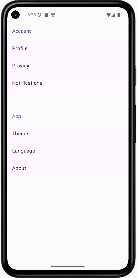
Sectioned List with Headers
Sectioned lists help you organize related items together, making it easier for users to find what they need. Think of a grocery store with aisles for "Produce," "Dairy," and "Snacks." Each aisle is a section header, and the items are grouped underneath.
Example: Settings Screen with Sections
@Composable
fun SectionedSettingsList() {
    val settings = listOf(
        SettingsSection(
            "Account",
            listOf(
                SettingItem("Profile"),
                SettingItem("Privacy"),
                SettingItem("Notifications")
            )
        ),
        SettingsSection(
            "App",
            listOf(
                SettingItem("Theme"),
                SettingItem("Language"),
                SettingItem("About")
            )
        )
    )

    LazyColumn {
        settings.forEach { section ->
            item {
                Text(
                    text = section.title,
                    style = MaterialTheme.typography.titleMedium,
                    modifier = Modifier.padding(16.dp),
                    color = MaterialTheme.colorScheme.primary
                )
            }
            items(section.items) { item ->
                ListItem(
                    headlineContent = { Text(item.title) },
                    modifier = Modifier.clickable { /* Handle click */ }
                )
            }
            item {
                Divider(modifier = Modifier.padding(horizontal = 16.dp))
            }
        }
    }
}

// Data classes for the example
data class SettingsSection(val title: String, val items: List)
data class SettingItem(val title: String)
This example builds a settings screen that is grouped into sections. Instead of one long unorganized list, related options are placed under clear headers such as Account and App.
How the code works (step by step)
- Create structured data first: the
settingslist containsSettingsSectionobjects, and each section has a title and a list of items. - Render with LazyColumn:
LazyColumnonly composes visible rows, which keeps long lists efficient. - Add a section header row: inside
item { ... }, the section title is shown with larger text and theme color to separate groups visually. - Render items inside each section:
items(section.items)loops through each setting and creates aListItem. - Make rows interactive:
Modifier.clickablemarks each setting row as tappable for navigation or actions. - Insert visual separators: a
Dividerafter each section helps users quickly scan where one group ends and the next begins.
Why this pattern matters: Grouped lists reduce cognitive load. Users can find settings faster because related actions are clustered in predictable places.
How this example renders
Above is just a snippet of the code to view the full code, you need to go to my GitHub page and look at the chapter14 cl_screen_sections.kt file.
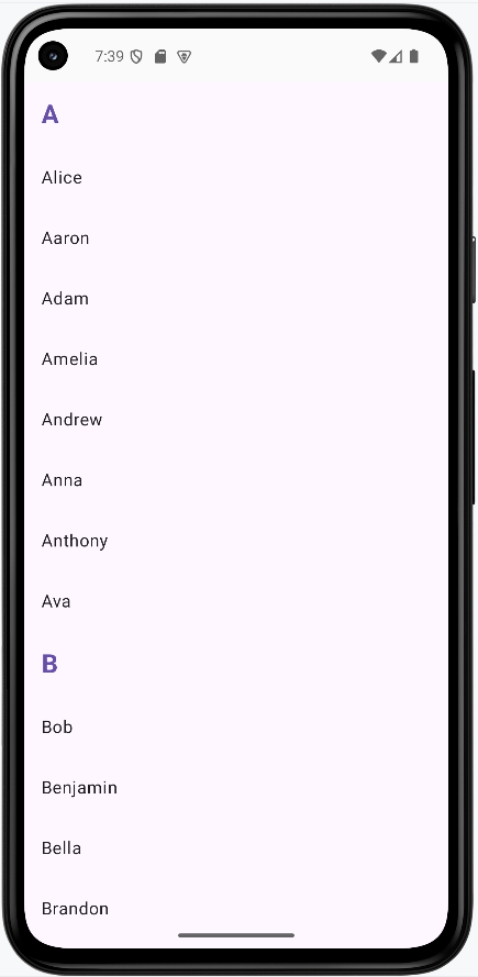
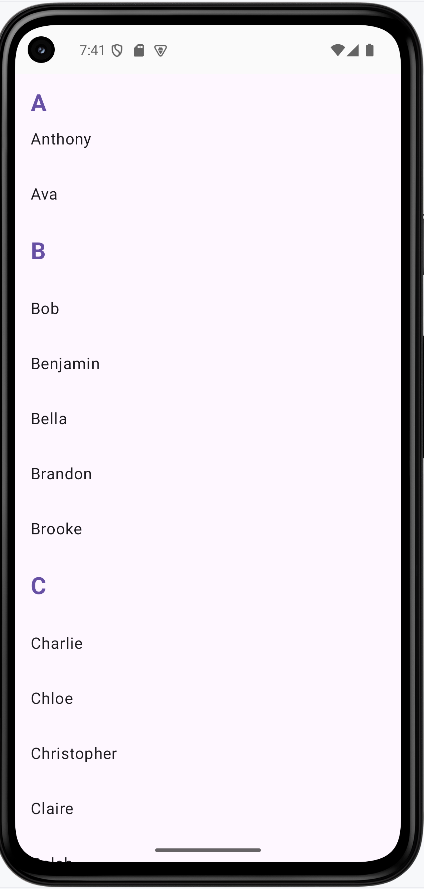
Sticky Headers in a Contact List
Sticky headers keep group labels visible as you scroll through long lists. Imagine a contacts app where the letter "A" stays at the top as you scroll through all the "A" names, then "B" takes its place when you reach the "B" section.
Example: Contacts with Sticky Letter Headers
@Composable
fun ContactListWithStickyHeaders() {
    val contacts = listOf(
        Contact("Alice"),
        Contact("Aaron"),
        Contact("Bob"),
        Contact("Charlie"),
        Contact("David"),
        Contact("Eve")
    ).groupBy { it.name.first().uppercase() }//This creates a map of the contacts by their first letter

    LazyColumn {
        contacts.forEach { (letter, contactList) ->//This iterates through the map where letter is the key and contactList is the value
            stickyHeader {
                Surface(
                    color = MaterialTheme.colorScheme.surface,
                    modifier = Modifier.fillMaxWidth()
                ) {
                    Text(
                        text = letter,
                        style = MaterialTheme.typography.titleMedium,
                        modifier = Modifier.padding(16.dp),
                        color = MaterialTheme.colorScheme.primary
                    )
                }
            }
            items(contactList) { contact ->
                ListItem(
                    headlineContent = { Text(contact.name) },
                    modifier = Modifier.clickable { /* Handle contact selection */ }
                )
            }
        }
    }
}

// Data class for the example
data class Contact(val name: String)
This example shows how to keep section labels visible while scrolling. As the user moves through names, the current letter stays pinned at the top until the next letter section reaches it.
How the code works (step by step)
- Build sample contacts: a list of
Contactobjects is created with names. - Group by first letter:
groupBy { it.name.first().uppercase() }turns the list into a map where keys are letters (A, B, C...) and values are lists of contacts in that group. - Iterate over each group:
contacts.forEach { (letter, contactList) -> ... }gives access to one letter and its matching contacts at a time. - Create sticky group headers:
stickyHeader { ... }defines content that stays pinned at the top during scrolling. - Style the header for readability:
Surface,fillMaxWidth(), and themed text make the letter header clear and full-width. - Render contacts under each header:
items(contactList)creates oneListItemper contact name.
Why this pattern matters: Sticky headers preserve context in long lists. Users always know which group they are currently browsing.
How this example renders
Above is just a snippet of the code to view the full code, you need to go to my GitHub page and look at the chapter14 cl_stickyHeaders.kt file.
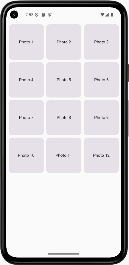
Grid List for a Photo Gallery
Grids are perfect for showing lots of items at once, like photos or products. Think of a photo gallery app where each image is a square in a grid, making it easy to browse many at a time.
Example: Simple Photo Gallery Grid
@Composable
fun PhotoGallery() {
    val photos = List(12) { "Photo ${it + 1}" }

    LazyVerticalGrid(
        columns = GridCells.Fixed(3),
        contentPadding = PaddingValues(8.dp),
        horizontalArrangement = Arrangement.spacedBy(8.dp),
        verticalArrangement = Arrangement.spacedBy(8.dp)
    ) {
        items(photos) { photo ->
            Card(
                modifier = Modifier
                    .aspectRatio(1f)
                    .clickable { /* Handle photo selection */ }
            ) {
                Box(
                    modifier = Modifier
                        .fillMaxSize(),
                    contentAlignment = Alignment.Center
                ) {
                    Text(
                        text = photo,
                        style = MaterialTheme.typography.bodyMedium
                    )
                }
            }
        }
    }
}
This example creates a gallery-style screen with a fixed 3-column grid. Each item is shown as a square card, making the layout compact and visually consistent.
How the code works (step by step)
- Create data:
List(12) { "Photo ${it + 1}" }generates 12 labels to simulate photo entries. - Use LazyVerticalGrid: this is the grid version of lazy lists; it only composes visible items for better performance.
- Set grid columns:
GridCells.Fixed(3)forces exactly three columns across the screen. - Control spacing:
contentPaddingadds outer margin, whilehorizontalArrangementandverticalArrangementset gaps between cards. - Render each grid cell:
items(photos)loops through photo labels and builds oneCardper item. - Keep each card square:
aspectRatio(1f)ensures width and height stay equal. - Center content inside card: a
BoxwithcontentAlignment = Alignment.Centerplaces label text in the middle. - Support interaction:
Modifier.clickableon each card allows opening a detail view or full image later.
Why this pattern matters: Grids maximize screen usage for visual collections such as images, products, and media thumbnails.
How this example renders
Above is just a snippet of the code to view the full code, you need to go to my GitHub page and look at the chapter14 cl_grid.kt file.
Tips for Success
- Use sectioned lists to group related items and make your UI easier to scan.
- Sticky headers are great for long, grouped lists like contacts or music libraries.
- Grids are perfect for showing lots of items at once, like photos or products.
- Test your lists with different amounts of data to make sure they look good and scroll smoothly.
- Keep your code simple and add features one at a time as you get comfortable.