Navigation UI Components
Introduction to Navigation UI
Navigation UI components are the visual elements that help users move around your app. Think of them like signs and doors in a building - they show users where they can go and how to get there. In this lesson, we'll learn about two common navigation UI components:
| Component | Where It Goes | What It's For | When to Use |
|---|---|---|---|
| Top App Bar | Top of the screen | Show app title and important actions | App-wide actions, context, or navigation. Note the or navigation part. |
| Bottom Navigation Bar | Bottom of the screen | Switch between main app sections | 3-5 top-level destinations |
What is Scaffold?
Scaffold is a layout in Jetpack Compose that gives your screen a standard structure: a place for a top bar, an optional bottom bar, and a large area in the middle for your main content. You don’t have to figure out where each part goes—Scaffold does that. You pass in the top bar (and bottom bar if you have one), and you put your main content in a block (a lambda). Scaffold also passes paddingValues into that block so you can add padding to your content and keep it from drawing underneath the bars.
In the example below, MainScreen uses Scaffold to show a top navigation bar and the main content. The main content is everything you put inside the content block. Here, that’s the NavHost. The NavHost is what actually shows your screens—HomeScreen, ProfileScreen, and SettingsScreen—depending on the current route. So in this code, the “main content” is the NavHost and the screen that’s currently visible inside it. Scaffold’s job is to put the top bar above that content and to give you paddingValues so the content doesn’t sit under the bar.
Here’s the same idea in terms of the code:
topBar = { TopNavigationBar(navController) }— This is the top bar. Scaffold draws it at the top of the screen.- The block
{ paddingValues -> ... }is the content block. Whatever you put here is the main content. Here we put theNavHost. - Inside the content block we use
Modifier.padding(paddingValues)on the NavHost. That applies the padding Scaffold provides so the NavHost (and the Home, Profile, or Settings screen inside it) is drawn below the top bar instead of underneath it.
@Composable
fun MainScreen() {
    val navController = rememberNavController()

    Scaffold(
        topBar = { TopNavigationBar(navController) }
    ) { paddingValues ->
        NavHost(
            navController = navController,
            startDestination = NavigationRoutes.HOME,
            modifier = Modifier.padding(paddingValues)
        ) {
            composable(NavigationRoutes.HOME) { HomeScreen() }
            composable(NavigationRoutes.PROFILE) { ProfileScreen() }
            composable(NavigationRoutes.SETTINGS) { SettingsScreen() }
        }
    }
}
So: the main content is the NavHost and the screens it displays (HomeScreen, ProfileScreen, SettingsScreen). Scaffold places the top bar above that content and gives you paddingValues so the content stays visible below the bar.
Top App Bar
The Top App Bar (also called Action Bar) is like a header that stays at the top of your screen. It's great for showing the current screen title and navigation actions.
// NavigationRoutes.kt
    object NavigationRoutes {
        const val HOME = "home"
        const val PROFILE = "profile"
        const val SETTINGS = "settings"
    }

    // TopNavigation.kt
@OptIn(ExperimentalMaterial3Api::class)
@Composable
fun TopNavigationBar(navController: NavController) {
    val currentRoute = navController.currentBackStackEntryAsState().value?.destination?.route

    TopAppBar(
        title = { Text("Top Navigation Bar") },
        colors = TopAppBarDefaults.topAppBarColors(
            containerColor = MaterialTheme.colorScheme.primaryContainer,
            titleContentColor = MaterialTheme.colorScheme.onPrimaryContainer
        ),
        actions = {
            IconButton(onClick = {
                navController.navigate(NavigationRoutes.HOME) { launchSingleTop = true }
            }) {
                Icon(
                    imageVector = Icons.Filled.Home,
                    contentDescription = "Home",
                    tint = if (currentRoute == NavigationRoutes.HOME) MaterialTheme.colorScheme.primary else MaterialTheme.colorScheme.onPrimaryContainer
                )
            }
            IconButton(onClick = {
                navController.navigate(NavigationRoutes.PROFILE) { launchSingleTop = true }
            }) {
                Icon(
                    imageVector = Icons.Filled.Person,
                    contentDescription = "Profile",
                    tint = if (currentRoute == NavigationRoutes.PROFILE) MaterialTheme.colorScheme.primary else MaterialTheme.colorScheme.onPrimaryContainer
                )
            }
            IconButton(onClick = {
                navController.navigate(NavigationRoutes.SETTINGS) { launchSingleTop = true }
            }) {
                Icon(
                    imageVector = Icons.Filled.Settings,
                    contentDescription = "Settings",
                    tint = if (currentRoute == NavigationRoutes.SETTINGS) MaterialTheme.colorScheme.primary else MaterialTheme.colorScheme.onPrimaryContainer
                )
            }
        }
    )
}

    // MainScreen.kt
    @Composable
    fun MainScreen() {
        val navController = rememberNavController()

        Scaffold(
            topBar = { TopNavigationBar(navController) }
        ) { paddingValues ->
            NavHost(
                navController = navController,
                startDestination = NavigationRoutes.HOME,
                modifier = Modifier.padding(paddingValues)
            ) {
                composable(NavigationRoutes.HOME) { HomeScreen() }
                composable(NavigationRoutes.PROFILE) { ProfileScreen() }
                composable(NavigationRoutes.SETTINGS) { SettingsScreen() }
            }
        }
    }
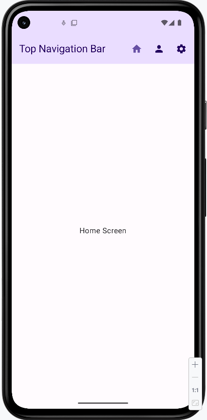
How the Top App Bar works:
- The top app bar is like a header at the top of your screen that shows your app's name and navigation buttons
- It's different from the bottom navigation bar because it's meant for app-level actions and showing where you are in the app
- In the code, we use
topBarin theScaffoldto put it at the top of the screen - It can show a back button when you're not on the home screen
- While it can have navigation buttons, its main job is to show your app's title and important actions
How this example renders
Above is just a snippet of the code to view the full code, you need to go to my GitHub page and look at the chapter9 topNavBar.kt file.
Bottom Navigation Bar
The bottom navigation bar is perfect for switching between the main sections of your app. It's like having a row of buttons at the bottom of the screen that take you to different places.
/ NavigationRoutes.kt
object NavigationRoutes {
const val HOME = "home"
const val PROFILE = "profile"
const val SETTINGS = "settings"
}
// BottomNavigation.kt
@Composable
fun BottomNavigationBar(navController: NavController) {
val currentRoute = navController.currentBackStackEntryAsState().value?.destination?.route
NavigationBar {
NavigationBarItem(
icon = { Icon(Icons.Filled.Home, contentDescription = "Home") },
label = { Text("Home") },
selected = currentRoute == NavigationRoutes.HOME,
onClick = {
navController.navigate(NavigationRoutes.HOME) {
launchSingleTop = true
}
}
)
NavigationBarItem(
icon = { Icon(Icons.Filled.Person, contentDescription = "Profile") },
label = { Text("Profile") },
selected = currentRoute == NavigationRoutes.PROFILE,
onClick = {
navController.navigate(NavigationRoutes.PROFILE) {
launchSingleTop = true
}
}
)
NavigationBarItem(
icon = { Icon(Icons.Filled.Settings, contentDescription = "Settings") },
label = { Text("Settings") },
selected = currentRoute == NavigationRoutes.SETTINGS,
onClick = {
navController.navigate(NavigationRoutes.SETTINGS) {
launchSingleTop = true
}
}
)
}
}
// MainScreen.kt
@Composable
fun MainScreen() {
val navController = rememberNavController()
Scaffold(
bottomBar = { BottomNavigationBar(navController) }
) { paddingValues ->
NavHost(
navController = navController,
startDestination = NavigationRoutes.HOME,
modifier = Modifier.padding(paddingValues)
) {
composable(NavigationRoutes.HOME) { HomeScreen() }
composable(NavigationRoutes.PROFILE) { ProfileScreen() }
composable(NavigationRoutes.SETTINGS) { SettingsScreen() }
}
}
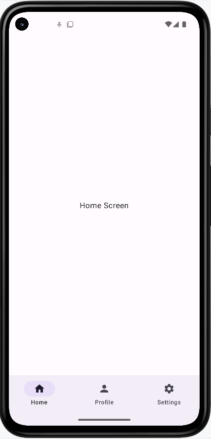
}How Bottom Navigation Works:
- Think of the bottom navigation bar like a row of buttons at the bottom of your screen that let you jump to different parts of your app
- Each button (called a
NavigationBarItem) has an icon and a label to show what it does - The current section you're on will be highlighted automatically
- It's perfect for apps with 3-5 main sections (like Home, Profile, Settings)
- In the code, we use
bottomBarin theScaffoldto put it at the bottom of the screen
How this example renders
Above is just a snippet of the code to view the full code, you need to go to my GitHub page and look at the chapter9 bottomNavBar.kt file.
Bottom Navigation vs Top App Bar: What's the Difference?
- Where they go:
- Bottom Navigation Bar goes at the bottom of your screen
- Top App Bar goes at the top of your screen
- What they're for:
- Bottom Navigation Bar is for switching between the main parts of your app (like Home, Profile, Settings)
- Top App Bar is for showing your app's name and important actions at the top
- When to use each:
- Use Bottom Navigation when you want users to easily switch between main sections of your app
- Use Top App Bar when you want to show the app name and important actions at the top of the screen
Where Do the Icons Come From?
In our examples, we use icons from the Material Icons library. These are built into Android and easy to use. Here's how we get them:
// Import the icons we want to use
import androidx.compose.material.icons.Icons
import androidx.compose.material.icons.filled.Home
import androidx.compose.material.icons.filled.Person
import androidx.compose.material.icons.filled.Settings

// Then use them in our code
Icon(Icons.Filled.Home, contentDescription = "Home")
Icon(Icons.Filled.Person, contentDescription = "Profile")
Icon(Icons.Filled.Settings, contentDescription = "Settings")
Some things to know about Material Icons:
- They're free to use and come with Android
- There are many icons to choose from (like Home, Settings, Person, etc.)
- You can find all available icons in Android Studio by typing
Icons.Filled.and looking at the suggestions - Always include a
contentDescriptionfor accessibility
Tips for Success
- Choose the right navigation component for your app's needs
- Keep navigation consistent throughout your app
- Use clear icons and labels
- Test navigation on different screen sizes
Common Mistakes to Avoid
- Using too many navigation components at once
- Unclear icons or labels
- Inconsistent navigation patterns
- Not handling back navigation properly