Row Layout
Imagine you're arranging pictures on a wall - if you put them side by side, that's exactly what a Row does in your app! While a Column stacks things from top to bottom (like a stack of books), a Row puts things next to each other from left to right (like books on a shelf). You'll use Row when you want things to sit next to each other - like putting an icon next to some text, or creating a row of buttons.
In this lesson, we'll explore how to use the Row layout effectively in your Android apps. You'll learn how to create basic rows, add spacing between items, align items vertically, and create beautiful, user-friendly interfaces.
Quick Reference Table
| Property | Description | When to Use |
|---|---|---|
| modifier | Controls appearance and behavior | When you need to style or position the row |
| horizontalArrangement | Controls spacing between items | When you need to adjust horizontal spacing |
| verticalAlignment | Controls vertical alignment of items | When you need to align items vertically |
Let's Start Simple: A Basic Row
When to Use
- When you need to arrange elements horizontally
- When creating navigation bars or toolbars
- When displaying items side by side
- When you want to create a horizontal list of options
Practical Example
@Composable
fun RowExample() {
    Row(
        modifier = Modifier
            .padding(16.dp)  // Outer padding
            .border(width = 1.dp, color = Color.Blue)  // Add a border
            .padding(16.dp)  // Inner padding between elements and border
    ) {
        Text("First")
        Text("Second")
        Text("Third")
        Text("Fourth")
        Text("Fifth")
    }
}
What's happening here?
- We create a row with some space around it (that's what padding does - like margins in a notebook)
- We add a blue border so we can see where our row is (like drawing a box around our words)
- We put five words inside: "First", "Second", "Third", "Fourth", and "Fifth"
Adding Space Between Items
When to Use
- When you need consistent spacing between items
- When you want to create a more readable layout
- When you need to separate different sections of content
- When you want to create a more visually appealing design
Using Spacers (Like Adding Invisible Bookends)
This is one way to add space between items. Using Spacer composables between items when you want different amounts of space in different places. For example:
@Composable
fun RowWithSpacer() {
    Row(modifier = Modifier.padding(16.dp)) {
        Text("First")
        Spacer(modifier = Modifier.width(10.dp))  // Add 10dp of space
        Text("Second")
        Spacer(modifier = Modifier.width(10.dp))  // Add 10dp of space
        Text("Third")
        Spacer(modifier = Modifier.width(10.dp))  // Add 10dp of space
        Text("Fourth")
        Spacer(modifier = Modifier.width(10.dp))  // Add 10dp of space
        Text("Fifth")
    }
}
Here, we're adding invisible spacers between our words. Each spacer is exactly 10dp wide (dp is just a measurement unit - like inches or centimeters, but for screens).
Spreading Things Out Automatically
This is another way to add space between items. Using Arrangement.SpaceBetween to spread items evenly across the row. For example:
@Composable
fun RowWithArrangement() {
    Row(
        modifier = Modifier
            .fillMaxWidth()  // Make the row as wide as the screen
            .padding(16.dp),  // Add space around the row
        horizontalArrangement = Arrangement.SpaceBetween  // Spread items evenly
    ) {
        Text("First")
        Text("Second")
        Text("Third")
        Text("Fourth")
        Text("Fifth")
    }
}
This time, instead of adding specific spaces, we tell the row to spread things out evenly across the whole width. It's like telling five people to spread out equally across a room!
Making Things Line Up Vertically
When to Use
- When you want to align items at the top, middle, or bottom
- When creating a more polished, professional look
- When you need to create a balanced, symmetrical layout
- When you want to create a more visually appealing design
Lining Things Up
In these examples, we make the row 100dp tall.
Top Alignment
@Composable
fun RowTopAlignment() {
    Row(
        modifier = Modifier
            .height(100.dp)  // Set the height of the row
            .fillMaxWidth()  // Make the row as wide as the screen
            .border(width = 1.dp, color = Color.Blue)  // Add a border
            .padding(16.dp),  // Add space around the row
        verticalAlignment = Alignment.Top  // Align items at the top
    ) {
        Text("First")
        Spacer(modifier = Modifier.width(16.dp))  // Add space between items
        Text("Second")
        Spacer(modifier = Modifier.width(16.dp))
        Text("Third")
        Spacer(modifier = Modifier.width(16.dp))
        Text("Fourth")
        Spacer(modifier = Modifier.width(16.dp))
        Text("Fifth")
    }
}
What this does: The row is 100 dp tall with a blue border. verticalAlignment = Alignment.Top pulls all the text and spacers to the top of that row, so "First," "Second," "Third," "Fourth," and "Fifth" sit on the top edge instead of in the middle or bottom.
Center Alignment
@Composable
fun RowCenterAlignment() {
    Row(
        modifier = Modifier
            .height(100.dp)  // Set the height of the row
            .fillMaxWidth()  // Make the row as wide as the screen
            .border(width = 1.dp, color = Color.Blue)  // Add a border
            .padding(16.dp),  // Add space around the row
        verticalAlignment = Alignment.CenterVertically  // Align items in the center
    ) {
        Text("First")
        Spacer(modifier = Modifier.width(16.dp))  // Add space between items
        Text("Second")
        Spacer(modifier = Modifier.width(16.dp))
        Text("Third")
        Spacer(modifier = Modifier.width(16.dp))
        Text("Fourth")
        Spacer(modifier = Modifier.width(16.dp))
        Text("Fifth")
    }
}
What this does: Same row size and border, but verticalAlignment = Alignment.CenterVertically centers all the items vertically inside the row. The five words and the spacers between them sit in the middle of the 100 dp height.
Bottom Alignment
@Composable
fun RowBottomAlignment() {
    Row(
        modifier = Modifier
            .height(100.dp)  // Set the height of the row
            .fillMaxWidth()  // Make the row as wide as the screen
            .border(width = 1.dp, color = Color.Blue)  // Add a border
            .padding(16.dp),  // Add space around the row
        verticalAlignment = Alignment.Bottom  // Align items at the bottom
    ) {
        Text("First")
        Spacer(modifier = Modifier.width(16.dp))  // Add space between items
        Text("Second")
        Spacer(modifier = Modifier.width(16.dp))
        Text("Third")
        Spacer(modifier = Modifier.width(16.dp))
        Text("Fourth")
        Spacer(modifier = Modifier.width(16.dp))
        Text("Fifth")
    }
}
What this does: Same row again, but verticalAlignment = Alignment.Bottom pushes all the items to the bottom of the row. The five words sit on the bottom edge of the 100 dp tall row.
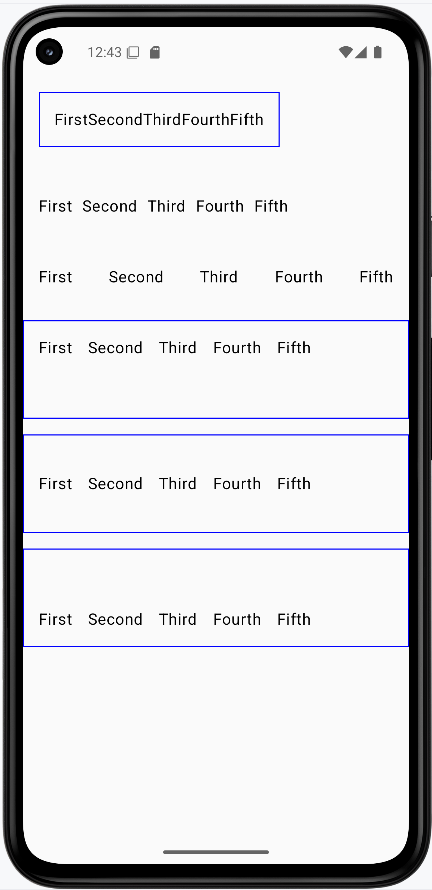
How these examples render
The image below shows what the row examples look like when you run them: a basic row of five words, a row with spacers between items, a row with items spread across the width, and the three alignment variants (top, center, bottom). The snippets above are only part of the code; to see and run the full project, go to my GitHub page and open the chapter4 row_code.kt file.
Tips for Success
- Start with simple rows and build up to more complex ones
- Use the Compose Preview feature to see your rows as you build them
- Use modifiers to fine-tune the appearance and positioning of your rows
- Test your rows on different screen sizes and orientations
- Use the Compose documentation and samples as reference
- Break down complex rows into smaller, reusable components
Common Mistakes to Avoid
- Creating overly complex rows that are hard to maintain
- Not using modifiers to control the appearance and positioning of rows
- Not considering different screen sizes and orientations
- Not using the Compose Preview feature to check your rows
- Not following Material Design guidelines for consistency
- Not breaking down complex rows into smaller, reusable components
Best Practices
- Keep rows simple and focused on a single responsibility
- Use meaningful names for your row composables
- Extract reusable row components into separate composables
- Use the Compose Preview feature to iterate quickly
- Follow Material Design guidelines for a consistent look
- Test your rows with different screen sizes and orientations