Adding Space
Introduction
Have you ever looked at a webpage or app and thought, "This looks too crowded!" or "These elements are too far apart!"? That's where spacing comes in! In Jetpack Compose, we have two powerful tools to control the space between elements: Spacer and Arrangement. Think of them like the spacing tools in a word processor - they help you create layouts that are easy to read and use.
Quick Reference
| Tool | Description | Common Use |
|---|---|---|
| Spacer | Creates flexible space between specific elements | Custom spacing, uneven gaps |
| Arrangement | Controls spacing between all elements in a layout | Consistent spacing, equal gaps |
When to Use Each Tool
- Use Spacer when:
- You need different amounts of space between elements
- You want precise control over specific gaps
- You're working with a small number of elements
- Use Arrangement when:
- You want equal spacing between all elements
- You're working with many elements
- You want to maintain consistent spacing automatically
Common Options
| Option | What It Does | When to Use It |
|---|---|---|
| Spacer with height | Creates vertical space in Columns | Adding gaps between stacked elements |
| Spacer with width | Creates horizontal space in Rows | Adding gaps between side-by-side elements |
| Arrangement.spacedBy() | Adds equal space between all elements | Creating consistent spacing in lists or grids |
Using Spacer
Let's look at how to use Spacer to create custom spacing between elements:
@Composable
fun SpacerExample() {
    Column(modifier = Modifier.padding(16.dp)) {
        Text("Item 1")
        Spacer(modifier = Modifier.height(16.dp))  // Adds 16dp of vertical space
        Text("Item 2")
        Spacer(modifier = Modifier.height(32.dp))  // Adds 32dp of vertical space
        Text("Item 3")
    }
}
What This Example Is Doing
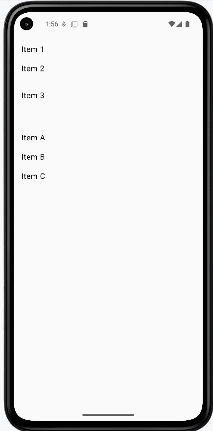
SpacerExample shows a column with three lines of text: "Item 1," "Item 2," and "Item 3." Between "Item 1" and "Item 2" there is a Spacer(modifier = Modifier.height(16.dp)), so 16 density-independent pixels of vertical space. Between "Item 2" and "Item 3" there is a Spacer of 32 dp. So you get different gaps in different places—useful when you want one section more spaced out than another.
Using Arrangement
Here's how to use Arrangement to create consistent spacing between all elements:
@Composable
fun ArrangementExample() {
    Column(
        modifier = Modifier
            .padding(16.dp)
            .fillMaxWidth(),
        verticalArrangement = Arrangement.spacedBy(16.dp)  // Adds 16dp between all items
    ) {
        Text("Item A")
        Text("Item B")
        Text("Item C")
    }
}
What This Example Is Doing
ArrangementExample shows a column with three lines: "Item A," "Item B," and "Item C." The column uses verticalArrangement = Arrangement.spacedBy(16.dp), so Compose automatically puts 16 dp of space between every pair of items. You don't add any Spacers—the layout handles it. Good for lists or any place where you want the same gap between all items.
How these examples render
The image below shows what the spacing examples look like when you run them: the column with custom gaps (16 dp and 32 dp) from Spacers, and the column with even 16 dp spacing from Arrangement.spacedBy(16.dp). The snippets above are only part of the code; to see and run the full project, go to my GitHub page and open the chapter5 spacer_code.kt file.
Tips for Success
- Start with
Arrangementfor consistent spacing - Use
Spacerwhen you need custom spacing between specific elements - Consider using both tools together for complex layouts
- Test your spacing on different screen sizes
Common Mistakes to Avoid
- Using too many
Spacers whenArrangementwould be simpler - Forgetting to add padding around your layout
- Using inconsistent spacing values
- Not considering how spacing affects touch targets
Best Practices
- Use standard spacing values (8dp, 16dp, 24dp, 32dp) for consistency
- Consider accessibility when spacing touch targets
- Use
Arrangementfor lists and grids - Test your layout with different content lengths