Custom Composable Components
What are Custom Composable Components?
Think of custom composable components like building your own LEGO pieces. Instead of always using the standard blocks that come with the set, you can create your own special pieces that do exactly what you need. Custom components let you build reusable UI elements that match your app's design and functionality perfectly.
Custom composable components are like creating your own building blocks for your app. They help you avoid repeating the same code, make your app more organized, and create consistent user experiences across your entire application.
Quick Reference
| Component Type | Description | When to Use |
|---|---|---|
| Simple Components | Basic UI elements with custom styling | Custom buttons, cards, or text styles |
| Complex Components | Multi-part components with state | Custom forms, dialogs, or data displays |
| Reusable Components | Components used throughout your app | Common UI patterns, theme elements |
| Composable Functions | Functions that return composable content | Any custom UI element you want to reuse |
When to Create Custom Components
Create Custom Components When:
- You find yourself repeating the same UI code multiple times
- You want to ensure consistent styling across your app
- You need to encapsulate complex UI logic
- You want to make your code more readable and maintainable
- You're building a design system for your app
- You need to create reusable UI patterns
Benefits of Custom Components
- Reduces code duplication and makes maintenance easier
- Ensures consistent design across your app
- Makes your code more readable and organized
- Allows for easy updates and changes
- Improves testing and debugging
- Makes your app more modular and scalable
Common Component Patterns
| Pattern | What It Does | When to Use It |
|---|---|---|
| @Composable Function | Creates a reusable UI component | For any custom UI element |
| Parameters | Makes components configurable | When you need different variations |
| Modifier Parameter | Allows external styling customization | When you want flexible styling |
| State Management | Handles component's internal state | For interactive components |
Practical Examples
Simple Custom Button
@Composable
fun CustomButton(
    text: String,
    onClick: () -> Unit,
    modifier: Modifier = Modifier,
    enabled: Boolean = true
) {
    Button(
        onClick = onClick,
        modifier = modifier,
        enabled = enabled,
        colors = ButtonDefaults.buttonColors(
            containerColor = MaterialTheme.colorScheme.primary,
            contentColor = MaterialTheme.colorScheme.onPrimary
        ),
        shape = RoundedCornerShape(8.dp)
    ) {
        Text(
            text = text,
            style = MaterialTheme.typography.labelLarge
        )
    }
}

// Using the custom button
CustomButton(
    text = "Click Me",
    onClick = { /* Handle click */ },
    modifier = Modifier.padding(16.dp)
)
This creates a custom button with consistent styling. You can use it throughout your app to ensure all buttons look the same. The parameters make it flexible for different use cases.
Custom Card Component
@Composable
fun InfoCard(
    title: String,
    description: String,
    icon: ImageVector,
    onClick: (() -> Unit)? = null,
    modifier: Modifier = Modifier
) {
    Card(
        modifier = modifier
            .fillMaxWidth()
            .then(
                if (onClick != null) {
                    Modifier.clickable { onClick() }
                } else {
                    Modifier
                }
            ),
        elevation = CardDefaults.cardElevation(defaultElevation = 4.dp)
    ) {
        Row(
            modifier = Modifier.padding(16.dp),
            verticalAlignment = Alignment.CenterVertically
        ) {
            Icon(
                imageVector = icon,
                contentDescription = null,
                tint = MaterialTheme.colorScheme.primary,
                modifier = Modifier.size(24.dp)
            )

            Spacer(modifier = Modifier.width(16.dp))

            Column {
                Text(
                    text = title,
                    style = MaterialTheme.typography.titleMedium
                )
                Text(
                    text = description,
                    style = MaterialTheme.typography.bodyMedium,
                    color = MaterialTheme.colorScheme.onSurfaceVariant
                )
            }
        }
    }
}

// Using the custom card
InfoCard(
    title = "Weather",
    description = "Partly cloudy, 72°F",
    icon = Icons.Default.Cloud,
    onClick = { /* Navigate to weather */ }
)
This creates a reusable card component with an icon, title, and description. The optional onClick parameter makes it flexible for both clickable and non-clickable cards.
Custom Loading Component
@Composable
fun LoadingSpinner(
    message: String = "Loading...",
    modifier: Modifier = Modifier
) {
    Column(
        modifier = modifier,
        horizontalAlignment = Alignment.CenterHorizontally,
        verticalArrangement = Arrangement.Center
    ) {
        CircularProgressIndicator(
            modifier = Modifier.size(48.dp),
            color = MaterialTheme.colorScheme.primary
        )

        Spacer(modifier = Modifier.height(16.dp))

        Text(
            text = message,
            style = MaterialTheme.typography.bodyLarge,
            color = MaterialTheme.colorScheme.onSurfaceVariant
        )
    }
}

// Using the loading component
LoadingSpinner(
    message = "Fetching data...",
    modifier = Modifier.fillMaxSize()
)
This creates a reusable loading component that you can use anywhere in your app. It provides consistent loading feedback with customizable messages.
Custom Form Input Component
@Composable
fun CustomTextField(
    value: String,
    onValueChange: (String) -> Unit,
    label: String,
    modifier: Modifier = Modifier,
    isError: Boolean = false,
    errorMessage: String? = null,
    keyboardOptions: KeyboardOptions = KeyboardOptions.Default,
    singleLine: Boolean = true
) {
    Column(modifier = modifier) {
        OutlinedTextField(
            value = value,
            onValueChange = onValueChange,
            label = { Text(label) },
            isError = isError,
            keyboardOptions = keyboardOptions,
            singleLine = singleLine,
            modifier = Modifier.fillMaxWidth()
        )

        if (isError && errorMessage != null) {
            Text(
                text = errorMessage,
                color = MaterialTheme.colorScheme.error,
                style = MaterialTheme.typography.bodySmall,
                modifier = Modifier.padding(start = 16.dp, top = 4.dp)
            )
        }
    }
}

// Using the custom text field
var email by remember { mutableStateOf("") }
var emailError by remember { mutableStateOf(false) }

CustomTextField(
    value = email,
    onValueChange = { email = it },
    label = "Email",
    isError = emailError,
    errorMessage = if (emailError) "Please enter a valid email" else null,
    keyboardOptions = KeyboardOptions(
        keyboardType = KeyboardType.Email
    )
)
This creates a custom text field component with built-in error handling. It includes validation feedback and can be easily reused throughout your app.
Complex Custom Component with State
@Composable
fun ExpandableCard(
    title: String,
    content: String,
    modifier: Modifier = Modifier
) {
    var expanded by remember { mutableStateOf(false) }

    Card(
        modifier = modifier.fillMaxWidth(),
        elevation = CardDefaults.cardElevation(defaultElevation = 2.dp)
    ) {
        Column(modifier = Modifier.padding(16.dp)) {
            Row(
                modifier = Modifier.fillMaxWidth(),
                horizontalArrangement = Arrangement.SpaceBetween,
                verticalAlignment = Alignment.CenterVertically
            ) {
                Text(
                    text = title,
                    style = MaterialTheme.typography.titleMedium
                )

                IconButton(onClick = { expanded = !expanded }) {
                    Icon(
                        imageVector = if (expanded) Icons.Default.ExpandLess else Icons.Default.ExpandMore,
                        contentDescription = if (expanded) "Collapse" else "Expand"
                    )
                }
            }

            AnimatedVisibility(
                visible = expanded,
                enter = expandVertically() + fadeIn(),
                exit = shrinkVertically() + fadeOut()
            ) {
                Text(
                    text = content,
                    style = MaterialTheme.typography.bodyMedium,
                    modifier = Modifier.padding(top = 8.dp)
                )
            }
        }
    }
}

// Using the expandable card
ExpandableCard(
    title = "How to use this app",
    content = "This app helps you organize your tasks and stay productive. Tap the + button to add new tasks, and swipe to delete completed ones."
)
This creates a complex component with internal state management. It handles its own expansion/collapse behavior and includes smooth animations.
Creating a Component Library
// Create a file called MyComponents.kt
object MyComponents {
    @Composable
    fun PrimaryButton(
        text: String,
        onClick: () -> Unit,
        modifier: Modifier = Modifier
    ) {
        Button(
            onClick = onClick,
            modifier = modifier,
            colors = ButtonDefaults.buttonColors(
                containerColor = MaterialTheme.colorScheme.primary
            )
        ) {
            Text(text)
        }
    }

    @Composable
    fun SecondaryButton(
        text: String,
        onClick: () -> Unit,
        modifier: Modifier = Modifier
    ) {
        OutlinedButton(
            onClick = onClick,
            modifier = modifier
        ) {
            Text(text)
        }
    }

    @Composable
    fun InfoBox(
        title: String,
        message: String,
        modifier: Modifier = Modifier
    ) {
        Card(
            modifier = modifier,
            colors = CardDefaults.cardColors(
                containerColor = MaterialTheme.colorScheme.surfaceVariant
            )
        ) {
            Column(modifier = Modifier.padding(16.dp)) {
                Text(
                    text = title,
                    style = MaterialTheme.typography.titleSmall
                )
                Text(
                    text = message,
                    style = MaterialTheme.typography.bodyMedium
                )
            }
        }
    }
}

// Using components from the library
MyComponents.PrimaryButton(
    text = "Save",
    onClick = { /* Save action */ }
)

MyComponents.InfoBox(
    title = "Note",
    message = "Your changes have been saved successfully."
)
This shows how to create a component library that organizes all your custom components in one place. This makes it easy to maintain consistency and reuse components across your app.
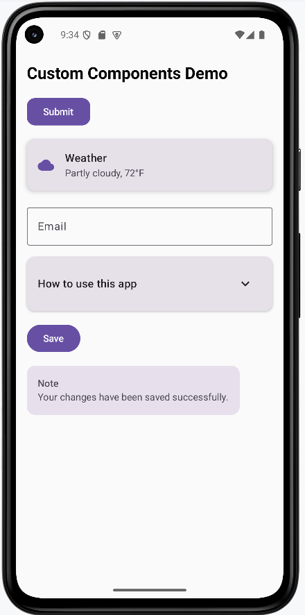
How the Examples Render
I created one example that combines all the custom components into one screen. You can view the full code on my GitHub page and look at the chapter14 customComponents.kt file.
To run this exmaple you will need to add the follwing to your libs.version.toml file in the [Libraries] section:
compose-material-icons-extended = { module = "androidx.compose.material:material-icons-extended" }
You will then need to add the follwing to your build.gradle file:
    implementation(platform(libs.androidx.compose.bom))
    implementation(libs.compose.material.icons.extended)
Once added make sure to sync your project with gradle files.
This is the rended application
Tips for Success
- Start with simple components and gradually add complexity
- Use descriptive names for your custom components
- Make components flexible with parameters and modifiers
- Keep components focused on a single responsibility
- Use consistent naming conventions across your components
- Document your components with clear parameter descriptions
- Test your components with different data and states
- Consider accessibility when designing custom components
Common Mistakes to Avoid
- Creating components that are too specific and not reusable
- Not providing enough parameters for customization
- Making components too complex with too many responsibilities
- Not considering different screen sizes and orientations
- Forgetting to handle edge cases and error states
- Not using consistent styling across components
- Creating components that are too tightly coupled to specific data
- Not providing proper content descriptions for accessibility
Best Practices
- Design components to be reusable and flexible
- Use meaningful parameter names and provide default values
- Keep components focused and single-purpose
- Use consistent styling and follow Material Design guidelines
- Handle different states (loading, error, empty) gracefully
- Test components with various data and screen sizes
- Document your components and their usage
- Consider performance implications when creating complex components