Handling Clicks and Selection
Introduction
Have you ever wondered how apps know when you tap on something? Or how you can select multiple items at once? That's what we're going to learn about today! We'll discover how to make your lists respond to user touches and handle different types of selection.
Quick Reference: Interaction Types
| Interaction Type | What It Does | When to Use It |
|---|---|---|
| Basic Click | Responds to single tap | For simple item selection |
| Single Selection | Selects one item at a time | For exclusive choices |
| Multiple Selection | Selects multiple items | For choosing many items |
| Checkbox Selection | Shows clear selection state | For clear visual feedback |
| Long Press | Activates selection mode | For starting multi-select |
Basic Interaction Concepts
When to Use Different Interactions
- Basic Click: Simple item selection, navigation
- Single Selection: Settings, options, single choice
- Multiple Selection: Lists, galleries, bulk actions
- Checkbox Selection: Clear visual feedback needed
- Long Press: Starting selection mode, context menus
Example List
For the small examples you can use this list code
@Composable
fun ExampleUsage() {
    val sampleNames = listOf(
        "Alice",
        "Bob",
        "Charlie",
        "Diana",
        "Ethan"
    )
    ClickableList(items = sampleNames)//You will have to change this to test other examples
}
Basic Click Example
Basic click handling is the simplest form of interaction. It allows users to tap on an item to perform an action. In this example, we use the clickable modifier to make each list item respond to taps. When tapped, it shows a Toast message with the item's text. This is perfect for simple navigation or item selection where you don't need to maintain any selection state.
@Composable
fun ClickableList(items: List<String>) {
    var clickedItem by remember { mutableStateOf("") }

    Column(modifier = Modifier.padding(top = 50.dp)) {
        LazyColumn(
            modifier = Modifier.weight(1f)   /* fill available space but not more so the text
        will show at that bottom. NOTE: AI could not figure out why the text did not show up */
        ) {
            items(items) { item ->
                ListItem(
                    headlineContent = { Text(item) },
                    modifier = Modifier.clickable {
                        clickedItem = "You clicked: $item"
                    }
                )
            }
        }

        if (clickedItem.isNotEmpty()) {
            Text(
                text = clickedItem,
                modifier = Modifier.padding(16.dp)
            )
        }
    }
}
What This Example Is Doing
ClickableList keeps clickedItem in state (initially empty). The LazyColumn shows each string in a ListItem with Modifier.clickable { clickedItem = "You clicked: $item" }. When you tap an item, state updates and the text at the bottom shows "You clicked: Alice" (or whichever item). So you get a simple list where each tap updates a single message below the list.
Single Selection
Single selection allows users to select one item at a time, similar to radio buttons. We use a state variable to track the currently selected item. When an item is tapped, it becomes selected and changes its background color. This is ideal for settings menus or when you need exclusive selection, like choosing a single option from a list.
@Composable
fun SelectableList(items: List<String>) {
    var selectedItem by remember { mutableStateOf<String?>(null) }

    Column(modifier = Modifier.padding(top = 50.dp)) {
        LazyColumn(modifier = Modifier.weight(1f)) {
            items(items) { item ->
                ListItem(
                    headlineContent = { Text(item) },
                    modifier = Modifier.clickable { selectedItem = item },
                    /*
                    The 'colors' parameter lets you override the default Material3 background (container) and content (text/icon) colors of the ListItem. By using ListItemDefaults.colors, you can provide different containerColor values depending on state (selected/unselected). This is the *official* Material3 way to change a ListItem's background color.*/
                    colors = ListItemDefaults.colors(
                        containerColor = if (selectedItem == item) {
                            Color.Red
                        } else {
                            Color.Green
                        }
                    )
                )
            }
        }
    }
}
What This Example Is Doing
SelectableList keeps selectedItem in state (nullable string). Each ListItem is clickable and sets selectedItem = item. The colors parameter uses ListItemDefaults.colors(containerColor = ...) so the row is red when selectedItem == item and green otherwise. Only one item can be selected at a time; tapping another replaces the selection. So you get a single-selection list with clear visual feedback.
Multiple Selection
Multiple selection allows users to select several items at once, like checkboxes. We use a Set to track selected items, and each tap toggles the selection state. This is perfect for bulk actions, like selecting multiple emails to delete or photos to share. The background color changes to indicate which items are selected.
@Composable
fun MultiSelectList(items: List<String>) {
    /*
       'selectedItems' holds the set of currently selected names from the list.
       We use 'mutableStateOf' so that Compose will automatically recompose
       the UI whenever the set changes. Without 'mutableStateOf', the UI would not
       update when selections are added or removed.
    */
    var selectedItems by remember { mutableStateOf<Set<String>>(setOf()) }

    Column(modifier = Modifier.padding(top = 50.dp)) {
        LazyColumn(modifier = Modifier.weight(1f)) {
            items(items) { item ->
                ListItem(
                    headlineContent = { Text(item) },
                    modifier = Modifier.clickable {
                        /*
                           When an item is clicked, toggle its selection:
                           - If it's already in 'selectedItems', remove it
                           - If it's not in 'selectedItems', add it
                        */
                        selectedItems = if (selectedItems.contains(item)) {
                            selectedItems - item
                        } else {
                            selectedItems + item
                        }
                    },
                    /*
                       Change the background color based on whether the item is selected.
                       - Red means selected
                       - Green means unselected
                    */
                    colors = ListItemDefaults.colors(
                        containerColor = if (selectedItems.contains(item)) {
                            Color.Red   /* selected */
                        } else {
                            Color.Green /* unselected */
                        }
                    )
                )
            }
        }
    }
}
What This Example Is Doing
MultiSelectList keeps selectedItems as a Set<String> in state. When you tap an item, the clickable toggles it: if the item is in the set it’s removed, otherwise it’s added. ListItemDefaults.colors(containerColor = ...) shows red for selected and green for unselected. So you can select multiple items; each tap adds or removes that item from the selection.
Checkbox Selection
Checkbox selection provides a clear visual indicator of selection state using actual checkboxes. This makes it very obvious which items are selected. We combine the checkbox with the item text in a Row, and both the checkbox and the text area are clickable. This is great for forms, settings, or any situation where you want to make the selection state very clear to users.
@Composable
fun CheckboxList(items: List<String>) {
    /*
       'selectedItems' holds the set of currently checked items.
       Using 'mutableStateOf' ensures the UI will automatically
       recompose whenever the set changes.
    */
    var selectedItems by remember { mutableStateOf<Set<String>>(setOf()) }

    Column(modifier = Modifier.padding(top = 50.dp)) {
        LazyColumn(modifier = Modifier.weight(1f)) {
            items(items) { item ->
                Row(
                    modifier = Modifier
                        .fillMaxWidth()
                        .clickable {
                            /*
                               Toggle selection when the row is clicked:
                               - If the item is already selected, remove it
                               - If not, add it to the set
                            */
                            selectedItems = if (selectedItems.contains(item)) {
                                selectedItems - item
                            } else {
                                selectedItems + item
                            }
                        }
                        .padding(16.dp),
                    verticalAlignment = Alignment.CenterVertically
                ) {
                    Checkbox(
                        checked = selectedItems.contains(item),
                        onCheckedChange = {
                            /*
                               Toggle selection when the checkbox itself is clicked.
                               This keeps row clicks and checkbox clicks in sync.
                            */
                            selectedItems = if (selectedItems.contains(item)) {
                                selectedItems - item
                            } else {
                                selectedItems + item
                            }
                        }
                    )
                    Spacer(modifier = Modifier.width(8.dp))
                    Text(item)
                }
            }
        }
    }
}
What This Example Is Doing
CheckboxList also keeps selectedItems as a set. Each row has a Checkbox (checked when the item is in the set) and the item text; the whole row and the checkbox both toggle the item in/out of selectedItems on click. So the checkbox state and the set stay in sync, and the user gets a clear multi-select list with checkboxes.
Long Press Selection
Long press selection is a common pattern in mobile apps: when you hold your finger on an item for a moment, the app switches into a special mode (like selection mode) instead of treating it as a normal tap. That way, a quick tap can do one thing (e.g., open the item) and a long press can do another (e.g., start selecting multiple items). It's similar to how many photo gallery apps work—a long press enters selection mode, and then you can tap more items to add or remove them from the selection.
In Compose we handle both taps and long presses on the same element with Modifier.combinedClickable. You pass it an onClick lambda for normal taps and an onLongClick lambda for long presses. The framework decides whether the user did a short tap or a long press (based on how long the finger was down) and calls the right lambda. So we don't have to measure time ourselves; we just provide the two behaviors.
@OptIn(ExperimentalComposeUiApi::class, ExperimentalFoundationApi::class)
    @Composable
    fun LongPressList(items: List<String>) {

        /*
           isSelectionMode:
           Tracks whether we are currently in multi-select mode.
           Starts as false.
         */
        var isSelectionMode by remember { mutableStateOf(false) }

        /*
           selectedItems:
           Stores the set of currently selected items.
           We use a Set to prevent duplicates.
         */
        var selectedItems by remember { mutableStateOf(setOf<String>()) }

        Column(modifier = Modifier.padding(top = 50.dp)) {

            // Optional: Show selection count when in selection mode
            if (isSelectionMode) {
                Text(
                    text = "Selected: ${selectedItems.size}",
                    modifier = Modifier.padding(16.dp),
                    color = Color.Black
                )
            }

            LazyColumn {

                items(items) { item ->

                    val isSelected = selectedItems.contains(item)

                    ListItem(
                        headlineContent = { Text(item) },

                        /*
                           combinedClickable is the correct Compose API
                           for handling click + long click gestures.
                         */
                        modifier = Modifier
                            .fillMaxWidth()
                            .combinedClickable(

                                /*
                                   Normal Click Behavior
                                   ---------------------
                                   - If in selection mode → toggle selection
                                   - If NOT in selection mode → normal action
                                 */
                                onClick = {
                                    if (isSelectionMode) {

                                        selectedItems =
                                            if (isSelected) {
                                                selectedItems - item   // remove from selection
                                            } else {
                                                selectedItems + item   // add to selection
                                            }

                                        // Exit selection mode if nothing selected
                                        if (selectedItems.isEmpty()) {
                                            isSelectionMode = false
                                        }

                                    } else {
                                        // Normal click behavior (replace with real action)
                                        println("Clicked: $item")
                                    }
                                },

                                /*
                                   Long Click Behavior
                                   -------------------
                                   - Enter selection mode
                                   - Select the long-pressed item
                                 */
                                onLongClick = {
                                    if(isSelectionMode){
                                        isSelectionMode = false
                                        // Clear ALL selected items
                                        selectedItems = emptySet()
                                    }
                                    else {
                                        isSelectionMode = true
                                        selectedItems = selectedItems + item
                                    }
                                }
                            ),

                        /*
                           Change background color based on selection state
                           Red   → selected
                           Green → not selected
                         */
                        colors = ListItemDefaults.colors(
                            containerColor =
                                if (isSelected) Color.Red
                                else Color.Green
                        )
                    )
                }
            }
        }
    }
What This Example Is Doing
The list keeps two pieces of state: isSelectionMode (whether we're in multi-select mode) and selectedItems (the set of items currently selected). When isSelectionMode is true, a header above the list shows "Selected: N" so the user sees how many items are selected.
Each row uses Modifier.combinedClickable with two lambdas. On a normal tap (onClick): if we're in selection mode, that tap toggles the item in or out of selectedItems (add if not selected, remove if selected), and if the set becomes empty we turn off selection mode; if we're not in selection mode, the tap does the normal action (here, just printing the item). On a long press (onLongClick): if we're already in selection mode, we exit it and clear all selections; if we're not in selection mode, we turn it on and add the long-pressed item to selectedItems. So one long press enters selection mode and selects that item; further taps add or remove items; another long press (or clearing the selection) exits selection mode.
Visual feedback: each row's background is red when that item is in selectedItems and green when it isn't, so the user can see the current selection at a glance.
Putting It All Together
Now that we've learned about the different types of interactions, let's put them all together in a single example. This example shows how to create a list of tasks with different types of interactions:
@Composable
    fun TaskListApp() {
        // Sample data for our task list
        val tasks = listOf(
            Task("1", "Study for Math Exam", "Review chapters 1-5"),
            Task("2", "Complete Programming Assignment", "Finish the Android app"),
            Task("3", "Read History Chapter", "Read pages 50-75"),
            Task("4", "Write Essay", "Draft the introduction"),
            Task("5", "Group Project Meeting", "Prepare presentation slides")
        )
        TaskList(tasks = tasks)
    }

    @Composable
    fun TaskList(tasks: List<Task>) {
        var selectionMode by remember { mutableStateOf(SelectionMode.SINGLE) }
        var selectedTask by remember { mutableStateOf<String?>(null) }
        var selectedTasks by remember { mutableStateOf(setOf<String>()) }
        val context = LocalContext.current

        Column(
            modifier = Modifier
                .fillMaxSize()
                .padding(16.dp)
                .padding(top = 50.dp)
        ) {
            // Mode selector buttons
            Row(
                modifier = Modifier
                    .fillMaxWidth()
                    .padding(bottom = 16.dp),
                horizontalArrangement = Arrangement.SpaceEvenly
            ) {
                Button(
                    onClick = {
                        selectionMode = SelectionMode.SINGLE
                        selectedTasks = emptySet()
                        selectedTask = null

                    },
                    colors = ButtonDefaults.buttonColors(
                        containerColor = if (selectionMode == SelectionMode.SINGLE) Color(0xFF4CAF50) else Color(0xFFF44336), // Green if selected, red if not
                        contentColor = Color.White
                    )
                ) {
                    Text("Single Selection")
                }
                Button(
                    onClick = {
                        selectionMode = SelectionMode.MULTIPLE
                        selectedTask = null
                        selectedTasks = emptySet()
                    },
                    colors = ButtonDefaults.buttonColors(
                        containerColor = if (selectionMode == SelectionMode.MULTIPLE) Color(0xFF4CAF50) else Color(0xFFF44336), // Green if selected, red if not
                        contentColor = Color.White
                    )
                ) {
                    Text("Multiple Selection")
                }
            }

            // Selection mode header
            if (selectionMode == SelectionMode.MULTIPLE && selectedTasks.isNotEmpty()) {
                Row(
                    modifier = Modifier
                        .fillMaxWidth()
                        .padding(bottom = 8.dp),
                    horizontalArrangement = Arrangement.SpaceBetween,
                    verticalAlignment = Alignment.CenterVertically
                ) {
                    Text(
                        "${selectedTasks.size} tasks selected",
                        style = MaterialTheme.typography.titleMedium
                    )
                    Row {
                        IconButton(onClick = {
                            Toast.makeText(context, "Completing ${selectedTasks.size} tasks", Toast.LENGTH_SHORT).show()
                        }) {
                            Icon(Icons.Default.Check, "Complete")
                        }
                        IconButton(onClick = {
                            Toast.makeText(context, "Deleting ${selectedTasks.size} tasks", Toast.LENGTH_SHORT).show()
                        }) {
                            Icon(Icons.Default.Delete, "Delete")
                        }
                    }
                }
            }

            // Task list
            LazyColumn {
                items(tasks) { task ->
                    TaskItem(
                        task = task,
                        isSelected = if (selectionMode == SelectionMode.SINGLE) selectedTask == task.id else selectedTasks.contains(task.id),
                        selectionMode = selectionMode,
                        onTaskClick = {
                            if (selectionMode == SelectionMode.SINGLE) {
                                selectedTask = task.id
                                selectedTasks = emptySet()
                                Toast.makeText(context, "Selected: ${task.title}", Toast.LENGTH_SHORT).show()
                            } else {
                                selectedTask = null
                                selectedTasks = if (selectedTasks.contains(task.id)) {
                                    selectedTasks - task.id
                                } else {
                                    selectedTasks + task.id
                                }
                            }
                        },
                        onTaskLongPress = {
                            if (selectionMode == SelectionMode.SINGLE) {
                                selectionMode = SelectionMode.MULTIPLE
                                selectedTasks = setOf(task.id)
                                selectedTask = null
                            }
                        }
                    )
                }
            }
    }
}
What This Example Is Doing
TaskListApp provides sample tasks and calls TaskList. TaskList keeps selectionMode (SINGLE or MULTIPLE), selectedTask (one id), and selectedTasks (set of ids). Two buttons at the top switch between Single and Multiple selection (and clear selection). In single mode, tapping a task sets selectedTask and shows a toast; in multiple mode, tapping toggles the task in selectedTasks. When multiple items are selected, a header shows the count and Complete/Delete icon buttons (toasts in this example). Long-pressing a task (via TaskItem and e.g. combinedClickable) can switch to multiple mode and select that task. So you get a task list with switchable single/multi selection and action bar for multi-select.
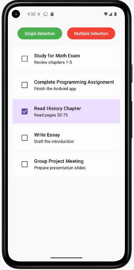
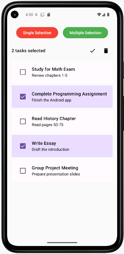
How these examples render
The two screenshots below show what the task list looks like on screen. First image (Single Selection): The list is in single-selection mode; one task is highlighted (e.g., “Complete Programming Assignment”). Tapping a task selects it; tapping another switches the selection. The “Single Selection” button is highlighted to show the current mode. Second image (Multiple Selection): The list is in multiple-selection mode with several tasks selected. A header at the top shows “X tasks selected” and the Complete (checkmark) and Delete icons; tapping those would run actions on the selected tasks (here they show toasts). To try it yourself, get the full project from my GitHub page and open the chapter8 selectClick.kt file.
Tips for Success
- Make items clickable to respond to taps
- Use state to keep track of what's selected
- Support multiple selection when needed
- Add clear visual indicators for selection
- Provide actions for selected items
- Consider using long press for selection mode
Common Mistakes to Avoid
- Not handling selection state properly
- Missing visual feedback for selection
- Forgetting to clear selection state
- Not considering accessibility
- Ignoring long press interactions
Best Practices
- Use appropriate selection patterns
- Provide clear visual feedback
- Handle selection state properly
- Consider accessibility
- Test all interaction patterns