Validation
Introduction
When users enter information into your app, you want to make sure they're providing the right kind of data. This is called input validation, and it's like having a helpful assistant that checks if the information is correct before letting users proceed. Let's learn how to add these helpful checks to your Compose apps!
Quick Reference: Common Validation Types
| Validation Type | What It Checks | When to Use It |
|---|---|---|
| Required Fields | If a field is empty | Essential information like name, email |
| Format Validation | Correct pattern (email, phone) | Structured data like emails, dates |
| Length Validation | Minimum/maximum length | Passwords, usernames, messages |
| Matching Validation | If two fields match | Password confirmation, email confirmation |
Basic Validation Concepts
When to Use Validation
- When collecting user information
- For form submissions
- When data needs to follow a specific format
- For security-sensitive information
- When data needs to be consistent
Common Validation Features
| Feature | What It Does | When to Use It |
|---|---|---|
| isError | Shows red border for invalid input | When input doesn't meet requirements |
| supportingText | Displays error messages | To explain what's wrong |
| regex patterns | Validates complex formats | For email, phone, password validation |
Basic Validation Example
Let's start with a simple example that shows how to validate a required field, we have seen this type of example before so this is just a review.
@Composable
fun NameInput() {
    // State to store the name and validation status
    var name by remember { mutableStateOf("") }
    var isNameValid by remember { mutableStateOf(true) }

    Column {
        OutlinedTextField(
            value = name,
            onValueChange = {
                name = it
                // Check if the name is not empty
                isNameValid = it.isNotEmpty()
            },
            label = { Text("Name") },
            // Show red border if name is empty
            isError = !isNameValid && name.isNotEmpty(),
            // Show error message below the field
            supportingText = {
                if (!isNameValid && name.isNotEmpty()) {
                    Text("Please enter your name")
                }
            }
        )
    }
}
What This Example Is Doing
NameInput keeps name and isNameValid in state. On each change it sets isNameValid = it.isNotEmpty(), so the field is valid when it has at least one character. The error state and message are shown only when the field is invalid and non-empty (!isNameValid && name.isNotEmpty()), so an empty field at startup doesn’t show an error. When the user types and then clears the field, the red border and "Please enter your name" appear.
Advanced Validation Patterns
Email Validation
Email addresses have a specific format they need to follow. Let's create a more complex validation that checks for a proper email format using regex:
@Composable
fun EmailInput() {
    var email by remember { mutableStateOf("") }
    var isEmailValid by remember { mutableStateOf(true) }
    var errorMessage by remember { mutableStateOf("") }

    // Create regex pattern for email validation
    val emailRegex = "^[A-Za-z0-9+_.-]+@(.+)$".toRegex()

    Column {
        OutlinedTextField(
            value = email,
            onValueChange = {
                email = it
                // Use regex to check email format
                isEmailValid = it.isEmpty() || it.matches(emailRegex)
                // Set error message only when we'll show it (not empty and invalid format)
                errorMessage = if (it.isNotEmpty() && !it.matches(emailRegex)) "Please enter a valid email address" else ""
            },
            label = { Text("Email") },
            isError = !isEmailValid && email.isNotEmpty(),
            supportingText = {
                if (!isEmailValid && email.isNotEmpty()) {
                    Text(errorMessage)
                }
            }
        )
    }
}
What This Example Is Doing
EmailInput keeps three things in state: email (what the user typed), isEmailValid (whether that text looks like a valid email), and errorMessage (the exact message to show under the field when something is wrong). Keeping errorMessage in state lets us pick the right message as the user types and then show it in supportingText.
Every time the user types, onValueChange runs. It (1) updates email with the new text, (2) sets isEmailValid to true if the field is empty or if the text matches the email regex, and (3) sets errorMessage to "Please enter a valid email address" only when the field is not empty and doesn't match the regex—otherwise "". That way we only store a message when we will actually show it. isError and supportingText are only used when !isEmailValid && email.isNotEmpty(), so the field does not show an error when it is empty—the screen does not load with a red field, and if the user clears the field the error goes away. The user only sees the red state and "Please enter a valid email address" when they have typed something that is invalid (e.g. missing @).
This example uses a regex to decide what counts as a valid email. The pattern ^[A-Za-z0-9+_.-]+@(.+)$ checks for:
- Letters (uppercase or lowercase), numbers, and characters like +, _, ., and - before the @
- An @ symbol
- Something after the @ (the domain part)
Note: This is a very simple email check. In real apps you might use a stricter or more complex pattern to validate email addresses.
Password Validation
Passwords often need to meet specific security requirements. Here's an example that checks for password strength using regex:
@Composable
fun PasswordInput() {
    var password by remember { mutableStateOf("") }
    var isPasswordValid by remember { mutableStateOf(true) }
    var errorMessage by remember { mutableStateOf("") }

    // Create regex pattern for password validation
    val passwordRegex = "^(?=.*[0-9])(?=.*[a-z])(?=.*[A-Z]).{8,}$".toRegex()

    Column {
        OutlinedTextField(
            value = password,
            onValueChange = {
                password = it
                // Use regex to check password requirements
                isPasswordValid = it.isEmpty() || it.matches(passwordRegex)
                // Set error message only when we'll show it (not empty and invalid)
                errorMessage = if (it.isNotEmpty() && !it.matches(passwordRegex)) "Password must be at least 8 characters with uppercase, lowercase, and numbers" else ""
            },
            label = { Text("Password") },
            visualTransformation = PasswordVisualTransformation(),
            isError = !isPasswordValid && password.isNotEmpty(),
            supportingText = {
                if (!isPasswordValid && password.isNotEmpty()) {
                    Text(errorMessage)
                }
            }
        )
    }
}
What This Example Is Doing
PasswordInput keeps password, isPasswordValid, and errorMessage in state. The regex requires at least one digit, one lowercase letter, one uppercase letter, and length 8 or more. visualTransformation = PasswordVisualTransformation() masks the input. We set errorMessage only when the field is not empty and doesn't match the regex—otherwise ""—so we only store a message when we will show it. isError and supportingText are used only when !isPasswordValid && password.isNotEmpty(), so the field does not show an error when it is empty (the screen does not load with a red field, and clearing the field clears the error). The user only sees the red state and "Password must be at least 8 characters with uppercase, lowercase, and numbers" when they have typed something that fails the requirements.
This password validation uses regex to check for:
- Minimum length of 8 characters
- At least one uppercase letter
- At least one lowercase letter
- At least one number
Registration Form Example
Let's put it all together in a registration form that validates multiple fields using regex:
@Composable
fun RegistrationForm() {
    var name by remember { mutableStateOf("") }
    var email by remember { mutableStateOf("") }
    var password by remember { mutableStateOf("") }
    var confirmPassword by remember { mutableStateOf("") }

    var isNameValid by remember { mutableStateOf(true) }
    var isEmailValid by remember { mutableStateOf(true) }
    var isPasswordValid by remember { mutableStateOf(true) }
    var isConfirmPasswordValid by remember { mutableStateOf(true) }

    // Create regex patterns
    val emailRegex = "^[A-Za-z0-9+_.-]+@(.+)$".toRegex()
    val passwordRegex = "^(?=.*[0-9])(?=.*[a-z])(?=.*[A-Z]).{8,}$".toRegex()
    val nameRegex = "^[A-Za-z\\s]{2,}$".toRegex() // At least 2 characters, letters and spaces only

    Column(
        modifier = Modifier
            .fillMaxWidth()
            .padding(16.dp),
        verticalArrangement = Arrangement.spacedBy(8.dp)
    ) {
        // Name field
        OutlinedTextField(
            value = name,
            onValueChange = {
                name = it
                isNameValid = it.isEmpty() || it.matches(nameRegex)
            },
            label = { Text("Name") },
            isError = !isNameValid && name.isNotEmpty(),
            supportingText = {
                if (!isNameValid && name.isNotEmpty()) {
                    Text("Name must be at least 2 characters and contain only letters and spaces")
                }
            }
        )

        // Email field
        OutlinedTextField(
            value = email,
            onValueChange = {
                email = it
                isEmailValid = it.isEmpty() || it.matches(emailRegex)
            },
            label = { Text("Email") },
            isError = !isEmailValid && email.isNotEmpty(),
            supportingText = {
                if (!isEmailValid && email.isNotEmpty()) {
                    Text("Please enter a valid email address")
                }
            }
        )

        // Password field
        OutlinedTextField(
            value = password,
            onValueChange = {
                password = it
                isPasswordValid = it.isEmpty() || it.matches(passwordRegex)
            },
            label = { Text("Password") },
            visualTransformation = PasswordVisualTransformation(),
            isError = !isPasswordValid && password.isNotEmpty(),
            supportingText = {
                if (!isPasswordValid && password.isNotEmpty()) {
                    Text("Password must be at least 8 characters with uppercase, lowercase, and numbers")
                }
            }
        )

        // Confirm password field
        OutlinedTextField(
            value = confirmPassword,
            onValueChange = {
                confirmPassword = it
                isConfirmPasswordValid = it == password
            },
            label = { Text("Confirm Password") },
            visualTransformation = PasswordVisualTransformation(),
            isError = !isConfirmPasswordValid && confirmPassword.isNotEmpty(),
            supportingText = {
                if (!isConfirmPasswordValid && confirmPassword.isNotEmpty()) {
                    Text("Passwords don't match")
                }
            }
        )

        // Submit button
        Button(
            onClick = { /* Handle registration */ },
            modifier = Modifier.fillMaxWidth(),
            enabled = isNameValid && isEmailValid && isPasswordValid &&
                     isConfirmPasswordValid && name.isNotEmpty() &&
                     email.isNotEmpty() && password.isNotEmpty() &&
                     confirmPassword.isNotEmpty()
        ) {
            Text("Register")
        }
    }
}
Understanding the RegistrationForm Composable (Step-by-Step)
This Kotlin code defines a RegistrationForm composable using Jetpack Compose, which implements a user registration form with real-time input validation. Let's break down how it works:
The RegistrationForm() Composable - Central State Management
The RegistrationForm() function is the central point of this UI. It is responsible for:
- Holding all form data (state): It declares variables for
name,email,password, andconfirmPassword. These are marked withremember { mutableStateOf("") }, meaning their values can change, and Compose will automatically recompose (update) the UI when they do. - Holding all validation states: Similarly, it declares boolean variables like
isNameValid,isEmailValid, etc., initialized totrue. These will track the validity of each input. - Defining validation rules (Regex): It sets up regular expressions (
emailRegex,passwordRegex,nameRegex) that define the criteria for valid input for each field.
var name by remember { mutableStateOf("") }
var email by remember { mutableStateOf("") }
var password by remember { mutableStateOf("") }
var confirmPassword by remember { mutableStateOf("") }

var isNameValid by remember { mutableStateOf(true) }
var isEmailValid by remember { mutableStateOf(true) }
var isPasswordValid by remember { mutableStateOf(true) }
var isConfirmPasswordValid by remember { mutableStateOf(true) }

// Create regex patterns
val emailRegex = "^[A-Za-z0-9+_.-]+@(.+)$".toRegex()
val passwordRegex = "^(?=.*[0-9])(?=.*[a-z])(?=.*[A-Z]).{8,}$".toRegex()
val nameRegex = "^[A-Za-z\\s]{2,}$".toRegex() // At least 2 characters, letters and spaces only
Structuring the Layout
A Column composable is used to arrange the input fields and button vertically, with some padding and spacing:
Column(
    modifier = Modifier
        .fillMaxWidth()
        .padding(16.dp),
    verticalArrangement = Arrangement.spacedBy(8.dp)
) {
    // Input fields and button go here
}
Individual Input Fields (OutlinedTextField)
Each input field (Name, Email, Password, Confirm Password) uses an OutlinedTextField composable. Let's look at the "Name field" as an example, as the others follow a similar pattern:
OutlinedTextField(
    value = name, // 1. Displays the current 'name' state
    onValueChange = { // 2. Lambda executed when user types
        name = it // Updates the 'name' state in RegistrationForm
        isNameValid = it.isEmpty() || it.matches(nameRegex) // Updates 'isNameValid' state
    },
    label = { Text("Name") }, // 3. Label for the input field
    isError = !isNameValid && name.isNotEmpty(), // 4. Controls error visual
    supportingText = { // 5. Displays error message if needed
        if (!isNameValid && name.isNotEmpty()) {
            Text("Name must be at least 2 characters and contain only letters and spaces")
        }
    }
)
-
value = name: This ties the text field's displayed content directly to thenamestate variable from `RegistrationForm`. Whatever is in `name` will be shown here. -
onValueChange = { ... }: This is a **callback function** (a lambda) that gets triggered every time the user types a character.name = it: The `it` refers to the new text entered by the user. This line updates the `name` state variable in the `RegistrationForm`. Because `name` is a mutable state, this will trigger a recomposition, updating the `OutlinedTextField` with the new text.isNameValid = it.isEmpty() || it.matches(nameRegex): This line immediately re-evaluates the validity of the name based on the `nameRegex`. `it.isEmpty()` handles the case where the field is empty (no error shown). The `isNameValid` state is updated, which will affect the `isError` parameter.
-
label = { Text("Name") }: This provides a floating label for the input field. -
isError = !isNameValid && name.isNotEmpty(): This is a crucial line for visual feedback.- If `isNameValid` is `false` (meaning the input doesn't match the regex) AND the `name` field is not empty, `isError` becomes `true`.
- When `isError` is `true`, the `OutlinedTextField` automatically changes its visual style (e.g., border color turns red) to indicate an error.
-
supportingText = { ... }: This is another lambda that provides a small helper text below the input.- It only displays the error message ("Name must be at least 2 characters...") when `isNameValid` is `false` AND the `name` field is not empty, matching the `isError` condition.
The "Email field" (`isEmailValid`, `emailRegex`), "Password field" (`isPasswordValid`, `passwordRegex`, `PasswordVisualTransformation` to hide text), and "Confirm password field" (`isConfirmPasswordValid`, checks `it == password`) follow the same pattern, each with its own specific validation logic and error messages.
The Submit Button
Finally, a `Button` is displayed at the bottom:
Button(
    onClick = { /* Handle registration */ },
    modifier = Modifier.fillMaxWidth(),
    enabled = isNameValid && isEmailValid && isPasswordValid &&
             isConfirmPasswordValid && name.isNotEmpty() &&
             email.isNotEmpty() && password.isNotEmpty() &&
             confirmPassword.isNotEmpty()
) {
    Text("Register")
}
-
onClick = { /* Handle registration */ }: This is the lambda that will be executed when the button is pressed. Currently, it's just a placeholder. -
enabled = ...: This condition determines if the button is clickable. The button is only enabled (`true`) if:- ALL validation states (`isNameValid`, `isEmailValid`, `isPasswordValid`, `isConfirmPasswordValid`) are `true`.
- AND ALL input fields (`name`, `email`, `password`, `confirmPassword`) are not empty.
Overall Flow:
When the user interacts with any `OutlinedTextField`:
- The `onValueChange` lambda for that field is executed.
- The corresponding state variable (e.g., `name`) in `RegistrationForm` is updated.
- The corresponding validation state (e.g., `isNameValid`) in `RegistrationForm` is updated based on the regex.
- Because these are mutable states, Compose detects the changes and triggers a recomposition of `RegistrationForm` and its children.
- During recomposition, the `OutlinedTextField`s re-render, potentially showing error visuals and messages based on their updated `isError` and `supportingText` conditions.
- The `Button` also re-renders, and its `enabled` state is re-evaluated based on the current validity and emptiness of all fields.
This entire process provides a responsive, real-time feedback mechanism for form validation.
This registration form shows how to:
- Use regex patterns for validating name, email, and password
- Show different error messages for each field
- Enable/disable the submit button based on all validations
- Handle password confirmation
- Provide clear visual feedback for each field
- Coordinate validation across multiple fields
- Manage complex button state logic
How these examples render
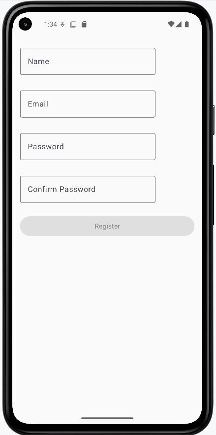
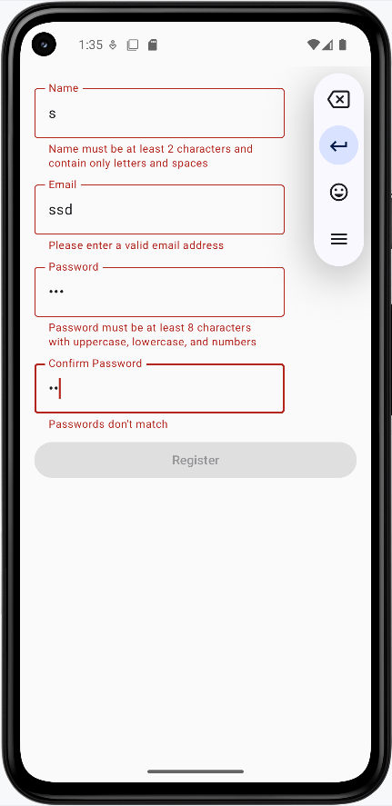
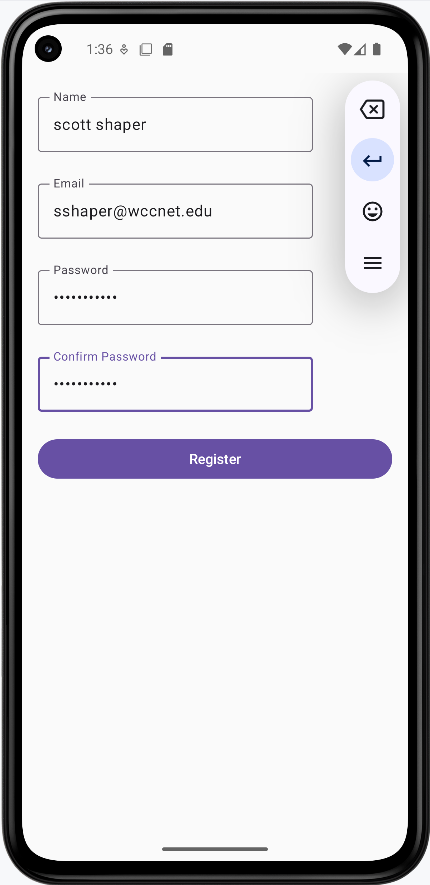
The images below show the registration form at different stages. The snippets above are only part of the code; to see and run the full project, go to my GitHub page and open the chapter7 validation.kt file.
- First image: Form when first loaded (empty fields, Register disabled).
- Second image: Invalid input entered—error messages and red borders show for fields that don’t meet the rules.
- Third image: All fields filled with valid data—errors cleared and Register button enabled.
Tips for Success
- Validate input as the user types for immediate feedback
- Use clear, specific error messages
- Show validation errors only after user interaction
- Keep validation rules consistent across your app
- Test validation with various input scenarios
Common Mistakes to Avoid
- Showing errors before user starts typing
- Using vague error messages
- Not validating on both client and server side
- Making validation rules too strict
- Not handling edge cases in validation
Best Practices
- Use regex for complex format validation
- Provide helpful error messages
- Validate in real-time when possible
- Keep validation logic separate from UI
- Consider accessibility in error messages