Understanding Modifiers
Introduction
Think of modifiers in Jetpack Compose like the settings on your phone - they let you customize how things look and behave without changing what they are. Want to make a button bigger? Add some space around text? Change colors? That's what modifiers are for! They're like a toolbox full of ways to style and arrange your UI elements.
Quick Reference
| Modifier Type | What It Does | Common Use |
|---|---|---|
| Size Modifiers | Controls width, height, and dimensions | Making elements bigger/smaller |
| Padding Modifiers | Adds space around elements | Creating margins and spacing |
| Background Modifiers | Changes element background | Adding colors and visual separation |
| Alignment Modifiers | Positions elements within containers | Centering and aligning content |
When to Use Modifiers
- When you need to customize how an element looks
- To add spacing or padding around elements
- When you want to change the size of elements
- To align elements within their containers
- When you need to add backgrounds or borders
Common Options
| Modifier | What It Does | When to Use It |
|---|---|---|
| padding() | Adds space around an element | Creating margins and spacing |
| size() | Sets exact dimensions | Fixed-size elements |
| fillMaxWidth() | Makes element as wide as possible | Full-width layouts |
| background() | Adds background color | Visual separation and styling |
| align() | Positions element in container | Centering and alignment |
Basic Modifier Example
Let's start with a simple example that shows how to add padding and a background color:
@Composable
        fun ModifierExample() {
            Text(
                text = "Hello, Modifier!",
                modifier = Modifier
                    .border(2.dp, Color.Red)//border around text element
                    .padding(36.dp)  // Outer padding
                    .border(2.dp, Color.Green)//border around text
                    .background(Color.LightGray)  // Background color
                    .padding(18.dp), // Inner padding around text
                color = Color.Blue
            )
        }
What This Example Is Doing
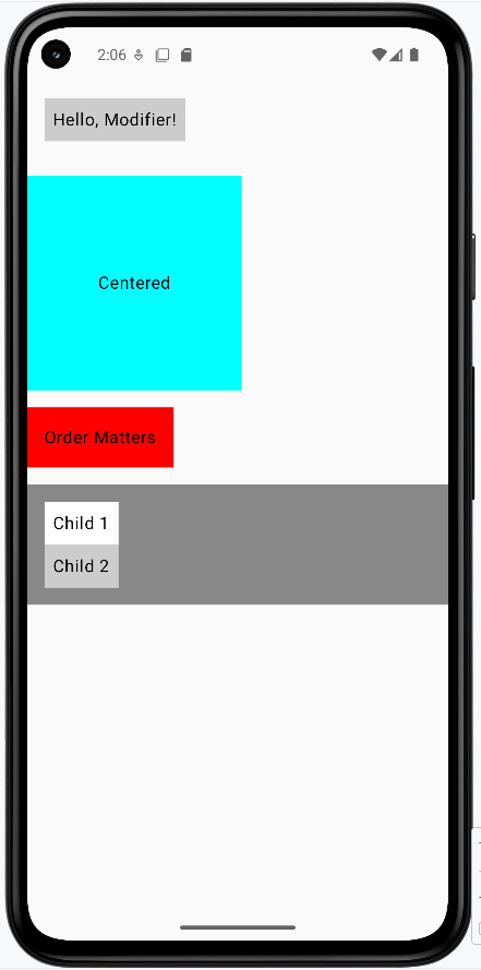
The modifier chain is applied from the bottom up (the last modifier in the chain is closest to the text). So from the text outward: (1) 18 dp padding around the text, (2) light gray background, (3) green border around that, (4) 36 dp padding, (5) red border around the whole thing. The order matters—if you put background before padding, the background would only be behind the text, not the padded area. color = Color.Blue is a parameter of the Text composable itself (the text color), not part of the modifier chain.
The Modifier class in Compose is immutable: each modifier function returns a new Modifier. Chaining them with Modifier.padding(...).background(...) and so on builds one chain that gets applied to the UI element in order.
Size and Alignment Example
Here's how to control the size of elements and position them within containers:
@Composable
fun ModifierSizeExample() {
    Box(
        modifier = Modifier
            .size(200.dp)          // Fixed size box
            .background(Color.Cyan) // Cyan background
    ) {
        Text(
            text = "Centered",
            modifier = Modifier.align(Alignment.Center)  // Center the text
        )
    }
}
What This Example Is Doing
ModifierSizeExample draws a 200 dp × 200 dp Box with a cyan background—so a square. Inside the box, a Text says "Centered." The text uses Modifier.align(Alignment.Center), which positions it in the center of the box. So you get a fixed-size container and one child positioned in the middle.
Chaining Modifiers
Modifiers work like a chain - each one builds on the previous one. The order matters!
@Composable
fun ModifierChainExample() {
    Text(
        text = "Order Matters",
        modifier = Modifier
            .background(Color(0xFFFF0000))  // First, add background
            .padding(16.dp)        // Then, add padding inside
    )
}
What This Example Is Doing
Here the chain is background first, then padding. So the red background is applied to the full size of the text; then 16 dp of padding is added inside that, so the red shows as a band around the padded text. If you reversed the order (padding then background), the background would only sit behind the text, and the padding would be outside it—so the visible result would be different. Order matters.
Parent and Child Modifiers
You can style both containers and their children. Here's how:
@Composable
fun ModifierParentChildExample() {
    Column(
        modifier = Modifier
            .fillMaxWidth()        // Make column full width
            .background(Color.Gray) // Gray background for column
            .padding(16.dp)        // Padding around column
    ) {
        Text("Child 1", modifier = Modifier.background(Color.White).padding(8.dp))
        Text("Child 2", modifier = Modifier.background(Color.LightGray).padding(8.dp))
    }
}
What This Example Is Doing
The Column has modifiers: full width, gray background, and 16 dp padding. So the column is a gray strip with space around its edges. Inside it, "Child 1" has a white background and 8 dp padding, and "Child 2" has a light gray background and 8 dp padding. So the parent (column) gets one set of styles and each child gets its own—showing how you can style both the container and the items inside it.
How these examples render
The image below shows what the modifier examples look like when you run them: the layered borders and padding around "Hello, Modifier!," the cyan square with centered text, the red-backed "Order Matters" with padding, and the gray column with two differently styled children. The snippets above are only part of the code; to see and run the full project, go to my GitHub page and open the chapter5 modifiers_code.kt file.
Tips for Success
- Start with basic modifiers like padding and background
- Remember that modifier order matters
- Use comments to explain complex modifier chains
- Test your layouts on different screen sizes
Common Mistakes to Avoid
- Putting modifiers in the wrong order
- Forgetting to add padding around elements
- Using too many nested modifiers
- Not considering how modifiers affect layout
Best Practices
- Keep modifier chains readable and well-commented
- Use standard spacing values (8dp, 16dp, 24dp, 32dp)
- Consider reusing common modifier combinations
- Test your layouts with different content