Gestures and Animations
What are Gestures and Animations?
Think of gestures and animations like the way you interact with a physical book. When you flip a page, you use a swipe gesture, and the page animates as it turns. When you tap on a button, it might animate to show it was pressed. Gestures are the ways users interact with your app using touch, and animations are the visual responses that make those interactions feel natural and engaging.
Gestures include tapping, swiping, dragging, pinching, and more. Animations include transitions, scaling, fading, and moving elements. Together, they create a smooth, intuitive user experience that feels responsive and polished.
Quick Reference
| Type | Description | When to Use |
|---|---|---|
| Tap Gestures | Single finger tap on screen | Buttons, list items, navigation |
| Swipe Gestures | Finger drag across screen | Navigation, deletion, scrolling |
| Drag Gestures | Long press and move | Reordering, dragging items |
| Scale Gestures | Two finger pinch or spread | Zooming images, maps |
When to Use Gestures and Animations
Use Gestures When:
- You want to provide intuitive ways to interact with your app
- You need to handle touch input beyond simple taps
- You want to create natural, app-like interactions
- You're building interactive elements like sliders or draggable items
- You want to provide alternative ways to perform actions
Use Animations When:
- You want to provide visual feedback for user actions
- You need to guide users' attention to important elements
- You want to make transitions between screens smoother
- You're showing loading states or progress
- You want to make your app feel more polished and responsive
Common Gesture and Animation Components
| Component | What It Does | When to Use It |
|---|---|---|
| clickable | Makes an element respond to taps | For buttons, cards, or any tappable element |
| pointerInput | Handles complex touch gestures | For custom gesture recognition |
| animate*AsState | Animates state changes smoothly | For smooth transitions between states |
| AnimatedVisibility | Animates elements appearing/disappearing | For showing/hiding content with animation |
Practical Examples
Tap Animation Example
@Composable
fun TapAnimationExample() {
    var isPressed by remember { mutableStateOf(false) }
    val scale by animateFloatAsState(
        targetValue = if (isPressed) 0.95f else 1f,
        animationSpec = tween(durationMillis = 100), label = "tapScale"
    )
    val buttonColor by animateColorAsState(
        targetValue = if (isPressed)
            Color(0xFFFF0000) // Red color when pressed
        else
            MaterialTheme.colorScheme.primary, // Normal theme color
        animationSpec = tween(durationMillis = 100), label = "tapColor"
    )
    Card(
        modifier = Modifier
            .scale(scale)
            .pointerInput(Unit) {
                detectTapGestures(
                    onPress = {
                        isPressed = true
                        try {
                            awaitRelease()
                        } finally {
                            isPressed = false
                        }
                    }
                )
            },
        colors = CardDefaults.cardColors(
            containerColor = buttonColor
        ),
        shape = MaterialTheme.shapes.medium
    ) {
        Box(
            modifier = Modifier
                .padding(horizontal = 24.dp, vertical = 12.dp),
            contentAlignment = Alignment.Center
        ) {
            Text(
                text = "Tap Me!",
                color = MaterialTheme.colorScheme.onPrimary,
                style = MaterialTheme.typography.labelLarge
            )
        }
    }
}
Code Breakdown
Press state and animated values
var isPressed by remember { mutableStateOf(false) }
val scale by animateFloatAsState(targetValue = if (isPressed) 0.95f else 1f, ...)
val buttonColor by animateColorAsState(targetValue = if (isPressed) Color(0xFFFF0000) else MaterialTheme.colorScheme.primary, ...)
var isPressed by remember { mutableStateOf(false) } creates a Boolean state variable that survives recomposition and starts as not pressed. The two animation lines read that same state: when isPressed is true, scale targets 0.95f (slight shrink) and buttonColor targets red; when false, they return to normal size and theme primary color. Because both animated values are derived from one state source, the size and color transitions stay synchronized and Compose updates both automatically whenever press state changes.
Gesture handler that controls the state
.pointerInput(Unit) {
    detectTapGestures(
        onPress = {
            isPressed = true
            try { awaitRelease() } finally { isPressed = false }
        }
    )
}
pointerInput(Unit) attaches a gesture detector to this composable, and using Unit means the detector does not restart unless this modifier is recreated. Inside it, detectTapGestures(onPress = ...) runs when the pointer goes down, immediately setting isPressed = true so the animations begin. awaitRelease() suspends until the finger lifts (or the gesture is canceled), and the finally block always runs, forcing isPressed = false so the UI reliably animates back to normal.
Apply animated values to UI
Card(
    modifier = Modifier.scale(scale),
    colors = CardDefaults.cardColors(containerColor = buttonColor)
)
Modifier.scale(scale) applies the current animated float to the entire card transform, so all content inside the card shrinks/expands together. CardDefaults.cardColors(containerColor = buttonColor) binds the card background to the animated color state, so color transitions happen through the same animation system instead of abrupt changes. These two bindings turn gesture state into two synchronized visual channels (shape and color), which is why the feedback feels responsive and polished.
Swipe to Delete Example
@OptIn(ExperimentalMaterial3Api::class)
@Composable
fun SwipeToDeleteExample() {
    var items by remember { mutableStateOf((1..3).map { "Item $it" }.toMutableList()) }
    val scope = rememberCoroutineScope()
    Column {
        items.forEach { item ->
            key(item) {
                SwipeableListItem(
                    item = item,
                    onDelete = {
                        scope.launch {
                            delay(250) // Let dismiss animation/background settle briefly before removal.
                            val updatedItems = items.toMutableList()
                            updatedItems.remove(item)
                            items = updatedItems
                        }
                    }
                )
                Spacer(modifier = Modifier.height(8.dp))
            }
        }
    }
}

@OptIn(ExperimentalMaterial3Api::class)
@Composable
fun SwipeableListItem(item: String, onDelete: () -> Unit) {
    val dismissState = rememberSwipeToDismissBoxState(
        confirmValueChange = { value ->
            if (value == SwipeToDismissBoxValue.EndToStart) {
                onDelete()
                true
            } else {
                false
            }
        }
    )
    SwipeToDismissBox(
        state = dismissState,
        backgroundContent = {
            Box(
                modifier = Modifier
                    .fillMaxSize()
                    .background(Color.Red)
                    .padding(horizontal = 20.dp),
                contentAlignment = Alignment.CenterEnd
            ) {
                Icon(
                    imageVector = Icons.Default.Delete,
                    contentDescription = "Delete",
                    tint = Color.White
                )
            }
        }
    ) {
        Card(
            modifier = Modifier.fillMaxWidth()
        ) {
            ListItem(
                headlineContent = { Text(item) }
            )
        }
    }
}
Code Breakdown
Parent list state
var items by remember { mutableStateOf((1..3).map { "Item $it" }.toMutableList()) }
val scope = rememberCoroutineScope()
items.forEach { item ->
    key(item) {
        SwipeableListItem(
            item = item,
            onDelete = {
                scope.launch {
                    delay(250)
                    val updatedItems = items.toMutableList()
                    updatedItems.remove(item)
                    items = updatedItems
                }
            }
        )
        Spacer(modifier = Modifier.height(8.dp))
    }
}
The first line creates mutable UI state that holds a list of three strings, and the (1..3).map { "Item $it" } expression generates those labels programmatically. rememberCoroutineScope() provides a scope that can launch coroutines from the onDelete callback (the source file imports kotlinx.coroutines.delay and kotlinx.coroutines.launch). key(item) ties each row’s composition identity to its string so swipe/dismiss state does not slide to the wrong row when another item is removed. The forEach loop renders one SwipeableListItem per value. onDelete uses scope.launch { delay(250) … } so the dismiss animation can finish before the list mutates; then it copies the list, removes the item, and assigns items = updatedItems so Compose observes a new list reference and the row leaves the UI cleanly.
Dismiss-state gate for allowed swipe direction
val dismissState = rememberSwipeToDismissBoxState(
    confirmValueChange = { value ->
        if (value == SwipeToDismissBoxValue.EndToStart) {
            onDelete()
            true
        } else {
            false
        }
    }
)
rememberSwipeToDismissBoxState stores swipe progress and target dismissal value for this row. The confirmValueChange callback runs before the state commits to a new value, so it is the correct place to enforce business rules. Here, only SwipeToDismissBoxValue.EndToStart is accepted: if matched, onDelete() is called and true confirms the dismiss; otherwise false cancels state change and snaps the row back. SwipeToDismissBox (shown below) is the container composable that enables this interaction: it wraps a row, tracks horizontal drag gestures, and transitions the content into a dismissed state when the gesture reaches the configured threshold. These swipe APIs come from Jetpack Compose Material 3 (for example, androidx.compose.material3.SwipeToDismissBox, androidx.compose.material3.SwipeToDismissBoxValue, and androidx.compose.material3.rememberSwipeToDismissBoxState).
Background and foreground layers
SwipeToDismissBox(
    state = dismissState,
    backgroundContent = { /* red background + delete icon */ }
) {
    Card { ListItem(headlineContent = { Text(item) }) }
}
SwipeToDismissBox renders two layers: backgroundContent (red container with delete icon) and the main content lambda (card/list row). During swipe, the foreground row translates while the background is gradually revealed, which visually explains the pending delete action before commit. Keeping the icon in the background layer, rather than inside the row, ensures it stays anchored while the row moves away.
Draggable Card Example
@Composable
fun DraggableCardExample() {
    var offset by remember { mutableStateOf(Offset.Zero) }
    val animatedOffset by animateOffsetAsState(
        targetValue = offset,
        animationSpec = spring(
            dampingRatio = Spring.DampingRatioMediumBouncy,
            stiffness = Spring.StiffnessLow
        ), label = "dragOffset"
    )
    Card(
        modifier = Modifier
            .offset { IntOffset(animatedOffset.x.roundToInt(), animatedOffset.y.roundToInt()) }
            .pointerInput(Unit) {
                detectDragGestures { change, dragAmount ->
                    change.consume()
                    offset += Offset(dragAmount.x, dragAmount.y)
                }
            }
            .size(200.dp)
    ) {
        Box(
            modifier = Modifier.fillMaxSize(),
            contentAlignment = Alignment.Center
        ) {
            Text("Drag me around!")
        }
    }
}
Code Breakdown
Position state and animated output
var offset by remember { mutableStateOf(Offset.Zero) }
val animatedOffset by animateOffsetAsState(
    targetValue = offset,
    animationSpec = spring(...)
)
offset is the mutable state that stores the current drag translation in x/y coordinates relative to the card's starting location. animateOffsetAsState(targetValue = offset, ...) creates a second value that continuously interpolates toward that target with spring physics. Using this animated value for rendering prevents abrupt jumps and gives physically smoother motion whenever drag updates arrive quickly.
Drag detection and state updates
.pointerInput(Unit) {
    detectDragGestures { change, dragAmount ->
        change.consume()
        offset += Offset(dragAmount.x, dragAmount.y)
    }
}
detectDragGestures emits many small movement deltas rather than one final position, so the handler accumulates each delta into offset using offset += Offset(...). change.consume() marks the pointer event as handled, which prevents parent/neighbor gesture detectors from also treating that same movement as their own gesture. This keeps drag behavior deterministic and avoids conflicting interactions in nested layouts.
Render position on screen
.offset {
    IntOffset(animatedOffset.x.roundToInt(), animatedOffset.y.roundToInt())
}
The offset modifier lambda must return IntOffset, so floating-point animation coordinates are converted with roundToInt(). This conversion happens every frame, mapping the smooth animation output to valid pixel positions that the layout system can place on screen. By using animatedOffset here instead of raw state, the card's visible position remains smooth even as state updates happen rapidly.
Animated Visibility Example
@Composable
fun AnimatedVisibilityExample() {
    var visible by remember { mutableStateOf(false) }
    Column(horizontalAlignment = Alignment.CenterHorizontally) {
        Button(onClick = { visible = !visible }) {
            Text(if (visible) "Hide" else "Show")
        }
        AnimatedVisibility(
            visible = visible,
            enter = slideInVertically(
                initialOffsetY = { -it },
                animationSpec = tween(durationMillis = 300)
            ) + fadeIn(animationSpec = tween(durationMillis = 300)),
            exit = slideOutVertically(
                targetOffsetY = { -it },
                animationSpec = tween(durationMillis = 300)
            ) + fadeOut(animationSpec = tween(durationMillis = 300))
        ) {
            Card(
                modifier = Modifier
                    .fillMaxWidth()
                    .padding(16.dp)
            ) {
                Text(
                    text = "This content animates in and out!",
                    modifier = Modifier.padding(16.dp)
                )
            }
        }
    }
}
Code Breakdown
Visibility toggle state
var visible by remember { mutableStateOf(false) }
Button(onClick = { visible = !visible }) {
    Text(if (visible) "Hide" else "Show")
}
visible is a remembered Boolean state and acts as the single source of truth for this interaction. The button click toggles that state with visible = !visible, and the button text is derived from the same value using an inline if. This means the control label ("Show"/"Hide") and the actual visibility behavior stay logically synchronized without extra bookkeeping.
AnimatedVisibility enter/exit definitions
AnimatedVisibility(
    visible = visible,
    enter = slideInVertically(initialOffsetY = { -it }, ...) + fadeIn(...),
    exit = slideOutVertically(targetOffsetY = { -it }, ...) + fadeOut(...)
) { ... }
AnimatedVisibility listens to visible; when true it runs enter, and when false it runs exit. In the enter transition, slideInVertically(initialOffsetY = { -it }) starts content above its final position, where it is the content height, while fadeIn animates alpha from transparent to opaque. The + operator composes these transitions so position and opacity animate concurrently with the same timing model.
Animated content body
AnimatedVisibility(...) {
    Card { Text("This content animates in and out!") }
}
The snippet shows the animation boundary explicitly: only the card/text block inside AnimatedVisibility participates in enter/exit transitions. Elements outside that block (like the toggle button and parent column) keep their normal layout lifecycle and are not animated by this API. This separation is important because it lets you animate a target region without causing unrelated UI to shift unexpectedly.
Long Press Scale Example
@Composable
fun LongPressScaleExample() {
    var isLongPressed by remember { mutableStateOf(false) }
    val scale by animateFloatAsState(
        targetValue = if (isLongPressed) .75f else 1f, // 0.75f = 75% size
        animationSpec = tween(durationMillis = 200), label = "longPressScale"
    )
    val color by animateColorAsState(
        targetValue = if (isLongPressed) {
            Color(0xFF00FF00) // Green color for long press
        } else {
            MaterialTheme.colorScheme.primary // Default theme color
        },
        animationSpec = tween(durationMillis = 200),
        label = "longPressColor"
    )
    Card(
        modifier = Modifier
            .scale(scale) // Apply animated scale
            .pointerInput(Unit) {
                detectTapGestures(
                    onLongPress = { isLongPressed = true }, // Triggered when user holds down
                    onPress = {
                        isLongPressed = false // Reset on regular press
                        try {
                            awaitRelease() // Wait for finger to lift
                        } finally {
                            isLongPressed = false // Always reset when done
                        }
                    }
                )
            }
            .size(150.dp),
        colors = CardDefaults.cardColors(
            containerColor = color)
    ) {
        Box(
            modifier = Modifier.fillMaxSize(),
            contentAlignment = Alignment.Center
        ) {
            Text("Long press me!")
        }
    }
}
Code Breakdown
Long-press state and animated outputs
var isLongPressed by remember { mutableStateOf(false) }
val scale by animateFloatAsState(targetValue = if (isLongPressed) .75f else 1f, ...)
val color by animateColorAsState(targetValue = if (isLongPressed) Color(0xFF00FF00) else MaterialTheme.colorScheme.primary, ...)
isLongPressed captures whether the long-press condition is active, and both animation targets read that value so behavior is centralized. When true, animateFloatAsState drives scale toward 0.75f and animateColorAsState drives background toward green; when false, both return to default values. This "single state, multiple derived outputs" pattern is key in Compose because it keeps visual effects consistent and prevents state mismatch bugs.
Gesture callbacks
detectTapGestures(
    onLongPress = { isLongPressed = true },
    onPress = {
        isLongPressed = false
        try { awaitRelease() } finally { isLongPressed = false }
    }
)
onLongPress is the semantic event that activates long-press mode, so it sets isLongPressed = true once the hold threshold is reached. onPress begins on initial touch down and handles the full press lifecycle, including release/cancel, which is why it resets the state before and after awaitRelease(). The try/finally structure ensures cleanup always happens even if the gesture is interrupted, preventing stale long-press visuals.
Apply visual feedback to card
Card(
    modifier = Modifier.scale(scale),
    colors = CardDefaults.cardColors(containerColor = color)
)
The card binds animation outputs in two places: Modifier.scale(scale) applies geometric feedback to the whole component, and containerColor = color applies color feedback to the background. Because both are tied to animated state values, the transition into and out of long-press mode is gradual rather than abrupt. This makes recognition of the gesture clearer while still feeling smooth.
Interactive Slider Example
@Composable
fun InteractiveSliderExample() {
    var sliderValue by remember { mutableStateOf(0.5f) } // Start at 50%
    var isDragging by remember { mutableStateOf(false) }

    // Store the actual width of the slider track in pixels
    // We need this to calculate thumb position accurately
    var trackWidth by remember { mutableStateOf(0f) }

    val animatedValue by animateFloatAsState(
        targetValue = sliderValue,
        animationSpec = if (isDragging) {
            tween(durationMillis = 0) // No animation while dragging (instant response)
        } else {
            spring(dampingRatio = Spring.DampingRatioMediumBouncy) // Bouncy animation when released
        }, label = "sliderValue"
    )

    Column(
        modifier = Modifier.padding(16.dp),
        horizontalAlignment = Alignment.CenterHorizontally
    ) {
        Text("Value: ${(animatedValue * 100).toInt()}%")
        Spacer(modifier = Modifier.height(16.dp))

        // This is the parent Box that contains both the track and the thumb
        Box(
            modifier = Modifier.fillMaxWidth(),
            contentAlignment = Alignment.CenterStart // Align thumb to the start
        ) {
            // Slider Track
            Box(
                modifier = Modifier
                    .fillMaxWidth()
                    .height(8.dp)
                    .background(
                        color = MaterialTheme.colorScheme.surfaceVariant,
                        shape = MaterialTheme.shapes.small
                    )
                    .onSizeChanged { newSize ->
                        // Capture the actual width when the track is measured
                        // This happens after the layout is calculated
                        trackWidth = newSize.width.toFloat()
                    }
                    .pointerInput(trackWidth) { // Re-trigger if width changes
                        if (trackWidth == 0f) return@pointerInput // Safety check: avoid division by zero
                        detectDragGestures(
                            onDragStart = { isDragging = true }, // User started dragging
                            onDragEnd = { isDragging = false }, // User released
                            onDrag = { change, dragAmount ->
                                change.consume()
                                // Calculate how much the drag represents as a percentage
                                // dragAmount.x is pixels moved, trackWidth is total width
                                val dragPercentage = dragAmount.x / trackWidth
                                // Update slider value, keeping it between 0 and 1
                                sliderValue = (sliderValue + dragPercentage).coerceIn(0f, 1f)
                            }
                        )
                    }
            )

            // Slider Thumb (the draggable circle)
            Box(
                modifier = Modifier
                    .offset {
                        // Calculate thumb position: animatedValue (0-1) * trackWidth = position in pixels
                        val thumbCenterOffset = animatedValue * trackWidth
                        // Center the thumb: subtract half its width so it's centered on the position
                        val thumbHalfWidth = (24.dp.toPx() / 2)
                        IntOffset((thumbCenterOffset - thumbHalfWidth).roundToInt(), 0)
                    }
                    .size(24.dp)
                    .background(
                        color = MaterialTheme.colorScheme.primary,
                        shape = CircleShape
                    )
            )
        }
    }
}
Code Breakdown with Snippets:
Core slider state
var sliderValue by remember { mutableStateOf(0.5f) }
var isDragging by remember { mutableStateOf(false) }
var trackWidth by remember { mutableStateOf(0f) }
sliderValue stores the domain value in normalized form (0 to 1), which makes it easy to convert between percentage text and pixel position. isDragging tracks interaction mode so animation behavior can switch between "direct-follow" and "settle" modes. trackWidth is measured at runtime because track size depends on device/layout, and drag deltas must be divided by this width to produce accurate value changes.
Conditional animation policy
val animatedValue by animateFloatAsState(
    targetValue = sliderValue,
    animationSpec = if (isDragging) tween(durationMillis = 0) else spring(...)
)
This animation line uses one target (sliderValue) with two possible specs. While dragging, tween(durationMillis = 0) effectively disables interpolation so thumb/value stay locked to finger movement with no lag. After release, the spring spec adds eased settling, which removes abrupt stop behavior and gives a more natural finish.
Track measurement and drag conversion
.onSizeChanged { newSize -> trackWidth = newSize.width.toFloat() }
.pointerInput(trackWidth) {
    detectDragGestures(
        onDrag = { change, dragAmount ->
            change.consume()
            val dragPercentage = dragAmount.x / trackWidth
            sliderValue = (sliderValue + dragPercentage).coerceIn(0f, 1f)
        }
    )
}
onSizeChanged captures the actual pixel width once layout is measured, and pointerInput(trackWidth) rebuilds the gesture detector if width changes. During drag, dragAmount.x (pixels moved this frame) is divided by trackWidth to compute fractional value change, then added to the current value. coerceIn(0f, 1f) enforces valid range so the thumb cannot move beyond the visual track.
Thumb position calculation
.offset {
    val thumbCenterOffset = animatedValue * trackWidth
    val thumbHalfWidth = (24.dp.toPx() / 2)
    IntOffset((thumbCenterOffset - thumbHalfWidth).roundToInt(), 0)
}
animatedValue * trackWidth converts normalized value back into a pixel coordinate along the track. Because offset positions the top-left corner of the thumb, the code subtracts half the thumb diameter (24.dp.toPx() / 2) so the thumb center, not its edge, marks the current value. Final conversion to IntOffset gives the layout engine integer pixel coordinates for placement.
Multi-Gesture Card Example
@Composable
fun MultiGestureCardExample() {
    var scale by remember { mutableStateOf(1f) }
    var rotation by remember { mutableStateOf(0f) }
    var offset by remember { mutableStateOf(Offset.Zero) }
    val animatedScale by animateFloatAsState(
        targetValue = scale,
        animationSpec = spring(dampingRatio = Spring.DampingRatioMediumBouncy), label = "multiScale"
    )
    val animatedRotation by animateFloatAsState(
        targetValue = rotation,
        animationSpec = spring(dampingRatio = Spring.DampingRatioMediumBouncy), label = "multiRotation"
    )
    val animatedOffset by animateOffsetAsState(
        targetValue = offset,
        animationSpec = spring(dampingRatio = Spring.DampingRatioMediumBouncy), label = "multiOffset"
    )
    Card(
        modifier = Modifier
            .offset { IntOffset(animatedOffset.x.roundToInt(), animatedOffset.y.roundToInt()) }
            .scale(animatedScale)
            .rotate(animatedRotation)
            .pointerInput(Unit) {
                detectTransformGestures { _, pan, zoom, rotationChange ->
                    scale *= zoom
                    rotation += rotationChange
                    offset += pan
                }
            }
            .size(200.dp)
    ) {
        Box(
            modifier = Modifier.fillMaxSize(),
            contentAlignment = Alignment.Center
        ) {
            Text("Pinch, rotate, and drag me!")
        }
    }
}
Code Breakdown with Snippets:
Independent transform states
var scale by remember { mutableStateOf(1f) }
var rotation by remember { mutableStateOf(0f) }
var offset by remember { mutableStateOf(Offset.Zero) }
The snippet separates transform concerns into three independent state variables: scale for zoom factor, rotation for angle, and offset for translation. Keeping these separate avoids coupling math across unrelated transformations and makes gesture updates easier to reason about. Each gesture delta updates only the property it belongs to.
Animated transform outputs
val animatedScale by animateFloatAsState(targetValue = scale, animationSpec = spring(...))
val animatedRotation by animateFloatAsState(targetValue = rotation, animationSpec = spring(...))
val animatedOffset by animateOffsetAsState(targetValue = offset, animationSpec = spring(...))
Each animate*AsState call wraps one transform channel and interpolates toward the latest target value. This is important in transform gestures because pan/zoom/rotation can update at high frequency and sometimes uneven intervals. Spring animation smooths these updates so the card feels stable rather than jittery.
Multi-touch gesture update logic
detectTransformGestures { _, pan, zoom, rotationChange ->
    scale *= zoom
    rotation += rotationChange
    offset += pan
}
detectTransformGestures emits four values per frame; this snippet uses three of them: pan, zoom, and rotationChange. Zoom is applied multiplicatively (scale *= zoom) because zoom is a ratio around 1.0, while rotation and translation are accumulated additively because they are incremental deltas. This preserves mathematically correct behavior for continuous multi-touch transformations.
Apply transforms to card
Modifier
    .offset { IntOffset(animatedOffset.x.roundToInt(), animatedOffset.y.roundToInt()) }
    .scale(animatedScale)
    .rotate(animatedRotation)
The modifier chain binds the animated transform values back to rendering: offset sets position, scale sets size ratio, and rotate sets angle. Because the values are animated versions of the raw state, the visual card trails rapid gesture updates smoothly instead of snapping. Applying all transforms on the same element allows pinch, rotate, and pan to compose into a single continuous interaction.
Rearrange Example
@Composable
fun RearrangeExample() {
    var items by remember { mutableStateOf((1..5).map { "Box $it" }) }
    var draggedIndex by remember { mutableStateOf<Int?>(null) }
    var dragOffset by remember { mutableStateOf(Offset.Zero) }
    val boxHeight = 80.dp
    val density = LocalDensity.current

    Column(
        modifier = Modifier.fillMaxWidth(),
        horizontalAlignment = Alignment.CenterHorizontally
    ) {
        items.forEachIndexed { index, item ->
            val isDragging = draggedIndex == index
            val animatedOffset by animateOffsetAsState(
                targetValue = if (isDragging) dragOffset else Offset.Zero,
                animationSpec = if (isDragging) {
                    tween(durationMillis = 0)
                } else {
                    spring(dampingRatio = Spring.DampingRatioMediumBouncy)
                }, label = "rearrangeOffset"
            )
            val scale by animateFloatAsState(
                targetValue = if (isDragging) 1.05f else 1f,
                animationSpec = tween(durationMillis = 200), label = "rearrangeScale"
            )
            val alpha by animateFloatAsState(
                targetValue = if (isDragging) 0.8f else 1f,
                animationSpec = tween(durationMillis = 200), label = "rearrangeAlpha"
            )

            Box(
                modifier = Modifier
                    .fillMaxWidth()
                    .height(boxHeight)
                    .padding(vertical = 4.dp)
                    .offset { IntOffset(animatedOffset.x.roundToInt(), animatedOffset.y.roundToInt()) }
                    .scale(scale)
                    .alpha(alpha)
                    .shadow(
                        elevation = if (isDragging) 8.dp else 2.dp,
                        shape = MaterialTheme.shapes.medium
                    )
                    .background(
                        color = MaterialTheme.colorScheme.primaryContainer,
                        shape = MaterialTheme.shapes.medium
                    )
                    .pointerInput(index) {
                        detectDragGestures(
                            onDragStart = {
                                draggedIndex = index
                                dragOffset = Offset.Zero
                            },
                            onDragEnd = {
                                val boxHeightPx = with(density) { boxHeight.toPx() }
                                val newIndex = when {
                                    dragOffset.y < -boxHeightPx / 2 && index > 0 -> index - 1
                                    dragOffset.y > boxHeightPx / 2 && index < items.size - 1 -> index + 1
                                    else -> index
                                }

                                if (newIndex != index) {
                                    val newItems = items.toMutableList()
                                    val itemToMove = newItems.removeAt(index)
                                    newItems.add(newIndex, itemToMove)
                                    items = newItems
                                }

                                draggedIndex = null
                                dragOffset = Offset.Zero
                            },
                            onDrag = { change, dragAmount ->
                                change.consume()
                                dragOffset += Offset(dragAmount.x, dragAmount.y)
                            }
                        )
                    },
                contentAlignment = Alignment.Center
            ) {
                Text(
                    text = item,
                    style = MaterialTheme.typography.titleMedium,
                    color = MaterialTheme.colorScheme.onPrimaryContainer
                )
            }
        }
    }
}
Code Breakdown with Snippets:
Reorder state
var items by remember { mutableStateOf((1..5).map { "Box $it" }) }
var draggedIndex by remember { mutableStateOf<Int?>(null) }
var dragOffset by remember { mutableStateOf(Offset.Zero) }
items is the current ordered dataset shown on screen, and reordering works by creating/reassigning this list. draggedIndex identifies which row is currently being moved (or null when none), and dragOffset stores cumulative drag distance for that active row. These three values together define both list structure and in-progress interaction state.
Per-item drag styling and position
val isDragging = draggedIndex == index
val animatedOffset by animateOffsetAsState(targetValue = if (isDragging) dragOffset else Offset.Zero, ...)
val scale by animateFloatAsState(targetValue = if (isDragging) 1.05f else 1f, ...)
val alpha by animateFloatAsState(targetValue = if (isDragging) 0.8f else 1f, ...)
isDragging = draggedIndex == index computes row-local drag state inside the loop, so each row can render differently based on whether it is active. The animated offset drives movement for the active row, while animated scale/alpha add visual emphasis so users can track which row is being moved. Inactive rows evaluate the same expressions but resolve to default targets, so they remain stable.
Drag lifecycle and threshold decision
onDragEnd = {
    val boxHeightPx = with(density) { boxHeight.toPx() }
    val newIndex = when {
        dragOffset.y < -boxHeightPx / 2 && index > 0 -> index - 1
        dragOffset.y > boxHeightPx / 2 && index < items.size - 1 -> index + 1
        else -> index
    }
}
At drag end, boxHeight is converted from dp to pixels because drag distances are reported in pixels. The when block checks whether vertical movement crossed half-row threshold upward or downward, which prevents accidental reorder from tiny finger jitter. Boundary checks (index > 0 and index < items.size - 1) stop moves beyond first/last positions.
Immutable reorder update
val newItems = items.toMutableList()
val itemToMove = newItems.removeAt(index)
newItems.add(newIndex, itemToMove)
items = newItems
The code copies the current list to a mutable working list, removes the dragged item from its old index, and inserts it at the new index. Reassigning items = newItems publishes a new list instance to state, which Compose observes as a change and recomposes the rows in new order. This immutable-style state update pattern is more reliable than mutating a shared list in place.
Tile Swap Example
@Composable
fun TileSwapExample() {
    var tiles by remember { mutableStateOf(listOf(1, 2, 3, 0)) } // 0 represents empty space
    var draggedIndex by remember { mutableStateOf<Int?>(null) }
    var dragOffset by remember { mutableStateOf(Offset.Zero) }
    val gridSize = 2 // 2x2 grid

    Column(
        modifier = Modifier.fillMaxWidth(),
        horizontalAlignment = Alignment.CenterHorizontally,
        verticalArrangement = Arrangement.spacedBy(8.dp)
    ) {
        Text(
            text = "Drag tiles to swap with empty space",
            style = MaterialTheme.typography.bodyMedium,
            modifier = Modifier.padding(bottom = 16.dp)
        )

        // 2x2 Grid layout
        Column(
            verticalArrangement = Arrangement.spacedBy(8.dp)
        ) {
            repeat(gridSize) { row ->
                Row(
                    horizontalArrangement = Arrangement.spacedBy(8.dp)
                ) {
                    repeat(gridSize) { col ->
                        val index = row * gridSize + col
                        val tileValue = tiles[index]
                        val isDragging = draggedIndex == index

                        val animatedOffset by animateOffsetAsState(
                            targetValue = if (isDragging) dragOffset else Offset.Zero,
                            animationSpec = if (isDragging) {
                                tween(durationMillis = 0)
                            } else {
                                spring(dampingRatio = Spring.DampingRatioMediumBouncy)
                            }, label = "tileOffset"
                        )

                        val scale by animateFloatAsState(
                            targetValue = if (isDragging) 1.1f else 1f,
                            animationSpec = tween(durationMillis = 200), label = "tileScale"
                        )

                        val alpha by animateFloatAsState(
                            targetValue = if (isDragging) 0.8f else 1f,
                            animationSpec = tween(durationMillis = 200), label = "tileAlpha"
                        )

                        if (tileValue == 0) {
                            // Empty space
                            Box(
                                modifier = Modifier
                                    .size(100.dp)
                                    .background(
                                        color = MaterialTheme.colorScheme.surfaceVariant,
                                        shape = RoundedCornerShape(12.dp)
                                    )
                            )
                        } else {
                            // Tile with number
                            Card(
                                modifier = Modifier
                                    .size(100.dp)
                                    .offset { IntOffset(animatedOffset.x.roundToInt(), animatedOffset.y.roundToInt()) }
                                    .scale(scale)
                                    .alpha(alpha)
                                    .shadow(
                                        elevation = if (isDragging) 8.dp else 4.dp,
                                        shape = RoundedCornerShape(12.dp)
                                    )
                                    .pointerInput(index) {
                                        detectDragGestures(
                                            onDragStart = {
                                                draggedIndex = index
                                                dragOffset = Offset.Zero
                                            },
                                            onDragEnd = {
                                                val emptyIndex = tiles.indexOf(0)

                                                if (isAdjacent(index, emptyIndex, gridSize)) {
                                                    val newTiles = tiles.toMutableList()
                                                    newTiles[emptyIndex] = tiles[index]
                                                    newTiles[index] = 0
                                                    tiles = newTiles
                                                }

                                                draggedIndex = null
                                                dragOffset = Offset.Zero
                                            },
                                            onDrag = { change, dragAmount ->
                                                change.consume()
                                                dragOffset += Offset(dragAmount.x, dragAmount.y)
                                            }
                                        )
                                    },
                                colors = CardDefaults.cardColors(
                                    containerColor = MaterialTheme.colorScheme.primaryContainer
                                ),
                                shape = RoundedCornerShape(12.dp)
                            ) {
                                Box(
                                    modifier = Modifier.fillMaxSize(),
                                    contentAlignment = Alignment.Center
                                ) {
                                    Text(
                                        text = tileValue.toString(),
                                        style = MaterialTheme.typography.headlineMedium,
                                        color = MaterialTheme.colorScheme.onPrimaryContainer,
                                        fontWeight = FontWeight.Bold
                                    )
                                }
                            }
                        }
                    }
                }
            }
        }
    }
}

private fun isAdjacent(index1: Int, index2: Int, gridSize: Int): Boolean {
    val row1 = index1 / gridSize
    val col1 = index1 % gridSize
    val row2 = index2 / gridSize
    val col2 = index2 % gridSize

    return (row1 == row2 && kotlin.math.abs(col1 - col2) == 1) ||
           (col1 == col2 && kotlin.math.abs(row1 - row2) == 1)
}
Code Breakdown with Snippets:
Puzzle state and grid mapping
var tiles by remember { mutableStateOf(listOf(1, 2, 3, 0)) } // 0 = empty
val gridSize = 2
val index = row * gridSize + col
tiles stores the puzzle in row-major order as a flat list, with 0 reserved to represent the empty space. gridSize defines how that one-dimensional data should be interpreted as a square grid. The mapping formula row * gridSize + col converts visual row/column coordinates into the correct list index for reading/updating tile values.
Render empty space vs numbered tile
if (tileValue == 0) {
    Box(modifier = Modifier.size(100.dp) /* empty slot */)
} else {
    Card(modifier = Modifier.size(100.dp) /* draggable tile */) { ... }
}
The conditional split is a rules-enforcement step: if value is 0, render only a visual placeholder box; if value is non-zero, render an interactive card tile. By not attaching drag handlers to the empty slot, the code ensures only numbered tiles can be dragged. This mirrors the behavior of real sliding puzzles, where movement always starts from a numbered tile.
Drag end swap logic
val emptyIndex = tiles.indexOf(0)
if (isAdjacent(index, emptyIndex, gridSize)) {
    val newTiles = tiles.toMutableList()
    newTiles[emptyIndex] = tiles[index]
    newTiles[index] = 0
    tiles = newTiles
}
On drag end, tiles.indexOf(0) finds the empty cell at that moment, then isAdjacent(...) validates whether the dragged tile is a legal neighbor. Only when legal does the code create a mutable copy and perform the two assignments needed for a swap: move dragged value into empty index and write 0 into the old tile position. Assigning the updated list back to tiles commits the move and refreshes the board UI.
Adjacency function
return (row1 == row2 && abs(col1 - col2) == 1) ||
       (col1 == col2 && abs(row1 - row2) == 1)
This return expression encodes Manhattan adjacency: same row and one column apart, or same column and one row apart. Diagonal positions fail both conditions, so they are correctly treated as non-adjacent. Encoding adjacency this way keeps move validation concise while still matching puzzle movement rules exactly.
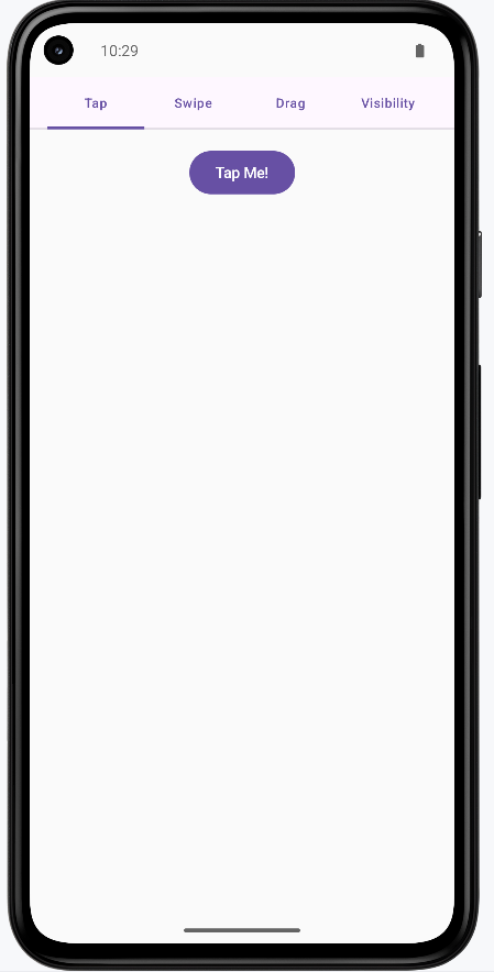
How the Examples Render
I created one example that combines all the custom components into one screen. You can view the full code on my GitHub page and look at the chapter14 gestures.kt file.
This is the rended application. It uses a scrollable tabbed navigation to show the different examples.
Tips for Success
- Use gestures to provide intuitive ways to interact with your app
- Provide visual feedback for all user interactions
- Keep animations smooth and not too distracting
- Use appropriate animation durations (100-300ms for quick feedback)
- Test gestures on different screen sizes and devices
- Provide alternative ways to perform actions (accessibility)
- Use spring animations for natural, bouncy feel
- Consider the user's context when choosing gesture types
Common Mistakes to Avoid
- Making gestures too complex or hard to discover
- Using animations that are too slow or distracting
- Not providing visual feedback for gesture interactions
- Forgetting to handle edge cases in gesture detection
- Using gestures that conflict with system gestures
- Not considering accessibility for users who can't use gestures
- Making animations that interfere with usability
- Not testing gestures on different devices and screen sizes
Best Practices
- Use standard gestures that users expect (tap, swipe, pinch)
- Provide clear visual feedback for all interactions
- Keep animations smooth and performant
- Use appropriate animation curves and durations
- Test gestures thoroughly on different devices
- Provide alternative interaction methods for accessibility
- Follow platform guidelines for gesture behavior
- Consider the user's mental model when designing interactions