Another Click Handling Example
In this section we will create a news feed that allows the user to click on a news item to read more about it.
Note: In order for the news feed images to work you will need to add the following dependencies and permissions.
This will go in your libs.versions.toml file
[versions]
...
coil = "2.4.0" // Add this line for Coil version

[libraries]
...
coil-compose = { module = "io.coil-kt:coil-compose", version.ref = "coil" } // Add this line for Coil Compose make sure it is in the libraries section.
This will go in your build.gradle file
dependencies {
    ...
    implementation(libs.coil.compose) // Add this line for Coil Compose
}
You will need to add this code to your manifest file to allow internet access. It is found in apps→manifests→AndroidManifest.xml.
<uses-permission android:name="android.permission.INTERNET" />
Sticky Header and Surface
In the news feed code below we use two ideas you haven’t seen yet: a sticky header and a Surface.
Sticky header: A sticky header is a title or bar that stays at the top of the list while the user scrolls. The rest of the list (the news cards) scrolls underneath it. So instead of the title scrolling away, it stays visible so the user always knows which section they’re in. In Compose we get this with stickyHeader { ... } inside a LazyColumn.
Surface: Surface is a Material Design composable that acts as a container with a background color and optional elevation (a slight shadow or lift). It’s useful for grouping content—like our “Latest News” title—and making it stand out from the content behind or below it. In the example we use Surface inside the sticky header so the header has a clear background and a bit of elevation, which makes it look like it’s sitting above the scrolling list.
fun NewsFeedExample() {
    // Sample data for the news feed
    val newsItems = listOf(
        NewsItem(
            title = "News Article One",
            description = "Lorem ipsum dolor sit amet, consectetur adipiscing elit. Nullam id massa id ante pretium molestie. Donec a libero pellentesque, hendrerit ante faucibus, feugiat mi. Maecenas fringilla urna quis elit egestas, in tincidunt velit feugiat. ",
            imageUrl = "https://picsum.photos/800/400"
        ),
        NewsItem(
            title = "News Article Two",
            description = "Lorem ipsum dolor sit amet, consectetur adipiscing elit. Nullam id massa id ante pretium molestie. Donec a libero pellentesque, hendrerit ante faucibus, feugiat mi. Maecenas fringilla urna quis elit egestas, in tincidunt velit feugiat. ",
            imageUrl = "https://picsum.photos/800/401"
        ),
        NewsItem(
            title = "News Article Three",
            description = "Lorem ipsum dolor sit amet, consectetur adipiscing elit. Nullam id massa id ante pretium molestie. Donec a libero pellentesque, hendrerit ante faucibus, feugiat mi. Maecenas fringilla urna quis elit egestas, in tincidunt velit feugiat. ",
            imageUrl = "https://picsum.photos/800/406"
        ),
        NewsItem(
            title = "News Article Four",
            description = "Lorem ipsum dolor sit amet, consectetur adipiscing elit. Nullam id massa id ante pretium molestie. Donec a libero pellentesque, hendrerit ante faucibus, feugiat mi. Maecenas fringilla urna quis elit egestas, in tincidunt velit feugiat. ",
            imageUrl = "https://picsum.photos/800/403"
        )
    )

    // State to track which news item is being shown in the dialog
    var selectedNewsItem by remember { mutableStateOf(null) }

    // Box is used as a container for the news feed
    Box(
        modifier = Modifier.fillMaxSize()
    ) {
        // LazyColumn displays the list of news items with system bar padding
        LazyColumn(
            modifier = Modifier
                .fillMaxSize()
                .systemBarsPadding()
        ) {
            // Sticky header for the section title this will stay at the top of the list while scrolling
            stickyHeader {
                Surface(
                    color = MaterialTheme.colorScheme.surface,
                    tonalElevation = 4.dp
                ) {
                    Text(
                        "Latest News",
                        modifier = Modifier
                            .fillMaxWidth()
                            .padding(16.dp),
                        style = MaterialTheme.typography.titleLarge
                    )
                }
            }
            // Display each news item in the list
            items(newsItems) { news ->
                NewsCard(
                    news = news,
                    onClick = { selectedNewsItem = news }
                )
            }
        }

        // Show dialog when a news item is selected
        selectedNewsItem?.let { news ->
            NewsDialog(
                news = news,
                onDismiss = { selectedNewsItem = null }
            )
        }
    }
}

/**
 * NewsCard displays a single news item in a card layout.
 * It shows the news image, title, and description.
 * Uses Coil's AsyncImage for image loading and RoundedCornerShape for image corners.
 */
@Composable
fun NewsCard(
    news: NewsItem,
    onClick: () -> Unit
) {
    Card(
        modifier = Modifier
            .fillMaxWidth()
            .padding(8.dp)
            .clickable(onClick = onClick),
        elevation = CardDefaults.cardElevation(defaultElevation = 4.dp)
    ) {
        Column(
            modifier = Modifier.padding(16.dp)
        ) {
            // News image
            AsyncImage(
                model = news.imageUrl,
                contentDescription = news.title,
                modifier = Modifier
                    .fillMaxWidth()
                    .height(200.dp)
                    .clip(RoundedCornerShape(8.dp))
            )
            Spacer(modifier = Modifier.height(8.dp))
            // News title
            Text(
                text = news.title,
                style = MaterialTheme.typography.titleMedium
            )
        }
    }
}

/**
 * NewsDialog displays a popup dialog with the full news item details.
 * Includes a close button and shows the image, title, and description.
 */
@Composable
fun NewsDialog(
    news: NewsItem,
    onDismiss: () -> Unit
) {
    Dialog(onDismissRequest = onDismiss) {
        Card(
            modifier = Modifier
                .fillMaxWidth()
                .padding(16.dp),
            shape = RoundedCornerShape(16.dp)
        ) {
            Column(
                modifier = Modifier.padding(16.dp)
            ) {
                // Close button
                Row(
                    modifier = Modifier.fillMaxWidth(),
                    horizontalArrangement = Arrangement.End
                ) {
                    IconButton(onClick = onDismiss) {
                        Icon(
                            imageVector = Icons.Default.Close,
                            contentDescription = "Close"
                        )
                    }
                }

                // News image
                AsyncImage(
                    model = news.imageUrl,
                    contentDescription = news.title,
                    modifier = Modifier
                        .fillMaxWidth()
                        .height(200.dp)
                        .clip(RoundedCornerShape(8.dp))
                )

                Spacer(modifier = Modifier.height(16.dp))

                // News title
                Text(
                    text = news.title,
                    style = MaterialTheme.typography.titleLarge
                )

                Spacer(modifier = Modifier.height(8.dp))

                // News description
                Text(
                    text = news.description,
                    style = MaterialTheme.typography.bodyLarge
                )
            }
        }
    }
}
What This Example Is Doing
NewsFeedExample holds a list of NewsItems (title, description, image URL) and selectedNewsItem in state. A LazyColumn shows a sticky “Latest News” header at the top and then each item as a NewsCard. Tapping a card sets selectedNewsItem = news. When selectedNewsItem is not null, NewsDialog is shown: a dialog with the full image, title, description, and a close button that clears selectedNewsItem. So you get a scrollable news list; tap a card to open the article in a dialog, then close it to return to the list. Coil and the INTERNET permission (from the snippets above) are required for loading images.
Composable Functions Explained
NewsFeedExample
The main composable that sets up the entire news feed interface. It:
- Creates sample news data with titles, descriptions, and images
- Manages the selected news item state
- Uses LazyColumn for efficient scrolling of news items
- Includes a sticky header that stays at the top while scrolling
- Shows a dialog when a news item is selected
NewsCard
A reusable card component that displays a single news item. It:
- Shows a news image with rounded corners
- Displays the news title below the image
- Handles click events to show the full article
- Uses Material Design elevation for a modern look
NewsDialog
A popup dialog that shows the complete news article. It:
- Displays a larger version of the news image
- Shows the full title and description
- Includes a close button to dismiss the dialog
- Uses proper spacing and typography for readability
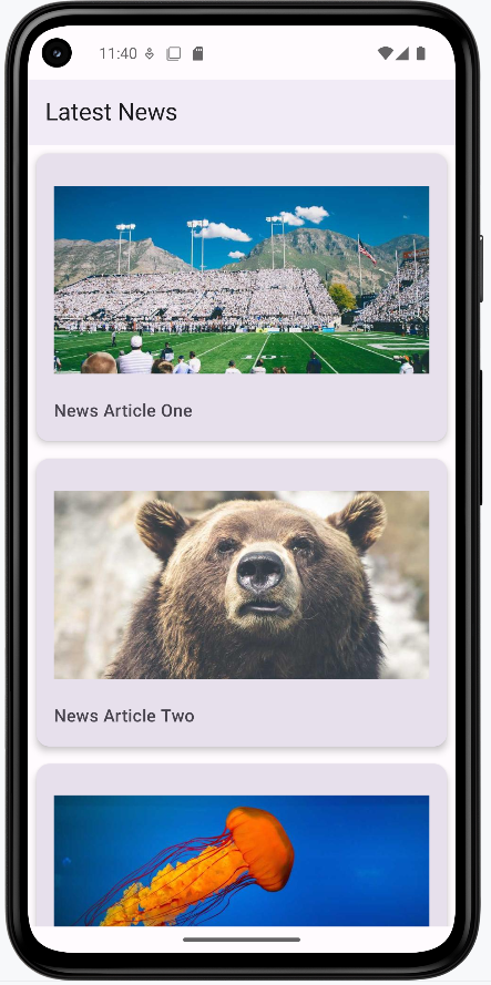
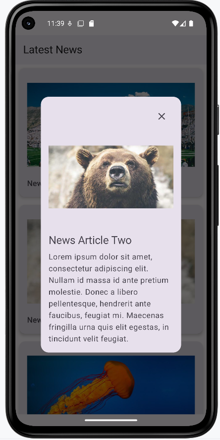
How this example renders
The two screenshots show the news feed in action. First image: The main list with a “Latest News” header at the top and a vertical list of news cards (image + title). You scroll to see more articles; tapping a card opens the full article. Second image: The dialog that appears when you tap a card—it shows the same image, the full title, the full description, and a close (X) button. Tapping close dismisses the dialog and returns you to the list. The full project is on my GitHub page—open the chapter8 newsfeed.kt file to run it.