FlowRow and FlowColumn
Introduction
Have you ever tried to display a list of items that's too wide for your screen? Or maybe you've needed to show multiple columns of content that need to wrap when they run out of space? That's exactly what FlowRow and FlowColumn are designed to handle!
Think of them like text wrapping in a word processor: when text hits the edge of the page, it automatically moves to the next line. FlowRow and FlowColumn do the same thing for your UI elements, making them perfect for creating responsive layouts that adapt to different screen sizes.
Quick Reference
| Component | Description | Common Use |
|---|---|---|
| FlowRow | Arranges items horizontally with automatic wrapping | Tag clouds, button groups, filter chips |
| FlowColumn | Arranges items vertically with automatic column wrapping | Image galleries, card layouts, content grids |
When to Use FlowRow and FlowColumn
- When you need items to wrap to new lines/columns automatically
- For responsive layouts that adapt to different screen sizes
- When displaying dynamic content that might grow or shrink
- For creating tag clouds, filter chips, or button groups
- When building image galleries or card layouts
Important Note: Experimental API
Before we dive into the examples, there's one important thing to know: FlowRow and FlowColumn are part of Jetpack Compose's experimental layout system. This means they work great but might have minor changes in future updates. To use them, you need to add this line above any composable function that uses them:
@OptIn(ExperimentalLayoutApi::class)What this does: This annotation tells the compiler that you're okay using an experimental API. You must add it above any composable that uses FlowRow or FlowColumn, or your project may not compile.
FlowRow in Action
Let's look at a basic example of FlowRow that displays several items:
@OptIn(ExperimentalLayoutApi::class)
@Composable
fun FlowRowExample() {
    FlowRow(
        modifier = Modifier.padding(16.dp),
        horizontalArrangement = Arrangement.spacedBy(8.dp),
        verticalArrangement = Arrangement.spacedBy(8.dp)
    ) {
        Text("Item 1", modifier = Modifier.background(Color.LightGray).padding(8.dp))
        Text("Item 2", modifier = Modifier.background(Color.LightGray).padding(8.dp))
        Text("Item 3", modifier = Modifier.background(Color.LightGray).padding(8.dp))
        Text("Item 4", modifier = Modifier.background(Color.LightGray).padding(8.dp))
        Text("Item 5", modifier = Modifier.background(Color.LightGray).padding(8.dp))
        Text("Item 6", modifier = Modifier.background(Color.LightGray).padding(8.dp))
    }
}
What This Example Is Doing
FlowRowExample puts six items ("Item 1" through "Item 6") in a FlowRow with 8 dp of space between items horizontally and between rows. Unlike a regular Row, when the row runs out of horizontal space, the next item wraps to a new line automatically. So on a narrow screen you might see two rows of three items; on a wide screen, more items might fit on the first line. No need to compute line breaks yourself—the layout is responsive.
FlowColumn Example
Here's how FlowColumn works - it's similar to FlowRow but stacks elements vertically and wraps to new columns when needed:
@OptIn(ExperimentalLayoutApi::class)
@Composable
fun FlowColumnExample() {
    FlowColumn(
        modifier = Modifier.padding(16.dp),
        verticalArrangement = Arrangement.spacedBy(8.dp),
        horizontalArrangement = Arrangement.spacedBy(8.dp)
    ) {
        Text("Item 0", modifier = Modifier.background(Color.Cyan).padding(8.dp))
        Text("Item 1", modifier = Modifier.background(Color.Cyan).padding(8.dp))
        Text("Item 2", modifier = Modifier.background(Color.Cyan).padding(8.dp))
        Text("Item 3", modifier = Modifier.background(Color.Cyan).padding(8.dp))
        Text("Item 4", modifier = Modifier.background(Color.Cyan).padding(8.dp))
        Text("Item 5", modifier = Modifier.background(Color.Cyan).padding(8.dp))
        Text("Item 6", modifier = Modifier.background(Color.Cyan).padding(8.dp))
        Text("Item 7", modifier = Modifier.background(Color.Cyan).padding(8.dp))
        Text("Item 8", modifier = Modifier.background(Color.Cyan).padding(8.dp))
        Text("Item 9", modifier = Modifier.background(Color.Cyan).padding(8.dp))
    }
}
What This Example Is Doing
FlowColumnExample puts ten items ("Item 0" through "Item 9") in a FlowColumn with 8 dp of space between items vertically and between columns. Items stack vertically first; when they run out of vertical space, the next item flows into a new column to the side. So you get a responsive grid that wraps by column instead of by row, which is useful for tall content or narrow, scrollable areas.
Interactive Example: Dynamic FlowRow
Let's make things more interesting by creating a dynamic FlowRow and FlowColumn that lets users add items at runtime:
FlowRow Part:
@OptIn(ExperimentalLayoutApi::class)
@Composable
fun DynamicFlowRow() {
    // State to track number of items
    var itemCount by remember { mutableStateOf(1) }

    Column(
        modifier = Modifier.padding(16.dp)
    ) {
        // Button to add more items
        Button(onClick = { itemCount++ }) {
            Text("Add Row Item")
        }

        Spacer(modifier = Modifier.height(16.dp))

        // FlowRow automatically wraps items to new rows when they exceed the width
        FlowRow(
            horizontalArrangement = Arrangement.spacedBy(8.dp),  // Space between items horizontally
            verticalArrangement = Arrangement.spacedBy(8.dp)     // Space between rows
        ) {
            // Create items based on itemCount
            for (i in 1..itemCount) {
                Text(
                    "Item $i",
                    modifier = Modifier
                        .background(Color.LightGray)  // Light gray background for visibility
                        .padding(horizontal = 12.dp, vertical = 8.dp)  // Padding inside each item
                )
            }
        }
    }
}
What This Example Is Doing
DynamicFlowRow keeps itemCount in state (starting at 1). It shows an "Add Row Item" button; each click increases itemCount. Below the button, a FlowRow draws that many items ("Item 1," "Item 2," …). So you start with one item and add more; the flow row wraps them to new lines when the width is full. This shows how flow layouts behave when the number or size of items changes at runtime.
FlowColumn Part
@OptIn(ExperimentalLayoutApi::class)
@Composable
fun DynamicFlowColumn() {
    // State to track number of items
    var itemCount by remember { mutableStateOf(1) }

    Column(
        modifier = Modifier.padding(16.dp)
    ) {
        // Button to add more items
        Button(onClick = { itemCount++ }) {
            Text("Add Column Item")
        }

        Spacer(modifier = Modifier.height(16.dp))

        // Box with fixed height to demonstrate flowing behavior
        Box(
            modifier = Modifier
                .fillMaxWidth()
                .height(300.dp)  // Fixed height container
                .background(Color.LightGray.copy(alpha = 0.2f))  // Light background to show container
                .padding(16.dp)
        ) {
            // FlowColumn automatically wraps items to new columns when they exceed the height
            FlowColumn(
                modifier = Modifier.fillMaxWidth(),
                verticalArrangement = Arrangement.spacedBy(8.dp),    // Space between items vertically
                horizontalArrangement = Arrangement.spacedBy(8.dp)   // Space between columns
            ) {
                // Create items based on itemCount
                for (i in 1..itemCount) {
                    Text(
                        "Column $i",
                        modifier = Modifier
                            .background(Color.Cyan)  // Cyan background for visibility
                            .padding(horizontal = 12.dp, vertical = 8.dp)  // Padding inside each item
                    )
                }
            }
        }
    }
}
What This Example Is Doing
DynamicFlowColumn also keeps itemCount in state and has an "Add Column Item" button. The items are drawn inside a fixed-height (300 dp) box so you can see the flow: as you add items, they fill the first column vertically, then wrap into a second column when the height is used. So you get a dynamic, column-wrapping layout that responds to both the container size and the number of items.
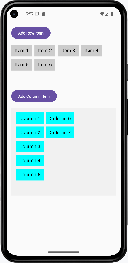
How these examples render
The image below shows what the FlowRow and FlowColumn examples look like when you run them: items wrapping to new lines (FlowRow) or new columns (FlowColumn), and the dynamic examples with the add buttons. The snippets above are only part of the code; to see and run the full project, go to my GitHub page and open the chapter5 flow_code.kt file.
Tips for Success
- Always add the
@OptIn(ExperimentalLayoutApi::class)annotation when using these components - Use
horizontalArrangementandverticalArrangementto control spacing between items - Consider using
Modifier.padding()to add space around your flow layouts - Test your layout with different screen sizes to ensure proper wrapping
Common Mistakes to Avoid
- Forgetting to add the
@OptInannotation - Not considering the minimum width/height of items when they wrap
- Using flow layouts when a simple
RoworColumnwould suffice - Not testing the layout with different content sizes
Best Practices
- Use flow layouts for dynamic content that might change size
- Add appropriate spacing between items using arrangement parameters
- Consider accessibility when items wrap to new lines/columns
- Test your layout with various screen sizes and orientations