Managing Input State
Introduction
Think of input state management like having a conversation with your app - it needs to listen, understand, and respond to what users type in real-time. In this chapter, we'll explore how to handle text input in Compose, from simple text fields to complex forms with validation. We'll learn how to create responsive, user-friendly interfaces that give immediate feedback to users as they type.
Quick Reference: Input State Patterns
| Pattern | Description | When to Use |
|---|---|---|
| Basic Text Input | Simple text field with state management | Single input fields, search boxes |
| Form Validation | Real-time input validation with feedback | Login forms, registration forms |
| Debounced Input | Delayed processing of input changes | Search fields, auto-save features |
| State Hoisting | Managing state at parent level | Complex forms, shared input state |
Basic Input State Management
Basic input state management is the foundation of handling user input in Compose. Think of it like having a notepad that automatically updates whenever someone writes something new. It's a way to store, track, and update what users type in your app's text fields. The state persists across UI updates, ensuring that user input isn't lost when the screen refreshes or changes.
When to Use Basic Input State
- When you need to capture user text input
- For simple forms with one or two fields
- When real-time validation isn't required
- For search functionality
Common Input State Features
| Feature | What It Does | When to Use It |
|---|---|---|
| mutableStateOf | Creates state that can be updated | Any time you need to store user input |
| OutlinedTextField | Material Design text input field | Most text input scenarios |
| VisualTransformation | Changes how text appears | Password fields, formatted input |
Real-World Example: A Login Screen
Let's look at a complete example that shows these special input state features:
NOTE: In order for the icon on the password field to work, you need to add the following to your libs.versions.toml file:
[libraries]
compose-material-icons-extended = { module = "androidx.compose.material:material-icons-extended" }
You also need to add the following to your build.gradle file:
implementation(libs.compose.material.icons.extended)
@Composable
fun LoginScreen() {
    // State for username and password
    var username by remember { mutableStateOf("") }
    var password by remember { mutableStateOf("") }
    // State to remember if we're showing the password
    var showPassword by remember { mutableStateOf(false) }
    // State for validation
    var isUsernameValid by remember { mutableStateOf(true) }
    var isPasswordValid by remember { mutableStateOf(true) }

    Column(
        modifier = Modifier
            .fillMaxWidth()
            .padding(16.dp),
        verticalArrangement = Arrangement.spacedBy(8.dp)
    ) {
        // Username field with validation
        OutlinedTextField(
            value = username,
            onValueChange = {
                username = it
                isUsernameValid = it.length >= 3
            },
            label = { Text("Username") },
            modifier = Modifier.fillMaxWidth(),
            isError = !isUsernameValid && username.isNotEmpty(),
            supportingText = {
                if (!isUsernameValid && username.isNotEmpty()) {
                    Text("Username must be at least 3 characters")
                }
            }
        )

        // Password field with show/hide and validation
        OutlinedTextField(
            value = password,
            onValueChange = {
                password = it
                isPasswordValid = it.length >= 6
            },
            label = { Text("Password") },
            modifier = Modifier.fillMaxWidth(),
            visualTransformation = if (showPassword) VisualTransformation.None else PasswordVisualTransformation(),
            isError = !isPasswordValid && password.isNotEmpty(),
            supportingText = {
                if (!isPasswordValid && password.isNotEmpty()) {
                    Text("Password must be at least 6 characters")
                }
            },
            trailingIcon = {
                IconButton(onClick = { showPassword = !showPassword }) {
                    Icon(
                        if (showPassword) Icons.Default.VisibilityOff else Icons.Default.Visibility,
                        contentDescription = if (showPassword) "Hide password" else "Show password"
                    )
                }
            }
        )

        // Login button (disabled if inputs are invalid)
        Button(
            onClick = { /* Handle login */ },
            modifier = Modifier.fillMaxWidth(),
            enabled = isUsernameValid && isPasswordValid && username.isNotEmpty() && password.isNotEmpty()
        ) {
            Text("Login")
        }
    }
}
Code Explanation:
State Variables:
var username by remember { mutableStateOf("") }: A mutable state variable holding the text entered into the username field, initialized as an empty string.var password by remember { mutableStateOf("") }: A mutable state variable holding the text entered into the password field, initialized as an empty string.var showPassword by remember { mutableStateOf(false) }: A boolean mutable state variable that controls the visibility of the password text. When true, the password is shown as plain text; when false, it's obscured (e.g., with asterisks).var isUsernameValid by remember { mutableStateOf(true) }: A boolean mutable state variable indicating the validation status of the username. It's true if the username meets the criteria, false otherwise.var isPasswordValid by remember { mutableStateOf(true) }: A boolean mutable state variable indicating the validation status of the password. It's true if the password meets the criteria, false otherwise.
Layout (Column):
The main content of the login screen is arranged vertically using a Column:
- modifier = Modifier.fillMaxWidth().padding(16.dp): The column fills the width of its parent and has 16dp of padding on all sides.
- verticalArrangement = Arrangement.spacedBy(8.dp): Provides 8dp of vertical space between its child composables.
Username OutlinedTextField:
This input field handles the username entry and its validation:
value = username: Binds the field's text to the username state.onValueChange = { username = it; isUsernameValid = it.length >= 3 }: Updates username with new input (it) and sets isUsernameValid to true if the username length is 3 or more characters, false otherwise.label = { Text("Username") }: The floating label for the field.isError = !isUsernameValid && username.isNotEmpty(): The error state is active if the username is invalid AND not empty (prevents error on initial empty field).
isErroris a parameter of the OutlinedTextField composable. When you set isError = true, it signals to the OutlinedTextField that there's an error with the input. The OutlinedTextField then automatically applies the Material Design error styling, which includes changing the border color (and usually the label and supporting text color) to the designated error color (often red).supportingText = { ... }: Displays an error message:- if (!isUsernameValid && username.isNotEmpty()) { Text("Username must be at least 3 characters") }: Shows this message when the username is invalid and not empty.
Password OutlinedTextField:
This input field handles password entry, its validation, and the show/hide functionality:
value = password: Binds the field's text to the password state.onValueChange = { password = it; isPasswordValid = it.length >= 6 }: Updates password with new input (it) and sets isPasswordValid to true if the password length is 6 or more characters, false otherwise.label = { Text("Password") }: The floating label for the field.visualTransformation = if (showPassword) VisualTransformation.None else PasswordVisualTransformation(): This is key for the show/hide functionality. If showPassword is true, the text is displayed normally (VisualTransformation.None); otherwise, it's obscured using PasswordVisualTransformation().isError = !isPasswordValid && password.isNotEmpty(): The error state is active if the password is invalid AND not empty.supportingText = { ... }: Displays an error message:- if (!isPasswordValid && password.isNotEmpty()) { Text("Password must be at least 6 characters") }: Shows this message when the password is invalid and not empty.
trailingIcon = { ... }:trailingIconis a parameter ofOutlinedTextField(andTextField) that lets you put any composable at the end of the field—often an icon button. You choose what to put there; it's just a slot. Here we use it for a show/hide password button.- IconButton(onClick = { showPassword = !showPassword }): A clickable icon that toggles the showPassword state when pressed.
- Icon(...): The actual icon comes from the Material Icons library that ships with Compose. Names like
Icons.Default.VisibilityandIcons.Default.VisibilityOffare the standard “eye” and “eye with slash” icons. You find them in the Material Icons catalog online, in your IDE's autocomplete when you typeIcons., or by searching for “visibility” in the docs—developers use these names to pick the right icon.
Login Button:
The button to initiate the login process:
- onClick = { /* Handle login */ }: Placeholder for the actual login logic.
- modifier = Modifier.fillMaxWidth(): Makes the button fill the width.
- enabled = isUsernameValid && isPasswordValid && username.isNotEmpty() && password.isNotEmpty(): The button is only enabled when ALL of these conditions are met:
- isUsernameValid is true
- isPasswordValid is true
- username is not empty
- password is not empty
- Text("Login"): The text displayed on the button.
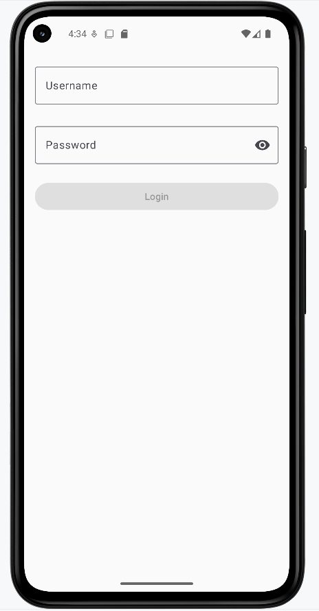
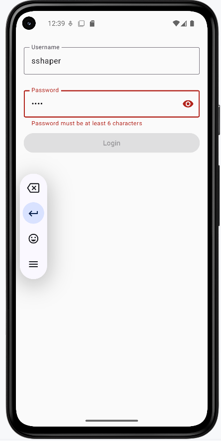
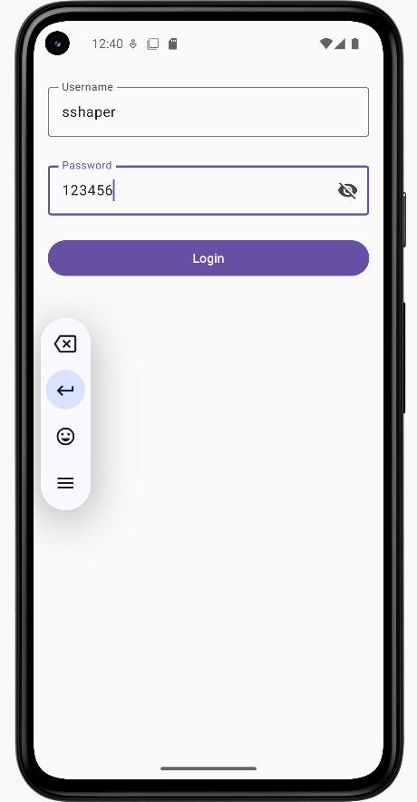
How these examples render
The images below show the login screen at different stages. The snippets above are only part of the code; to see and run the full project, go to my GitHub page and open the chapter7 inputstate.kt file.
- First image: Screen when first loaded (empty fields, Login disabled).
- Second image: Username is valid but password is too short; password shows an error message and Login stays disabled.
- Third image: Both username and password are valid, the show-password icon has been clicked so the password is visible, and the Login button is enabled.
State Hoisting in Input Management
State hoisting is a pattern in Compose where you move state management up to a parent component, making it the single source of truth for that state. Think of it like a family tree: instead of each child component managing its own state, the parent component holds the state and passes it down to its children. This is particularly useful for input management when you need to share state between multiple components or when child components need to communicate with each other.
When to Use State Hoisting
- When multiple components need to share input state
- For complex forms with interdependent fields
- When you need to validate across multiple inputs
- To make input components more reusable
Here's a simple example of state hoisting with an input field:
@Composable
fun ParentScreen() {
    // State is hoisted to the parent
    var text by remember { mutableStateOf("") }

    Column {
        // Pass state and update function to child
        CustomTextField(
            value = text,
            onValueChange = { text = it },
            label = "Enter text"
        )

        // Another component using the same state
        Text("You typed: $text")
    }
}

@Composable
fun CustomTextField(
    value: String,
    onValueChange: (String) -> Unit,
    label: String
) {
    OutlinedTextField(
        value = value,
        onValueChange = onValueChange,
        label = { Text(label) }
    )
}
What This Example Is Doing
ParentScreen holds the only state: text. It passes value = text and onValueChange = { text = it } to CustomTextField, so the child never owns state—it just displays and reports changes. The parent also shows "You typed: $text" below the field, so the same state drives both the field and the label. CustomTextField is stateless and reusable: it only needs a value and a callback.
Let's break down how this hoisting example works:
State Management:
- The text state is defined in the parent composable
- The state update function is passed down to the child
- The child composable is stateless and just displays the value
Benefits of Hoisting:
- Multiple components can share the same input state
- Input components become more reusable
- State management is centralized in one place
- Testing becomes easier as components are more predictable
Here's a more practical example showing hoisting with validation:
@Composable
fun FormScreen() {
    // State Hoisting: All state is managed at the parent level
    // This allows child components to share and react to state changes
    var name by remember { mutableStateOf("") }
    var email by remember { mutableStateOf("") }
    // This state depends on both name and email, showing why hoisting is useful
    var isFormValid by remember { mutableStateOf(false) }

    Column {
        // State Hoisting: Passing state and update functions to child components
        // The child components don't manage their own state, they just display and update it
        NameInput(
            value = name,
            onValueChange = {
                name = it
                // Validation happens at the parent level, affecting multiple components
                isFormValid = name.isNotEmpty() && email.isNotEmpty()
            }
        )

        EmailInput(
            value = email,
            onValueChange = {
                email = it
                // Same validation logic is shared between components
                isFormValid = name.isNotEmpty() && email.isNotEmpty()
            }
        )

        // The button's state depends on the hoisted validation state
        // This wouldn't be possible if each input managed its own state
        Button(
            onClick = { /* Handle submit */ },
            enabled = isFormValid
        ) {
            Text("Submit")
        }
    }
}

@Composable
fun NameInput(
    value: String,
    onValueChange: (String) -> Unit
) {
    OutlinedTextField(
        value = value,
        onValueChange = onValueChange,
        label = { Text("Name") }
    )
}

@Composable
fun EmailInput(
    value: String,
    onValueChange: (String) -> Unit
) {
    OutlinedTextField(
        value = value,
        onValueChange = onValueChange,
        label = { Text("Email") }
    )
}
Code Explanation:
This Kotlin Composable function, FormScreen, along with its child components NameInput and EmailInput, demonstrates a fundamental concept in Jetpack Compose called **State Hoisting**. State hoisting involves moving the state management (e.g., mutableStateOf variables) from a child composable to its parent, making the child composable "stateless."
FormScreen Composable: (Parent Component - State Holder)
This composable is responsible for holding and managing the state for the form:
var name by remember { mutableStateOf("") }: Holds the current text for the name input.var email by remember { mutableStateOf("") }: Holds the current text for the email input.var isFormValid by remember { mutableStateOf(false) }: A boolean flag indicating if the entire form is valid. This state depends on bothnameandemailbeing non-empty.
Inside the Column layout:
- NameInput and EmailInput Calls:
value = name(oremail): The current value of the input field is passed down from the parent's state.onValueChange = { ... }: A lambda function is passed down, which is responsible for updating the parent's state. When the child component calls thisonValueChangewith new input, the parent updates itsnameoremailstate.- **Validation Logic**: The line
isFormValid = name.isNotEmpty() && email.isNotEmpty()is executed in bothonValueChangecallbacks. This demonstrates that the validation logic for the entire form is managed at the parent level, ensuring thatisFormValidaccurately reflects the validity of both input fields.
- Button Composable:
enabled = isFormValid: The "Submit" button's enabled state directly depends on theisFormValidstate hoisted in FormScreen. This means the button will only become clickable when both the name and email fields are non-empty, showcasing the power of shared state.
NameInput Composable: (Child Component - Stateless)
This composable is a reusable input field that doesn't manage its own state:
value: String: It receives its current text value from the parent.onValueChange: (String) -> Unit: It receives a callback function from the parent to notify the parent about changes in its text. It simply calls this function when its ownOutlinedTextField'sonValueChangeis triggered.OutlinedTextField(...): The actual UI element for the text input.
EmailInput Composable: (Child Component - Stateless)
Similar to NameInput, this is another stateless child component for the email input, showcasing the reusability and simplified logic that state hoisting enables.
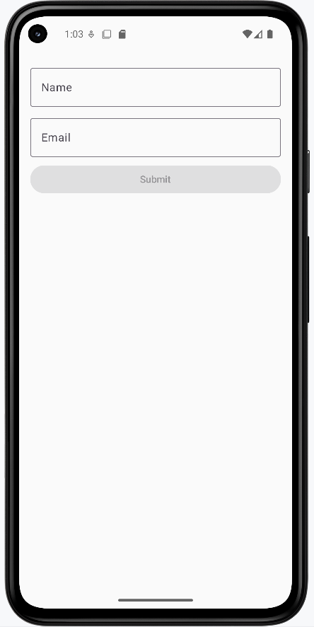
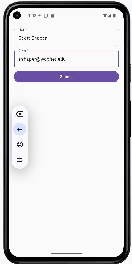
How these examples render
The images below show the state-hoisting form. The snippets above are only part of the code; to see and run the full project, go to my GitHub page and open the chapter7 hoisting.kt file.
- First image: Form when first loaded (empty fields, Submit disabled).
- Second image: Name and email are filled in, so the Submit button is enabled.
Tips for Success
- Always validate input in real-time for better user experience
- Provide clear, helpful error messages
- Use appropriate input types for different data (email, password, etc.)
- Consider accessibility when designing input fields
- Test your forms with different input scenarios
Common Mistakes to Avoid
- Not providing immediate feedback on invalid input
- Forgetting to handle edge cases in validation
- Not considering keyboard types for different inputs
- Over-complicating simple input scenarios
- Ignoring performance with frequent state updates
Best Practices
- Use state hoisting for complex forms
- Implement debouncing for search and auto-save features
- Keep validation logic separate from UI components
- Use appropriate Material Design components
- Consider form submission handling