Writing Your First Composable
Like stated in the last section, think of composable functions as the building blocks of your app's user interface. Just as you use LEGO pieces to build structures, composables are the pieces you use to build your app's screens. Each composable is a special function that creates a part of your UI, like a button, text, or image. The main advantage of using Jetpack Compose over XML is you can write UI code in Kotlin, which is more powerful and flexible than XML.
In this lesson, we'll learn how to create your first composable function and understand how these functions work together to build complete screens. We'll explore the structure of composables, how to customize them, and how to combine them to create more complex UIs.
Quick Reference of Composable Function Components
| Component | What It Does | Example |
|---|---|---|
| @Composable Annotation | Marks a function as a UI component | @Composable fun Greeting() { } |
| Function Name | Identifies the composable | fun Greeting() { } |
| Parameters | Customizes the composable | fun Greeting(name: String) { } |
| Callback Parameters | Handles user interactions (lambda functions) | fun Button(onClick: () -> Unit) { } |
| Function Body | Contains the UI elements | { Text("Hello") } |
When to Use
- When you need to create any part of your app's UI
- When you want to display text, buttons, or other UI elements
- When you need to create reusable UI components
- When you want to build responsive layouts
Practical Example
This is a small example; we will go much deeper into composable functions as we continue through this book. In this example we have a function named MainScreen that creates a Box that contains a Column. The column calls Greeting three times; Greeting displays a line of text. Greeting can take a value for name or use a default value, and it can take an optional modifier for extra styling.
Note about Callback Parameters: When you need to handle user interactions (like button clicks, text input changes, etc.), you use callback parameters. These are lambda functions (function types) that get called when the interaction occurs. For example, a Button composable uses onClick: () -> Unit as a callback parameter to handle click events. We'll explore interactive composables with callbacks in more detail in later chapters.
@Composable
fun MainScreen() {
    Box(modifier = Modifier.fillMaxSize()) {
        Column(
            modifier = Modifier
                .fillMaxSize()
                .padding(50.dp),
            horizontalAlignment = Alignment.CenterHorizontally
        ) {
            // Demonstrates different ways to use the Greeting composable:
            Greeting()  // Uses default values
            Greeting(name = "Android")  // Custom name
            Greeting(
                name = "Developer",
                modifier = Modifier.padding(24.dp) //dp stands for density pixels
            )
        }
    }
}


@Composable
fun Greeting(
    modifier: Modifier = Modifier,
    name: String = "Compose"

) {
    Text(
        text = "Hello, $name!",
        modifier = modifier.padding(16.dp),
        style = TextStyle(
            fontSize = 24.sp, //sp stands for Scale-independent Pixels
            fontWeight = FontWeight.Bold
        ),
        color = MaterialTheme.colorScheme.primary
    )
}
What This Example Is Doing
Here’s a simple walkthrough of what the code above does, step by step.
- MainScreen is the top-level composable. It creates a
Boxthat fills the screen, then puts aColumninside it. The column fills the space and has 50 density-independent pixels of padding on all sides, and it centers its children horizontally. - Inside that column, three
Greetingcomposables are called:Greeting()— No arguments, so it uses the default name"Compose". The user sees: Hello, Compose!Greeting(name = "Android")— Passes a custom name. The user sees: Hello, Android!Greeting(name = "Developer", modifier = Modifier.padding(24.dp))— Passes both a name and extra padding (24 dp) around that text. The user sees: Hello, Developer! with more space around it.
- Greeting is a reusable composable that shows one line of text. It takes an optional
modifier(defaults to no extra styling) and aname(defaults to"Compose"). It displays"Hello, $name!"with 16 dp padding, bold 24 sp text, and the theme’s primary color. So the same function can show different messages depending on the parameters you pass.
In short: MainScreen sets up the layout (a centered column), and Greeting is the small building block that displays each greeting. Using parameters like name and modifier makes Greeting reusable without copying and pasting code.
How the example renders
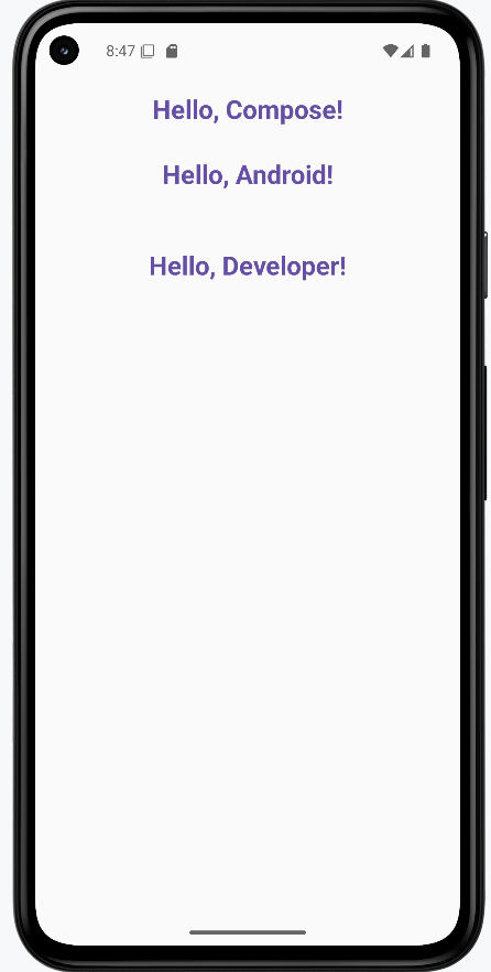
The image below shows what the example looks like when you run it: three lines of text stacked vertically—"Hello, Compose!", "Hello, Android!", and "Hello, Developer!"—each produced by a call to Greeting. The snippet above is only part of the code; to see and run the full project, go to my GitHub page and open the chapter4 function_code.kt file.
Tips for Success
- Always use the @Composable annotation for UI functions
- Name your composables with descriptive nouns
- Keep composables small and focused on a single responsibility
- Use parameters to make composables reusable
- Use callback parameters (lambda functions) to handle user interactions like clicks and input changes
- Use the Compose Preview feature to see your UI as you build it
- Break down complex UIs into smaller, reusable composables
Common Mistakes to Avoid
- Forgetting to add the @Composable annotation
- Creating overly complex composables that are hard to maintain
- Not using parameters to make composables reusable
- Forgetting to use callback parameters for handling user interactions
- Not handling state properly in interactive composables
- Not using the Compose Preview feature to check your UI
- Not following Material Design guidelines for consistency
Best Practices
- Use meaningful names for your composable functions
- Keep composables small and focused on a single responsibility
- Use parameters to make composables reusable
- Use callback parameters (function types) to handle user interactions in interactive composables
- Use the Compose Preview feature to iterate quickly
- Follow Material Design guidelines for a consistent look
- Test your composables with different screen sizes and orientations