CPS251
Android Development
Theming for Different App Sections (Multiple Themes)
Introduction
Sometimes you want different parts of your app to look unique—maybe an admin section, a special event screen, or a user profile area. In Jetpack Compose, you can apply different themes to different screens or sections, giving each part its own style while keeping the rest of your app consistent.
When to Use Multiple Themes
- You have different user roles (like admin vs. regular user)
- You want to highlight special features or events
- You want to test new looks without changing your whole app
- You want to support brand partnerships or seasonal themes
How to Apply Multiple Themes in Compose
- Wrap each section or screen in its own
MaterialTheme - Provide different color schemes, typography, or shapes as needed
- Keep your main theme as the default for most of the app
Practical Example
@Composable
    fun AdminSection(modifier: Modifier = Modifier) {
        // Admin color scheme with red as primary color
        val adminColors = lightColorScheme(
            primary = Color(0xFFB00020),    // Deep red
            secondary = Color(0xFF3700B3),  // Deep purple
            background = Color(0xFFFFEBEE)  // Light red background
        )

        MaterialTheme(colorScheme = adminColors) {
            Surface(
                modifier = modifier.fillMaxSize(),
                color = MaterialTheme.colorScheme.background
            ) {
                Column(modifier = Modifier.padding(16.dp)) {
                    Text(
                        text = "Admin Area",
                        style = MaterialTheme.typography.headlineMedium,
                        color = MaterialTheme.colorScheme.primary
                    )
                    Button(
                        onClick = { /* TODO: Implement admin action */ },
                        modifier = Modifier.padding(top = 8.dp)
                    ) {
                        Text("Admin Action")
                    }
                }
            }
        }
    }


    @Composable
    fun UserSection(modifier: Modifier = Modifier) {
        // User color scheme with blue as primary color
        val userColors = lightColorScheme(
            primary = Color(0xFF1976D2),    // Blue
            secondary = Color(0xFF03DAC6),  // Teal
            background = Color(0xFFE3F2FD)  // Light blue background
        )

        MaterialTheme(colorScheme = userColors) {
            Surface(
                modifier = modifier.fillMaxSize(),
                color = MaterialTheme.colorScheme.background
            ) {
                Column(modifier = Modifier.padding(16.dp)) {
                    Text(
                        text = "User Area",
                        style = MaterialTheme.typography.headlineMedium,
                        color = MaterialTheme.colorScheme.primary
                    )
                    Button(
                        onClick = { /* TODO: Implement user action */ },
                        modifier = Modifier.padding(top = 8.dp)
                    ) {
                        Text("User Action")
                    }
                }
            }
        }
    }
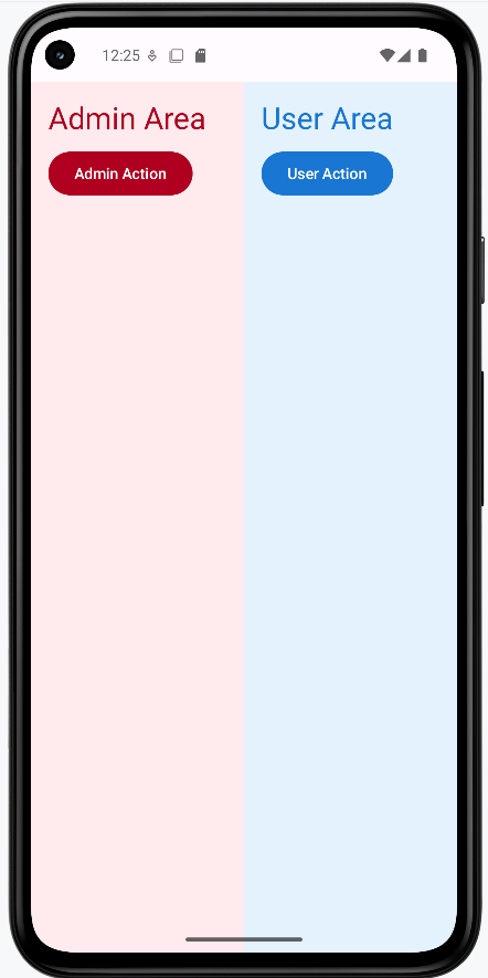
- The admin section has different colors than the user section.
- Both these sections are shown side by side but they could be different pages in the application.
- You can nest or swap themes as needed for different screens
How this example renders
Above is just a snippet of the code to view the full code, you need to go to my GitHub page and look at the chapter13 multi_theme.kt file. When you run the code it will look like the example below.
Tips for Success
- Keep most of your app on a single theme for consistency
- Use multiple themes only when you have a clear reason
- Document where and why you use different themes
Common Mistakes to Avoid
- Using too many themes, making your app look inconsistent
- Forgetting to test all sections in both light and dark mode
- Not updating navigation or icons to match the new theme
Best Practices
- Keep your theme logic organized and easy to update
- Use clear naming for different theme sections
- Test your app's look and feel with real users