Box Layout
Think of a Box like a stack of photos on your desk - you can put one thing on top of another! In Android apps, we use Box when we want to layer things, like putting text over a picture or adding a cool badge in the corner of something.
In this lesson, we'll explore how to use the Box layout effectively in your Android apps. You'll learn how to create basic boxes, style them, and layer content to create beautiful, user-friendly interfaces.
Quick Reference Table
| Property | Description | When to Use |
|---|---|---|
| modifier | Controls appearance and behavior | When you need to style or position the box |
| contentAlignment | Controls default alignment of content | When you need to align items within the box |
| content | The items to be displayed in the box | When you need to add content to the box |
Let's Start Simple: A Basic Box
When to Use
- When you need to layer elements on top of each other
- When you want to position elements precisely within a container
- When you need to create complex layouts with overlapping components
- When you want to create a more visually appealing design
Practical Example
@Composable
fun BoxExample() {
    Box(modifier = Modifier
        .size(150.dp)  // Set the size of the box
        .padding(16.dp)  // Add space around the box
        .border(width = 1.dp, color = Color.Blue)  // Add a border
    ) {
        Text(
            text = "Top Text",
            modifier = Modifier.align(Alignment.TopCenter)  // Position at the top center
        )
        Text(
            text = "Bottom Text",
            modifier = Modifier.align(Alignment.BottomCenter)  // Position at the bottom center
        )
    }
}
Let's break down what this does:
- Creates a box that's 150 by 150 units big (like a square sticky note)
- Adds some space around it (16 units of padding)
- Adds a blue border so we can see where the box is
- Puts "Top Text" at the top center (like sticking it to the top of the note)
- Puts "Bottom Text" at the bottom center (like sticking it to the bottom)
Making a Box Look Pretty
When to Use
- When you want to create a visually appealing UI
- When you need to highlight important content
- When you want to create a card-like container
- When you need to create a more polished, professional look
Practical Example
@Composable
fun ColoredBox() {
    Box(
        modifier = Modifier
            .size(200.dp)  // Set the size of the box
            .padding(16.dp)  // Add space around the box
            .background(  // Add a background color
                Color(0xFF673AB7),  // Purple color
                shape = androidx.compose.foundation.shape.RoundedCornerShape(24.dp)  // Rounded corners
            )
            .border(  // Add a border
                width = 1.dp,
                color = Color(0xFF512DA8),  // Darker purple
                shape = androidx.compose.foundation.shape.RoundedCornerShape(24.dp)  // Rounded corners
            )
    ) {
        Text(
            "Box Content",
            color = Color.White,  // White text
            modifier = Modifier.align(Alignment.Center)  // Center the text
        )
    }
}
This is like:
- Taking a box and making it 200 units big
- Adding some breathing room (16 units of padding)
- Painting it in a nice purple color (that's what the Color(0xFF673AB7) does)
- Making the corners round (like a rounded rectangle)
- Adding a darker purple border to make it pop
- Putting white text right in the middle so it's easy to read against the purple
Putting One Thing On Top of Another
When to Use
- When you need to overlay elements on top of each other
- When you want to position elements precisely within a container
- When you need to layer UI elements
- When you want to create complex layouts with overlapping components
Practical Example
@Composable
fun BoxWithOverlay() {
    Box(
        modifier = Modifier
            .size(200.dp)  // Set the size of the box
            .padding(16.dp)  // Add space around the box
            .background(Color.Cyan)  // Add a cyan background
    ) {
        Text(
            text = "Overlay",
            color = Color.White,  // White text
            modifier = Modifier
                .align(Alignment.BottomEnd)  // Position at the bottom right
                .background(Color.DarkGray)  // Dark gray background
                .padding(4.dp)  // Add space around the text
        )
    }
}
Here's what's happening:
- We make a bigger cyan (light blue) box that's 200 units big
- We add some space around it (16 units of padding)
- We add the word "Overlay" on top of it
- We put that word in the bottom-right corner
- We give the word a dark gray background and some space around it (padding) so it's easy to read
How these examples render
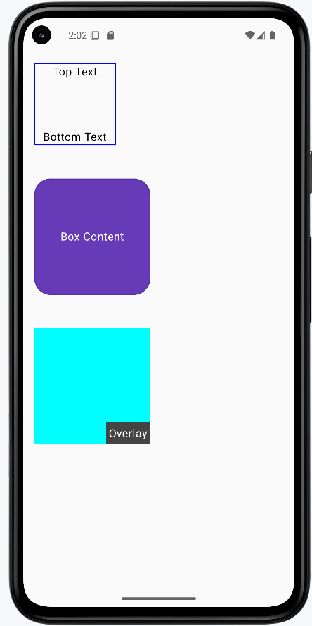
The image below shows what the three box examples look like when you run them: a basic box with "Top Text" and "Bottom Text" at the top and bottom, a purple rounded box with centered "Box Content," and a cyan box with an "Overlay" label in the bottom-right corner. The snippets above are only part of the code; to see and run the full project, go to my GitHub page and open the chapter4 box_code.kt file.
Tips for Success
- Start with simple boxes and build up to more complex ones
- Use the Compose Preview feature to see your boxes as you build them
- Use modifiers to fine-tune the appearance and positioning of your boxes
- Test your boxes on different screen sizes and orientations
- Use the Compose documentation and samples as reference
- Break down complex boxes into smaller, reusable components
Common Mistakes to Avoid
- Creating overly complex boxes that are hard to maintain
- Not using modifiers to control the appearance and positioning of boxes
- Not considering different screen sizes and orientations
- Not using the Compose Preview feature to check your boxes
- Not following Material Design guidelines for consistency
- Not breaking down complex boxes into smaller, reusable components
Best Practices
- Keep boxes simple and focused on a single responsibility
- Use meaningful names for your box composables
- Extract reusable box components into separate composables
- Use the Compose Preview feature to iterate quickly
- Follow Material Design guidelines for a consistent look
- Test your boxes with different screen sizes and orientations