Bottom Sheets and Dialogs
What are Bottom Sheets and Dialogs?
Think of bottom sheets and dialogs like pop-up menus in a restaurant. When you want to see the dessert menu, the waiter brings it to your table (that's like a dialog). When you want to see the daily specials, they might slide a card across the table (that's like a bottom sheet). These UI elements help you show additional information without taking over the entire screen.
Bottom sheets slide up from the bottom of the screen, while dialogs appear in the center and dim the background. Both are great ways to show extra options, confirm actions, or display additional content without losing context of what's behind them.
Quick Reference
| Component | Description | When to Use |
|---|---|---|
| Bottom Sheet | Slides up from bottom of screen | Showing options, filters, or additional content |
| Dialog | Appears in center with dimmed background | Confirming actions, showing alerts, or important messages |
TextButton |
Material 3 text-style button: label only, no solid fill; looks lighter than a filled or tonal button | Secondary actions in dialogs (Cancel, OK), rows in a list-style dialog, and options inside a bottom sheet where you want a simple tap target without a heavy button |
List-style AlertDialog |
Same as dialog; body is often a column of buttons or rows | Choosing one of several labeled options (e.g. size, category) |
DatePickerDialog + DatePicker |
Modal dialog with a calendar UI and OK/Cancel | Picking a single date; read selectedDateMillis from state |
When to Use Bottom Sheets and Dialogs
Use Bottom Sheets When:
- You want to show multiple options or filters
- You need to display additional content without losing context
- You want to provide a quick way to access related features
- You're showing a list of items that users can select from
- You want to save space on the main screen
Use Dialogs When:
- You need to confirm an important action (like deleting something)
- You want to show an error message or alert
- You need to get user input for a specific task
- You want to display critical information that requires attention
- You're asking for permission or showing terms of service
Practical examples
Each pattern below is minimal on purpose: a little state, a trigger, and the Material 3 composable that does the work.
Showing selections in a text field
@OptIn(ExperimentalMaterial3Api::class)
@Composable
fun MyScreen() {
// State variables to control the visibility of overlays
var showDeleteDialog by remember { mutableStateOf(false) }
var showOptionsSheet by remember { mutableStateOf(false) }
var showListOptionsDialog by remember { mutableStateOf(false) }
var showDatePickerDialog by remember { mutableStateOf(false) }
// Persist each overlay’s result in its own string; the read-only text field below displays them.
var bottomSheetSelection by remember { mutableStateOf("") }
var listOptionSelection by remember { mutableStateOf("") }
var dateSelection by remember { mutableStateOf("") }
// Single block of text for the OutlinedTextField: labeled lines, or a placeholder until any selection exists.
val selectionSummary = buildString {
val hasAny =
bottomSheetSelection.isNotEmpty() || listOptionSelection.isNotEmpty() || dateSelection.isNotEmpty()
if (bottomSheetSelection.isNotEmpty()) appendLine("Bottom sheet: $bottomSheetSelection")
if (listOptionSelection.isNotEmpty()) appendLine("List option: $listOptionSelection")
if (dateSelection.isNotEmpty()) appendLine("Date: $dateSelection")
if (!hasAny) append("Selections will appear here.")
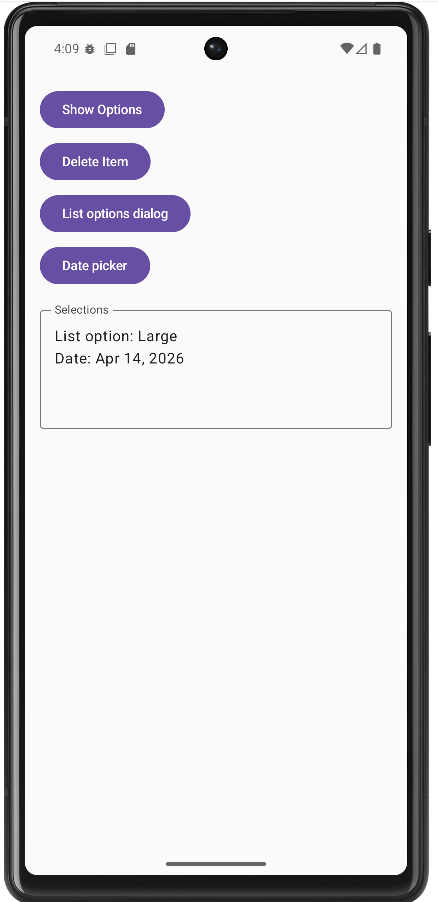
}.trimEnd()The sample start with calling MyScreen which holds three strings in remember { mutableStateOf("") }—one for the last bottom-sheet action, one for the list dialog choice, and one for the formatted date from the date picker.
When the user picks an option or a date, the corresponding callback updates only that string (for example bottomSheetSelection = option or dateSelection = sdf.format(...)). A fourth block of logic builds a single multi-line selectionSummary with buildString: it prints labeled lines for each non-empty string, or the placeholder line “Selections will appear here.” if nothing has been chosen yet.
That summary is bound to an OutlinedTextField with readOnly = true and an empty onValueChange = { }. The field is display-only; the user cannot type into it. Because the field’s value is selectionSummary, any change to the underlying state recomposes the UI and the text box updates immediately—no Context or Android toast API required.
DeleteConfirmationDialog is only a yes/no confirmation in this sample, so it does not write into the summary text; the list dialog, bottom sheet, and date picker are the ones that populate the box.
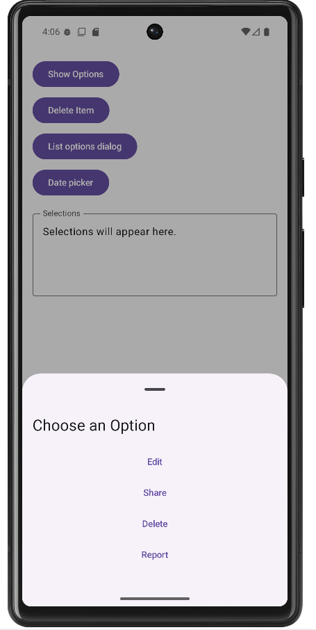
Modal bottom sheet
@OptIn(ExperimentalMaterial3Api::class)
@Composable
fun BottomSheetDemo() {
    var showSheet by remember { mutableStateOf(false) }

    Button(onClick = { showSheet = true }) { Text("Open sheet") }

    if (showSheet) {
        ModalBottomSheet(
            onDismissRequest = { showSheet = false },
            sheetState = rememberModalBottomSheetState()
        ) {
            Column(Modifier.fillMaxWidth().padding(16.dp)) {
                Text("Sheet content", style = MaterialTheme.typography.titleMedium)
                TextButton(onClick = { showSheet = false }) { Text("Close") }
            }
        }
    }
}
A modal bottom sheet is anchored to the bottom edge of the screen and slides up over the current UI. It is a good fit when you want several related actions or extra content without a full new screen. Material 3’s ModalBottomSheet is still marked experimental, so the composable (or its caller) must use @OptIn(ExperimentalMaterial3Api::class).
Visibility is driven by a single piece of remembered state, here showSheet. The sheet is only composed when showSheet is true, which is the usual Compose pattern: if the flag is false, the sheet is not in the tree at all. Opening the sheet sets the flag to true; closing it must set the flag back to false so the overlay disappears and state stays consistent.
rememberModalBottomSheetState() gives you a SheetState that the implementation uses for expansion, animation, and drag gestures. You pass it into ModalBottomSheet so the sheet can be dismissed with a swipe down as well as by tapping the scrim (the dimmed area outside the sheet).
onDismissRequest runs when the system wants to dismiss the sheet: for example the user tapped outside or used a back gesture. Your lambda should clear showSheet. You can also clear the same flag from an explicit control inside the sheet (here a “Close” TextButton), so both gestures and buttons end up in the same state.
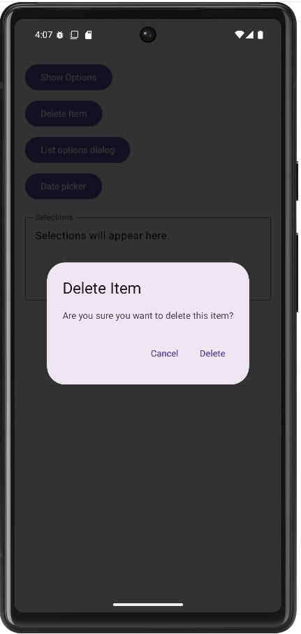
Confirmation alert dialog
@Composable
fun DeleteConfirmationDialog(
    onConfirm: () -> Unit,
    onDismiss: () -> Unit
) {
    AlertDialog(
        onDismissRequest = onDismiss,
        title = { Text("Delete Item") },
        text = { Text("Are you sure you want to delete this item?") },
        confirmButton = {
            TextButton(onClick = onConfirm) { Text("Delete") }
        },
        dismissButton = {
            TextButton(onClick = onDismiss) { Text("Cancel") }
        }
    )
}
An alert dialog appears in the center of the screen with a dimmed background. It interrupts the flow briefly, which is why it is appropriate for confirmations—especially destructive actions such as delete—where you want a clear yes or no before anything irreversible happens.
This composable does not own “whether the dialog is visible.” The parent decides that, typically with something like if (showDeleteDialog) { DeleteConfirmationDialog(…) }. The dialog composable only describes what appears when it is shown. That separation keeps navigation and state in one place and keeps the dialog reusable.
Material 3’s AlertDialog uses composable slots. title and text are usually short strings; confirmButton and dismissButton are the primary and secondary actions. Naming is conventional: “confirm” is often the risky action (Delete) and “dismiss” the safe escape (Cancel), but the API does not enforce danger styling—you would add colors or typography yourself if needed.
onDismissRequest is called when the user tries to leave the dialog without pressing one of your buttons—tapping outside the dialog (if allowed) or pressing the system back button. It should run the same cleanup as Cancel: typically call the same lambda as the dismiss button or set your visibility flag to false. Keeping onConfirm and onDismiss as separate parameters lets you perform the delete only on confirm, while cancel and outside-dismiss only close the dialog.
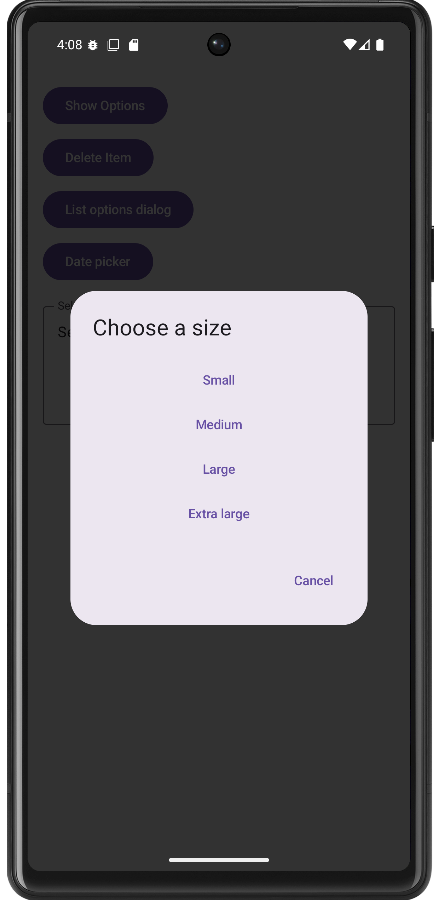
List of options in a dialog
@Composable
fun ListOptionsDialog(
    onDismiss: () -> Unit,
    onOptionSelected: (String) -> Unit = {}
) {
    val options = listOf("Small", "Medium", "Large", "Extra large")
    AlertDialog(
        onDismissRequest = onDismiss,
        title = { Text("Choose a size") },
        text = {
            Column(Modifier.fillMaxWidth()) {
                options.forEach { option ->
                    TextButton(
                        onClick = {
                            onOptionSelected(option)
                            onDismiss()
                        },
                        modifier = Modifier.fillMaxWidth()
                    ) {
                        Text(option)
                    }
                }
            }
        },
        confirmButton = {
            TextButton(onClick = onDismiss) { Text("Cancel") }
        }
    )
}
Sometimes you need more than two buttons: several mutually exclusive choices (size, category, sort order). The same AlertDialog API can host a vertical list by putting a Column inside the text slot. Each row is a full-width TextButton so taps are easy to hit and the layout reads like a list.
When the user picks a row, call onOptionSelected(option) so the parent can store the string in state—for example to show it in a read-only OutlinedTextField on the main screen—then call onDismiss() to close the dialog. Order matters: update the parent’s state first, then hide the UI.
The confirmButton slot here holds a neutral Cancel action. Material’s dialog API always wants a confirm button composable; using it for “close without choosing” is a common pattern when the main choices live in the body. Tapping Cancel should only dismiss, not fire onOptionSelected.
The extra parameter onOptionSelected defaults to an empty lambda so callers who only dismiss can omit it. Pass a lambda when you need to copy the chosen label into screen state (such as the summary text field in optionsDialog.kt).
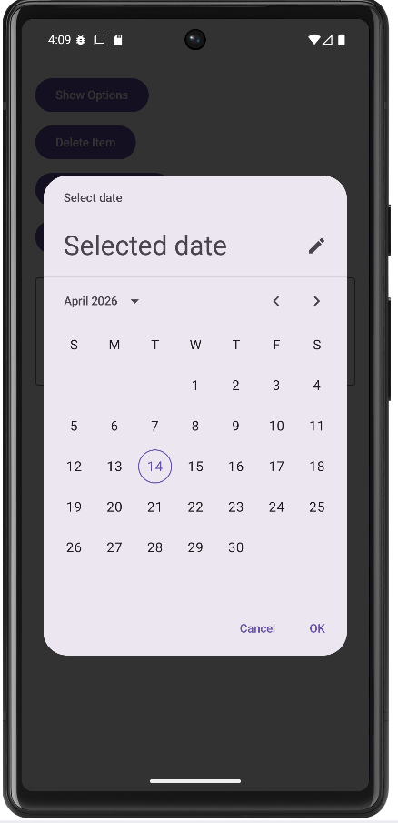
Date picker dialog
@OptIn(ExperimentalMaterial3Api::class)
@Composable
fun DatePickerDemo() {
    var showPicker by remember { mutableStateOf(false) }
    var dateLabel by remember { mutableStateOf("") }

    Button(onClick = { showPicker = true }) { Text("Pick date") }
    OutlinedTextField(
        value = dateLabel.ifEmpty { "Pick a date above" },
        onValueChange = {},
        readOnly = true,
        label = { Text("Selected date") }
    )

    if (showPicker) {
        val datePickerState = rememberDatePickerState()
        DatePickerDialog(
            onDismissRequest = { showPicker = false },
            confirmButton = {
                TextButton(
                    onClick = {
                        dateLabel = datePickerState.selectedDateMillis?.let { millis ->
                            val sdf = SimpleDateFormat("MMM d, yyyy", Locale.getDefault()).apply {
                                timeZone = TimeZone.getTimeZone("UTC")
                            }
                            sdf.format(Date(millis))
                        } ?: "No date selected"
                        showPicker = false
                    }
                ) { Text("OK") }
            },
            dismissButton = {
                TextButton(onClick = { showPicker = false }) { Text("Cancel") }
            }
        ) {
            DatePicker(state = datePickerState)
        }
    }
}
Material 3 provides a dedicated date picker dialog: a shell (DatePickerDialog) with slots for OK and Cancel, plus a trailing lambda that builds the dialog body. The body contains a single DatePicker composable tied to rememberDatePickerState(). That state object holds the calendar UI state and exposes selectedDateMillis after the user selects a day.
The date-picker APIs are experimental, so you need the same @OptIn(ExperimentalMaterial3Api::class) as for the bottom sheet. Until the API is stabilized, expect minor API changes between library versions.
selectedDateMillis can be null if the user has not committed a selection, so the OK handler should use a safe call or check before formatting. The formatted string is assigned to remembered state (dateLabel) and bound to a read-only OutlinedTextField so the user sees the result on the main screen instead of a transient Toast. The sample formats with SimpleDateFormat and sets the formatter’s time zone to UTC because the picker’s millis value is defined in UTC for the chosen calendar date; using UTC for display avoids off-by-one-day bugs in many locales.
rememberDatePickerState() is called inside if (showPicker) so the state is created when the dialog is shown and discarded when it leaves composition. Alternatively, you can hoist state to a fixed call site if you need to preserve selection across open/close cycles.
onDismissRequest should clear showPicker when the user dismisses without OK (for example back or outside tap, depending on behavior). Cancel and OK both should eventually set showPicker to false so the dialog is removed from the tree.
Imports for these examples
Beyond the usual Compose layout and Material 3 imports, the date example uses DatePicker, DatePickerDialog, and rememberDatePickerState; OutlinedTextField for read-only display; and java.text.SimpleDateFormat, java.util.Date, java.util.Locale, and java.util.TimeZone. The sample app optionsDialog.kt combines these patterns and uses one multiline read-only OutlinedTextField to summarize bottom-sheet, list, and date selections.
Key takeaways
- Control each overlay with remembered state; set it to false whenever the user dismisses the surface.
- Use bottom sheets for non-blocking lists of actions; use centered dialogs when you need a hard stop and a clear choice.
- Opt in to experimental Material 3 APIs where the compiler requires it.
- Surface choices on the main screen with
Textor a read-onlyOutlinedTextFieldbound to state updated from callbacks—no need forToastfor simple feedback.
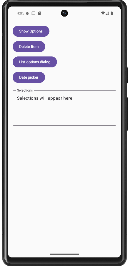
How this example renders
The screenshots below come from the sample app that implements these patterns together. For the complete source, see the chapter14 optionsDialog.kt file on my GitHub page.
Tips for Success
- Use bottom sheets for multiple options and dialogs for single confirmations
- Always provide a way to dismiss bottom sheets and dialogs
- Keep dialog content focused and avoid overwhelming users
- Use appropriate titles and messages that clearly explain the purpose
- Test your bottom sheets and dialogs on different screen sizes
- Consider accessibility - make sure screen readers can navigate your dialogs
- Use consistent styling across all your dialogs and bottom sheets
Common Mistakes to Avoid
- Using dialogs for simple information that could be shown inline
- Creating bottom sheets that are too tall and hard to dismiss
- Not providing clear action buttons in dialogs
- Forgetting to handle the dismiss action properly
- Using too many nested dialogs or bottom sheets
- Not considering the user's context when showing dialogs
- Making dialogs or bottom sheets too complex with too many options
Best Practices
- Use bottom sheets for actions that don't require immediate attention
- Use dialogs for critical decisions or important information
- Keep dialog content concise and focused on a single task
- Provide clear, descriptive button labels
- Use consistent visual design across all your overlays
- Consider the user's workflow when deciding between bottom sheets and dialogs
- Test your overlays with different content lengths and screen sizes
- Use appropriate animations and transitions for a polished feel