Combining LazyColumn and LazyRow
In this section we will combine LazyColumn and LazyRow to create a more complex layout. We will use a LazyColumn to display a list of categories and a LazyRow to display a list of items for each category.
Note: In order for the images to work you will need to add the following dependencies and permissions.
This will go in your libs.versions.toml file
[versions]
...
coil = "2.4.0" // Add this line for Coil version

[libraries]
...
coil-compose = { module = "io.coil-kt:coil-compose", version.ref = "coil" } // Add this line for Coil Compose make sure it is in the libraries section.
This will go in your build.gradle file
dependencies {
    ...
    implementation(libs.coil.compose) // Add this line for Coil Compose
}
You will need to add this code to your manifest file to allow internet access. It is found in apps→manifests→AndroidManifest.xml.
<uses-permission android:name="android.permission.INTERNET" />
@Composable
    fun CategoryList() {
        // Create sample data
        val categories = List(7) { categoryIndex ->
            Category(
                id = categoryIndex,
                name = "Category ${categoryIndex + 1}",
                items = List(10) { itemIndex ->
                    CategoryItem(
                        id = itemIndex,
                        title = "Title ${itemIndex + 1}",
                        // Using placeholder images from picsum.photos
                        imageUrl = "https://picsum.photos/200/300?random=${categoryIndex * 10 + itemIndex}"
                    )
                }
            )
        }

        LazyColumn(
            modifier = Modifier
                .fillMaxSize()
                .padding(top=50.dp),
            verticalArrangement = Arrangement.spacedBy(16.dp),
            contentPadding = PaddingValues(16.dp)
        ) {
            items(categories) { category ->
                // Within the LazyColumn we have a CategorySection composable which contains a LazyRow
                CategorySection(category)
            }
        }
    }

    @Composable
    fun CategorySection(category: Category) {
        Column {
            // Category title
            Text(
                text = category.name,
                style = MaterialTheme.typography.titleLarge,
                modifier = Modifier.padding(bottom = 8.dp)
            )

            // Horizontal scrolling list of items
            LazyRow(
                horizontalArrangement = Arrangement.spacedBy(8.dp)
            ) {
                items(category.items) { item ->
                    CategoryItemCard(item)
                }
            }
        }
    }

    @Composable
fun CategoryItemCard(item: CategoryItem) {
    Card(
        modifier = Modifier
            .width(160.dp)    // Fixed width for consistent card size
            .height(200.dp),  // Fixed height for consistent card size
        elevation = CardDefaults.cardElevation(defaultElevation = 4.dp)  // Card shadow
    ) {
        Column {

            AsyncImage(
                model = item.imageUrl,
                contentDescription = item.title,
                modifier = Modifier
                    .fillMaxWidth()
                    .height(120.dp),
                contentScale = ContentScale.Crop  // Crop image to fill the space
            )


            Text(
                text = item.title,
                style = MaterialTheme.typography.titleMedium,
                maxLines = 2,  // Limit to 2 lines
                overflow = TextOverflow.Ellipsis,  // Show ellipsis for overflow
                modifier = Modifier.padding(8.dp)
            )
        }
    }
}
What This Example Is Doing
CategoryList builds sample data: seven categories, each with ten items that have titles and image URLs (from picsum.photos). A LazyColumn scrolls vertically through categories; for each category, CategorySection shows the category name and a LazyRow of item cards. So you get a vertical list of sections, and each section has a horizontal row of cards. CategoryItemCard displays each item in a fixed-size card: AsyncImage loads the image from the URL (Coil + INTERNET permission required), and the title appears below. The dependency snippets above add the Coil library and INTERNET permission so images can load from the web.
Above Code Explained
The CategoryList composable creates a vertically scrolling list of categories using LazyColumn. Each category contains:
- A title displayed at the top
- A horizontally scrolling list of items using LazyRow
- Proper spacing between categories (16.dp) and items (8.dp)
The CategorySection composable handles the display of each category by:
- Showing the category name using Material Design typography
- Creating a horizontal LazyRow for the category's items
- Managing the layout and spacing of items
The CategoryItemCard composable displays individual items as cards, each containing:
- An image loaded from the provided URL
- A title below the image
- Material Design styling with proper elevation and padding
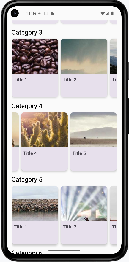
How this example renders
The screenshot shows the combined layout on screen: a vertically scrolling list of category sections (e.g., “Category 1”, “Category 2”). Each section has a title at the top and a horizontally scrolling row of cards below it. Each card shows an image and a title. You scroll down to see more categories and scroll left/right within a section to see more items. The full project is on my GitHub page—open the chapter8 combined.kt file to run it.