Material Design
Introduction
Material Design is a design language created by Google to help apps look modern, clean, and easy to use. In Jetpack Compose, Material Design is built right in, so you can quickly make your app look professional without a lot of extra work. Think of it as a set of design rules and ready-made building blocks for your app's look and feel. The default colors, typography, and shapes you get in Compose come from MaterialTheme and the Material components library (which follows Google's Material Design tokens). For the full design system—spacing, motion, components, and accessibility—see Material Design (material.io). For how those ideas map to Compose APIs, defaults, and theming, see the Android Developers guide Material Design in Compose.
When to Use Material Design in Compose
- You want your app to look consistent with other Android apps
- You want to use ready-made components like Buttons, Cards, and AppBars
- You want to easily support light and dark themes
- You want to follow Google's design guidelines
Common Material Components
| Component | What It Does | When to Use It |
|---|---|---|
| Button | A clickable button with Material styling | For actions like submit, next, or save |
| Card | A container with elevation and rounded corners | To group related content |
| TopAppBar | A bar at the top of the screen | For titles, navigation, and actions |
| Scaffold | Basic layout structure for screens | To organize app bars, FABs, and content |
Practical Example
@Composable
fun MaterialExample() {
    MaterialTheme {
        Scaffold(
            topBar = {
                TopAppBar(title = { Text("My App") })
            }
        ) { padding ->
            Column(modifier = Modifier.padding(padding)) {
                Card(elevation = CardDefaults.cardElevation(8.dp)) {
                    Text("Hello, Material Design!", modifier = Modifier.padding(16.dp))
                }
                Spacer(modifier = Modifier.height(16.dp))
                Button(onClick = { /* Do something */ }) {
                    Text("Click Me")
                }
            }
        }
    }
}
Explaining the Example
MaterialThemewraps the whole UI, giving it Material colors and stylesScaffoldsets up a basic screen layout with a top barTopAppBarshows the app's title at the topCarddisplays a message with a shadow and rounded cornersButtonis a clickable Material-styled button
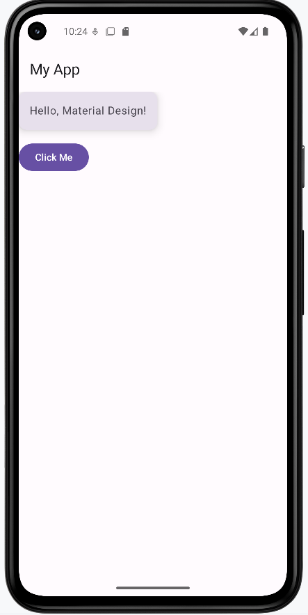
How the example renders:
Above is just a snippet of the code to view the full code, you need to go to my GitHub page and look at the chapter13 material_design.kt file. When you run the code it will look like the example below.
Elevation, Shadows, and Surface Layers
Elevation in Material Design is like stacking pieces of paper: the higher the stack, the bigger the shadow it casts. This helps users see which parts of your app are on top, clickable, or most important. In Compose, you can set elevation on components like Surface, Card, and FloatingActionButton to create this effect.
A FloatingActionButton (FAB) is a circular, elevated button (usually placed in the lower right corner) that triggers a primary action—for example, a "+" button to add a new item or a "send" button in a compose screen. Its elevation (and shadow) helps it "float" above the rest of your UI, drawing the user's attention.
- Higher elevation = bigger shadow = appears "closer" to the user
- Use elevation to show which parts of your UI are interactive or layered above others
- Most Material components (like AppBar, FAB, Card) use elevation by default
@Composable
fun ElevationExample() {
    Box(modifier = Modifier.fillMaxSize()) {
        Column(modifier = Modifier.padding(16.dp)) {
            Surface(
                tonalElevation = 2.dp,
                shadowElevation = 2.dp,
                modifier = Modifier.padding(bottom = 8.dp)
            ) {
                Text("Low elevation (Surface)", modifier = Modifier.padding(16.dp))
            }
            Spacer(modifier = Modifier.height(25.dp))
            Card(elevation = CardDefaults.cardElevation(8.dp), modifier = Modifier.padding(bottom = 8.dp)) {
                Text("Higher elevation (Card)", modifier = Modifier.padding(16.dp))
            }
            Spacer(modifier = Modifier.height(25.dp))
            Surface(
                tonalElevation = 12.dp,
                shadowElevation = 12.dp
            ) {
                Text("Very high elevation (Surface)", modifier = Modifier.padding(16.dp))
            }
        }
        Spacer(modifier = Modifier.height(25.dp))
        FloatingActionButton(
            onClick = { /* do something */ },
            modifier = Modifier.align(Alignment.CenterHorizontally).padding(16.dp),
            elevation = FloatingActionButtonDefaults.elevation(6.dp)
        ) {
            Text("+")
        }
    }
}
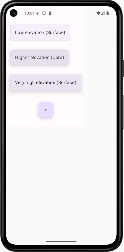
How this example renders
Above is just a snippet of the code to view the full code, you need to go to my GitHub page and look at the chapter13 elevation.kt file. When you run the code it will look like the example below.
Tips for Success
- Wrap your screens in
MaterialThemefor consistent styling - Use Material components whenever possible—they handle a lot of details for you
- Check out Google's Material Design guidelines for inspiration
Common Mistakes to Avoid
- Not using
MaterialTheme—your app may look inconsistent - Mixing Material and non-Material components without care
- Ignoring accessibility (like color contrast and touch targets)
Best Practices
- Keep your UI simple and clean
- Use Material components for a professional look
- Test your app in both light and dark mode