Column Layout
Think of a Column like a stack of building blocks - each block sits on top of the one below it. In Jetpack Compose, a Column is one of the most important tools for creating vertical layouts. Whether you're building a profile screen, a settings menu, or a form, the Column layout helps you stack your UI elements neatly from top to bottom.
In this lesson, we'll explore how to use the Column layout effectively in your Android apps. You'll learn how to create basic columns, center items, add spacing, and style your columns to create beautiful, user-friendly interfaces.
Quick Reference Table
| Property | Description | When to Use |
|---|---|---|
| modifier | Controls appearance and behavior | When you need to style or position the column |
| verticalArrangement | Controls spacing between items | When you need to adjust vertical spacing |
| horizontalAlignment | Controls horizontal alignment of items | When you need to center or align items |
Your First Column
When to Use
- When you need to stack elements vertically
- When creating forms or lists
- When displaying content that flows from top to bottom
- When you want to create a vertical navigation menu
Practical Example
@Composable
fun ColumnExample() {
    Column(
        modifier = Modifier.padding(16.dp)  // Add space around the column
    ) {
        Text("Welcome to Compose!")  // First text element
        Text("Let's build a layout.") // Second text element
    }
}
What's happening here:
- The
Columnis like a container that holds everything together Modifier.padding(16.dp)adds some breathing room around the edges- The two
Textelements stack on top of each other, just like blocks
Centering Your Column Items
When to Use
- When you want to center items horizontally
- When creating a balanced, symmetrical layout
- When you want to create a more polished look
- When you need to align items in the middle of the screen
Practical Example
@Composable
fun CenteredColumn() {
    Column(
        modifier = Modifier.fillMaxWidth(),  // Make the column as wide as the screen
        horizontalAlignment = Alignment.CenterHorizontally  // Center items horizontally
    ) {
        Text("Centered Item 1")  // First centered text
        Text("Centered Item 2")  // Second centered text
    }
}
This code does two important things:
fillMaxWidth()makes the Column stretch across the whole screenhorizontalAlignment = Alignment.CenterHorizontallycenters everything inside
Adding Space Between Items
When to Use
- When you need consistent spacing between items
- When you want to create a more readable layout
- When you need to separate different sections of content
- When you want to create a more visually appealing design
Practical Example
This is one way to add space between items. Using verticalArrangement = Arrangement.spacedBy(12.dp) adds exactly 12 units of space between each item automatically. Think of it like adding invisible spacers between your blocks.
@Composable
fun SpacedColumn() {
    Column(
        modifier = Modifier.padding(16.dp),  // Add space around the column
        verticalArrangement = Arrangement.spacedBy(12.dp)  // Add space between items
    ) {
        Text("Item One")    // First item
        Text("Item Two")    // Second item
        Text("Item Three")  // Third item
    }
}
Another way to add space between items is to use the Spacer composable. You can also add Spacer composables between items when you want different amounts of space in different places. For example:
Column {
    Text("First Item")
    Spacer(modifier = Modifier.height(20.dp))  // Adds 20 units of space
    Text("Second Item")
    Spacer(modifier = Modifier.height(10.dp))  // Adds 10 units of space
    Text("Third Item")
}
What This Second Example Is Doing
This version uses Spacer composables instead of Arrangement.spacedBy. The column shows "First Item," then an invisible Spacer that is 20 dp tall, then "Second Item," then a 10 dp Spacer, then "Third Item." So you get a different amount of space between the first and second items (20 dp) than between the second and third (10 dp). That gives you more control when you want different spacing in different places.
Making Your Column Look Fancy
When to Use
- When you want to create a visually appealing UI
- When you need to highlight important content
- When you want to create a card-like container
- When you need to create a more polished, professional look
Practical Example
@Composable
fun StyledColumn() {
    // First, let's set up our Column with some basic styling
    Column(
        // This modifier chain sets up the Column's appearance
        modifier = Modifier
            .fillMaxWidth()  // Makes the Column as wide as the screen
            .padding(16.dp)  // Adds space around the edges
            .background(     // Adds a background color
                color = MaterialTheme.colorScheme.primaryContainer,
                shape = RoundedCornerShape(16.dp)  // Makes the corners rounded
            )
            .border(        // Adds a border around the Column
                width = 2.dp,
                color = MaterialTheme.colorScheme.primary,
                shape = RoundedCornerShape(16.dp)
            )
            .padding(16.dp),  // Adds more space inside the Column

        // Center everything horizontally
        horizontalAlignment = Alignment.CenterHorizontally,
        // Add space between items
        verticalArrangement = Arrangement.spacedBy(8.dp)
    ) {
        // First item: A large, bold title
        Text(
            text = "Styled Column",
            style = TextStyle(
                fontSize = 24.sp,        // Makes the text bigger
                fontWeight = FontWeight.Bold,  // Makes it bold
                color = MaterialTheme.colorScheme.primary  // Uses the primary color
            ),
            modifier = Modifier.padding(bottom = 8.dp)  // Adds space below
        )

        // Second item: A smaller, regular text
        Text(
            text = "This is a styled text",
            style = TextStyle(
                fontSize = 16.sp,  // Smaller text size
                color = MaterialTheme.colorScheme.onPrimaryContainer  // Different color
            )
        )

        // Third item: A button
        Button(
            onClick = { /* TODO: Add click action */ },
            modifier = Modifier.padding(top = 8.dp)  // Adds space above
        ) {
            Text("Styled Button")
        }

        // Fourth item: A colored box with text
        Box(
            modifier = Modifier
                .size(100.dp)  // Makes the box 100x100 units
                .background(    // Adds a different background color
                    color = MaterialTheme.colorScheme.secondaryContainer,
                    shape = RoundedCornerShape(8.dp)  // Rounded corners
                )
                .padding(8.dp),  // Adds space inside the box
            contentAlignment = Alignment.Center  // Centers the text inside
        ) {
            Text(
                text = "Box",
                color = MaterialTheme.colorScheme.onSecondaryContainer
            )
        }
    }
}
Let's understand what each part does:
The Column Setup
fillMaxWidth()makes the Column stretch across the screenpadding(16.dp)adds space around the edgesbackground()gives it a nice background color with rounded cornersborder()adds a colored border around it
The Items Inside
- Title Text: Big, bold text in the primary color
- Regular Text: Smaller text in a different color
- Button: A clickable button with text
- Box: A colored square with centered text
Spacing and Alignment
horizontalAlignment = Alignment.CenterHorizontallycenters everythingverticalArrangement = Arrangement.spacedBy(8.dp)adds space between items- Individual
padding()modifiers add extra space where needed
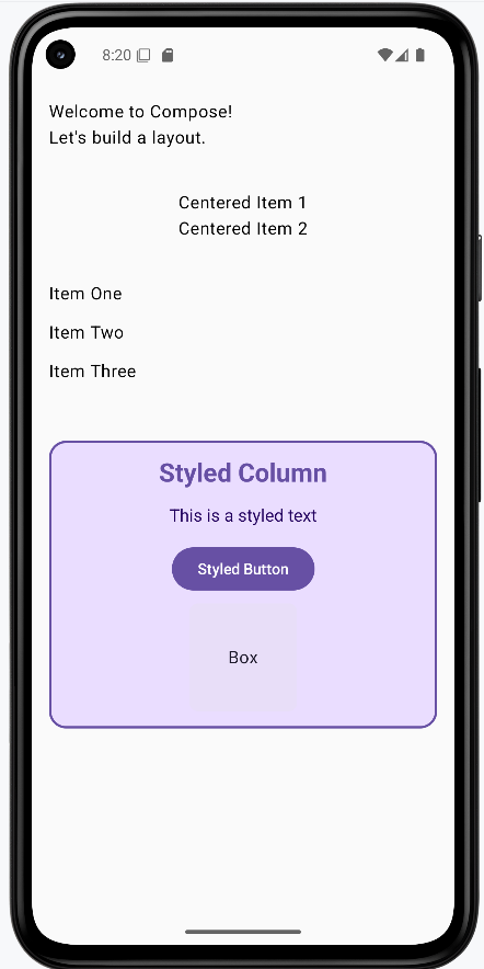
How these examples render
The image below shows what the column examples look like when you run them: a simple column, a centered column, a spaced column, and the styled column with title, text, button, and colored box. The snippets above are only part of the code; to see and run the full project, go to my GitHub page and open the chapter4 column_code.kt file.
Tips for Success
- Start with simple columns and build up to more complex ones
- Use the Compose Preview feature to see your columns as you build them
- Use modifiers to fine-tune the appearance and positioning of your columns
- Test your columns on different screen sizes and orientations
- Use the Compose documentation and samples as reference
- Break down complex columns into smaller, reusable components
Common Mistakes to Avoid
- Creating overly complex columns that are hard to maintain
- Not using modifiers to control the appearance and positioning of columns
- Not considering different screen sizes and orientations
- Not using the Compose Preview feature to check your columns
- Not following Material Design guidelines for consistency
- Not breaking down complex columns into smaller, reusable components
Best Practices
- Keep columns simple and focused on a single responsibility
- Use meaningful names for your column composables
- Extract reusable column components into separate composables
- Use the Compose Preview feature to iterate quickly
- Follow Material Design guidelines for a consistent look
- Test your columns with different screen sizes and orientations