Image Loading
Imagine you're building a photo gallery app. You need to show hundreds of pictures, but if you try to load them all at once, your app will be slow and might crash. Just like a smart photo album that only shows the photos you're looking at, image loading libraries help your app display images efficiently. They handle downloading images from the internet, storing them temporarily, and showing them only when needed. This makes your app faster and uses less memory, which is especially important on mobile devices.
In this lesson, we'll learn how to use Coil (Coroutine Image Loader) to load and display images in your Android app. Coil is a popular library that makes it easy to load images from the internet, local storage, or resources, with automatic caching and memory management.
When to Use Image Loading
- When displaying images from the internet (like profile pictures or product photos)
- When showing images from your app's resources or assets
- When creating image galleries or lists with many images
- When you need to show images with loading indicators
- When you want to automatically cache images for better performance
- When displaying images in different sizes (thumbnails, full-size)
- When handling image loading errors gracefully
- When optimizing memory usage for image-heavy apps
Key Image Loading Concepts
| Concept | What It Does | When to Use It |
|---|---|---|
AsyncImage |
Loads and displays images asynchronously | When you need to display images from URLs or resources |
rememberAsyncImagePainter |
Creates an image painter that loads images in the background | When you need more control over image loading states |
ImageRequest |
Defines how and where to load an image | When you need to customize image loading (size, transformations) |
ContentScale |
Defines how the image should be scaled to fit its container | When you need to control how images fill their space |
placeholder |
Shows an image while loading | When you want to show something while the image downloads |
error |
Shows an image when loading fails | When you want to handle image loading errors gracefully |
crossfade |
Creates a smooth fade transition when image loads | When you want smooth visual transitions for better UX |
Project Setup: Image Gallery App
Let's start by setting up our ImageGallery project. This will be a simple app that demonstrates how to load and display images using Coil.
Step 1: Adding Dependencies
First, we need to add the Coil dependency for image loading. We'll update the gradle/libs.versions.toml file:
[versions]
...
coil = "2.6.0"  # Add this line

[libraries]
...
coil-compose = { group = "io.coil-kt", name = "coil-compose", version.ref = "coil" }  # Add this line
Then update the app/build.gradle.kts file to include the Coil dependency:
dependencies {
    ...
    implementation(libs.coil.compose)  // Add this line

}
Step 2: Adding Internet Permission
Since our app loads images from the internet, we need to add the internet permission to AndroidManifest.xml:
<?xml version="1.0" encoding="utf-8"?>
<manifest xmlns:android="http://schemas.android.com/apk/res/android"
    xmlns:tools="http://schemas.android.com/tools">

    <!-- Permission for internet access to load images -->
    <uses-permission android:name="android.permission.INTERNET" />

    <application
        <!--manifest code here-->
    </application>
</manifest>
Step 3: Understanding the App Structure
Our ImageGallery app will have a simple structure with:
- Image List - A scrollable list of images from the internet
- Loading States - Shows placeholders while images load
- Error Handling - Shows error images when loading fails
- Image Details - Clicking an image shows it in full size
Step 4: Creating the Data Model
First, let's create our data model. Create a new file called ImageItem.kt:
package com.example.imagegallery

// Data class representing an image in our gallery
data class ImageItem(
    val id: String,
    val title: String,
    val imageUrl: String,
    val thumbnailUrl: String
)
What this does:
id- Unique identifier for each imagetitle- The title or description of the imageimageUrl- URL for the full-size imagethumbnailUrl- URL for a smaller thumbnail version
Step 5: Creating Sample Data
Now let's create sample data for our app. Create SampleImageData.kt:
package com.example.imagegallery

// Sample image data using Picsum Photos (a free image service)
object SampleImageData {

    fun getSampleImages(): List {
        return listOf(
            ImageItem(
                id = "1",
                title = "Sample Image 1",
                imageUrl = "https://picsum.photos/id/1/800/600",
                thumbnailUrl = "https://picsum.photos/id/1/200/200"
            ),
            ImageItem(
                id = "2",
                title = "Sample Image 2",
                imageUrl = "https://picsum.photos/id/2/800/600",
                thumbnailUrl = "https://picsum.photos/id/2/200/200"
            ),
            ImageItem(
                id = "3",
                title = "Sample Image 3",
                imageUrl = "https://picsum.photos/id/3/800/600",
                thumbnailUrl = "https://picsum.photos/id/3/200/200"
            ),
            ImageItem(
                id = "4",
                title = "Sample Image 4",
                imageUrl = "https://picsum.photos/id/4/800/600",
                thumbnailUrl = "https://picsum.photos/id/4/200/200"
            ),
            ImageItem(
                id = "5",
                title = "Sample Image 5",
                imageUrl = "https://picsum.photos/id/5/800/600",
                thumbnailUrl = "https://picsum.photos/id/5/200/200"
            ),
            ImageItem(
                id = "6",
                title = "Sample Image 6",
                imageUrl = "https://picsum.photos/id/6/800/600",
                thumbnailUrl = "https://picsum.photos/id/6/200/200"
            )
        )
    }
}
What this does:
object SampleImageData- Creates a singleton object that provides sample datafun getSampleImages()- Returns a list of ImageItem objectsimageUrl- URL for the full-size image (800x600 pixels)thumbnailUrl- URL for the smaller thumbnail (200x200 pixels)- Important: We use
/id/format instead of?random=to ensure the thumbnail and full-size image show the same picture. Using?random=would generate different images each time, causing the thumbnail and full-size image to not match.
Step 6: Creating a Simple Image Card
Now let's create a composable that displays an image card. Create ImageCard.kt:
package com.example.imagegallery

import androidx.compose.foundation.clickable
import androidx.compose.foundation.layout.*
import androidx.compose.foundation.shape.RoundedCornerShape
import androidx.compose.material3.*
import androidx.compose.runtime.Composable
import androidx.compose.ui.Alignment
import androidx.compose.ui.Modifier
import androidx.compose.ui.layout.ContentScale
import androidx.compose.ui.unit.dp
import coil.compose.AsyncImage

@Composable
fun ImageCard(
    imageItem: ImageItem,
    onClick: () -> Unit,
    modifier: Modifier = Modifier
) {
    Card(
        modifier = modifier
            .fillMaxWidth()
            .padding(8.dp)
            .clickable(onClick = onClick),
        shape = RoundedCornerShape(8.dp)
    ) {
        Column {
            // Image
            AsyncImage(
                model = imageItem.thumbnailUrl,
                contentDescription = imageItem.title,
                modifier = Modifier
                    .fillMaxWidth()
                    .height(200.dp),
                contentScale = ContentScale.Crop
            )

            // Image title
            Text(
                text = imageItem.title,
                style = MaterialTheme.typography.titleMedium,
                modifier = Modifier.padding(16.dp)
            )
        }
    }
}
What this code does:
Card- Creates a card container with rounded corners that holds the image and titleclickable(onClick = onClick)- Makes the entire card clickable, so users can tap anywhere on itAsyncImage- The simplest way to load and display images from URLs. Coil automatically handles:- Downloading the image in the background
- Showing a loading state while downloading
- Caching the image for faster future loads
- Handling errors gracefully
model = imageItem.thumbnailUrl- Tells AsyncImage which URL to load (the thumbnail version for the list)contentDescription- Provides text for screen readers (accessibility)ContentScale.Crop- Crops the image to fill the 200dp height, maintaining aspect ratioText- Displays the image title below the image
Why we use AsyncImage directly:
AsyncImage is the simplest and most reliable way to load images. It automatically handles all the complexity of loading, caching, and error handling for you. While you can use rememberAsyncImagePainter for more control over loading states, AsyncImage is perfect for most use cases and is what we use in this example.
Step 7: Creating the Image Gallery Screen
Now let's create the main screen that displays our image gallery. Create ImageGalleryScreen.kt:
package com.example.imagegallery

import androidx.compose.foundation.layout.*
import androidx.compose.foundation.lazy.LazyColumn
import androidx.compose.foundation.lazy.items
import androidx.compose.material3.*
import androidx.compose.runtime.*
import androidx.compose.ui.Modifier
import androidx.compose.ui.unit.dp

@Composable
fun ImageGalleryScreen(
    images: List,
    onImageClick: (ImageItem) -> Unit
) {
    LazyColumn(
        modifier = Modifier
            .fillMaxSize()
            .padding(top = 50.dp),
        verticalArrangement = Arrangement.spacedBy(8.dp),
        contentPadding = PaddingValues(horizontal = 16.dp, vertical = 8.dp)
    ) {
        items(images) { image ->
            ImageCard(
                imageItem = image,
                onClick = { onImageClick(image) }
            )
        }
    }
}
What this code does:
ImageGalleryScreen- A composable function that displays a scrollable list of image cardsimages: List<ImageItem>- Takes a list of ImageItem objects to display in the galleryonImageClick: (ImageItem) -> Unit- A callback function that gets called when an image card is clicked. It receives the clicked ImageItem as a parameterLazyColumn- Creates a vertically scrollable list that is "lazy" (efficient). It only creates and displays the image cards that are currently visible on screen. As you scroll, it creates new cards and removes ones that are off-screen, making it very memory efficient for long listsfillMaxSize()- Makes the LazyColumn take up the full available screen spacepadding(top = 50.dp)- Adds 50dp of padding at the top to account for the system status barverticalArrangement = Arrangement.spacedBy(8.dp)- Adds 8dp of vertical space between each image card in the listcontentPadding = PaddingValues(horizontal = 16.dp, vertical = 8.dp)- Adds padding around the entire list (16dp on left and right, 8dp on top and bottom)items(images) { image -> ... }- This is a LazyColumn function that creates one item for each element in the images list. For each image, it executes the code inside the curly bracesImageCard- Creates an ImageCard composable for each image in the listonClick = { onImageClick(image) }- When an ImageCard is clicked, it calls the onImageClick callback function and passes the current image as a parameter. This allows the parent composable (like ImageGalleryApp) to know which image was clicked
Why we use LazyColumn:
LazyColumn is essential for displaying lists efficiently. Unlike a regular Column, which would try to create all items at once (even if they're off-screen), LazyColumn only creates the items that are visible. This means:
- Better Performance - Only visible items are created, saving memory and processing power
- Smooth Scrolling - As you scroll, items are created and removed dynamically
- Scalability - Can handle hundreds or thousands of items without performance issues
- Automatic Optimization - Coil works perfectly with LazyColumn, only loading images that are visible
Step 8: Creating a Full-Size Image Viewer
Let's create a screen that shows the full-size image when clicked. Create FullSizeImageScreen.kt:
package com.example.imagegallery

import androidx.compose.foundation.layout.*
import androidx.compose.material.icons.Icons
import androidx.compose.material.icons.automirrored.filled.ArrowBack
import androidx.compose.material3.*
import androidx.compose.material3.ExperimentalMaterial3Api
import androidx.compose.runtime.Composable
import androidx.compose.ui.Alignment
import androidx.compose.ui.Modifier
import androidx.compose.ui.layout.ContentScale
import androidx.compose.ui.unit.dp
import coil.compose.AsyncImage

@OptIn(ExperimentalMaterial3Api::class)
@Composable
fun FullSizeImageScreen(
    imageItem: ImageItem,
    onBackClick: () -> Unit,
    modifier: Modifier = Modifier
) {
    Scaffold(
        topBar = {
            TopAppBar(
                title = { Text(imageItem.title) },
                navigationIcon = {
                    IconButton(onClick = onBackClick) {
                        Icon(
                            imageVector = Icons.AutoMirrored.Filled.ArrowBack,
                            contentDescription = "Back"
                        )
                    }
                }
            )
        }
    ) { paddingValues ->
        Box(
            modifier = modifier
                .fillMaxSize()
                .padding(paddingValues),
            contentAlignment = Alignment.Center
        ) {
            AsyncImage(
                model = imageItem.imageUrl,
                contentDescription = imageItem.title,
                modifier = Modifier.fillMaxSize(),
                contentScale = ContentScale.Fit
            )
        }
    }
}
What this code does:
@OptIn(ExperimentalMaterial3Api::class)- Required annotation becauseTopAppBaris an experimental Material3 APIScaffold- Provides the basic structure with a top app barTopAppBar- Displays the image title and a back button at the topIcons.AutoMirrored.Filled.ArrowBack- Uses the AutoMirrored version of the back arrow icon, which automatically flips for right-to-left languages (this is the recommended version, as the oldIcons.Default.ArrowBackis deprecated)Box- Container that centers the image on the screenAsyncImage- Loads and displays the full-size imagemodel = imageItem.imageUrl- Uses the full-size image URL (800x600) instead of the thumbnailContentScale.Fit- Scales the image to fit within the screen while maintaining aspect ratio, so the entire image is visible
Key difference from ImageCard:
- ImageCard uses
imageItem.thumbnailUrl(smaller 200x200 image) for the list - FullSizeImageScreen uses
imageItem.imageUrl(larger 800x600 image) for the detail view - This ensures we load smaller images in the list (faster) and larger images only when needed (when clicked)
Step 9: Updating MainActivity
Finally, let's update MainActivity.kt to use our image gallery:
package com.example.imagegallery

import android.os.Bundle
import androidx.activity.ComponentActivity
import androidx.activity.compose.setContent
import androidx.activity.enableEdgeToEdge
import androidx.compose.foundation.layout.fillMaxSize
import androidx.compose.foundation.layout.padding
import androidx.compose.material3.Scaffold
import androidx.compose.runtime.*
import androidx.compose.ui.Modifier
import com.example.imagegallery.ui.theme.ImageGalleryTheme

class MainActivity : ComponentActivity() {
    override fun onCreate(savedInstanceState: Bundle?) {
        super.onCreate(savedInstanceState)
        enableEdgeToEdge()
        setContent {
            ImageGalleryTheme {
                Scaffold(modifier = Modifier.fillMaxSize()) { innerPadding ->
                    ImageGalleryApp(modifier = Modifier.padding(innerPadding))
                }
            }
        }
    }
}

@Composable
fun ImageGalleryApp(modifier: Modifier = Modifier) {
    var selectedImage by remember { mutableStateOf(null) }
    val images = remember { SampleImageData.getSampleImages() }

    if (selectedImage == null) {
        ImageGalleryScreen(
            images = images,
            onImageClick = { image -> selectedImage = image }
        )
    } else {
        FullSizeImageScreen(
            imageItem = selectedImage!!,
            onBackClick = { selectedImage = null }
        )
    }
}
Understanding Each Part of the Implementation
How the App Flow Works:
- App Starts -
ImageGalleryAppcreates a list of images and showsImageGalleryScreen - Displaying the List -
ImageGalleryScreenuses aLazyColumnto efficiently display all images as cards - Image Cards - Each
ImageCardshows a thumbnail (200x200) usingAsyncImagewithContentScale.Crop - User Clicks - When a user taps an image card, the
onClickcallback updatesselectedImagestate - Showing Full Image - When
selectedImageis not null, the app showsFullSizeImageScreenwith the full-size image (800x600) - Going Back - When the user clicks the back button,
selectedImageis set to null, returning to the list
Image Loading with Coil:
AsyncImage- The simplest way to load and display images. It automatically:- Downloads images in the background without blocking the UI
- Shows a loading indicator while downloading
- Caches images for faster future loads
- Handles errors gracefully
model- The URL or resource to load (can be a String URL, Drawable resource, or other image source)contentDescription- Text description for accessibility (screen readers)
Content Scale Options:
ContentScale.Crop- Crops the image to fill the container while maintaining aspect ratio. Used in ImageCard for thumbnailsContentScale.Fit- Scales the image to fit within the container while maintaining aspect ratio. Used in FullSizeImageScreen so the entire image is visibleContentScale.FillBounds- Stretches the image to fill the container, which may distort the image
State Management:
var selectedImage by remember { mutableStateOf- Tracks which image is currently selected- When
selectedImageisnull, the gallery list is shown - When
selectedImagehas a value, the full-size image screen is shown - This simple state management allows us to switch between two screens
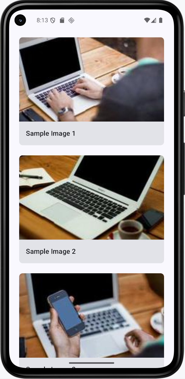
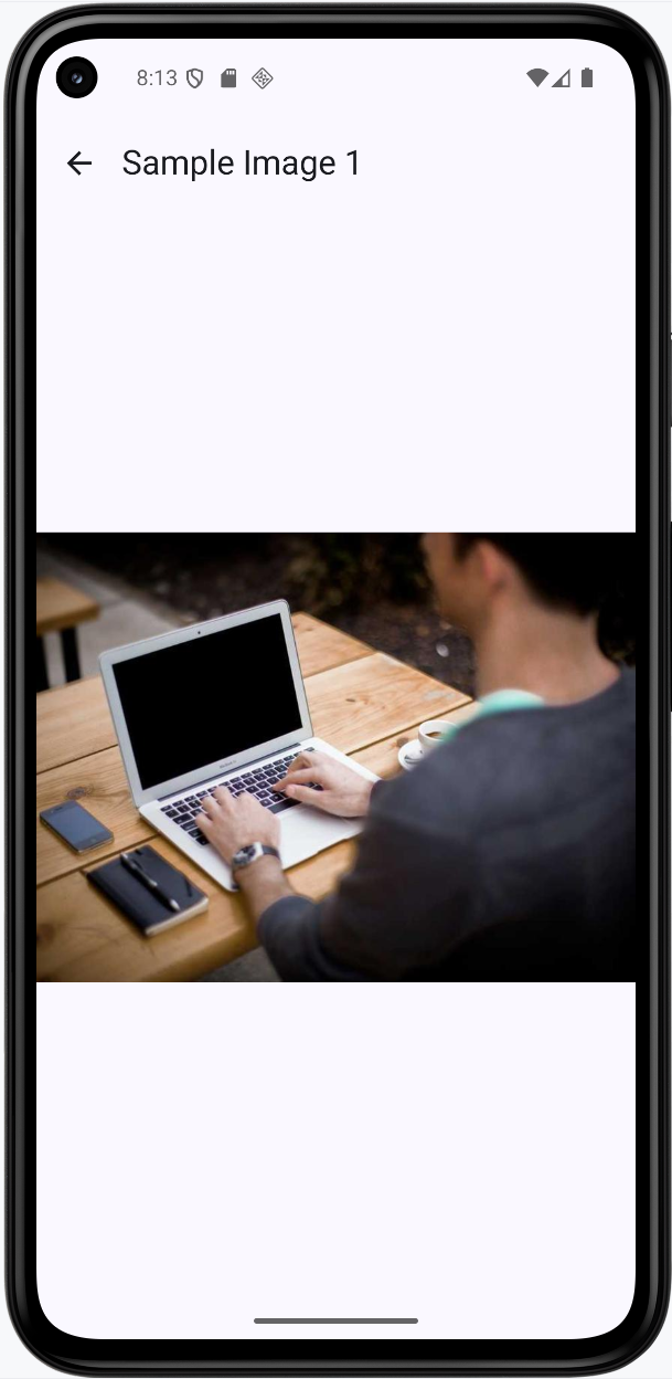
How this example renders
Above is just a snippet of the code to view the full code, you need to go to my GitHub page and look at the chapter15 ImageGallery app.
Tips for Success
- Always use
AsyncImagefor loading images from the internet - it's simple and handles everything automatically - Provide
contentDescriptionfor images to make your app accessible to screen readers - Use thumbnails in lists and load full-size images only when needed - this improves performance
- Use consistent image IDs in URLs (like
/id/1/) to ensure thumbnails and full images match - Choose the right
ContentScale- useCropfor thumbnails andFitfor full-size images - Add internet permission to your manifest when loading images from URLs
- Use
@OptIn(ExperimentalMaterial3Api::class)when using experimental Material3 components likeTopAppBar - Use
Icons.AutoMirrored.Filled.ArrowBackinstead of the deprecatedIcons.Default.ArrowBack - Test that clicking a thumbnail shows the matching full-size image
- Keep your image loading code simple -
AsyncImagehandles most cases perfectly
Common Mistakes to Avoid
- Forgetting to add internet permission for loading images from URLs
- Using
?random=in image URLs, which causes thumbnails and full images to not match - Loading full-size images in lists instead of thumbnails - this wastes bandwidth and memory
- Not providing
contentDescriptionfor accessibility - Forgetting to add the Coil dependency
- Using the wrong
ContentScale- usingFillBoundscan distort images - Forgetting
@OptIn(ExperimentalMaterial3Api::class)when usingTopAppBar - Using deprecated icons like
Icons.Default.ArrowBackinstead ofIcons.AutoMirrored.Filled.ArrowBack - Not testing that the thumbnail matches the full-size image when clicked
- Overcomplicating image loading -
AsyncImageis usually all you need
Best Practices
- Use Coil's
AsyncImagefor all image loading - it's simple, efficient, and handles everything automatically - Use thumbnails in lists (smaller images) and load full-size images only when needed
- Use consistent image IDs in URLs (like
/id/1/) to ensure thumbnails and full images match - Provide meaningful
contentDescriptionfor all images for accessibility - Use
ContentScale.Cropfor thumbnails andContentScale.Fitfor full-size images - Keep image loading code simple -
AsyncImagehandles loading, caching, and errors automatically - Use
LazyColumnfor lists to efficiently display many images - Manage navigation with simple state (like
selectedImage) to switch between screens - Always use
@OptInannotations for experimental APIs - Use AutoMirrored icons for better internationalization support