Using MaterialTheme
Introduction
MaterialTheme is like the style manager for your app in Jetpack Compose. It controls the colors, shapes, and text styles your app uses, so everything looks consistent and professional. By wrapping your UI in MaterialTheme, you make sure your app follows Material Design rules automatically.
When to Use MaterialTheme
- Whenever you want your app to look modern and consistent
- When you want to easily switch between light and dark mode
- When you want to customize your app's colors, typography, or shapes
- When you use Material components (like Button, Card, etc.)
What You Can Customize with MaterialTheme
| Property | What It Does | When to Use It |
|---|---|---|
| colorScheme | Controls all the colors in your app | To match your brand or support dark mode |
| typography | Controls all the text styles | To set custom fonts or text sizes |
| shapes | Controls the roundness of corners | To make buttons or cards more/less rounded |
Want to see all the possible theme properties?
Check out the Theme Reference for a complete list of ColorScheme, Typography, and Shapes properties, what they do, and example values.
Where Are Themes Defined and How Do You Customize Them?
In a real Jetpack Compose project, your app's theme is usually set up in a file called Theme.kt (often found in a ui/theme folder). This file is where you define your color scheme, typography, and shapes for the whole app. When you use MaterialTheme in your code, it uses the settings from this file.
For example, here's what a typical Theme.kt file might look like:
// Theme.kt
val LightColors = lightColorScheme(
    primary = Color(0xFF6200EE),
    secondary = Color(0xFF03DAC6),
    background = Color.White,
    // ... other colors
)

@Composable
fun MyAppTheme(content: @Composable () -> Unit) {
    MaterialTheme(
        colorScheme = LightColors,
        typography = Typography,
        shapes = Shapes,
        content = content
    )
}
In Theme.kt, you edit the hex color values so your app matches a brand, your school colors, or anything you like. After you set up the theme, buttons, cards, and other Material widgets pick up those colors and styles on their own—you do not have to restyle every screen by hand. If you never customize the theme, Compose still works: it falls back to the standard Material look. Later, you can also add separate light and dark themes, or even a different theme for one part of the app, when you are ready for that.
Can I Use My Own Variable Name for a Color Scheme?
Yes! You can use any variable name you want for your color scheme—what matters is that you use lightColorScheme() or darkColorScheme() to create it. For example, you could call your color scheme myColorScheme, MyColors, adminColors, or anything you like.
Where does this code go? For your app’s default theme, put the color scheme and your theme composable (for example MyAppTheme) in Theme.kt, usually under something like ui/theme. In MainActivity, you only call that composable: setContent { MyAppTheme { … } }. You do not paste the full lightColorScheme(…) block or the MyAppTheme @Composable into MainActivity—that file should stay thin. Later, you will also see examples where another composable wraps part of the UI in MaterialTheme with its own colors; that is a nested theme (a local override or a teaching example), not a replacement for defining your main theme in Theme.kt.
// Theme.kt — define the scheme and theme composable here (not in MainActivity)
// You can name this variable anything you want!
val myColorScheme = lightColorScheme(
    primary = Color(0xFF123456),
    secondary = Color(0xFF654321),
    background = Color.White,
    // ... other colors
)

@Composable
fun MyAppTheme(content: @Composable () -> Unit) {
    MaterialTheme(
        colorScheme = myColorScheme, // Use your custom variable here
        typography = Typography,
        shapes = Shapes,
        content = content
    )
}
- The important part is that
myColorSchemeis created usinglightColorScheme()(ordarkColorScheme()for dark mode). - You can use any variable name that makes sense for your app or section.
- In
MainActivity, callsetContent { MyAppTheme { … } }(or your theme’s name)—you do not need to repeat the color scheme there.
Do You Have to Pick Light or Dark?
For each ColorScheme you build, you call one of the two factories: lightColorScheme() or darkColorScheme(). That choice does not lock your whole app to one mode forever—it tells Material which baseline defaults to use for any color roles you leave unset (and those baselines are tuned for light vs dark surfaces and contrast).
If you support both light and dark mode, you usually define two schemes (one with lightColorScheme(), one with darkColorScheme()), then pass the right one into MaterialTheme based on the system or user setting—for example with isSystemInDarkTheme() in your root theme composable. If you only care about one look, a single scheme built with the matching factory is enough.
Where Does MaterialTheme.colorScheme.background Come From?
MaterialTheme.colorScheme.background (and all the other color properties like primary, secondary, etc.) come from the ColorScheme you provide to MaterialTheme. You set these values when you create your color scheme using lightColorScheme() or darkColorScheme()—either in your Theme.kt file or in a local override inside a composable.
For example, if you write:
val myColorScheme = lightColorScheme(
    primary = Color(0xFF123456),
    secondary = Color(0xFF654321),
    background = Color.White, // This sets colorScheme.background
    // ... other colors
)
Then anywhere in your app where you use MaterialTheme.colorScheme.background, it will use the value you set above (in this case, Color.White).
Important: The name you give your variable (myColorScheme, customColors, etc.) is only for where you build the scheme and pass it into MaterialTheme(colorScheme = …). There is no MaterialTheme.myColorScheme on the API—you always read the active scheme with MaterialTheme.colorScheme, which returns whatever ColorScheme that MaterialTheme block was given.
If you don't set background (or any other color) in your color scheme, Compose will use a default Material3 color for that property. You can always check or change these values in your theme setup.
Practical Example
The code below puts lightColorScheme and MaterialTheme inside CustomThemeExample on purpose: it keeps everything in one composable so the chapter can show how theme colors flow to children. That is not where your whole app’s theme should live in a real project—you still use Theme.kt for the default theme and MainActivity only wraps with MyAppTheme { … }. Here, the inner MaterialTheme is a nested theme: it only affects the UI inside its { … } block. If this screen were also under your app’s MyAppTheme, this nested block would override those colors locally—useful for one screen, a dialog, or a demo.
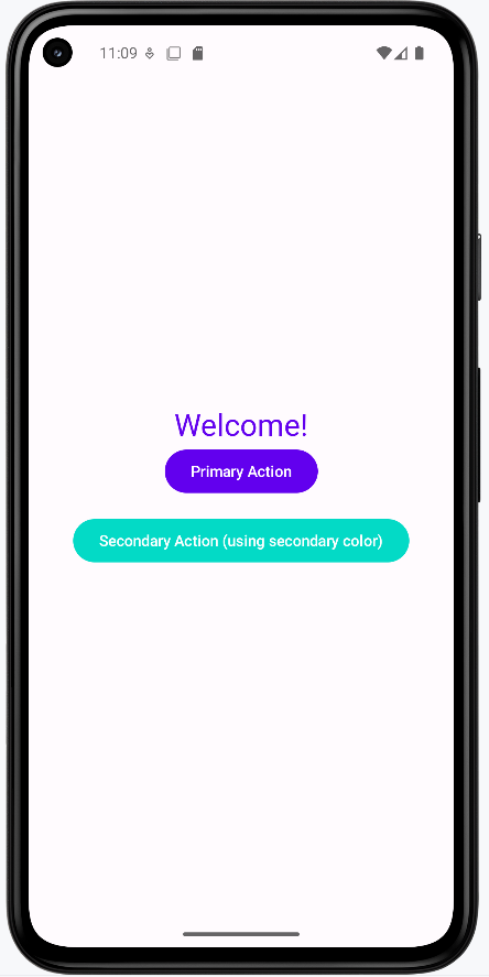
@Composable
fun CustomThemeExample() {
    val customColors = lightColorScheme(
        primary = Color(0xFF6200EE),
        secondary = Color(0xFF03DAC6)
    )
    MaterialTheme(
        colorScheme = customColors
    ) {
        Column(
            modifier = Modifier
                .fillMaxSize()
                .background(MaterialTheme.colorScheme.background),
            horizontalAlignment = Alignment.CenterHorizontally,
            verticalArrangement = Arrangement.Center
        ) {
            Text(
                text = "Welcome!",
                color = MaterialTheme.colorScheme.primary,
                style = MaterialTheme.typography.headlineMedium
            )
            Button(onClick = { /* Do something */ }) {
                Text("Primary Action")
            }
            Spacer(modifier = Modifier.height(16.dp))
            Button(onClick = { /* Do something else */ }, colors = ButtonDefaults.buttonColors(containerColor = MaterialTheme.colorScheme.secondary)) {
                Text("Secondary Action (using secondary color)")
            }
        }
    }
}
Explaining the Example
lightColorSchemecreates a custom color paletteMaterialThemeapplies these colors to all child componentsMaterialTheme.colorScheme.primaryandbackgroundare used for text and backgroundsMaterialTheme.typography.headlineMediumsets the text style- All Material components inside automatically use the custom theme
containerColoris used to set the color of the button
Note on Color Hex Codes: In our example, the primary color is set to 0xFF6200EE (a deep purple) and the secondary color to 0xFF03DAC6 (a teal). The "0xFF" prefix is an alpha (opacity) value (here, fully opaque), and the last six characters (e.g. "6200EE") represent the actual color. You can change these six characters (for example, to "FF0000" for red) to update the color. (For more details, see the Compose Color documentation.)
How this example renders
Above is just a snippet of the code to view the full code, you need to go to my GitHub page and look at the chapter13 material_theme.kt file. When you run the code it will look like the example below.
Tips for Success
- Always wrap your app's UI in
MaterialTheme - Use
MaterialTheme.colorSchemeandMaterialTheme.typographyfor consistent styling - Try customizing the theme to match your school or favorite colors
Common Mistakes to Avoid
- Forgetting to use
MaterialTheme—your app may look plain or inconsistent - Hardcoding colors or fonts instead of using the theme
- Not testing your theme in both light and dark mode
Best Practices
- Keep your theme settings in one place for easy updates
- Use theme values instead of hardcoded styles
- Test your app's look on different devices and modes