Text Fields
Introduction
Text fields are the building blocks of user input in Android apps. Just like a form you fill out on paper, text fields give users a place to type their information. Whether you're creating a login screen, a search bar, or a contact form, text fields are essential for getting information from your users.
Quick Reference
| Component | Description | Best For |
|---|---|---|
| TextField | Basic text input with a simple design | Simple forms, search bars |
| OutlinedTextField | Text input with a visible border | Forms, login screens |
When to Use Text Fields
- When you need to collect user information
- For search functionality in your app
- When creating forms or surveys
- For user authentication (login/signup)
- When you need to get text input from users
Common Options (TextField and OutlinedTextField)
Both TextField and OutlinedTextField use the same options. Here are the main ones:
| Option | What It Does | When to Use It |
|---|---|---|
| value | Stores the current text | Always required to track input |
| onValueChange | Handles text changes | When you need to respond to user typing |
| label | Shows field description | To tell users what to enter |
| placeholder | Shows example text | To provide input guidance |
| isError | Shows error state (e.g. red border) | When the input is invalid; use with supportingText to show the message |
| supportingText | Shows extra text below the field (e.g. hint or error message) | To explain an error or give a short hint; often used with isError |
| minLines | Minimum number of visible lines | To make a field taller (e.g. for a message box); use 2 or more for multi-line |
| maxLines | Maximum number of visible lines | To cap how tall the field can grow; use 1 for single-line, or a number to limit scrolling |
Basic Text Field
Here's how to create a simple text field:
@Composable
fun SimpleTextField() {
    // This state will store what the user types
    var text by remember { mutableStateOf("") }

    TextField(
        value = text,
        onValueChange = { text = it },
        label = { Text("Enter your name") }
    )
}
What This Example Is Doing
SimpleTextField keeps text in state with remember { mutableStateOf("") }. The TextField shows that value and calls onValueChange = { text = it } when the user types, so the state and the field stay in sync. The label "Enter your name" appears above or inside the field. So you get a basic single-line text input with state.
Outlined Text Field
For a more visually distinct input field. The options are the same as for TextField—see Common Options (TextField and OutlinedTextField) above.
@Composable
fun OutlinedTextFieldExample() {
    var text by remember { mutableStateOf("") }

    OutlinedTextField(
        value = text,
        onValueChange = { text = it },
        label = { Text("Your message") }
    )
}
What This Example Is Doing
OutlinedTextFieldExample is the same idea as the simple text field but uses OutlinedTextField instead of TextField. The outlined version has a visible border around the input area, which is common in Material-style forms. State is still text; value and onValueChange bind the field to that state.
Practical Examples
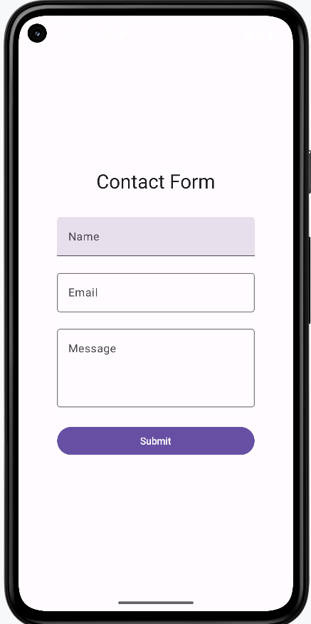
Contact Form Example
Here's a real-world example of a contact form using multiple text fields:
@Composable
fun ContactForm() {
    // State for each field
    var name by remember { mutableStateOf("") }
    var email by remember { mutableStateOf("") }
    var message by remember { mutableStateOf("") }

    Column(
        modifier = Modifier
            .fillMaxWidth()
            .padding(16.dp),
        verticalArrangement = Arrangement.spacedBy(8.dp)
    ) {
        OutlinedTextField(
            value = name,
            onValueChange = { name = it },
            label = { Text("Name") },
            modifier = Modifier.fillMaxWidth()
        )

        OutlinedTextField(
            value = email,
            onValueChange = { email = it },
            label = { Text("Email") },
            placeholder = { Text("Enter your email") },
            modifier = Modifier.fillMaxWidth()
        )

        OutlinedTextField(
            value = message,
            onValueChange = { message = it },
            label = { Text("Message") },
            modifier = Modifier.fillMaxWidth(),
            minLines = 3
        )

        Button(
            onClick = { /* Handle form submission */ },
            modifier = Modifier.fillMaxWidth()
        ) {
            Text("Send Message")
        }
    }
}
What This Example Is Doing
ContactForm keeps three state variables: name, email, and message. A column holds three full-width OutlinedTextFields (Name, Email, Message) and a "Send Message" button. Each field is bound to its state with value and onValueChange. The email field has a placeholder "Enter your email"; the message field has minLines = 3 so it can grow for longer text. The button’s onClick would typically send the form data. So you get a simple multi-field form with separate state per field.
OutlinedTextField Explained
Text Fields with Error States and Validation
Text fields can show error states to provide immediate feedback to users. Here's how to implement error handling:
@Composable
fun TextFieldWithError() {
    var text by remember { mutableStateOf("") }
    var isValid by remember { mutableStateOf(true) }

    Column(
        modifier = Modifier
            .fillMaxWidth()
            .padding(16.dp),
        verticalArrangement = Arrangement.spacedBy(16.dp)
    ) {
        OutlinedTextField(
            value = text,
            onValueChange = {
                text = it
                // Validate that the field is not empty
                isValid = it.isNotEmpty()
            },
            label = { Text("Required Field") },
            // Show error state when field is invalid and user has typed something
            isError = !isValid && text.isNotEmpty(),
            // Display error message below the field
            supportingText = {
                if (!isValid && text.isNotEmpty()) {
                    Text(
                        text = "This field is required",
                        color = Color.Red
                    )
                }
            },
            modifier = Modifier.fillMaxWidth()
        )

        // Show validation status
        Text(
            text = "Field Valid: $isValid",
            color = if (isValid) Color.Green else Color.Red
        )
    }
}
Code Explanation:
State Variables:
var text by remember { mutableStateOf("") }: This line declares a mutable state variable namedtext, initialized as an empty string. This variable holds the current value of the text entered into theOutlinedTextField. Therememberfunction helps retain this state across recompositions, andmutableStateOfmakes it observable by the UI.var isValid by remember { mutableStateOf(true) }: This declares another mutable state variable namedisValid, initialized totrue. This boolean flag tracks the validation status of the text field. It will befalseif the field is empty andtrueotherwise.
OutlinedTextField Parameters:
value = text: Binds the content of the text field to thetextstate variable.onValueChange = { ... }: This lambda is invoked whenever the user types into the text field.text = it: Updates thetextstate variable with the new input (it).isValid = it.isNotEmpty(): Updates theisValidstate. If the new inputitis not empty,isValidbecomestrue; otherwise, it becomesfalse. This is the core validation logic for this example.
label = { Text("Required Field") }: Provides a floating label for the text field.isError = !isValid && text.isNotEmpty(): This is a crucial parameter for displaying the error state.!isValid: Checks if the `isValid` flag is `false` (meaning the field is empty).text.isNotEmpty(): Ensures that the error is only shown if the user has actually typed something and then deleted it, or if they tried to submit an empty field. This prevents the error from showing immediately when the field is initially displayed empty.- The error state (e.g., a red border) is activated only when both conditions are met.
supportingText = { ... }: This composable block is used to display additional text, typically error messages, below the input field.if (!isValid && text.isNotEmpty()) { ... }: The error message "This field is required" is only shown if the same conditions that trigger the `isError` state are met.color = Color.Red: Sets the color of the supporting text to red to visually indicate an error.
modifier = Modifier.fillMaxWidth(): Makes the text field take up the full width available.
Advanced Error Handling Example
var name by remember { mutableStateOf("") }
var email by remember { mutableStateOf("") }
var message by remember { mutableStateOf("") }
var nameHasInteracted by remember { mutableStateOf(false) } // New state for name field interaction
var isNameValid by remember { mutableStateOf(true) } // New state for name field validity


//...more code here...

OutlinedTextField( // Changed to OutlinedTextField
    value = name,
    onValueChange = {
        name = it
        nameHasInteracted = true // Mark as interacted
        isNameValid = it.length >= 3 // Validation logic
    },
    label = { Text("Name") },
    modifier = Modifier.fillMaxWidth(),
    placeholder = { Text("Enter your full name") },
    isError = nameHasInteracted && !isNameValid, // Error state based on interaction and validity
    supportingText = {
        if (nameHasInteracted && !isNameValid) {
            Text(
                text = "Name must be at least 3 characters",
                color = MaterialTheme.colorScheme.error
            )
        }
    }
)

// Email input field with validation
OutlinedTextField(
    value = email,
    onValueChange = { email = it },
    label = { Text("Email") },
    modifier = Modifier.fillMaxWidth(),
    placeholder = { Text("Enter your email address") },
    isError = email.isNotEmpty() && !email.contains("@"),  // Basic email validation
    supportingText = {
        if (email.isNotEmpty() && !email.contains("@")) {
            Text(
                text = "Email must contain an @ symbol",
                color = MaterialTheme.colorScheme.error
            )
        }
    }
)
Code Explanation
State Variables:
var username by remember { mutableStateOf("") }: Holds the current text input for the "Name" field.var email by remember { mutableStateOf("") }: Holds the current text input for the "Email" field.var message by remember { mutableStateOf("") }: Holds the current text input for the "Message" field (though the `OutlinedTextField` for message is not shown in this snippet, the state is declared).var nameHasInteracted by remember { mutableStateOf(false) }: A boolean flag, initialized to `false`, that becomes `true` once the user starts typing in the "Name" field. This is used to prevent validation errors from showing prematurely on an untouched field.var isNameValid by remember { mutableStateOf(true) }: A boolean flag, initialized to `true`, that indicates the validity of the "Name" field based on its validation rules.
"Username"
value = username: Binds the field's content to the `username` state variable.onValueChange = { ... }: This lambda updates the state when the user types:username = it: Updates the `username` variable with the new input.usernameHasInteracted = true: Sets this flag to `true` to indicate user interaction.isNameValid = it.length >= 3: The validation rule for the username field. `isNameValid` is `true` if the input has 3 or more characters, `false` otherwise.
label = { Text("Username") }: Provides a floating label.placeholder = { Text("Enter your full name") }: Displays hint text when the field is empty and not focused.isError = usernameHasInteracted && !isUsernameValid: The error state (e.g., red border) is active if the user has `usernameHasInteracted` AND the `isUsernameValid` flag is `false`.supportingText = { ... }: Displays an error message below the field:if (usernameHasInteracted && !isUsernameValid) { Text(text = "Username must be at least 3 characters", color = MaterialTheme.colorScheme.error) }: Shows the "Username must be at least 3 characters" message in red only when the error conditions (interacted and invalid) are met.
"Email"
value = email: Binds the field's content to the `email` state variable.onValueChange = { email = it }: Updates the `email` variable with the new input.label = { Text("Email") }: Provides a floating label.placeholder = { Text("Enter your email address") }: Displays hint text.isError = email.isNotEmpty() && !email.contains("@"): The error state for the email field is active if the `email` is not empty AND it does not contain the "@" symbol.supportingText = { ... }: Displays an error message below the field:if (email.isNotEmpty() && !email.contains("@")) { Text(text = "Email must contain an @ symbol", color = MaterialTheme.colorScheme.error) }: Shows the "Email must contain an @ symbol" message in red when the error conditions (not empty and missing "@") are met.
How these examples render
The image below shows what the text field examples look like when you run them (e.g. the simple text field, outlined text field, contact form, or validated field with error state). The snippets above are only part of the code; to see and run the full project, go to my GitHub page and open the chapter7 textfield.kt file.
Tips for Success
- Always use state to track text field values
- Make labels clear and descriptive
- Use placeholders to guide user input
- Consider using OutlinedTextField for better visibility
- Test your text fields with different input types
Common Mistakes to Avoid
- Forgetting to handle state changes
- Using unclear or missing labels
- Not providing enough space for input
- Missing error handling for invalid input
- Not considering keyboard types for different inputs
Best Practices
- Use appropriate keyboard types for different inputs (email, number, etc.)
- Validate input as users type
- Provide clear error messages
- Use consistent styling across your app
- Consider accessibility needs